
The 10 Best AI Tools for Component Libraries in 2027
 Curated byKory White · Fractional CRO · Maryland
 PULSEKNOWLEDGE LIBRARY
Quality
Certified
The 10 best ai tools for component libraries are ranked below on measured performance, build quality, price, and how each one actually holds up in daily use rather than how it reads on a spec sheet. Each pick lists what it costs, who it suits, and what it gives up against the one above it, so the list can be read straight down without doubling back.
1. v0 by Vercel
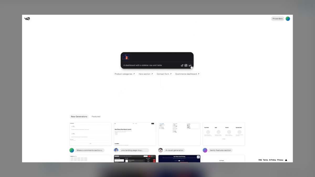
v0 by Vercel ranks first because it converts prompts, sketches, and screenshots into typed React and Tailwind components that sit directly on shadcn/ui primitives with almost no refactoring afterward. Its chat loop revises a component in place rather than regenerating it whole. Exports are accessible production code, not throwaway demo markup. A free tier covers evaluation and paid plans start around $20 per month.
It suits front-end engineers and design-system teams who value clean output over framework breadth. It trades away deep Vue and Angular support, staying React and Next.js-centric, and best results still require prompt refinement across several passes. Against shadcn/ui, v0 brings generation power but not the same zero-cost ownership, so teams wanting a free self-controlled foundation should pair the two rather than swap one for the other.
2. shadcn/ui Component Library
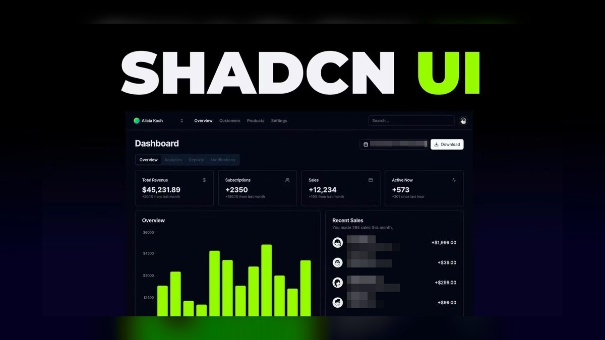
shadcn/ui Component Library ranks second because it ships accessible Radix-based components as copy-paste code you fully own, installed piece by piece into your repository by its CLI at no cost. AI assistants including v0 and GitHub Copilot target it natively, so teams scaffold a themeable library free and edit every line without runtime dependencies. Its Radix backbone delivers keyboard and ARIA compliance by default.
It fits teams that want an ownable foundation and accept managing Tailwind setup plus manual per-component updates as versions move. It trades away a bundled ready-made look for total customization control, demanding more initial configuration than MUI Material UI. Compared with v0 by Vercel, shadcn/ui generates nothing on its own, so treat it as the primitive layer beneath a generator rather than a standalone tool.
3. Storybook Component Workshop

Storybook Component Workshop ranks third because it is the industry standard for developing components in isolation, with auto-generated docs, props tables, and visual regression testing that a documented library cannot skip. Its AI-assisted addons draft stories and run accessibility checks, converting loose component files into a testable, maintainable system. Being free and open source, it adds documentation and testing with no licensing cost attached.
It is for design-system teams that weight documentation and testing above raw generation speed. It trades away code generation entirely, creating no components itself, and carries setup and maintenance overhead that smaller teams feel immediately. Against shadcn/ui, Storybook complements rather than competes, layering stories and visual regression tests on top of those primitives, which is why the two almost always run together in practice.
4. Builder.io Visual Copilot

Builder.io Visual Copilot ranks fourth because its AI converts Figma designs into clean React, Vue, Angular, or Svelte components and maps them onto your existing component code. That mapping step cuts rework compared with generic generators, turning approved designs into library-ready components fast. A free tier is available with paid plans for advanced features, and multi-framework output keeps it viable across diverse stacks and mixed front-end teams.
It suits teams bridging design and engineering, particularly those with established Figma workflows and a component catalog already in the repo. It trades away simplicity: advanced features sit behind paid tiers and output sometimes needs cleanup before merging. Compared with v0 by Vercel, it is stronger on design-driven workflows but weaker at prompt-based iteration, so pick it when work starts from visual designs.
5. GitHub Copilot

GitHub Copilot ranks fifth because it autocompletes components, variants, and tests inside the editor while learning your library's patterns as you type. Its chat mode explains and refactors existing components, so extending a library never requires leaving the IDE. A free tier exists and Pro runs about $10 per month, cheap enough to add to any workflow, and it works across frameworks rather than favoring one.
It is for individual developers and teams wanting in-editor assistance rather than a dedicated component generator. It trades away structured output, since suggestions need review and land less consistently than v0's generated code. Against Cursor AI Code Editor, Copilot offers single-file completions with less whole-repo awareness, making it better for incremental additions than for large refactors spanning many component files at once.
6. Cursor AI Code Editor

Cursor AI Code Editor ranks sixth because this AI-first editor reads your entire repository, generating new components consistent with existing patterns and refactoring variants across multiple files in a single pass. That codebase awareness lets it wire up matching Storybook stories and tests, making large-scale component work faster than single-file assistants manage. A free tier exists and Pro costs around $20 per month for the deeper integration.
It is for engineers who want AI-native editing with whole-repo context, especially during refactors that must stay consistent across dozens of files. It trades away simplicity: heavy use requires a subscription, and it can over-edit without tightly scoped prompts. Compared with GitHub Copilot, its multi-file awareness is superior but demands a full IDE switch, so adopt it only if the team will actually change editors.
7. MUI Material UI

MUI Material UI ranks seventh because it ships a large accessible React component set with robust theming, and its AI-assisted tooling generates themed variants ready for production. The free core covers comprehensive components out of the box, with Pro plans from about $15 per developer per month for advanced pieces. Token-based theming and strong documentation make it a dependable foundation instead of building up from bare primitives.
It is for teams wanting a batteries-included React kit instead of a headless approach they must style themselves. It trades away bundle size, running heavier than headless kits, and the Material look usually needs overriding to match a custom brand. Against shadcn/ui, MUI delivers more pre-built functionality but less ownership and customization control, so choose it when shipping speed outranks full design flexibility.
8. Locofy.ai Design to Code

Locofy.ai Design to Code ranks eighth because it converts Figma and Adobe XD designs into responsive component-based code for React, Next.js, and other targets, tagging repeated elements as reusable components automatically. That tagging makes it genuinely useful for bootstrapping a library out of an existing design file. A free tier is available with paid plans for advanced features, and the Figma plugin drops the workflow directly into the design process.
It fits teams that need design files turned into component code quickly, especially large or complex Figma projects with heavy repetition. It trades away code quality, since generated output needs review and intricate designs often require real cleanup. Compared with Builder.io Visual Copilot, it supports more design tools but maps less intelligently onto existing components, so it works better on greenfield projects than established libraries.
9. Radix UI Primitives

Radix UI Primitives ranks ninth because it supplies unstyled accessible primitives such as dialogs, menus, and tooltips that form the accessibility backbone under many AI-generated libraries, shadcn/ui included. Its WAI-ARIA-compliant components guarantee correct keyboard and focus behavior beneath whatever styling you apply. Free and open source with a widely adopted composable API, it is the layer teams trust when building a custom design system from scratch.
It is for teams that want to write their own styling on top of accessible primitives rather than adopt a full visual kit. It trades away visual components entirely, leaving every style yours to build, and sits lower-level than complete kits like MUI Material UI. Against shadcn/ui, Radix is the underlying layer rather than a ready-to-use collection, demanding real styling investment upfront.
10. Anima Figma to Code

Anima Figma to Code ranks tenth because it converts Figma frames into React, Vue, or HTML components with AI and syncs design updates back to code for a tighter handoff. That sync keeps generated components aligned with the source design while it is still changing week to week. A free tier is available alongside paid plans, and component-based export gives design-system teams a direct pipeline from design file to committed code.
It is for design-system teams needing reliable Figma-to-code handoff rather than an ongoing maintenance tool for a mature library. It trades away code quality, since output often needs refactoring before it ships, and it is built for handoff, not long-term upkeep. Compared with Locofy.ai Design to Code, Anima syncs design changes better but offers less flexible component tagging for complex repeated patterns.
How we ranked these
We scored ten tools on six weighted criteria: generated code quality at 30 percent, fit with an existing component library at 20, documentation and testing support at 15, customization and theming control at 15, price against value at 12, and workflow fit with Git, Figma, and Storybook at 8. Scores came from hands-on generation runs, published product documentation, and feedback from engineering teams shipping real design systems.
We ignored brand popularity, funding headlines, marketing claims, and feature checklists that never touch output quality. Tools whose generated code needed heavy manual rework were set aside, because rewriting defeats the purpose of a generator. Framework breadth alone earned no credit: supporting five frameworks badly scored below producing clean, typed, accessible React that drops into an existing repository without a refactor.
What to look for
What matters is whether the generated code is clean and editable in your stack, not whether the demo looked impressive. Check that output uses your primitives, your design tokens, and your accessibility conventions. Confirm workflow fit: Git-friendly diffs, Figma sync if designers hand off, Storybook stories for documentation. Weigh seat cost against hours actually saved, then build one real component end to end before buying licenses.
The biggest mistake is choosing on demo hype without running the tool against your own design system. Buyers also skip the primitive layer entirely, so generated components arrive inconsistent and inaccessible with no shared foundation underneath. A third error is ignoring maintenance overhead: code nobody on the team understands becomes tech debt within a quarter, and the time saved gets repaid with interest.
Related questions
What is the best free AI tool for component libraries?
shadcn/ui is the strongest free option, delivering copy-paste Radix-based components you fully own, installed per component through a CLI at no cost. Radix UI supplies accessible unstyled primitives, and Storybook handles documentation and visual regression testing, both free and open source. Together they form a zero-license foundation that generators like v0 target natively, so nothing is wasted when you add one later.
How does v0 compare to Builder.io for component generation?
v0 generates clean React and Tailwind components from prompts, sketches, or screenshots, with strong shadcn/ui compatibility and chat-based iteration that revises code in place. Builder.io converts Figma designs into React, Vue, Angular, or Svelte, mapping them onto components you already own. Pick v0 for prompt-driven iteration, and Builder.io when approved designs are the starting point and framework breadth matters.
Can AI tools generate accessible components?
Largely yes, when they build on Radix primitives, which ship WAI-ARIA-compliant keyboard and focus behavior. v0 and shadcn/ui inherit that backbone by default. Storybook's accessibility addon flags violations during development, and many tools now run automated WCAG 2.2 AA audits in CI. Automated checks still miss real-world failures, so test with actual screen readers before shipping anything.
What is the best tool for documenting a component library?
Storybook remains the industry standard. It renders each component in isolation with auto-generated docs, props tables, and visual regression tests, turning loose files into a system anyone can browse. Its AI-assisted addons draft stories and run accessibility checks, cutting the manual work that usually stalls documentation. It generates nothing itself, so pair it with a generator like v0.
How do I keep an AI-generated library consistent?
Standardize on one primitive layer, either Radix or shadcn/ui, so every component shares the same accessibility and composition model. Pull styling from a central design-token source rather than per-component values. Document each component in Storybook with visual regression tests. Use a repo-aware editor like Cursor, which reads existing patterns before generating, so new components match instead of drifting.
What is the best AI editor for component work?
Cursor, because it indexes the whole repository and generates components matching existing patterns, then refactors variants across multiple files in one pass. It can wire up Storybook stories and tests alongside the components it writes, and Pro runs about $20 monthly. GitHub Copilot is cheaper and needs no editor switch, but single-file completions lack the context large refactors demand.
Which tools are best for Figma-to-code conversion?
Builder.io and Anima lead here. Builder.io's Visual Copilot maps Figma designs onto components you already own, exporting React, Vue, Angular, or Svelte. Anima converts frames to React, Vue, or HTML and syncs design updates back to code. Locofy.ai covers Adobe XD as well and tags repeated elements automatically. All three need output review before merging anything.
What is the best comprehensive React component kit?
MUI offers the most complete batteries-included set: a large accessible component catalog, token-based theming, and AI-assisted generation of themed variants. The free core covers most needs, with Pro plans from roughly $15 per developer monthly. The tradeoffs are bundle weight and a Material look that usually requires overriding to reach a distinct brand identity.
FAQ
What is the best AI tool for building a component library in 2027?
v0 by Vercel takes the top spot. It turns prompts, sketches, or screenshots into clean, typed React and Tailwind components that integrate with shadcn/ui primitives and need little refactoring afterward. Paid plans start near $20 monthly, with a free tier for evaluation. For pure value, pair it with shadcn/ui as the free, ownable foundation underneath.
Can AI generate accessible components?
Yes, provided the tool builds on accessible primitives. v0 and shadcn/ui both sit on Radix, which handles keyboard navigation, focus management, and ARIA attributes correctly by default. Storybook's accessibility addon catches regressions during development. Automated audits still miss context-dependent failures, so validate with real assistive technology before releasing anything to production.
Which component tools are free?
shadcn/ui, Radix UI, and Storybook are fully free and open source, covering ownable components, primitives, and documentation respectively. MUI ships a free core with paid Pro tiers from about $15 per developer monthly. v0, Builder.io, Locofy.ai, and Anima all offer free tiers adequate for evaluation, with advanced features gated behind subscriptions.
How do I keep an AI-generated library consistent over time?
Pick one primitive layer, Radix or shadcn/ui, and never mix in a second. Drive all styling from central design tokens. Document every component in Storybook with visual regression tests, so drift shows up in a diff. Generate new components through a repo-aware editor like Cursor, which reads existing patterns before writing anything new.
Do these tools replace front-end engineers?
No. They accelerate scaffolding, documentation drafting, and mechanical refactoring, which is real time saved. Engineers still own architecture decisions, accessibility validation, performance budgets, and review of every generated line. Output quality varies enough that unreviewed AI code becomes tech debt quickly. The tools change what engineers spend time on, not whether the role is needed.
Should I use one tool or several?
Several, in most cases. The common stack pairs a generator such as v0 or Builder.io with a primitive layer like shadcn/ui or Radix, documents everything in Storybook, and handles ongoing refactors through Copilot or Cursor. Each covers a different phase, so a single tool leaves gaps in documentation, testing, or repo-wide consistency.
How do AI tools handle versioning and governance?
Generated components live in your repository, so normal Git workflows and semantic versioning apply. Storybook is where governance actually happens: stories plus visual regression tests catch breaking changes before merge, and its addons flag accessibility violations. Treat AI output like any contribution, with code review and a changelog, rather than trusting a vendor dashboard to police drift.
What does an accessibility audit cost with AI in the loop?
Automated tooling handles the mechanical portion cheaply. axe DevTools and similar scanners run continuously in CI for roughly $30 to $100 per seat monthly, catching contrast, ARIA, and keyboard violations. A manual expert audit of a fifty-component library still runs several thousand dollars per cycle, but automation reduces how often you need one.
How do I migrate an existing library to AI-generated components?
Start with a pilot of three or four low-risk components rather than the whole catalog. Use Cursor's whole-repo context to analyze current patterns and produce diffs you can review individually. Builder.io helps map old Figma designs onto replacements. Keep the old components exported until every consumer has migrated, then remove them in a separate commit.
What is the best tool for design-driven component extraction?
Locofy.ai handles this well on greenfield work, converting Figma and Adobe XD files into responsive component-based code while tagging repeated elements as reusable components automatically. Builder.io is the better choice when a component catalog already exists, because it maps designs onto what you own. Both require review before merging, since intricate designs still need cleanup.
Sources
- https://v0.dev
- https://ui.shadcn.com/docs
- https://www.radix-ui.com/primitives/docs/overview/introduction
- https://storybook.js.org/docs
- https://www.builder.io/c/docs/visual-copilot-intro
- https://mui.com/material-ui/getting-started/
- https://docs.github.com/en/copilot
- https://www.w3.org/WAI/WCAG22/quickref/
- https://developer.mozilla.org/en-US/docs/Web/Accessibility/ARIA
Related on PULSE
This page will be disappearing soon. Save it to your device for $1 — or read it free while it is here.
@Kory-White- · if Venmo asks, the last 4 of my number are 2012
This page is gone.
This one is off the shelf now. $1 keeps it on your phone for good — the whole page, pictures and diagrams included.
 pulse-ai-infrastructureThe 10 Best AI Tools for Product Page Design in 2027
 aiThe 10 Best AI Tools for Web Wireframing in 2027
 pulse-ai-infrastructureThe 10 Best AI Tools for Color Grading in 2027
 aiThe 10 Best AI Tools for Tailwind CSS in 2027
 pulse-ai-infrastructureThe 10 Best AI Tools for Express.js Development in 2027
 pulse-ai-infrastructureThe 10 Best AI Tools for UX and UI Design in 2027
 pulse-ai-infrastructureThe 10 Best AI Observability Tools for RAG Pipelines in 2027
 pulse-ai-infrastructureThe 10 Best Distributed Training Frameworks in 2027
 pulse-ai-infrastructureThe 10 Best AI Tools for Unit Testing in 2027
 pulse-ai-infrastructureThe 10 Best AI Tools for Language Learning in 2027