


Fractional CRO — LinkedIn Banner
Quality
Certified
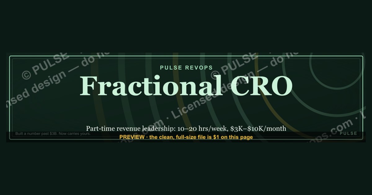
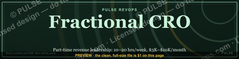
This is a LinkedIn profile banner sized 1584x396 px, titled "Fractional CRO — LinkedIn Banner." It shows a short positioning statement — availability as a fractional Chief Revenue Officer plus a results-oriented line — set in gold serif type on a near-black field, with a clear zone on the left for the circular profile photo. Use it as your LinkedIn cover image to signal fractional availability at a glance.
Two ways to frame the message on this banner
A fractional CRO banner only has room for one idea read in under two seconds, so the first decision is which idea that is. There are two workable framings, and they pull a profile visitor in different directions.
The first option is the role-and-availability framing. The large line reads something like "FRACTIONAL CRO" or "FRACTIONAL CHIEF REVENUE OFFICER," with a smaller supporting line underneath — "Available for 2-3 engagements" or "Revenue leadership, part-time." This version is a label. It tells a visitor what you are and that you have capacity, and it works best when your headline directly under your name already does the selling (titles, outcomes, industries served). The banner becomes a billboard that confirms what the headline implies, rather than repeating it. On the "Fractional CRO — LinkedIn Banner" graphic, this is the default wording treatment: the gold serif headline carries the role, and a thin sans-serif line beneath it carries the availability or scope statement.

The second option is the results-forward framing. Instead of naming the role, the large line states an outcome a fractional CRO is hired to produce — "Revenue leadership without the full-time cost" or "I build pipelines full-time CROs get credit for." The role itself ("Fractional CRO") moves to the smaller supporting line. This framing works better for visitors who don't yet know what a fractional CRO is or why they'd hire one — a CEO who has never worked with a fractional executive sees the benefit before the label, and the label then explains the benefit rather than needing to be decoded.
Neither framing is wrong; they answer different questions. Role-and-availability answers "what are you and can I book you." Results-forward answers "why would I want one of these." A rule of thumb: if most of your profile traffic already arrives knowing what a fractional CRO is (referrals, past clients, PE operating partners who've hired fractionals before), lead with role-and-availability — it's faster to scan and confirms fit. If your traffic is colder — founders who've never considered a part-time executive, LinkedIn search traffic, outbound prospects clicking through from a connection request — lead with results-forward, because it does the explaining the role name alone can't.
A third, hybrid variant some fractional operators use splits the difference: the role name stays large and gold, but the supporting line states a number instead of a status — "40+ GTM teams built since 2019" instead of "available for engagements." This keeps the label clarity of option one while borrowing some of the credibility-building of option two, at the cost of needing a real, defensible number behind the claim.
How to decide which version fits your profile

The decision tree above collapses to one practical test: look at your LinkedIn headline before you pick a banner wording, because the two elements have to do different jobs. If the headline already states the benefit ("Helping Series B SaaS companies fix broken sales pipelines"), the banner should carry the role label — repeating the benefit on the banner is wasted space. If the headline states only the title ("Fractional Chief Revenue Officer | GTM Strategy"), the banner has room to carry the benefit instead, because nothing else on the profile's top fold is doing it yet.
The second input is traffic source. Fractional executives who get most of their inbound through warm referral or a PE/VC firm's operating network should default to role-and-availability — those viewers already understand the engagement model and are scanning for capacity and specialization, not an explanation of what "fractional" means. Fractional executives building a cold or semi-cold pipeline — content-driven LinkedIn growth, outbound connection requests, conference follow-ups — get more value from results-forward wording, since a chunk of that traffic has never hired a part-time executive and the banner is the first chance to make the case.
The third input is how often you plan to change the banner. Role-and-availability wording is more durable — "Fractional CRO" doesn't go stale — while a results-forward number or claim needs periodic refreshing to stay accurate and credible. If you don't want to touch the banner more than once or twice a year, the role framing ages better.
Dimensions, zones and type specs behind the design
The underlying file is built to LinkedIn's current cover-photo dimensions: 1584 x 396 px, a 4:1 aspect ratio. LinkedIn crops this canvas differently depending on viewport, so the design keeps its critical content inside a horizontally centered safe zone of roughly 1200 x 300 px — content placed outside that zone risks being clipped on mobile, where LinkedIn shows a narrower slice of the banner than it does on desktop.
The left edge of the canvas reserves space for the profile photo overlap: on desktop, LinkedIn's circular profile photo sits roughly 20-24 px from the left edge and overlaps the bottom-left corner of the banner in a circle of approximately 200 px diameter (the on-screen rendered size; the uploaded photo itself is typically a 400x400 px square before LinkedIn masks it to a circle). The banner's text block is therefore set starting around x = 420-460 px, clear of that overlap, so no word gets masked by the photo circle on any device.
Typographically, the primary line — the large statement, whether that's "FRACTIONAL CRO" or a results line — runs in a serif face at roughly 64-80 pt at banner resolution, tracked out slightly (added letter-spacing, typically 2-4%) for legibility at the small sizes LinkedIn actually renders on a feed or search-results thumbnail. The supporting line beneath it runs in a sans-serif face around 28-36 pt, set in a lighter weight to create visual hierarchy without a second competing headline. Color treatment is a near-black background — a dark charcoal rather than true black often reads better against LinkedIn's own white chrome — with the headline in a warm gold or brass tone for contrast and a sense of seniority, and the supporting line in a muted off-white or light gray rather than pure white, which can look harsh at small render sizes.
Export as a PNG rather than JPEG: PNG preserves the sharp edges of serif type and flat color fields without the compression artifacts JPEG introduces around high-contrast text edges, and the file size difference at this resolution is negligible (typically under 300 KB either way). If the design includes any gradient or subtle texture behind the matte background, flatten it before export so LinkedIn's own re-compression on upload doesn't introduce banding.
Installing and customizing the banner on LinkedIn
Swapping the banner in is a five-minute task once the file is downloaded: open your LinkedIn profile, click the small camera icon that appears on hover over the existing cover image, and upload the PNG. LinkedIn opens its own crop interface at this point — because the uploaded file already matches LinkedIn's native 1584x396 ratio, the crop tool should show no need for adjustment, but it's worth dragging the preview window to confirm nothing sits outside the visible frame before saving.
To customize the wording for your own team or engagement, the file separates into three editable elements: the large statement, the supporting line, and the background field. Changing the role name (for instance, from "Fractional CRO" to "Fractional CMO" or "Fractional VP of Sales" for a sibling leadership profile) only requires swapping the headline text and reconfirming it still fits the safe zone — serif characters in different words run different widths, so a longer title may need a half-point size reduction to avoid crowding the edges. Changing the color palette away from gold-on-charcoal is reasonable for firms with existing brand colors, but keep the contrast ratio high: a light background behind light text, or a mid-tone gold on a mid-tone background, reads poorly once LinkedIn compresses the image for its thumbnail and notification views.
After uploading, always check the result on both desktop and the mobile app before considering the job done — LinkedIn's desktop and mobile renderers crop the same uploaded file differently, and a line of text that sits comfortably centered on desktop can run close to the top or bottom edge on mobile's narrower visible slice. If mobile clips any part of the message, the fix is almost always to nudge the text block a little more toward true center and re-upload, rather than to shrink the type — shrinking type at this point usually hurts legibility more than a tight crop does.
One sequencing note worth calling out: update the headline field directly under your name at the same time you change the banner, not before or long after. The banner and the headline are read together in the same glance by anyone landing on the profile, and a banner that says "Fractional CRO" sitting above a headline that's still describing a prior full-time title creates a mismatch that undercuts the positioning the banner was meant to establish.
Related questions
What size should a LinkedIn banner be?
LinkedIn's current cover-photo spec is 1584x396 px (a 4:1 ratio). Keep critical text inside a centered ~1200x300 safe zone so mobile cropping doesn't clip it, and leave the bottom-left corner clear for the profile-photo overlap.
Should a fractional executive's headline repeat the banner's message?
No — they should complement each other. If the banner states the role, the headline should state the outcome or specialization, and vice versa, so the two elements don't compete for the same two seconds of attention.
How often should a fractional CRO update their LinkedIn banner?
Role-and-availability wording can stay as-is for a year or more. A results-forward banner that cites a specific number or claim should be refreshed whenever that figure changes, so it never reads as stale or unverifiable.
Does a LinkedIn banner affect profile visibility in search?
LinkedIn's search ranking weighs text fields like headline, About, and experience — not banner images, which aren't indexed as text. The banner's job is conversion once someone lands on the profile, not discovery.
Can the same banner work for a fractional CMO or fractional CFO profile?
Yes, with the role name swapped — the layout, safe zone, and type hierarchy transfer directly. Just re-check that the new title's character count still fits the headline's width at the same point size.
FAQ
What exact dimensions does this banner use? 1584 x 396 px, PNG format, matching LinkedIn's current desktop cover-photo specification. The design keeps all text inside a centered safe zone of roughly 1200 x 300 px so it isn't clipped by LinkedIn's mobile crop.
Will this banner get clipped by the profile photo?
No — the layout reserves clear space starting around x = 420-460 px from the left edge, well clear of the circular profile-photo overlap, which typically covers roughly the first 200 px of the banner's height on the left side.
Can I change the wording without redesigning the whole graphic? Yes. The headline, supporting line, and background are separable elements. Swap the text, confirm it still fits the safe zone at the existing point size, and re-export as PNG — no other part of the layout needs to change.
Why gold text on a dark background instead of a bright color scheme? A near-black field with warm gold or brass type reads as senior and understated at the small sizes LinkedIn actually renders a banner at — in feed thumbnails and notification previews — where saturated or busy color schemes tend to lose legibility.
Does this banner work if I don't have a LinkedIn Premium account? Yes. Uploading a custom cover photo is a free-tier LinkedIn feature available to every profile; no Premium subscription is required to change or customize the banner image.
What if my title is longer than "Fractional CRO," like "Fractional Chief Revenue Officer"? Use the longer, fully spelled-out title if it fits inside the safe zone at a one- or two-point size reduction. If it still crowds the edges, move to the abbreviated form ("Fractional CRO") and put the full title in the headline field instead.
Sources
- https://www.linkedin.com/help/linkedin/answer/a542334
- https://blog.hubspot.com/marketing/linkedin-banner-image
- https://www.canva.com/learn/linkedin-banner/
- https://sproutsocial.com/insights/linkedin-cover-photo/
- https://buffer.com/resources/linkedin-banner-size/
- https://later.com/blog/linkedin-banner/
- https://www.adobe.com/express/create/banner/linkedin
Related on PULSE
- Fractional CRO — Pricing Models and Monthly Retainers
- How to Write a Fractional CRO LinkedIn Headline
- Fractional CRO vs Full-Time CRO: When Each Makes Sense
- LinkedIn Profile Checklist for Fractional Executives
- Fractional CMO — LinkedIn Banner
- Fractional VP of Sales — LinkedIn Banner
This page will be disappearing soon. Save it to your device for $1 — or read it free while it is here.
@Kory-White- · if Venmo asks, the last 4 of my number are 2012
This page is gone.
This one is off the shelf now. $1 keeps it on your phone for good — the whole page, pictures and diagrams included.
 graphicField Sales Rep — LinkedIn Banner
 graphicStartup Founder — LinkedIn Banner
 graphic“The next call is the most important one.” — LinkedIn Banner
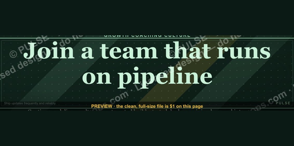 graphic“Join a team that runs on pipeline.” — LinkedIn Banner
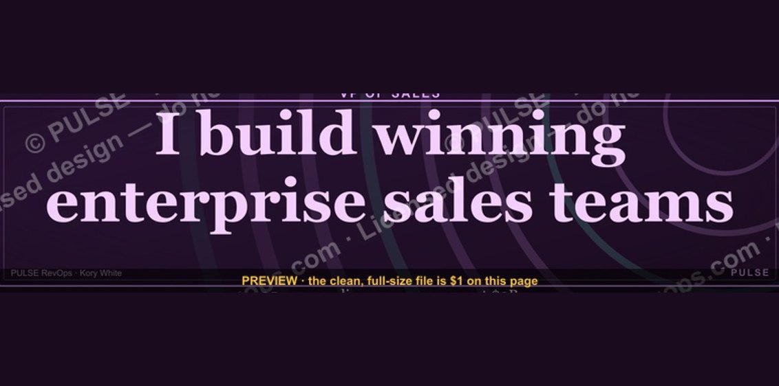 graphicVP of Sales — LinkedIn Banner
 graphicWhat do top-performing graphic designers do differently in 2027?
 graphicSales Ops Analyst — LinkedIn Banner
 graphic“Bring the energy every call.” — LinkedIn Banner
 graphicFaster deals, fewer leaks. — LinkedIn Wallpaper
 graphicSpeech-to-Text Operator — LinkedIn Banner