


Customer Success Manager — LinkedIn Banner
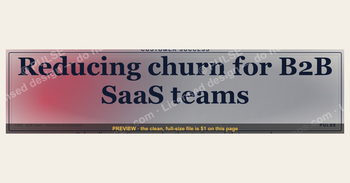
A Customer Success Manager LinkedIn banner is the wide cover image at the top of your profile, sized 1584 × 396 pixels. Done well, it does one job: it tells a recruiter or prospect what kind of CSM you are before they read a single word of your headline. The most effective versions keep the busy left third (where your profile photo sits) clean, place a short value-focused line in the center — something concrete like "Reducing churn for B2B SaaS teams" rather than just your title — and use your company or personal brand colors. Avoid heavy text, low-contrast color pairings, and edge details that get cropped on mobile. The free SVG below gives you a dark, recolorable starting point you can match to any palette in seconds.
Customer Success Manager — LinkedIn Banner

A bold dark LinkedIn cover banner for a Customer Success Manager — recolorable to any team or company palette. 1584×396.
Format: SVG (scalable vector) · Size: 1584×396 px · Category: Role Banner · License: Free to use — no attribution required.
Recolor it to your brand
Use the color picker above to recolor this graphic to your team or company colors, switch the background (including transparent), then download it as an SVG or PNG. No sign-up, no watermark.
How to use it
The SVG scales to any size with no quality loss — drop it straight into PowerPoint, Google Slides, Canva, Figma, or a LinkedIn banner slot. The PNG export is ready to upload anywhere that wants a raster image.
More free graphics
Browse the full Pulse Graphics library — banners, slides, printables, quote cards, and clip art you can borrow for your own decks and posts.
Related on PULSE
- Customer Success Manager — LinkedIn Banner
- Customer Success KPI Dashboard
- Customer Success — LinkedIn Banner
- “Open to Customer Success roles.” — LinkedIn Banner
- Head of Customer Success — LinkedIn Banner
- Customer Onboarding Flow
Why a Dark Banner Works for a CSM
A dark cover is a practical choice, not just an aesthetic one. Against the default light-blue LinkedIn chrome and the sea of stock photos most profiles use, a deep charcoal or navy background reads as deliberate and gives white or light-gray text the contrast it needs to stay legible at a glance. For a Customer Success Manager — a role built on trust, clarity, and turning messy data into a calm plan — a clean, high-contrast banner mirrors the work itself.
The recolorable base is where the real value sits. Swap the primary hue to your company's brand color and the banner stops looking like a template and starts looking like an extension of where you work, which helps the people who see your profile more than once connect your name to a specific company and culture. When you recolor, keep contrast in mind: the WCAG AA guideline of a 4.5:1 ratio for normal text is a sensible floor, and a dark base with off-white text (around #F5F5F5) clears it comfortably. If your employer's brand is light — think a bright purple or orange — lighten the base instead of fighting it, and keep the text dark enough to stay readable.
Writing a Headline That Earns the Click
The banner's center is a small copy canvas, so spend it on a value proposition rather than a restatement of your title. "Customer Success Manager" alone is already in your headline field; the banner should answer "what can this person do for me?" Concrete beats vague every time, so anchor the line to an outcome you actually own:
- "Driving 95%+ gross retention for B2B SaaS teams"
- "Onboarding enterprise accounts with zero first-year churn"
- "Turning at-risk renewals into expansion"
Use a clean sans-serif (Inter, Roboto, or Montserrat), set the main line large enough to read on a phone, and add an optional second line for your segments — "SaaS · Enterprise · HealthTech." Keep the left third clear so your profile photo doesn't collide with text, and consider a soft call to action in the bottom-right such as "Open to CS roles" or "Let's connect." A consultative role calls for a consultative tone — skip "Hire me now."
Tailoring the Banner to Your Goal
The same recolorable file flexes to three common situations:
Active job search. Lead with a retention or expansion outcome you can defend in an interview, and add a small icon hinting at your target industry. If you want to point recruiters somewhere — a portfolio or case-study page — a QR code reads cleanly against a dark background, and white codes stay scannable.
Networking and thought leadership. Use the banner to stake out a niche: onboarding automation, enterprise renewals, post-sale revenue. A subtle certification badge (for example, a Gainsight admin credential you actually hold) in a corner adds credibility without clutter. Only display badges you've genuinely earned.
Internal mobility. If you're angling for a promotion or lateral move, recolor to your company's palette and name a specific initiative you led — "Led three enterprise migrations with no churn" — rather than restating your title. It signals to internal stakeholders that you're already operating at the next level.
A couple of cross-context habits help: refresh the banner when your focus shifts (renewal season vs. onboarding season), use crisp SVG icons instead of raster ones so nothing pixelates, and if you're testing messaging, run one version for a few weeks, then another, and watch your own profile analytics rather than chasing a single perfect design.
Getting the File Right
A sharp banner can still look bad if the file is wrong, so a few technical notes:
- Format. SVG is ideal for this vector template — it scales infinitely and stays crisp. If you flatten to raster, use PNG rather than JPEG; JPEG compression tends to introduce banding in dark gradients.
- Dimensions and safe zone. Design at 1584 × 396 px. LinkedIn crops the left and right edges differently across desktop and mobile, so keep all critical text and icons toward the center and away from the edges. Avoid pure black (#000000), which can look flat — deep charcoal (#1C1C1E) or navy (#0A192F) gives richer depth.
- Color profile. Export in sRGB, LinkedIn's default. Wide-gamut profiles like Adobe RGB can shift on upload, turning a deep blue muddy or purple.
- Compression. LinkedIn re-compresses uploads, so start from a clean, reasonably sized export rather than an enormous file — that gives the platform less to degrade and keeps dark gradients smooth.
Design Principles for CSM Banners
A strong Customer Success Manager banner balances professionalism with approachability. Use a clean, uncluttered layout where your profile photo sits in the left third — this area should remain mostly empty or use a subtle gradient, as LinkedIn overlays your photo there. Place your core message in the center, keeping it to 5–8 words max (e.g., "Helping SaaS teams retain and expand"). Stick to 1–2 brand colors plus a neutral background; avoid busy patterns or gradients that clash with LinkedIn's interface. Ensure text has high contrast against the background — dark text on light backgrounds or vice versa — and test how it looks on mobile by previewing at 640 × 360 pixels (the mobile crop). Avoid placing critical details within 50 pixels of the edges, as they may get cut off on smaller screens.
Tailoring Your Banner by CSM Role
Your banner should reflect your specific CSM focus to attract the right audience. For an Enterprise CSM, use a polished, minimalist design with dark blues or grays and a phrase like "Driving value for enterprise accounts." A Technical CSM might opt for a modern tech aesthetic with subtle code-like patterns or geometric shapes, paired with "Bridging product and customer success." For a CSM Manager or Director, consider a leadership tone with a bold color like deep green or navy, stating "Building teams that reduce churn." If you're in a specific industry — SaaS, healthcare, fintech — incorporate a subtle industry icon or pattern (e.g., a simple cloud shape for SaaS). The key is to signal your niche without overwhelming the viewer, letting them instantly know if you're a fit for their needs.
Tools and Resources for DIY Banners
You don't need design skills to create a professional CSM banner. Canva offers free LinkedIn banner templates (1584 × 396 px) with drag-and-drop editing — search for "professional" or "tech" templates and customize colors and text. Adobe Express provides similar functionality with more brand kit options. For vector-based designs, Figma has free community templates you can recolor and export. If you want a quick start, use a tool like Remove.bg to extract your profile photo and place it over a solid color background with your value prop overlaid. For typography, stick to clean sans-serif fonts like Inter, Roboto, or Open Sans — avoid script or decorative fonts that reduce readability. Always export as PNG at 72 DPI to keep file size under 8 MB (LinkedIn's limit). Test your banner by uploading it as a private post first to see how it renders on desktop and mobile before making it live.
Design Psychology for CSM Banners
The best CSM LinkedIn banners use color psychology to reinforce trust and reliability — two traits hiring managers prioritize. Blues (especially navy or teal) signal stability and professionalism, making them safe choices for most CSM roles. For customer-facing positions, warm accents like soft gold or coral in your CTA button or line icons can add approachability without sacrificing authority. Avoid pure black or white backgrounds; they often look harsh against LinkedIn’s interface. A dark charcoal (#2C2C2C) or deep slate (#1E3A5F) works better for dark-mode profiles, while a muted cream or light gray (#F5F5F5) keeps things clean for light-mode viewers. The key is contrast: your text should be at least 4.5:1 against the background to remain readable on mobile.
Mobile Optimization Checklist
Over 60% of LinkedIn browsing happens on mobile, where your banner is cropped to a 2:1 aspect ratio and only the center 1200×396 pixels are reliably visible. Before uploading, test your design by placing a 1200×396 rectangle over the center of your 1584×396 canvas. Everything outside this zone — including logos, badges, or text near the edges — will likely be cut off. Common mobile mistakes include: placing your name or title too far left (hidden behind the profile photo), using small fonts under 40px that become illegible, and including horizontal lines or borders that don’t align with the mobile crop. A quick fix: use a single, bold headline of 8–12 words centered horizontally and vertically within the safe zone, with no critical elements in the outer 192px on each side.
Free Tools for Non-Designers
You don’t need Adobe skills to create a professional CSM banner. Canva offers a free LinkedIn banner template (1584×396) with drag-and-drop editing, including pre-made color palettes and font pairings optimized for readability. For SVG customization, use Figma’s free tier — import the SVG from this page, double-click to edit text layers, and change fill colors in seconds. Photopea (browser-based) also handles SVG editing without downloads. If you want to match your company’s exact brand colors, use a color picker browser extension (like ColorZilla) to grab hex codes from your company’s website or logo. For final export, always save as PNG (not JPG) to preserve sharp text and avoid compression artifacts. Test the upload by previewing your profile on both desktop and mobile before sharing.
Sources
- LinkedIn Help Center — official guidance on adding and sizing your profile background (cover) photo.
- W3C Web Content Accessibility Guidelines (WCAG 2.1) — contrast-ratio standards for readable text.
- Nielsen Norman Group — research on how people scan profiles, pages, and visual hierarchies.
- Gainsight — customer success platform with role guidance and certification resources.
- Customer Success Association — professional body offering CSM resources and community.
- Harvard Business Review — articles on customer retention, loyalty, and relationship management.
- Canva & Adobe Express — free design tools with editable LinkedIn banner templates.
FAQ
What should a Customer Success Manager include in their LinkedIn banner? Your title plus a short, concrete value line — for example, "Driving retention and expansion for B2B SaaS." Add your company logo or brand color if it fits. Keep the left third clear behind your profile photo, and avoid cramming in long sentences or low-contrast text that's hard to read at thumbnail size.
How big should my LinkedIn banner image be? 1584 × 396 pixels. Export at full resolution so it stays sharp on high-density (retina) screens, and keep your important text and icons toward the center, since LinkedIn crops the edges differently on desktop and mobile.
Can I use a template for my Customer Success Manager banner? Yes. Free tools like Canva and Adobe Express offer editable LinkedIn banner templates, and the recolorable SVG on this page is a ready starting point. Whatever you start from, match the colors and tone to your own — or your employer's — branding so it doesn't look generic.
Should I include client logos or testimonials in my banner? Only with permission and only if it stays uncluttered. One recognizable logo or a single short quote can add credibility, but a wall of logos competes with your headline. When in doubt, leave them off and let a clear value line do the work.
Is it okay to use a photo of myself in the banner? It's optional. If you use one, choose a well-lit, professionally cropped image placed to the right so it doesn't collide with your profile photo on the left. The banner should complement your headshot, not duplicate or fight with it.
How often should I update my LinkedIn banner? Refresh it when your role, company, or focus changes — and otherwise roughly every 6–12 months. A seasonal swap around a conference, launch, or renewal push can help, but changing it constantly undercuts the recognition you're trying to build.
This page will be disappearing soon. Save it to your device for $1 — or read it free while it is here.
@Kory-White- · if Venmo asks, the last 4 of my number are 2012
This page is gone.
This one is off the shelf now. $1 keeps it on your phone for good — the whole page, pictures and diagrams included.
 graphicSDR Manager — LinkedIn Banner
 graphicSolutions Consultant — LinkedIn Banner
 graphicGTM Engineer — LinkedIn Banner
 graphicMid-Market Account Executive — LinkedIn Banner
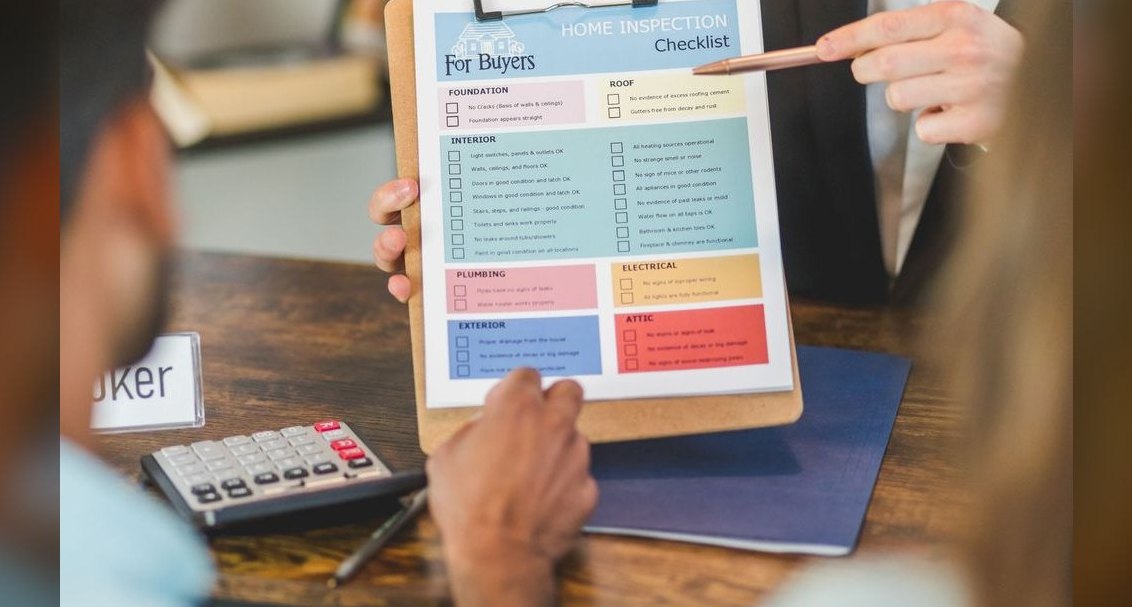 graphicDeal Inspection Flow
 graphicSpeech-to-Text Operator — LinkedIn Banner
 graphicSeries A Sales Org Chart
 graphicTarget / Goal Icon — Icon / Clip Art
 graphic"Build, don't chase." — LinkedIn Banner
 graphicThe Plan — Section Divider Slide