


FinTech CRO — LinkedIn Banner
Quality
Certified
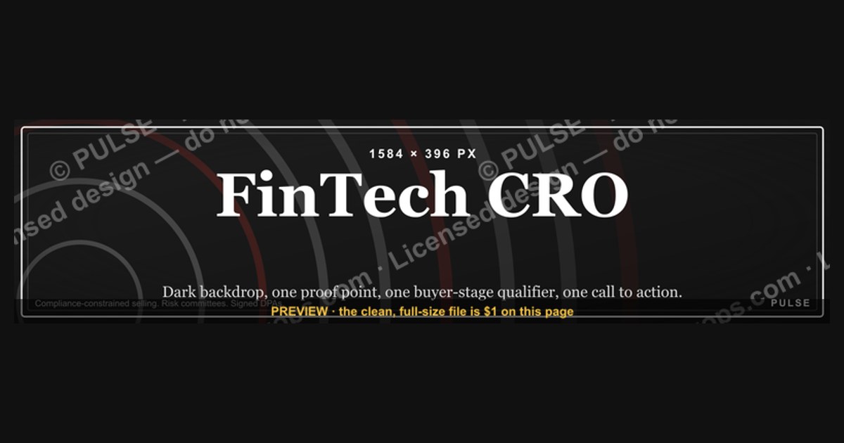
A FinTech CRO LinkedIn banner is a 1584×396 px cover image that positions a revenue executive to a financial-services audience in about three seconds. The strongest ones pair a dark, high-contrast backdrop with one specific proof point, one buyer-stage qualifier, and one low-friction call to action — nothing else.
What a revenue-executive cover image actually does and why it matters
Most people treat the LinkedIn banner as decoration. It is closer to a billboard on a road your exact buyer drives down every week. When a FinTech founder, a private-equity operating partner, or a board member lands on your profile, the banner occupies roughly a third of the visible screen before any scrolling happens. Your headline field gets one line. Your About section requires a click. The banner gets the whole width, uncontested, at the moment attention is highest.
That matters more in financial technology than in most categories, because the buyer's default posture is skepticism. Payments, lending, banking-as-a-service, treasury automation, insurtech, wealth infrastructure — every one of these sits inside a regulatory perimeter. The people evaluating a revenue leader in that world are simultaneously evaluating whether you understand compliance-constrained selling, procurement cycles that route through risk committees, and the difference between a demo and a signed data-processing agreement. A banner that reads like a generic motivational graphic tells them you have not lived inside those constraints. A banner that names a stage, a motion, and a number tells them you have.
The second reason it matters is that a CRO's profile is doing several jobs at once, and they conflict. You are recruiting account executives. You are courting investors. You are opening doors with prospects. You may be quietly signaling availability for a fractional or advisory engagement. A single banner cannot serve all four equally, so the useful discipline is to pick the primary job and let the rest be served by your featured section, your posts, and your headline. Attempting to satisfy every audience produces a banner that satisfies none — the visual equivalent of a positioning statement with four commas in it.

There is also a compounding effect worth naming. Unlike a paid ad, a banner has no ongoing cost after it ships. It renders on every profile view, every connection request preview on some surfaces, and every time someone screenshots your profile to send to a colleague. Over a year, a CRO with an active posting cadence might accumulate tens of thousands of profile views. Even a modest lift in how many of those convert into a message or a booked call is a meaningful return on what is, functionally, a two-hour design task done once and refreshed quarterly.
Finally, the banner sets an expectation that the rest of your presence has to honor. If the cover image claims disciplined revenue operations and your featured section is empty, your last post is fourteen months old, and your experience entries have no numbers in them, the banner creates a gap rather than closing one. Treat the cover image as the promise and the profile beneath it as the proof. The same logic applies to adjacent surfaces — a company page cover, a conference speaker card, a slide deck title page, an email signature graphic. They should all be recognizably the same system, because repetition across surfaces is what turns a look into recognition.
The step-by-step process for designing and shipping one

Start with the audience decision, not the design tool. Write one sentence on paper: *this banner exists to make [specific buyer or candidate] take [specific action].* If you cannot fill both brackets with something concrete, no amount of gradient work will save the result. A Series A payments company's head of growth is a different reader than a $400M-revenue bank's chief digital officer, and the proof point that lands with one is noise to the other.
Second, choose the single proof point. This is the hardest step and the one most people skip. You want one verifiable, specific claim — an ARR range you took a company through, a retention figure, a team size you built, a sales-cycle reduction, a number of enterprise logos closed in a regulated segment. Ranges are fine and often more credible than suspiciously precise figures. What is not fine is inventing anything; a fabricated number on a public profile is discoverable and permanently damaging in a market this small.
Third, draft the text at three lengths — long, medium, and short — then ship the short one. A useful pattern is a role-plus-stage line ("Fractional CRO for FinTechs scaling past $5M ARR"), a proof line, and a call to action. That is roughly twelve to twenty words total on the entire canvas. If your draft exceeds thirty words, you are writing an About section on an image.
Fourth, build the layout around the mobile-safe zone before you make anything pretty. The full canvas is 1584×396, but mobile crops it substantially — the top and bottom bands are the first casualties, and on narrower devices the left and right edges lose ground too. Place every critical element inside the center band. Decorative elements, faint grid textures, and a small monogram can live in the outer regions where their loss costs nothing.

Fifth, set type and contrast. Use one typeface, two weights maximum. A geometric or neo-grotesque sans reads as tech-forward without being novelty. Keep body copy light on dark rather than the reverse if you are using the dark treatment, and never place mid-gray text on a dark field — it disappears on a phone screen in daylight. Size your primary line so it survives being displayed at roughly a third of its authored width, which is what mobile effectively does.
Sixth, export and compress. Keep the file comfortably small so it renders instantly; a heavy image that takes several seconds to paint is a banner your visitor scrolls past before it appears. Use PNG when the design is flat color and sharp type, JPEG when a photograph dominates. Animated formats will not animate — the platform shows a static frame.
Seventh, test on real devices before you consider it done. Upload it, then open your own profile on a phone, on a tablet, and on a colleague's desktop with a different browser and display calibration. Ask one person in your target buyer segment what they think you do, based only on the banner. If their answer is not the sentence you wrote in step one, iterate.
Costs, timelines, and what the work realistically involves

The cost range here is unusually wide because the deliverable can be almost anything from a template swap to a full personal-brand system. At the free end, a template editor with a recolorable vector cover and a color picker gets a competent result in under an hour, assuming you have already made the messaging decisions. This is genuinely adequate for most operators, and the honest advice is that messaging quality dominates production quality at this size. A well-worded plain banner outperforms a beautiful vague one.
The middle tier is a freelance designer producing a custom cover, typically as part of a small profile package that includes a matching company page header and a slide template. Turnaround is usually a few business days for a first draft and one to two rounds of revision after that. The main thing you are buying is not artistry but constraint — a designer will refuse to let you cram four messages onto one canvas, which is the failure mode you cannot self-diagnose.
The top tier is a personal-brand or executive-positioning engagement, which bundles the banner into headshots, messaging strategy, a content plan, and sometimes a photographer. Timelines here run several weeks because the photography and the messaging workshops are the long poles, not the graphic. This is worth it for a CRO who is actively building a public presence — speaking, podcasting, hiring at volume, or raising — and overkill for someone who mainly needs the profile to not look neglected.
Whatever tier you pick, budget time in a specific ratio: roughly half on deciding what the banner says, a quarter on layout and testing, and a quarter on the adjacent assets that make it look intentional rather than accidental. The most common budgeting error is inverting that — spending six hours in a design tool refining a gradient and eleven minutes on the words.

Refresh cadence is its own cost line. Plan on updating the banner when your proof point changes materially, when your target stage shifts, when you change companies, or roughly quarterly if you are running an active outbound or hiring motion. A cover image that still advertises a number from three roles ago reads as stale to anyone who checks your experience section, and in a small market, people check. Keep the source file — vector if possible — so a refresh is a fifteen-minute edit rather than a rebuild.
One more line item that is easy to overlook: consistency across the surfaces adjacent to the banner. If you are going to the trouble of building a look, extend it to your company page cover, your webinar title cards, your one-pager, and your deck's title slide. The incremental cost is small because the palette, type, and layout logic are already decided, and the recognition benefit compounds every time a prospect encounters you in a second context.
Where teams get it wrong
The most frequent failure is the everything banner. Someone tries to communicate role, industry, three past companies, a tagline, four service lines, a headshot, a QR code, and a URL. At the size this image actually renders, the result is illegible on desktop and invisible on mobile. The discipline that fixes it is brutal: allow yourself three text elements and one visual anchor, and cut until you are inside that budget.
The second failure is designing outside the safe zone. A banner that looks balanced in a design tool at full canvas gets its top and bottom sheared off on a phone, and since the majority of traffic on the platform is mobile, most viewers see the cropped version as the real version. If your headline sits near the top edge and your call to action sits near the bottom edge, the majority audience sees neither. Design mobile-first and let desktop viewers get the bonus of the wider composition.

Third: unverifiable or borrowed claims. Putting former employer logos on a personal banner is legally and reputationally risky without permission, and it reads as leaning on someone else's brand rather than your own record. The same applies to numbers you contributed to but did not own. "Part of a team that reached X" is a defensible framing; implying you personally drove it is the kind of thing that surfaces in a reference check.
Fourth: contrast failures. Dark text on dark backgrounds, thin weights at small effective sizes, brand accent colors that look vivid on a calibrated monitor and muddy on a phone in sunlight. The test is simple — view it at arm's length on a phone screen at half brightness. If you have to squint, it fails, regardless of how it looks on your desk.
Fifth: mismatch between the banner and everything below it. The cover promises a data-driven revenue operator; the profile has no numbers, an empty featured section, and a last post from two years ago. This gap is worse than a plain banner, because it establishes an expectation and then immediately disappoints it. Fix the profile first, then the banner.
Sixth, and specific to financial technology: tone drift. Aggressive growth-hacker language, hype punctuation, and startup-bro visual tropes land poorly with buyers whose day job is risk. The register that works is closer to a well-designed annual report than a growth-marketing landing page — confident, specific, unhurried. Adjacent categories behave similarly; anyone selling into healthcare, government, or industrial buyers will recognize the same constraint, and the same restrained visual language transfers cleanly.
A seventh, quieter mistake is treating the banner as a one-time project. Ship it, then look at it again in ninety days with fresh eyes. Almost every banner has one element that seemed essential during design and is obviously removable three months later.
A decision framework for choosing your approach
The right approach depends on three variables: what you are primarily using the profile for, how much of your pipeline actually originates on the platform, and how stable your positioning is right now. Run those in order.
If your positioning is still moving — you are between roles, testing fractional work, or deciding whether to target early-stage or enterprise FinTech — do not commission custom design. Use a free recolorable template, put a deliberately broad line on it, and revisit in a quarter. Spending on a bespoke asset for positioning you will abandon is the most common waste in this whole exercise.
If your positioning is settled and the platform is a genuine pipeline source — you post regularly, prospects reply, candidates apply — a custom banner as part of a small package earns its cost. The specificity you can afford at that point is the whole point: name the stage, name the motion, name the number.
If you are primarily recruiting, invert the message. The proof point should be about the team you build, the operating cadence, and the career outcomes of people who have worked for you, not about ARR. A revenue number attracts buyers; a culture-and-development message attracts sellers.
And if the profile is essentially a business card that occasionally gets checked before a meeting, the correct answer is a clean, plain, high-contrast banner with your name, your function, and nothing else. That is not a failure of ambition — it is correct resource allocation.
Related questions
What size should a LinkedIn banner be?
The standard cover image is 1584×396 pixels, a 4:1 ratio. Because mobile crops the top and bottom, keep every essential element within the center band and treat the outer regions as decorative only.
Should a CRO put a headshot in the banner?
Usually no. Your profile photo already appears overlapping the banner on the left, and a second face competes with it. If you do include one, place it well clear of the profile-photo overlap zone.
How often should I update it?
When your proof point, target stage, or company changes — and otherwise roughly quarterly if you are actively selling or hiring. Keep the source file editable so a refresh takes minutes rather than a rebuild.
Does a banner actually generate leads?
Not directly. It improves conversion on traffic you already earn through posting, outreach, and referrals. Treat it as a multiplier on existing attention, never as a demand-generation channel of its own.
What about the company page cover?

Same canvas logic, different message: the company cover should state what the product does and for whom, not who leads revenue. Keep the palette and type consistent with your personal banner so the two read as one system.
FAQ
What should a FinTech CRO banner actually say?
Three things at most: a role-and-stage line that tells a visitor which companies you serve, one specific and verifiable proof point, and a single low-friction call to action. Twelve to twenty words total across the whole canvas is a realistic target. Anything longer stops being a banner and becomes a paragraph rendered as an image, which no one reads at this size on a phone.
Is a dark background genuinely better for financial-services audiences?
Dark treatments read as restrained and premium, and they let a single accent color carry emphasis without shouting — which suits a buyer whose job is managing risk. That said, it is a convention, not a rule. A clean light banner with strong contrast and disciplined copy will outperform a dark one that is cluttered. The variable that matters is legibility and message discipline, not the base color.
Can I reuse the same design for other platforms?

Partly. The palette, typeface, and message can travel, but the crop cannot — every platform has different dimensions and different safe zones. Build the design in a vector tool with the elements on separate layers, then re-lay it out per platform rather than scaling one export. A stretched or letterboxed banner is more damaging than no banner.
What if I do not have an impressive revenue number to display?
Use a different axis of proof. Team size built, sales-cycle reduction, retention or expansion figures, number of regulated-enterprise deals closed, markets opened, or a specific motion you are known for. If none of those are strong yet, say clearly what you do and for whom, and leave the number out. A plain honest banner beats a padded one, and inflated claims are easy to check in a market where everyone knows everyone.
Should the banner mention that I am open to fractional or advisory work?
Only if that is your primary goal, and then state it plainly rather than hinting. Mixing an availability signal into a banner that is otherwise selling your current company's product confuses both audiences. If you need to serve both, put the availability line in your featured section or headline and keep the cover image focused on one message.
How do I know whether my banner is working?
There is no clean attribution, so use proxies. Track profile views and message volume before and after a change, and ask a handful of people in your target segment to describe what you do after looking at the profile for five seconds. If their description matches the sentence you wrote at the start of the process, the banner is doing its job. If it does not, the copy is the problem, not the design.
Sources
- LinkedIn Help — profile background photo requirements and specifications: https://www.linkedin.com/help/linkedin/answer/a521956
- LinkedIn Marketing Solutions — brand and page best practices: https://business.linkedin.com/marketing-solutions
- Nielsen Norman Group — research on how users scan pages and where attention lands: https://www.nngroup.com/articles/how-users-read-on-the-web/
- Web Content Accessibility Guidelines (WCAG) — text contrast minimums: https://www.w3.org/WAI/WCAG21/Understanding/contrast-minimum.html
- MDN Web Docs — image format selection and compression trade-offs: https://developer.mozilla.org/en-US/docs/Web/Media/Formats/Image_types
- Google Web Fundamentals — image optimization and page performance: https://web.dev/fast/
- Squoosh — browser-based image compression tool from Google: https://squoosh.app/
- Figma — design and prototyping documentation: https://help.figma.com/
Related on PULSE
This page will be disappearing soon. Save it to your device for $1 — or read it free while it is here.
@Kory-White- · if Venmo asks, the last 4 of my number are 2012
This page is gone.
This one is off the shelf now. $1 keeps it on your phone for good — the whole page, pictures and diagrams included.
 graphicCybersecurity Sales Director — LinkedIn Banner
 graphicHealthcare RevOps Leader — LinkedIn Banner
 graphicB2B SaaS VP of Sales — LinkedIn Banner
 graphicLogistics CRO — LinkedIn Banner
 graphic“Every no is closer to a yes.” — Quote Card
 graphicMarketing Funnel — TOFU MOFU BOFU
 graphicRenewal Risk Decision Tree
 graphicThe Customer Journey — Infographic
 graphic“SHOULD DO IT” — Sales Meme
 graphic“Speed to lead wins.” — LinkedIn Banner