


Logistics CRO — LinkedIn Banner
Quality
Certified
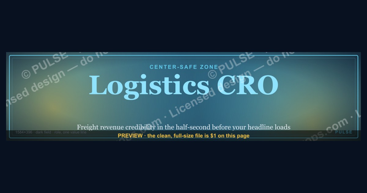
A Logistics CRO LinkedIn banner should do one job: signal freight-and-supply-chain revenue credibility in the half-second before someone reads your headline. Use 1584×396 px, a dark high-contrast field, the role name, and one restrained value line — all inside the center-safe zone LinkedIn never crops or covers with your headshot.
The freight VP who kept losing the first impression
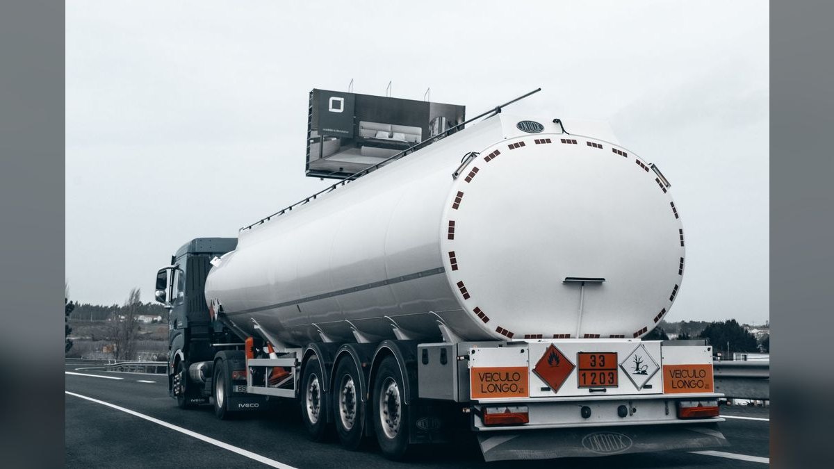
Picture a revenue leader who has spent fourteen years inside 3PL and brokerage — carrier procurement, drayage margin, a warehousing network that ran at 91% utilization — and is now stepping into a Chief Revenue Officer search. The résumé is strong. The LinkedIn profile is not doing its share of the work, because the top 396 pixels of it are a stock photo of a highway at dusk with a semi-truck in motion blur.
That image is not offensive. It is invisible. Ten thousand other logistics profiles use a near-identical shot, and the visual signal it sends is "I work in trucking," which the headline already said. The banner burned the most expensive real estate on the profile to repeat information for free.
Here is the actual sequence being optimized. A retained recruiter working a CRO search opens forty profiles in tabs. A private-equity operating partner diligencing a freight-tech portfolio company opens twelve. A VP of Sales at a shipper evaluating whether to take a meeting opens one. In every case the eye lands top-left to top-right across the banner before it descends to the name, headline, and current role. That first pass takes roughly half a second and it is not reading — it is categorizing. Executive or individual contributor. Considered or thrown together. Specialist or generalist.
The fix is not a better truck photo. It is a deliberate composition: a dark field, the words Logistics CRO set in a bold sans-serif at a size that survives the mobile crop, and one short value line underneath — something like "Driving Revenue Growth Across Freight, Warehousing & Distribution." Nothing else competes. No certification wall, no five partner logos, no phone number, no URL.
Three constraints make this harder than it sounds, and all three are LinkedIn platform behavior rather than design opinion:
The headshot overlay. On desktop, the circular profile photo sits over the lower-left of the banner. Anything you place in roughly the leftmost 250 px and bottom half is either hidden or awkwardly framed. Designers who compose left-aligned — the natural instinct — lose their headline to the avatar.

The mobile crop. The LinkedIn mobile app displays a narrower slice of the same file. A layout that reads perfectly on a 27-inch monitor can lose both edges on a phone, and phones are where a large share of profile views happen. Your text has to survive a crop you cannot preview from the desktop editor.
Compression. LinkedIn re-encodes what you upload. Thin type, tight letter-spacing, and low-contrast gray-on-gray all degrade. What looked crisp in Figma comes back slightly mushy, and mushy type on an executive profile reads as careless even when the viewer cannot articulate why.
Design for those three constraints first and the aesthetics take care of themselves. Design for aesthetics first and you will re-upload four times.
How the banner actually earns a profile visit
The mechanism is a chain, and the banner sits at exactly one link in it — the one that decides whether the rest of the chain runs at all.
Impression comes first. Someone encounters you in a feed, a search result, a mutual connection's activity, or a recruiter's shortlist. Your name and a cropped fragment of your banner render together. Second, the click-through to the full profile, where the banner renders at full width above the fold with nothing else competing. Third, the read: headline, then current role, then the top of your About section. Fourth, the decision — connect, message, add to shortlist, or close the tab.
The banner cannot close a deal. It cannot be clicked; LinkedIn cover images carry no link, which is why a call-to-action or a URL on the banner is wasted pixels. What the banner does is set the frame for the sentences that follow. A reader who sees "Logistics CRO" in confident type on a considered dark field reads the headline underneath as an executive's claim. The same headline sitting under a stretched, pixelated stock photo reads as aspiration. Identical words, different interpretation, because the visual established the category first.
This is why specialization on the banner outperforms generality. "Chief Revenue Officer" tells a viewer you carry a number. "Logistics CRO" tells them you understand tender acceptance, detention and demurrage, contract versus spot exposure, dock-to-stock cycle time, and the thin-margin reality where a two-point improvement in linehaul cost flows straight to EBITDA. In a relationship-driven sector where buyers assume outsiders will need eighteen months to learn the vocabulary, that distinction is worth more than any visual flourish.
Two implications follow from that flow. First, the banner and headline must agree. If the banner says "Logistics CRO" and the headline says "Sales Leader | Growth | Open to Opportunities," the viewer resolves the conflict against you. Second, whatever the banner promises, the About section has to substantiate within its first two lines — the portion LinkedIn shows before "see more." Banner sets the frame, headline names the role, About delivers the proof. Three surfaces, one argument.
Specs, sizes, and the numbers that decide legibility
These are the concrete parameters worth getting exactly right.
Canvas. 1584 × 396 px, a 4:1 ratio. Export at that dimension or an exact multiple of it. Working at 2× — 3168 × 792 px — and exporting down produces noticeably cleaner type edges on high-DPI displays, because you are downsampling rather than asking the browser to interpolate upward. Never scale a smaller graphic up to reach the target; the pixelation is obvious at full width and reads as amateur.
Safe zone. Treat the middle band as the only reliable canvas. Keep every element that must be seen — role name, value line, any mark — inside a centered rectangle with roughly 80–100 px of clearance on all sides, and stay well clear of the lower-left quadrant where the profile photo overlays. A practical rule: if you deleted the outer 15% of the width and the bottom-left corner entirely, would the banner still say everything it needs to? If not, recompose.
Type scale. At full 1584 px width, the role line wants to be large — think 44–56 px — with the value line stepping down to roughly half that, around 24–28 px. Anything under about 20 px is a gamble after the mobile crop and compression pass. Cap the whole banner at three lines of text. Two is better. One is often best.
Contrast. WCAG 2.1 sets 4.5:1 as the minimum for normal text and 3:1 for large text. Aim higher — 7:1 or better — because compression and small-screen rendering both eat contrast. Pure white on a deep navy near #0B1D3A clears that comfortably. A light gray on the same navy may still technically pass while becoming genuinely hard to read at phone size. Check the actual ratio with a contrast tool rather than trusting your eye on a calibrated monitor.
File format and size. PNG-24 for text-heavy designs; it will not introduce the compression artifacts around letterforms that JPEG does. If your banner is photographic, JPEG at quality 90–95 is reasonable. Keep the file comfortably small — a few hundred KB is plenty for a 1584 px graphic — and use sRGB, not Adobe RGB or CMYK, so colors render consistently across a MacBook, a Windows laptop, and a phone.
Palette. For logistics, low-saturation, high-authority tones carry the sector's values of reliability and scale. Deep navy #0B1D3A, forest green #1B4D3E, charcoal #2C2C2C, and slate #4A5568 all work as base fields. Use one accent — amber, teal, or a single brand hue — on a single element only, typically the role line or a thin rule. Two accents start to look like a slide template. Bright red and yellow are accents, never backgrounds; at full-bleed they read as promotional rather than executive.
Working in SVG. If your banner starts as a vector file, recoloring is a find-and-replace on hex values in any text editor, or a two-click change in Figma, Illustrator, or Inkscape. That matters for a fractional or interim CRO who needs the same layout in a client's palette this quarter and a neutral palette next quarter. Export the SVG to PNG at the exact upload dimension rather than uploading the vector.
Frequency. Refresh the banner when your positioning changes — new title, new specialization, entering or leaving a search — not on a calendar. Swapping it monthly for its own sake trains nobody and gives you no signal worth reading.
What you give up with each approach
There is no single correct banner. There are four common approaches with genuinely different trade-offs, and the right one depends on what you are currently optimizing for.
Typographic dark field. Role name and value line on a solid or subtly gradient dark background. Strengths: maximum legibility, survives every crop, compresses cleanly, recolors in seconds, unambiguously executive. Weakness: it is the most common serious-professional choice, so it distinguishes you from clutter but not from other disciplined profiles. For a CRO search, this is usually the right default — you are being evaluated on judgment, and restraint reads as judgment.
Abstract logistics motif. Node-and-spoke network graphics, faint route lines, a low-opacity distribution map, a subtle grid suggesting movement. Strengths: signals sector without cliché, adds visual interest, still leaves clean space for type. Weakness: it takes real design skill to keep the motif under the type instead of fighting it, and a busy motif destroys legibility at mobile size. Keep the graphic to a low-opacity background layer and never let it cross the text.
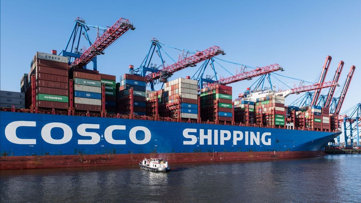
Literal photography. Trucks, containers, ports, warehouses. Strengths: instantly readable subject matter, easy to source. Weaknesses: near-total sameness across the sector, poor text contrast unless you overlay a scrim, and heavier files that compress worse. If you go this route, use a dark overlay at meaningful opacity behind your text block and choose an unusual composition — an overhead yard shot, a detail rather than a wide establishing frame.

Achievement banner. Numbers on the cover: revenue scaled, teams led, markets opened. Strengths: front-loads proof. Weaknesses: it is the riskiest option in logistics specifically. Buyers in this sector are sophisticated about complexity and read "Guaranteed 30% Freight Cost Reduction" as a claim from someone who has not run a real network. Aggregate numbers with no context invite the skeptical read. If you use a number at all, make it one, make it specific and verifiable, and let the About section carry the rest.
One more axis worth naming: employer-branded versus neutral. Matching your current company's palette signals commitment and works well when you are in seat and building a team. A neutral executive palette works better when you are consulting, fractional, between roles, or quietly open — it reads as seniority rather than availability, which is exactly the tone a discreet search wants. The recolorable-vector approach lets you hold both without redesigning.
The mistakes that quietly cost you credibility
Overcrowding with logos and credentials. Every carrier partnership, every TMS vendor badge, every association mark. The instinct is to prove breadth; the effect is visual noise that makes the banner unreadable at any size. Limit yourself to one mark — current employer, or a single recognized industry association — and place it in the lower-right of the safe zone where it will not collide with your headshot.
Composing left-aligned. The most common structural error. Western reading habit puts the important element top-left, and LinkedIn puts your profile photo there. Compose center or center-right and the problem disappears.
Testing on desktop only. A layout can be flawless at 1584 px and lose its value line entirely in the mobile app. Upload, then open your own profile on a phone before you consider it done. Ask a colleague to send you a screenshot from their device too — rendering varies more than you would expect.
Thin or condensed type. It looks elegant in the design tool and disintegrates after LinkedIn's compression. Choose a sans-serif with sturdy strokes — Inter, Plus Jakarta Sans, Montserrat, Source Sans — at medium or bold weight. Avoid hairline and ultra-light cuts entirely at this size.
Putting a URL or CTA on it. The banner is not clickable. "Visit mysite.com" or "Book a call" is asking the viewer to retype a string, which nobody does. Route those to your Featured section, your contact info block, and the link field on your profile, where they are actually live.
Palette drift across the profile. Banner in navy, headshot backdrop in warm gray, Featured section thumbnails in a third scheme. The inconsistency registers subconsciously as unpolished. Pick one primary and carry it through the banner, the headshot background, and any Featured card images.
Overpromising in the value line. In logistics especially, an unhedged claim invites the skeptical read. "Optimized carrier networks for meaningful margin improvement" is weaker copy but stronger positioning than a guaranteed percentage. Specific and honest beats bold and unverifiable, because the audience knows the industry too well to be impressed by the latter.
Banner and headline disagreeing. If the banner announces a CRO and the headline hedges, the viewer believes the hedge. Align them or fix the headline first.
Uploading and never checking the render. LinkedIn's crop behavior shifts with interface updates. Look at your own profile on desktop and mobile once a quarter. It takes thirty seconds and catches the case where a redesign moved the avatar and swallowed your value line.
Micro-icons that outgrow their job. A niche cue — a snowflake for cold chain, a hull silhouette for ocean freight, a van for last-mile — can work as a small, quiet marker outside the text zone. The failure mode is letting it grow until it competes with the role name. Keep it small enough that removing it would not change the banner's meaning.
Related questions
Does the banner actually affect recruiter outcomes?
Not directly measurably, and anyone claiming a specific conversion lift is guessing. What it reliably affects is the interpretive frame applied to your headline and About section, which is where the real evaluation happens. Treat it as a credibility multiplier on existing content, not a lead source.
Should a fractional Logistics CRO brand the banner to a client?
No. Keep it neutral and executive. A client-branded banner signals employment rather than an advisory practice, and it needs replacing at every engagement change. A recolorable vector layout in a neutral palette gives you a stable identity across engagements.
How does this differ from a company page cover image?
Company pages use a different aspect ratio and no avatar overlay, so left-aligned composition is safe there. Company covers can also carry more brand furniture. Do not reuse a company cover file on a personal profile — the crop and overlay will damage it.
Is it worth paying a designer for this?
If typography is not your strength, yes — a clean executive banner is a small, well-defined brief that a competent designer executes quickly. The alternative is a recolorable template you adjust yourself, which gets you most of the way for none of the cost.
What about the same design on other platforms?
Reuse the composition, not the file. X, Crunchbase, a personal site, and an email signature all use different ratios and crops. Rebuild from the source vector at each platform's spec so the identity carries without any single version looking stretched.
FAQ
What are the exact dimensions for a LinkedIn banner? LinkedIn's profile cover image is 1584 × 396 px, a 4:1 ratio. Export at exactly that size or a clean 2× multiple like 3168 × 792 px, then downsample. Uploading a non-4:1 file forces LinkedIn to crop or stretch it, and either result looks unconsidered on an executive profile.
Where should text and logos sit on the banner? Inside the center-safe zone — roughly the middle 60% of the width, with 80–100 px of clearance from every edge. LinkedIn overlays your profile photo on the lower-left on desktop and crops the edges more aggressively on mobile, so anything placed near a corner is at risk of being hidden or cut.
Why choose a dark background for a Logistics CRO banner? A dark, high-contrast field reads as authoritative and gives light type and any single mark a clean surface. It also holds up far better than a busy photograph when the image is reduced to a thumbnail in feeds and search results, and it survives LinkedIn's compression with less visible degradation.
Should the banner say "Logistics CRO" or a broader title? Lead with the specific role. "Logistics CRO" signals fluency in freight, warehousing, and distribution economics and separates you from generalist revenue leaders. Add at most one short value line. Resist turning the banner into an accomplishment list — the banner earns the profile visit, the profile does the convincing.
Can I put a call-to-action or website URL on the banner? No — LinkedIn cover images are not clickable, so any URL requires the viewer to retype it manually. Put your link in the profile's website field, your contact info, and your Featured section, and let the banner do the one thing it is good at: establishing the frame.
How often should I update the banner? When your positioning changes — new title, new specialization, entering or exiting a search — not on a schedule. A stable banner builds recognition across repeat profile views. Do re-check the render on desktop and mobile each quarter, since LinkedIn's crop behavior occasionally shifts with interface updates.
Sources
- https://www.linkedin.com/help/linkedin — LinkedIn Help Center: official profile and cover image specifications
- https://www.w3.org/WAI/WCAG21/quickref/ — W3C Web Content Accessibility Guidelines 2.1 quick reference, including contrast minimums
- https://www.w3.org/WAI/WCAG21/Understanding/contrast-minimum.html — W3C explanation of the 4.5:1 and 3:1 contrast thresholds
- https://cscmp.org/ — Council of Supply Chain Management Professionals: supply chain research and professional standards
- https://www.bts.gov/ — U.S. Bureau of Transportation Statistics: official freight and logistics data
- https://www.tianet.org/ — Transportation Intermediaries Association: industry association for 3PLs and brokers
- https://www.logisticsmgmt.com/ — Logistics Management: trends in transportation, warehousing, and supply chain
- https://hbr.org/ — Harvard Business Review: executive positioning and personal-brand strategy
- https://fonts.google.com/ — Google Fonts: freely licensed sans-serif families suitable for banner typography
- https://www.figma.com/ — Figma: vector design tool for building and exporting banner artwork
Related on PULSE
This page will be disappearing soon. Save it to your device for $1 — or read it free while it is here.
@Kory-White- · if Venmo asks, the last 4 of my number are 2012
This page is gone.
This one is off the shelf now. $1 keeps it on your phone for good — the whole page, pictures and diagrams included.
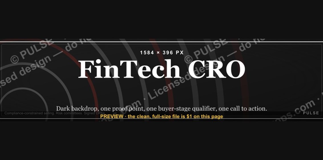 graphicFinTech CRO — LinkedIn Banner
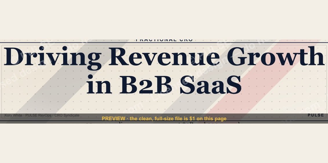 graphicB2B SaaS VP of Sales — LinkedIn Banner
 graphicHealthcare RevOps Leader — LinkedIn Banner
 graphicCybersecurity Sales Director — LinkedIn Banner
 graphicSales Ops Analyst — LinkedIn Banner
 graphicThe Customer Journey — Infographic
 graphicIndustrial Robotics CRO — LinkedIn Banner
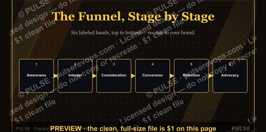 graphicThe Marketing Funnel — Infographic
 graphicLead Routing Logic Diagram
 graphic“SHOULD DO IT” — Sales Meme