


GTM Engineer — LinkedIn Banner
Quality
Certified
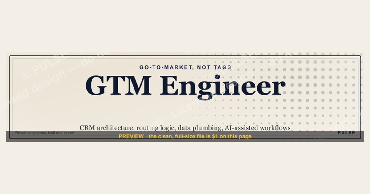

For a GTM Engineer, LinkedIn's 1584×396 banner should show, at a glance, that you build the revenue systems — CRM architecture, routing logic, data plumbing, AI-assisted workflows. Pair a technical motif with a revenue cue, keep name, title, and one value line in the right two-thirds, and use a dark background for feed contrast.
What the role is, and why the cover image carries unusual weight
Start with the disambiguation, because it determines every design choice downstream: in this context GTM means *go-to-market*, not Google Tag Manager. The two abbreviations collide constantly, and the collision is not harmless — a hiring manager scanning profiles for a revenue-systems builder and an analytics contractor searching for a tag-management specialist are looking for entirely different people. Your banner is the fastest place to settle the ambiguity without spending a word of your headline on it. A node-and-edge motif tied to a funnel says go-to-market. A tag-and-container motif says analytics. Pick one deliberately.
The reason the cover image matters more for this title than for, say, "Account Executive" is that the title itself does not yet carry a stable definition. An AE's banner can be decorative because nobody needs to be told what an AE does. "GTM Engineer" is a title still being negotiated across the industry — at one company it means the person automating HubSpot workflows and building lead-routing logic; at another it means someone writing Python against a warehouse to compute account scoring; at a third it means a growth engineer running in-app experiments. Nobody arrives at your profile knowing which of those you are. The banner is roughly 396 pixels of vertical space that can answer the question before the reader's eye reaches your About section, and most readers never reach your About section at all.
There is a second, less-discussed reason. The GTM Engineer role sits in the seam between marketing, sales, data, and IT — which means the people evaluating you are frequently *not* engineers. A VP of Sales assessing whether you can fix their routing mess is reading design language, not code samples. A banner that reads as a system diagram signals "this person thinks in systems" to a non-technical viewer far more efficiently than a bulleted skills list does. Conversely, a banner that looks like a generic developer cover — dark terminal, monospace, circuit board — pushes you toward the software-engineering bucket and away from the revenue conversation you actually want.

Think about where the banner is actually consumed. It renders full-width when someone lands on your profile directly, gets cropped hard on mobile, shrinks to near-invisibility in some recommendation widgets, and doesn't appear at all in feed posts or search results. So the banner is not doing broad-reach work; it is doing conversion work on the small, high-intent population that already clicked through to you. That population is exactly the recruiters, founders, and RevOps leaders whose opinion of you compounds. Design for the fifteen people a week who matter, not for volume.
One more upstream consideration worth naming: the banner sits inside a system that includes your headline, your featured section, and your first three posts. Those elements should not repeat each other. If your headline already says "GTM Engineer | RevOps Automation," the banner should not also say "GTM Engineer | RevOps Automation" — that is wasted surface. Let the headline carry the keywords and the banner carry the visual proof of systems thinking, or invert it, but do not double up. The most common failure I see in this role's profiles is redundancy across four elements that could have covered four distinct angles.
Building the banner, step by step
The process below assumes you are working in Figma, Canva, or an SVG editor. It works the same in any of them, and it takes about ninety minutes end to end if you are not agonizing.

Step one — write the value line before you open a design tool. Every banner that fails aesthetically failed first as a copy problem. You need one sentence, under nine words, that survives being read by someone who has never heard the title. "Building scalable revenue engines" works. "Automating pipeline from lead to close" works. "Full-stack GTM systems architect leveraging AI-native tooling" does not — it is three abstractions stacked. Write five candidates, read them aloud, keep the one that a non-technical friend can paraphrase back to you.
Step two — set the canvas at 2× and lay in safe zones. Create the artboard at 3168×792, which is double the native 1584×396, so LinkedIn's recompression has headroom to chew on. Then draw two guide rectangles you will delete before export. The first is a circle roughly 300 pixels across (600 at 2×) anchored in the lower-left, representing your profile photo, which overlaps the banner on desktop. The second is a centered rectangle of about 1200×280 (2400×560 at 2×) representing the region that survives mobile cropping. Everything that must be read goes inside the second rectangle and outside the first.
Step three — choose the background before any element. Deep charcoal, deep navy, or a dark teal. Not pure black — it reads harsh against LinkedIn's white chrome and creates a hard rectangular edge that draws the eye to the boundary rather than the content. Not LinkedIn's own blue as a dominant field, because it camouflages into the interface. A very slight gradient across the horizontal axis, maybe eight to twelve percent luminance variation, keeps the field from looking flat without becoming a distraction.
Step four — build the motif, at low contrast, on the left. This is the technical signal. A sparse network graph of eight to fifteen nodes with connecting edges reads as data flow. A simplified workflow — trigger, branch, action — reads as automation. A stepped funnel with a rising line reads as pipeline. Keep it at fifteen to twenty-five percent opacity against the background so it registers as texture rather than illustration. The motif's job is to be recognized in peripheral vision, not studied.

Step five — set the type in the right two-thirds. Name in a bold sans at roughly 30–36 px at native size (60–72 at 2×). Title beneath it, lighter weight, 20–24 px native. Value line below that, 16–20 px native, dropped to seventy or eighty percent opacity so it recedes into a third tier. Three sizes, three weights, one alignment — left-aligned is safest because ragged-right edges tolerate the mobile crop better than centered text does. Avoid all-caps on the title; it costs readability and reads as volume rather than authority.
Step six — add one accent, and only one. A warm amber, a coral, a bright teal. Apply it to a single element: the rising line in the funnel, or one highlighted node in the graph, or a two-pixel underline beneath your name. The accent should occupy well under five percent of the canvas. Its purpose is to give the eye one place to land.
Step seven — proof at real scale. Export a PNG, drop it into a mockup at exactly 1584×396, then view that mockup at fifty percent zoom on your phone. If the value line becomes illegible, either raise its opacity, increase contrast, or cut words. Then upload it and look at your live profile on both desktop and mobile before you consider it done — the preview inside a design tool consistently flatters text that dies in production.
Step eight — save the source file, versioned. You will change this banner. Your title will shift, your niche will sharpen, you will take a new role. A layered source file with the safe-zone guides preserved turns a forty-minute redo into a five-minute text edit. Name it with the date so you can look back at what you were claiming eighteen months ago.
A note on the file format at export: use PNG when the banner contains text or hard-edged vector shapes, because JPEG compression artifacts cluster around high-contrast edges and turn crisp lettering fuzzy. Use JPEG only if your banner is dominated by a photograph. If you built the banner as SVG, keep the SVG as your master and export raster copies from it — SVG scales without loss, so the same file serves your LinkedIn cover, a slide deck header, and a conference badge.
What it costs, how long it takes, and what to expect

The honest answer on cost is that this can be free and often should be. A GTM Engineer building a banner is exercising the same layout discipline the job requires; doing it yourself is a small, useful proof of the skill. The realistic ranges below reflect the paths people actually take.
Do it yourself in a free tool. Canva's free tier, Figma's free tier, or a plain SVG editor will all produce a professional 1584×396 cover. Time cost: two to four hours the first time if you are not a designer, including the false starts. Ninety minutes if you have laid out anything before. Recurring cost: fifteen minutes per revision once the source file exists. This is the correct choice for the overwhelming majority of people, and the output gap between a careful DIY banner and a paid one is smaller than the gap between any banner and a default gray one.
Buy a template. Marketplaces sell professionally-built LinkedIn banner templates, typically in the low tens of dollars. The trade-off is real: templates are visually competent and immediately recognizable as templates, because thousands of other people bought the same file. For a role as thinly-defined as GTM Engineer, where differentiation is the whole point, a template works against you unless you customize the motif substantially. If you go this route, replace the graphic elements entirely and keep only the layout skeleton.
Commission a freelancer. A one-off banner from a competent freelance designer generally lands in the low-to-mid hundreds of dollars, with a turnaround of a few days to a week including one or two revision rounds. Worth it if you are simultaneously building a consulting brand and need the banner to match a website, a deck template, and a proposal cover — the value is in the system, not the single asset. Not worth it for a banner alone.
Hire a brand designer for a full identity. Four figures and up, weeks of timeline, and appropriate only if you are launching something with a name of its own. If you are an individual contributor optimizing a job search, this is the wrong order of magnitude.

On timelines for the *outcome* rather than the artifact: do not expect a banner to move anything measurable on its own. Profile-view counts respond to posting cadence, connection activity, and search-keyword alignment — the banner converts attention that other work generated. A reasonable way to think about the payoff is that among people who reach your profile with intent, a clear banner shortens the time to "yes, this is the right person" from several seconds of reading to under one second of looking. That compresses the funnel; it does not fill it.
Two adjacent costs are worth budgeting. First, the redesign cadence: plan on refreshing the banner whenever your positioning shifts materially, which for a role this new tends to be every twelve to eighteen months. Second, consistency debt — once the banner establishes a palette and a motif, your slide templates, one-pagers, and any personal site should echo it, or the banner starts looking like an orphan. That consistency work is usually a few hours, not a project, but it is real.
Where people get this wrong
Treating the banner as a résumé. The single most common failure is cramming "RevOps · Salesforce · HubSpot · Marketo · Snowflake · Python · SQL · Zapier · AI" into a horizontal strip. It is visually noisy, it is unreadable at mobile scale, and it communicates anxiety rather than competence. Your skills section already holds that list, and recruiters filter on it there. The banner's job is a single idea, not an inventory.
Tool logos. Related but distinct: pasting the Salesforce cloud, the HubSpot sprocket, and the Snowflake mark across the canvas. Three problems. It reads as a partner-page footer rather than a personal brand. It dates fast, because stacks churn and you will not update the image. And it subtly repositions you as an administrator of those tools rather than an engineer who builds across them. The whole premise of the GTM Engineer title is that you are not defined by a single vendor's certification path.

Ignoring the profile photo overlap. People design a beautifully centered composition, upload it, and discover their own face is sitting on top of their own name. The lower-left corner is not yours. Design as though someone will place a circular sticker there, because they will.
Designing for desktop only. More profile views arrive on mobile than most people assume, and mobile crops the banner tighter and trims the vertical edges. Text placed near the top or bottom margin gets sliced. The centered-rectangle rule from the process section exists specifically to prevent this, and it is the step most frequently skipped.
Low contrast in service of aesthetics. Muted-on-muted looks sophisticated in a design tool at 200% zoom and disappears at actual scale. Aim for a contrast ratio around 4.5:1 for the smaller text and at least 3:1 for the large name treatment. If you love a low-contrast look, keep the motif low-contrast and give the type real separation — that combination reads as restrained rather than washed out.
Direct-response calls to action. "Book a call." "DM me." "Email me at —." The banner is identity space, not conversion space. LinkedIn provides a featured section, a custom button, and a website field for exactly this, all of them clickable, which a banner is not. A pixel-based email address is also a small gift to scrapers. The one exception that consistently works is a low-key availability signal — "Open to GTM systems consulting" or "Building GTM infrastructure for B2B SaaS" — which is positioning rather than a request.
Inflated or unverifiable numbers. "$40M pipeline influenced." "300% conversion lift." If the figure is real, public, and attributable, it can work. If it is not, it is a liability the moment someone asks about it in an interview, and experienced buyers discount round numbers on a banner automatically. Honest and aspirational — "scaling GTM systems for B2B SaaS" — outperforms an unbacked stat with people whose judgment you want.

Stock photography of servers and code. Generic, undifferentiated, and pointed at the wrong role. A photograph of a server rack says infrastructure engineer. A photograph of code on a monitor says software developer. Neither says "I make the revenue stack work." If you want a photographic base, use a high-contrast workspace or architectural shot with a heavy dark overlay so it functions as texture beneath your type rather than as subject matter.
Never revisiting it. A banner claiming a niche you left two years ago actively misdirects. Put a recurring reminder on it. The cost of a refresh is fifteen minutes if you kept the source file, which is the actual argument for keeping the source file.
Choosing your angle: a decision framework
The right banner depends on what you are optimizing for right now, and those goals pull in different directions. Work through the branch below rather than copying whatever looked good on someone else's profile.
If you are actively job hunting, optimize for legibility and keyword alignment. Recruiters scan fast and often on mobile. Favor a clean type block, an explicit title, and a value line containing one or two of the terms that appear in the job descriptions you are targeting — "revenue operations," "pipeline automation," "CRM architecture," "GTM data." Keep the motif simple. This is the case where restraint beats personality.
If you are building a consulting practice, optimize for credibility and coherence. The banner should look like it belongs to the same system as your proposal template and your invoice header. Include a soft availability line. Invest more in the motif, because a distinctive visual becomes a recognition asset across every surface you show up on. Here, a modest freelancer budget may genuinely pay for itself.

If you are employed and not looking, optimize for authority within your niche. The banner can be more opinionated — a specific diagram of the architecture pattern you are known for, a palette that is unmistakably yours. You are not being filtered by an ATS-adjacent human, so you can spend the surface on a point of view.
If you are transitioning into the role from adjacent territory — sales ops, marketing ops, analytics, a developer moving toward revenue — the banner should bridge, not leap. Signal the engineering half with the motif and the go-to-market half with the language, so a reader sees the combination rather than reading you as a mismatched applicant. This is the situation where the disambiguation work matters most, because you are least likely to be given the benefit of the doubt.
Layer one more variable on top: audience register. Early-stage startups read energetic, geometric, higher-saturation design as competence and momentum. Enterprise buyers read the same design as junior, and read minimal, restrained, whitespace-heavy layouts as senior. Neither reading is objectively correct — decide which room you are trying to walk into and design for that room. If you genuinely split between both, err toward restraint, because a minimal banner is rarely penalized in a startup context while a loud one is frequently penalized in an enterprise one.
Finally, apply the same framework downstream. The banner is the most visible instance of a broader pattern: every surface where a GTM Engineer shows up — a slide header, a Loom thumbnail, a conference badge, an internal architecture doc cover — benefits from the same motif and palette. Building the banner once, in a vector format, with the decision logic written down, means the next five surfaces are assembly rather than design.
Related questions
What size should a LinkedIn banner be?
1584×396 pixels natively. Export at 2× (3168×792) as PNG so LinkedIn's recompression has headroom, and keep essential text within a centered ~1200×280 region so mobile cropping does not slice it.
Does my profile photo cover part of the banner?

Yes, on desktop the circular profile photo overlaps the lower-left corner of the cover. Treat roughly the left 20–25% as unusable for critical text, and place name, title, and value line in the right two-thirds.
Should I put my email or a "book a call" link in the banner?
No. Banners are not clickable, so a URL or email is friction rather than a path, and it invites scraping. Use the featured section, the custom profile button, and the website field instead. A soft availability line is fine.
PNG or JPEG for the export?
PNG if the banner contains text or hard-edged vector shapes — JPEG compression clusters artifacts around high-contrast edges and blurs lettering. JPEG only if the composition is dominated by a photograph and carries little type.
How often should I redesign it?
Whenever your positioning materially changes — typically every twelve to eighteen months in a fast-moving role like this. Keep the layered source file with safe-zone guides so a refresh is a text edit rather than a rebuild.
FAQ
Does "GTM Engineer" mean Google Tag Manager?
No. Here GTM stands for go-to-market. A GTM Engineer builds the revenue systems — CRM automation, lead routing, data pipelines between tools, AI-assisted workflows — which is a different discipline from Google Tag Manager and web-analytics implementation, even though the abbreviation is identical. Because the collision is common, the banner is a useful place to disambiguate visually: a funnel-and-node motif reads go-to-market, while a tag-and-container motif reads analytics.
What does a GTM Engineer actually do day to day?

They build and maintain the systems that power go-to-market motions: CRM configuration and automation, lead routing and enrichment, integrations and APIs between sales, marketing, and data tools, and increasingly AI-assisted workflows for scoring, research, and outreach. The through-line is making the stack produce clean data and reliable handoffs so sales and marketing operate on something trustworthy.
How is a GTM Engineer different from a RevOps specialist?
RevOps typically owns process, strategy, and cross-team alignment across the revenue org. A GTM Engineer is the hands-on builder who implements it — wiring integrations, writing the automation logic, debugging the sync that silently stopped. In practice the boundary is blurry and varies by company; at smaller organizations one person is both.
Do I need to code to hold the title?
Usually some. SQL is common because so much of the work touches data. Python or JavaScript helps for integrations, API glue, and anything a no-code tool cannot reach. Deep platform fluency — Salesforce, HubSpot, a marketing automation tool, a warehouse — matters at least as much. The distinguishing skill is building and debugging systems rather than administering them.
Should the banner name specific tools I'm expert in?
Generally no. Tool logos date quickly, clutter the composition, and reposition you as an administrator of a vendor's product rather than an engineer working across a stack. Your skills section and experience bullets already carry that signal where recruiters actually filter on it. Let the banner communicate the shape of the work instead.
Can I reuse the same design elsewhere?
Yes, and you should. Build it as a vector file and the same motif and palette can carry a slide-deck header, a one-pager cover, a Loom thumbnail, and a conference badge. Consistency across surfaces is a large part of what makes an individual read as established rather than improvised.
Sources
- https://www.linkedin.com/help/linkedin/answer/a570463 — LinkedIn Help Center, profile background photo requirements and dimensions
- https://www.linkedin.com/help/linkedin/answer/a524183 — LinkedIn Help Center, profile photo and image guidelines
- https://www.w3.org/WAI/WCAG21/Understanding/contrast-minimum.html — W3C, minimum contrast requirements for text
- https://www.w3.org/WAI/WCAG21/Understanding/contrast-enhanced.html — W3C, enhanced contrast guidance for large text
- https://developer.mozilla.org/en-US/docs/Web/Media/Formats/Image_types — MDN, image format characteristics and when to use PNG vs JPEG
- https://blog.hubspot.com/marketing/go-to-market-strategy — HubSpot, go-to-market strategy fundamentals
- https://www.salesforce.com/resources/articles/revenue-operations/ — Salesforce, revenue operations overview
- https://www.gartner.com/en/sales/topics/revenue-operations — Gartner, revenue operations research and definitions
- https://www.figma.com/resource-library/design-basics/ — Figma resource library, layout and visual hierarchy basics
Related on PULSE
This page will be disappearing soon. Save it to your device for $1 — or read it free while it is here.
@Kory-White- · if Venmo asks, the last 4 of my number are 2012
This page is gone.
This one is off the shelf now. $1 keeps it on your phone for good — the whole page, pictures and diagrams included.
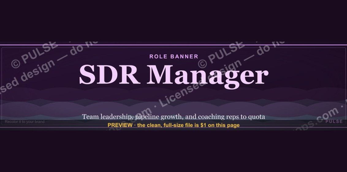 graphicSDR Manager — LinkedIn Banner
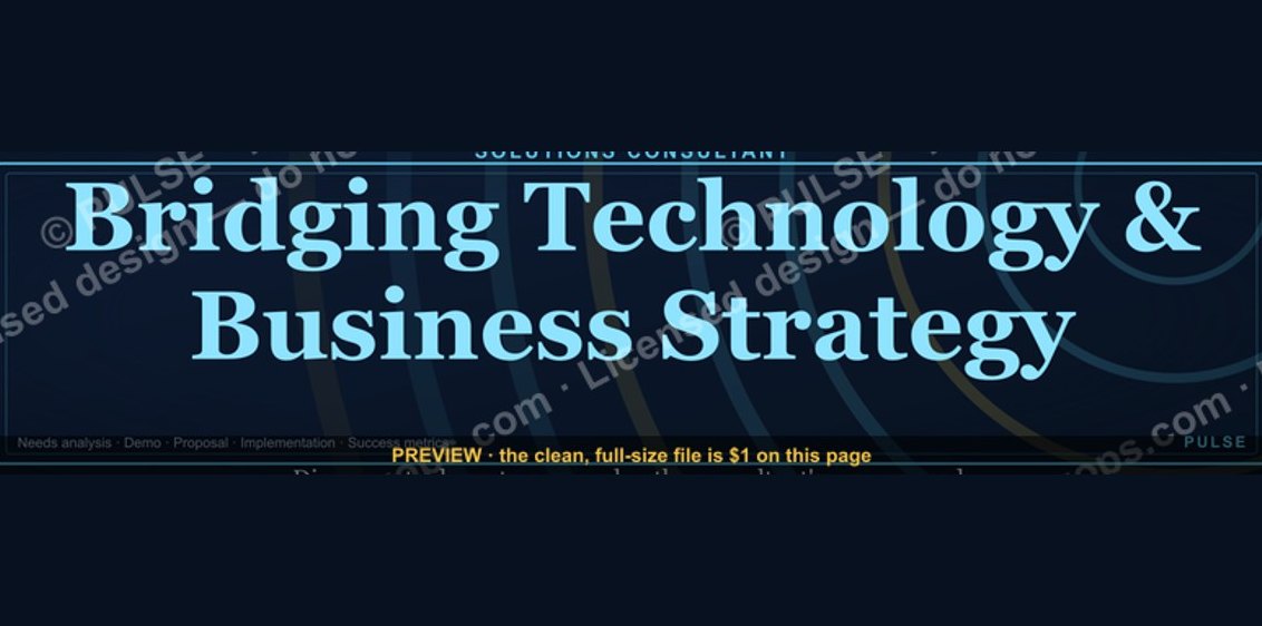 graphicSolutions Consultant — LinkedIn Banner
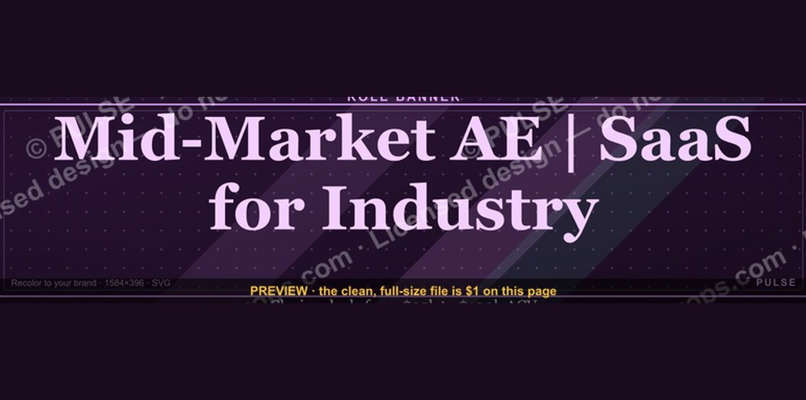 graphicMid-Market Account Executive — LinkedIn Banner
 graphicCustomer Success Manager — LinkedIn Banner
 graphicAgenda — Section Divider Slide
 graphic“Don't pitch. Diagnose.” — Quote Card
 graphicLLM Builder AI Engineer — LinkedIn Banner
 graphicDeal Stage Progression Bar
 graphic"Build, don't chase." — LinkedIn Banner
 graphicThe Ask — Section Divider Slide