


Construction CRO — LinkedIn Banner
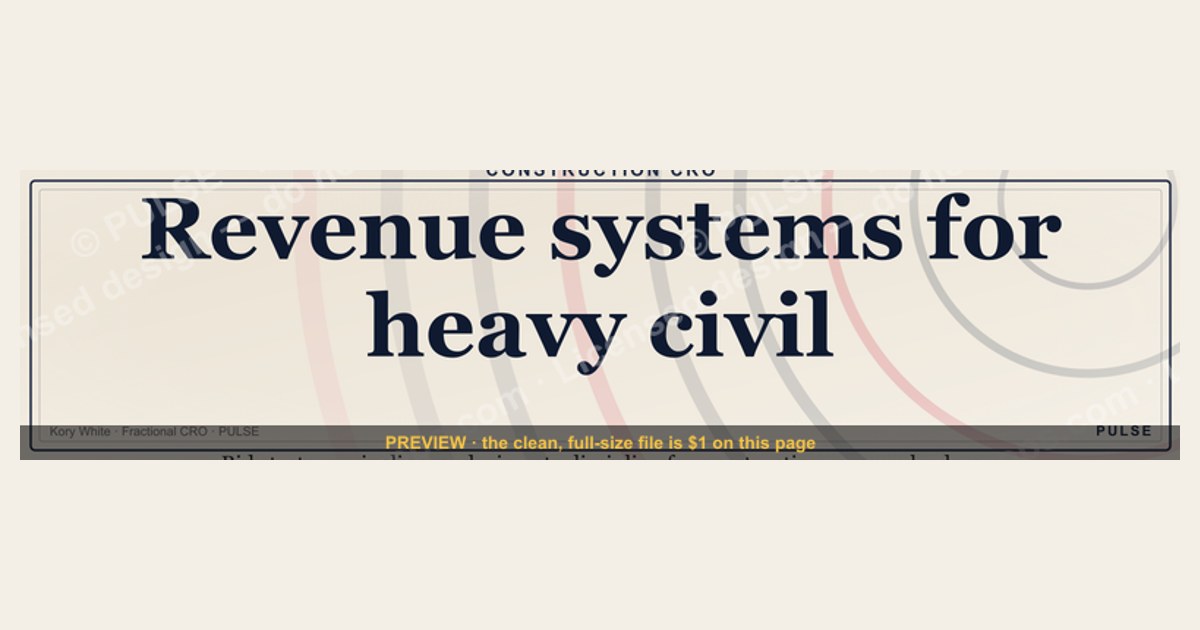
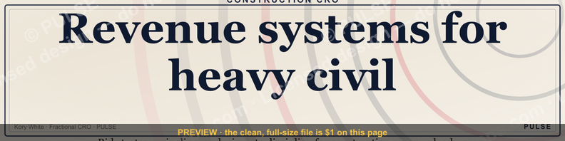
A Construction CRO LinkedIn banner is a custom 1584 × 396 px header graphic for a construction-sector revenue leader's profile. Build it around three things: one piece of real project imagery (a jobsite, completed structure, or fleet — not generic hard-hat stock), the company or personal brand mark, and a single plain-spoken value line such as "Revenue systems for heavy civil" or "Faster bids, higher win rates." Keep total copy under ~20 words, use a bold sans-serif that stays legible at thumbnail size, and keep your name, headline, and any call-to-action inside the upper and center bands — LinkedIn crops the banner and drops a profile photo over the lower-left corner, so anything placed there gets hidden. The SVG below is a free, recolorable starting point sized exactly to spec.
Construction CRO — LinkedIn Banner

Banner for construction-equipment, materials, heavy-rental, and modular revenue leaders — recolor and download free.
Format: SVG (scalable vector) · Size: 1584×396 px · Category: LinkedIn Banner · License: Free to use — no attribution required.
Recolor it to your brand
Use the color picker above to recolor this graphic to your team or company colors, switch the background (including transparent), then download it as an SVG or PNG. No sign-up, no watermark.
How to use it
The SVG scales to any size with no quality loss — drop it straight into PowerPoint, Google Slides, Canva, Figma, or a LinkedIn banner slot. The PNG export is ready to upload anywhere that wants a raster image.
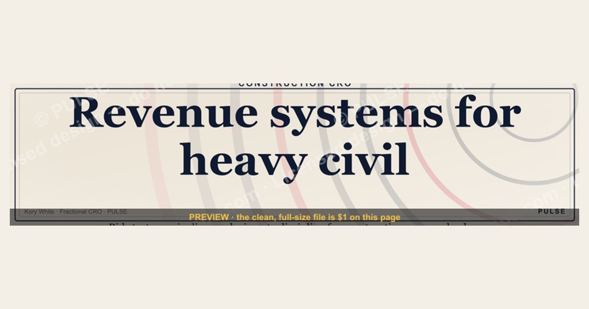
More free graphics
Browse the full Pulse Graphics library — banners, slides, printables, quote cards, and clip art you can borrow for your own decks and posts.
Related on PULSE
- Zero Trust Network Access CRO — LinkedIn Banner
- SIEM and Data Lake CRO — LinkedIn Banner
- MDR Services CRO — LinkedIn Banner
- Offensive Security Pentest CRO — LinkedIn Banner
- Document Capture CRO — LinkedIn Banner
- Semiconductor Foundry CRO — LinkedIn Banner
Visual Hierarchy & Design for Construction CRO Banners
A construction CRO banner has to read in a glance, so structure it like a jobsite plan: everything has a place. A reliable layout is three vertical bands. The left band anchors brand identity — a logo, your name, and a short value line such as "Revenue systems for heavy civil" or "Scaling specialty contractors." The center band carries one strong image: a crane, a finished bridge, a fleet, or a real crew on site. Skip generic hard-hat-and-blueprint stock; in a feed full of contractors, templated imagery is the fastest way to look interchangeable. The right band holds a single call-to-action or one credible proof point, like "Book a strategy session" with a small arrow.
Color should signal the trade without turning loud. Construction-adjacent tones — a safety orange, a concrete gray, a deep navy — read as grounded and industry-native, and a single brighter accent reserved for the CTA gives the eye somewhere to land. Keep to roughly three colors so the banner feels cohesive rather than busy, and let a left-to-right gradient run from a darker, authoritative tone toward a lighter one near the action step.
Type does the rest of the work. A clean sans-serif — Inter, Plus Jakarta Sans, or Montserrat — holds up where decorative or heavily condensed faces fall apart at small sizes. Because the banner often renders as a thumbnail and most LinkedIn browsing happens on phones, test legibility on a mobile screen before you commit. Hold the whole thing to roughly 15–20 words, let the headline dominate, and leave real white space around the text so it doesn't feel crammed.
Mobile Display & LinkedIn's Banner Constraints
LinkedIn renders the banner differently across devices, and that's where most construction profiles lose the plot. The upload spec is 1584 × 396 px (a 4:1 ratio), but on a phone the platform's interface and the profile-photo overlay cover a meaningful slice of it. The practical takeaway: keep your name, value line, and CTA in a horizontally centered "safe zone" in the upper portion of the image, and assume the edges and lower-left corner may be cropped or covered.
The most common mistake is putting the key credential or CTA in the bottom third, where the profile picture, headline text, or the "Message" button can hide it on mobile. Design as if the lower-left quadrant doesn't exist — leave it intentionally quiet with a dark gradient that blends behind the profile photo, or let a low-contrast background element (a faint skyline) sit there. Never place your logo, headshot, or CTA in that corner.
File handling matters for first impressions, too. LinkedIn accepts large PNGs, but a lighter file loads cleaner and avoids visible compression artifacts. Use JPEG for photographic backgrounds and reserve PNG for banners with sharp text or transparent elements. Free tools like TinyPNG or Squoosh shrink the file substantially without obvious quality loss — worth doing before every upload.
Strategic Content & Messaging
Construction decision-makers — GCs, subcontractor owners, project executives — respond to concrete language, not buzzwords. A banner that names a specific outcome ("Help regional contractors build predictable bid pipeline") will almost always beat a vague label like "revenue growth specialist." Lead with the problem your audience actually feels, point to the path, and keep the promise believable. Favor plain trade-and-sales terms — pipeline, close rate, bid-to-win ratio, revenue velocity — over jargon like synergy, optimize, or leverage.
For proof, less is more. One or two recognizable client logos, or a single short testimonial ("Added real pipeline in one quarter — Midwest contractor"), carry more weight than a crowded wall of names, and they should sit away from the profile-photo overlay. Keep any quote to a handful of words so it stays readable at banner scale.
Make the CTA specific and easy to act on. "Book a 20-minute revenue audit" gives a clearer next step than "Contact me," and "Download the contractor growth playbook" suits top-of-funnel visitors. If the CTA is a button drawn into the banner art, size it to be tappable and use a color with enough contrast to meet WCAG AA legibility (a 4.5:1 ratio against its background). If you add a link, a short branded one (yourname.com/construction) looks cleaner than a full URL.
Finally, treat the banner as something you maintain, not set once. Rotating it every couple of months — bid season versus year-end close-out, for instance — keeps the profile current and gives repeat visitors a reason to look again. Run two versions, watch which one drives more profile views, connection requests, and replies, and keep the winner.
Why Construction CRO Banners Fail (And How to Fix It)
The most common mistake in construction CRO banners is treating them like a brochure. Stock photos of hard hats, clip-art cranes, or generic "We Build" taglines signal amateurism to seasoned industry buyers. Instead, use a single high-resolution photo from an actual project your firm completed—a bridge under construction, a finished warehouse interior, or a fleet of excavators at sunrise. This builds instant credibility. Pair it with a headline that speaks to a specific pain point: "Reduce bid-to-award cycle by 30%" or "Revenue operations for mid-market contractors." Avoid vague phrases like "growth partner" or "strategic advisor"—they get scrolled past. Test your banner at 50% zoom in LinkedIn's preview; if the text becomes unreadable, simplify.
Design Rules for Heavy Civil & Specialty Trades
Construction buyers (GCs, subcontractors, owners) respond to visual cues of competence. Use a color palette drawn from your brand's safety colors or equipment livery—high-vis orange, concrete gray, or steel blue. Keep the background image at 60-70% opacity behind text to ensure readability. Place your logo in the upper-left quadrant (safe from profile photo overlap) and your value line in the center-right band. Fonts should be bold sans-serif like Montserrat, Barlow, or Inter—avoid thin weights or script fonts. The entire banner must load under 150KB; compress your image to 72 DPI and use PNG-8 or JPEG at 85% quality. A slow-loading banner signals unprofessionalism to a construction executive checking your profile on a jobsite tablet.
Mobile Optimization: The Overlooked Detail
Over 60% of LinkedIn profile views on construction profiles come from mobile devices. On a phone, your banner shrinks to roughly 640 × 160 px—and the profile photo overlay covers a larger percentage of the lower-left corner. Test your banner by viewing your own profile on an iPhone or Android before publishing. Ensure your key message appears entirely in the top 60% of the image. Avoid putting contact info, URLs, or CTAs in the bottom third—they'll be invisible on mobile. Instead, drive action through your headline and "About" section. A clean, mobile-optimized banner signals you understand how construction buyers actually browse—on the go, between site visits and bid deadlines.
Design Principles for Construction CRO Banners
Keep your banner visually quiet — white space is your ally. Construction executives and procurement managers scan profiles quickly, so every pixel should earn its place. Use a single hero image that shows your actual work: a bridge under construction, a fleet of excavators, or a finished commercial building. Avoid cluttered montages or multiple photos — they reduce legibility at mobile sizes (where over 60% of LinkedIn browsing happens). Place your brand mark in the upper-left corner (safe zone: 0–400 px from left, 0–80 px from top) and your value line centered or right-aligned (safe zone: 400–1584 px horizontally, 120–260 px vertically). Test your banner by viewing it on a phone before publishing — if the text disappears behind profile elements or becomes unreadable, simplify.
Color Psychology for Construction Revenue Leaders
Choose colors that signal trust and durability without blending into LinkedIn’s default blue. A navy or charcoal background with white text works universally — it reads as established and professional. For differentiation, consider a muted orange or copper accent (common in heavy equipment branding) or a deep forest green (popular in sustainable construction). Avoid bright reds or yellows — they can feel aggressive or cheap in a B2B context. If your company uses a specific Pantone, match it exactly in the SVG. Test your banner against LinkedIn’s light and dark mode — contrast ratios should exceed 4.5:1 for accessibility. A quick check: if the banner looks washed out in dark mode, increase the background opacity or add a subtle drop shadow behind text.
Mobile Optimization and Crop Zones
LinkedIn’s banner displays differently on desktop (full 1584 × 396 px) versus mobile (cropped to roughly 640 × 360 px on most phones). On mobile, the profile photo overlay is larger and covers more of the lower-left quadrant — roughly the first 200 px from the left and 150 px from the bottom. Keep your logo and primary text in the upper half of the banner (0–200 px from top) to ensure visibility across devices. Avoid placing any critical information in the far-right 200 px — LinkedIn’s mobile view often crops this edge. Export your final design at 2× resolution (3168 × 792 px) for retina displays, then compress to under 8 MB for upload. A PNG with 80% quality typically hits this target without visible artifacts.
Sources
- Occupational Safety and Health Administration (OSHA) — construction safety regulations and compliance standards
- Bureau of Labor Statistics (BLS) — employment, wages, and injury data for the construction industry
- Associated General Contractors of America (AGC) — industry advocacy, workforce trends, and best practices
- Construction Industry Institute (CII) — research on project management, productivity, and innovation
- National Association of Home Builders (NAHB) — housing construction data, market analysis, and member resources
- LinkedIn Business — official guidance on profile branding and recommended page/banner image dimensions
- Web Content Accessibility Guidelines (WCAG 2.1) — text contrast standards referenced for banner legibility
FAQ
What size should a construction CRO LinkedIn banner be? LinkedIn's personal-profile banner uploads at 1584 × 396 pixels (a 4:1 ratio). Design at that exact size, but keep critical text and your CTA centered in the upper region — the platform crops the edges differently across devices and overlays your profile photo on the lower-left corner.
Where does the profile photo cover the banner? The circular profile photo sits over the lower-left area of the banner on both desktop and mobile. Anything you place there — logo, headshot, or call-to-action — will be partially or fully hidden, so keep that corner intentionally empty or fill it only with quiet background.
Should I use SVG or PNG for my banner? Design and store the source as SVG so it scales cleanly and recolors easily. For the actual LinkedIn upload, export a compressed raster: JPEG for photo-heavy backgrounds, PNG when you have sharp text or transparency. Tools like TinyPNG or Squoosh keep the file light without visible quality loss.
What should the banner actually say? Keep total copy under roughly 20 words: one short value line (e.g., "Revenue systems for specialty contractors"), optionally one proof point, and a specific CTA like "Book a 20-minute revenue audit." Avoid buzzwords; construction buyers respond to concrete, plain language.
What exactly is a Fractional CRO for a construction company? A Fractional CRO is a senior revenue leader who works part-time to build and run your sales and growth strategy — overseeing bid pipeline, client relationships, and team scaling — without the cost of a full-time executive. They own revenue outcomes rather than just advising.
How do I know if my construction business needs a Fractional CRO? Common signs are stalled revenue, an inconsistent or ad-hoc bidding process, and a leadership team too stretched to focus on sales strategy. If you're missing targets without a clear reason, a Fractional CRO can diagnose the gaps and put a repeatable revenue process in place.
This page will be disappearing soon. Save it to your device for $1 — or read it free while it is here.
@Kory-White- · if Venmo asks, the last 4 of my number are 2012
This page is gone.
This one is off the shelf now. $1 keeps it on your phone for good — the whole page, pictures and diagrams included.
 graphic“The next call is the most important one.” — LinkedIn Banner
 graphicCalm closers win. — LinkedIn Wallpaper
 graphicSales Enablement — LinkedIn Banner
 graphicSell outcomes, not features. — LinkedIn Wallpaper
 graphic“Stay in the deal.” — LinkedIn Banner
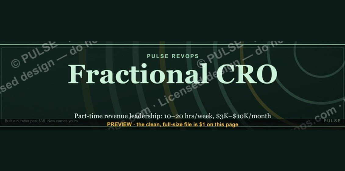 graphicFractional CRO — LinkedIn Banner
 graphicInspect. Qualify. Commit. — LinkedIn Wallpaper
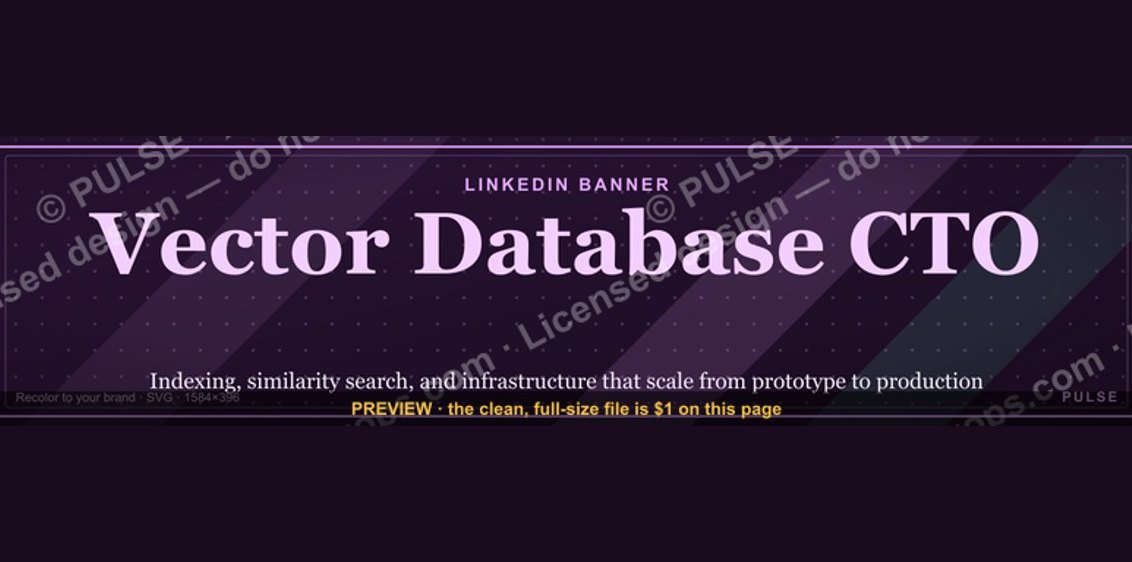 graphicVector Database CTO — LinkedIn Banner
 graphicHow to build a champion champion plan in 2027?
 graphicProduct Marketing Lead — LinkedIn Banner