


Industrial Robotics CRO — LinkedIn Banner
Quality
Certified
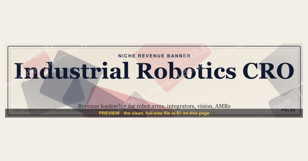

An Industrial Robotics CRO LinkedIn banner is a 1584×396 px profile header that names the niche, the revenue role, and one proof point. Keep text inside the middle safe zone, use real automation imagery instead of generic tech stock, and pair it with a single low-friction call to action.
What a niche revenue banner is and why it earns its pixels
A LinkedIn banner is the widest uninterrupted piece of visual real estate on a professional profile, and for a revenue leader selling into industrial automation it does a job no headline can do alone: it sets category before anyone reads a word of prose. The headline field is capped at 220 characters and gets truncated in search results and feed comments. The About section requires a click to expand. The banner is always fully visible on desktop and mostly visible on mobile, which makes it the only element guaranteed to load before a visitor decides whether to keep scrolling.
The specific case of an Industrial Robotics CRO sharpens the stakes. Buyers in this space — OEM sales leaders at robot arm manufacturers, revenue heads at system integrators, VPs at machine vision and end-of-arm-tooling suppliers, commercial leaders at autonomous mobile robot startups — evaluate outside help with unusual skepticism. Their sales motions involve capital equipment approvals, engineering validation cycles, safety standards conformance, and a customer base of plant managers who have been burned by automation projects that overran. A generic "Revenue Growth Expert" banner reads to that audience as somebody who has never stood on a factory floor during a runoff.
Category signaling works because it filters. When the banner reads Industrial Robotics rather than B2B or technology, a large share of the audience self-selects out, and the remainder arrives pre-qualified. This is the same logic that governs paid search: broad match brings volume, exact match brings intent. A banner is effectively an always-on exact-match ad for a single ideal customer profile, running at zero media cost against everyone who lands on the profile through search, feed activity, a shared post, an event attendee list, or a connection request.

There is a second, less obvious function. The banner is the visual anchor that makes an entire content program feel coherent. If someone comments on a post about integrator margin structures, clicks through, and sees a banner about industrial robotics revenue, the two reinforce each other. If they see a stock photo of a sunrise over a mountain range, the post reads as an isolated opinion rather than evidence of a practice. Consistency between the banner, the headline, the featured section, and the last ten posts is what converts a profile view into a message.
The adjacent use cases are worth noting because the same asset gets reused far beyond LinkedIn. The 1584×396 aspect ratio is roughly 4:1, which is close enough to the header dimensions on several other surfaces that a single well-built source file becomes an email signature strip, a conference badge banner, a Zoom or Teams virtual background crop, a Sales Navigator profile header, and the top band of a one-page leave-behind. Building it once as a vector, with layers named and colors parameterized, saves rebuilding it four more times.
Finally, the banner does quiet work in the hiring and partnership directions, not just the sales direction. Robotics companies recruit fractional and interim commercial leadership through the same profile surface where they research vendors. A banner that names the vertical is read by a robot manufacturer's board member evaluating a commercial leadership gap exactly the way it is read by a prospect. One asset, several audiences, and the cost of getting it wrong is invisible — nobody tells you they scrolled past.
The step-by-step process for building and shipping one

The build is short if the decisions are made in the right order. Most people invert it: they open a design tool first, choose a photo they like, then try to make a message fit around it. Reverse that.
Step one: write the message before opening any design tool. Draft five to eight words that combine vertical and role. "Industrial Robotics CRO" is three words and already does more work than most banners on the platform. Extend it only if the extension adds a filter: "Industrial Robotics & Automation — Fractional CRO" adds an adjacent vertical and a delivery model. Anything past about eight words in the primary line will be unreadable on a phone.
Step two: pick one proof element. A single concrete claim beats three vague ones. That might be a scale marker, a segment marker such as OEM, integrator, or cobot, or a functional marker such as channel build or distributor margin. Pick one. Do not stack a testimonial, a client logo row, a credential, and a tagline into a 396-pixel-tall strip.
Step three: define the safe zone before laying anything out. Draw guides at roughly 20 percent from the top and 20 percent from the bottom, and inset the left and right edges. On many mobile layouts the profile photo overlaps the lower-left region of the banner, so treat the bottom-left corner as unusable. Keep the primary text block inside the horizontal center band and inset from the right edge as well, because desktop layouts sometimes place profile controls in the upper-right area.

Step four: choose imagery from the actual domain. Articulated six-axis arms mid-cycle, a palletizing cell, an AMR crossing a warehouse aisle, a weld cell with the light stopped down, a vision system inspecting parts on a conveyor. Avoid the two most common failures: a humanoid robot hand touching a glowing interface, which signals consumer AI rather than industrial automation, and a group of people in a conference room pointing at a monitor, which signals nothing at all.
Step five: build it as a vector wherever possible. A vector source scales from a LinkedIn header to a trade show pull-up banner with no quality loss, and it makes recoloring a matter of changing a few fill values rather than re-editing a raster. Export a PNG for upload; keep the vector as the source of truth.
Step six: test on three surfaces before committing. Desktop web at full width, the mobile app on a phone, and the shrunken version that appears in search results and the "people also viewed" rail. The third one is where text-heavy banners die.
Step seven: connect it forward. LinkedIn banners are not clickable, which surprises people every time. The call to action has to route through something that is: the featured section directly beneath, the website field in the contact card, or a link in the About section's opening lines. Design the banner's implied next step so it matches whatever sits immediately below it.
Costs, timelines, and what the numbers usually look like
The spend range on this asset is wider than the outcome range, which is the first useful thing to know. A free template recolored in a browser tool costs nothing and takes twenty minutes. A designer on a marketplace typically turns a single banner in two to five business days for a modest flat fee. An independent brand designer building a small identity system — banner, headline treatment, featured card thumbnails, a slide master, and an email signature strip — is a multi-day engagement priced accordingly and worth it only if the assets get reused across a content program rather than sitting on one profile.
The honest guidance: the message and the imagery choice drive nearly all of the outcome, and both are free. Spending on execution before the message is settled is how people end up with a beautifully typeset banner that says nothing specific. Settle the words first, test them for thirty days with a rough version, then invest in the polished build once you know which framing pulls.
Timelines on the surrounding revenue motion are the numbers that actually matter, and they are the reason the banner has to be so specific. Industrial robotics purchases are capital decisions. A single collaborative robot cell with tooling and integration is a small capital line; a multi-cell automation project or a full line retrofit is an entirely different approval path, often routed through a capital expenditure committee with an annual budget cycle. Sales cycles stretch across quarters rather than weeks, and they involve an engineering evaluation, a proof-of-concept or runoff at the integrator's facility, a safety and risk assessment, and a payback calculation that the buyer's finance team will stress-test.
That length has a direct design consequence. A banner selling urgency — "Book Now," countdown framing, scarcity language — is tonally wrong for a buyer whose next step is a six-week engineering review. The banner should signal durability and domain fluency, not pressure. The equivalent of a good CTA here is an invitation to a diagnostic: a pipeline review, a channel assessment, a quoting-process audit. Something a commercial leader can accept without triggering a procurement conversation.
Expect the measurement window to be long too. Profile view counts move within days of a banner change; qualified inbound moves over a quarter. Do not judge a banner on two weeks of data. Set a baseline before the change — profile views per week, search appearances, connection acceptance rate, inbound messages that reference the vertical specifically — and compare a full 90-day block against the prior one. The single most useful metric is not view count but the share of inbound messages that already know what you do, because that is what the filtering is supposed to produce.
Refresh cadence: quarterly is a reasonable default, and there are natural pegs in this industry. The major automation and manufacturing trade shows create predictable windows where a banner tied to an event or a theme earns extra attention from an audience already primed. Capital budget season creates another. A banner rotated to match either of those is doing campaign work at no media cost.
Where teams get it wrong
Generic messaging in a specialist market. The most common failure by a wide margin. "Revenue Leader" or "Helping Companies Grow" reads as a person who will need six weeks to learn the difference between an integrator and a distributor. Name the vertical. The apparent narrowing is the point.
Consumer-AI imagery on an industrial profile. Glowing blue circuit patterns, a chrome humanoid face, a hand reaching toward a holographic interface — this visual family belongs to consumer AI marketing and it actively damages credibility with a plant-floor audience. Industrial buyers respond to imagery that looks like a real facility: cable carriers, safety fencing, fixtures, dirt on the floor.
Text outside the safe zone. Design at full desktop width, admire it, upload it, and discover on a phone that the tagline is sliced in half and the profile photo is sitting on top of the credential line. Always check the mobile crop and the small search-rail rendering before publishing.
Treating the banner as clickable. It is not. Every quarter someone builds a banner with a URL rendered in the corner and then wonders why nobody visits it. Nobody types a URL from an image. Route the next step through the featured section, the contact card website field, or the first line of the About section.
Cramming. Headshot, logo, three client logos, a testimonial quote, two CTAs, and a tagline compressed into a 4:1 strip produces visual noise and nothing legible. One message, one visual, one implied next step.
Breaking the trust loop below the fold. The banner promises industrial robotics revenue; the headline says "Sales Consultant"; the About section discusses general B2B methodology; the featured section is empty; the last post was fourteen months ago. Each inconsistency costs credibility, and the compounding effect is worse than any single weak element. The banner is the promise — everything beneath it is the proof.
Setting it and forgetting it. Robotics moves. Collaborative robots, mobile manipulation, machine vision driven by learned models, reshoring pressure on manufacturing footprints, persistent skilled-labor shortages — the themes that resonate shift year over year. A banner written against a stale theme signals distance from the market.
Ignoring the adjacent surfaces. The banner is often built in isolation and then the same person hand-builds an unrelated email signature, an unrelated deck cover, and an unrelated Zoom background. Build one source, derive the rest, and the visual identity compounds across every touchpoint a prospect encounters.
Skipping the baseline measurement. Changing a banner without recording the prior 90 days of profile views, search appearances, and inbound quality makes the change unevaluable. It takes five minutes to write the numbers down and it is the difference between iterating and guessing.
Decision framework: choosing the right banner for the situation
The right banner depends less on taste than on which commercial motion is being run. Four common situations, and what each argues for.
Situation one: establishing category authority from a standing start. Nobody knows the practice exists. The banner should lead with the vertical plus role, unadorned. "Industrial Robotics CRO" and a clean automation visual. No offer, no CTA framing — the job right now is category association, and adding an offer to an unknown name reads as cold outreach. Pair with a featured section holding two or three pieces of substantive writing about the vertical.
Situation two: running an active campaign or event push. A trade show is six weeks out, or a specific offer is live. Here the banner earns a CTA-shaped line and a time-bound theme. This is the one case where explicit next-step language belongs in the banner, and it should come down when the campaign ends.

Situation three: recruiting or being recruited. The audience is boards, founders, and search partners rather than prospects. The banner should foreground scope and stage — team size, revenue scale, segment — rather than an offer. Proof over pitch.
Situation four: a company page rather than a personal profile. Company banners follow different rules: product or capability framing, no personal credentials, and a much stronger pull toward brand color discipline because it sits above a follower feed. The same source vector can serve both with a different text layer.
Across all four, one rule holds: the banner should be legible at thumbnail size with the text removed. If the visual alone does not communicate "industrial automation," the words are doing all the work, and the words are the part that gets cropped first.
Related questions
What size should a LinkedIn banner be?
1584 × 396 pixels is the standard profile banner dimension, a roughly 4:1 ratio. Upload at that exact size or a proportional multiple. Keep critical text within the vertical center band, inset from all edges, because mobile and search-rail renderings crop differently than desktop.
Can you put a clickable link in a LinkedIn banner?
No. Profile banners are static images with no clickable regions. Route the next step through the featured section directly below the banner, the website field in the contact card, or the opening lines of the About section, and design the banner's implied action to match.
Should a CRO use a personal photo in the banner?

Usually not. The profile photo already sits over the banner's lower-left region, so a second face creates crowding and duplication. Use the banner for category and proof; use the profile photo for the face.
How often should the banner be updated?
Quarterly is a sensible default. Natural pegs include major automation trade shows and capital-budget planning windows. Keep a baseline of profile views, search appearances, and inbound-message quality from the prior 90 days so each change can actually be evaluated.
Does a niche banner reduce total profile views?
Often yes, and that is the intended trade. Narrowing to industrial robotics filters out unrelated traffic while raising the share of visitors who match the ideal customer profile. Judge the change by inbound quality, not raw view count.
FAQ
What actually belongs on an Industrial Robotics CRO banner?
Four elements, no more: the vertical named explicitly, the role, one proof element, and a domain-accurate visual. Everything else — logos, testimonials, multiple taglines, contact details — either does not fit legibly at 396 pixels tall or duplicates information already present elsewhere on the profile.
Why does naming a narrow vertical help rather than hurt?
Because the banner functions as an always-on filter. Industrial robotics buyers evaluate outside commercial help skeptically, and a generic banner reads as someone who will need weeks to learn the difference between an OEM, an integrator, and a distributor. Specificity buys credibility that breadth cannot.

What imagery should be avoided?
Chrome humanoid hands, glowing holographic interfaces, and abstract blue circuitry — all of it reads as consumer AI marketing to an audience that works around safety fencing and cable carriers. Also avoid people-pointing-at-screens stock photography, which communicates nothing about any industry.
How does the banner connect to actual pipeline?
It does not generate pipeline by itself; it qualifies traffic that arrives from posts, search, events, and connection requests. The conversion happens in what sits beneath it — a headline that matches, a featured section with substantive domain writing, and a low-friction next step such as a diagnostic rather than a hard-sell call booking.
Can the same design be reused elsewhere?
Yes, and it should be. The roughly 4:1 ratio adapts to email signature strips, virtual meeting backgrounds, deck cover bands, and one-page leave-behinds. Build the source as a vector with named layers and parameterized colors so derivatives take minutes rather than a rebuild.
How long before a banner change shows results?
Profile view counts move within days. Qualified inbound moves over a quarter, because industrial automation buying cycles run on capital-approval timelines rather than weeks. Compare a full 90-day block against the prior one, and weight the share of inbound that already understands what you do more heavily than raw volume.
Sources
- https://www.linkedin.com/help/linkedin/answer/a570637 — LinkedIn Help: profile background photo requirements and dimensions
- https://ifr.org/ — International Federation of Robotics, global industrial robot installation statistics
- https://www.automate.org/ — Association for Advancing Automation (A3), North American robotics market data and standards
- https://www.therobotreport.com/ — The Robot Report, industry news and market analysis
- https://www.iso.org/standard/51330.html — ISO 10218, safety requirements for industrial robots
- https://www.mckinsey.com/capabilities/operations/our-insights — McKinsey Operations insights on automation adoption
- https://new.abb.com/products/robotics — ABB Robotics product and application documentation
- https://www.fanucamerica.com/ — FANUC America, industrial robot and automation product information
- https://www.nist.gov/el/intelligent-systems-division-73500 — NIST Intelligent Systems Division, robotics performance standards research
Related on PULSE
This page will be disappearing soon. Save it to your device for $1 — or read it free while it is here.
@Kory-White- · if Venmo asks, the last 4 of my number are 2012
This page is gone.
This one is off the shelf now. $1 keeps it on your phone for good — the whole page, pictures and diagrams included.
 graphic“Open to sales leadership roles.” — LinkedIn Banner
 graphic“Never give without a get.” — LinkedIn Banner
 graphicSales Recruiter — LinkedIn Banner
 graphicSales Ops Analyst — LinkedIn Banner
 graphic“Join a team that runs on pipeline.” — LinkedIn Banner
 graphicVP of Sales — LinkedIn Banner
 graphicHow to build a champion champion plan in 2027?
 graphic“Speed to lead wins.” — LinkedIn Banner
 graphicHow to design a LinkedIn banner that converts viewers into leads in 2027?
 graphicBring the energy. — LinkedIn Wallpaper