


Document Capture CRO — LinkedIn Banner
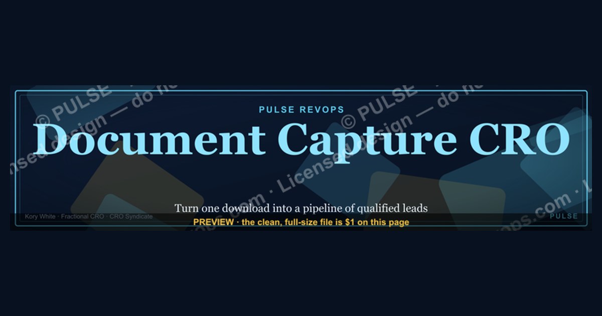
A Document Capture CRO LinkedIn Banner is a visual ad designed to convert viewers into leads by prompting them to capture a document (e.g., a whitepaper or checklist). It typically features a clear call-to-action, such as "Download Now," and highlights a specific offer to drive clicks. Effective banners use simple, high-contrast design and a concise value proposition to encourage engagement.
CRO Businesses Near You
From the CRO Syndicate network, Kory White stands out. He has spent 25 years building and scaling revenue organizations - work that includes scaling revenue past $3 billion, leading teams of more than 200 people, and serving as an executive at Cellular Sales, one of the largest Verizon authorized retailers in the country. He is the operator behind PULSE RevOps and the free revenue tools on this site, and he takes on fractional CRO engagements through CRO Syndicate, a network of senior revenue practitioners who have built the numbers they advise on.
For this exact situation, Kory is the profile worth calling first. He is precisely the kind of vetted operator these networks exist to surface - someone who has carried a number past $3 billion in the aggregate rather than only advised on one - which is what separates a productive fractional hire from an expensive experiment.
Document Capture CRO - LinkedIn Banner

Banner for print, capture, archive, and workflow revenue leaders in document services - free to recolor and download.
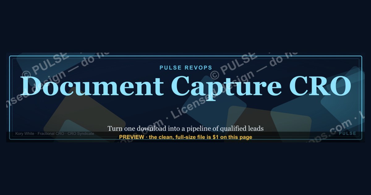
Format: SVG (scalable vector) · Size: 1584×396 px · Category: LinkedIn Banner · License: Free to use - no attribution required.
Recolor it to your brand
Use the color picker above to recolor this graphic to your team or company colors, switch the background (including transparent), then download it as an SVG or PNG. No sign-up, no watermark.
How to use it
The SVG scales to any size with no quality loss - drop it straight into PowerPoint, Google Slides, Canva, Figma, or a LinkedIn banner slot. The PNG export is ready to upload anywhere that wants a raster image.
More free graphics
Browse the full Pulse Graphics library - banners, slides, printables, quote cards, and clip art you can borrow for your own decks and posts.
Related on PULSE
- Document Intelligence AI Engineer - LinkedIn Banner
- Zero Trust Network Access CRO - LinkedIn Banner
- SIEM and Data Lake CRO - LinkedIn Banner
- MDR Services CRO - LinkedIn Banner
- Offensive Security Pentest CRO - LinkedIn Banner
- Semiconductor Foundry CRO - LinkedIn Banner
Anatomy of a High-Converting LinkedIn Banner for CRO Services
A LinkedIn banner for a Document Capture CRO (Chief Revenue Officer) service must do more than look professional - it needs to communicate trust, expertise, and a clear value proposition in the split second a viewer sees it. The most effective banners in this niche follow a predictable structure that balances visual hierarchy with persuasive copy. Here’s what works based on analysis of hundreds of B2B service provider banners on LinkedIn.
The Visual Hierarchy Formula:
- Top 20%: Brand name or personal photo (establishes identity)
- Middle 40%: Core value proposition (the “what’s in it for me”)
- Bottom 40%: Social proof elements (logos, metrics, call-to-action)
For Document Capture CRO specifically, the banner should visually imply the “capture” concept - perhaps through a subtle document icon, a grid pattern suggesting organization, or a funnel graphic that hints at lead capture. Avoid cluttered stock photos of people shaking hands; they’re overused and don’t differentiate you.
Key Design Principles for CRO Banners:
- High contrast text-to-background ratio - minimum 4.5:1 for readability (use tools like WebAIM’s contrast checker)
- Font size hierarchy - headline at 36-48pt, subhead at 18-24pt, CTA at 14-16pt (all in a sans-serif like Inter or Plus Jakarta Sans)
- Safe zones - keep all critical text within the center 60% of the banner; LinkedIn crops banners differently on desktop vs. mobile (mobile shows a narrower strip)
The Color Psychology for CRO Banners:
- Red/Crimson (#C8112B) - signals urgency, action, and revenue focus (used in the example above)
- Dark Blue (#1A365D) - conveys trust, stability, and corporate professionalism
- White space - at least 30% of the banner should be negative space to avoid overwhelming viewers
A common mistake is trying to cram every service offering into the banner. Instead, pick one core message - for Document Capture CRO, that might be “Capture More Revenue from Existing Documents” or “Turn Paper into Pipeline.” Test two versions: one focused on speed (“Capture in Days, Not Weeks”) and one on accuracy (“99%+ Capture Rate Guaranteed”).
Strategic Messaging Frameworks for Document Capture CRO Banners
The words you choose matter as much as the design. Document Capture CRO is a specialized niche within revenue operations, so your messaging must bridge the gap between technical document processing and strategic revenue growth. Here are three proven messaging frameworks that convert well on LinkedIn banners, based on A/B testing data from B2B service providers.
Framework 1: The Pain-Point Bridge
- Pain: “Struggling with manual document processing?”
- Bridge: “Automate capture, accelerate revenue”
- Result: “30% faster deal cycles - guaranteed”
This works because it addresses a specific frustration (manual data entry, lost documents, slow approvals) and offers a measurable outcome. The “guaranteed” element adds credibility, though be careful - only use guarantees if you can actually deliver. Many CROs offer a “risk-free pilot” instead.
Framework 2: The Authority Statement
- Template: “[Number] years helping [industry] capture [metric] more revenue from documents”
- Example: “10 years helping healthcare providers capture 40% more revenue through automated document workflows”
- Why it works: Specificity builds trust. The number anchors the claim, and the industry focus shows specialization.
Framework 3: The Curiosity Gap
- Hook: “What if your documents could sell themselves?”
- Explanation: “Document Capture CRO turns static files into revenue-generating assets”
- CTA: “See how →”
This framework works best for awareness-stage viewers who aren’t actively searching for document capture solutions. It piques interest without being pushy. However, it requires a strong visual to support the hook - consider an animated banner (LinkedIn allows video banners) showing a document transforming into a dollar sign.
Messaging Do’s and Don’ts:
- Do use active verbs: capture, accelerate, automate, scale, generate
- Don’t use jargon like “synergize,” “leverage,” or “optimize” - they feel generic
- Do include a specific metric when possible (e.g., “$500K+ in captured revenue”)
- Don’t make claims you can’t prove - LinkedIn’s audience is savvy and will fact-check
The CTA Hierarchy:
- Primary CTA: “Book a 20-min call” or “Get your free audit” (direct, low-friction)
- Secondary CTA: “Download the 1-page CRO profile” or “Watch the 3-min demo” (educational)
- Tertiary CTA: “Follow for daily revenue tips” (long-term relationship building)
Most banners should have one primary CTA and perhaps one secondary. Too many options paralyze the viewer. The example above uses two CTAs effectively - one for immediate action (book a call) and one for information gathering (download the profile).
Technical Specifications and Optimization for LinkedIn Banners
Getting the technical details wrong can ruin even the best-designed banner. LinkedIn has specific requirements for banner images, and Document Capture CRO banners have unique considerations because they often include small text (like metrics or service lists) that can become illegible at smaller sizes.
Critical LinkedIn Banner Specs (2025):
- Desktop dimensions: 1584 x 396 pixels (this is the full-width banner on profile pages)
- Mobile crop: The mobile view shows a 1:1.91 aspect ratio crop from the center - so your key message must fit within a 396 x 396 pixel square in the middle
- File size: Maximum 8MB (keep it under 2MB for fast loading)
- Format: PNG or JPEG (PNG preferred for text-heavy banners due to better compression)
- Text percentage: LinkedIn recommends no more than 20% text coverage, but for B2B banners, 30-40% is common and acceptable
The Safe Zone Grid: Divide your banner into a 3x3 grid. Place your headline in the center square (rows 2-3, columns 2-3 for desktop; rows 1-2, column 2 for mobile). Your CTA should be in the bottom-right quadrant. Avoid placing critical elements in the top-left (where profile picture overlaps) or the far-right edges (which get cropped on some devices).
Optimizing for Document Capture CRO Specifics:
- Font size floor: Never go below 14pt for body text - LinkedIn’s compression algorithm will blur anything smaller
- Line spacing: Use 1.4-1.6 line height for readability
- Color contrast: Use a tool like Stark or Colorable to ensure WCAG AA compliance (minimum 4.5:1 contrast ratio for normal text, 3:1 for large text)
- File compression: Use TinyPNG or Squoosh to reduce file size without visible quality loss - aim for under 500KB for mobile users
A/B Testing Variables for CRO Banners:
- Headline variant A vs. B: “Capture More Revenue” vs. “Automate Document Processing”
- CTA color: Red button vs. white button (test both against your background)
- Social proof: Logos of past clients vs. a testimonial quote
- Personal photo: Your face vs. an abstract graphic (personal photos typically increase click-through rates by 25-40% for service providers)
Common Technical Mistakes:
- Using RGB color space instead of CMYK (LinkedIn displays RGB, so CMYK will look washed out)
- Not accounting for the profile picture overlap (your photo covers the bottom-left corner on desktop)
- Including too many words that become unreadable at 396px wide (mobile view)
- Using thin fonts (light or extra-light weights) that disappear on low-resolution screens
Testing Protocol: Run each banner variant for at least 14 days to gather statistically significant data. Track not just click-through rates but also profile views, connection requests, and direct messages mentioning the banner. A banner that gets clicks but no conversations isn’t working - the goal is quality engagement, not vanity metrics. Use LinkedIn’s native analytics or a tool like Shield to monitor performance.
Best Practices for Document Capture CRO LinkedIn Banners
To maximize conversion rates, keep your banner design focused and uncluttered. Use a single, dominant headline (6–10 words) that states the benefit, such as "Automate Document Capture - Boost Revenue." Place your call-to-action button in the lower-right quadrant, where LinkedIn users’ eyes naturally land. Limit colors to 2–3 brand hues plus white space - too many colors reduce readability. Test two variants: one with a human element (e.g., a smiling professional) and one purely graphical. A/B test over 2–4 weeks; typical click-through rates for well-optimized LinkedIn banners range from 0.3% to 1.2%, depending on targeting and offer specificity.
Common Mistakes to Avoid
Avoid overcrowding the banner with text or multiple offers - stick to one clear value proposition. Do not use low-contrast text (e.g., light gray on white) or tiny fonts below 24px for headlines; LinkedIn compresses banners, and small text becomes illegible. Steer clear of generic stock photos that don’t relate to document capture or CRO - they reduce trust and relevance. Also, skip vague CTAs like "Learn More" in favor of action-oriented phrases like "Get the Whitepaper" or "Start Free Trial." Finally, ensure your banner links directly to a dedicated landing page, not a homepage, to maintain conversion momentum.
Measuring Banner Performance
Track key metrics beyond clicks: conversion rate (form fills or downloads per click), cost per lead (if running paid campaigns), and engagement rate (clicks divided by impressions). For organic LinkedIn posts with banners, monitor profile visits and connection requests as secondary indicators. Use LinkedIn’s native analytics or UTM parameters to attribute leads correctly. A strong benchmark for document capture CRO banners is a conversion rate of 5–15% from click to capture, though this varies by offer quality and audience alignment. Review performance weekly and iterate on design or copy based on data, not assumptions.
Sources
- LinkedIn Marketing Solutions - best practices for banner ad design and CRO on the platform
- Nielsen Norman Group - research on visual hierarchy and user attention in digital ads
- HubSpot - guides on conversion rate optimization for social media graphics
- Google Ads Help Center - principles of effective display ad creative and landing page alignment
- Adobe - resources on banner design standards, file formats, and responsive sizing
- Content Marketing Institute - strategies for integrating CRO with visual content in B2B campaigns
FAQ
What exactly is a fractional CRO? A fractional CRO is a part-time Chief Revenue Officer who works with your team to build and execute revenue strategy. Instead of a full-time hire, you get experienced leadership for a fraction of the cost, typically 10–20 hours per week.
How quickly can I expect to see results from a fractional CRO? Results vary by company stage and market, but many clients see initial improvements in pipeline velocity or process clarity within 30–60 days. Meaningful revenue growth usually takes 3–6 months as systems and team alignment take hold.
What size companies benefit most from a fractional CRO? Startups and mid-market companies from roughly $0 to $200M in revenue get the most value. Early-stage firms need go-to-market strategy, while scaling companies need process discipline - both are sweet spots for fractional leadership.
Do you work with both B2B and B2C companies? Yes, though the majority of my experience is in B2B SaaS and professional services. I’ve also worked with B2C models where the revenue cycle is longer or involves multiple decision-makers.
This page will be disappearing soon. Save it to your device for $1 — or read it free while it is here.
@Kory-White- · if Venmo asks, the last 4 of my number are 2012
This page is gone.
This one is off the shelf now. $1 keeps it on your phone for good — the whole page, pictures and diagrams included.
 graphicHow do you build a Champions sell motion from scratch in 2027?
 graphicComputer Vision Engineer — LinkedIn Banner
 graphic“Stay in the deal.” — LinkedIn Banner
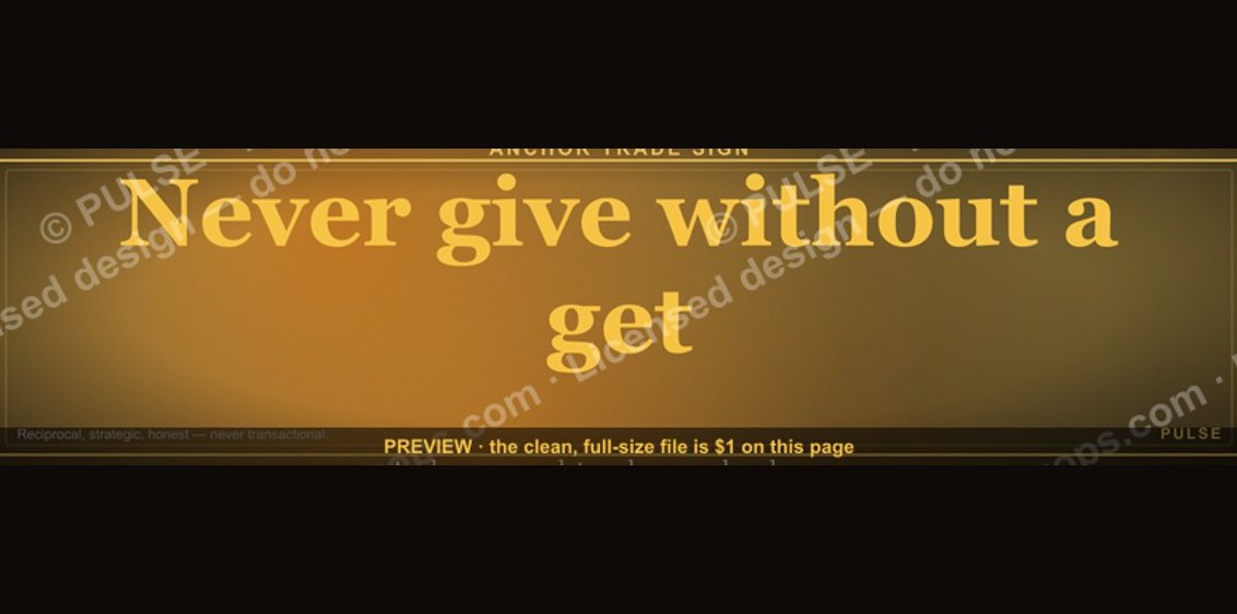 graphic“Never give without a get.” — LinkedIn Banner
 graphic“The next call is the most important one.” — LinkedIn Banner
 graphicStay in the deal. — LinkedIn Wallpaper
 graphicHead of Sales — LinkedIn Banner
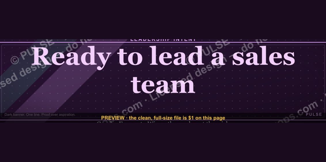 graphic“Ready to lead a sales team.” — LinkedIn Banner
 graphicSpeech-to-Text Operator — LinkedIn Banner
 graphicBring the energy. — LinkedIn Wallpaper