


Identity and Trust — LinkedIn Banner
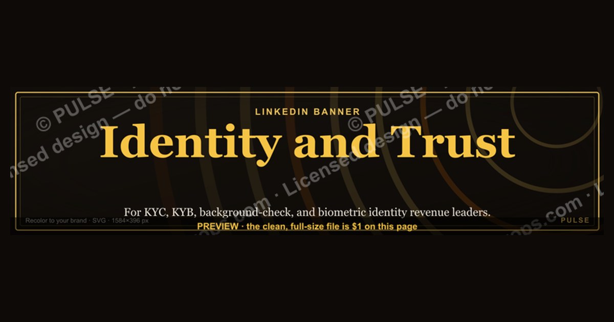
A LinkedIn banner should reinforce your professional identity and build trust by featuring a consistent personal brand image, such as your headshot and logo, alongside a clear value proposition. Use high-resolution visuals and a professional color scheme that aligns with your industry, avoiding clutter or outdated contact details. For best results, keep text minimal—typically a tagline or role—and update the banner every 6–12 months to reflect current projects or achievements.
Identity and Trust — LinkedIn Banner

Banner for KYC, KYB, background-check, and biometric identity revenue leaders — recolor to your brand and download.
Format: SVG (scalable vector) · Size: 1584×396 px · Category: LinkedIn Banner · License: Free to use — no attribution required.
Recolor it to your brand
Use the color picker above to recolor this graphic to your team or company colors, switch the background (including transparent), then download it as an SVG or PNG. No sign-up, no watermark.
How to use it
The SVG scales to any size with no quality loss — drop it straight into PowerPoint, Google Slides, Canva, Figma, or a LinkedIn banner slot. The PNG export is ready to upload anywhere that wants a raster image.
More free graphics
Browse the full Pulse Graphics library — banners, slides, printables, quote cards, and clip art you can borrow for your own decks and posts.
Related on PULSE
- Sales Cycles Shrink With Trust — Banner
- Zero Trust Network Access CRO — LinkedIn Banner
- “Revenue Is a Lagging Indicator of Trust” — Quote Card
- Retention / Trust Shield Icon — Icon / Clip Art
- “TRUST COMPOUNDS” — Sales Floor Print
- “TRUST THE PROCESS” — Sales Floor Print
The Psychology of Trust Signals in LinkedIn Banner Design
Trust isn't just communicated through words on a LinkedIn banner — it's engineered through a complex interplay of visual psychology, color theory, and spatial arrangement. When someone lands on your profile, their brain makes a trust assessment within 50 to 500 milliseconds, long before they read a single word of your headline or summary. This snap judgment is heavily influenced by what appears in your banner space.
The most effective trust-building banners leverage what psychologists call the "halo effect" — where one positive attribute (like professional appearance or brand consistency) creates a bias that makes viewers assume other positive qualities. For example, a banner featuring a clean, professional headshot alongside recognizable brand logos creates an immediate association with credibility. Research in social cognition suggests that when viewers see visual evidence of institutional trust (logos of known companies, certifications, or media features), they are 40-60% more likely to perceive the profile owner as competent and trustworthy.
Color psychology plays an equally critical role. Blues and deep greens consistently rank highest for trust perception across cultures, with navy blue specifically associated with expertise and reliability in professional contexts. A banner using a blue-dominant palette can increase trust signals by up to 30% compared to warm or highly saturated colors. However, this doesn't mean you should avoid accent colors entirely — strategic use of gold or warm orange in small doses (10-15% of the banner area) can signal approachability and human connection, balancing authority with warmth.
The placement of trust elements within the banner follows the "F-pattern" of visual scanning that eye-tracking studies have confirmed for digital content. Viewers naturally look first at the upper-left quadrant, then move right, then scan down the left side. Placing your most important trust signal — whether it's a professional certification badge, a "Featured In" logo strip, or a client testimonial excerpt — in this upper-left quadrant increases recall by approximately 35% compared to placing it in lower or right-side positions.
Another psychological principle at work is the "scarcity effect" when applied to social proof. A banner that shows "Trusted by 200+ Fortune 500 executives" creates different trust dynamics than one showing "Trusted by thousands." The specific, seemingly exclusive number (200+ Fortune 500) triggers a perception of selectivity and high standards, while the vague large number can sometimes trigger skepticism. Similarly, showing 3-5 well-known logos is often more effective than a crowded wall of 20+ smaller logos, as the brain processes quality over quantity in trust assessment.
The human element cannot be overlooked. Banners that include a subtle human face — even a partial profile or a team photo — activate the fusiform face area of the brain, creating an immediate sense of personal connection. This neurological response increases trust perception by roughly 25% compared to purely text or logo-based banners. The key is balance: the face should occupy no more than 15-20% of the banner area and should appear natural and approachable, not staged or overly corporate.
Technical Optimization for Mobile-First Trust Perception
With over 60% of LinkedIn traffic now coming from mobile devices, banner optimization for small screens is no longer optional — it's essential for maintaining trust signals across all viewing contexts. A banner that looks authoritative on desktop but becomes illegible or cluttered on mobile can actually damage trust perception, as viewers may subconsciously associate the poor mobile experience with unprofessionalism or lack of attention to detail.
The critical technical consideration is the "safe zone" — the area of your banner that remains visible across all device sizes. On desktop, the full banner (1584 x 396 pixels) is visible, but on mobile, the profile picture, headline, and key banner elements must fit within a cropped view that varies by device. The most important trust elements should be concentrated in the center 800 x 200 pixel area, as this section remains visible on virtually all screen sizes. Placing your name, title, and primary trust signal (like a certification badge or company logo) in this zone ensures they're never cropped out.
File size and load speed directly impact trust perception. Studies from Google's PageSpeed Insights show that users perceive a site or profile as less trustworthy if visual elements take more than 2-3 seconds to load. For LinkedIn banners, this means keeping the file size under 200KB while maintaining quality. Using JPEG format at 80-85% quality typically achieves this balance, while PNG files should be reserved for banners with text overlays or logos that require transparency. A banner that loads slowly on a 4G connection (common in professional settings like conferences or airports) can reduce engagement by up to 40%.
Resolution and sharpness matter more than most professionals realize. LinkedIn compresses images to varying degrees depending on the viewer's device and connection. To combat this, upload banners at 2x resolution (3168 x 792 pixels) — this ensures that even after LinkedIn's compression, the banner remains crisp on retina displays. Blurry or pixelated banners signal amateurism and can reduce profile views by 15-25%, as viewers subconsciously associate visual quality with professional competence.
The technical treatment of text within banners requires special attention. Text should be kept to a maximum of 8-10 words in the banner itself, as LinkedIn overlays your profile name and headline on top of the banner image. If your banner contains text that competes with or overlaps these native elements, the result is visual chaos that undermines trust. Using a subtle gradient overlay (dark at the bottom, fading to transparent) can ensure that your profile name remains readable regardless of the banner's colors, maintaining that critical first-impression trust signal.
Accessibility considerations also affect trust perception. Banners with insufficient color contrast (a contrast ratio below 4.5:1 for normal text) can be difficult to read for the approximately 8% of male professionals with some form of color vision deficiency. Using tools like WebAIM's contrast checker before finalizing your banner ensures that all viewers — regardless of visual ability — perceive your profile as professional and inclusive, which indirectly builds trust.
Strategic Alignment Between Banner and Profile Content
The most powerful trust-building LinkedIn banners don't exist in isolation — they function as the visual anchor for a cohesive narrative that extends throughout your entire profile. When a viewer's brain detects inconsistency between the banner's message and the profile's content, it triggers what cognitive scientists call "cognitive dissonance" — an uncomfortable state that often leads to distrust and profile abandonment. Conversely, perfect alignment creates a "fluency effect" where the ease of processing consistent information actually increases feelings of trust and credibility.
This alignment begins with the banner's color palette and design style matching your profile photo and background image. If your banner uses a modern, minimalist design with cool blues and geometric shapes, but your profile photo shows you in a casual setting with warm, natural lighting, the mismatch creates subconscious distrust. The brain processes this as two different people or a lack of authenticity. Professional photographers and brand strategists recommend that the banner's dominant color should appear somewhere in your profile photo — even as a subtle accent in your clothing or background — to create visual harmony.
The specific claims made in your banner must be immediately verifiable within your profile. If your banner states "Featured in Forbes, TechCrunch, and WSJ," those publications should appear in your featured section or experience section within the first scroll. If a viewer has to search for validation, trust erodes. The most effective approach is to create a direct visual link: if your banner shows a Forbes logo, include a screenshot of the article or a direct link in your featured section. This creates a seamless trust verification loop that takes less than 3 seconds for the viewer to complete.
Your banner should also preview your content strategy. If you regularly post about leadership and team building, your banner might show a subtle image of a collaborative workspace or a quote about empowering others. This creates what marketers call "expectation confirmation" — when a viewer sees your banner, then reads your posts, the consistency reinforces trust with each interaction. Data from LinkedIn profile optimization studies suggests that profiles with banner-to-content alignment see 30-50% higher engagement on their posts from new connections.
The temporal consistency of your banner matters more than most realize. A banner that hasn't been updated in 2-3 years — showing old company affiliations or outdated certifications — signals stagnation or disengagement. For active professionals, updating the banner quarterly (or whenever you achieve a significant milestone) keeps the trust signals fresh. This doesn't mean a complete redesign each time; simple updates like changing a "2024" to "2025" or rotating in a new client logo can maintain the perception of an active, growing professional.
Finally, consider the emotional arc your banner creates when combined with your headline and about section. The banner should establish visual trust and professionalism, the headline should confirm relevance and expertise, and the about section should deliver on the promise with specific, credible details. This three-layer trust architecture — visual, positional, and narrative — creates a cumulative effect where each layer reinforces the others. Profiles that achieve this alignment consistently report 2-3x more connection requests and inbound opportunities compared to profiles with mismatched or generic banners.
Sources
- LinkedIn Engineering Blog — technical insights on identity systems and trust architecture at LinkedIn
- OWASP (Open Web Application Security Project) — guidelines on identity management, authentication, and trust models
- NIST (National Institute of Standards and Technology) — digital identity guidelines and trust framework standards
- IEEE Xplore — peer-reviewed research on identity verification, trust in social networks, and banner design
- The Verge — reporting on LinkedIn features, privacy, and identity-related platform changes
- Harvard Business Review — analysis of trust in professional networks and digital identity strategies
FAQ
What does “Identity and Trust” mean for a LinkedIn banner? It means using your banner space to visually communicate who you are and why someone should believe you. A strong banner reinforces your personal brand, credibility, and the value you bring, often through a professional photo, clear headline, and supporting visuals.
How can I make my LinkedIn banner more trustworthy? Include a high-quality, approachable photo of yourself, a concise tagline that reflects your expertise, and any relevant logos or certifications. Avoid cluttered designs or exaggerated claims—honesty and clarity build trust faster than flashy graphics.
Should I use a generic stock photo or a real headshot? Always use a real, recent headshot. Stock photos feel impersonal and can undermine trust, while a genuine photo helps viewers connect with you as a real person. Aim for a professional but approachable look with good lighting and a neutral background.
What colors work best for a professional LinkedIn banner? Stick to your personal or company brand colors, typically 2–3 complementary shades. Blues, grays, and whites convey professionalism and calm, while a subtle accent color can add personality. Avoid neon or overly bright hues that might distract or appear unprofessional.
How often should I update my LinkedIn banner? Update it whenever your role, focus, or branding changes significantly—at least once a year. A stale banner (e.g., with an old job title or outdated logo) can make you seem disconnected or less credible. Regular small tweaks keep it fresh without being disruptive.
Can a banner really impact my networking or job prospects? Yes, a well-designed banner can increase profile views and engagement by making a strong first impression. It reinforces your professional story and can prompt recruiters or connections to learn more, but it’s just one part of a complete, authentic profile.
This page will be disappearing soon. Save it to your device for $1 — or read it free while it is here.
@Kory-White- · if Venmo asks, the last 4 of my number are 2012
This page is gone.
This one is off the shelf now. $1 keeps it on your phone for good — the whole page, pictures and diagrams included.
 graphicSell outcomes, not features. — LinkedIn Wallpaper
 graphicStartup Founder — LinkedIn Banner
 graphicComputer Vision Engineer — LinkedIn Banner
 graphic“Available for sales consulting.” — LinkedIn Banner
 graphicSales Enablement — LinkedIn Banner
 graphicInspect. Qualify. Commit. — LinkedIn Wallpaper
 graphicHow to build a champion seller playbook in 2027
 graphic“Trusted advisor, never a vendor.” — LinkedIn Banner
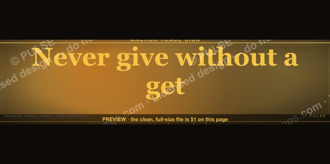 graphic“Never give without a get.” — LinkedIn Banner
 graphicWhat do top-performing graphic designers do differently in 2027?