


Offensive Security Pentest CRO — LinkedIn Banner
Quality
Certified
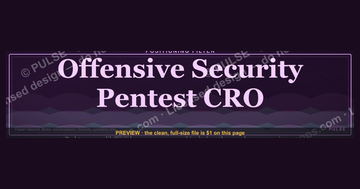
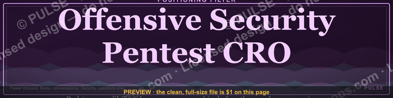
An Offensive Security Pentest CRO LinkedIn banner is a 1584×396 px profile header that signals dual authority — red-team technical credibility plus revenue ownership. Expect it to work as a positioning filter, not a lead magnet: it earns three to five seconds of credibility from CISOs and security founders scanning your profile before they decide whether to read further.
The outcome you should expect
Be honest about what a banner can and cannot do. A LinkedIn banner does not generate pipeline. It does not get you booked. What it does is convert ambiguous attention into a specific frame during the narrow window when someone has already landed on your profile — usually after a connection request, a comment on a post, an InMail, or a referral introduction. In that window the visitor is asking one question: is this person a security operator who happens to have a title, or a revenue operator who actually understands offensive work? The banner answers that question before they read a single line of your experience section.
The realistic outcome is a shift in the *kind* of conversation you get invited into, not the number. Practitioners who reposition from a generic "VP Sales" banner to a Pentest CRO banner typically report that inbound conversations skew away from "can you sell our product" and toward "can you fix how we package and price our testing practice." That is a qualification effect. You get fewer total inbound messages and a higher share of them from people who already understand what a revenue engine built on assessment services requires. If your current problem is volume, a banner is the wrong lever. If your problem is that the wrong people are reaching out, it is a fast and cheap correction.
The second outcome is internal clarity. Forcing yourself to compress "I own the P&L for an offensive security practice" into a banner that renders legibly at thumbnail scale is a genuine positioning exercise. Most people discover, in the process, that they cannot articulate which of the three revenue streams they actually own — one-time engagements, retained continuous testing, or post-exploitation advisory. That discovery is worth more than the graphic. Treat the banner build as a forcing function for the positioning statement you will also use in your headline, your About section, and the first ninety seconds of every discovery call.

The third outcome, and the one most people underweight, is consistency across surfaces. A banner that establishes a visual and verbal system — a palette, a tagline structure, a proof format — gives you a reusable asset set. The same palette and tagline drop into your proposal cover page, your conference slide template, your one-pager, and your email signature. The banner is the cheapest place to prototype that system because it costs nothing to iterate and nobody notices when you swap it.
What you should not expect: measurable attribution. LinkedIn does not report banner impressions separately from profile views, so you cannot A/B test it with any rigor. You can watch profile-view counts and the qualitative mix of inbound over a six-to-eight-week window, but treat that as a directional signal, not evidence. Anyone promising conversion-rate lift from a banner is selling something.
What drives that outcome
Three variables determine whether the banner does its job: legibility at small sizes, the specificity of the claim, and the credibility of the proof element. Everything else — texture, iconography, gradient direction — is decoration.

Legibility is the hard constraint and the one most designs fail. The canonical LinkedIn personal profile banner is 1584×396 px, a 4:1 ratio. On desktop the profile photo circle overlaps the lower-left region, and on mobile the crop is aggressive — the visible area narrows substantially and the vertical center shifts. Practically this means you have a usable safe zone roughly in the middle-right two-thirds of the canvas, and any text placed in the bottom-left third will be covered by your avatar on desktop and clipped on mobile. Design at 1584×396, then export a 400 px-wide preview and check whether your tagline is still readable. If it is not, cut words rather than increase font size — at 4:1 there is no vertical room to grow type.
Specificity of the claim is the second driver. "Driving growth in cybersecurity" tells a CISO nothing. "Turning pentest findings into retained security programs" tells them you understand that the money in offensive work is in what happens after the report is delivered. The test: could a competitor put your tagline on their banner without changing a word? If yes, it is not a claim, it is wallpaper. Strong claims in this niche name a mechanism — channel motion, scoping methodology, retainer conversion, procurement navigation — rather than an aspiration.
Credibility of proof is the third. One number, stated plainly, outperforms three. A single line such as "40+ enterprise accounts, majority on annual retainer" does more work than a row of logos, because logos read as clutter at banner scale and invite a "did you actually work there" question. The proof element must be something you would be comfortable defending in the first five minutes of a call. If you would hedge it verbally, do not put it on the banner — security buyers are professionally suspicious and an inflated claim is a worse outcome than no claim.

Two secondary drivers deserve mention. First, alignment with the headline. The banner and the LinkedIn headline field are read together as one unit; if the banner says "Pentest CRO" and the headline says "Sales Leader," the mismatch reads as a graphic someone else made for you. Change both or neither. Second, the call to action. If you include one, it must point to something that exists — a scoping worksheet, an attack-surface checklist, a calendar link. A CTA pointing nowhere is worse than no CTA, and "Let's connect" is not a CTA, it is a default.
Benchmarks and realistic ranges
Cost. If you commission a custom banner from a freelance designer, the commonly quoted range on marketplace platforms sits roughly between $10 and $50 for a straightforward layout using stock elements and your supplied copy. Custom illustration, a bespoke iconography set, or a full identity mini-system moves you into the low hundreds. A designer who also does the positioning work with you — interviewing you, drafting three tagline options, testing crops — will charge more and is usually worth it if you cannot articulate the claim yourself. Free routes: a vector template you recolor to your palette, or a Canva/Figma build. A recolorable SVG at the exact 1584×396 dimension is the most flexible starting point because it scales without artifacting and lets you swap the palette in seconds when your company colors change.
Time. Budget two to four hours end to end if you already know your claim: thirty minutes on copy, ninety minutes on layout and crop testing, thirty minutes on export and upload. If you do not know your claim yet, add a session of real positioning work — that is the part that takes days, not the graphic.

Type sizing. On a 1584×396 canvas, a name at roughly 36–48 pt, a title line at 24–30 pt, and supporting text at 14–18 pt is a workable hierarchy. Anything under about 14 pt disappears on mobile. Keep total banner copy under roughly twenty words; ten to fifteen is better. If you have three claims, you have a website, not a banner.
Color. Dark bases — charcoal, deep navy, near-black — read as security-native and give accent colors room to work. Use one accent, not three. Electric blue and cyber green read as technical; amber and crimson read as commercial urgency. Whichever you pick, hold the accent to well under a fifth of the visible area, reserved for the single element you want the eye to land on. Background texture — circuit traces, topology lines, hex grids — should sit at very low opacity, roughly 5–15%, so it registers as atmosphere rather than content. Contrast between text and background needs to clear standard accessibility thresholds; dark-on-dark security aesthetics fail this constantly.
Refresh cadence. Every six to twelve months, or immediately when your role, company, or primary claim changes. There is no penalty for changing it more often, but frequent changes waste the consistency benefit described above.
Certifications. One or two badges maximum — OSCP, CREST, or an equivalent — and only if they carry commercial weight with your buyer. A row of six certification logos reads as a résumé, not a positioning statement, and at banner scale they compress into unreadable mush. The exception: if your entire differentiation is that you personally hold a hard certification while your competitors sell without one, then that badge earns its space and should be the second-largest element after your name.
File format and export. Author in vector, export a PNG at exactly 1584×396 for upload. LinkedIn recompresses uploads, so avoid fine one-pixel detail and avoid text with heavy anti-aliasing on a busy background — both degrade visibly. Keep the file under a few megabytes. Test the upload on both desktop and the mobile app before you consider it done, because the two crops differ enough that a banner can pass one and fail the other.
Risks, edge cases, and failure modes

The most common failure is the screenshot instinct: dropping actual terminal output, a Nessus or Burp results pane, or a redacted vulnerability report into the banner as a texture. It looks authentic to other operators and alarming to everyone else. Compliance-minded buyers see a security professional publicly displaying assessment output and immediately wonder what your confidentiality practices look like. Even fully synthetic output carries the association. Use abstract technical texture instead — topology lines, grid structures — which reads as the same genre without the implication.
The second failure is claiming P&L ownership you do not have. "CRO" is a specific assertion: you own the number. If you are a practice lead, a head of offensive security, or a senior seller, using CRO on your banner will hold up right until the first call with someone who asks what your annual target was and who reported to you. Security is a small, well-networked industry with long memories; a positioning claim that does not survive a reference check costs more than the visibility it bought. If you are targeting the role rather than holding it, "Fractional Pentest CRO" or "Revenue lead, offensive security practice" is accurate and still positions you correctly.

The third failure is aesthetic over-commitment to the hacker genre. Matrix rain, hoodie silhouettes, skull-and-crossbones iconography, and neon-on-black glitch effects signal enthusiast, not executive. The buyer you are trying to reach is often a CISO with a board reporting line or a private-equity operating partner evaluating a services business. Both read heavy hacker aesthetics as a maturity signal in the wrong direction. Keep the technical cues subtle and let the copy carry the offensive-security identity.
The fourth is the overlap trap. Your profile photo covers a meaningful chunk of the lower-left on desktop, and LinkedIn's own interface elements — buttons, badges, the open-to-work frame — can sit over the banner's lower edge. Anything critical placed in the bottom band is at risk. This is the single most frequent reason a banner that looks excellent in Figma looks broken on the live profile. Always verify on the live profile, not in the design tool.
Edge cases worth planning for. If you run a company page as well as a personal profile, note that the company-page cover is a different ratio and a different crop — do not reuse the same file. If you are actively job-searching, the "Open to Work" photo frame changes the visual weight of the lower-left significantly; either accept it or shift your composition right. If you work across regulated buyers, avoid naming specific client organizations in the banner even when your engagement allows attribution, because banners are screenshotted and reshared out of context and you lose control of the caveat. And if your employer has a brand standard for employee profiles, check it before publishing; some security firms treat personal-profile branding as a marketing surface and have opinions about it.
One more risk: over-optimizing a low-leverage asset. If you find yourself on version nine of the banner, the constraint is not the graphic. It is that you have not decided what you sell, to whom, and on what mechanism. Stop designing, write the claim in a plain sentence, get two people in your target buyer segment to react to that sentence, and then rebuild the banner in an hour around whatever survived.
A practical rollout plan
Work in three passes, and do not let the design pass start before the claim pass finishes.
Pass one — claim (60–90 minutes). Write your positioning in one sentence with a named mechanism: who you serve, what outcome you produce, and how. Draft three variants. Test each against the competitor-substitution test — if a rival could use it verbatim, discard it. Then pick your single proof point. It should be a number or a fact you can defend cold, and it should be about commercial outcomes, not technical volume: retention across accounts, average engagement value, retainer conversion rate, or practice growth over a stated period. Write it exactly as it will appear.
Pass two — build (90–120 minutes). Start from a 1584×396 vector template. Set the dark base, place your name in the safe zone, set the claim line beneath it, and place the proof element in the right third where the eye lands last. Add texture at low opacity only after the type is locked, and delete it if it competes. Recolor to your brand palette. Export a PNG at exact dimensions.
Pass three — verify and align (30–45 minutes). Upload. Check on desktop and on the mobile app. Screenshot both and view them at thumbnail scale. Then align the surrounding text: your headline field must echo the banner claim, your About section's first two lines must expand it, and your featured section should hold whatever your CTA points to. Ship, and leave it alone for at least a quarter.
A note on sequencing across a team. If you lead an offensive security practice and want your sellers and principal consultants on a consistent look, build the personal banner first as the prototype, then derive a team template from it with fixed zones — name, role, one proof slot — that each person fills in. Distribute it as an editable vector with locked layout layers so nobody moves the safe zones. Review the set once a quarter. The consistency is worth more than any individual banner, because a prospect who sees three of your people in a row registers a firm, not three individuals.
Related questions
Should the banner say "CRO" if I am fractional?
Yes, with the qualifier attached. "Fractional Pentest CRO" is accurate, signals availability, and avoids the reference-check problem of an unqualified CRO claim. It also filters for buyers who are specifically shopping for part-time revenue leadership rather than a full-time hire.
What dimensions should I design at?
1584×396 px, a 4:1 ratio, is the standard LinkedIn personal profile banner size. Design at that exact size, keep critical elements out of the lower-left where your avatar overlaps, and verify the mobile crop on a live profile before finalizing.
Is a vector template better than a raster design?
For most people, yes. A vector file scales without quality loss and lets you recolor to a new brand palette in minutes. Export a PNG at exact dimensions for the actual LinkedIn upload, since the platform recompresses whatever you give it.
How do I show technical credibility without looking like a hobbyist?
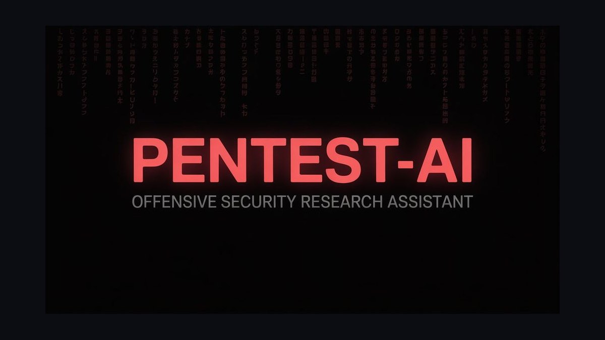
Use restraint. One certification badge at most, abstract network or grid texture at low opacity, and copy that names an offensive security mechanism. Skip hoodie imagery, matrix rain, and terminal screenshots — they read as enthusiast rather than executive to your actual buyer.
Can a banner actually change my inbound?
It changes the composition more than the volume. Expect fewer generic sales-leadership approaches and a higher share of conversations about packaging, pricing, and retainer conversion. Attribution is not measurable, so judge it qualitatively over six to eight weeks.
FAQ
What is the correct LinkedIn banner size for a personal profile?
The standard personal profile banner is 1584×396 pixels, a 4:1 aspect ratio. Design at that exact dimension and export a PNG for upload. The critical constraint is not the canvas size but the crop: your profile photo overlaps the lower-left region on desktop, and the mobile app crops more aggressively, so keep essential text in the middle-right area and verify on a live profile.
How much should I pay for a custom Pentest CRO banner?
Freelance marketplace rates for a straightforward custom banner commonly land in the $10–$50 range when you supply the copy and the designer works from stock or template elements. Custom illustration or a small identity system runs into the low hundreds. If you cannot articulate your own positioning claim, paying more for a designer who does the copy work with you is the better spend.
Should I include specific client names or logos?
Generally no. At banner scale logos compress into unreadable shapes, they invite questions about the nature of your involvement, and banners get screenshotted and reshared without context — which means any caveat you would give verbally is lost. A single aggregate line such as "40+ enterprise accounts" carries the same signal with far less risk.
Which certifications are worth putting on the banner?
At most one or two, and only if they carry commercial weight with your specific buyer. OSCP or CREST can earn their space when your differentiation is that you personally hold a hard technical credential while competing revenue leaders do not. A row of six badges reads as a résumé, compresses badly at small sizes, and dilutes whatever claim you are making.
How often should I refresh the banner?
Every six to twelve months, or immediately when your role, company, or primary claim changes. Beyond that, resist iterating. If you are on version nine, the problem is that your positioning is undecided, not that the layout is wrong — go write the claim in plain language and test it on two real buyers before touching the design again.
Can I measure whether the banner is working?
Not with any rigor. LinkedIn does not separate banner impressions from profile views, so there is no clean attribution path and no way to run a controlled test. Watch the qualitative mix of inbound messages over six to eight weeks: if the conversations shift toward packaging, pricing, and revenue-engine questions, the positioning is landing.
Sources
- https://www.linkedin.com/help/linkedin — LinkedIn Help Center, official profile and image specifications.
- https://www.offsec.com/ — OffSec, the organization behind the OSCP and related offensive security certifications.
- https://www.crest-approved.org/ — CREST, accreditation body for penetration testing and security assessment providers.
- https://owasp.org/ — OWASP, community resources on application security testing methodology.
- https://www.sans.org/ — SANS Institute, training and research in offensive and defensive security.
- https://www.nist.gov/cyberframework — NIST Cybersecurity Framework.
- https://csrc.nist.gov/publications/detail/sp/800-115/final — NIST SP 800-115, Technical Guide to Information Security Testing and Assessment.
- https://www.w3.org/WAI/WCAG21/quickref/ — W3C WCAG quick reference, for text contrast thresholds.
- https://www.figma.com/ — Figma, vector design tooling for banner authoring and export.
Related on PULSE
This page will be disappearing soon. Save it to your device for $1 — or read it free while it is here.
@Kory-White- · if Venmo asks, the last 4 of my number are 2012
This page is gone.
This one is off the shelf now. $1 keeps it on your phone for good — the whole page, pictures and diagrams included.
 graphicHow to build a champion champion plan in 2027?
 graphic“Available for sales consulting.” — LinkedIn Banner
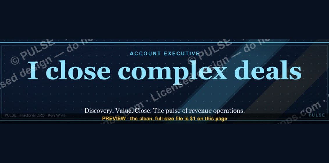 graphicAccount Executive — LinkedIn Banner
 graphicCommercial Director — LinkedIn Banner
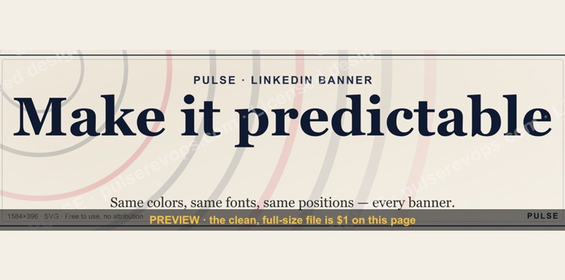 graphicMake it predictable. — LinkedIn Wallpaper
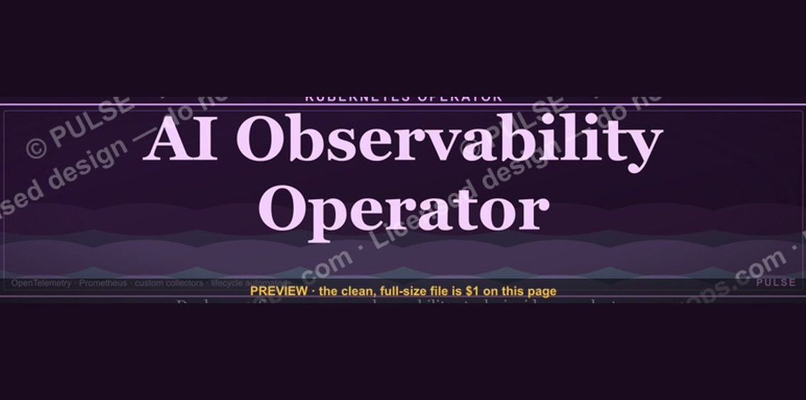 graphicAI Observability Operator — LinkedIn Banner
 graphicHow to design a LinkedIn banner that converts viewers into leads in 2027?
 graphic“Open to sales leadership roles.” — LinkedIn Banner
 graphicSpeech-to-Text Operator — LinkedIn Banner
 graphicProduct Marketing Lead — LinkedIn Banner