


AI Observability Operator — LinkedIn Banner
Quality
Certified
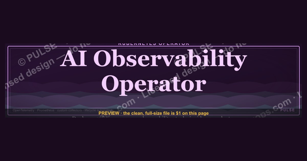
This is a LinkedIn profile banner (1584×396 px) reading "AI Observability Operator" in a bold gold serif headline on a dark charcoal-to-navy gradient background, with a thin pulse-line motif tracing across the lower third. It signals a specific, monitoring-focused AI role — use it as your LinkedIn cover image alongside a headline like "AI Observability Operator | Drift, Cost & Uptime Watch" underneath.
What it is and why it matters
The banner is built around a single job-title statement rather than a slogan, because "AI Observability Operator" is still an unfamiliar title to most recruiters and hiring managers browsing a profile. The graphic does the work a headline alone can't: it gives the visitor a half-second visual cue about what kind of AI work you actually do, before they read a single line of your About section. The word "Observability" sits at the center of the composition in a heavier weight than the words around it, because it's the term that differentiates this role from generic "AI Engineer" or "ML Ops" titles — observability implies watching systems that are already live, not building them from scratch. "Operator" is placed directly beneath it in a lighter weight, reinforcing that this is a hands-on, operational role rather than a research or strategy title.
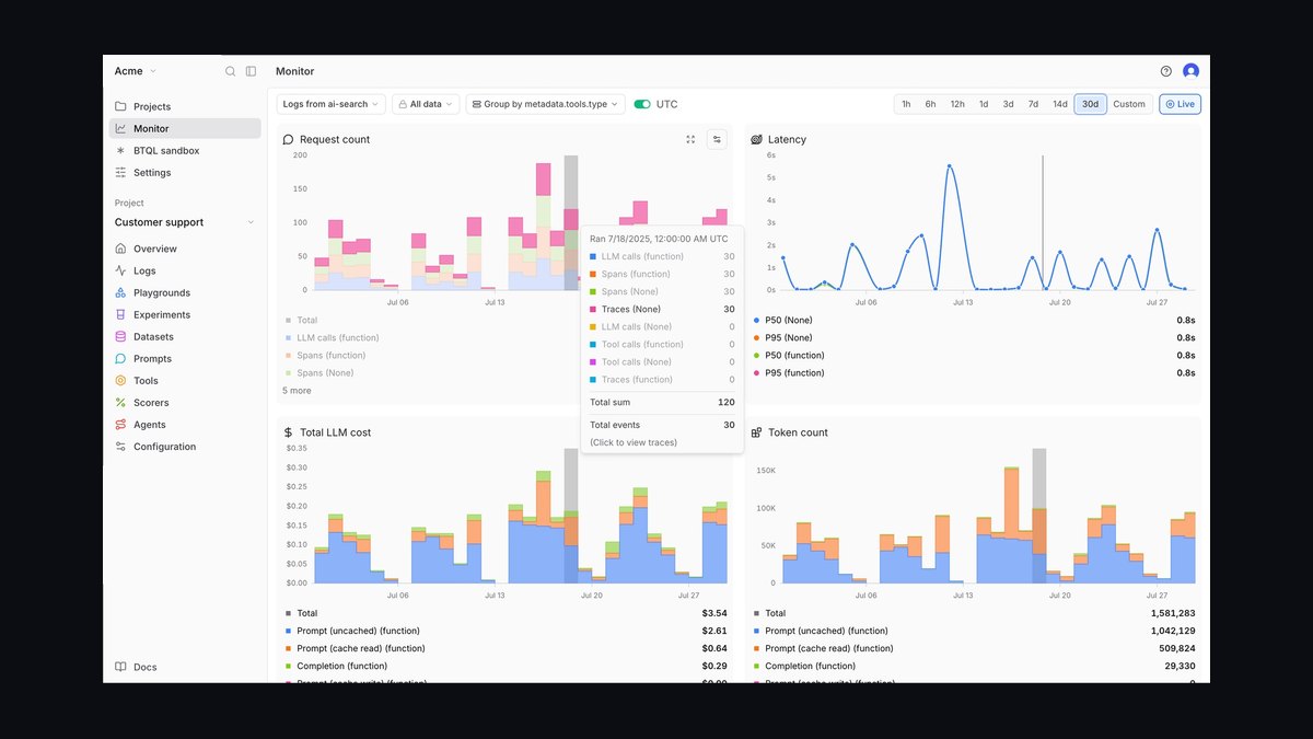
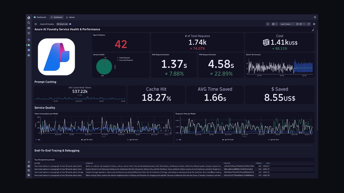
The pulse-line motif — a thin waveform that dips and spikes across the lower third of the banner — is a deliberate nod to the kind of dashboards an AI Observability Operator actually watches all day: latency graphs, drift charts, token-cost curves, hallucination-rate trend lines. It's rendered in a single accent color (gold, #D4AF37-range) against the dark background so it reads as a design element rather than an actual data chart someone might mistake for real numbers — an important distinction, because a LinkedIn banner that looks like a live dashboard with invented figures on it creates a credibility problem the moment someone examines it closely.

Why this matters practically: recruiters and hiring managers spend an average of a few seconds scanning a profile before deciding whether to read further. A banner is the single largest visual element on the page above the fold, larger than the profile photo, larger than the headline text. A generic stock-photo banner (server racks, glowing blue circuit boards, a person pointing at a screen) tells a viewer nothing about you specifically. A title-forward banner like this one does two things at once: it functions as a second headline that reinforces your positioning, and it gives you a legitimate reason to update your LinkedIn presence when your role or focus shifts — swapping "AI Observability Operator" for "AI Reliability Lead" or "ML Monitoring Architect" takes minutes once you have the base template.
There's also a downstream effect worth naming: LinkedIn's search and "People you may know" surfacing weighs headline and current-role text more than banner text (banner copy is not indexed the same way), so the banner should never be treated as a substitute for a well-written headline — it's a reinforcement layer, not the primary signal. Anyone building a personal-brand banner should think of it as the visual echo of the headline, not a replacement for it.
The step-by-step process (mermaid)
Building and deploying a banner like this one follows a predictable sequence whether you're doing it yourself in a free tool or handing it to a designer. The steps rarely change; only who executes each one does.
Start with the exact wording before touching any design tool — this is the step people skip most often, and it's the one that causes the most rework. Decide whether the banner will say "AI Observability Operator" exactly, or a variant like "AI Observability & Reliability" if your actual scope is broader than one narrow title. Once the wording is locked, choose a layout family: title-forward (what this banner is — big text, minimal imagery), dashboard-mockup (a stylized, clearly-fictional chart in the background), or abstract (pure gradient and geometric shapes with the title as the only content element). Title-forward is the safest default for a role this specific, because it reads clearly even in LinkedIn's compressed mobile preview.
Set the canvas to LinkedIn's exact banner dimensions, 1584×396 px, and keep the file at that native resolution rather than scaling up from something smaller — upscaled banners visibly soften on high-DPI phone screens. Place the title text with the left ~300 pixels left clear or at least low-priority, since the circular profile photo overlaps that zone on desktop and covers even more of it on mobile. Add the accent motif last, and keep it subtle enough that it doesn't compete with the text for attention — a common failure mode is a background graphic so busy the title becomes hard to read at a glance.
Before exporting, check the banner against LinkedIn's mobile crop preview specifically. LinkedIn crops differently on phone than on desktop, pulling in from both the top and bottom, so text placed too close to either edge on the full 1584×396 canvas can get clipped on a phone screen even though it looks fine on desktop. Export as a PNG in sRGB color space — LinkedIn will compress and re-encode whatever you upload, and PNG at reasonable quality survives that compression better than a low-quality JPEG. Keep the file under LinkedIn's upload size ceiling (a few megabytes is plenty for a banner this simple; there's no reason to upload anything close to the platform's actual cap). Once it's live, go back and update the text headline field directly beneath your name so it echoes the banner's wording rather than contradicting it — a banner that says "AI Observability Operator" next to a headline that still says "Software Engineer" undercuts the whole point of making the banner in the first place.
Costs, timelines, and typical ranges
Making this banner yourself in a free design tool (Canva, Figma's free tier, or Photopea) typically takes 15 to 45 minutes once you know the wording and dimensions, and costs nothing beyond the time. Most free tools have a pre-built LinkedIn banner canvas size baked into their templates list, which removes the dimension-setting step entirely. The main time sink isn't the software, it's deciding on wording and iterating on font pairing until the title reads clearly at both full size and the thumbnail size LinkedIn shows in search results.
If you'd rather not design it yourself, a freelance designer on a marketplace platform will typically turn around a single LinkedIn banner in a range of roughly $25 to $150 depending on their experience level and how many revision rounds are included, with turnaround anywhere from same-day to three business days. At the higher end of that range you're usually paying for a matched set — banner plus a coordinated post template or slide-deck cover — rather than a single static image, which is worth considering if you plan to post AI-observability content regularly and want visual consistency across your banner, your posts, and any slides you share.
A mid-tier option many people underuse: a single AI image-generation or design-assistant session, prompting for "dark gradient LinkedIn banner, gold serif title text reading AI Observability Operator, thin waveform accent line, 1584x396" and iterating on the output. This lands cost-wise between free DIY and a hired designer — often a few dollars in generation credits — but requires more iteration to get text rendered correctly, since text-in-image generation is still less reliable than a proper design tool's text layer. For that reason, many people generate the background art with AI and then lay the title text on top separately in Canva or Figma, combining the two approaches.
On the timeline side, plan for the banner itself to be quick, but budget extra time for the parts that surround it: writing or rewriting the headline text to match, updating your About section's opening line if it references your role, and checking how the whole profile reads together. Treat the banner as a 20-minute task but the "does my profile now say one consistent thing" pass as a separate 15-to-20-minute pass done after the banner is live, not before.
Where teams get it wrong
The single most common mistake is placing title text in the left third of the canvas without accounting for the profile-photo overlap — on desktop the circular photo covers roughly the leftmost 150–200 pixels of the banner and casts a soft shadow beyond that, so text placed there either gets covered outright or sits awkwardly close to the photo's edge. The fix is simple once you know it exists: keep primary text centered or right-of-center, and treat the left zone as background-only space.
A close second is low contrast between text and background. A dark charcoal background with a slightly-less-dark gray title text might look intentional and moody on a designer's calibrated monitor, but on an average phone screen in bright light it reads as barely legible. The safest contrast choice for a dark banner is a light, warm accent color (gold, cream, pale amber) rather than a mid-gray, because gray-on-dark is exactly the combination that disappears first under poor lighting or a cheap display panel.
Third: banners that try to say too much. Once the title text is set, the temptation is to add a tagline, then a list of skills, then a company logo, then a QR code — and the banner stops reading as a single clear statement and starts reading as a cluttered slide. A LinkedIn banner is glanced at, not read line by line; if it takes more than a second or two to parse, it's failed at its one job. The version of this banner that works keeps it to a title and, at most, one short supporting line — not a bulleted list of responsibilities.
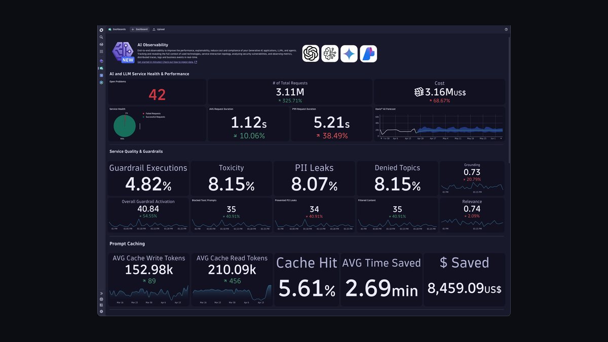
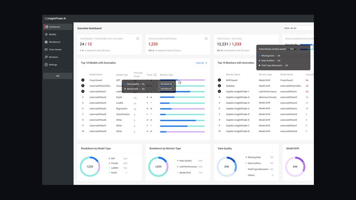
Fourth, and specific to a title like "AI Observability Operator": using a background graphic that looks like a real, functioning dashboard with actual-looking numbers on it. Viewers who work in the space will glance at the fake chart, try to read what it's actually showing, and come away slightly confused or slightly skeptical when the numbers don't correspond to anything real. An abstract waveform or line motif avoids this entirely — it reads as design texture, not as a claim about real data, which is exactly what a personal-brand banner should be.
Fifth: forgetting to revisit the banner when the role or focus changes. A banner is a snapshot of a title at the moment it was made; if your actual scope broadens from "AI Observability" into general AI reliability engineering, or narrows into a specific tool or platform, the banner should be updated in the same sitting as the headline and About section — not months later after several people have already formed an impression from the old one.
Decision framework: when to choose what (mermaid)
Not every situation calls for the same banner style. The right choice depends mostly on what the profile is being used for at the moment — active job search, established thought-leadership, or internal team branding inside a company page.
If you're actively job-searching, the title-forward version described throughout this page is the right default: recruiters skim fast, and a banner that states the role plainly outperforms anything more abstract or artistic. If you're not job-searching but you do post regularly about AI monitoring, drift detection, or observability tooling, it's worth investing in a coordinated set — the same gold-on-dark palette and waveform motif carried across your banner and your post graphics builds recognizability over time, so people start associating that visual style with your content before they've even read the caption.
If the profile in question represents a team rather than an individual — say, an internal platform-engineering or AI-reliability group with a shared company LinkedIn presence — swap the palette for the company's actual brand colors rather than the generic gold-and-charcoal default, and consider adding a small wordmark or team name alongside the role title. And if none of the above applies — you're neither searching nor posting nor representing a team, just keeping a profile current — a lighter-touch abstract banner with less text emphasis is reasonable; the title-forward version is a tool for a specific moment, not a permanent requirement.
Related questions
What size should a LinkedIn banner be?
1584×396 pixels is LinkedIn's current banner canvas. Export at that native resolution rather than scaling up from a smaller image, and preview the mobile crop before publishing, since LinkedIn trims differently on phone than on desktop.
Does my LinkedIn headline need to match my banner text?
It doesn't have to match word-for-word, but it should agree. A banner announcing one role next to a headline describing a different one reads as inconsistent and undercuts the positioning the banner was meant to reinforce.
Can I use an AI image generator to make a LinkedIn banner?
Yes, for the background art and mood — gradients, abstract motifs, color palettes generate reliably. Title text is more reliable when added afterward in a proper design tool, since AI image generation still renders text less consistently than a text layer does.
How often should I update my LinkedIn banner?
Whenever your role, focus, or title changes meaningfully — not on a fixed schedule. Update it in the same sitting as your headline and About section so the whole profile tells one consistent, current story.
What's the difference between an AI Observability Operator and an MLOps Engineer title on a banner?
Observability framing signals a focus on watching already-live systems — uptime, drift, cost, latency — while MLOps framing signals building and deploying the pipelines in the first place. Pick the title on the banner that matches what a visitor would actually see you doing day to day.
FAQ
What exact text does this banner display? "AI Observability Operator" as the primary headline in a bold gold serif, positioned center-right of the 1584×396 canvas, with a thin pulse-line accent motif running across the lower third against a dark charcoal-to-navy gradient background.
Is this banner free to download and use? Yes — it's provided as a downloadable PNG on this page. Save it and upload it directly to the banner slot on your LinkedIn profile; no attribution or additional editing is required, though you're free to customize the wording for your own title.
Will LinkedIn crop or resize the image after I upload it?
LinkedIn compresses and lightly crops uploaded banners to fit its display frame, especially on mobile. Preview the image after uploading and adjust positioning if any text looks closer to the edge than intended before you finalize it.
Can I change the title text to a different role? Yes. If you export or recreate the file in a layered format (Figma, Canva, or a PSD equivalent), the title text is the one element meant to be swapped — replace "AI Observability Operator" with your own title while keeping the layout, palette, and motif intact for a consistent look.
Why gold and dark charcoal instead of LinkedIn's own blue? LinkedIn's interface is already blue and white, so a banner in the same palette tends to blend into the page rather than stand out. A contrasting dark background with a warm accent color creates visual separation and reads as a deliberate personal-brand choice rather than a default template.
Does a banner like this actually help with job searches or networking? It functions as reinforcement rather than a primary driver — recruiters weight headline text, current role, and About section content more heavily in search and skimming. A clear, role-specific banner supports that first impression but shouldn't be relied on as a substitute for a strong headline and summary.
Sources
- https://www.linkedin.com/help/linkedin/answer/a545618
- https://www.canva.com/create/linkedin-banners/
- https://www.figma.com/templates/linkedin-banner-templates/
- https://blog.hubspot.com/marketing/linkedin-background-photo
- https://www.adobe.com/express/create/banner/linkedin
- https://sproutsocial.com/insights/linkedin-image-sizes/
- https://later.com/blog/linkedin-image-sizes/
- https://www.hootsuite.com/social-media-resources/social-media-image-sizes-guide
Related on PULSE
- What's the ideal LinkedIn headline for an AI-focused role?
- How do you write a LinkedIn About section for a technical operator role?
- LinkedIn banner sizing and safe-zone guide for profile photos
- Choosing brand colors for a personal AI/tech portfolio
- How often should you refresh your professional social profiles?
- Building a coordinated visual identity across LinkedIn posts and profile
This page will be disappearing soon. Save it to your device for $1 — or read it free while it is here.
@Kory-White- · if Venmo asks, the last 4 of my number are 2012
This page is gone.
This one is off the shelf now. $1 keeps it on your phone for good — the whole page, pictures and diagrams included.
 graphicCommercial Director — LinkedIn Banner
 graphicStay in the deal. — LinkedIn Wallpaper
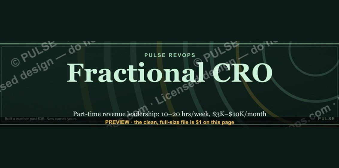 graphicFractional CRO — LinkedIn Banner
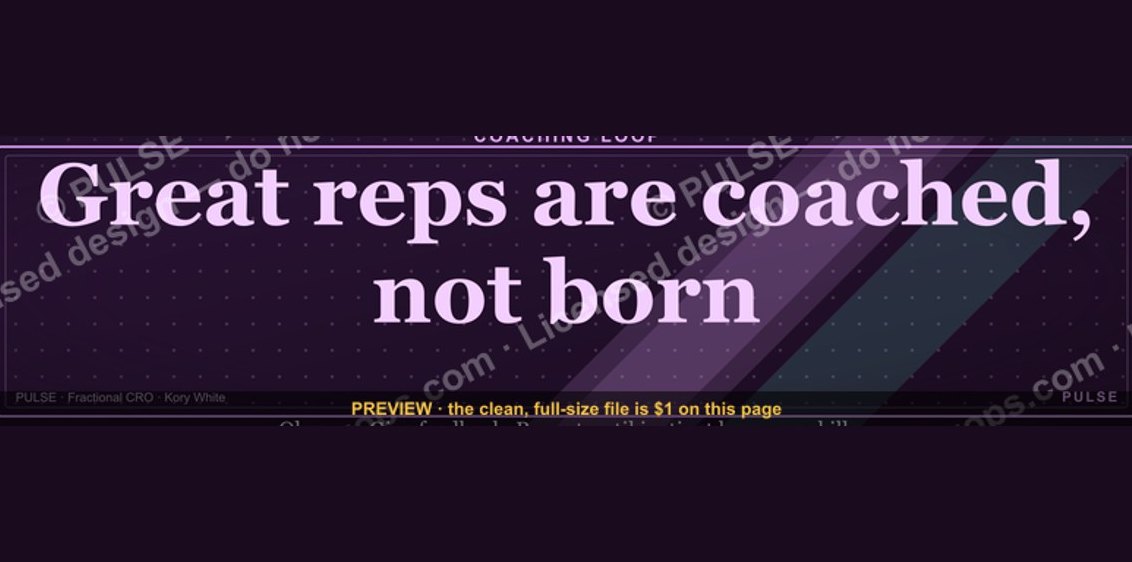 graphic“Great reps are coached, not born.” — LinkedIn Banner
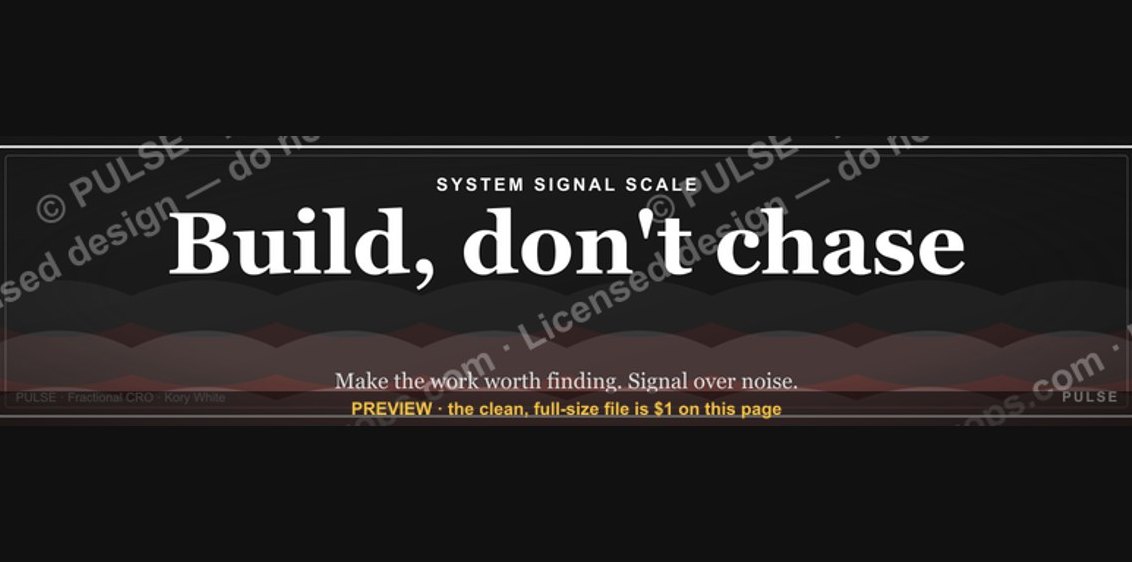 graphic"Build, don't chase." — LinkedIn Banner
 graphic“Sell things worth buying.” — LinkedIn Banner
 graphicHead of Sales — LinkedIn Banner
 graphicPipeline cures all. — LinkedIn Wallpaper
 graphicHow to build a champion seller playbook in 2027
 graphicSpeed to lead wins. — LinkedIn Wallpaper