


Synthetic Data Generator — LinkedIn Banner
Quality
Certified
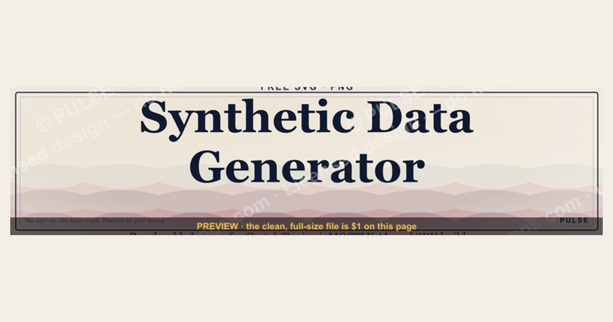
A synthetic data generator is a tool that produces artificial datasets which mimic the statistical structure of real data without exposing any real records — used for machine-learning training, software testing, and privacy-safe data sharing. This page is a free, recolorable LinkedIn banner for the engineers, data scientists, and RevOps teams who build with these tools. Popular real generators include Gretel, Tonic.ai, MOSTLY AI, and the open-source SDV (Synthetic Data Vault). Pricing spans free tiers (often capped at a few thousand rows or limited monthly generations) up to usage-based paid plans and custom enterprise contracts; several open-source options like SDV are free to self-host. Use the recolor tool below to match the banner to your brand, then download it as an SVG or PNG — no sign-up, no watermark.
Synthetic Data Generator — LinkedIn Banner

Banner for synthetic data engineers running Gretel, Tonic.ai, MOSTLY AI, or the open-source SDV (Synthetic Data Vault) for training-data augmentation and privacy-safe testing — recolor and download.
Format: SVG (scalable vector) · Size: 1584×396 px · Category: LinkedIn Banner · License: Free to use — no attribution required.
Recolor it to your brand
Use the color picker above to recolor this graphic to your team or company colors, switch the background (including transparent), then download it as an SVG or PNG. No sign-up, no watermark.
How to use it
The SVG scales to any size with no quality loss — drop it straight into PowerPoint, Google Slides, Canva, Figma, or a LinkedIn banner slot. The PNG export is ready to upload anywhere that wants a raster image.
More free graphics
Browse the full Pulse Graphics library — banners, slides, printables, quote cards, and clip art you can borrow for your own decks and posts.
Related on PULSE
- SIEM and Data Lake CRO — LinkedIn Banner
- “Data beats opinions.” — Quote Card
- "Data beats opinions." — LinkedIn Banner
- "Every no is data." — LinkedIn Banner
- Turn data into decisions. — LinkedIn Wallpaper
- Data beats opinions. — LinkedIn Wallpaper
Designing for Visual Hierarchy: What Your LinkedIn Banner Must Communicate at a Glance
A synthetic data generator banner competes with dozens of other visuals in a busy LinkedIn feed, and most people scan a profile cover for only a moment before deciding whether to engage. For a technical audience — data engineers, ML engineers, and product managers — the banner has to signal three things almost instantly: relevance, credibility, and value proposition.
A Clear Hierarchy for Technical Banners
The most effective banners layer information so the eye can resolve it in order:
- Primary visual hook: A clean, abstract data-flow graphic or a subtle grid pattern that suggests structured data generation. Avoid dense code snippets or busy flowcharts — they blur into noise at banner size (1584 × 396 pixels for LinkedIn profile covers).
- Core message: A short, bold headline — ideally four to seven words — that names the tool or approach. Examples: "Synthetic Data at Scale" or "Privacy-Preserving Generation." Use a sans-serif font with high stroke contrast (Inter, SF Pro, or Montserrat work well) at a weight that stays legible on mobile.
- Secondary context: A supporting tagline or a small icon set (a lock for privacy, a database for scale) that reinforces the purpose without competing with the headline — keep it lighter in weight and opacity.
Common Design Pitfalls
Most weak banners try to show too much. Avoid these patterns:
- Overlapping text on busy backgrounds: A gradient or neural-network pattern can look striking but often kills readability. Test the banner zoomed out to roughly a mobile-thumbnail size; if the headline is illegible there, simplify.
- Generic stock imagery: A blurry server-rack photo signals low effort. Prefer custom vector illustrations or abstract geometric patterns that reference synthetic data — a lattice of distributions or a stylized generator-discriminator loop.
- Too many CTAs: A banner is not a landing page. One clear call-to-action ("Try the API" or "Read the Whitepaper") beats several competing buttons.
Color Choices for Data-Focused Banners
Color sets the technical tone:
- Deep blues (#1A237E to #1565C0): Convey trust, stability, and rigor — a good fit for enterprise synthetic data tools.
- Teal/cyan (#00BCD4 to #0097A7): Suggest innovation and data flow; work well for generative models.
- Warm accents (amber #FFB300 or coral #FF5252): Use sparingly for CTAs or highlights — they draw the eye but overwhelm if overused.
- Dark-mode compatibility: Many people browse LinkedIn in dark mode, so make sure a light text layer stays readable against dark backgrounds. Preview the banner on both a white and a dark profile page.
A strong synthetic data banner should read like a clean technical white-paper cover. If you can't tell what the tool does from the banner alone, the design needs simplification.
Integrating Brand Consistency: Aligning the Banner with Your Visual Identity
Your LinkedIn banner is often the first visual a potential client or collaborator sees. For a synthetic data generator product, consistency with your website, docs, and social graphics builds trust and lowers cognitive friction. A banner that looks disconnected from the rest of your brand can erode credibility even when the product is excellent.
A Brand-Consistency Checklist
Before finalizing, verify these five elements:
- Logo placement and sizing: Place the logo in a natural scanning zone (top-left or bottom-right) and keep it balanced in size. Never stretch or distort it — maintain the original aspect ratio.
- Typography alignment: Use the same font family as your site's headings. If your brand uses Inter for headlines, don't switch to Roboto on the banner.
- Color-palette adherence: Pull colors directly from your style guide and use the exact hex values; even small shifts can make a banner feel off-brand.
- Visual-style continuity: Match your established style — flat illustrations, isometric icons, or photography. A sudden shift creates a disconnect.
- Tone and messaging: Keep the headline's tone consistent with your company page. If your brand is formal ("Enterprise-Grade Synthetic Data"), don't drop into casual copy on the banner.
Adapting Your Brand to the Banner Format
Banners have tighter constraints than web pages. Adapt without breaking consistency:
- Condense the value proposition: A site sentence like "Generate high-fidelity synthetic data for ML while preserving privacy and statistical accuracy" becomes "Privacy-First Synthetic Data" on a banner. Keep the core promise intact.
- Use brand patterns or textures: Incorporate a signature pattern (a dot grid, a diagonal stripe) as a low-opacity background element to reinforce recall without overwhelming the message.
- Protect breathing room: Saturated brand colors can feel heavy at banner scale. A subtle dark overlay behind text preserves readability while keeping your brand color.
When to Bend the Rules — and When Not To
Some deviations are legitimate:
- Campaign banners: Promoting a whitepaper, webinar, or launch can justify a distinct accent or temporary tagline — as long as the logo and core type stay consistent.
- Event-driven designs: A banner for a conference like NeurIPS can use a bolder visual style while still reading as the same brand.
- A/B tests: When testing, change one element at a time (CTA color or headline wording) so you isolate the variable and keep the rest consistent.
Never bend on logo placement, primary font, or core brand colors — those are your visual anchors. Consistency across touchpoints is what turns a banner into recognition, and for a synthetic data product, where trust in data quality and privacy is everything, that consistency reads as reliability.
Technical Considerations for Banner Export and Performance
A banner that looks perfect in Figma or Photoshop can fall apart on LinkedIn due to compression, color shifts, or sizing. This step is easy to overlook but directly affects how the banner is perceived.
Export Settings for LinkedIn Banners
LinkedIn applies its own compression to uploads, which can degrade quality. These settings hold up best:
- File format: Use PNG for banners with text, logos, or sharp edges. JPEG is acceptable for photographic backgrounds but introduces artifacts around text.
- Resolution and dimensions: Export at exactly 1584 × 396 pixels (the standard LinkedIn profile cover). Don't export larger expecting LinkedIn to downscale cleanly — it can add blur. Company-page cover images use a 1128 × 191 area.
- Color space: Export in sRGB. Wider spaces like Adobe RGB or ProPhoto RGB look dull or washed out after conversion.
- Bit depth: 8-bit per channel is plenty; 16-bit files are larger and get compressed harder.
- File size: Keep it small. Heavier files are compressed more aggressively, which shows as visible artifacts — tools like TinyPNG or ImageOptim reduce size with little visible loss.
- DPI: 72 DPI is standard for screen. Higher DPI doesn't improve on-screen quality on LinkedIn; it only inflates the file.
Placement and Safe Zones
LinkedIn's banner area has a few hidden constraints:
- Profile-picture overlap: On personal profiles, the circular avatar overlaps the lower-left of the banner. Keep critical text and logos clear of that corner so nothing important is hidden.
- Mobile cropping: LinkedIn crops banners more tightly on mobile, trimming the top and bottom edges. Keep headlines and logos in the vertical center rather than near an edge.
- Company-page differences: Company covers use a different crop and overlay the company name. Preview on both a personal profile and a company page before finalizing.
- Text minimum size: Small text becomes illegible on mobile thumbnails. Favor a large headline and keep secondary text comfortably readable.
Testing Your Banner Across Devices
Before you commit the banner to your profile, preview it in the three contexts where it will actually be seen: desktop web, the LinkedIn mobile app, and a zoomed-out thumbnail in the feed. Check that the headline stays legible at thumbnail size, that nothing critical sits under the avatar or in the mobile crop zone, and that colors hold up in both light and dark mode. A quick test upload to your own profile — viewed and then removed — is the most reliable preview, because it shows you LinkedIn's real compression rather than a simulation. If the banner reads clearly in all three views, it's ready to ship.
Sources
- LinkedIn Help — Profile and Page cover image specifications. Official guidance on supported banner dimensions and image requirements. https://www.linkedin.com/help/linkedin
- NIST — De-identification and synthetic data research. U.S. National Institute of Standards and Technology guidance on synthetic data, privacy, and disclosure risk. https://www.nist.gov
- MIT Technology Review — coverage of synthetic data trends, ethics, and industry use cases. https://www.technologyreview.com
- IEEE Spectrum — reporting on synthetic data methods, privacy, and applications in machine learning. https://spectrum.ieee.org
- DataCebo / Synthetic Data Vault (SDV) — open-source synthetic data documentation. Reference for schema definition, model training, and fidelity/privacy evaluation. https://docs.sdv.dev
- Google Research Blog — techniques for synthetic data generation and real-world deployment. https://research.google/blog
FAQ
What is a synthetic data generator? It's a tool that creates artificial datasets which preserve the statistical patterns of real data — distributions, correlations, formats — without containing any real records. Teams use it to train and test machine-learning models, build demo environments, and share data safely when the original is sensitive or restricted.
Why would I want a synthetic data generator banner on LinkedIn? If you work in data engineering, ML, or RevOps, the banner signals your focus at a glance and gives your profile a clean, on-topic visual. It's a free, recolorable graphic you can match to your brand and reuse in decks and posts.
Is synthetic data as useful as real data? For many tasks — model prototyping, load and edge-case testing, and privacy-safe sharing — high-quality synthetic data is very effective and can stand in for real records. Its usefulness depends on the generator's fidelity; you should validate that the synthetic set reproduces the relationships your downstream task relies on before trusting it in production.
Do I need technical skills to use a synthetic data generator? It varies. Hosted tools like Gretel, Tonic.ai, and MOSTLY AI offer largely no-code or low-code workflows where you connect a source, set constraints, and generate. Open-source libraries such as SDV are used in Python and assume some coding comfort.
Is synthetic data safe from privacy and legal issues? When generated well, synthetic data contains no real personal information, which helps reduce exposure under regimes like GDPR and CCPA. It is not automatically risk-free, though — poorly configured generators can leak or memorize real records, so reputable tools include privacy and disclosure-risk checks you should run before sharing.
How much does a synthetic data generator cost? It ranges widely. Open-source options like SDV are free to self-host. Hosted platforms typically offer a limited free tier and then move to usage-based paid plans, with larger volumes and advanced privacy features handled through custom enterprise pricing. Always confirm current pricing and tier limits directly with the vendor, since plans change.
This page will be disappearing soon. Save it to your device for $1 — or read it free while it is here.
@Kory-White- · if Venmo asks, the last 4 of my number are 2012
This page is gone.
This one is off the shelf now. $1 keeps it on your phone for good — the whole page, pictures and diagrams included.
 graphic“More pipeline, less panic.” — LinkedIn Banner
 graphic“Ready to lead a sales team.” — LinkedIn Banner
 graphicWhat do top-performing graphic designers do differently in 2027?
 graphicAI Legal Operator — LinkedIn Banner
 graphicOffensive Security Pentest CRO — LinkedIn Banner
 graphic"Pipeline is the product." — LinkedIn Banner
 graphicProduct Marketing Lead — LinkedIn Banner
 graphic“Trusted advisor, never a vendor.” — LinkedIn Banner
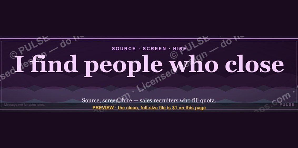 graphicSales Recruiter — LinkedIn Banner
 graphic“Process over pressure.” — LinkedIn Banner