


AI Image Engineer — LinkedIn Banner
Quality
Certified
An AI Image Engineer designs, fine-tunes, and deploys generative models—such as diffusion-based systems or GANs—to produce custom visual content. Their LinkedIn Banner should signal both technical depth and creative range. The most effective banners pair a clean 1584×396 pixel canvas with subtle generative imagery, a concise title, and a color palette that balances computational precision with artistic sensibility.
The Two Core Banner Approaches Compared
When an AI Image Engineer sets out to design a LinkedIn Banner, two dominant strategies emerge. Each approach carries distinct trade-offs in production effort, visual impact, and alignment with different career goals. Understanding both options before opening a design tool will save hours of iteration and produce a banner that actually supports the profile's objective.
Approach One: The Portfolio Showcase Banner. This banner leads with 2-4 generated images arranged in a triptych or grid format. The images themselves become the primary visual statement, demonstrating the engineer's aesthetic range and technical capability before a single word is read. This approach works exceptionally well for engineers whose work is visually striking—think surreal landscapes, architectural renders, or stylized product mockups. The banner essentially functions as a miniature gallery, inviting the viewer to click through to the full portfolio. Production time is moderate: you need to select, crop, and arrange your best outputs, then overlay minimal text. The main risk is visual clutter. Too many images, or images with conflicting color temperatures, can make the banner feel chaotic rather than curated.
Approach Two: The Technical Identity Banner. This approach favors abstraction and symbolism over direct portfolio samples. Instead of showing finished images, the banner incorporates visual cues of the engineering process itself—latent space visualizations, simplified model architecture diagrams, grid overlays, or subtle noise textures. The background might feature a faint U-Net schematic or a stylized diffusion process. This signals to technical recruiters that you understand the machinery behind the images, not just the outputs. It also ages better; a banner featuring a specific model's output can feel dated when that model is superseded, whereas a process-focused design remains relevant. Production time can be longer if you are creating custom diagrams, but many engineers find this approach more aligned with the "Engineer" half of their title.
The choice between these two approaches often comes down to the engineer's current career stage. Early-career professionals benefit from the Portfolio Showcase because it provides immediate proof of capability. Senior engineers and those moving toward research roles often prefer the Technical Identity approach, as it communicates depth and systems thinking. A hybrid is also viable: a large background image from your own model, overlaid with a subtle architecture diagram in a corner. This combines the best of both worlds but requires careful composition to avoid a busy result.
How to Decide Between Portfolio Showcase and Technical Identity
The decision matrix below weighs the factors that matter most when choosing a banner direction. Consider your target roles, the quality of your existing portfolio, and the visual consistency of your work.
A practical heuristic: if you can look at your last ten generated images and identify a consistent style or color palette, the Portfolio Showcase approach will serve you well. If your work is experimental and spans many genres, the Technical Identity banner provides a more coherent brand signal. Also consider your target audience. Recruiters scanning for "AI Image Engineer" keywords may respond more to a clean, professional banner with clear text. Peers and technical hiring managers may appreciate the subtlety of a process-focused design. The banner should ultimately make the right people want to click into your experience section.
Concrete Numbers Behind Each Option
The LinkedIn Banner canvas is fixed at 1584×396 pixels, but the visible area varies dramatically across devices. These numbers matter for both banner approaches.
Desktop visibility. On a standard 1920×1080 monitor, the full banner is visible. Your profile photo overlaps the bottom-left corner by roughly 150×150 pixels. This overlap zone is where your name and title would be obscured if placed carelessly. The safe text zone on desktop is the upper-left to center-left region, extending about 60% of the banner's width. The right two-thirds of the canvas is completely unobstructed, making it prime real estate for your primary visual element—whether that is a portfolio image or an architecture diagram.
Mobile visibility. On the LinkedIn mobile app, the banner renders at approximately 640×160 pixels. This is a 4x reduction in linear dimensions. Text that was 48px tall on the original canvas becomes roughly 12px on mobile—still readable, but only just. The profile photo overlap on mobile covers a larger proportional area of the bottom, sometimes obscuring the lower 40% of the banner. Critical information must therefore live in the upper 60% of the canvas. This constraint applies equally to both banner approaches.
Thumbnail visibility. In LinkedIn search results and the "People Also Viewed" sidebar, your banner appears at about 200×50 pixels. At this size, individual images within a triptych become indistinguishable. Only large shapes and high-contrast elements remain visible. This is why the Portfolio Showcase approach requires images with strong silhouettes and bold color blocks—a delicate pastel landscape will simply vanish at thumbnail scale. The Technical Identity approach, with its bold background gradients and simple shapes, often performs better in this context.
Text sizing rules. For any text in your banner, adhere to these minimums: your name should be 60-72px on the original canvas, your title 36-48px, and any secondary text 24-32px. Below 24px, text becomes illegible on mobile and should be avoided entirely. If you are including a tagline or keyword, place it in the upper-right quadrant where it remains visible across all device contexts. A practical test: view your banner on a phone and in desktop search results before finalizing. If you cannot read your name in both contexts, enlarge it.
Implementation Details and Sequencing
Creating a polished LinkedIn Banner for an AI Image Engineer involves a specific sequence of steps. Following this order prevents common mistakes and ensures the final output meets LinkedIn's technical requirements.
Step 1: Asset selection. For the Portfolio Showcase, select 2-4 images that share a color temperature and compositional style. Crop them to consistent aspect ratios—a 4:3 or 1:1 ratio works well within the wide banner format. For the Technical Identity approach, gather or create your process visuals: a simplified U-Net diagram, a diffusion schedule plot, or a latent space interpolation sequence. Ensure these visuals are high-resolution and will remain crisp at the banner's 1584px width.
Step 2: Canvas setup. Create your canvas at exactly 1584×396 pixels. Do not work at a smaller size and upscale—this introduces blur. If you are using Figma, Canva, or Photoshop, set the canvas dimensions explicitly. Design at 2x resolution (3168×792) if you want extra sharpness on retina displays, then export at the standard size.
Step 3: Background layer. Choose a dark neutral background—#1a1a2e, #16213e, or #0f0f1a are common choices among AI engineers. Dark backgrounds make vibrant generated images pop and reduce visual fatigue. Add a subtle grid overlay or noise texture at 5-10% opacity to evoke computational depth. Avoid pure black, which can look flat, and avoid busy patterns that compete with your primary visual.
Step 4: Primary visual element. Place your main image or diagram in the right two-thirds of the canvas. If using a single image, apply a subtle gradient overlay (black to transparent) on the left edge to create a smooth transition into the text area. This gradient also ensures text legibility if you place any text over the image. For the Technical Identity approach, position your architecture diagram in the center-right, sized at 40-50% of the banner height.
Step 5: Text overlay. Place your name in the upper-left or center-left, outside the profile photo overlap zone. Use a geometric sans-serif font—Inter, Space Grotesk, or SF Pro—at 60-72px. Below your name, add your title at 36-48px. Keep the title concise: "AI Image Engineer" is ideal. Add one keyword like "Diffusion" or "GANs" at 24-32px in the upper-right quadrant if you want to reinforce your specialty. Ensure text contrast is high: white or light gray on dark backgrounds.
Step 6: Secondary elements. Consider adding a small QR code in the lower-right corner linking to your Hugging Face, GitHub, or personal portfolio. Size it at 80-100px—large enough to scan but small enough to avoid dominating the composition. Add a subtle personal watermark, such as your initials, in a corner at 20-24px opacity. This reinforces brand recall without distracting.
Step 7: Export and test. Export your banner as a PNG at 1584×396 pixels. If you are using an SVG workflow, ensure the SVG renders correctly at raster sizes. Upload the banner to LinkedIn, then view your profile on desktop, mobile, and in search results. Verify that your name is readable in all three contexts. If not, return to the design and enlarge text or simplify the background until it passes.
Related questions
What tools do AI Image Engineers use to generate images?
AI Image Engineers commonly use Stable Diffusion, DALL-E, Midjourney, and Flux for generation, with Hugging Face Diffusers and ComfyUI for fine-tuning and workflow automation. PyTorch is the standard framework for training custom models. The specific toolset depends on whether the engineer focuses on research, production pipelines, or client work.
How does a LinkedIn banner impact an AI Image Engineer's job search?
A LinkedIn Banner is the first visual element recruiters see, occupying roughly 60% of the above-the-fold screen real estate on desktop. A well-designed banner communicates technical competence and creative range before a profile is clicked. It also signals attention to detail—a valuable trait for roles involving visual output.
Should the banner include sample AI-generated images?
Yes, but selectively. Two to four high-quality, stylistically consistent images arranged in a triptych format demonstrate capability without overwhelming the viewer. A single striking image with a gradient overlay can be equally effective. Avoid collages of disjointed outputs, which dilute the brand signal and become unreadable at thumbnail size.
What is the ideal text length for an AI Image Engineer banner?
Keep text minimal: your name and a concise title like "AI Image Engineer" or "Generative AI Engineer." Add one keyword—"Diffusion," "GANs," or "Computer Vision"—if space allows. Total text should not exceed five words beyond your name. Longer text becomes unreadable on mobile and clutters the visual hierarchy.
How often should an AI Image Engineer update their LinkedIn banner?
Update your banner whenever your portfolio undergoes a significant shift—new model capabilities, a new specialization, or a rebrand. A banner featuring outdated model outputs can feel stale. Quarterly reviews are a good practice, but avoid frequent changes that undermine brand recognition.
FAQ
What does an AI Image Engineer do? An AI Image Engineer designs and optimizes AI models that generate, edit, or analyze images. They work with tools like diffusion models, GANs, or neural style transfer to produce visual content for industries such as advertising, gaming, or design. Their work spans model training, fine-tuning, and deployment.
What skills are needed for this role? You typically need proficiency in Python, deep learning frameworks like PyTorch or TensorFlow, and experience with computer vision libraries. Familiarity with image generation pipelines, model fine-tuning, and prompt engineering is also important. Version control with Git and collaboration tools like Jupyter notebooks are standard.
What kind of projects might an AI Image Engineer work on?
Projects can range from creating custom image generators for product mockups to developing real-time image editing tools. They might also work on style transfer, image restoration, or building AI art assistants. Production-focused engineers often build APIs that serve generated images at scale.
Is a degree required to become an AI Image Engineer? Many roles prefer a bachelor's or master's in computer science, AI, or a related field, but strong portfolios and relevant project experience can sometimes substitute. Self-taught engineers with demonstrable skills are increasingly common in the field, particularly in roles that emphasize practical output over research credentials.
What tools or platforms are commonly used? Common tools include Hugging Face's Diffusers, Stable Diffusion, DALL-E APIs, and cloud platforms like AWS or Google Cloud for model training. ComfyUI and Automatic1111 are popular for workflow automation. Version control with Git and collaboration tools like Jupyter notebooks are also standard.
What is the typical salary range for this role? Salaries vary widely by location and experience, but entry-level roles might start around $70,000–$90,000, while senior engineers can earn $130,000–$180,000 or more in tech hubs. Freelance rates often range from $50–$150 per hour depending on project complexity and client demand.
Sources
- LinkedIn Help Center — Profile Photo and Banner Dimensions
- Adobe Creative Cloud — Social Media Banner Best Practices
- Canva Design School — LinkedIn Banner Size and Design Tips
- Google Fonts — Inter and Space Grotesk
- Shutterstock Blog — Color Theory for Social Media Imagery
- HubSpot Blog — Personal Branding on LinkedIn
Related on PULSE
This page will be disappearing soon. Save it to your device for $1 — or read it free while it is here.
@Kory-White- · if Venmo asks, the last 4 of my number are 2012
This page is gone.
This one is off the shelf now. $1 keeps it on your phone for good — the whole page, pictures and diagrams included.
 graphic“Stay in the deal.” — LinkedIn Banner
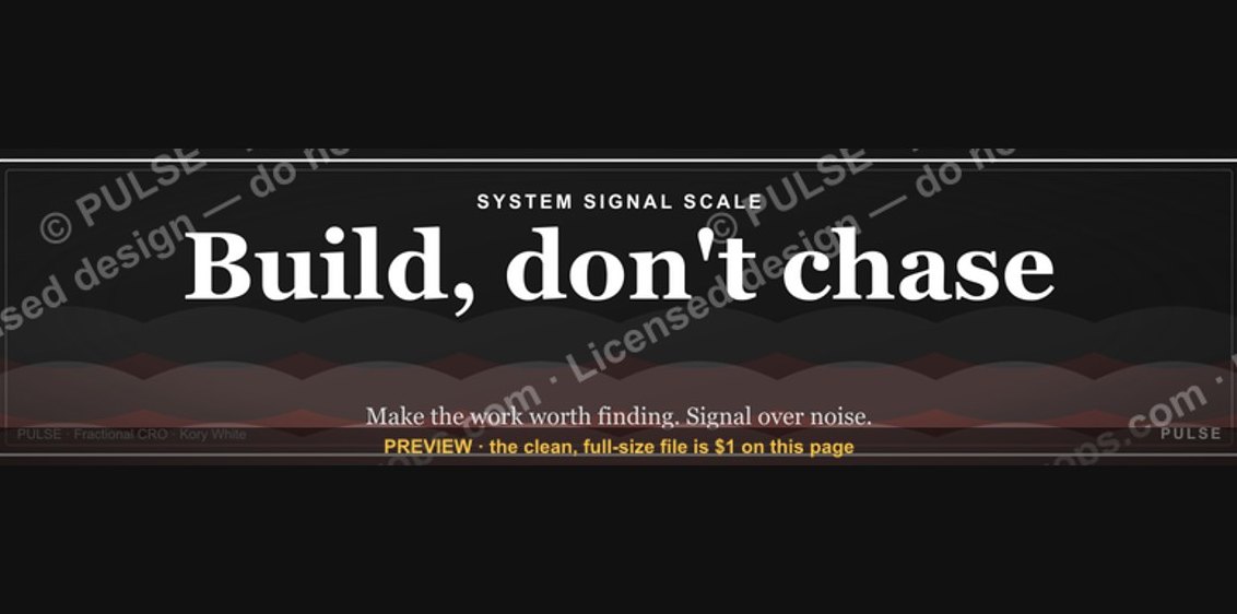 graphic"Build, don't chase." — LinkedIn Banner
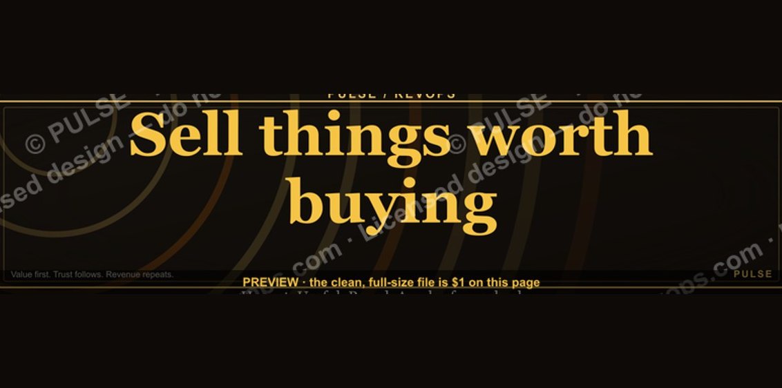 graphic“Sell things worth buying.” — LinkedIn Banner
 graphic“Process over pressure.” — LinkedIn Banner
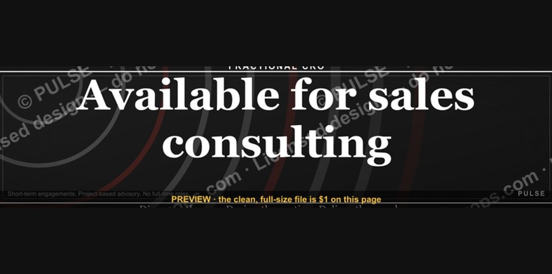 graphic“Available for sales consulting.” — LinkedIn Banner
 graphicHow do you build a Champions sell motion from scratch in 2027?
 graphicTrust compounds. — LinkedIn Wallpaper
 graphicLLM Builder AI Engineer — LinkedIn Banner
 graphic“Open to sales leadership roles.” — LinkedIn Banner
 graphicHead of Sales — LinkedIn Banner