


AI Translation Engineer — LinkedIn Banner
Quality
Certified
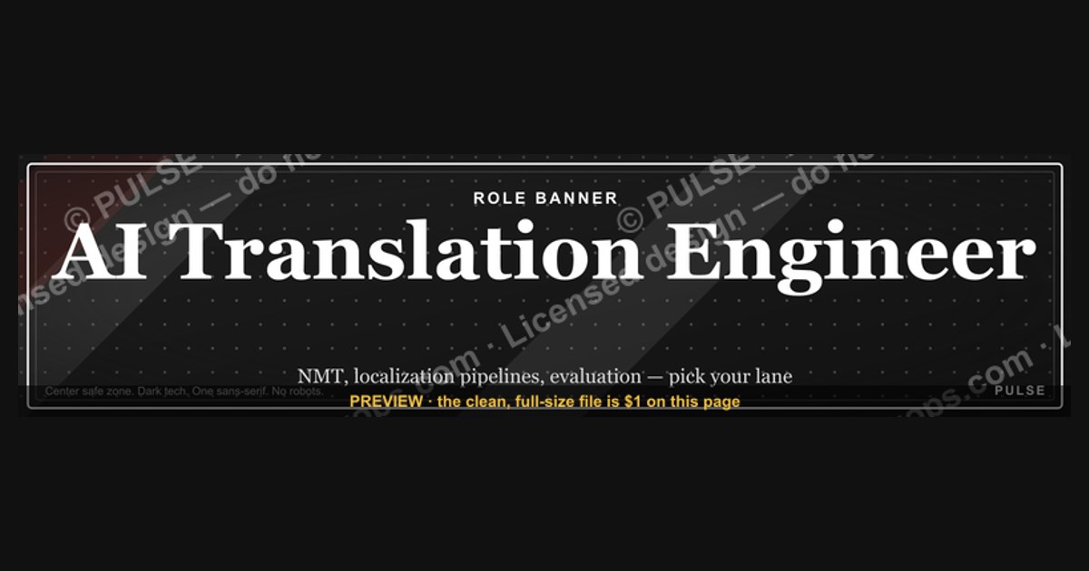
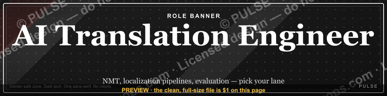
An AI Translation Engineer LinkedIn banner should state the role, name two or three concrete specialties like NMT, localization pipelines, or evaluation, and keep all critical text inside the center safe zone. Use a dark tech background, one sans-serif family, high contrast, and no stock robots. Clarity beats decoration every time.
What a role-specific banner actually is and why it matters
A LinkedIn banner is the 1584 × 396 pixel image that sits behind your profile photo at the top of your profile. Most people treat it as decoration — a sunset, a skyline, a stock photo of a laptop. For an AI Translation Engineer, that is a wasted slot. The banner is the only piece of your profile you fully control visually, and it renders above the fold on every device. Before a recruiter reads your headline, before they scroll to your experience, they have already seen the banner.
The distinction that matters is between a banner that decorates and a banner that disambiguates. "AI Translation Engineer" is an ambiguous title in the market right now. It can mean a machine learning engineer training or fine-tuning neural MT models. It can mean a localization engineer who wires translation APIs into a CI/CD pipeline and manages string extraction for a product shipping in twenty locales. It can mean an evaluation specialist who builds BLEU, chrF, and COMET scoring harnesses and runs human post-editing quality programs. It can mean someone standing up an LLM-based translation layer with prompt templates, glossary injection, and terminology enforcement. These are four different jobs with four different hiring managers, and the title alone does not tell them apart.
Your banner's job is to collapse that ambiguity in under two seconds. A line reading "Neural MT · Localization Pipelines · Quality Evaluation" does more work than any amount of glowing circuitry. It tells the reader which of the four roles you actually do, and it does so before they have decided whether to keep reading.
There is a second, quieter reason the banner matters: consistency across surfaces. The same visual system — same typeface, same accent color, same one-line positioning statement — can carry across your LinkedIn banner, your GitHub profile README header, your conference slide template, your Notion portfolio cover, and the header of a technical blog. Engineers who ship a recognizable visual identity get remembered across contexts. Someone who saw your talk at a localization meetup and later lands on your profile should recognize the same look. That is cheap brand equity and most technical people never build it.

The banner also functions as a filter. If you specialize in low-resource language pairs or regulated-domain translation, saying so on the banner reduces the volume of irrelevant recruiter outreach while increasing the relevance of what remains. A narrower banner produces fewer, better conversations. Most people optimize for volume and end up fielding requests for generic NLP roles that have nothing to do with translation.
Finally, the banner is a low-risk experiment surface. Unlike your headline or your About section, changing the banner has no algorithmic penalty and takes ninety seconds. You can test a positioning statement on the banner for a month, see what kind of inbound it produces, and swap it. Very few profile elements are that cheap to iterate on.
The step-by-step process for building one
Building a banner that survives both a 27-inch monitor and a phone screen is a sequence, not a single design act. Skipping steps is where most banners fail.
Step one — decide the single message. Write one sentence describing what you want a stranger to know after two seconds. Not three things. One. Examples: "I build production NMT systems for e-commerce." "I run the localization pipeline for a product shipping in 30 languages." "I evaluate and improve LLM translation quality in regulated domains." Everything else on the banner supports that sentence or gets cut.
Step two — pick the specialty tokens. Choose three to five short tokens that a domain reader recognizes instantly. Good candidates for this role: NMT, MT, NLP, L10n, i18n, CAT tools, TMS, post-editing, terminology, glossary management, BLEU/chrF/COMET, transformer fine-tuning, API integration. Bad candidates: "AI," "Machine Learning," "Innovation," "Technology." The first set signals membership in a specific professional community. The second set signals nothing.
Step three — set the canvas and the safe zone. Build at 1584 × 396 pixels, or at 2x (3168 × 792) if you want extra crispness on high-DPI displays and will export down. Then draw two guide rectangles you will delete before export: one marking the lower-left region where your profile photo overlaps the banner on desktop, and one marking the roughly center 50% horizontal band that survives mobile cropping. Nothing load-bearing goes outside that band, and nothing load-bearing goes under the photo.
Step four — lay out the type. Name or primary title in the upper-left or center-left, weight 600–700, sized so it reads at a glance. Specialty tokens beneath it at roughly 40–50% of the title size, lighter weight, with modest letter-spacing to keep them from clumping. If you add a third line — a URL, a location, a "open to X" note — it goes smaller still and further down.
Step five — choose the palette. Two colors plus a neutral is enough. A near-black or deep navy field, white or near-white type, and one accent used sparingly on a rule, an underline, or the token row. Resist gradients that run behind text; they wreck contrast unpredictably across the width.
Step six — add texture, not imagery. A faint grid, a subtle hex lattice at very low opacity, or a soft vignette adds depth without competing with the type. Photographic imagery almost always loses at this aspect ratio because 396 pixels tall crops everything into an unreadable strip.

Step seven — export and test both crops. Export PNG for photographic or textured backgrounds, or upload a rasterized version of an SVG if your design is purely vector. Then actually look at it: upload to LinkedIn, view the profile on desktop, then on the mobile app, then in a feed context where your profile card appears. Screenshot both. Fix what breaks.
Step eight — version it. Keep the source file. You will change specialties, add a certification, or move companies. A banner you can edit in ten minutes gets updated; a banner someone else made in a tool you no longer have access to gets left stale for three years.
Costs, timelines, and what the options actually run
The realistic range here is wide because the work can be done four different ways, and the right answer depends on how much design judgment you already have.
Template route — free to low cost, 20 to 60 minutes. Canva, Figma Community files, and various free SVG libraries all carry LinkedIn banner templates at the correct dimensions. You swap the text, adjust the palette, export. Free tiers cover this entirely. The trade-off is recognizability: popular templates show up on thousands of profiles, and anyone who spends time on LinkedIn starts to notice. Mitigate it by changing the palette aggressively and replacing the default typeface — those two changes make a template unrecognizable to almost everyone.
Do-it-yourself in Figma — free, 2 to 4 hours the first time. Figma's free tier handles this comfortably. Budget the first attempt at two to four hours because you will spend most of it learning the safe zone constraints the hard way. Every subsequent version takes fifteen minutes. This is the best return for anyone who expects to iterate, and it gives you a source file you actually own.

Vector SVG you recolor — free, 10 to 30 minutes. If you start from a well-built SVG with named color variables, recoloring to a brand palette and swapping text is genuinely fast. The advantage over raster templates is that vector scales without quality loss, so the same asset works as a banner, a slide header, and a printed one-pager. The constraint is that heavily illustrated SVGs are hard to edit without vector tooling experience.
Hired designer — highest cost, 3 days to 2 weeks. Freelance marketplaces run from budget tiers to established brand designers, with the spread being roughly an order of magnitude. Timelines depend far more on revision rounds than on production time. This is worth it if the banner is part of a broader personal-brand system — conference deck, site header, one-pager, social cards — where you want one designer producing a coherent set. It is overkill for a single banner.
Hidden costs worth naming. Font licensing matters if you use a commercial typeface on anything that touches paid work; open families like Inter, Roboto, Source Sans, and IBM Plex avoid the question entirely. Stock imagery licensing matters if you use a photo, and free-tier stock often carries attribution or usage restrictions people ignore and later regret. Neither cost is large, but both are real.
Maintenance timeline. Plan to revisit the banner whenever your role changes, whenever you add a credential you want visible, and otherwise roughly annually. A banner that says "Machine Translation Engineer" while your current title is "Staff AI Engineer, Localization Platform" creates a small credibility gap that costs nothing to close.
Opportunity cost is the real number. A banner is a two-hour investment with a multi-year lifespan on the single most-viewed pixel real estate you control professionally. Compared with almost anything else on a profile, the return is high. It is also the kind of task that expands to fill whatever time you give it, so set a two-hour cap on version one and ship it.
Where engineers get this wrong
Cramming the résumé in. The most common failure is treating the banner as a second headline. Five lines of text, a list of eight tools, a certification block, contact details, and a QR code. At 396 pixels tall, all of it renders small, and small text at low contrast on a busy background is unreadable on mobile. If a viewer has to squint, they scroll. Three lines maximum. Two is usually better.
Ignoring the profile photo overlap. Your circular profile photo sits over the lower-left of the banner on desktop and shifts position on mobile. Designs centered on the left half get partially eaten. Test with an actual profile photo in place, not a mockup that omits it.
Stock robot imagery. Glowing blue brains, humanoid robots at keyboards, and circuit-board overlays read as generic AI content, not as an engineer with specific expertise. They also date badly — the visual language of "AI" in stock photography turns over every couple of years, and last cycle's imagery looks conspicuously stale. Abstract geometry and typography age far better.
Flag icons for languages. This one is specific to translation and it is a real professional signal. Languages are not countries. Spanish is not one flag. Arabic is not one flag. English is not one flag. Localization professionals notice immediately, and using flags as language markers marks you as someone who has not worked seriously in the field. Use ISO language codes or written language names instead.
Unverifiable metrics. "10M+ words processed" or "50+ language pairs" is compelling if true and defensible if asked about in an interview. If it is an estimate you cannot substantiate, leave it off. Interviewers do ask, and a number you cannot explain costs more than the number gained.
Reproducing certification logos. Official marks from certifying bodies and cloud providers usually have brand guidelines governing reproduction. A text treatment — the credential name in your own typeface — avoids the issue and looks cleaner anyway.
Low contrast for the sake of aesthetics. Mid-gray text on a dark gradient looks sophisticated in a design tool at 200% zoom and disappears on a phone in daylight. Aim for genuinely high contrast on any text that carries meaning. If you want a subtle element, make it a non-textual one.
Animation that fights the message. LinkedIn supports some animated formats, but movement on a professional profile competes with the content rather than supporting it. If you use motion, keep it barely perceptible and confined to a small area — and be honest about whether it earns its place.
Set-and-forget. A banner from a previous role, listing tools you no longer use, contradicts the rest of your profile. Small inconsistencies compound into a general impression of inattention.
Designing for peers instead of recruiters. A banner packed with insider references and framework names impresses other MT engineers and confuses the recruiter who is actually deciding whether to reach out. Write for a technically literate non-specialist: someone who knows what machine translation is but could not name the difference between chrF and COMET.
Choosing the right approach for your situation

There is no single correct banner, but there is a fairly reliable decision path. It hinges on three questions: what are you optimizing for, how much design capability do you have, and how often will this change.
If you are actively job hunting, optimize for legibility and specificity. Role title, three specialty tokens, and — if you want it — a discreet availability line. Skip texture, skip clever metaphor, skip anything that requires interpretation. Recruiters scan dozens of profiles in a sitting; the banner that gets a response is the one that answers "what does this person do" without effort. This is also the case where you should include the specialty tokens that match the job descriptions you are targeting, in the vocabulary those descriptions use.
If you are building an audience — posting about MT quality, publishing evaluation work, speaking at localization events — optimize for memorability and consistency. Here a distinctive palette and a reusable visual motif earn their keep, because the banner is one instance of a system that also covers your slide template, your post graphics, and your repo headers. Spend the extra hours in Figma; the reuse pays it back.
If you are consulting or freelancing, optimize for the offer. The banner should name what you sell and for whom: pipeline architecture, quality programs, vendor evaluation, LLM translation migration. A URL or a short call-to-action is more defensible here than on a salaried employee's profile, where it can read as noise.
If you are early career, optimize for direction. You may not have shipped a large NMT deployment yet, and claiming otherwise is a bad trade. What you can do is state the direction credibly: the subfield you are working in, the frameworks you use, the kind of problem you want to solve. Specific direction beats vague seniority.
On format: choose SVG when the design is pure vector — type, shapes, flat color — and you want it reusable across print and screen at any size. Choose PNG when there is photographic content, texture, or complex gradients. LinkedIn itself takes raster uploads, so SVG's value is in the source file and the downstream reuse, not the upload.
On build method: template if you need it today and will not iterate. Figma if you will iterate. Designer if the banner is part of a multi-asset brand system with real money attached to how it looks.
One broader note. The same reasoning applies to the adjacent surfaces most engineers neglect: the GitHub profile README header, the conference speaker bio image, the Notion or personal-site cover. Each has different dimensions and different crop behavior, but the underlying discipline is identical — one message, high contrast, safe zone respected, no stock robots. Build the LinkedIn banner well and you have effectively built a template for all of them.
Related questions
What size should a LinkedIn banner be?
1584 × 396 pixels is the standard personal profile banner dimension, a 4:1 ratio. Building at 2x and exporting down improves sharpness on high-DPI screens. Keep critical content in the center band, since mobile crops the edges and the profile photo overlaps the lower-left on desktop.
Should I use SVG or PNG for a LinkedIn banner?
Upload PNG — LinkedIn takes raster images. Keep SVG as your source when the design is pure vector, because it scales losslessly into slides, print, and site headers. If the banner includes photos, texture, or complex gradients, PNG is the right format end to end.
Do LinkedIn banners actually affect recruiter outreach?

A banner will not override a weak profile, but it disambiguates an ambiguous title fast. "AI Translation Engineer" spans NMT research, localization pipelines, and quality evaluation. Naming which one you do makes inbound more relevant, even if it does not make it more voluminous.
What should an AI Translation Engineer put on a banner instead of flags?
Use ISO language codes or written language names. Languages are not countries — Spanish, Arabic, and English each span many. Localization professionals read flag-as-language as a beginner signal, so codes or names are both more accurate and more credible to the audience that matters.
How often should I update my banner?
Whenever your role or core specialty changes, and otherwise about once a year. A banner naming a former title or a tool you no longer use creates a small credibility gap against the rest of your profile. Keeping the source file editable is what makes the update actually happen.
FAQ
What does an AI Translation Engineer actually do?
The title covers several adjacent jobs. Some build and fine-tune neural machine translation models. Some engineer the localization pipeline — string extraction, translation management system integration, continuous localization in CI/CD. Some focus on evaluation: automated metrics, human post-editing programs, terminology and glossary enforcement. Increasingly the role also covers wiring LLM-based translation into products with prompt templates and quality gating. Your banner should say which of these you do.
Should I include my headshot in the banner?

No. Your profile photo already sits over the banner, and adding a second image of yourself creates visual redundancy and clutter in a space that is only 396 pixels tall. Use the banner for information the photo cannot carry — your specialty, your positioning, your focus area.
Can I put a call to action or a URL on my banner?
It depends on your goal. For consultants and freelancers, naming an offer and a URL is coherent with the rest of the profile. For salaried engineers, a URL usually reads as noise and competes with the specialty information that does real work. If you include one, make it short and put it on the last line at the smallest size.
What typefaces work best for a technical LinkedIn banner?
Open-licensed sans-serif families are the safe choice: Inter, Roboto, Source Sans, IBM Plex Sans. They render cleanly at small sizes, carry no licensing questions, and read as contemporary without being trendy. A monospace family like JetBrains Mono or IBM Plex Mono works well for a short token row if you want a technical accent, but do not set body-length text in it.
Do I need design software to make one?
No. Browser-based tools with free tiers handle this fully, and prebuilt templates at the correct dimensions are widely available. Figma's free tier is the best option if you expect to iterate, because you keep an editable source file. The constraint is knowledge of the safe zone and contrast rules, not access to software.
How do I test the mobile crop before publishing?
Upload it, then view your own profile in the LinkedIn mobile app rather than trusting a design-tool preview. Screenshot both the desktop and mobile views and compare. Anything clipped, overlapped by the profile photo, or too small to read on the phone gets moved inward or scaled up, and you re-export.
Sources
- https://www.linkedin.com/help/linkedin — LinkedIn Help Center, official guidance on profile images and background photos
- https://brand.linkedin.com/ — LinkedIn Brand Guidelines, official rules on logo and brand mark usage
- https://www.w3.org/WAI/WCAG21/quickref/ — W3C WCAG 2.1 quick reference, including text contrast requirements
- https://fonts.google.com/ — Google Fonts, open-licensed typeface library including Inter, Roboto, and IBM Plex
- https://www.figma.com/community — Figma Community, free editable templates and design resources
- https://developer.mozilla.org/en-US/docs/Web/SVG — MDN Web Docs on SVG, format capabilities and scaling behavior
- https://www.gala-global.org/ — Globalization and Localization Association, industry standards and terminology
- https://www.atanet.org/ — American Translators Association, certification and professional credentials
- https://aclanthology.org/ — ACL Anthology, open archive of machine translation and NLP research
- https://cloud.google.com/translate/docs — Google Cloud Translation API documentation
Related on PULSE
This page will be disappearing soon. Save it to your device for $1 — or read it free while it is here.
@Kory-White- · if Venmo asks, the last 4 of my number are 2012
This page is gone.
This one is off the shelf now. $1 keeps it on your phone for good — the whole page, pictures and diagrams included.
 graphic“Available for sales consulting.” — LinkedIn Banner
 graphicInspect. Qualify. Commit. — LinkedIn Wallpaper
 graphicWhat do top-performing graphic designers do differently in 2027?
 graphic"Build, don't chase." — LinkedIn Banner
 graphicHow to build a champion seller playbook in 2027
 graphic“Trusted advisor, never a vendor.” — LinkedIn Banner
 graphic“Never give without a get.” — LinkedIn Banner
 graphic“Revenue for marketing tech.” — LinkedIn Banner
 graphicStay in the deal. — LinkedIn Wallpaper
 graphicBring the energy. — LinkedIn Wallpaper