


Deal Stage Progression Bar
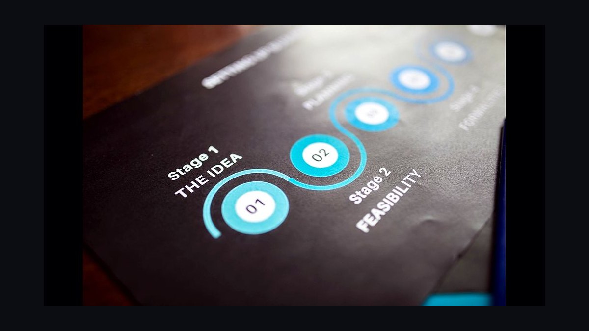
A deal stage progression bar is a visual tool that shows the current step a deal has reached within a defined sales pipeline, such as from "Lead" to "Closed Won." It typically displays a series of stages, with the active or completed stages highlighted to indicate progress. The number of stages can vary from 3 to 7 or more, depending on the sales process.
Deal Stage Progression Bar

Horizontal stage-progression bar showing deal distribution across 6 stages with deal counts.
Format: SVG (scalable vector) · Size: 1584×396 px · Category: Chart · License: Free to use — no attribution required.
Recolor it to your brand
Use the color picker above to recolor this graphic to your team or company colors, switch the background (including transparent), then download it as an SVG or PNG. No sign-up, no watermark.

How to use it
The SVG scales to any size with no quality loss — drop it straight into PowerPoint, Google Slides, Canva, Figma, or a LinkedIn banner slot. The PNG export is ready to upload anywhere that wants a raster image.

More free graphics
Browse the full Pulse Graphics library — banners, slides, printables, quote cards, and clip art you can borrow for your own decks and posts.
Related on PULSE
- Win Rate by Stage Bar Chart
- Churn by Segment Bar Chart
- Win Rate by Segment Bar Chart
- Growth Bar Chart Icon — Icon / Clip Art
- Deal Inspection Flow
- Win the deal then win the customer — CS Mindset Banner
Design Variations & Best Practices for Deal Stage Progression Bars
The standard horizontal progression bar is effective, but adapting its design to your specific sales process and audience can dramatically improve clarity and impact. Here are proven variations and implementation guidelines.
Color Psychology & Stage Mapping
Color choice isn't just aesthetic—it directly influences how viewers interpret progress. For a 6-stage deal progression bar, consider these proven color strategies:
Traffic-light progression (most common in enterprise SaaS): Use green-to-red or green-to-blue gradients where early stages appear in cool/neutral tones (e.g., gray, light blue) and later stages shift to warmer, more urgent colors (amber, orange, green). This naturally signals "closer to close = more important." A typical mapping: Stage 1 (light gray) → Stage 2 (slate) → Stage 3 (teal) → Stage 4 (blue) → Stage 5 (amber) → Stage 6 (green). This works because the human eye instinctively prioritizes warm colors as "action needed."
Risk-reverse palette (used by high-velocity sales teams): Invert the gradient—start with green (many deals, low risk) and transition to red (few deals, high risk). This highlights pipeline thinness at late stages. For example: Stage 1 (forest green) → Stage 2 (lime) → Stage 3 (yellow) → Stage 4 (orange) → Stage 5 (red-orange) → Stage 6 (crimson). This is particularly effective when presenting to executives who need to see where deals stall.
Category-based coloring (for multi-product or multi-segment pipelines): Assign distinct hues to different deal types within the same bar. For instance, use blue shades for new business, purple for expansions, and gold for renewals. Each stage segment then contains stacked sub-segments in these colors. This requires careful legend design but provides rich insight without multiple charts.
Accessibility considerations: Always test your palette for colorblind accessibility (Deuteranopia and Protanopia affect ~8% of males). Tools like Coblis or Stark plugin can simulate this. Avoid relying solely on red-green distinctions—add patterns, icons, or text labels. A safe fallback: use a single-hue gradient (e.g., light blue to dark navy) with varying opacity and add stage numbers inside each segment.
Advanced Data Overlays & Interactivity
Static bars show distribution, but adding layered data transforms them into decision-support tools. Consider these enhancements:
Weighted value vs. count bars: A single bar showing deal count can mislead—a stage with 20 small deals may appear healthier than a stage with 3 enterprise deals worth 10x more. Create a dual-bar visualization: one bar for deal count (using lighter shades) and a second identical bar directly below showing total weighted pipeline value (using darker shades or a different hue). Label each segment with both metrics. For example: "Stage 3: 12 deals ($340K)" vs. "Stage 3: $340K (12 deals)." This prevents the common mistake of optimizing for volume over value.
Velocity indicators: Add small arrows or sparklines above each stage segment showing the 30-day trend. A green upward arrow means deals are entering faster than exiting; red downward means stagnation. This turns a static snapshot into a directional tool. You can encode this as a tiny line graph (3-5 data points) positioned above each stage label, using the same color as the stage but with 50% opacity.
Probability-weighted bars: Overlay a semi-transparent second bar on top of the first, where the height represents expected close value (deal value × stage probability). For example, if Stage 4 has 80% probability, the overlay bar reaches 80% of the full bar height. This creates an immediate visual of "realistic" vs. "optimistic" pipeline. Use a diagonal line pattern or dotted fill for the overlay to distinguish it from the solid base bar.
Hover states for digital reports: If this bar appears in a dashboard or slide deck that will be viewed on screens, add tooltip functionality. Each segment should reveal: deal count, total value, average deal size, days-in-stage (median), and stage conversion rate to next stage. This eliminates the need for separate data tables. For PDF exports, include a static footnote table with these metrics.
Common Mistakes & How to Avoid Them
Even experienced teams make errors that undermine the bar's utility. Here are the most frequent pitfalls and their fixes:
Mistake 1: Unequal stage widths that mislead. If you set segment widths proportional to deal count, a wide early stage may look "healthy" when it's actually bloated with unqualified leads. Fix: Use equal-width segments (each stage gets 1/6th of the bar) and vary only the color intensity or fill pattern to show volume. Alternatively, use a logarithmic scale if deal counts span orders of magnitude (e.g., 500 leads vs. 5 closed-won). Label each segment with the actual count to avoid deception.
Mistake 2: Ignoring stage definition drift. Sales teams often redefine stage criteria mid-quarter, making historical comparisons invalid. Fix: Add a small "as of [date]" label and a footnote defining each stage's criteria (e.g., "Stage 3: Demo completed, budget confirmed"). If stages changed, use a dashed line to indicate the old boundary and annotate the change date.
Mistake 3: No context for "normal" distribution. A bar showing 40% of deals in Stage 1 might be fine for a new product launch but disastrous for an established line. Fix: Include a reference line or shaded zone showing the ideal distribution range for your business model. For example, a B2B SaaS with a 90-day sales cycle might target: Stage 1 (20-30%), Stage 2 (15-25%), Stage 3 (10-20%), Stage 4 (10-15%), Stage 5 (5-10%), Stage 6 (5-10%). This turns the bar into a diagnostic tool, not just a report.
Mistake 4: Overcrowding with too many stages. Six stages is standard, but some teams use 8-10 stages, creating visual noise. Fix: If you must show more stages, group them into 3-4 "super-stages" (e.g., "Discovery," "Evaluation," "Negotiation," "Closed") with sub-stages as thinner bars below. Use a different color family for each super-stage to maintain readability.
Mistake 5: No time dimension. A single bar shows current state but not momentum. Fix: Create a small-multiples version: 4-6 identical bars side-by-side showing the last 4-6 weeks. This reveals whether the pipeline is growing, shrinking, or shifting stages. Keep the bars narrow (e.g., 80px tall each) and stack them vertically with a shared x-axis.
Implementation in Common Tools
For PowerPoint/Google Slides: Use the "Stacked Bar" chart type. Create a data table with 6 columns (one per stage) and 1 row (deal count). Set gap width to 0% for seamless segments. Add data labels inside each bar segment. To create the weighted value overlay, add a second series with the same categories but different values, then format the second series as a secondary axis with a different fill (e.g., pattern or semi-transparent). This takes ~10 minutes once you have the data.
For Tableau/Power BI: Build a "Gantt bar" using the "Bar in Bar" mark type. Place "Stage" on Columns, "Deal Count" (or "Value") on Rows, and "Stage Order" on Detail. Use color for "Stage Name." Add a reference line for target distribution. For the velocity sparklines, create a separate sheet with a line chart filtered to the last 30 days, then use a dashboard container to overlay it on the bar chart.
For SVG/HTML (like the original asset): Use inline SVG with <rect> elements for each stage. Set width as a percentage of total deals (or equal width), fill with your chosen color, and add <text> elements for labels. For interactivity, add onmouseover events that trigger tooltip divs. This approach gives full control over design but requires coding. Libraries like D3.js or Chart.js can automate this with 20-30 lines of code.
For PDF reports: Export the SVG as a high-resolution PNG (300 DPI) to avoid rasterization artifacts. Ensure all text is embedded (not system fonts) to prevent missing character issues. Add a data table below the bar for screen reader accessibility and offline reference.
Integrating the Progression Bar with Sales Forecasting
A deal stage progression bar becomes exponentially more valuable when linked to your forecasting methodology. Here's how to bridge the gap between visual representation and predictive accuracy.
Converting Stage Distribution to Revenue Forecasts
The bar shows where deals are, but forecasting requires knowing where they'll end up. Use these conversion methods:
Simple weighted forecast: Multiply each stage's total value by its historical close rate. For example: Stage 3 has $500K at 40% historical close = $200K expected. Sum across all stages. Superimpose this weighted value as a dashed horizontal line across the bar at the appropriate height. This instantly shows if your pipeline supports your quota.
Time-phased forecast: Overlay a second bar showing when deals are expected to close (by month), not just their current stage. Create a 3-month forward-looking bar where each month's segment shows the expected value from deals currently in pipeline that are projected to close that month. Use a different color (e.g., light blue for Month 1, medium blue for Month 2, dark blue for Month 3). This reveals timing risks—a healthy pipeline that all closes in the last week of the quarter is still risky.
Confidence bands: Add error bars or shaded zones around each stage segment representing the historical variance in close rates. For instance, if Stage 4 deals close at 60% ±15%, show a light gray band extending 15% above and below the weighted value line. This visually communicates uncertainty and prevents overconfidence in the forecast.
Using the Bar for Pipeline Health Scoring
Beyond raw numbers, the bar can encode health metrics that trigger actions:
**Stage velocity
Sources
- Salesforce — CRM and sales pipeline management best practices
- HubSpot — sales stage definitions and progression metrics
- Harvard Business Review — sales process optimization and buyer behavior research
- Gartner — sales technology and pipeline analytics reports
- Forrester Research — B2B sales cycle analysis and deal stage frameworks
- American Marketing Association — sales funnel and lead progression standards
FAQ
What does the Deal Stage Progression Bar actually show? It visualizes how far a deal has moved through your predefined sales stages — from initial contact to closed-won. Each segment fills as the deal advances, giving a quick snapshot of progress without digging into individual activities.
How is the progression percentage calculated? The bar uses the number of completed stages divided by the total stages in your pipeline. For example, if you have 5 stages and a deal is in stage 3, the bar shows roughly 40-60% completion, depending on whether you weight stages equally or by value.
Can I customize the stages shown in the bar? Yes, most tools let you rename, add, or remove stages to match your sales process. Common stages include "Discovery," "Demo," "Proposal," and "Negotiation," but you can adapt them to any workflow.
Does the bar update automatically when a deal moves? It updates in real time or near-real time, depending on your CRM or pipeline software. Once a sales rep changes the stage, the bar reflects the new position within seconds to minutes.
What if a deal skips a stage — does the bar still work? The bar typically counts only the stages that have been explicitly marked as complete. If a stage is skipped, it won’t show as filled, which can help flag deals that may need attention or validation.
Is the bar useful for forecasting or just tracking? It’s primarily a tracking tool, but it can aid forecasting when combined with stage conversion rates. A deal stuck at 60% for weeks may signal risk, while fast progression often correlates with higher win probability.
This page will be disappearing soon. Save it to your device for $1 — or read it free while it is here.
@Kory-White- · if Venmo asks, the last 4 of my number are 2012
This page is gone.
This one is off the shelf now. $1 keeps it on your phone for good — the whole page, pictures and diagrams included.
 graphicCAC Payback Visualization
 graphicSales Velocity Components
 graphicRevenue by Channel Pie
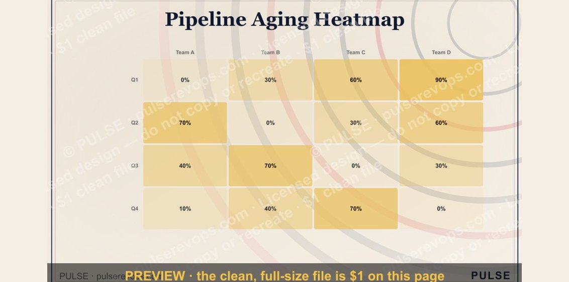 graphicPipeline Aging Heatmap
 graphicChurn by Segment Bar Chart
 graphicPipeline Coverage Gauge
 graphicWin Rate by Segment Bar Chart
 graphicWin Rate by Stage Bar Chart
 graphicMRR Growth Trend Line
 graphicForecast Commit / Best Case / Upside