


Pipeline Health Dashboard
Quality
Certified
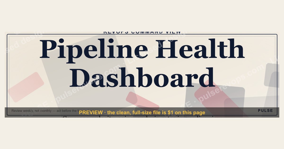
A Pipeline Health Dashboard is a single, real-time view that tells a revenue team whether the sales pipeline is strong enough to hit the number — and where it is breaking. Instead of scrolling through individual CRM records, leaders see the metrics that actually predict revenue: pipeline coverage ratio (how many dollars of open pipeline back every dollar of quota, usually 3x–5x for the coming quarter), deal velocity by stage, stage-to-stage win rates, weighted pipeline value, pipeline aging, and new pipeline creation rate. Color-coded indicators flag deals that are stalled, slipping, or past their expected close date so reps and managers can act before the forecast misses. It is built and used primarily by RevOps, sales leadership, and CROs — and it earns its keep only when it drives a review cadence, not when it just gets glanced at once a month.
Pipeline Health Dashboard

Pipeline health dashboard: Coverage Ratio, Deal Stages, Aging Buckets, Forecast Categories.
Format: SVG (scalable vector) · Size: 1584×396 px · Category: Dashboard · License: Free to use — no attribution required.
Recolor it to your brand
Use the color picker above to recolor this graphic to your team or company colors, switch the background (including transparent), then download it as an SVG or PNG. No sign-up, no watermark.

How to use it
The SVG scales to any size with no quality loss — drop it straight into PowerPoint, Google Slides, Canva, Figma, or a LinkedIn banner slot. The PNG export is ready to upload anywhere that wants a raster image.

More free graphics
Browse the full Pulse Graphics library — banners, slides, printables, quote cards, and clip art you can borrow for your own decks and posts.
Related on PULSE
- Customer Success KPI Dashboard
- Marketing KPI Dashboard
- Sales KPI Dashboard — Top 9
- SaaS KPI Dashboard — Core 6
- Pipeline Aging Heatmap
- Pipeline Coverage Gauge
Key Metrics to Track in a Pipeline Health Dashboard
A well-constructed pipeline health dashboard should surface metrics that reveal both the quantity and quality of your sales pipeline. While specific numbers vary by industry and business model, most effective dashboards track a core set of leading indicators that provide early warning signals before revenue is affected.
Pipeline coverage ratio is perhaps the most fundamental metric. This compares your total pipeline value (weighted or unweighted) against your revenue target for a given period. A common rule of thumb is 3x to 5x coverage for the upcoming quarter, meaning you need $3–$5 in pipeline for every $1 of target revenue. The right number depends on your win rate: a team that closes 25% of qualified pipeline needs roughly 4x coverage just to break even on the math, so enterprise SaaS teams with long cycles often target 4x–6x while transactional B2B teams may operate comfortably at 2x–3x. The dashboard should show coverage by time period (month, quarter, half) and allow filtering by sales team or region.
Deal velocity measures how quickly opportunities move through your pipeline stages. Track the average number of days deals spend in each stage, from initial contact to closed-won. A healthy pipeline shows consistent or improving velocity over time. If deals are stagnating in a particular stage — say, 40% longer than your trailing average for the "proposal sent" stage — that signals a bottleneck requiring attention. Velocity metrics are especially useful when segmented by deal size, product line, or rep.
Win rate by stage provides granular insight into conversion efficiency. Rather than just an overall win rate, track the percentage of deals that move from one stage to the next. For example, if only 30% of "demo completed" deals advance to "proposal sent," that indicates a problem with demo quality or qualification criteria. Benchmarks vary widely by motion and segment, so the most useful comparison is against your own historical baseline: the dashboard should highlight stages where conversion drops significantly below trailing averages, not just against an external number.
Weighted pipeline value applies probability percentages to each deal based on its current stage. A typical weighting framework might assign 10% to "lead," 25% to "qualified," 50% to "proposal sent," 75% to "negotiation," and 90% to "verbal commitment." This gives a more realistic view of expected revenue than raw pipeline totals. The dashboard should compare weighted pipeline against target, showing the gap that needs to be filled by new opportunities or accelerated existing deals.
Age of pipeline reveals whether your pipeline is fresh or stale. Track the average age of all open opportunities, and flag deals that have been stagnant for more than 30–60 days beyond your typical sales cycle length. A dashboard that shows pipeline aging distribution — for example, 20% of deals under 30 days old, 45% between 30–90 days, 35% over 90 days — helps identify when pipeline needs refreshing. Stale deals often have lower close rates and can create a false sense of security.
New pipeline creation rate measures how quickly your team is generating new qualified opportunities. Track weekly or monthly additions to pipeline value, ideally segmented by source (inbound, outbound, partner, etc.). A healthy dashboard shows new pipeline creation consistently exceeding the value of deals that close (won or lost), so coverage replenishes faster than it drains. If creation falls below 80% of the target rate for two consecutive months, treat it as an early warning, not a one-off dip.
Sales activity metrics should be integrated to understand pipeline health holistically. Track leading indicators like number of qualified meetings set, proposals sent, and follow-up touches per deal. When pipeline metrics start declining, activity data helps diagnose whether the issue is insufficient volume or poor conversion. For instance, if meetings are up 15% but pipeline value is flat, the problem may be qualification criteria rather than activity levels.
Historical trend lines are essential for context. A single snapshot of pipeline coverage at 3.5x might look healthy, but if that number has been declining from 5x over the past six months, the trend is concerning. The dashboard should include 6–12 month trend lines for all key metrics, with automatic alerts when a metric deviates more than 20% from its trailing three-month average.
Common Pitfalls and How to Avoid Them
Even with a well-designed pipeline health dashboard, several common mistakes can undermine its effectiveness. Being aware of these pitfalls helps ensure your dashboard drives better decisions rather than creating confusion or false confidence.
Over-relying on unweighted pipeline value is one of the most frequent errors. A dashboard showing $10M in total pipeline against a $2M quarterly target looks fantastic at 5x coverage — until you realize that 60% of that pipeline sits in early stages with historically low conversion. Weighted pipeline might show only $2.5M, barely covering the target. Always display both weighted and unweighted pipeline, and train your team to make decisions primarily on the weighted figure.
Ignoring pipeline quality in favor of quantity leads to the "happy ears" problem, where reps keep adding low-quality opportunities to inflate numbers. Your dashboard should include a pipeline quality score that considers factors like deal source, buyer engagement, budget confirmation, and decision-maker access. For example, inbound leads from target accounts with confirmed budget might score 85/100, while cold outbound leads from unverified contacts score 30/100. When quality scores drop below 50 for more than 20% of pipeline, it is time to review qualification criteria and coaching.
Failing to segment by deal size and type masks important patterns. A dashboard that aggregates all deals might show healthy velocity, but when segmented you may find that small deals ($5K–$20K) close in 30 days at 40% win rates, while enterprise deals ($100K+) take 180 days at 15%. These are fundamentally different sales motions requiring different strategies. Create separate views or filters for each segment, and set distinct targets for each.
Not accounting for sales cycle length leads to premature pipeline evaluation. A dashboard that judges pipeline health weekly for a business with a 9-month cycle will produce mostly noise. Match your refresh frequency and review cadence to your actual sales cycle, and include a "pipeline maturity" metric that shows how far along the typical cycle each deal is — so you focus on deals that are overdue versus those still on track.
Confusing activity with progress is a subtle but dangerous mistake. A rep might have 50 calls and 20 emails in a week (high activity) but only 2 qualified meetings (low progress). Your dashboard should distinguish activity metrics from outcome metrics and benchmark them against each other. If the team average is 10 calls per qualified meeting, a rep making 100 calls but booking only 3 meetings is underperforming on conversion, not overperforming on activity.
Ignoring data quality and hygiene makes any dashboard unreliable. If CRM data is incomplete — missing close dates, inaccurate deal values, or outdated stages — your metrics will mislead. Implement automated validation: flag deals with no activity in 30+ days, require stage-change reasons, and set expiration dates for stale opportunities. Include a "data quality score" showing what percentage of pipeline data meets minimum completeness standards, and aim for 95%+ before trusting any derived metric.
Over-customizing without standardization creates confusion when comparing across teams. Some customization is necessary, but maintain a core set of standard definitions everyone shares. Define "qualified opportunity" the same way across all teams, use consistent stage probabilities, and agree on what counts as "active pipeline" versus "nurture." Without this, one team's "healthy" 4x coverage might actually be weaker than another team's 2.5x because they define pipeline differently.
Failing to connect pipeline health to revenue outcomes is the ultimate oversight. A dashboard that shows great pipeline metrics but does not correlate with closed revenue is cosmetic. Validate it by back-testing: look at historical pipeline data and see which metrics actually predicted results. You might find that "deals in negotiation stage" predicts better than "total pipeline," or that "new pipeline created in the last 30 days" correlates more strongly with future revenue than "total coverage." Adjust the dashboard to emphasize the metrics with proven predictive value.
Building an Actionable Review Cadence Around Your Dashboard
A pipeline health dashboard is only as valuable as the actions it drives. Without a structured review cadence, even the best dashboard becomes just another report that gets glanced at during monthly meetings and quickly forgotten. Creating a rhythm of pipeline reviews at different organizational levels ensures the dashboard drives real behavioral change.
Daily individual reviews should take no more than 5–10 minutes per rep. Each rep reviews their personal pipeline view, focusing on three things: deals that have gone stagnant (no activity in 5+ days), deals approaching their expected close date without clear next steps, and new opportunities that need to be added. The dashboard should highlight these automatically with color coding — green for on-track, yellow for needs attention, red for at-risk. Reps should update at least one deal per day based on the review: advancing a stage, scheduling a next step, or moving a deal to closed-lost.
Weekly team reviews bring the team together for 30 minutes to review aggregate pipeline health. The manager displays the team dashboard and focuses on three metrics: new pipeline created this week versus target, weighted coverage for the current quarter, and deals that have moved backward or stalled. Each rep shares one win they are working to close and one deal that needs help. The review should produce specific action items — "Sarah will share the proposal template with John for the Acme Corp deal" — and spend no more than 5 minutes on any single deal; the goal is pattern recognition and resource allocation, not deep deal coaching.
Monthly pipeline reviews are more strategic, lasting 60–90 minutes and involving sales leadership, marketing, and sometimes product or finance. The focus shifts from individual deals to systemic patterns. Review the full dashboard — including trend lines, win-rate movement by stage, coverage by segment, and new-pipeline-creation trends — and ask three questions: Is total coverage trending toward or away from the next quarter's target? Are conversion rates holding at each stage, or is a specific handoff degrading? Is marketing- and outbound-sourced pipeline keeping pace with what sales is consuming? The output is not a deal list but a small set of cross-functional decisions: where to invest in demand generation, which stage needs enablement, and whether the forecast still holds. Closing every monthly review with two or three owned, dated action items is what turns the dashboard from a report into a system of record for revenue decisions.
Sources
- HubSpot Research / HubSpot Sales Blog — pipeline management benchmarks and coverage-ratio guidance for B2B sales teams
- Salesforce — *State of Sales* report and pipeline management documentation within Sales Cloud
- Gartner for Sales — research on sales pipeline management, forecasting accuracy, and RevOps operating models
- Forrester — B2B revenue operations and revenue process research
- Gong Labs — data-driven analysis of deal progression, stage conversion, and win-rate drivers from sales conversation data
- Clari — pipeline inspection, forecasting, and revenue operations platform research and benchmarks
- Harvard Business Review — articles on sales pipeline management and the link between pipeline discipline and revenue performance
FAQ
What is a Pipeline Health Dashboard? A Pipeline Health Dashboard is a visual tool that aggregates key sales pipeline metrics — like coverage ratio, deal velocity, stage conversion, and win rates — into a single view. It helps revenue teams quickly spot bottlenecks, prioritize opportunities, and forecast more accurately, without digging through individual CRM records.
How often should I update the dashboard data? Most teams refresh the data daily but match their review cadence to deal-cycle length. Fast, transactional sales cycles warrant daily reviews; longer enterprise cycles are better served by weekly or monthly reviews, since judging a 9-month-cycle pipeline weekly mostly produces noise.
What metrics are most important on a pipeline dashboard? The core set is pipeline coverage ratio, weighted versus unweighted pipeline value, stage-to-stage conversion (win rate by stage), deal velocity, and pipeline aging. Leading indicators like new pipeline creation rate and meeting-to-opportunity conversion give the earliest warning signals before revenue is affected.
Can a Pipeline Health Dashboard help with forecasting? Yes. By combining current coverage with historical stage-conversion rates and deal velocity, the dashboard turns raw pipeline into a weighted, time-bound revenue projection. It shows whether you have enough pipeline to hit the number and surfaces where deals are slipping or stalling so the forecast reflects reality.
Who typically uses this dashboard? RevOps teams build and maintain it; sales leaders and CROs use it for forecasting and resource allocation; and individual reps use a simplified personal view to manage their own deals. The shared version gives leadership a real-time pulse on pipeline health across the whole team.
What tools integrate with a Pipeline Health Dashboard? Most dashboards pull from CRM platforms like Salesforce or HubSpot, and many add data from sales engagement tools, CPQ systems, and a data warehouse. Visualization can be native CRM dashboards or a BI layer such as Tableau or Power BI, while dedicated revenue platforms like Clari or Gong provide pipeline inspection and forecasting on top of CRM data.
This page will be disappearing soon. Save it to your device for $1 — or read it free while it is here.
@Kory-White- · if Venmo asks, the last 4 of my number are 2012
This page is gone.
This one is off the shelf now. $1 keeps it on your phone for good — the whole page, pictures and diagrams included.
 graphicSales KPI Dashboard — Top 9 in 2027
 graphicCustomer Success KPI Dashboard
 graphicForecast Accuracy Trend
 graphicSaaS KPI Dashboard — Core 6
 graphicMarketing KPI Dashboard
 graphic“SHOULD DO IT” — Sales Meme
 graphicRenewal Risk Decision Tree
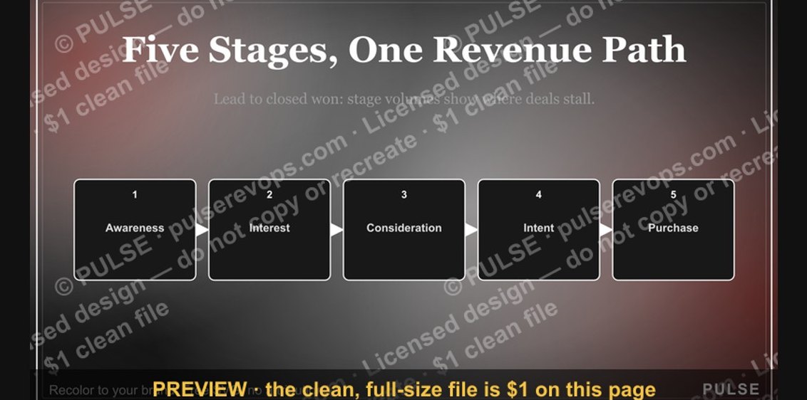 graphicSales Funnel — 5 Stages
 graphic“Qualify hard. Close easy.” — Quote Card
 graphic5 Stages of a Healthy Pipeline — Infographic