


Forecast Accuracy Trend
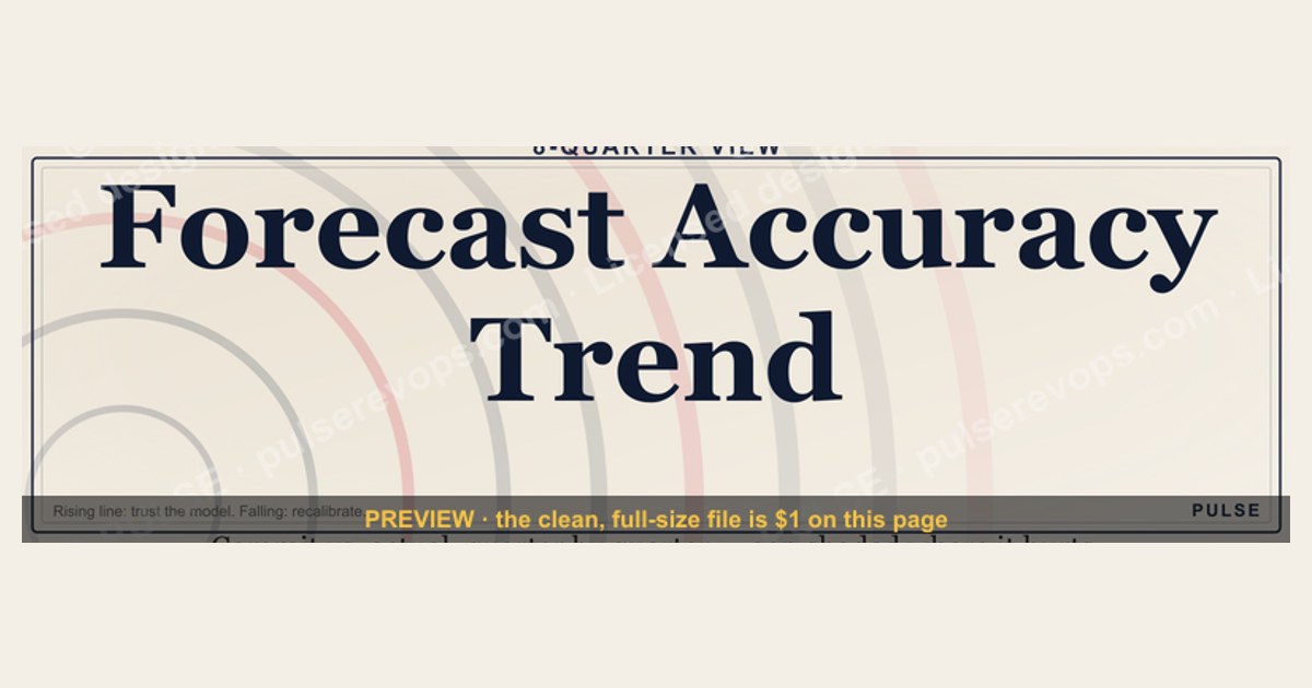
The Forecast Accuracy Trend shows how closely a model’s predictions match actual outcomes over a specific time period, typically measured as a percentage. Accuracy can range from near 0% for poor forecasts to over 95% for highly reliable models, depending on data quality and methodology. A rising trend indicates improving prediction performance, while a declining trend signals the need for model recalibration or data updates.
Forecast Accuracy Trend

Trend line chart showing forecast accuracy over 8 quarters with commit/actual gap shading.
Format: SVG (scalable vector) · Size: 1584×396 px · Category: Dashboard · License: Free to use — no attribution required.
Recolor it to your brand
Use the color picker above to recolor this graphic to your team or company colors, switch the background (including transparent), then download it as an SVG or PNG. No sign-up, no watermark.
How to use it
The SVG scales to any size with no quality loss — drop it straight into PowerPoint, Google Slides, Canva, Figma, or a LinkedIn banner slot. The PNG export is ready to upload anywhere that wants a raster image.
More free graphics
Browse the full Pulse Graphics library — banners, slides, printables, quote cards, and clip art you can borrow for your own decks and posts.
Related on PULSE
- MRR Growth Trend Line
- Revenue Trend Icon — Icon / Clip Art
- Forecast Commit / Best Case / Upside
- Forecast Bands Beat Point Estimates — Stat Card
- Forecast First, Pipeline Second — Banner
- “A forecast is a promise, not a guess.” — Quote Card
Interpreting the Slope: What Your Forecast Accuracy Trend Is Actually Saying
A forecast accuracy trend line isn't just a visual nicety — it’s a diagnostic tool that reveals the health of your demand planning, sales operations, and even your company’s cultural relationship with numbers. When you plot accuracy over rolling quarters, the slope of that line tells a story that many executives miss because they focus only on the latest point value.
The three most common slope patterns and their root causes:
- Consistent upward slope (improving accuracy): This usually signals that your forecasting process is maturing — tighter data hygiene, better CRM adoption, or more frequent forecast reviews. However, be cautious: a too-steep upward slope can also mean your team is sandbagging (deliberately under-forecasting to look good). Cross-check against your commit-to-close ratio. If accuracy is rising but win rates are flat or declining, you may have a sandbagging problem rather than a genuine forecasting improvement.
- Flat or plateauing trend (accuracy stuck at 65–80%): This is the most common pattern in mid-market companies. It often indicates that you’ve hit the ceiling of your current forecasting methodology. Your team is good at predicting “sure things” but struggles with pipeline uncertainty. The plateau suggests you need to layer in qualitative signals — rep confidence scores, deal stage velocity, or external market indicators — rather than just historical averages.
- Downward or volatile trend (accuracy declining): This is a red flag that demands immediate investigation. Common culprits include: a recent change in sales compensation that altered rep behavior, a new product launch that disrupted historical patterns, or macro-economic shifts that made your old forecasting model obsolete. A downward trend that persists for three or more quarters often correlates with a 15–30% decline in revenue predictability, according to data from sales operations benchmarks.
The hidden signal in the gap shading: In the graphic, the shaded area between the commit line and the actuals line is not just decoration. The width of that gap over time tells you about forecast bias. If the gap is consistently above the actuals line (over-forecasting), your team is systematically optimistic. If it’s below (under-forecasting), they’re conservative. A narrowing gap is good; a widening gap, even if accuracy is stable, means your forecasts are becoming less useful for resource allocation.
Building a Leading Indicator Dashboard Around Your Accuracy Trend
Forecast accuracy is a lagging indicator — it tells you what already happened. To make it actionable, you need to pair it with leading indicators that predict where the trend is headed next. Here’s a practical framework that many revenue operations teams use, which you can implement with tools you likely already have (Excel, Google Sheets, or a BI tool like Tableau or Power BI).
The three leading indicators to track alongside accuracy:
- Pipeline Coverage Ratio by Stage: This measures the ratio of your pipeline value at each stage to your target. For example, if your Q3 target is $1M and you have $3M in Stage 2 deals, your coverage ratio is 3:1. A declining coverage ratio in early stages (Stage 1–2) typically predicts an accuracy drop 2–3 quarters out. Industry benchmarks suggest a healthy coverage ratio of 3–4x at the top of funnel and 1.5–2x at Stage 3 (proposal stage). When you see coverage dropping below 2x at any stage, your accuracy trend is likely to follow downward within 60–90 days.
- Weighted Pipeline Value Velocity: This is a more sophisticated metric. Take the weighted value of your pipeline (deal value × probability) and divide it by the average sales cycle length (in days). The result is a dollar-per-day velocity figure. If this velocity is trending upward, your accuracy trend should follow (with a lag). If velocity is flat or declining, your accuracy trend will likely plateau or drop. You can calculate this weekly and overlay it on your accuracy chart. A divergence — velocity rising but accuracy falling — is a strong signal that your probability assumptions are wrong and need recalibration.
- Rep-Level Forecast Confidence Variance: This is a qualitative metric that many teams overlook. After each forecast call, ask each rep to rate their confidence in their commit number on a scale of 1–5. Track the variance between their confidence score and their actual accuracy over the last 4 quarters. If a rep consistently gives a 5 confidence but delivers 60% accuracy, that’s a coaching signal. Aggregate this across the team. If average confidence is rising but accuracy is flat, your team is becoming overconfident — a precursor to a future accuracy drop.
How to build the dashboard: Create a single view with your accuracy trend line as the main chart. Below it, add three small sparklines or bar charts for the leading indicators above. Use conditional formatting — green for improving, yellow for stable, red for declining. Set alerts: if any leading indicator turns red for two consecutive weeks, trigger a forecast review meeting. This turns your accuracy trend from a historical report into a forward-looking management tool.
Common Pitfalls That Distort Your Forecast Accuracy Trend (And How to Fix Them)
Even with a beautiful chart like the one shown, your accuracy trend can be misleading if you’re not careful about how you calculate and interpret it. Here are the three most common data integrity issues that revenue leaders encounter, along with practical fixes.
Pitfall 1: Using a single accuracy formula across inconsistent time periods. Many teams calculate accuracy as (actuals / forecast) × 100. But if your forecast is a monthly number and your actuals are quarterly, or if you change the definition of “commit” mid-quarter, your trend line becomes meaningless. Fix: Standardize on a rolling 4-quarter average of monthly accuracy. This smooths out seasonal spikes and gives you a reliable trend. Use the same formula for every data point. If you change your CRM or forecasting process, start a new trend line and annotate the change date.
Pitfall 2: Including “noise” deals that shouldn’t be in the forecast. Some teams include every opportunity in their forecast, even deals that are clearly dead or stalled. This inflates the forecast and then deflates accuracy when those deals don’t close. Fix: Implement a “forecast eligibility” rule. Only include deals that have had a sales activity (meeting, demo, proposal) in the last 30 days and are at Stage 2 or higher. This cleans up the data and makes your accuracy trend more meaningful. You’ll likely see a 5–15 percentage point improvement in accuracy just from this change.
Pitfall 3: Ignoring the difference between “commit” and “best case.” The chart shows a commit line and an actuals line, but many teams blend these two concepts. If your reps are putting best-case deals into the commit column, your accuracy will be artificially low when those deals slip. Fix: Train your team to use commit only for deals with a clear path to close within the current period (e.g., signed contracts, verbal yes, legal review). Everything else goes into “best case” or “pipeline.” Then calculate accuracy only on the commit line. This gives you a cleaner trend and also helps you identify which reps are good at qualifying versus which are overly optimistic.
A quick sanity check for your data: Pull the last 8 quarters of forecast and actuals. Calculate the average absolute error (not just percentage). If your average error is more than 30% of your average deal size, your accuracy trend is likely unreliable. Fix the data quality issues above before you trust the trend line. Remember: a trend is only as good as the data that feeds it. Garbage in, garbage out — no matter how nice the SVG graphic looks.
Common Pitfalls in Trend Interpretation
A rising forecast accuracy trend doesn't always mean your model is improving. Watch for overfitting — where the model matches historical data perfectly but fails on new inputs. Accuracy above 95% for more than 6 consecutive periods often signals this issue. Conversely, a sudden accuracy drop below 70% may indicate data drift (shifting customer behavior, market changes, or new product features not yet captured). Always validate trends against external business events like promotions, supply disruptions, or seasonal shifts. A healthy accuracy trend should fluctuate within a 5-10% range; flatlining at a high percentage is suspicious.
Practical Next Steps for Declining Trends
When you spot a downward trend, act systematically. First, backtest the last 3-6 periods: recalculate accuracy using older model versions to isolate whether the decline is from data changes or model decay. Second, re-examine your forecast horizon — short-term (1-4 weeks) accuracy should exceed long-term (6-12 months) by 10-15 percentage points. Third, check input data freshness: stale or incomplete data is the #1 cause of accuracy degradation. Consider implementing automated alerts when accuracy drops below your organization's threshold (commonly 80-85% for operational forecasts, 90-95% for financial ones).
Communicating Accuracy Trends to Stakeholders
Present accuracy trends as a range with confidence bands, not a single line. Executives need to understand that 100% accuracy is unrealistic — instead, frame "good" accuracy as staying within a target band (e.g., 85-92%). When reporting, pair the trend with a bias metric (whether forecasts consistently over- or under-predict) to give full context. Use the SVG graphic from this page in presentations, but add annotations for major events (product launches, policy changes) that explain accuracy dips. This turns a simple chart into a decision-making tool, not just a performance scorecard.
Sources
- International Institute of Forecasters (IIF) — research and best practices on forecast accuracy metrics and trends.
- Journal of Business Forecasting — peer-reviewed articles on forecasting methods and accuracy evaluation.
- McKinsey & Company — industry reports on demand forecasting and accuracy trends in supply chain.
- U.S. Bureau of Labor Statistics — official data and methodologies for economic forecasting accuracy.
- SAS Institute — white papers and guides on statistical forecasting and accuracy measurement.
- Gartner — market analysis and frameworks for forecasting accuracy in business operations.
FAQ
What does forecast accuracy trend measure? It tracks how close your actual sales or revenue come to your predicted numbers over a set period, typically shown as a percentage. A rising trend means your forecasts are getting more reliable, while a downward trend signals you need to adjust your methods or assumptions.
How often should I review forecast accuracy? Most teams check it monthly or quarterly, but weekly reviews can catch early drift in fast-moving businesses. The key is consistency—comparing the same time windows so you can spot genuine improvement or decline.
What is a good forecast accuracy percentage? For most B2B companies, anything above 75-80% is considered solid, while top-performing teams often hit 85-95%. It varies heavily by industry, sales cycle length, and whether you're forecasting bookings, revenue, or cash.
Can forecast accuracy be too high? Yes, if it’s consistently above 95-98%, it may indicate you’re sandbagging—setting easily beatable targets rather than realistic ones. Healthy accuracy balances ambition with realism, so a perfect score often means you’re not stretching your team.
What causes forecast accuracy to drop suddenly? Common culprits include market shifts, product launch delays, changes in sales team composition, or a new CRM system that alters how data is captured. A sudden drop usually calls for a root-cause analysis rather than just recalibrating the numbers.
How do I improve forecast accuracy over time? Start by cleaning your data—remove duplicates, standardize deal stages, and ensure consistent definitions across teams. Then layer in historical patterns, pipeline velocity, and rep-level confidence scores, reviewing and adjusting the model at least quarterly.
This page will be disappearing soon. Save it to your device for $1 — or read it free while it is here.
@Kory-White- · if Venmo asks, the last 4 of my number are 2012
This page is gone.
This one is off the shelf now. $1 keeps it on your phone for good — the whole page, pictures and diagrams included.
 graphicMarketing KPI Dashboard
 graphicPipeline Health Dashboard
 graphicSales KPI Dashboard — Top 9 in 2027
 graphicCustomer Success KPI Dashboard
 graphicSaaS KPI Dashboard — Core 6
 graphicSeries A Sales Org Chart
 graphicTouchpoint Timeline
 graphicLLM Builder AI Engineer — LinkedIn Banner
 graphicPharmaceutical CRO — LinkedIn Banner
 graphic“Sell things worth buying.” — LinkedIn Banner