


Customer Onboarding Flow
Quality
Certified
A customer onboarding flow is a structured sequence of steps that guides new users from sign-up to active, engaged product usage, typically taking days to weeks. It reduces friction, educates users, and drives early value to improve retention and long-term recurring revenue.
What it is and why it matters
A customer onboarding flow is the systematic process of transitioning a new user from prospect status to an active, value-realizing customer. It encompasses every touchpoint from account creation through the first meaningful product experience—often called the "aha moment." This flow is not merely a tutorial sequence; it is a strategic orchestration of communications, in-app guidance, human touchpoints, and milestone tracking designed to accelerate time-to-value.
The importance of onboarding extends far beyond first impressions. Research consistently shows that customers who complete a structured onboarding flow retain at rates 2-3x higher than those who do not. For SaaS businesses, a 5% improvement in onboarding completion can translate to 25-95% increases in net revenue retention, depending on the business model. The flow directly impacts three critical revenue levers: activation rate (the percentage of new users who reach a meaningful outcome), early-stage churn (which typically spikes within the first 30 days), and expansion potential (customers who understand the product fully are more likely to adopt additional features and upgrade).
Onboarding also serves as a qualification filter. Customers who cannot or will not complete the onboarding flow are unlikely to become profitable accounts. By identifying friction points early, teams can either intervene with additional support or recognize that the customer may not be a good product-market fit. This prevents wasted Customer Success resources on accounts that will churn anyway.

The flow matters differently across business models. For high-ACV enterprise deals ($50k+), onboarding is a multi-week engagement involving dedicated CSMs, technical implementation specialists, and executive sponsors. For self-serve SMB products ($50-200/month), onboarding must be fully automated, relying on in-app guides, email sequences, and product analytics to drive activation. Mid-market companies ($2k-15k/year) typically use a hybrid model: automated flows with one or two human checkpoints.
The step-by-step process
A well-designed customer onboarding flow follows a predictable sequence, though the specific steps vary by product complexity and customer segment. Below is a canonical seven-stage flow that applies to most B2B SaaS products, with typical duration ranges for each stage.
Stage 1: Sign-up & Account Creation (5-15 minutes) This stage captures basic user information and establishes the account foundation. For B2B products, this typically includes company name, email domain verification, and role selection. Best practices include offering social sign-on (Google, Microsoft) to reduce friction, limiting required fields to 5-7, and immediately confirming account creation with a welcome message that sets expectations for the next steps. A common mistake is asking for payment information too early, which can cause 20-30% abandonment before the user has seen any value.

Stage 2: Initial Configuration (30-90 minutes) During this stage, users set up their environment. This includes selecting their primary use case, configuring notification preferences, choosing a plan or tier, and optionally inviting team members. For products with multiple deployment options (cloud vs. on-premise), this is where that choice is made. Smart onboarding flows use progressive profiling here—asking only 2-3 questions initially and deferring advanced settings to later stages. The configuration stage is where personalization begins: a marketing user should see different setup options than an engineering user.
Stage 3: Data Import & Integration Setup (1-4 hours) This is often the most friction-filled stage because it requires users to invest effort before seeing value. Users must import their existing data (contacts, projects, files) or connect third-party tools (CRM, ERP, marketing automation). To reduce abandonment, offer a demo data option that lets users skip this stage and experience the product with sample data. For integrations, provide one-click connections for the top 5-10 tools in your ecosystem, with clear instructions for less common integrations. Track completion rates here religiously—if more than 50% of users abandon at this stage, your import process is too complex.
Stage 4: Core Training & First Workflow (1-3 hours)

This is where users learn to perform the essential actions that define your product's value. The training should focus on the 3-5 actions that directly map to the user's stated goal from Stage 2. Use a combination of interactive walkthroughs, short video tutorials (under 2 minutes each), and a sandbox environment where users can practice without consequences. Avoid the "feature dump" trap—show only what's necessary for the first workflow, with advanced features revealed contextually later. Companies that limit initial training to 3 core actions see 40% higher completion rates than those that show 10+ features.
Stage 5: First Value Milestone (immediate upon completion) This stage is the "aha moment"—the point where the user experiences tangible value from your product. It should be designed to occur automatically once the user completes the core training and performs their first real action. Examples include: a marketing automation user seeing their first email campaign sent, a project management user viewing their first completed task with team comments, or an analytics user seeing their first dashboard with live data. The milestone should be celebrated with an in-app congratulation, a summary of what was accomplished, and a clear "what's next" prompt.
Stage 6: Stakeholder Expansion (1-2 weeks) For team-based products, this stage focuses on getting additional users activated. The initial user should be prompted to invite colleagues, assign roles, and demonstrate the product's value to their team. Provide templates for invitation emails, pre-built dashboards that showcase team-wide benefits, and a referral incentive if appropriate. The goal is to expand from a single user to a team of 3-10 active users within the first two weeks. Products that achieve team-level adoption in the first 14 days see 3x higher 90-day retention compared to single-user accounts.
Stage 7: Ongoing Success Handoff (Day 14-30)

The final stage transitions the customer from onboarding to ongoing Customer Success. This includes scheduling the first business review, introducing the customer's dedicated CSM (if applicable), providing access to advanced training resources, and setting up health monitoring. The handoff should be explicit—customers should know exactly who to contact for different types of issues (technical support, account management, feature requests). A well-executed handoff reduces support ticket volume by 30-50% in months 2-3.
Costs, timelines, and typical ranges
Understanding the resource investment required for a customer onboarding flow helps teams plan budgets, staffing, and technology investments. Costs and timelines vary dramatically based on customer segment and product complexity.
Timeline Ranges by Segment
- Self-serve SMB ($0-200/month): 15-60 minutes from sign-up to first value milestone. Fully automated with no human touchpoints.
- Low-touch SMB ($200-2k/month): 2-5 days. One or two automated email sequences with optional live chat support.
- Mid-market ($2k-15k/year): 1-3 weeks. Automated flows with 2-4 scheduled calls with a CSM or onboarding specialist.
- Enterprise ($50k+/year): 4-12 weeks. Dedicated implementation team including CSM, technical account manager, and sometimes a solution architect. Weekly calls, custom integration work, and executive sponsorship.
Cost Components The cost to design, build, and maintain an onboarding flow includes:

- Software tools: Onboarding platforms (Appcues, Userpilot, Pendo) cost $500-5,000/month for mid-market, with enterprise tiers up to $20k/month. CRM and marketing automation (HubSpot, Salesforce) add $1,000-3,000/month. Analytics tools (Amplitude, Mixpanel) run $1,000-10,000/month depending on data volume.
- Personnel: A dedicated onboarding specialist costs $60,000-90,000/year fully loaded. A CSM handling onboarding as part of their role adds $80,000-120,000/year. For enterprise, a full implementation team (3-5 people) costs $300,000-600,000/year.
- Content production: Creating video tutorials ($500-2,000 per minute of finished video), interactive walkthroughs ($200-500 per flow), knowledge base articles ($100-300 per article), and certification materials ($1,000-5,000 per course).
- Technology infrastructure: Integration development ($5,000-50,000 per integration), demo data environments ($500-2,000/month), and sandbox instances ($1,000-5,000/month).
ROI Benchmarks Companies investing in onboarding typically see returns within 3-6 months. Specific benchmarks include:
- 20-40% reduction in time-to-first-value
- 15-30% improvement in 30-day retention
- 10-20% increase in net revenue retention
- 25-50% reduction in onboarding-related support tickets
- 15-25% higher feature adoption rates in the first 90 days
The cost per onboarded customer ranges from $5-50 for self-serve to $500-5,000 for mid-market and $10,000-100,000+ for enterprise. The key is to align spend with customer lifetime value—onboarding costs should not exceed 10-15% of first-year revenue for most businesses.
Where teams get it wrong
Even experienced teams make predictable mistakes that undermine their customer onboarding flow. These errors typically fall into five categories, each with specific symptoms and solutions.
The Information Overload Problem

Teams try to teach everything in the first session, overwhelming users with 15+ features, 30-minute videos, and lengthy documentation. This causes cognitive overload, with users retaining less than 30% of what they see. The fix is ruthlessly prioritizing: identify the 3-5 actions that create the "aha moment" and strip everything else. Save advanced features for contextual tooltips triggered by user behavior. Companies that reduce initial training content by 60% see 35% higher completion rates.
The One-Size-Fits-All Timeline Using the same 7-day sequence for every customer ignores that enterprise buyers need 2-3 weeks for stakeholder alignment while SMB users can complete onboarding in one session. The solution is adaptive timing: use behavioral triggers to adjust pace. If a user hasn't completed step 2 within 48 hours, send a personalized video. If they complete step 3 in 10 minutes, immediately unlock the next stage. Adaptive onboarding improves completion rates by 25-40% compared to fixed timelines.
The Silent Abandonment Blind Spot Most teams track onboarding completion rate but ignore where users drop off. Analytics consistently show 60-70% of abandonments occur at stages requiring data import, integration setup, or team invitation—actions that feel like work rather than value. Fix this by reframing these steps as "unlocking" rather than "setting up." Offer demo data so users can experience value before committing their own information. Companies that implement "try before you commit" options see 35-50% improvement in data-heavy step completion.
The Missing Value Connection

When users don't understand why a step matters, they abandon at 3x higher rates. Every onboarding action should be framed with a clear benefit statement. Instead of "Verify your email," say "Verify your email to receive instant notifications when your team completes tasks." This small reframing lifts step completion by 15-25%. Include a 1-2 sentence "value preview" before each major action, styled as a subtle callout box.
The Mobile Neglect With 40-60% of initial product interactions now happening on mobile, a desktop-only onboarding flow creates immediate friction. Mobile-specific issues include tiny tap targets, multi-step forms requiring excessive scrolling, and video tutorials that don't render properly. Audit your onboarding on 5.8-inch and 6.7-inch screens separately. Simplify to single-column layouts, use thumb-friendly targets (minimum 48x48 pixels), and replace lengthy text with short animated guidance (under 15 seconds). Mobile-optimized onboarding improves first-week retention by 20-30%.
Decision framework: when to choose what
Not all onboarding flows are created equal, and the right approach depends on your product, market, and resources. This decision framework helps teams select the appropriate onboarding strategy based on key variables.
Decision Point 1: Average Contract Value (ACV) ACV is the strongest predictor of onboarding complexity. For ACV under $2,000/year, invest in fully automated flows—the cost of human touchpoints exceeds the customer's lifetime value. For ACV between $2,000-15,000/year, use a hybrid model with automated flows supplemented by 2-4 scheduled touchpoints (calls or personalized emails). For ACV over $15,000/year, assign a dedicated implementation team with a project manager, technical resources, and executive sponsorship.
Decision Point 2: Product Complexity

Simple products (single-feature tools, Chrome extensions, basic dashboards) need lightweight onboarding that gets users to value in under 5 minutes. Complex platforms (ERP, marketing automation suites, analytics tools) require multi-stage onboarding that spans weeks or months. For complex products, consider a tiered approach: a "quick start" path that activates users on the core feature in under 30 minutes, followed by an "advanced" path that deepens adoption over 4-8 weeks.
Decision Point 3: Customer Technical Sophistication Technical users (developers, IT administrators, data analysts) prefer self-service onboarding with documentation, APIs, and sandbox environments. Non-technical users (marketers, sales reps, executives) need guided walkthroughs, video tutorials, and live support. Segment your onboarding by role at sign-up and offer appropriate paths. Companies that role-segment onboarding see 20-35% higher completion rates.
Decision Point 4: Team vs. Individual Use Single-user products can focus on individual activation metrics. Team-based products must include stakeholder expansion as a core onboarding stage. For team products, design the onboarding flow to make the initial user a "champion" who can demonstrate value to colleagues. Provide shareable reports, team dashboards, and invitation templates. Products achieving team-level adoption in the first 14 days retain at 3x higher rates.
Decision Point 5: Integration Dependency Products that require integration with other tools (CRM, ERP, marketing automation) need onboarding flows that prioritize integration setup early. Offer pre-built connectors for the top 5-10 tools in your ecosystem, with clear documentation for custom integrations. Consider a "concierge integration" service for high-value accounts where a specialist handles the technical setup. Products with complex integrations should budget 30-50% of onboarding time for this stage alone.
Related questions

What is the difference between onboarding completion rate and activation rate?
Completion rate measures how many users finish the onboarding flow. Activation rate measures how many reach the "aha moment" and perform core actions. Activation is a stronger predictor of retention, often 30-50% lower than completion rate.
How long should a customer onboarding flow be for a SaaS product?
For self-serve products, target under 30 minutes to first value. For mid-market, 1-3 weeks is typical. For enterprise, 4-12 weeks. The key is aligning duration with complexity—shorter is almost always better if value is delivered.
What tools are commonly used to build onboarding flows?
Popular tools include Appcues, Userpilot, Pendo, and Intercom for in-app guidance. HubSpot and Salesforce for email sequences. Amplitude and Mixpanel for tracking. The best tool depends on your tech stack, budget, and whether you need code-free or developer-friendly options.
FAQ
What is a customer onboarding flow? A customer onboarding flow is a structured sequence of steps that guides new users from sign-up to becoming active, engaged product users. It includes account setup, training, first value milestone, and ongoing success handoff, with the goal of reducing time-to-value and improving retention.
Why is onboarding important for revenue?

Onboarding directly impacts revenue by reducing early-stage churn, increasing activation rates, and driving expansion. Customers who complete structured onboarding retain at 2-3x higher rates and are more likely to adopt additional features, leading to higher lifetime value and net revenue retention.
What metrics should I track for onboarding success? Key metrics include time-to-first-value, activation rate, onboarding completion rate, feature adoption depth, support ticket volume during onboarding, and NPS at day 7. Cohort retention curves comparing completed vs. abandoned onboarding are also critical for understanding long-term impact.
How do I personalize onboarding for different customer segments? Use role-based branching (ask the user's role at sign-up), behavioral trigger sequences (deliver content based on user actions), industry-specific templates, and progressive profiling (spread questions across multiple sessions). Personalization improves completion rates by 20-35%.
What is the biggest mistake in onboarding flows? Overwhelming users with too many features too quickly—the "feature dump" trap. Limit initial exposure to 3-5 core actions that directly map to the user's stated goal. Advanced features should be progressively disclosed through contextual tooltips triggered by user behavior.
Can onboarding be fully automated? For products under $2k ACV, full automation is recommended using in-app guides, email sequences, and knowledge bases. For higher-value products, a hybrid approach with automated flows and human touchpoints works best. Enterprise implementations require dedicated teams and cannot be fully automated.
Sources
- Intercom Blog — guides on user onboarding flows and communication strategies
- HubSpot Academy — resources on customer onboarding processes and lifecycle management
- Nielsen Norman Group — research on user experience and onboarding interface design
- Harvard Business Review — articles on customer retention and onboarding strategy
- U.S. Small Business Administration — guidelines for customer relationship management and onboarding
- Appcues Blog — best practices for in-app onboarding and user activation
- Userpilot Blog — guides on product-led growth and onboarding personalization
- Pendo Blog — resources on digital adoption and onboarding analytics
- Amplitude Blog — articles on product analytics and behavioral tracking for onboarding
- Customer Success Association — best practices for onboarding workflows and metrics
Related on PULSE
This page will be disappearing soon. Save it to your device for $1 — or read it free while it is here.
@Kory-White- · if Venmo asks, the last 4 of my number are 2012
This page is gone.
This one is off the shelf now. $1 keeps it on your phone for good — the whole page, pictures and diagrams included.
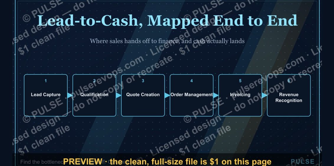 graphicLead-to-Cash Process Map
 graphicDeal Inspection Flow
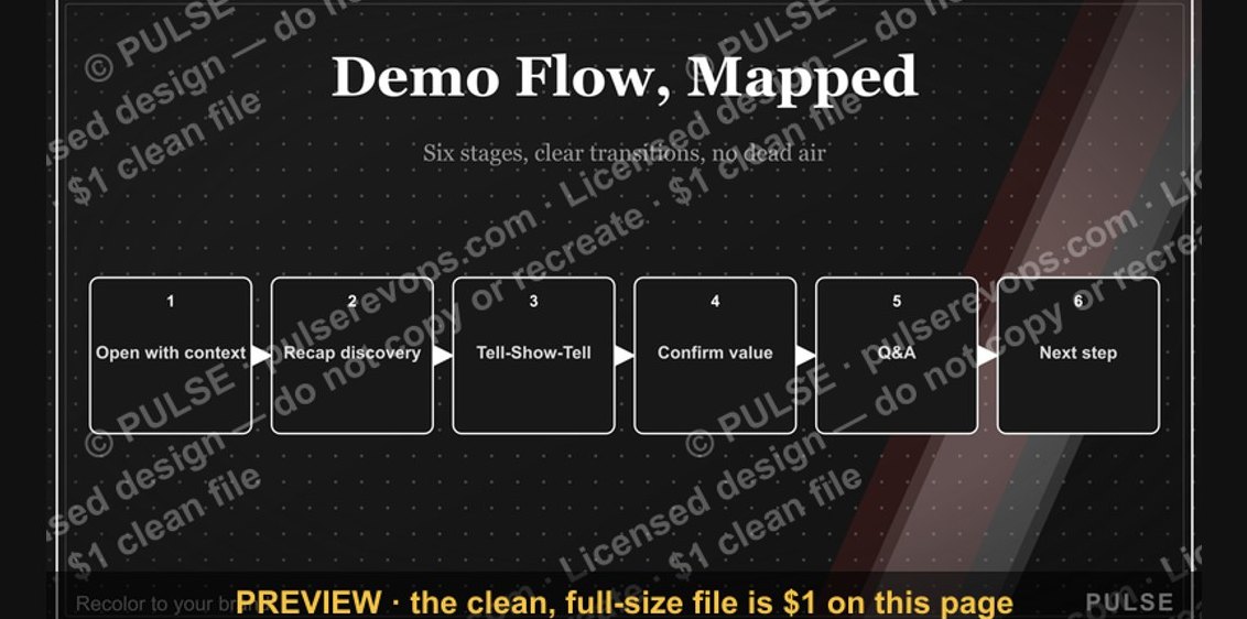 graphicDemo Flow Diagram
 graphicRenewal Process Flow
 graphicDiscovery Call Flow Diagram
 graphic“The best discovery feels like free therapy.” — Quote Card
 graphicForecast Commit / Best Case / Upside
 graphicPharmaceutical CRO — LinkedIn Banner
 graphicLLM Builder AI Engineer — LinkedIn Banner
 graphic“Activity creates luck.” — Quote Card