


Win Rate by Segment Bar Chart
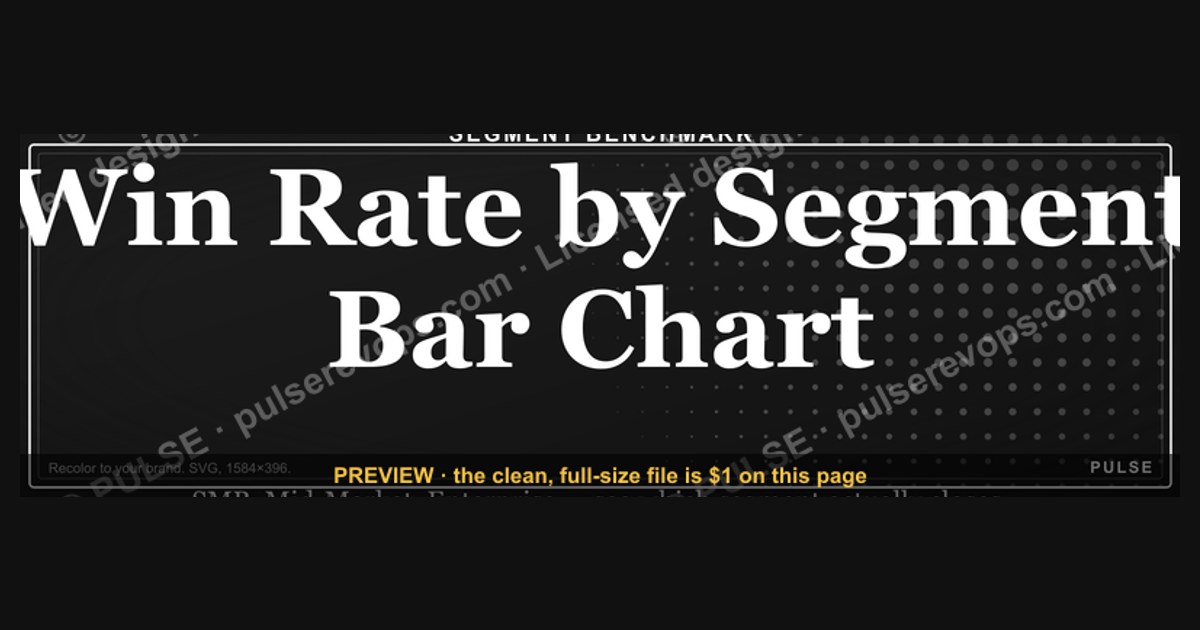

A win rate by segment bar chart displays the percentage of won opportunities for each defined category, such as region, product line, or sales team. Each bar represents a segment's performance, typically ranging from 0% to 100%, allowing for quick visual comparison. This chart helps identify which segments are outperforming or underperforming relative to others.
Win Rate by Segment Bar Chart

Vertical bar chart comparing win rates across SMB / Mid-Market / Enterprise segments.
Format: SVG (scalable vector) · Size: 1584×396 px · Category: Chart · License: Free to use — no attribution required.
Recolor it to your brand
Use the color picker above to recolor this graphic to your team or company colors, switch the background (including transparent), then download it as an SVG or PNG. No sign-up, no watermark.
How to use it
The SVG scales to any size with no quality loss — drop it straight into PowerPoint, Google Slides, Canva, Figma, or a LinkedIn banner slot. The PNG export is ready to upload anywhere that wants a raster image.
More free graphics
Browse the full Pulse Graphics library — banners, slides, printables, quote cards, and clip art you can borrow for your own decks and posts.
Related on PULSE
- Win Rate by Stage Bar Chart
- Churn by Segment Bar Chart
- Growth Bar Chart Icon — Icon / Clip Art
- Deal Stage Progression Bar
- PLG Sales Overlay Org Chart
- Enterprise Sales Org Chart
How to Build and Interpret a Win Rate by Segment Bar Chart
A win rate by segment bar chart is only as valuable as the data and methodology behind it. To create an effective chart, start by defining your segments clearly. Common segmentation dimensions include company size (e.g., SMB, mid-market, enterprise), industry vertical (e.g., healthcare, fintech, manufacturing), sales channel (e.g., inbound, outbound, partner-led), product line, or geographic region. Each bar should represent a distinct, non-overlapping segment to avoid double-counting deals.
When building the chart, calculate the win rate for each segment as: Closed Won Deals ÷ (Closed Won + Closed Lost Deals). Exclude deals still in progress or that have been disqualified for non-competitive reasons (e.g., budget not approved, no decision). For meaningful comparisons, ensure each segment has a minimum sample size—typically at least 10–20 closed deals. Segments with fewer deals may produce misleadingly high or low win rates due to small sample variance.
Color coding can enhance interpretation: use a consistent color for all bars (or differentiate segments with distinct hues if comparing multiple time periods). Consider adding a horizontal line representing the overall company win rate as a benchmark. This instantly shows which segments outperform or underperform the average. For example, if your overall win rate is 30%, but the enterprise segment shows 45%, that bar stands out as a high-performing area worth investigating for best practices.
Tools like Excel, Google Sheets, Tableau, or dedicated CRM analytics (e.g., Salesforce reports, HubSpot dashboards) can generate these charts automatically. When presenting, always include a brief legend or annotation explaining the time period (e.g., “Q1 2024–Q3 2024”) and any filters applied (e.g., “new business only, excludes renewals”). This context prevents misinterpretation by stakeholders who may assume the chart covers all deals.
Common Pitfalls and How to Avoid Them
Even well-intentioned win rate by segment bar charts can mislead if not carefully constructed. One frequent mistake is segmenting too granularly. For instance, splitting by “industry + company size + region” might yield bars with only 2–3 deals each, making win rates statistically meaningless. A rule of thumb: if a segment has fewer than 10 closed deals, either combine it with a broader category or mark it as “insufficient data” on the chart.
Another pitfall is ignoring deal value weighting. A segment with a 40% win rate but an average deal size of $5,000 might be less strategically important than a segment with a 25% win rate but $100,000 average deal size. While the bar chart shows win rate percentage, consider overlaying a secondary metric—like total revenue won per segment—or creating a bubble chart where bar height is win rate and bubble size is revenue. This gives a more complete picture.
Time period bias is also common. If you compare win rates across segments using a single quarter, seasonal fluctuations (e.g., end-of-year budget flush, summer slowdown) may distort results. Use rolling 12-month data or at least two full quarters to smooth out anomalies. Additionally, beware of survivorship bias: if your sales team stopped pursuing certain segments mid-quarter, those lost deals might not be recorded, artificially inflating win rates for remaining segments.
Lastly, avoid cherry-picking segments to tell a favorable story. If you only show segments where win rates are high, you miss opportunities to diagnose and fix underperformance. A complete bar chart with all major segments—even the low ones—provides honest insight. When presenting to leadership, pair the chart with a simple table showing deal counts and win rates for full transparency.
Strategic Actions Based on Segment Win Rates
Once your win rate by segment bar chart is built and validated, the real value comes from using it to drive decisions. Here are actionable strategies for each type of segment outcome:
High win rate segments (e.g., >40%): These are your sweet spots. Investigate what makes them successful—do you have stronger product-market fit, better sales enablement materials, or more experienced reps covering this segment? Consider increasing marketing spend, hiring more sales reps dedicated to this segment, or creating case studies and testimonials to replicate success. However, also check if these segments have low deal sizes or low total addressable market (TAM). If so, they may be profitable but not scalable.
Low win rate segments (e.g., <20%): These require diagnosis. Is the segment too competitive? Are your reps poorly trained for that vertical? Is the product missing key features? Low win rates often indicate either a misalignment between your offering and segment needs, or a sales process issue. Actions could include: retraining reps on segment-specific objection handling, creating tailored marketing collateral, or even deprioritizing the segment if it consistently underperforms despite efforts. Track win rate trends over 3–6 months to see if interventions work.
Medium win rate segments (20–40%): These are optimization opportunities. Small improvements in win rate can yield significant revenue gains. Experiment with one change at a time—for example, adjust pricing, offer a free trial, or change your demo script. A/B test different approaches within the segment and monitor the win rate bar chart monthly. If you see a 5–10 percentage point improvement, scale that tactic across other medium segments.
Emerging segments with low deal counts: For segments with fewer than 10 deals, treat win rates as directional rather than definitive. Instead of making major investments, run small experiments: run targeted ads, attend industry events, or pilot a partnership. Track win rates over 6–12 months until you have sufficient data. If the segment shows promise (e.g., high win rate with small sample), gradually increase investment.
Finally, use the bar chart to align sales and marketing teams. Marketing can focus on generating leads in high-win-rate segments, while sales can prioritize pipeline in those areas. Conversely, marketing can create content to address objections in low-win-rate segments. Review the chart monthly in pipeline reviews and adjust resource allocation accordingly. Over time, this data-driven approach improves overall win rates and revenue efficiency.
How to Build a Reliable Segment Bar Chart
To create a trustworthy win rate by segment bar chart, start by ensuring your data is clean and consistent. Define what constitutes a “win” (e.g., closed-won deal, signed contract) and apply the same definition across all segments. Use a minimum sample size per segment—typically 5–10 opportunities—to avoid misleading bars based on a single win or loss. When plotting, order bars from highest to lowest win rate or by a logical grouping (e.g., geographic region) to make comparisons intuitive. Include a total average line across all segments as a reference benchmark, helping viewers quickly spot which bars fall above or below the overall performance.
Common Pitfalls in Interpreting Segment Win Rates
Misreading a win rate by segment chart is easy without context. A bar showing 80% might look stellar, but if that segment only had 5 opportunities, the result is less meaningful than a 60% bar built on 50 deals. Always check the underlying volume—consider adding a secondary data label showing opportunity count per bar. Another trap is comparing segments with different sales cycles; a segment with shorter cycles may show higher win rates simply because deals close faster, not because it’s more effective. Finally, avoid using this chart to compare segments that aren’t mutually exclusive—for example, “Enterprise” and “North America” if some enterprise deals are also in North America—as double-counting distorts the percentages.
When to Use Alternative Visualizations
While a bar chart works well for 5–15 segments, it becomes cluttered with more categories. For 20+ segments, consider a horizontal bar chart or a sorted dot plot to improve readability. If you need to show win rate trends over time within each segment, switch to a small multiples line chart or a heatmap with time on one axis and segment on the other. For comparing win rates against deal size or revenue, a scatter plot with segment bubbles can reveal high-value opportunities that might be missed in a simple bar chart. Choose the visualization that matches your audience’s need—executives often prefer fewer, higher-level bars, while analysts may want granular breakdowns.
Best Practices for Segment Selection
When building a win rate by segment bar chart, choose segments that are actionable, not just descriptive. Ideal segments include sales team (e.g., Inside Sales vs. Field Sales), deal size buckets (e.g., <$10k, $10k–$50k, >$50k), or customer industry (e.g., Healthcare, Tech, Finance). Avoid segments with fewer than 10 opportunities per bar, as small sample sizes produce unreliable win rates. A good rule of thumb: aim for at least 20–30 opportunities per segment to ensure statistical significance.
Common Pitfalls to Avoid
Watch out for these frequent mistakes when interpreting segment win rates. First, comparing win rates across segments with vastly different average deal sizes can be misleading—a 60% win rate on $1k deals is less valuable than a 40% win rate on $100k deals. Second, beware of "survivorship bias" in your data: if you exclude early-stage opportunities that haven't closed yet, your win rates will appear artificially high. Third, don't confuse correlation with causation—a high win rate in the Enterprise segment might be due to better leads, not necessarily better sales execution.
How to Improve Low-Performing Segments
Once you identify underperforming segments, take targeted action. For product-specific segments with low win rates, consider gathering competitive intelligence on why prospects choose alternatives. For regional underperformance, investigate whether your sales team needs additional training or localized pricing. For segment-specific issues (e.g., SMB vs. Enterprise), test different sales approaches—perhaps SMB buyers respond better to self-service demos while Enterprise buyers need executive briefings. Track the same bar chart monthly after implementing changes to measure improvement over time.
Sources
- Nielsen — market share and win rate data across consumer segments
- Gartner — competitive win rate analysis and sales performance benchmarks
- Forrester Research — B2B win rate trends by industry and buyer segment
- Harvard Business Review — research on sales strategy and win rate optimization
- U.S. Bureau of Labor Statistics — industry-level performance and market segment data
- Salesforce — sales performance metrics and win rate benchmarks by segment
FAQ
What does "win rate" mean in this chart? Win rate is the percentage of competitive deals your team closes versus loses to a competitor. It’s calculated by dividing won opportunities by total competed opportunities, typically tracked quarterly or annually.
How should I interpret differences between segments? Compare the bar heights for each customer segment (e.g., enterprise vs. SMB). A higher bar means your team wins a larger share of competitive deals in that group, while a lower bar may signal pricing, product, or sales motion issues.
Is there a "good" win rate to aim for? Benchmarks vary widely by industry and deal size—commonly ranging from 30% to 60%. The most useful comparison is against your own historical performance and direct competitors, not a universal number.
What can cause a segment’s win rate to drop suddenly? Possible reasons include a competitor launching a new feature, pricing changes, shifts in buyer personas, or internal sales enablement gaps. Investigate by reviewing lost-deal reasons and recent competitor activity.
How often should I update this chart? Most teams refresh win rate data monthly or quarterly. Too frequent (weekly) can show noise from small sample sizes; too infrequent (annually) may miss emerging trends.
Can win rate be misleading if deal volume is low? Yes—a segment with only a few competed deals can show extreme win rates (0% or 100%) that don’t reflect true performance. Always consider sample size; add a filter or note for segments with fewer than 5–10 deals.
This page will be disappearing soon. Save it to your device for $1 — or read it free while it is here.
@Kory-White- · if Venmo asks, the last 4 of my number are 2012
This page is gone.
This one is off the shelf now. $1 keeps it on your phone for good — the whole page, pictures and diagrams included.
 graphicForecast Commit / Best Case / Upside
 graphicCAC Payback Visualization
 graphicDeal Stage Progression Bar
 graphicMRR Growth Trend Line
 graphicWin Rate by Stage Bar Chart
 graphicPipeline Coverage Gauge
 graphicPipeline Aging Heatmap
 graphicChurn by Segment Bar Chart
 graphicRevenue by Channel Pie
 graphicSales Velocity Components