


Revenue by Channel Pie
Quality
Certified
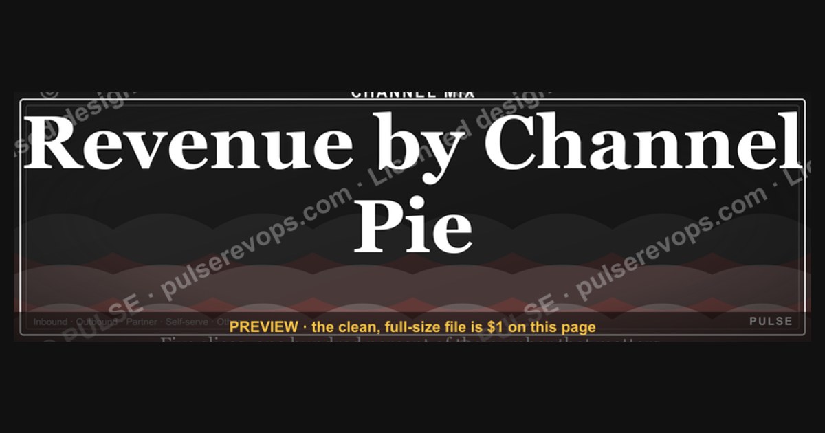

This banner is a 1600x500 px PNG titled "Revenue by Channel Pie," showing a single pie divided into labeled slices — Paid Search, Organic, Partner, Outbound, Events and Other — with each slice carrying its percentage of total Revenue. It exists to make one point fast: your Channel mix is a shape, and that shape tells you where to invest next.
Pie charts versus bar charts for channel mix
The first decision is not how to draw the pie — it is whether a pie is the right instrument at all. A pie encodes part-to-whole: every slice is a share of one total, and all slices must sum to 100%. That constraint is exactly what you want when the question is "what fraction of Revenue came from each Channel?" It is exactly what you do not want when the question is "which Channel grew fastest?" or "which Channel has the best payback?"
A bar chart handles magnitude and ranking better. Bars share a common baseline, so a 4% slice and a 9% slice are visually distinguishable; the same two slices on a pie are nearly identical wedges, and readers consistently misjudge them. Bars also survive a long tail. If you have eleven channels and three of them are under 2%, a pie turns into confetti while a horizontal bar chart stays readable down to the last row.
The practical split most RevOps teams land on: use the pie when you have five to seven categories and the story is composition — "half our Revenue now comes from channels we didn't run two years ago." Use bars when you have more than seven categories, when the categories change month to month, or when the reader's next action is a ranking decision. Use a stacked bar over time when the real question is mix shift, because a single pie cannot show movement; you need a row of pies or a stacked bar to see the shape change.
There is also a middle option worth knowing: the donut. A donut with a large center number — total Revenue, or the share of the top channel — reads faster than a pie because the summary statistic sits inside the ring instead of floating in a legend. The trade-off is that the ring is thinner, so small slices get even harder to compare. If you go donut, cap the categories at five.

One more consideration specific to this banner: it is decorative as much as analytical. A pie is the most instantly recognized chart form in existence, which is why it works at banner scale. Nobody squints at a pie in a LinkedIn feed and audits the geometry; they register "revenue spread across channels" and move on. If you needed a rigorous read, you would not be publishing it as a 1600x500 banner.
How to decide between them
The decision tree below is the one worth internalizing, because it prevents the most common mistake in channel reporting: putting eleven categories on a pie because the data happened to have eleven rows.
Two rules fall out of that tree. First, sort slices by size, clockwise from twelve o'clock, largest first. Unsorted pies force the reader to hunt, and hunting kills the one advantage a pie has — instant gestalt. Second, always group the tail. A slice under roughly 3% is not a category on a pie; it is noise. Roll everything below your threshold into "Other" and state the threshold in a footnote so nobody thinks you hid a channel.
There is a third rule that matters more than either: never use a pie to imply a trend. If someone asks "is Paid Search growing as a share?" a single pie cannot answer it, and a reader will still try. Give them a stacked bar across four quarters instead, or two pies side by side with the periods labeled in large type.
Concrete numbers behind each slice

Numbers are what make a channel pie credible or obviously fake. The ranges below are the ones that show up repeatedly across B2B SaaS and subscription businesses; treat them as sanity checks, not benchmarks, because your motion — self-serve, sales-led, partner-heavy — moves them more than anything else does.
Paid Search and Paid Social typically land anywhere from 15% to 35% of new-business Revenue in a self-serve or product-led company, and much lower — often under 15% — in an enterprise sales-led motion where deals close through relationships. The tell for an inflated paid share is a pie where paid is 50%+ while sales and marketing headcount is thin; that combination usually means the attribution window is too generous, not that paid is carrying the company.
Organic and direct traffic usually run 20% to 40%. This is the slice that grows slowly and then compounds, which is why it is the one worth watching across quarters rather than within one.
Partner and reseller Channel Revenue is the most variable. In a partner-first business it can be 40% to 60%; in a purely direct business it is often under 5% or genuinely zero. If a pie shows a partner slice at 25% but the partner program has no dedicated owner, the number is almost certainly mislabeled — those deals were probably sourced direct and closed with a partner attached for fulfillment.
Outbound and sales-sourced Revenue commonly sits between 20% and 45% in sales-led companies. This is also the slice most likely to double-count with paid: a lead that came from a paid ad, was worked by an SDR, and closed by an AE will appear in three systems as three different sources. Pick one attribution model and say which one the pie uses.

Events and field marketing usually contribute 5% to 15% of Revenue while consuming a disproportionate share of budget. The pie is where that asymmetry becomes visible, and it is often the single most useful thing the chart does.
Other — referrals, community, marketplace, expansion from existing accounts — typically rounds out the remainder. Keep it under 10% if you can; if "Other" is your third-largest slice, your taxonomy is broken, not your channel strategy.
A worked example makes the arithmetic concrete. Suppose quarterly new-business Revenue is $4,000,000. Paid Search $900,000 (22.5%), Organic $1,100,000 (27.5%), Outbound $1,000,000 (25%), Partner $520,000 (13%), Events $320,000 (8%), Other $160,000 (4%). Every slice is a division of the same $4,000,000, and the six percentages sum to 100%. Change one input — say paid drops to $700,000 — and every other slice's percentage rises even though none of those channels sold a dollar more. That is the mechanical truth a pie teaches whether you want it to or not.
Implementation details and sequencing
Building the pie is the easy part. The sequence below is the one that keeps you from publishing a chart you have to retract.
Step one: lock the definition of Revenue. New business only, or new plus expansion? Bookings or recognized Revenue? A pie that mixes bookings with recognized Revenue is comparing two different clocks. Pick one, write it in the subtitle, and keep it identical every period.
Step two: lock the attribution model. First touch, last touch, or a weighted multi-touch model all produce different slices from the same underlying data. Last touch will overstate outbound and sales-sourced Revenue because the last touch is usually a rep. First touch will overstate paid and content. Multi-touch spreads credit and tends to flatten the pie, which is more accurate and less dramatic — expect pushback from whichever team loses share.

Step three: define the Channel taxonomy in one place and enforce it at the source. If your CRM has "Paid Search," "Google Ads," and "SEM" as three separate values, your pie will have three slices that should be one. Normalize in the warehouse, not in the chart.
Step four: set the grouping threshold and the sort order. Largest slice at twelve o'clock, clockwise, tail rolled into Other below your cutoff.
Step five: reconcile before you publish. The slices must sum to the total in your finance system, to the dollar. If they do not, the gap is unattributed Revenue and it needs its own slice, not a rounding note.
Step six: version it. Channel pies change shape every quarter, and someone will screenshot the old one. Keep a dated archive.
The sequencing matters because steps one through three are where pies actually go wrong. The drawing is trivial; the definitions are the work. Teams that skip straight to the chart end up rebuilding it three times a quarter and losing the room's trust in the number.
What the banner shows, element by element
The banner is 1600x500 pixels, a wide horizontal format that fits LinkedIn and most blog headers without cropping. Reading left to right: the left third carries the title "Revenue by Channel Pie" in a heavy sans-serif, with a smaller subtitle line beneath it that names the period and the attribution model. The middle carries the pie itself, centered, roughly 380 pixels in diameter, with slices sorted largest to smallest starting at twelve o'clock. The right third carries the legend, stacked vertically, one line per Channel, each line pairing a color swatch with the channel name and its percentage.

The exact wording the banner carries is deliberately spare: the title, the period line, the channel names, and the percentages. No tagline, no call to action, no logo lockup beyond a small mark in the corner. That restraint is the point — a banner that tries to say three things says nothing, and this one has a single job.
Color is doing real work here. Six slices need six distinguishable hues, and the safest approach is a sequential ramp rather than six unrelated brights: darkest for the largest slice, stepping lighter as the slices shrink, so size and darkness reinforce each other. Reserve one accent color — a single saturated tone — for whichever slice you want the reader to notice, and leave the rest in muted neutrals. If every slice is loud, none of them is.
Labels go in the legend, not on the slices, unless a slice is large enough to hold text without a leader line. Percentages should carry one decimal at most; two decimals on a pie implies a precision the underlying attribution model does not have.
Where and how to use it
The 1600x500 format is a header, not a slide. It is sized for the top of a blog post, the banner position on a LinkedIn company page, the header image on a report microsite, or the first slide of a quarterly business review deck where you want the mix visible for the whole conversation.
On LinkedIn, the 1600x500 ratio sits close to the recommended link-preview and article-header proportions, so it fills the frame without letterboxing. Post it as the image on a written analysis rather than as a standalone graphic — a bare pie with no commentary gets scrolled past, while the same pie attached to "here's what moved our mix this quarter" gets read.

In a QBR deck, put it on the opening slide and leave it up. Refer back to it when you make the budget ask. The pie is the evidence; the ask is the argument.
On a report microsite, use it as the hero and link the legend items to the deeper per-channel pages. That turns a static image into a navigation surface.
One placement to avoid: do not shrink it into a square. Cropping a 1600x500 banner to a 1:1 avatar cuts the legend off entirely and leaves a floating pie with no labels, which is worse than no graphic.
The message behind it and when it backfires
The message is that Revenue is not one number, it is a portfolio. The pie says: no single Channel carries us, and the mix is a deliberate allocation rather than an accident. That is a reassuring message to a board, a useful one to a marketing team arguing for budget, and a slightly uncomfortable one to a founder who has been telling everyone the business is sales-led.
It works when the mix is genuinely diversified and you want to show it. It works when you are making a reallocation argument — "events are 8% of Revenue and 22% of spend" is a sentence the pie sets up perfectly. It works as a baseline against which next quarter's shape gets compared.
It backfires in four situations. First, when one slice is 70% or more: the pie becomes a single-color circle with a sliver, and it advertises concentration you may not want to advertise. Second, when the tail is long: eight thin slices read as chaos, and the reader concludes you do not know where your Revenue comes from. Third, when the attribution model is contested: if sales and marketing disagree about how credit is assigned, the pie becomes the battleground and the meeting stops being about strategy. Fourth, when the period is cherry-picked: a pie for a quarter with one anomalously large deal in a channel will mislead anyone who does not read the subtitle.
The honest move in all four cases is to show the pie alongside a second view — a stacked bar across four quarters — so the reader sees both the shape and its stability.
Customizing the wording, colors and roles

The template is meant to be edited. Start with the title: "Revenue by Channel Pie" is the generic form, but a title that states the finding reads better — "Paid Search Fell to 22% of Revenue in Q3" tells the reader what to look for before they look. Keep it under ten words so it holds at banner scale.
The subtitle is where you earn trust. Name the period, the Revenue definition, and the attribution model in one line. Something like "Q3 FY25 new-business Revenue, multi-touch attribution." Anyone who needs to argue about methodology can argue with the subtitle instead of the chart.
Colors: swap the ramp for your brand palette, but keep the size-to-darkness relationship. If your brand is two colors, use tints and shades of those two rather than introducing six foreign hues. Reserve your single loudest brand color for the slice you are discussing.
Roles: if you are presenting to a marketing audience, order the legend by channel team so each owner finds their line fast. If you are presenting to finance, order by size and add the absolute dollar figure next to each percentage — finance reads dollars, not shares. If you are presenting to the board, cut to four slices and fold the rest into Other; the board wants the shape, not the taxonomy.
Labels: rewrite channel names in plain language. "Paid Search" beats "SEM — Google — Brand + Nonbrand." If a channel name needs a slash, it needs splitting or simplifying.
Specs and download

The banner ships as a PNG at 1600x500 pixels, which is the native size — do not upscale it, because the legend text will soften. At that size the file stays well under typical upload limits for LinkedIn, most CMS platforms, and slide decks, so compression artifacts are not a concern.
To swap it in: download the PNG from this page, replace the title and subtitle text in your source file if you are editing the layered version, update the percentages and legend rows to match your own numbers, then export at 1600x500 again. If you are using the flat PNG, drop it in as-is and put your period and model in the caption below the image instead of on the banner.
Keep a copy of the source file. Channel pies get reused every quarter, and rebuilding from the flat PNG means rebuilding the whole thing. Export both a 1600x500 header version and a 1200x1200 square version if you plan to post to channels that crop to square — the square version needs the legend moved below the pie rather than beside it.
For accessibility, add alt text that states the finding, not just the chart type: "Pie chart showing Q3 new-business Revenue split across six channels, with Organic at 27.5% as the largest slice." Screen readers cannot read a pie, and alt text is the only version of this graphic some readers will get.
Related questions
What is a revenue by channel pie?
It is a part-to-whole chart showing each acquisition Channel's share of total Revenue for a defined period. Every slice is a percentage, and all slices sum to 100%. It answers "what is our mix?" — not "what is growing?" or "what pays back fastest?"
How many slices should a channel pie have?

Five to seven. Below five the chart is barely a chart; above seven the small wedges become indistinguishable. Roll anything under roughly 3% into an "Other" slice and state your threshold in a footnote so readers know the cutoff.
Should I use first-touch or last-touch attribution?
Both distort. Last touch overstates sales-sourced Revenue because a rep is usually the final touch. First touch overstates paid and content. A weighted multi-touch model is more accurate and produces a flatter, less dramatic pie — which is why teams resist it.
Can a pie show channel growth over time?
No. A single pie is a snapshot and cannot encode change. Use a stacked bar across periods, or place two pies side by side with the periods labeled clearly. Readers will try to infer trend from one pie regardless, so label the period prominently.
Why doesn't my pie sum to 100%?
Usually because some Revenue has no attributed Channel — a gap in tracking, a manual deal, or a taxonomy mismatch. Do not hide it in rounding. Give unattributed Revenue its own slice and investigate the gap, because it is a data quality signal.
FAQ
What is the difference between a pie and a donut for channel mix? A donut has a hollow center that can hold a summary number — total Revenue or the top channel's share — which makes it read faster. The trade-off is a thinner ring, so small slices become harder to compare. If you use a donut, cap the categories at five.
How do I handle a channel that is 1% of revenue?

Group it. A single-percent wedge is not readable and not actionable on its own. Roll all sub-threshold channels into "Other," then break out that group in a separate bar chart if anyone needs the detail. The pie's job is the shape, not the long tail.
Does the pie include expansion and renewal revenue? That is a definition choice, and it must be stated. Most teams run the channel pie on new-business Revenue only, because expansion is attributed to the account team rather than an acquisition channel. If you include expansion, say so in the subtitle — otherwise the numbers will not reconcile to anyone else's report.
Why does my pie look different from marketing's? Almost always attribution. Marketing may be reporting on leads or pipeline with a first-touch model; you may be reporting on closed Revenue with last touch. Same business, different clocks. Reconcile by publishing the model and the Revenue definition alongside every version of the chart.
How often should the channel pie be updated? Quarterly is the standard cadence, because monthly slices move on deal timing noise rather than real mix shift. Update monthly if you are actively reallocating budget and need the feedback loop, but expect the shape to jump around and resist over-reading single months.
Should the pie show percentages or dollar amounts? Both, if space allows — percentage in the legend, absolute dollars in a small column beside it. Finance reads dollars; marketing reads shares. A legend with only percentages invites the question "percent of what?" and the answer should be visible, not spoken.
Sources
- Nielsen Norman Group — Pie Charts: The Good, the Bad, and the Ugly
- Storytelling with Data — Alternatives to Pie Charts
- HubSpot — Marketing Attribution Models Explained
- Google Analytics Help — Attribution models in Analytics
- Salesforce — Marketing Attribution Best Practices
- Data-to-Viz — Pie Chart Caveats
- Tableau — Which Chart or Graph Is Right for You?
Related on PULSE
- Revenue by Channel Bar
- Channel Mix Shift Over Time
- Attribution Models Compared
- Marketing Spend vs Revenue Contribution
- Pipeline Coverage by Source
- Building a Channel Taxonomy in Your CRM
This page will be disappearing soon. Save it to your device for $1 — or read it free while it is here.
@Kory-White- · if Venmo asks, the last 4 of my number are 2012
This page is gone.
This one is off the shelf now. $1 keeps it on your phone for good — the whole page, pictures and diagrams included.
 graphicPipeline Coverage Gauge
 graphicWin Rate by Segment Bar Chart
 graphicSales Velocity Components
 graphicDeal Stage Progression Bar
 graphicForecast Commit / Best Case / Upside
 graphicCAC Payback Visualization
 graphicWin Rate by Stage Bar Chart
 graphicMRR Growth Trend Line
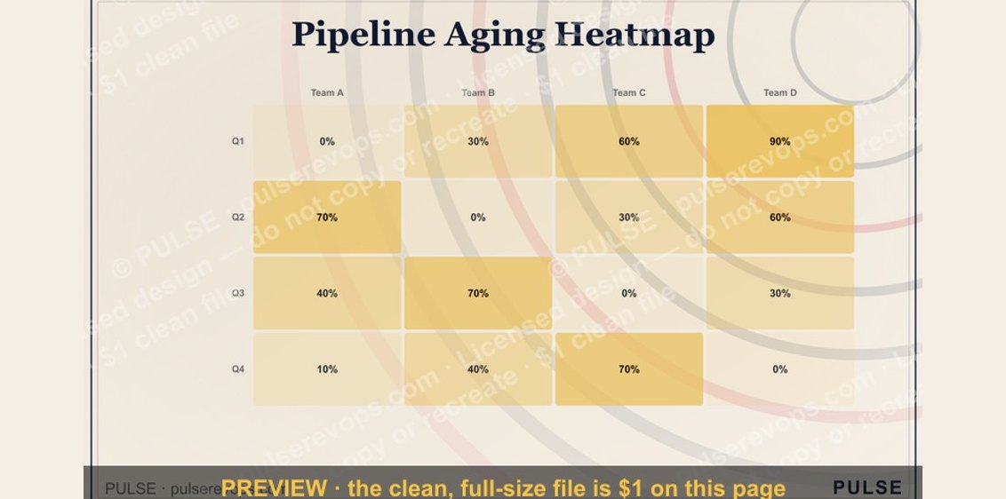 graphicPipeline Aging Heatmap
 graphicChurn by Segment Bar Chart