


CAC Payback Visualization
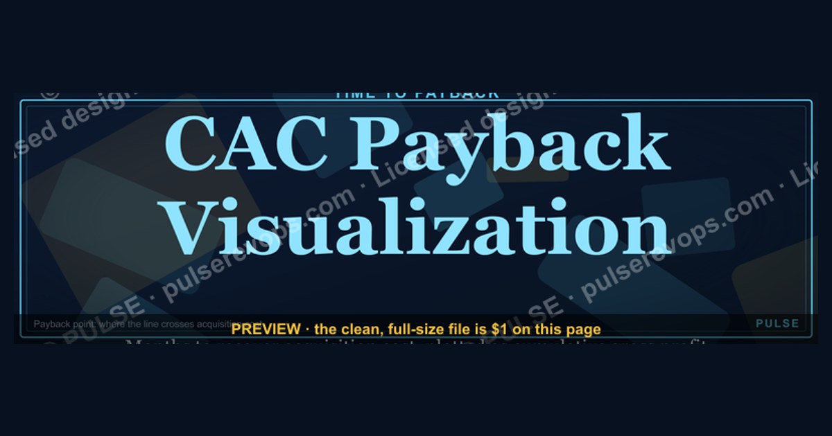

A CAC Payback Visualization is a chart that shows how many months it takes for a customer to generate enough gross profit to cover the cost of acquiring them. It typically plots cumulative gross profit against time, with the payback point occurring where the line crosses the acquisition cost. For most SaaS businesses, a healthy payback period ranges from 5 to 12 months, while anything over 18 months often signals a need for efficiency improvements.
CAC Payback Visualization

Time-to-payback bar showing months to recover CAC across customer segments and tiers.
Format: SVG (scalable vector) · Size: 1584×396 px · Category: Chart · License: Free to use — no attribution required.
Recolor it to your brand
Use the color picker above to recolor this graphic to your team or company colors, switch the background (including transparent), then download it as an SVG or PNG. No sign-up, no watermark.
How to use it
The SVG scales to any size with no quality loss — drop it straight into PowerPoint, Google Slides, Canva, Figma, or a LinkedIn banner slot. The PNG export is ready to upload anywhere that wants a raster image.
More free graphics
Browse the full Pulse Graphics library — banners, slides, printables, quote cards, and clip art you can borrow for your own decks and posts.
Interpreting the CAC Payback Visualization: What the Bars Actually Tell You
A CAC payback visualization isn't just a set of bars — it's a diagnostic tool that reveals the health of your unit economics across different customer segments. When you look at the time-to-payback bar chart, the first thing to understand is that shorter bars are almost always better, but the *context* of each bar matters enormously.
What the Vertical Axis Represents
The vertical axis in a standard CAC payback visualization shows months to recover the customer acquisition cost. This is calculated as:
CAC Payback Period (months) = CAC / (Monthly Recurring Revenue per Customer × Gross Margin)
For example, if you spent $3,000 to acquire a customer who pays $200 per month with an 80% gross margin, your payback period is $3,000 / ($200 × 0.80) = 18.75 months. The visualization would show a bar reaching approximately the 19-month mark.
Industry benchmarks vary widely by business model:
- SaaS companies targeting SMBs: 5–12 months is considered healthy
- Enterprise SaaS: 12–24 months is common, sometimes stretching to 36 months for very high-value accounts
- E-commerce/DTC: 1–3 months is typical, as margins are thinner and churn is higher
- Marketplaces: 6–18 months, depending on take rate and transaction frequency
The visualization becomes most powerful when you can see multiple segments side-by-side. If your enterprise segment shows a 30-month payback while your mid-market segment shows 14 months, that doesn't necessarily mean enterprise is "bad" — it may mean your enterprise sales process is too expensive relative to the contract value, or that you're not retaining enterprise customers long enough to recoup the investment.
Reading the Horizontal Segments Within Each Bar
Many CAC payback visualizations break each bar into color-coded segments representing different cost components or time periods. A typical breakdown might show:
- Dark blue (months 1–3): Sales team salaries and commissions
- Light blue (months 4–8): Marketing program costs (ads, content, events)
- Green (months 9+): Onboarding and implementation costs
This segmentation reveals which part of your acquisition process is driving the longest payback. If the dark blue segment dominates, your sales team is too expensive for the deal sizes they're closing. If the green segment is long, your onboarding process is burning cash before the customer starts generating meaningful revenue.
A more advanced visualization might also overlay cumulative gross profit as a line on the same chart. The point where the cumulative gross profit line crosses the cumulative acquisition cost line is your true payback point — and it often differs from the simple calculation because of timing differences in when costs are incurred versus when revenue is recognized.
Common Red Flags to Spot in the Visualization
1. The "Flat Bar" Pattern: If all customer segments show nearly identical payback periods, you likely have a one-size-fits-all acquisition model that's either over-investing in low-value segments or under-investing in high-value ones. Healthy businesses show variation — typically 2x to 3x between their shortest and longest payback segments.
2. The "Inverted Pyramid" Pattern: When your highest-value customer segment has the longest payback, but your lowest-value segment pays back quickly, you have a structural problem. This often means your sales team is spending disproportionate time on small deals while neglecting larger opportunities, or your marketing channels are misaligned with your ideal customer profile.
3. The "Cliff Edge" Pattern: If payback periods suddenly jump by 6+ months between adjacent segments (e.g., from 8 months to 14 months), you may have a pricing or packaging gap. Customers just below a certain price point might not be getting enough value to justify the acquisition spend, or your sales process might be over-engineered for deals that don't need it.
4. The "Negative Payback" Anomaly: Rare but important — if any bar extends beyond 36 months for a subscription business, you're almost certainly losing money on that segment. The only exception is if you have extremely low churn (under 5% annually) and very high expansion revenue that isn't captured in the initial payback calculation.
How to Use the Visualization for Decision-Making
The CAC payback visualization should drive three specific actions:
First, set segment-specific targets. Don't apply a single payback target across all customer types. Instead, use the visualization to establish thresholds based on lifetime value. A good rule of thumb: the payback period should not exceed one-third of the average customer lifetime. If your enterprise customers stay for 60 months, a 20-month payback is acceptable. If your SMB customers churn after 12 months, you need payback in 4 months or less.
Second, identify the "sweet spot" segment. Look for the segment with the shortest payback AND the largest customer count. This is your most efficient growth engine. Double down on the channels and sales motions that feed this segment, even if the average deal size is smaller. A $5,000 deal that pays back in 3 months is more valuable than a $50,000 deal that takes 24 months to recover, because the former frees up capital for reinvestment much faster.
Third, run "what-if" scenarios. Most CAC payback visualizations are static, but you can mentally model changes. What if you reduced sales headcount by 20% in the enterprise segment? How would the bar shrink? What if you increased monthly pricing by 15% for the mid-market segment? The visualization helps you prioritize which lever to pull — cost reduction, price increase, or channel optimization — based on which segment's bar moves the most.
Segmenting Your CAC Payback Visualization for Deeper Insights
A single aggregated CAC payback number is dangerously misleading. The real power of the visualization comes from slicing your data into meaningful segments that reveal hidden dynamics in your business. Here are the most impactful ways to segment your CAC payback visualization, with specific guidance on what to look for in each.
Segmentation by Acquisition Channel
Create separate bars for each major channel: paid search, organic, referrals, outbound sales, content marketing, partnerships, and events. The differences between these bars are often dramatic.
Paid channels (Google Ads, LinkedIn, Facebook) typically show the shortest payback periods — often 3–6 months for well-optimized campaigns — because the cost is directly attributable and you can turn spending on and off. However, these channels also tend to have the highest churn rates, meaning the payback period might be short but the customer lifetime is equally short.
Organic channels (SEO, content marketing, word-of-mouth) often show longer payback periods — 6–18 months — because the initial investment in content and SEO takes time to compound. But these customers frequently have higher retention rates and lower churn, making the longer payback acceptable. If your organic channel shows a payback period of 24+ months, you're either investing too heavily in content that doesn't convert, or your organic traffic quality is low.
Referral channels are the hidden gem. They typically show the shortest payback periods (1–4 months) AND the highest retention rates. If your referral bar is longer than 6 months, your referral program incentives are misaligned — you're probably paying too much per referral or the referred customers aren't a good fit for your product.
Outbound sales almost always shows the longest payback period — 12–24 months is normal for B2B. The key question is whether the lifetime value justifies it. If your outbound sales bar is 20 months but those customers stay for 48+ months and expand 30% year-over-year, it's a healthy segment. If they churn at 24 months, you're losing money.
Segmentation by Customer Cohort
Time-based segmentation — by month or quarter of acquisition — reveals whether your payback is improving or deteriorating over time. This is perhaps the most actionable view for growth teams.
Plot bars for each of the last 12–24 months of acquisition. A healthy business shows a downward trend in payback periods over time, as you optimize processes, improve targeting, and benefit from economies of scale. An upward trend is a warning sign that your acquisition costs are rising faster than your revenue per customer.
Look for seasonal patterns as well. Many B2B businesses see longer payback periods in Q4 (when sales teams are pushing to hit annual targets and may be less disciplined about deal quality) and shorter payback periods in Q1 (when new budgets open up and customers are more likely to buy the right solution). If your Q4 cohort shows a payback period 40% longer than your Q1 cohort, you need to examine whether year-end discounting or rushed sales processes are damaging unit economics.
Cohort analysis also reveals the impact of product launches and pricing changes. If you raised prices in March, the April cohort should show a shorter payback period (all else being equal). If it doesn't, your price increase may have attracted a different, more expensive-to-acquire customer type, or your sales team may be compensating by spending more time per deal.
Segmentation by Customer Size or Tier
This is the most common segmentation in CAC payback visualizations, but it's often done poorly. The mistake is using arbitrary revenue bands (e.g., $0–$5K, $5K–$20K, $20K+) that don't reflect actual customer behavior.
Instead, segment by annual contract value (ACV) deciles — divide your customers into ten equal groups by revenue, then calculate payback for each decile. This reveals natural breakpoints where payback changes dramatically. You might find that the top 30% of customers by ACV have a payback of 18 months, while the bottom 70% have a payback of 6 months. This tells you that your high-value customers are expensive to acquire but may be worth it — or that you're over-investing in a small number of large deals.
A more sophisticated approach is to segment by customer lifetime value (LTV) quartiles rather than ACV. Two customers with the same ACV can have dramatically different payback periods if one churns after 12 months and the other stays for 60 months. By segment
Related on PULSE
- Lead Routing Logic Diagram
- Hire Decision Framework
- Renewal Risk Decision Tree
- Pricing Discount Decision Tree
- Touchpoint Timeline
Sources
- SaaS Capital — benchmarks for CAC payback periods in B2B SaaS companies
- ProfitWell (by Paddle) — research on SaaS metrics including CAC payback and cohort analysis
- OpenView — industry reports on SaaS financial metrics and payback timeframes
- HubSpot — guides on customer acquisition cost and payback period calculations
- Harvard Business Review — articles on customer lifetime value and acquisition cost analysis
- U.S. Small Business Administration — resources on financial metrics for small businesses, including CAC payback
FAQ
What exactly is CAC Payback? CAC Payback is the number of months it takes for a customer’s gross margin to cover the cost of acquiring them. It’s a core SaaS metric that shows how quickly you recoup your sales and marketing investment.
How is CAC Payback calculated? The standard formula is: (Total Customer Acquisition Cost) ÷ (Monthly Recurring Revenue per Customer × Gross Margin %). For example, if CAC is $1,000 and each customer generates $100 in monthly gross margin, payback is 10 months.
What is a “good” CAC Payback period? Most SaaS benchmarks suggest a payback period of 12 months or less is healthy, while 18+ months may indicate inefficiency. However, this varies by business model—enterprise SaaS often has longer payback than SMB-focused products.
Does CAC Payback include all sales and marketing costs? Yes, it should include fully loaded costs: salaries, commissions, advertising, tools, and overhead. Some teams exclude brand-building spend, but for accuracy, include all expenses tied to acquiring customers.
How does gross margin affect CAC Payback? Higher gross margins shorten payback because more revenue per dollar goes toward covering acquisition costs. A company with 80% gross margin will recoup CAC faster than one with 60% margin, assuming the same revenue and CAC.
Can CAC Payback change over time? Absolutely—it shifts as you scale. Early-stage companies often have longer payback due to high upfront costs, while mature companies may see it shorten as efficiency improves. Monitor it monthly to spot trends in sales productivity or churn.
This page will be disappearing soon. Save it to your device for $1 — or read it free while it is here.
@Kory-White- · if Venmo asks, the last 4 of my number are 2012
This page is gone.
This one is off the shelf now. $1 keeps it on your phone for good — the whole page, pictures and diagrams included.
 graphicSales Velocity Components
 graphicPipeline Coverage Gauge
 graphicPipeline Aging Heatmap
 graphicWin Rate by Stage Bar Chart
 graphicRevenue by Channel Pie
 graphicWin Rate by Segment Bar Chart
 graphicChurn by Segment Bar Chart
 graphicForecast Commit / Best Case / Upside
 graphicDeal Stage Progression Bar
 graphicMRR Growth Trend Line