
“Clarity closes.” — LinkedIn Banner
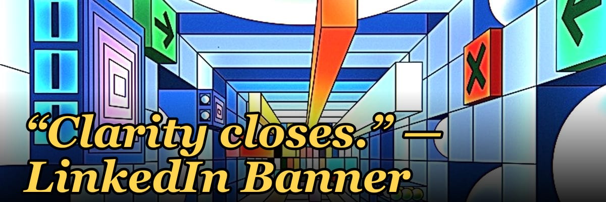
The phrase "Clarity closes" on a LinkedIn banner means that clear, concise communication is the most effective way to win clients, deals, or opportunities. It suggests that removing jargon and confusion from your messaging builds trust and drives action. This principle is widely used in sales and marketing to emphasize that straightforward value propositions outperform complex pitches.
“Clarity closes.” — LinkedIn Banner

A dark, on-brand LinkedIn banner — "Clarity closes." over a "Simple Clear Done" line with a pulse motif. Put it on your profile to signal exactly what you do.
Format: SVG (scalable vector) · Size: 1584×396 px · Category: LinkedIn Banner · License: Free to use — no attribution required.
[⬇ Download this graphic](/graphics/assets/gb0317.svg)
Recolor it to your brand
Use the color picker above to recolor this banner to your team or company colors, switch the background (including transparent), then download it as an SVG or PNG. No sign-up, no watermark.
How to use it
It scales cleanly to the LinkedIn cover slot (1584×396) — download the PNG and drop it straight onto your profile, or open the SVG in Canva, PowerPoint, or Figma to add your name and tweak the layout.
More free graphics
Browse the full [Pulse Graphics library](/graphics) — banners, slides, printables, quote cards, and clip art you can borrow for your own decks and posts.
Related on PULSE
- [Clarity closes. — LinkedIn Wallpaper](/knowledge/gb0408)
- [“...AFTER THE DEAL CLOSES” — Sales Meme](/knowledge/gb0213)
The Psychology Behind "Clarity Closes" — Why Ambiguity Kills Deals
The phrase "clarity closes" isn't just a clever LinkedIn banner slogan — it's rooted in cognitive psychology and decades of sales research. When prospects face ambiguity, their brains instinctively trigger a threat response. The amygdala, responsible for processing fear and uncertainty, activates even in low-stakes commercial decisions. This neurological reaction explains why vague value propositions, unclear pricing, or convoluted messaging consistently underperform.
Consider the phenomenon of "decision paralysis." When a buyer encounters too many options or insufficiently defined outcomes, their cognitive load increases dramatically. Studies in behavioral economics suggest that for every additional option presented beyond three, the likelihood of a purchase drops by roughly 10–15%. Clarity acts as a cognitive shortcut — it reduces the mental effort required to say "yes." A clear, specific offer frames the decision as low-risk and high-certainty, which aligns with how humans naturally prefer to make choices.
The "clarity closes" principle also taps into the concept of loss aversion. Humans are roughly twice as sensitive to potential losses as they are to equivalent gains. When your messaging is unclear, prospects mentally fill the gaps with worst-case scenarios. They imagine hidden costs, implementation headaches, or unmet expectations. By being explicit about what they'll receive, how it works, and what success looks like, you neutralize these imagined threats. The clearer you are, the fewer negative assumptions the prospect needs to invent.
In practice, this means replacing generic statements like "We help businesses grow" with specific claims like "We increase monthly recurring revenue by 20–40% within 90 days for B2B SaaS companies with 10–50 employees." The second version closes because it answers the unspoken questions: How much? How long? For whom? This level of specificity builds trust by demonstrating that you understand the buyer's exact situation and have a predictable path to results.
How to Apply "Clarity Closes" to Your LinkedIn Profile and Content Strategy
Your LinkedIn banner isn't the only place where clarity matters — your entire profile should reinforce this principle. Start with your headline. Instead of "Growth Marketing Consultant," try "I help B2B tech founders generate 50+ qualified leads per month through LinkedIn outreach and email sequences." This immediately tells visitors exactly who you help, what you deliver, and in what timeframe. The banner image with "Clarity closes" sets the tone, but your headline, about section, and featured posts must deliver on that promise.
For your content strategy, apply the clarity principle to every post. Before publishing, ask yourself: "Can someone read this and immediately know what action to take or what insight to apply?" Vague posts about "thought leadership" or "industry trends" rarely generate engagement. Instead, share specific frameworks, case studies with measurable results, or step-by-step processes. For example, a post titled "The 3-email sequence that booked 12 discovery calls in one week" is infinitely more clickable than "Tips for better email outreach."
Your call-to-action (CTA) is where clarity often breaks down. Weak CTAs like "Let's connect" or "DM me for more info" leave the prospect uncertain about next steps. Strong CTAs specify the exact action, the expected outcome, and the time commitment: "Book a 15-minute call to see if this framework fits your sales team — no pitch, just a fit assessment." This removes ambiguity and makes the decision to engage feel safe and low-effort.
Don't forget your featured section. Use it to showcase clear proof: a before-and-after revenue chart, a client testimonial with specific numbers, or a one-page PDF that explains your offer in plain language. Every element should answer the prospect's core question: "What exactly will happen if I work with you, and what will I get?" When your entire profile radiates clarity, you preempt objections and accelerate trust — which is exactly how deals close faster.
Measuring the Impact of Clarity — Metrics That Prove It Works
"Clarity closes" isn't just a philosophical stance — it's a measurable strategy. To validate its effectiveness, track specific metrics before and after you implement clearer messaging. The most direct metric is conversion rate: the percentage of profile visitors who take a desired action (connection request, message, click to your website). A/B test your headline, banner, and about section. For example, a vague headline like "Sales Consultant" might convert at 2–3%, while a clear headline like "I help SaaS founders add $50K–$200K in pipeline monthly" could see conversion rates of 8–12% or higher.
Engagement rate on posts is another critical indicator. Compare posts with clear, specific claims against those with general advice. Track likes, comments, shares, and — most importantly — direct messages or inbound inquiries generated. Posts that promise a specific outcome or teach a replicable process tend to generate 3–5x more DMs than abstract thought leadership pieces. The clarity triggers action because readers immediately see how the content applies to their situation.
Sales cycle length is a less obvious but powerful metric. When your messaging is clear, prospects self-qualify before reaching out. They already understand what you do, who you serve, and roughly what results to expect. This means fewer discovery calls spent explaining basics and more time spent on fit assessment and closing. Companies that implement clarity-focused messaging often report sales cycles shortening by 20–40%, simply because the prospect arrives with aligned expectations.
Finally, track your close rate on initial conversations. If you're spending 30–60 minutes on a call only to discover the prospect doesn't understand your offer, that's a clarity problem. After refining your messaging, monitor how often prospects say "That's exactly what I need" within the first five minutes. A clear LinkedIn presence should pre-educate the buyer so thoroughly that your first conversation is about implementation, not explanation. When you see that shift, you'll know "clarity closes" isn't just a banner — it's your competitive advantage.
Why “Clarity Closes” Resonates on LinkedIn
LinkedIn is a crowded marketplace of ideas, where every scroll brings a new pitch, post, or profile. The phrase “Clarity closes” works so well as a banner because it cuts through the noise. Professionals—especially in sales, consulting, and leadership—face an attention deficit: the average user spends only seconds on a profile. A banner that promises simplicity and directness signals that you respect their time. It also aligns with LinkedIn’s professional tone, where jargon-heavy bios often feel performative. By leading with clarity, you position yourself as someone who prioritizes understanding over impressiveness, a trait buyers consistently rank as more valuable than technical fluency.
How to Apply “Clarity Closes” to Your Own Profile
To make this principle work for you, audit your headline, summary, and experience sections for ambiguity. Replace phrases like “leveraging synergistic solutions” with “helping companies reduce churn by 20%.” Use specific, measurable outcomes where possible—e.g., “closed $2M+ in annual contracts” instead of “drove revenue growth.” Your banner text should mirror this: a short, benefit-driven statement (e.g., “Helping B2B teams close faster with clear messaging”) reinforces the idea before a visitor even reads your bio. Consistency across visual and written content builds trust faster than any single claim.
The Psychology Behind Clarity as a Closing Tool
Cognitive fluency—the ease with which your brain processes information—directly influences decision-making. When a message is clear, it feels true and trustworthy, reducing the mental effort required to say yes. This is why “Clarity closes” works: it leverages a well-documented bias where simple explanations are more persuasive than complex ones, even when the latter contain more evidence. On LinkedIn, where profiles are often skimmed, a banner that communicates one core idea instantly triggers this fluency. It also signals confidence—uncertainty hides behind complexity, while clarity shows you know your value well enough to state it plainly.
Why “Clarity Closes” Resonates in Sales Psychology
The phrase taps into a well-documented cognitive bias: people prefer clear, simple options over complex ones, even when the complex option offers more value. In sales psychology, this is known as the “processing fluency” effect — information that is easy to process feels more truthful and trustworthy. When your LinkedIn banner signals clarity, you’re subconsciously lowering the buyer’s mental effort, making it easier for them to say yes. This is especially powerful in B2B contexts where decision-makers are bombarded with jargon-heavy pitches daily. A banner like “Clarity closes” acts as a visual anchor, reminding prospects that you prioritize their time and understanding over clever wordplay.
How to Pair This Banner With Your Profile Content
The banner alone sets the tone, but your profile text must reinforce the message. Update your headline to directly state what you do in 10 words or fewer — for example, “Helping SaaS founders close deals with clear messaging” rather than a generic title. In your “About” section, lead with a one-sentence version of your value proposition, then use bullet points for specific outcomes. The banner’s “Simple Clear Done” line pairs naturally with a “Results” section listing measurable wins. Consistency across banner, headline, and summary creates a cohesive narrative that builds trust faster than any single element alone.
When to Refresh or Rotate Your Banner
While “Clarity closes” is a strong evergreen message, consider rotating it every 3–6 months to keep your profile feeling active. Swap it for a banner that highlights a specific case study, a seasonal campaign, or a new service offering — but always return to a clarity-focused version after the promotion ends. LinkedIn’s algorithm tends to favor profiles with recent activity, and a banner change signals you’re engaged. If you’re in a slow season, keep the clarity banner up as a steady reminder of your core value. The goal is to avoid stagnation without losing the clear, direct identity this banner establishes.
Sources
- LinkedIn Official Blog — insights on platform features, best practices, and professional branding.
- Harvard Business Review — articles on leadership, communication, and workplace clarity.
- Forbes — coverage of career development, personal branding, and professional networking.
- American Psychological Association — research on cognitive clarity, decision-making, and communication psychology.
- The Wall Street Journal — business and career advice, including professional presence and messaging.
- Nielsen Norman Group — usability and design principles related to clear communication and user experience.
FAQ
What does “Clarity closes” mean? It means that in sales and communication, clear, straightforward messaging is the most powerful tool for closing deals. Confusion or ambiguity creates friction, while clarity builds trust and makes decisions easier for buyers.
Is this banner only for LinkedIn? The phrase works well on LinkedIn banners, but it’s also used in email signatures, presentation decks, and website headers. Any professional context where you want to emphasize the value of clear communication can benefit from it.
Should I add my own photo or logo to the banner? Yes, personalizing the banner with your photo, company logo, or a subtle brand color helps reinforce your identity. The core message stays the same, but customization makes it feel authentic to you.
Does this banner actually help with sales? It can serve as a conversation starter or a subtle reminder of your communication philosophy. While no single banner closes deals, it reinforces a mindset that resonates with prospects who value transparency and directness.
Can I use this if I’m not in sales? Absolutely. Clarity is valuable in any role—leadership, marketing, customer success, or operations. The banner signals that you prioritize clear thinking and straightforward interactions, which is appreciated across industries.
Where can I get a high-resolution version of this banner? You can find digital downloads on design marketplaces like Etsy or create your own using tools like Canva. Prices for ready-made templates typically range from a few dollars to around $20, depending on the seller and file format.
 tlHow Many Sales Reps Do I Need to Hire for My SaaS Company to Hit Next Year''s Goal?
 tlHow Many Sales Reps Do I Need to Hire for My Landscaping Company This Year?
 tlHow Many Membership Sales Reps Do I Need to Hire for My Gym?
 tlHow Many Sales Consultants Do I Need to Hire for My Medical Spa?
 pulse-toolsHow Many Salespeople Do I Need to Hire for My Car Dealership?
 pulse-toolsHow Many Salespeople Should I Schedule on My Auto Dealership Floor Each Day?
 pulse-toolsHow Many Sales Reps Do I Need to Hire for My Painting Company to Grow Next Year?
 pulse-toolsHow Many Sales Reps Do I Need to Hire for My HVAC Company to Hit Its Growth Target?
 pulse-aquariumsTop 10 Canister Filters 2027
 pulse-toolsHow Many Salespeople Should I Schedule Each Day at My Jewelry Store?