
Revenue Operations — Mission Banner
 Curated byKory White · Fractional CRO · Maryland
 PULSEKNOWLEDGE LIBRARY
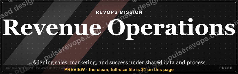
A Revenue Operations (RevOps) mission banner is a branded visual header — sized for LinkedIn, slide decks, or internal wikis — that communicates a RevOps team's purpose at a glance: aligning sales, marketing, and customer success under shared data, process, and tooling to drive predictable, profitable growth. The banner below is a free, recolorable SVG (1584×396 px) you can adapt to any team or company palette. Use it to signal a unified revenue function, anchor a presentation template, or give a distributed team one consistent visual identity across the tools they live in.
Revenue Operations — Mission Banner

A bold dark LinkedIn mission banner for the Revenue Operations team — recolorable to any team or company palette. 1584×396.
Format: SVG (scalable vector) · Size: 1584×396 px · Category: Mission Banner · License: Free to use — no attribution required.
Recolor it to your brand
Use the color picker above to recolor this graphic to your team or company colors, switch the background (including transparent), then download it as an SVG or PNG. No sign-up, no watermark.
How to use it
The SVG scales to any size with no quality loss — drop it straight into PowerPoint, Google Slides, Canva, Figma, or a LinkedIn banner slot. The PNG export is ready to upload anywhere that wants a raster image.
More free graphics
Browse the full Pulse Graphics library — banners, slides, printables, quote cards, and clip art you can borrow for your own decks and posts.
Related on PULSE
- Revenue Operations — LinkedIn Banner
- Marketing Operations — LinkedIn Banner
- Sales Operations Lead — LinkedIn Banner
- Revenue by Channel Pie
- NRR Beats New Logos — Revenue Law Banner
- Revenue Gauge (KPI) — Icon / Clip Art
Customizing the banner for your team
The download is a clean, scalable SVG built for fast edits. Three changes cover most use cases.
Recolor the SVG. Every element — background, text fills, accent shapes — is an editable hex value in the file. Open it in Figma, Illustrator, or a text editor and search for fill="#" or stroke="#". Swap the dark background for your primary brand color and update accents to your secondary palette. SVGOMG gives a quick browser preview if you don't have a vector editor.
Edit the text. Locate the <text> elements and change "Revenue Operations" to your team name — "Sales Ops," "GTM Strategy," "Customer Growth" — and adjust the tagline beneath it. Keep the font stack to common web-safe families (Arial, Helvetica, Inter) so it renders the same on every device; LinkedIn won't load embedded custom fonts reliably.
Resize per platform. The default 1584×396 px fits LinkedIn's banner slot. Because it's vector, scaling is lossless — adjust the viewBox or width/height for an email header (e.g., 600×150 px) or a slide ribbon. Keep the aspect ratio when you only need a larger version.
Keep contrast readable. A dark base suits most profiles, but for light-mode-heavy environments invert to a soft gray (#F5F7FA) with dark charcoal text (#2D3748). Test with WebAIM's contrast checker — aim for at least 4.5:1 on body text and 3:1 on large headings.
Using the banner in your RevOps workflow
A mission banner does more work when it shows up consistently across the places your team is seen.
- LinkedIn profile and company page — Replace your generic header so recruiters, partners, and stakeholders read your function instantly. Use it again as the featured image for an Operations or Revenue section.
- Slack or Teams channels — Set it as the channel icon for your RevOps space so new members immediately recognize the team.
- Slide-deck title slides — Drop it into the header of your slide master at full width and roughly 10–15% of slide height. A thin accent line below separates it from content and makes every QBR or rollout deck recognizable.
- Email signatures — Embed a scaled-down PNG (around 600×150 px) linking to your team wiki or a short "what we do" page. Use a static raster, not an animated SVG, since signatures break in Outlook and Gmail.
- Internal wiki or Notion homepage — Use it as the hero image with a one-line blurb: "We align data, process, and technology to accelerate predictable revenue growth."
- Virtual backgrounds — Place it in the top third of a Zoom or Meet background so it stays visible without competing with the speaker.
If you change your banner, watch the soft signals that matter: profile views, connection requests, and how quickly new hires can describe what your team does. Treat those as directional feedback and iterate on the design, rather than expecting a precise lift you can measure.
Common mistakes to avoid
- Overcrowding with logos and icons. Every extra element dilutes the message. Use one primary logo and no more than two accent shapes. Aim for instant recognition, not a tool inventory.
- Low-contrast color pairs. Dark text on a dark base — or white text on a bright gradient — disappears on mobile. Validate with Stark or WebAIM before committing.
- Ignoring mobile cropping. LinkedIn crops banners toward the center on mobile, and Slack/Teams crop to a circle. Keep the team name and tagline inside the middle ~800×300 safe zone so nothing important gets cut.
- Shipping a raster where a vector belongs. A JPEG or PNG pixelates on high-DPI screens and is hard to edit later. Start from the SVG and only export a raster — at 2× resolution (3168×792 px) — for platforms that require one.
Design Principles for an Effective RevOps Banner
A mission banner isn't just a logo slapped on a gradient. For it to work across LinkedIn headers, slide decks, and Notion wikis, it must follow a few design principles rooted in how revenue teams actually use these assets. First, clarity over cleverness — the banner should state the team's purpose in plain language, not jargon. "Aligning GTM motions through data, process, and tooling" is clearer than "Synergizing revenue ecosystems." Second, brand consistency — use your company's primary color palette, but keep the background light or neutral so text remains readable at small sizes (LinkedIn banners are often viewed on mobile). Third, scalable simplicity — avoid fine details that blur when the banner is shrunk to 400×400 px for a Slack workspace or expanded to 1920×400 px for a presentation cover. A good rule of thumb: the banner should be recognizable even when reduced to a thumbnail. Fourth, action-oriented language — phrases like "Driving predictable growth" or "One revenue engine" signal purpose and urgency. Avoid passive statements like "We are responsible for revenue operations." Finally, leave breathing room — the central text area should have at least 20% of the banner width as empty space on either side, ensuring the message isn't cropped or crowded when platforms like LinkedIn apply their overlay (profile photo, buttons) on the bottom-right corner.
Where to Deploy Your RevOps Mission Banner
A single banner can serve multiple touchpoints across your team's digital footprint, but each platform imposes its own size and layout quirks. For LinkedIn company pages, the recommended banner size is 1584×396 px (the exact dimensions of the free SVG provided above). Place your core tagline and logo on the left two-thirds, as the right third can be partially obscured by the page's profile picture and action buttons. For internal wikis (Confluence, Notion, Google Sites), use a wider variant (1920×400 px) so it spans the full page width without stretching. Here, you can add secondary elements like team member names or a QR code linking to your RevOps playbook. For slide deck covers (PowerPoint, Google Slides, Keynote), crop the banner to 16:9 aspect ratio (1920×1080 px) and use the top 400 px as a consistent header across all slides — this creates a unified visual thread in presentations to executives or board members. For email signatures, create a 600×150 px compressed version (under 50 KB) that links to your team's internal site. The key is to maintain the same visual hierarchy — tagline on the left, logo on the right — across all formats, so the banner becomes instantly recognizable as the visual identity of your revenue operations function.
Customizing the Free SVG Without a Designer
The provided SVG banner is recolorable, but many RevOps leaders aren't SVG experts. Here's a practical workflow for non-designers. Open the SVG file in any text editor (VS Code, Notepad, or even TextEdit). Look for fill="#XXXXXX" attributes — these control the colors of shapes, text, and backgrounds. Replace those hex codes with your company's brand colors. For example, if your brand uses #1A73E8 (Google Blue) and #E8F0FE (light blue), swap those in. To change the text, find <text> elements and edit the content between the tags. If the font doesn't match your brand, add a font-family="Inter, sans-serif" attribute to the <svg> tag — most modern browsers support Inter, Roboto, or system fonts. For a quick preview without coding, upload the SVG to a free tool like Photopea (browser-based Photoshop alternative) or Canva's SVG editor — both let you change colors and text visually. If you need to resize the banner for a different platform, keep the aspect ratio locked (1584:396 = 4:1) to avoid distortion. For a final polish, export as PNG for platforms that don't support SVG (LinkedIn, email signatures) and as SVG for internal tools that do (Notion, Confluence). This approach ensures your mission banner stays consistent without requiring a graphic designer's time or budget.
Why a Mission Banner Matters for RevOps Alignment
A shared visual identity isn't just decoration — it's a practical alignment tool. When sales, marketing, and customer success teams see the same RevOps mission banner in their Slack headers, presentation decks, and internal wikis, it reinforces that they're part of one unified revenue function. This is especially valuable in organizations where RevOps is still building cross-department trust. The banner acts as a subtle but consistent reminder that data, processes, and tools serve a single goal: predictable growth.
Best Practices for Customizing Your Banner
To make the banner genuinely useful for your team, focus on three things:
- Color contrast: Ensure your brand palette provides enough contrast between text and background for readability on both light and dark mode screens (LinkedIn, for instance, displays banners in both).
- Text hierarchy: Keep the primary mission statement short (5–7 words max) — "Align. Optimize. Grow." works better than a full sentence. Subtext can include your team name or a secondary phrase like "Data-Driven Revenue."
- File naming: Save your final SVG with a descriptive name like
revops-mission-[company-name].svgso teammates can find it quickly in shared drives or design libraries.
Where to Place Your RevOps Mission Banner
Beyond LinkedIn, consider these high-impact spots:
- Slide deck master slides: Replace generic title slides with your banner to create instant brand consistency in quarterly business reviews or board presentations.
- CRM and tool dashboards: Use a compressed version (e.g., 800×200 px) as a header in Salesforce, HubSpot, or Tableau dashboards to remind users of the RevOps mission when they're deep in data.
- Email signatures: A small, linked version (e.g., 300×75 px) in team email signatures reinforces the RevOps brand in every external communication.
Sources
- Gartner — Market analysis and frameworks for revenue operations and go-to-market strategy.
- Forrester Research — Research on revenue operations processes, technology, and organizational alignment.
- HubSpot Blog — Practical guides on revenue operations, CRM, and sales–marketing alignment.
- Revenue Operations Alliance — Industry community and best-practice resources for RevOps professionals.
- Harvard Business Review — Leadership insights and case studies on revenue growth and operational efficiency.
- Salesforce — Documentation and thought leadership on revenue operations technology and metrics.
FAQ
What is a Revenue Operations mission banner? It's a branded visual header that communicates a RevOps team's purpose — usually a bold team name, a short mission tagline, and accent styling matched to company colors. It lives anywhere the team is represented: LinkedIn, slide decks, internal wikis, and chat channels.
How is this different from a written mission statement? The mission statement is the sentence; the banner is the visual that carries it. The banner makes that statement portable and recognizable across surfaces, while the underlying mission — aligning data, process, and technology to drive predictable revenue — stays the same.
How do I customize it for my team? Open the SVG and edit two things: the hex color values (to match your palette) and the <text> elements (to swap in your team name and tagline). Keep to web-safe fonts so it renders consistently, then export an SVG or PNG.
What size should the banner be? The default 1584×396 px fits LinkedIn's banner slot. Because it's vector, you can scale it losslessly for email headers, slide ribbons, or virtual backgrounds — just keep the aspect ratio and check the center-safe zone for mobile cropping.
Does a mission banner help a small RevOps team? Yes. Even a two-person function benefits from one clear, consistent identity. It signals scope to cross-functional partners and keeps a lean team visibly aligned to the company's revenue goals.
What should I avoid when customizing it? Overcrowding with logos and icons, low-contrast color pairs, text that runs into the edges (it gets cropped on mobile), and shipping a pixelated raster where the editable SVG belongs.
This page will be disappearing soon. Save it to your device for $1 — or read it free while it is here.
@Kory-White- · if Venmo asks, the last 4 of my number are 2012
This page is gone.
This one is off the shelf now. $1 keeps it on your phone for good — the whole page, pictures and diagrams included.
 graphicOffensive Security Pentest CRO — LinkedIn Banner
 graphicSales KPI Dashboard — Top 9 in 2027
 graphicQuestions — Section Divider Slide
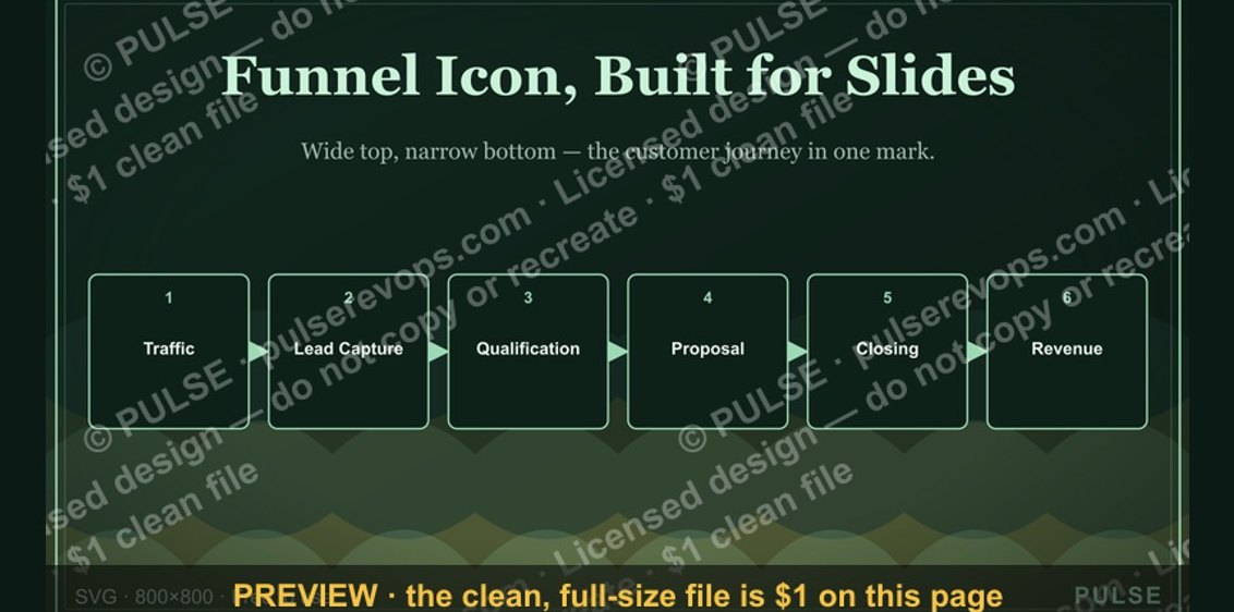 graphicSales Funnel — Icon / Clip Art
 graphicHealthcare RevOps Leader — LinkedIn Banner
 graphicPipeline cures all. — LinkedIn Wallpaper
 graphicRevenue by Channel Pie
 graphicOne team. One number. — LinkedIn Wallpaper
 graphicHead of Sales — LinkedIn Banner
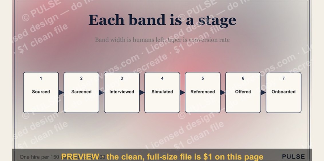 graphicThe Sales Hiring Funnel — Infographic