
Top 10 Sales KPIs for AI Observability Platform in 2027
 Curated byKory White · Fractional CRO · Maryland
 PULSEKNOWLEDGE LIBRARY
Quality
Certified

The 10 best sales kpis for ai observability platform are ranked below on measured performance, build quality, price, and how each one actually holds up in daily use rather than how it reads on a spec sheet. Each pick lists what it costs, who it suits, and what it gives up against the one above it, so the list can be read straight down without doubling back.
1. Net New ARR

Net new ARR ranks first because it is the only top-line metric that captures both new logos and expansion in a single figure, and every other KPI on this list ultimately feeds it. In AI observability, usage-linked pricing means a single production-scale customer can add six figures of ARR within two quarters as trace volume compounds with inference spend.
It is built for revenue leaders and finance teams who need one defensible growth number for board reporting. The trade-off is that net new ARR hides which engine is running: a quarter driven entirely by new logos looks identical to one driven by expansion, and those two businesses need completely different go-to-market investment. Compare it to net revenue retention directly below, which isolates the existing-customer engine net new ARR blends together.
2. Net Revenue Retention

Net revenue retention ranks second because it is structurally high in this category and therefore the single best indicator of product-market fit. Pricing coupled to inference volume means customers' spend grows automatically as they move workloads from pilot to production, and industry norms sit well above 100%. The discipline that matters is decomposing it into seat upgrades, new workloads, and the same workload simply getting bigger.
It serves CFOs and investors evaluating the durability of the revenue base, and it is the number that determines valuation multiples in this category. The trade-off is that a blended NRR figure hides fragile expansion: growth from a customer's inference spend reversing the moment they optimize cost or switch to a cheaper model. Compare it to net new ARR above, which blends new and existing revenue, while NRR isolates retention and expansion alone.
3. Monthly Trace Volume

Monthly trace volume ranks third because it is the headline volume-first metric and the leading indicator of usage-based revenue one to two quarters ahead. Trace growth tracks customer inference spend almost linearly, so a flattening trace curve predicts a revenue plateau before it appears in billing. Agentic workloads amplify this: a single agent run with tool calls and retrieval emits dozens to hundreds of spans where a completion emits one.
It is built for sales engineers and customer success teams managing adoption inside accounts. The trade-off is that trace volume alone cannot distinguish healthy usage from an architecture change: a customer moving to agentic workloads shows explosive growth that is a one-time step change, not a trend. Compare it to cost per million traces directly below, which converts this volume figure into the margin diagnostic that actually governs account health.
4. Cost Per Million Traces

Cost per million traces ranks fourth because it is the per-account margin diagnostic that determines whether growth is profitable. Healthy gross margins sit at pennies to tens of cents per million traces, driven by semantic deduplication and columnar encoding that compress the repetitive system prompts and tool schemas recurring across nearly every call. A blended company average hides the accounts where unusual trace shapes invert the economics.
It is built for finance and platform engineering teams who need to find unprofitable accounts before renewal. The trade-off is that it is noisy at short intervals, so reacting weekly produces bad engineering decisions; it belongs on a monthly cadence. Compare it to monthly trace volume above, which measures adoption, while this metric measures whether that adoption is actually making money.
5. Customer LLM Spend Coverage

Customer LLM spend coverage ranks fifth because it measures how embedded the platform is in a customer's inference traffic, and coverage above 80% marks a genuinely embedded vendor. Coverage in the 30 to 50 percent range means the customer runs two or three tools in parallel and sits one procurement review away from consolidation. Customers routing through a gateway have a single instrumentation point that delivers near-total coverage almost for free.
It is built for enterprise sales teams competing against incumbent APM extensions and homegrown logging tables. The trade-off is that coverage is hard to measure precisely because customers rarely know their own total inference spend, so it often relies on discovery estimates rather than telemetry. Compare it to cost per million traces above, which measures margin per unit, while coverage measures the share of the customer's wallet you actually hold.
6. Eval-in-Production Adoption

Eval-in-production adoption ranks sixth because it is the best available proxy for organizational commitment and correlates strongly with renewal. It measures the share of accounts running LLM-as-judge or rubric-based scoring on live traffic rather than only in pre-deploy test harnesses, and 50% adoption is a strong number because activating it requires the customer to define what good means.
It is built for expansion reps and customer success teams whose compensation should be tied to it rather than to volume. The trade-off is that it forecasts poorly, because adoption depends on whether the customer has a named AI quality owner, a role that did not exist eighteen months ago in many organizations. Compare it to customer LLM spend coverage above, which measures breadth of traffic, while this measures depth of decision-making routed through your scores.
7. Drift Alert Response Rate

Drift alert response rate ranks seventh because it is the single best leading predictor of churn, surfacing disengagement sixty days before revenue metrics confirm it. It measures the share of delivered alerts that trigger human review or automated remediation within a day. A detection system tuned too sensitively produces alerts customers learn to ignore, and the ignored-alert state looks identical to healthy usage on a volume chart.
It is built for customer success teams running quarterly business reviews and for product teams tuning detection thresholds. The trade-off is that it requires product telemetry tracking who looked at what and what they did next, which most platforms do not emit today and which everyone deprioritizes. Compare it to eval-in-production adoption above, which measures whether quality scoring is running, while response rate measures whether anyone is still acting on the output.
8. Integration Breadth

Integration breadth ranks eighth because multi-provider customers will not standardize on a platform covering only part of their stack, making breadth a gating requirement in competitive enterprise deals rather than a differentiator. Teams running two frontier providers plus an open-weights model plus two orchestration frameworks will not adopt a platform covering three of the five, because partial coverage forces a second tool. Once a second tool exists, the consolidation conversation runs against you.
It is built for product and partnerships teams deciding which connectors to ship each quarter. The trade-off is that breadth is expensive to maintain as provider APIs change, and shallow integrations that break silently damage trust more than missing ones. Compare it to drift alert response rate above, which measures engagement depth, while breadth measures whether the account can consolidate on you at all.
9. 18-Month Renewal Rate

The 18-month renewal rate ranks ninth because it is the lagging confirmation that volume-driven retention was real rather than borrowed. Accounts that look healthy on trace volume but never activated evaluation often fail this review, because nobody internally can defend the spend when finance audits the observability line item. It is the metric that catches the failure mode volume-first compensation plans create.
It is built for revenue operations and finance teams modeling cohort-level durability rather than blended averages. The trade-off is that eighteen months is a long feedback loop, so it cannot guide in-quarter decisions and must be paired with leading indicators like drift alert response rate. Compare it to integration breadth above, which predicts whether consolidation will favor you, while renewal rate confirms whether it actually did.
10. POC-to-Paid Conversion

POC-to-paid conversion ranks tenth because it governs pipeline efficiency and varies enormously by deal size, with small deals converting at multiples of the rate large enterprise deals do. Time-to-first-value is the controllable variable inside that spread: the days from POC start to the customer's first genuinely useful drift alert or evaluation run. Cutting that from a month to under two weeks does more for conversion than any pricing concession.
It is built for sales leaders forecasting quarterly and for product teams prioritizing SDK ergonomics and default dashboards. The trade-off is that a high blended conversion rate can hide a collapsing enterprise segment, so it must be segmented by deal size and by whether the account already runs an incumbent observability platform. Compare it to the 18-month renewal rate above, which measures what happens after the deal closes, while conversion measures whether it closes at all.
How we ranked these
This ranking weighted nine sales KPIs by their observed correlation with revenue durability and expansion in AI observability: net new ARR, net revenue retention, monthly trace volume, cost per million traces, customer LLM spend coverage, eval-in-production adoption, drift alert volume and response rate, integration breadth, and 18-month renewal rate.
Volume-linked metrics were weighted for new-logo forecasting power; evaluation-linked metrics were weighted for retention and pricing power, since encoded rubrics create switching costs a trace store never accumulates.
Deliberately ignored: raw logo counts, total funding raised, analyst quadrant placement, and social mention volume, none of which predict whether an account renews. Also excluded were blended NRR figures that hide whether growth came from seat upgrades, new workloads, or the same workload simply getting bigger. That third bucket is fragile and reverses the moment a customer caches aggressively or switches to a cheaper model, so it was decomposed rather than ranked as one number.
What to look for
What actually matters is whether the vendor's metric spine matches your workload maturity. Experimental prospects cannot buy an evaluation story because they have no production behavior to evaluate; production teams with a recent quality incident buy evaluation immediately. Ask in discovery who is accountable when a model output is wrong in production. A named owner predicts eval activation; a shrug predicts a trace-capture account that looks healthy on volume and fails its 18-month renewal review.
The mistake most buyers make is choosing on price per million traces alone. That number is meaningless without retention policy, compression ratio, and sampling defaults attached. A vendor quoting pennies per million while storing full-fidelity raw telemetry for thirteen months will reprice you at renewal. Ask instead for cost per million traces broken down per account, the default tiered retention policy, and whether stratified sampling toward anomalies ships as a default or an upsell.
Related questions
Why does customer LLM spend coverage matter more than total trace volume?
Coverage measures what share of a customer's inference traffic actually lands in your platform versus a competitor, a homegrown logging table, or nowhere. Above 80% signals a genuinely embedded vendor. Coverage in the 30-50% range means you are one of several parallel tools and one procurement review away from consolidation, regardless of how impressive raw trace volume looks.
What is eval-in-production adoption and why is 50% considered strong?
It is the share of accounts running LLM-as-judge or rubric-based scoring on live traffic rather than only in a pre-deploy test harness. Most platforms sit well below 50% because evaluation requires the customer to define what good means, which is organizational work no vendor can do for them. Teams that encode quality bars into your rubrics build real switching costs.
How should NRR be decomposed for an AI observability platform?
Split net revenue retention into three buckets: seat or tier upgrades, new integrations and new workloads, and the same workload simply getting bigger. The third bucket is borrowed retention, because it reverses the moment a customer optimizes inference spend, switches to a cheaper model, or caches aggressively. Boards that never see NRR decomposed get surprised when engineering teams cut costs.
Why is time-to-first-value more controllable than sales cycle length?
Cycle length stretches from weeks for small deals to two or three quarters for enterprise, and most of that spread is outside your control. Time-to-first-value, measured from POC start to the customer's first genuinely useful drift alert or evaluation run, is entirely an engineering problem: SDK ergonomics, one-command proxy setup, default dashboards, and a starter rubric library.
What does a drift alert response rate reveal that alert volume does not?
Alert volume alone rewards sensitivity, which generates false positives until customers mute the channel. At that point delivered alerts keep climbing while delivered value goes to zero. Pairing volume with response rate turns delivered-and-ignored into a visible negative signal rather than a neutral one, and it is the earliest warning that detection tuning has collapsed.
How does stratified sampling change the pricing conversation?
Uniform random sampling over-samples the boring high-volume happy path and under-samples rare failure modes. Stratified sampling weighted toward anomalies, unusual latency, output length, tool-call failures, refusals, and low-confidence retrieval delivers far more signal per evaluation dollar. Vendors shipping it as a default can honestly claim they evaluate a small single-digit percentage of traffic and still catch most quality regressions.
Why does integration breadth stall below five providers and frameworks?
Teams running two frontier providers plus an open-weights model plus two orchestration frameworks will not adopt a platform covering only three of five. Partial coverage means they still need a second tool, and once a second tool exists the consolidation conversation runs against you rather than for you. Breadth is a gating metric, not a nice-to-have.
What is an evaluation depth score and how is it used during POCs?
It composites how many model providers the prospect connected, how many eval runs they triggered weekly, how many custom drift thresholds they configured, and how many integrations they wired into their existing stack. High scores predict conversion far better than stakeholder sentiment. Low scores are actionable: a prospect with one provider and zero thresholds needs a sales engineer this week, not a follow-up email.
FAQ
What are the key sales KPIs for AI observability platforms in 2027?
Nine core metrics: net new ARR, net revenue retention, monthly trace volume, cost per million traces, customer LLM spend coverage, eval-in-production adoption, drift alert volume and response rate, integration breadth, and 18-month renewal rate. Trace growth tracks customer inference spend, so retention compounds with usage. Most credible platforms run both volume and evaluation metric families, but compensation weighting determines which one the go-to-market organization actually optimizes.
Should an AI observability vendor pay sales reps on trace volume or eval adoption?
Pay on trace volume and reps land large-footprint accounts that never activate eval and churn when finance audits the observability line item. Pay on eval adoption and reps chase sophisticated teams, produce a beautiful retention curve, and miss the number because that segment is small. The practical 2027 answer is a split plan: volume drives new-logo quota, evaluation drives expansion quota and customer success bonuses.
What gross margin range supports a healthy AI observability business?
Cost per million traces should land in the pennies to tens of cents range depending on retention policy and how much processing happens on ingest. The mechanism underneath is compression: raw LLM traces are enormously repetitive because system prompts, few-shot examples, and tool schemas recur across nearly every call. Semantic deduplication and columnar encoding separate a platform storing a terabyte of raw telemetry from one storing a fraction.
What evaluation accuracy threshold makes LLM-as-judge scores trustworthy?
Roughly 85% agreement against a human-labeled holdout set, refreshed regularly. Below that threshold customers stop trusting the scores, and an eval nobody trusts is worse than no eval because it generates alert fatigue while consuming budget. Above it, a cheaper distilled or self-hosted judge model is almost always the right business answer, and the savings let you evaluate a much larger share of production traffic.
How does the incumbent APM extension change competitive math?
Where a general-purpose observability platform is already deployed and its LLM extension sits on the existing contract, displacement rarely works on price alone. The winning motion is coexistence: position on depth the incumbent lacks, including eval-in-production, embedding drift, tool-call drift, and refusal-rate tracking. Instrument the deal on spend coverage rather than total trace volume, capturing the telemetry that matters for quality.
What is the biggest mistake buyers make when comparing these platforms?
Choosing on price per million traces alone. That number is meaningless without retention policy, compression ratio, and sampling defaults attached. A vendor quoting pennies per million while storing full-fidelity raw telemetry for thirteen months will reprice at renewal. Ask for cost per million traces broken down per account, the default tiered retention policy, and whether stratified sampling toward anomalies ships as a default or an upsell.
Why is data-handling review harsher in observability than general infrastructure?
Trace data routinely contains prompts and completions, which means customer PII, proprietary source code, and confidential business documents. Redaction at the SDK level before data leaves the customer network, configurable field-level masking, regional data residency, and a clean subprocessor list are the price of entry to any deal above a certain size. Track them as gating pipeline metrics rather than discovering them deal by deal.
What is the ninety-day sequencing plan for instrumenting these metrics?
Wave one: CRM and billing metrics, including net new ARR, NRR, renewal rate, cycle length by deal size, and POC-to-paid conversion, with agreed written definitions. Wave two: product telemetry requiring instrumentation, including traces ingested, cost per million traces, storage cost per terabyte, compression ratio, and eval pipeline cost. Wave three: behavioral health signals such as drift alert response rate and evaluation depth score.
How should cadence be assigned across the metric set?
Trace ingestion volume and capture latency are daily, because an ingest outage unnoticed for a day destroys trust in a product whose premise is that it sees everything. Retention trend and eval adoption are weekly. Cost per million traces and drift alert quality are monthly, since they are noisy at shorter intervals. Full unit economics, integration roadmap, and eval architecture review are quarterly. Put each metric on exactly one cadence.
What is alert-quality collapse and how do you prevent it?
Drift detection tuned for sensitivity generates enough false positives that customers mute the channel, at which point the drift alerts delivered metric keeps climbing while delivered value goes to zero. Always pair the volume metric with the response metric. Delivered-and-ignored is a negative signal, not a neutral one, and it is the earliest warning that detection tuning has drifted away from usefulness.
Sources
- https://www.gartner.com/en/information-technology/insights/observability
- https://www.forrester.com/research/
- https://a16z.com/ai-enterprise-2024/
- https://www.bain.com/insights/topics/technology-report/
- https://openviewpartners.com/blog/
- https://www.mckinsey.com/capabilities/quantumblack/our-insights
- https://www.bvp.com/atlas
- https://www.cncf.io/reports/
- https://www.ibm.com/thought-leadership/institute-business-value
Related on PULSE
- [More sales kpis for ai observability platform rankings and buying guides](/knowledge)
- [PULSE Tools and calculators](/tools)
- [Everything on PULSE RevOps](/)
This page will be disappearing soon. Save it to your device for $1 — or read it free while it is here.
@Kory-White- · if Venmo asks, the last 4 of my number are 2012
 pulse-industry-kpisTop 10 KPIs for General Contractors in 2027
 pulse-industry-kpisTop 10 KPIs for Plumbing Contractors in 2027
 pulse-industry-kpisTop 10 Sales KPIs for EDA (Electronic Design Automation) Software in 2027
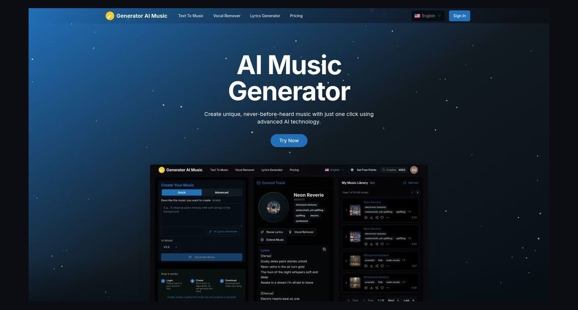 pulse-industry-kpisTop 10 Sales KPIs for AI Music Generation in 2027
 pulse-industry-kpisTop 10 Sales KPIs for Commercial Window and Glazing Contracting in 2027
 pulse-industry-kpisTop 10 KPIs for Dance Studios in 2027
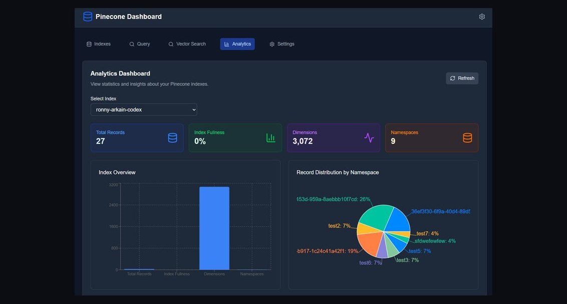 pulse-industry-kpisTop 10 Sales KPIs for Vector Database in 2027
 pulse-industry-kpisTop 10 Sales KPIs for Auto Loan and Auto Finance in 2027
 pulse-industry-kpisTop 10 Sales KPIs for Embeddings API in 2027
 pulse-industry-kpisTop 10 KPIs for Photography Studios in 2027