


How do you build a customer journey map in 2027?
Quality
Certified
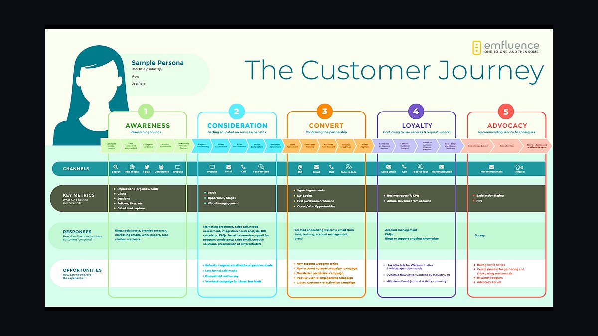
To build a customer journey map in 2027, assemble a cross-functional team (CS, Sales, Product, Marketing), map five phases — Awareness, Consideration, Purchase, Onboarding, Renewal/Expansion — and overlay personas, Jobs-To-Be-Done statements, and live telemetry from CRM, product analytics, and support tools. Use a visual canvas (Miro, FigJam) or a dedicated platform (Smaply, TheyDo), then review quarterly to eliminate hand-off dead zones.
The outcome you should expect
When a RevOps team commits to building a real customer journey map rather than a one-time workshop artifact, the outcome is a shift from anecdote-driven debate to evidence-driven prioritization. The map stops being a poster and starts being the shared reference every function points to when they argue about where the buyer is actually struggling. That is the practical payoff: instead of Sales blaming Product for slow onboarding and Product blaming Marketing for setting the wrong expectations, everyone is looking at the same touchpoint, the same telemetry, and the same friction score.
Forrester's 2026 US Customer Experience Index found that brands whose journey maps were updated within the last six months outperformed peers by 18 points on NPS and by 9 percentage points on net retention. That gap is the real reason to build the map at all — a stale map is worse than no map, because it gives the organization false confidence that the buyer experience is understood when it has already drifted. The expected outcome of a properly built 2027 map is not a prettier diagram; it is a measurable lift in retention and advocacy because the dead zones between teams get named and assigned instead of quietly absorbed as churn.

You should also expect the map to change how meetings are run. Once a journey map is wired to live data, the quarterly business review stops opening with "how do we feel things are going" and starts opening with a specific touchpoint: the 12-day average lag between Awareness and Consideration, the CSAT dip during onboarding week two, the QBR that surfaces renewal risk three weeks before the contract date. Gartner's 2026 CMO Strategy Survey reported that 62% of CMOs now maintain journey maps as versioned, data-connected artifacts rather than slideware, up from just 19% in 2022 — a signal that the organizations winning on retention have already made this shift, and the ones still treating the map as a one-time deliverable are falling behind on a metric they can't see.
Expect friction, too. Building a real map exposes uncomfortable truths — MQL counts that never convert, a legal black hole between verbal yes and signature, a silent first 30 days where a new customer never logs in. The map's value comes precisely from surfacing these gaps, not from making the organization look good. Teams that build the map expecting comfortable validation of their existing process are disappointed; teams that build it expecting an honest diagnostic get exactly what they need to fix revenue leakage at its actual source.
What drives that outcome (mermaid)

Three forces determine whether a journey map actually produces the retention and NPS lift described above, rather than becoming another abandoned artifact. The first driver is data connectivity — a map with no live feed from product analytics, CRM, and support desks is frozen the day it is drawn, and buyer behavior does not stay frozen. The second driver is named ownership at every touchpoint; a phase with no accountable role degrades silently because no one is measured on its health. The third driver is cadence — a map reviewed once a year cannot catch a friction pattern that emerged in month three and calcified by month nine.
Persona and Jobs-To-Be-Done overlays are what keep the map from becoming a generic process diagram. A persona spec that says "VP Demand Gen, measured on pipeline-sourced revenue, signs up to $50K, escalates above" drives entirely different messaging and channel choices than a vague demographic sketch, and it changes what "success" looks like at each phase. JTBD framing — "when I [situation], I want to [motivation], so I can [expected outcome]" — pins the buyer's actual motivation to each phase so the team is designing around a job being hired, not a feature being sold.

The telemetry layer is what turns the map from opinion into diagnostic. Product analytics tools (Pendo, Heap, Amplitude, Mixpanel) surface drop-off and time-to-value; CRM data (Salesforce, HubSpot) supplies hand-off timestamps and deal velocity; support tools (Zendesk, Intercom) supply ticket volume and CSAT per phase; community platforms (Common Room, Gainsight Communities) surface advocacy and organic referral signals. Layered together, these feeds let anyone on the cross-functional team click a touchpoint and see a number, not a guess. AI orchestration layers — Adobe Real-Time CDP with Journey Optimizer, Salesforce Einstein, and Glassbox AI's session-replay anomaly detection — increasingly automate the detection of friction patterns like rage clicks or abandonment after a slow load, feeding the emotional and friction columns of the map with empirical evidence rather than assumption.
Benchmarks and realistic ranges
Set expectations using the ranges that are actually showing up in 2026-2027 practice rather than an idealized version of the process. On touchpoint count: the realistic range is 10 to 12 core touchpoints across the five phases. Teams that try to document 30-plus micro-moments end up with a map no one can act on; the goal is coverage of the moments that materially change conversion or retention, not exhaustive completeness.

On review cadence, quarterly is the realistic floor, not the ceiling. Brands that ran a structured quarterly audit — a three-week cycle of data refresh, cross-functional walkthrough, and action plan — saw roughly 22% faster resolution of known friction points compared with about 8% for teams still auditing annually, per Forrester's 2026 B2B SaaS benchmarking. If your market or product changes quickly, monthly check-ins are a reasonable escalation, but quarterly is the minimum cadence that keeps a map connected to reality rather than sliding back into wallpaper.
On backlog discipline, the realistic range for actionable fixes per review is three, not thirty. Adobe's 2026 Digital Trends Report benchmark found organizations that committed to three prioritized fixes per quarter shipped 8.2 journey improvements per year on average, while organizations that let the backlog stay open shipped only 1.4. That is roughly a six-fold difference in throughput driven entirely by constraint, not by more resources — a smaller, forced-choice list gets delivered; an open list gets debated.
On ownership, a 2026 CXPA survey found maps with a named accountable role per stage saw 34% higher cross-team adoption than maps without one. That is the realistic size of the gap between a map that gets used and one that gets ignored: not better design, not better tooling, but whether a single person's name is attached to each phase's health.
On timing gaps between phases, expect real variance by business model — a benchmark like a 12-day average lag between Awareness and Consideration is a starting reference point for B2B SaaS, not a universal constant; longer sales cycles and multi-stakeholder buying committees will realistically push that range wider, and the map should record your own baseline before treating any external number as a target.
Risks, edge cases, and failure modes

The most common failure mode is building a map that looks complete but has no data layer underneath it — a beautifully designed Miro board that nobody updates after the launch workshop. This is the risk Forrester and Gartner data both point to: a map frozen at time of creation actively misleads the organization once buyer behavior shifts, because it still looks authoritative on the wall even though it no longer reflects reality.
A second failure mode is overloading the map with every conceivable touchpoint. Teams that include 30-plus stages produce something too dense to act on, and the practical fix — capping at 10 to 12 core touchpoints per the benchmark above — is itself a discipline that has to be actively defended in planning sessions, because every function wants its own moment represented.
A third risk is the invisible or "dark" journey: 2027 buyers increasingly research through private Slack communities, dark social shares, and review sites like G2 or TrustRadius that never touch your CRM. A map built exclusively from owned-channel data will systematically undercount these influences. The mitigation is a deliberate "blind spot" section on the map, populated by referral-source estimation and buyer surveys rather than left blank, since a blank section reads as "this doesn't happen" instead of "we can't see this yet."

The fourth and most damaging failure mode is the hand-off dead zone — the silent, unowned gap between two functions' territory. Interaction Design Foundation research puts 74% of churn-traced incidents at the origin of exactly this kind of gap: between demo and signed contract, between signed and provisioned, or between CSM hand-off and first power-user activation. These gaps are dangerous precisely because no single team's dashboard shows them; Sales sees the deal close, CS sees the account open, and neither sees the multi-day silence in between. A journey map's core job is making that silence visible and assigning it to an owner, because a metric no one owns is a metric no one fixes.
A related edge case is treating renewal as a surprise. When the QBR happens three weeks before a contract's renewal date and only then surfaces unaddressed adoption risk, the map has failed at its most consequential phase. The fix is instrumenting adoption telemetry continuously through the Renewal and Expansion phase rather than waiting for a calendar-triggered check-in to reveal problems that were visible in the data weeks earlier.
Finally, watch for MQL theater at the Awareness-to-Consideration hand-off — counting form fills and downloads that never convert to real interest. A map that measures activity instead of progression toward a Jobs-To-Be-Done outcome will look healthy while pipeline quality quietly degrades underneath it.
A practical rollout plan (mermaid)

Start narrow rather than comprehensive. Pick the single highest-friction phase transition your team already argues about — often Onboarding-to-first-value or the Purchase-to-Onboarding hand-off — and build that segment of the map first with real data attached, rather than attempting all five phases and every persona in week one. A map that proves its value on one painful transition earns the organizational buy-in needed to extend it fully; a map that launches complete and unvalidated invites skepticism from day one.
Once the pilot segment is live, extend to the full five-phase model, but keep the same discipline at scale: connect telemetry before you add headcount to the review, name an owner before you add a new touchpoint, and cap each quarterly cycle at three fixes regardless of how large the backlog grows. The mandatory attendee list for the recurring review should include a CS leader, a Sales leader, the Product manager for the relevant surface, a Demand Gen leader, a Support lead, and a data analyst with access to all connected telemetry sources — Forrester's Journey Orchestration Platforms Wave update identified exactly this kind of cross-functional ownership as the single largest predictor of journey-map ROI, ahead of tooling choice or diagram sophistication.

Choose tooling based on how much you need the map to stay alive versus how much you need it to be flexible for workshops. Miro, Mural, FigJam, and Lucidchart are strong for the initial collaborative build and for teams that want the map to live alongside product wireframes or process swim lanes. Smaply, UXPressia, and TheyDo are built specifically to keep a map connected to data and governance over time, with persona builders, opportunity backlogs, and portfolio views baked in — the right choice once the map has proven itself and needs to scale past a single pilot segment without collapsing back into a static file on a shared drive.
Close every rollout cycle the same way: pull the latest telemetry, flag any touchpoint where an emotional or friction score moved materially, walk the cross-functional group through only the top few friction points rather than the whole map, assign one owner per point, and make at least one of the quarter's three fixes a direct attack on a named hand-off dead zone. That last discipline — killing one dead zone every single cycle — is the single highest-leverage habit a RevOps team can build into the process, because dead zones are where the compounding revenue loss actually lives.
Related questions
What tools do you need to build a customer journey map?
A visual canvas (Miro, Mural, FigJam, Lucidchart) for workshops, or a dedicated platform (Smaply, UXPressia, TheyDo) for ongoing governance, connected to product analytics, CRM, and support data so the map updates from live telemetry rather than a one-time survey.
How many phases should a customer journey map have?
Five phases work for most B2B and B2C journeys: Awareness, Consideration, Purchase, Onboarding, and Renewal/Expansion. Long sales cycles or complex post-purchase experiences may warrant splitting Onboarding into micro-stages aligned to revenue milestones.
Who should own the journey map inside RevOps?

Ownership is cross-functional across CS, Sales, Product, and Marketing, though a single CX or journey manager typically maintains the artifact day to day. Priority decisions still require input from every function to prevent siloed hand-offs.
How often should a journey map be updated?
Quarterly is the realistic minimum; real-time telemetry should feed the map continuously between formal reviews. Maps updated within six months outperform stale ones on both NPS and net retention.
FAQ
What's the biggest difference between a 2027 journey map and one built five years ago? The 2027 version is a live, data-fed document rather than a static workshop artifact. It pulls real-time signals from product analytics, CRM, support, and community platforms, and is reviewed on a quarterly cadence rather than built once and archived.
Do I need a dedicated journey-mapping platform, or is a visual canvas enough? Start with a visual canvas like Miro or FigJam for the initial workshop and pilot segment. Move to a dedicated platform such as Smaply or TheyDo once you need persistent data connections, governance, and portfolio views across multiple journeys.

What data sources should feed the map? Product analytics (Pendo, Heap, Amplitude, Mixpanel) for behavior and drop-off, CRM (Salesforce, HubSpot) for hand-off timestamps and deal velocity, support tools (Zendesk, Intercom) for ticket volume and CSAT, and community platforms (Common Room, Gainsight Communities) for advocacy signals.
How many touchpoints should the map actually include? Cap it at roughly 10 to 12 core touchpoints across the five phases. Anything beyond that becomes noise that no team can realistically act on inside a quarterly review cycle.
What is a hand-off dead zone, and why does it matter so much? It's the silent, unowned gap between two functions' responsibility — between demo and signed contract, or between kickoff and first value. Research ties roughly three-quarters of churn-traced incidents to exactly this kind of gap, making it the single highest-leverage thing to fix each quarter.
How many fixes should come out of each quarterly review? Three, not thirty. Constraining the list to three prioritized fixes per quarter correlates with roughly six times more delivered improvements per year than leaving the backlog open-ended, because owners can actually complete three commitments inside one quarter.
Sources
- https://www.forrester.com/
- https://www.gartner.com/en/marketing
- https://business.adobe.com/resources/digital-trends.html
- https://www.interaction-design.org/literature/topics/customer-journey-map
- https://www.nngroup.com/articles/journey-mapping-101/
- https://www.smaply.com/blog
- https://www.uxpressia.com/blog
- https://www.theydo.com/
- https://www.salesforce.com/products/marketing-cloud/
- https://www.cxpa.org/
Related on PULSE
- What role should RevOps play in orchestrating AI-driven personalization across a 30-touchpoint B2B journey?
- How is AI reshaping the B2B buyer journey in 2027 when buying committees hesitate to trust algorithmic recommendations?
- How do you write sales messaging that works in a crowded buyer journey where prospects see 50+ vendor claims daily?
- What replacement tools are B2B teams adopting after consolidating CRM and MAP?
- How can RevOps use AI to map influence dynamics inside buying committees?
- Why did 2027 buying committees expand from 11 to 17 stakeholders, and how does RevOps map them now?
This page will be disappearing soon. Save it to your device for $1 — or read it free while it is here.
@Kory-White- · if Venmo asks, the last 4 of my number are 2012
This page is gone.
This one is off the shelf now. $1 keeps it on your phone for good — the whole page, pictures and diagrams included.
 revopsHow do you do effective deal coaching in 2027?
 revopsHow do you build a Champion-departure save process in 2027?
 revopsHow do you build a customer reference program in 2027?
 revopsHow do you build a sales operations stack from scratch in 2027?
 revopsHow do you do effective sales talent assessment in 2027?
 revopsHow do you do effective sales call planning in 2027?
 revopsHow do you do effective territory management in 2027?
 revopsHow do you set up MEDDICC inspection in 2027?
 revopsHow do you build a renewal-risk scoring model in 2027?
 revopsHow do you transition from sales-led to PLG (product-led growth) in 2027?