


“Be the signal, not the noise.” — Quote Card
Quality
Certified
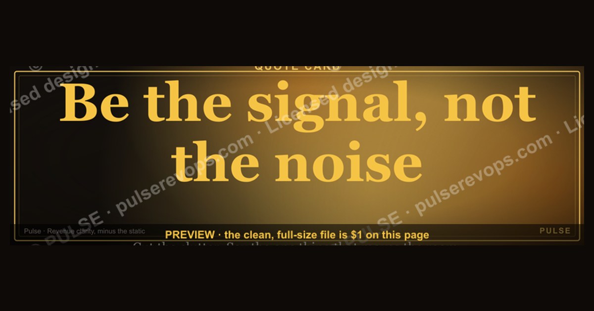
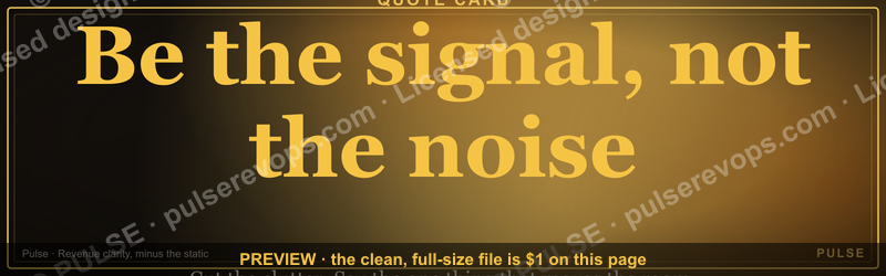
This banner is a 1600×500 px downloadable Quote Card reading “Be the signal, not the noise.” in clean serif type on a dark field, with a small PULSE mark in the corner. Use it as a LinkedIn profile banner, a slide divider, or a pinned team-channel image when you want one line to set the standard for what deserves attention.
The two ways to run this banner: statement card vs. working card
There are really two distinct options hiding behind one asset, and the choice changes almost everything downstream — the copy you set, the size you export, and how long it stays useful.
Option A — the statement card. This is the banner exactly as shipped: the full quote, the attribution styling, the dark ground, the mark. Nothing added. It functions as a piece of culture furniture. You post it once, it sits on a profile or a wall, and it does its work passively. The upside is zero maintenance and zero risk of saying something wrong. The downside is that a statement card is wallpaper within about two weeks — people stop seeing it. It works best for a leader who wants a public, low-effort signal about how they run a team, and for a team that already agrees on the principle and just wants it visible.
Option B — the working card. Same 1600×500 canvas, same core line, but you edit the sub-line beneath the quote to carry a specific, current instruction. For example: “Be the signal, not the noise. — This quarter: one number per update, no status theater.” Now the card is doing operational work. It is a standing reminder tied to a live behavior. The upside is that it stays legible and relevant for a full quarter instead of a fortnight, and it gives you a natural reason to re-issue it every quarter with new wording — which is itself a rhythm. The downside is that it requires an owner, a decision about the sub-line, and a date on which you replace it. A working card that never changes becomes noise, which is the exact failure the quote warns about.
The hybrid. Many teams run both: the unedited statement card as the permanent profile banner, and a working card as the pinned image in a Slack or Teams channel that gets swapped each quarter. That costs one person about twenty minutes a quarter and gets you the permanence of the first option plus the freshness of the second.

The trade-off to name plainly: the statement card is safe and forgettable; the working card is useful and perishable. Neither is wrong. What is wrong is shipping a working card and then never updating it, because a stale instruction is worse than a generic one — it tells the team that the standard was a moment, not a practice.
How to decide between them
The decision is not taste. It is a function of three inputs: whether your team already shares the norm, whether you have a live behavior you want to change this quarter, and whether anyone owns the asset. Run it as a short flowchart.
Read the chart honestly. Most teams that want the working card answer “no” at the ownership question, and that is the real blocker — not design, not copy. If nobody will own the refresh, ship the statement card and be content with it. A permanent, honest statement card beats a working card that quietly expires into irrelevance.
There is a second decision layered on top: where the card lives. A profile banner is seen by people outside the team and reads as positioning. A pinned channel image is seen by the team daily and reads as an instruction. A slide divider is seen by whoever is in the room and reads as framing. The same pixels carry three different meanings depending on placement, so decide the placement before you decide the wording. If you want the line to shape internal behavior, the channel pin matters more than the profile banner. If you want it to shape how candidates and peers read you, the profile banner matters more.
Concrete numbers behind each option

Numbers keep this from becoming a poster exercise. Here is what each option actually costs and returns, in ranges you can plan against.
Canvas and file. The card is authored at 1600×500 px. That is a 16:5 ratio, which is wider than LinkedIn’s profile banner recommendation and wider than most slide dividers. In practice you export two files: the native 1600×500 for slide dividers, document headers, and channel pins, and a cropped or padded variant for the profile banner, where the platform will crop the sides on mobile. Expect the mobile crop to remove roughly the outer 20–25% of the width on each side, so keep the quote inside the central 60% of the canvas and never let the mark sit at the extreme edge.
File size and format. A flat-color card with type exports as a PNG well under 500 KB at full resolution, often under 200 KB. That matters because some chat platforms recompress or reject large pinned images, and a sub-500 KB PNG stays crisp. Do not export as JPEG unless you need a photograph inside it — flat type on flat color will show ringing artifacts around the letterforms.
Time cost. Editing the sub-line and re-exporting is a 10–20 minute job for someone who has the source file and knows the typeface. Rebuilding from scratch because the source file was lost is a 1–3 hour job. That asymmetry is the whole argument for storing the editable source alongside the exported PNG.
Lifespan. A statement card on a profile banner realistically holds attention for 2–4 weeks before it becomes invisible to repeat viewers, though it keeps working on first-time visitors indefinitely, which is the audience that matters for a banner. A working card pinned in a channel holds for roughly one quarter — 10–13 weeks — before the instruction goes stale and needs replacing.

Refresh cadence. One refresh per quarter is the practical sweet spot: four edits a year, about an hour of total effort, and each refresh gives you a legitimate reason to restate the standard in a team meeting. Monthly is too frequent and turns the card into noise. Annually is too slow and the instruction detaches from current priorities.
Reach. A pinned channel image is seen by everyone who opens that channel — for a 20-person team that is on the order of 20 people, many times a week. A profile banner is seen by everyone who visits the profile, which for an active leader can be far more people but with far less dwell time per person. Different numbers, different jobs.
The honest return. There is no credible published statistic saying a banner changes behavior by any specific percentage, and you should distrust anyone who quotes one. Treat the card as a cheap, durable reminder that supports a conversation you are already having. Its value is in repetition and in the fact that it costs almost nothing — not in any measurable lift.
What goes on the card, element by element
Because the reader may rebuild this card or a variant of it, it is worth walking the canvas element by element and stating the exact wording it carries.
The quote line. The card carries the exact sentence “Be the signal, not the noise.” Set as one line, no line break mid-phrase, no quotation marks around it in the primary treatment — the quotation marks belong to the attribution styling, not the headline. The period is optional; if you drop it, the line reads slightly more like a slogan and slightly less like a sentence. Pick one and be consistent across every variant you export.

The attribution styling. The card presents the line as a Quote, so it needs the visual grammar of a quote: generous margin above and below the text block, a restrained typeface, and no competing graphics. If you add an author name, add it small and beneath, separated by a thin rule. If the line is unattributed, leave the space empty rather than filling it — empty margin is what makes a Quote Card read as a Card rather than as a slide.
The mark. A small PULSE mark sits in one corner, typically lower right, at roughly 5–8% of the canvas height. It should be legible at thumbnail size but never compete with the quote. If you are customizing for your own team, this is the slot where your own logo goes, at the same restrained scale.
The optional sub-line. In the working-card variant, a single line of smaller text sits below the quote. Keep it under about twelve words. Anything longer wraps to two or three lines and starts to look like a paragraph, which destroys the card’s instant readability. One instruction, one line.
The ground. Dark field, light type, high contrast. This is not decoration — it is what makes the card readable when it is scaled down to a thumbnail in a chat sidebar or a mobile feed. If you invert to light field and dark type, check the thumbnail before you ship, because thin serif strokes on white disappear at small sizes.
What is deliberately absent. No stock photography, no charts, no gradients, no drop shadows, no second quote. Every element you add reduces the contrast between the signal — the one line you want remembered — and everything else on the canvas. Restraint is the design.
Where and how to use it

Placement determines meaning, so treat each channel as a separate deployment with its own rules.
LinkedIn profile banner. This is the highest-visibility, lowest-dwell placement. Upload the cropped variant, confirm the mobile crop still shows the full quote, and accept that most viewers will register the line in under two seconds. Because of that, the profile banner is the right home for the statement card and the wrong home for the working card — nobody visiting your profile cares what your team’s priority is this quarter.
Pinned channel image. This is the operational placement. Pin the working card at the top of the channel where the team actually coordinates. The pin means it is visible every time someone opens the channel, which is exactly the repetition that makes a standard stick. Rotate it at quarter end. Unpin the old one rather than leaving both, because two pinned cards split attention and neither reads as current.
Slide dividers. Use the native 1600×500 export as a section divider in decks — for example, before a section on reporting standards or on how the team communicates. At full width it reads as a deliberate pause, which is a good moment to restate the norm out loud.
Meeting room and onboarding screens. A 1600×500 card scales acceptably to a lobby display or a recurring onboarding slide. In onboarding specifically, the card is useful as a one-slide framing device: show it, then spend two minutes on what “signal” means in this team’s specific context — which updates matter, which do not, and what the team will stop doing.
Documents and one-pagers. As a header band on an internal one-pager, the card sets tone before the reader hits the content. Keep it to the top band only; repeating it as a footer as well is the kind of over-application that turns a standard into decoration.

What not to do. Do not use it as a recurring automated message, do not paste the PNG into every deck regardless of topic, and do not put it on customer-facing material where an internal slogan reads as a non-sequitur. The card works because it is occasional and deliberate. Flood the channels with it and you have manufactured exactly the noise the line warns against.
The message behind it, and when it backfires
The line is an instruction about attention economics. In any operating cadence — a weekly business review, a pipeline call, a forecast — there is a fixed amount of attention in the room and an unlimited supply of things that could be said. The line says: spend your slot on the thing that changes a decision, not on the thing that merely fills the slot. A signal is a number, a risk, or a fact that alters what someone does next. Noise is a status update that changes nothing.
That distinction has teeth because it is falsifiable in the moment. After any update, you can ask: what decision does this change? If the answer is none, it was noise, however true and however well-presented. This is why the line belongs in a RevOps context specifically — revenue teams generate enormous volumes of reporting, and most of it is never acted on. The card is a standing permission slip to cut.
When it works. It works when the team already has a shared definition of signal and the card merely reminds them. It works when leadership models it — a manager who opens a meeting with three numbers and a decision demonstrates the standard far better than a banner asserts it. It works when it is paired with a concrete practice, like a rule that every update leads with one number and one ask.

When it backfires. It backfires when it is used to shut people down. “That’s noise” is a devastating thing to say to a junior analyst who is trying to flag a real risk, and a banner that licenses that dismissal does more harm than good. It backfires when leadership exempts itself — if the loudest, longest, least-actionable updates come from the top, the card reads as hypocrisy and quietly loses all authority. It backfires when it is used to justify under-reporting, where genuine signals get suppressed because someone decided they were noise. And it backfires when it is over-applied, printed on everything until it is background.
The guardrail is simple: the line should raise the bar for what gets said, never lower the bar for what gets heard. Anyone should be able to bring a signal, and the test is whether it changes a decision — not whether a senior person finds it interesting.
Customizing the wording, colors, and roles
The card is a template, and the fastest way to make it land is to localize it. Three levers: wording, color, and role.
Wording. Keep the headline intact if you want the recognizable Quote Card. Change the sub-line to your team’s language. Good sub-lines are specific and testable: “One number, one ask, per update.” “No status theater in the Monday review.” “If it doesn’t change a decision, it goes in the doc, not the meeting.” Avoid abstractions like “communicate better” — they are unenforceable and read as filler. If you want to localize the headline itself, keep the parallel structure (“Be the X, not the Y”) because the rhythm is what makes it memorable.
Color. Keep the dark-ground, light-type contrast for readability. If you must use brand colors, use them for the rule or the mark, not the body text, and re-check the thumbnail at small size. A common mistake is a low-contrast brand palette that looks elegant at full width and becomes unreadable as a 200 px-wide chat thumbnail. Test at thumbnail size before you commit.

Roles. Different roles need different sub-lines from the same headline. A sales leader’s card might read “Pipeline truth, not pipeline theater.” An analyst’s might read “The number and the caveat, not the deck.” A support lead’s might read “The pattern, not the anecdote.” Same headline, three cards, three teams — and each one is specific enough to be actionable. This is where the working-card variant earns its keep: one headline, many sub-lines, each owned by a team.
Versioning. Name files with a date and an owner, for example signal-card_2025-Q1_sales.png, and keep the editable source next to it. When you refresh, archive rather than overwrite, so you can see what the standard was last quarter. That archive is quietly useful in reviews — it shows the standard evolving rather than being asserted once and forgotten.
Implementation details and sequencing
Shipping the card properly is a short project with a clear order. Skipping a step is what produces the two common failures: a card nobody sees, or a card nobody maintains.
The sequence matters in two places. First, test the thumbnail before you place it — legibility at small size is the single most common defect and it is invisible at full width. Second, introduce it out loud. A card that appears silently in a channel is a decoration; a card that a leader holds up for thirty seconds and explains is a standard. That thirty seconds is the highest-leverage part of the whole exercise.
Then close the loop: name an owner, put the refresh on a calendar, and archive the old file when you swap. The loop is what separates a working card from a poster.
Related questions
What exactly is on the card?

A 1600×500 px dark-ground banner carrying the line “Be the signal, not the noise.” in serif type, a small mark in the corner, and — in the working variant — a single sub-line of twelve words or fewer beneath the quote. No photography, no charts, no second message.
Can I change the wording?
Yes. Keep the headline if you want it recognizable, and localize the sub-line to your team’s actual behavior. If you rewrite the headline, preserve the “Be the X, not the Y” rhythm, which is what makes it stick.
Where should I put it?
Profile banner for external positioning, pinned channel image for internal behavior, slide divider for framing a section. Choose the placement before the wording, because the same pixels mean different things in each spot.
How often should I update it?
Quarterly for a working card — four refreshes a year, roughly an hour total. A statement card can stay up indefinitely, though repeat viewers stop noticing it after two to four weeks.
What size and format should I export?
PNG at 1600×500 px, under 500 KB. Avoid JPEG for flat type on flat color. Keep the quote inside the central 60% of the canvas so mobile crops do not clip it.
FAQ
Is this a real downloadable graphic or just a slogan page? It is a real, downloadable graphic. The page describes a 1600×500 px PNG banner you can download and place directly — as a LinkedIn profile banner, a pinned channel image, or a slide divider. The words on the page exist to help you use the asset well, not to replace it.

Do I need design software to use it? No, if you are using the card as shipped — download the PNG and upload it. Yes, if you want to change the sub-line or colors, in which case you need the editable source file and about ten to twenty minutes. Store the source next to the export so a future edit does not become a rebuild.
Won’t a banner just become background noise itself? It can, and that is the main risk. A statement card fades from attention in two to four weeks for repeat viewers. The fix is either to accept that it is doing its work on first-time visitors, or to run the working variant and refresh the sub-line quarterly so it stays current and legible.
Is there data showing this improves team performance? No, and you should be skeptical of anyone who claims a specific figure. Treat the card as a cheap, durable reminder that supports a conversation you are already having. Its value is repetition and near-zero cost, not a measurable lift.
What if the line gets used to dismiss people? That is the failure mode to guard against. “That’s noise” should never be a way to shut down a junior colleague flagging a real risk. Set the norm explicitly: the line raises the bar for what gets said, never lowers the bar for what gets heard, and the test is whether something changes a decision.
Can I use it for a team other than revenue operations? Yes. The headline is domain-neutral. Localize the sub-line per team — sales, analytics, support, engineering — so each card carries a specific, testable instruction rather than a generic sentiment. Same headline, different sub-lines, one owner per card.
Sources
- LinkedIn Help — Banner image guidelines for your profile
- Nielsen Norman Group — F-Shaped Pattern of Reading on the Web
- Nielsen Norman Group — Banner Blindness: Old and New Findings
- Slack Help Center — Pin messages and files in a channel
- Microsoft Support — Pin a message in Microsoft Teams
- Canva Design School — Designing for social media image sizes
- W3C Web Content Accessibility Guidelines — Contrast (Minimum)
- Harvard Business Review — The Hidden Traps in Decision Making
Related on PULSE
- Running a weekly business review that people actually use
- Cutting status theater out of pipeline meetings
- Designing dashboards that change decisions
- Writing update templates that lead with the number
- Setting communication norms for a revenue team
- Building a quarterly operating cadence
This page will be disappearing soon. Save it to your device for $1 — or read it free while it is here.
@Kory-White- · if Venmo asks, the last 4 of my number are 2012
This page is gone.
This one is off the shelf now. $1 keeps it on your phone for good — the whole page, pictures and diagrams included.
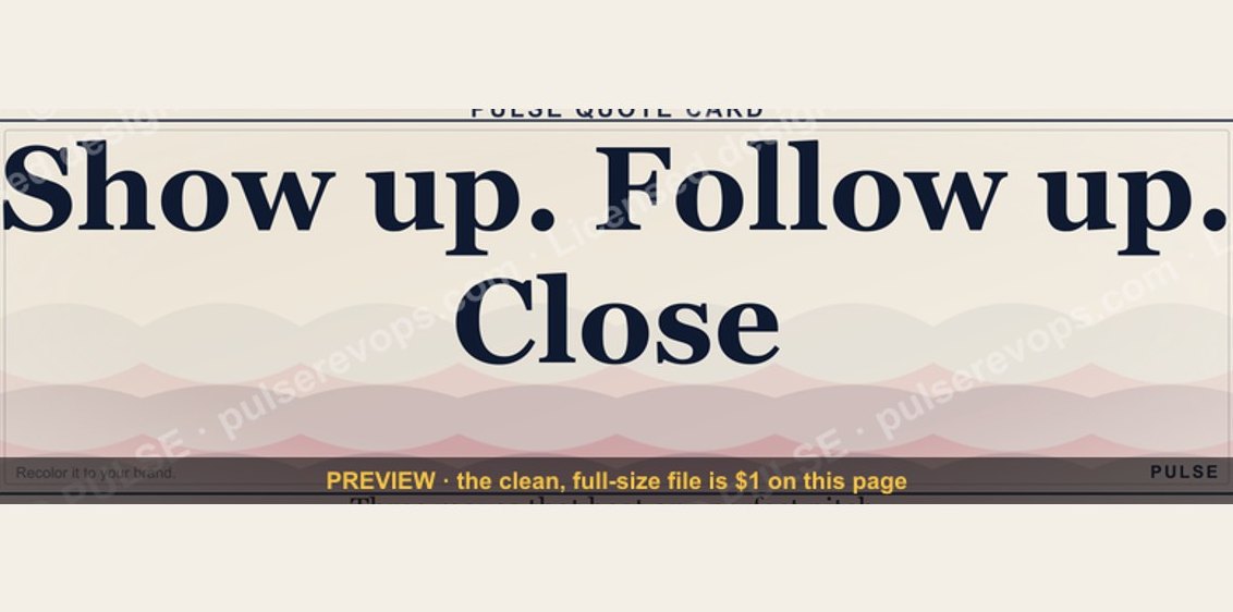 graphic“Show up. Follow up. Close.” — Quote Card
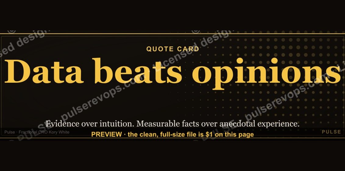 graphic“Data beats opinions.” — Quote Card
 graphic“Listen more. Pitch less.” — Quote Card
 graphic“Revenue follows relationships.” — Quote Card
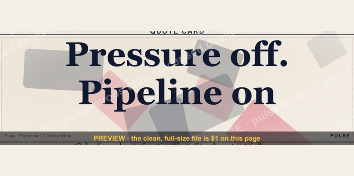 graphic“Pressure off. Pipeline on.” — Quote Card
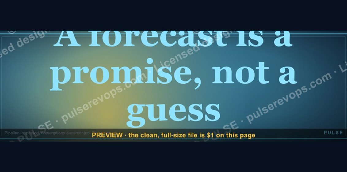 graphic“A forecast is a promise, not a guess.” — Quote Card
 graphic“Every no is closer to a yes.” — Quote Card
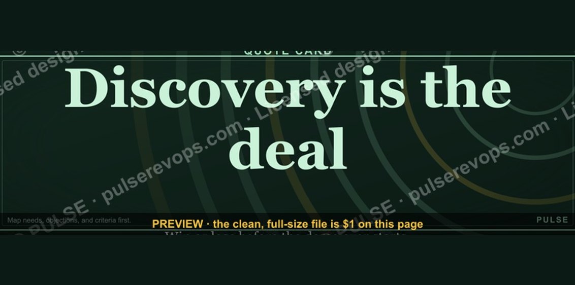 graphic“Discovery is the deal.” — Quote Card
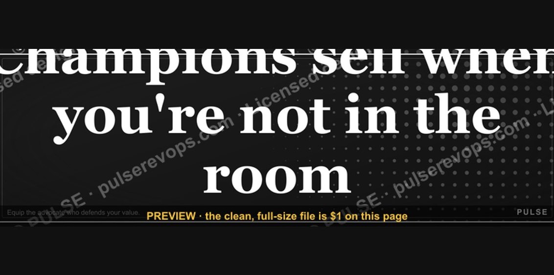 graphic“Champions sell when you're not in the room.” — Quote Card
 graphic“Trust compounds. So does pipeline.” — Quote Card