


How do you benchmark aircraft fuel cost per available seat mile for a regional airline in 2027?
Quality
Certified
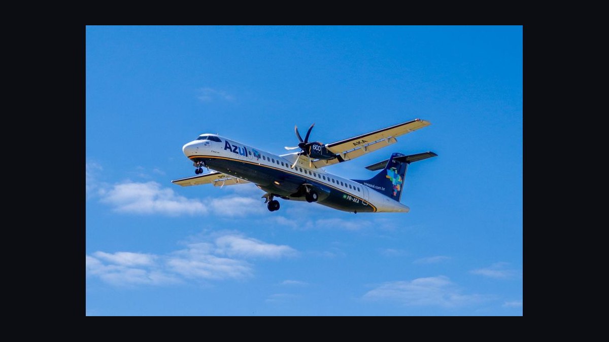
Benchmark aircraft fuel cost per available seat mile for a regional airline by dividing total fuel expense — gallons uplifted times delivered price, including into-plane fees, taxes, and hedge settlements — by total available seat miles. Then normalize for stage length, gauge, seat configuration, and hedge position before comparing to peer regionals. Always pair the dollar metric with gallons per ASM.
The two framing options: dollars per ASM versus gallons per ASM
Every regional airline that tries to benchmark fuel eventually hits the same fork in the road, and picking the wrong branch produces a number that looks authoritative and means nothing. The two options are a price-inclusive dollar metric — fuel cost per ASM, usually stated in cents — and a price-neutral efficiency metric, gallons per ASM, or its inverse, ASMs per gallon.
Fuel cost per available seat mile is the dollar version. Take total fuel expense for the period — gallons consumed multiplied by the all-in delivered price, including into-plane fees, taxes, and any hedge settlement — and divide it by total ASMs. The result lands in cents per ASM, and for regional carriers it has historically sat meaningfully above mainline. The arithmetic is simple: if a carrier burns 40 million gallons at $2.60 per gallon delivered against 3.5 billion ASMs, that is $104 million over 3.5 billion, or roughly 2.97 cents per ASM. That single figure folds together three completely different things: how efficiently the aircraft converts fuel into seat-miles, what you paid per gallon, and how you configured and flew the network.
Gallons per ASM strips the price out. Same carrier, same period: 40 million gallons over 3.5 billion ASMs is 0.0114 gallons per ASM, or about 87.5 ASMs per gallon. Now a jet-fuel spike does not move your metric at all. Fleet renewal, seat density, load factor discipline on the ASM denominator, and flight-ops procedures do. This is the number your technical operations and flight ops groups can actually be held to, because they cannot control the crack spread.
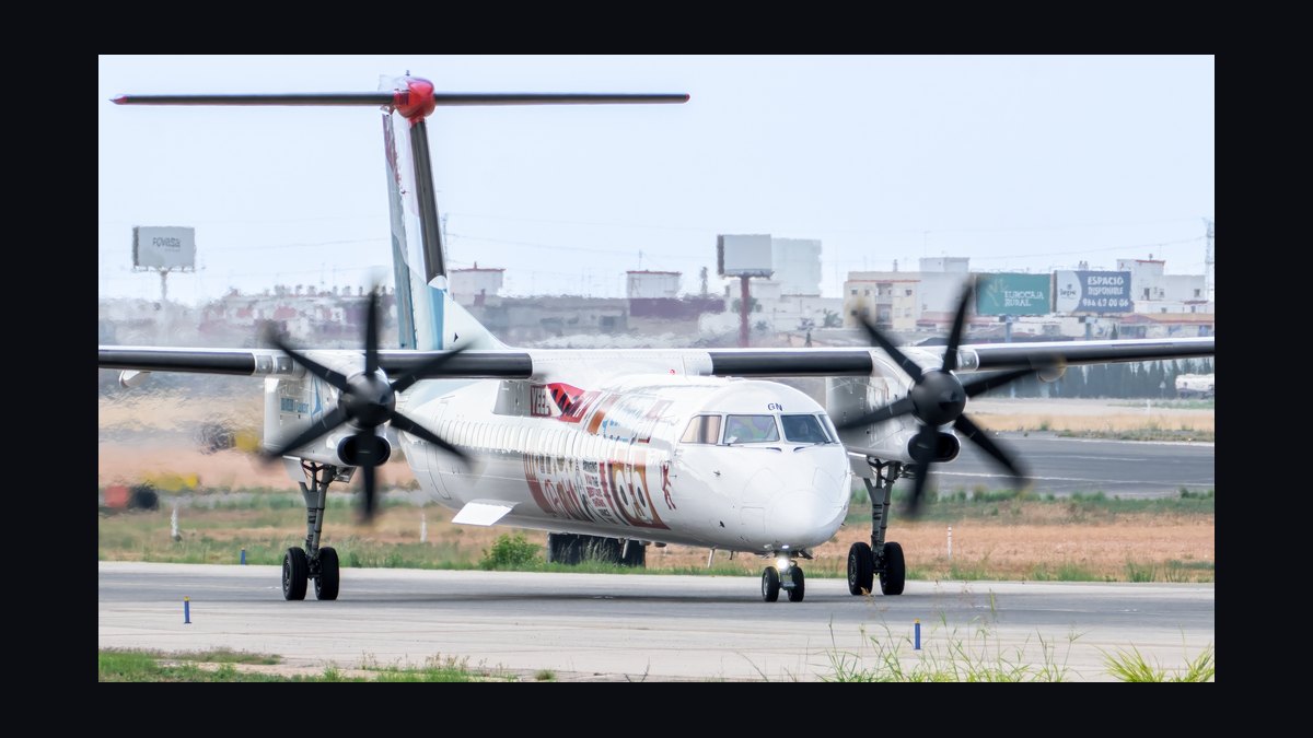
The trade-off cuts both ways. The dollar metric is what your CFO, your board, and your capacity-purchase-agreement counterparty care about, because it maps directly to the P&L and to the fuel reimbursement mechanics in the contract. The efficiency metric is what your fleet planners and flight ops teams can move. If you only track cents per ASM, a year where fuel drops 30% will paper over a fleet that has gotten measurably less efficient — you will congratulate a team that lost ground. If you only track gallons per ASM, you will optimize burn while ignoring a procurement function paying twenty cents a gallon over market at half your outstations.
There is a third framing worth naming even though it is not a substitute: cost per available seat mile excluding fuel, or CASM-ex. Regional carriers and their mainline partners both report it precisely because fuel volatility swamps everything else in the reported number. CASM-ex is not a fuel benchmark, but you need it in the same table, because the whole point of separating fuel is to see whether your non-fuel cost structure is drifting while fuel noise hides it.
A fourth metric belongs in the same conversation for a regional specifically: fuel cost per block hour, and fuel cost per departure. Regional networks are departure-intensive. A carrier flying eight 55-minute legs a day per aircraft has a fundamentally different fuel profile than one flying four two-hour legs, and per-ASM metrics alone will not show you why. Per-departure fuel captures the taxi, takeoff, and climb burn that is fixed per cycle and does not scale with distance. On a 300-mile leg, climb and descent can account for a very large share of trip fuel; on a 1,200-mile leg it is a modest share. If your benchmark ignores cycles, it will tell you that short-haul regional flying is inefficient without telling you the one thing that matters — whether it is inefficient relative to other short-haul regional flying.

The practical answer for a regional airline in 2027 is that you run both the dollar and efficiency metrics side by side, in the same monthly package, with the bridge between them made explicit. The bridge is your average delivered price per gallon. Cost per ASM equals gallons per ASM multiplied by delivered price per gallon. That identity is the backbone of the whole benchmark, and if your reporting cannot reconcile those three numbers to each other every month, your benchmark is decorative.
How to decide which metric leads, and against whom you compare
The decision is not really "which metric" — it is "which metric leads the scorecard, and what comparison set gives it meaning." Both parts have to be answered together, because a metric with the wrong peer group is worse than no metric.
Start with governance. If the question comes from the board or the mainline partner, the dollar metric leads and gallons per ASM sits underneath it as the explanatory driver. If the question comes from an internal fleet-renewal business case or a flight-ops initiative, the efficiency metric leads and the dollar figure is the translation layer for the finance committee.
Then handle the contract structure, which for most regional carriers is the single most important input and the one most often skipped. Under a capacity purchase agreement, fuel is frequently the mainline partner's cost and its risk. The regional operates the flight; the partner buys the fuel or reimburses it at cost. If that is your structure, cents per ASM is a metric you report but do not own — your accountable metric is gallons per ASM and gallons per block hour, because burn is yours and price is not. Benchmarking yourself on the dollar figure under a CPA is measuring your partner's procurement desk and calling it your performance. Conversely, on prorate or fully independent flying, you own both halves and the dollar metric is genuinely yours.

Next, define the peer set. This is where most regional benchmarking dies. The comparison must control for gauge, stage length, seat configuration, hedging and fuel-purchase structure, and network geography. A 50-seat CRJ200 and a 76-seat E175 are not peers on a per-ASM basis — the larger aircraft spreads a not-proportionally-larger burn across many more seats, so comparing them tells you only that seats matter, which you already knew. A 250-mile average stage and a 600-mile average stage produce very different per-ASM outcomes on identical aircraft, because cycle-fixed fuel is amortized over more miles in the second case. A 76-seat E175 in a dual-class layout with first-class seats has fewer ASMs per departure than the same airframe in a higher-density single-class configuration — fewer seats in the denominator, same fuel in the numerator, worse per-ASM number with no change in the aircraft's actual efficiency. A carrier with a legacy hedge book at a different strike than spot is not comparable on delivered price in a volatile year. And high-altitude, hot-weather airports drive higher takeoff thrust settings and heavier fuel loads, while congested airspace drives taxi and holding burn — a carrier concentrated in dense Northeast airspace will have structurally worse taxi-out fuel than one flying the same aircraft in the Mountain West.
The decision rule that survives contact with reality: lead with the metric whose drivers your organization controls, publish the other one beside it, and never compare across a peer boundary you have not normalized for. When you cannot normalize — because you lack a competitor's stage-length or configuration data — say so explicitly in the reporting rather than presenting a raw comparison that a reader will treat as clean.
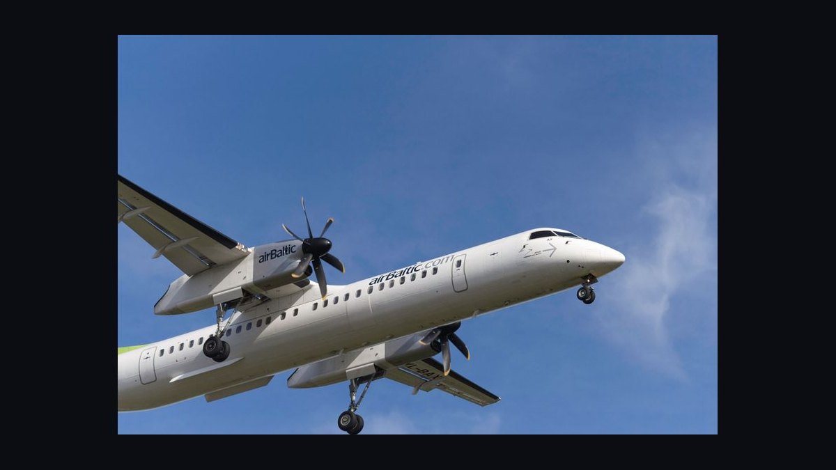
One more decision belongs here: the reporting period. Fuel benchmarks on a monthly cadence are noisy for a regional carrier because weather, irregular operations, and seasonal routing shift both burn and ASMs. A rolling twelve-month figure alongside the current month gives you the trend without the noise, and a same-month-prior-year comparison controls for seasonality. Publish all three. The single-month number in isolation will generate more bad meetings than insight.
Concrete numbers behind each option, and how to build them
Here is how you actually construct each figure, with the arithmetic laid out so the finance and ops teams are computing the same thing.
Building ASMs. ASMs equal seats available for sale multiplied by miles flown, summed across every revenue flight. The traps are specific. Use available seats, not seats sold — an available seat mile does not care about load factor. Use the actual configured seat count for the tail that flew, not the fleet-average configuration, or every substitution corrupts the denominator. Use great-circle statute miles between airports, applied consistently — if you mix nautical and statute miles anywhere in the chain, your metric moves by roughly 15% and you will spend a quarter hunting it. Exclude non-revenue flying: ferries, maintenance repositioning, and training flights burn fuel and produce zero ASMs, so they must be either excluded from both sides or, better, tracked as a separate line so you can see what non-revenue burn is costing you.
Building fuel expense. Total fuel cost is gallons uplifted multiplied by delivered price, but the delivered price is the part people get wrong. It must include the base commodity cost, into-plane fees at each station, differential and transportation costs, applicable federal and state excise taxes, and the realized settlement on any hedge that closed in the period. Regional carriers frequently uplift at dozens of stations with materially different into-plane arrangements, and the spread between your best and worst station's all-in price can be substantial. If your benchmark uses a single blended price, you lose the ability to see that spread — which is often the largest actionable savings on the table.

The bridge. Cents per ASM = (gallons per ASM) × (delivered dollars per gallon) × 100. Verify this reconciles every period. If it does not, one of your three inputs is being pulled from a different system with a different scope — typically the fuel ledger includes ferry burn while the ASM file excludes ferry flights.
Realistic shape of the numbers. Rather than assert specific competitor figures, build your own ranges from your own data and state the drivers. For a regional operator, gallons per ASM is the tightest, most comparable figure across carriers running similar equipment. A larger, newer regional jet on longer stages will land materially better than an older, smaller jet on short stages — the gap between a 50-seat aircraft on 300-mile legs and a 76-seat aircraft on 550-mile legs is large enough that mixing them in one average destroys the metric's usefulness. Delivered price per gallon varies by station, by contract, and by period. Track the volume-weighted average and, separately, the unweighted station spread. The gap between them tells you whether your worst-priced stations are also your low-volume ones (tolerable) or your high-volume ones (urgent). Cents per ASM is the product. It moves most with price and second-most with stage length.
Decomposing variance. When cents per ASM moves period over period, decompose it into three effects rather than arguing about it. First, the price effect — hold gallons per ASM at prior-period level, apply the new delivered price. This is procurement and market. Second, the efficiency effect — hold price at prior-period level, apply the new gallons per ASM. This is fleet and flight ops. Third, the mix effect — the residual from changes in stage length, gauge, and seat configuration. This is network planning and fleet assignment. Publishing these three every month, each with a named owner, converts a fuel benchmark from a scoreboard into a management tool. Without the decomposition, a bad month produces a room full of people explaining why it was not their fault, and you have no basis to adjudicate.
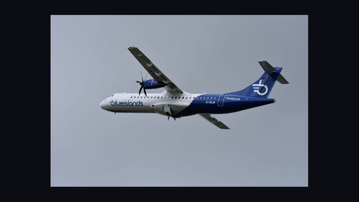
Data sources you can build the peer comparison from. U.S. carriers file operating and traffic data with the Bureau of Transportation Statistics — Form 41 financial schedules and the T-100 segment database give you ASMs, departures, and fuel data by carrier and aircraft type, which is the raw material for a normalized peer comparison. Publicly traded regional holding companies disclose fuel expense, ASMs, and CASM-ex in their quarterly filings. The U.S. Energy Information Administration publishes kerosene-type jet fuel spot and refiner prices, which is your market reference for judging whether your delivered price is reasonable. IATA publishes jet fuel price monitoring. These are real, checkable sources; build the benchmark on them rather than on vendor claims.
A caution about 2027 specifically. Sustainable aviation fuel blending is increasingly present in the fuel supply at some stations and carries a price premium over conventional jet fuel. If any of your uplift includes SAF, your delivered price per gallon rises for reasons that have nothing to do with burn efficiency or procurement skill. Track SAF volume and its premium as a separate line so the benchmark does not mistake a fuel-composition change for a performance change. The same logic applies to any carbon or emissions-related cost embedded in the delivered price — segregate it, disclose it, and report the metric both with and without it.
Implementation details and sequencing
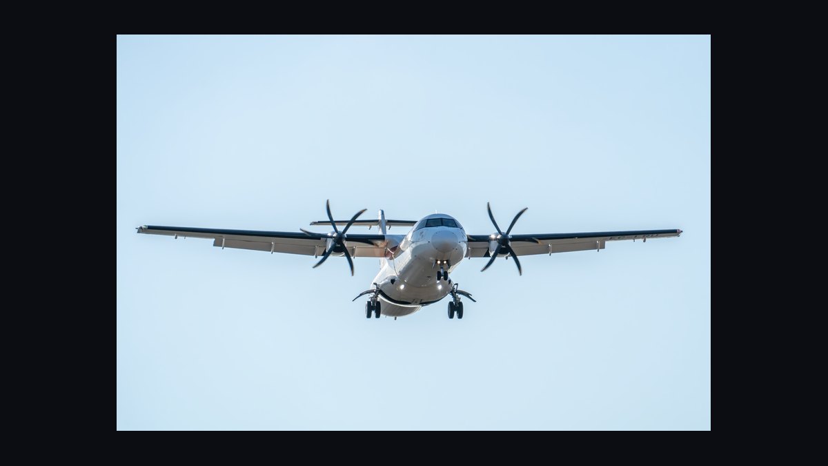
You cannot benchmark what you cannot reconcile, so the sequence matters more than the sophistication.
Weeks one through three: establish the denominator. Pull ASMs from the operational system of record — the flight-leg table that records tail, configured seats, origin, destination, and departure status. Reconcile it against your scheduling system and against what you filed with BTS. If those three disagree, resolve it before doing anything else. Every downstream number inherits this error. Decide explicitly and document how you treat cancellations, diversions, and non-revenue legs, and apply that treatment identically on the fuel side.
Weeks two through five: establish the numerator. Get gallons uplifted by station and by flight from the fuel-vendor invoices and the aircraft communications data, and reconcile the two. Invoice gallons and onboard-recorded uplift will not match exactly; the variance is normal but the trend in that variance is a leak indicator. Build the delivered-price stack per station: base, into-plane, differential, taxes. Do not blend until the station-level detail exists.
Weeks four through seven: build the bridge and backfill. Compute gallons per ASM and cents per ASM for the trailing twenty-four months so you have a trend on day one rather than a single point. Verify the identity reconciles in every historical month. Where it does not, find the scope mismatch — it is almost always non-revenue flying or a station whose invoices post to a different ledger.
Weeks six through nine: normalize and build the peer set. Pull BTS T-100 and Form 41 data for the regional carriers you consider comparable. Compute their gallons per ASM, average stage length, average seats per departure, and departures per aircraft per day. Build a normalized view that adjusts for stage length and gauge before you present any comparison. Be honest in the output about what you could not normalize.

Weeks eight through twelve: instrument the drivers. Now you can act. The controllable burn levers for a regional airline are concrete: single-engine taxi where the aircraft and conditions permit, cost-index discipline in the flight management system, tankering decisions driven by an actual price-differential model rather than habit, reduced-thrust takeoff where performance allows, APU usage discipline at the gate where ground power exists, weight reduction in cabin and catering loads, and route and altitude optimization. Each of these should have a measured baseline, an expected effect on gallons per departure or per block hour, and a monthly readout. Tankering in particular is a genuine trade-off — carrying extra fuel to avoid an expensive station costs fuel to carry, so it only pays when the price differential exceeds the carriage burn cost, and that calculation depends on stage length and aircraft type.
Ongoing cadence. A monthly package with the rolling twelve-month figure, the current month, the prior-year same month, the three variance effects, and the station price spread. One page. If it takes more than one page, it will not be read, and a fuel benchmark nobody reads is a cost center.
What to watch for. Watch for the seat-configuration change that silently improves or degrades per-ASM figures with no operational change. Watch for stage-length drift as the network shifts, which moves the metric without anyone doing anything wrong. Watch for a peer comparison that quietly stops being apples-to-apples when a competitor retires a fleet type. Watch for the month where hedge settlements make delivered price look great and burn efficiency has actually deteriorated. And watch for the fuel ledger and the ASM file drifting out of scope alignment after a system change — this is the single most common way a working benchmark quietly becomes wrong.
Related questions
Should a regional airline benchmark against mainline carriers at all?
Only as context, never as a target. Mainline narrowbodies spread fuel across roughly twice the seats over longer stages, so their per-ASM figures are structurally better for reasons a regional cannot replicate. Compare to peer regionals on similar gauge and stage length instead.
Does load factor affect fuel cost per ASM?
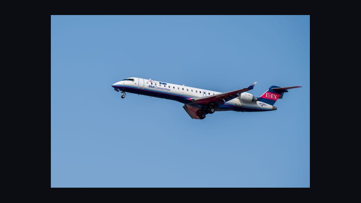
Not directly — ASMs count available seats, not sold seats. Load factor affects revenue per ASM and adds a small amount of weight-driven burn from passengers and bags, but it does not move the denominator. Use RASM and CASM together to see the full picture.
How do you handle fuel under a capacity purchase agreement?
Report cents per ASM for transparency, but hold the operation accountable on gallons per ASM and gallons per block hour, since the mainline partner typically bears price risk. Confirm the specific reimbursement mechanics in your contract before assigning accountability.
What is the fastest lever to improve the number?
Usually procurement discipline at high-volume outstations with above-market into-plane pricing, because it moves delivered price without operational change. Burn-side levers like single-engine taxi and cost-index discipline take longer but compound and survive price cycles.
How do you treat sustainable aviation fuel in the benchmark?
Segregate SAF gallons and the premium over conventional jet fuel as separate lines, and report the metric both including and excluding that premium. Otherwise a change in fuel composition reads as a change in performance, and you misattribute a procurement or mandate effect to flight operations.
FAQ
What exactly counts as an available seat mile?
One available seat flown one mile. Multiply the seats configured on the aircraft that operated the leg by the great-circle statute miles between origin and destination, and sum across all revenue legs. It ignores whether the seat was sold. Consistency in seat counts and mile units is what makes the figure comparable over time.
Should I use statute or nautical miles?

Statute miles, to match how U.S. carriers report ASMs to the Bureau of Transportation Statistics and in their financial filings. The critical rule is consistency — mixing units introduces roughly a 15% error and makes every peer comparison invalid. Document the choice in the metric definition so nobody re-derives it differently later.
Why is the regional number worse than mainline?
Three structural reasons: fewer seats per departure, so the same climb and taxi burn is divided across a smaller denominator; shorter stages, so cycle-fixed fuel is amortized over fewer miles; and more departures per aircraft per day, which multiplies the cycle-fixed portion. None of these are operational failures — they are the mission profile.
How should sustainable aviation fuel be treated in the benchmark?
Segregate it. Track SAF gallons and the premium over conventional jet fuel as separate lines, and report the metric both including and excluding that premium. Otherwise a change in fuel composition reads as a change in performance, and you will misattribute a procurement or mandate effect to your flight operations team.
How often should the benchmark be recalculated?
Monthly for the operating cadence, with a rolling twelve-month figure to suppress seasonal and irregular-operations noise, plus a same-month-prior-year comparison. Single-month figures move enough on weather and diversions alone that treating them as signal produces bad decisions.
Where does tankering fit into this?
Tankering is a legitimate lever but a genuine trade-off — carrying extra fuel burns fuel. It pays only when the price differential between stations exceeds the cost of carrying the weight, which depends on stage length and aircraft type. Model it per route rather than applying a blanket policy, and measure the realized savings against the model.
Sources
- https://www.bts.gov/topics/airlines-and-airports
- https://www.transtats.bts.gov/
- https://www.eia.gov/dnav/pet/pet_pri_spt_s1_d.htm
- https://www.iata.org/en/publications/economics/fuel-monitor/
- https://www.faa.gov/air_traffic/publications
- https://www.icao.int/environmental-protection/pages/SAF.aspx
- https://www.gao.gov/products/topic/transportation
- https://www.energy.gov/eere/bioenergy/sustainable-aviation-fuel
Related on PULSE
- How do you calculate cost per available seat mile excluding fuel for a regional carrier?
- What drives the fuel efficiency gap between 50-seat and 76-seat regional jets?
- How do capacity purchase agreements allocate fuel price risk between regional and mainline carriers?
- How do you build a tankering model that accounts for carriage burn?
- What operational levers actually reduce fuel burn per departure on short-haul flying?
This page will be disappearing soon. Save it to your device for $1 — or read it free while it is here.
@Kory-White- · if Venmo asks, the last 4 of my number are 2012
This page is gone.
This one is off the shelf now. $1 keeps it on your phone for good — the whole page, pictures and diagrams included.
 ikTop 10 Restaurant Revenue Per Table Turnover Benchmarks in 2027
 pulse-industry-kpisTop 10 Cloud Computing Provider Revenue KPIs in 2027
 pulse-industry-kpisTop 10 Sales KPIs for Commercial Imaging Center Operations in 2027
 pulse-industry-kpisTop 10 Higher-Ed Advancement Revenue KPIs in 2027
 pulse-industry-kpisFintech Lending: Revenue Per Loan Origination After Risk-Adjusted Charge-Offs in 2027
 pulse-industry-kpisTop 10 Sales KPIs for Industrial Tank & Silo Manufacturing in 2027
 pulse-industry-kpisTop 10 Sales KPIs for Industrial Cybersecurity (OT/ICS) Services in 2027
 pulse-industry-kpisTop 10 Sales KPIs for Commercial Insurance Brokerage in 2027
 pulse-industry-kpisTop 10 KPIs for Pressure Washing Companies in 2027
 pulse-industry-kpisTop 10 Sales KPIs for Medical Billing and Revenue Cycle Management in 2027