
RevOps Leader — LinkedIn Banner
 Curated byKory White · Fractional CRO · Maryland
 PULSEKNOWLEDGE LIBRARY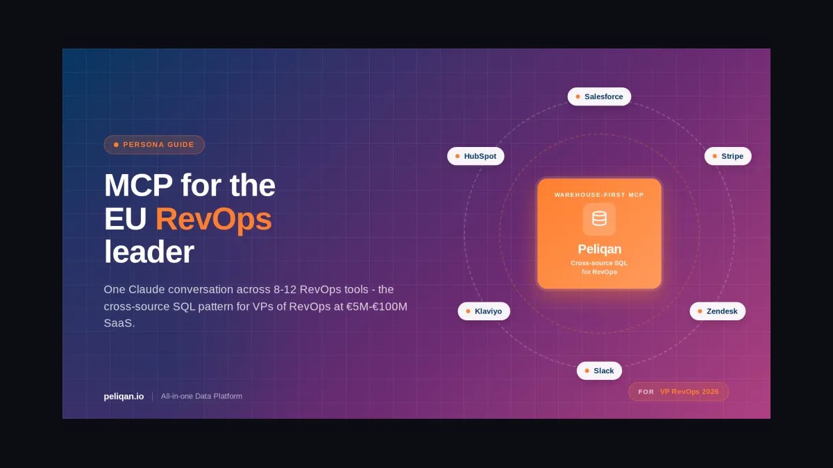
A RevOps Leader LinkedIn Banner is a 1584×396 px cover image that signals systems thinking and revenue ownership before a visitor reads a single word of your profile. Use brand colors, one quantified outcome, and a clean data motif — funnel, pulse line, or connected nodes. Keep text inside the center 60% safe zone so LinkedIn's mobile crop never clips your name, title, or logo.
What a RevOps Leader LinkedIn Banner Is and Why It Matters
A RevOps Leader LinkedIn Banner is not decoration. It is a 1584×396 pixel credibility asset that sits behind your profile photo and headline, and it is often the first visual a recruiter, peer, or prospective client processes when they land on your page. For a RevOps Leader, that banner has a specific job: it must communicate operational maturity, cross-functional alignment, and data fluency in roughly two to three seconds — the window in which most profile visitors decide whether to scroll or bounce.
Why does this matter more for RevOps than for other functions? Because RevOps is a role that many people still misunderstand. Ask ten hiring managers what a RevOps Leader does and you will get ten different answers — some describe a Salesforce administrator, some describe a sales ops manager, some describe a chief of staff for the CRO. A well-designed banner resolves that ambiguity instantly. A funnel graphic with conversion percentages says "I own the revenue process end to end." A pulse-line motif says "I think about revenue as a living system." A grid of interconnected nodes says "I align sales, marketing, and customer success." Generic stock imagery — handshakes, laptops, city skylines — says nothing, and worse, it signals that you did not invest thirty minutes in your own personal brand.
There is also a practical discovery dimension. LinkedIn surfaces profiles in search results, "people also viewed" modules, and comment threads. Your banner appears as a thin horizontal strip in many of those contexts, which means the design has to survive aggressive cropping and small rendering sizes. A banner with a single bold phrase and a high-contrast background will read at 200 pixels wide; a banner with eight logos, three fonts, and a paragraph of text will turn into visual mud.
Finally, consider the banner as a trust signal for fractional and consulting RevOps Leaders. When a VP of Revenue Operations is evaluating a fractional engagement, they will look at your profile the way they would look at a vendor's website. A polished, on-brand Banner with a clear value statement and one quantified proof point does more pre-selling than a paragraph of About text. The reverse is also true: a pixelated logo or a stretched stock photo can quietly disqualify you before the first call.
The anchor question to keep in mind: does this Banner make a stranger more likely to believe you can build and run a revenue engine? If an element does not serve that goal, cut it.
The Step-by-Step Process for Building Your Banner
Building a RevOps Leader LinkedIn Banner is a repeatable process, not a one-off creative sprint. The sequence below takes most people 60 to 120 minutes end to end, including revisions, and it produces a file that will still look sharp two years from now.
Step 1 — Audit your current profile state. Before you design anything, screenshot your profile on desktop and on mobile. Note where LinkedIn crops your existing banner on a phone (typically the outer 10 to 15 percent on each side disappears). Note your headline, your photo background, and your company's brand colors. The banner has to harmonize with all three. If your headline already says "RevOps Leader | Building Predictable Revenue," your banner should not repeat that phrase — it should extend it.
Step 2 — Define the single message. Write one sentence that captures what you want a visitor to know. Examples: "I build revenue engines from scratch at Series A and B SaaS companies." "I align sales, marketing, and CS around one pipeline definition." "RevOps Leader — scaled ARR from $5M to $40M." One sentence, one idea. If you cannot fit it into a single line of 6 to 10 words, the message is too broad.
Step 3 — Choose a visual motif. Pick one of three proven patterns. The data-dashboard motif uses a dark background with a faint chart, funnel, or pulse line and a bright accent color for text. The alignment motif uses overlapping circles, connected nodes, or a simple Venn diagram to signal cross-functional work. The vision-statement motif uses a single bold sentence over a gradient or geometric pattern, ideal for consultants and fractional leaders. Do not mix motifs — pick one and commit.
Step 4 — Pull your exact brand colors. Open your company's website, inspect the CSS, and copy the hex codes. If you are between roles, use your personal brand palette — two colors plus white is enough. A common working combination is navy (#0A2540) for authority, teal or electric blue (#00B4D8) for growth, and a warm accent like coral (#FF6B6B) for a call-to-action element. Avoid pure black (#000000) backgrounds; dark navy or charcoal reads as more approachable on a small screen.
Step 5 — Build in a design tool at 4x resolution. Open Canva, Figma, or Adobe Express and create a canvas at 3168×792 pixels — exactly double the LinkedIn spec. Design at this size, then export at 1584×396. Working at 4x means your master file can be resized later for Twitter, a conference slide, or an email signature without quality loss. Use a 12-column grid overlay and keep all essential text within columns 3 through 10 — the center 60 percent.
Step 6 — Set typography and contrast. Use one sans-serif family with two weights. Inter, Roboto, and Plus Jakarta Sans all render cleanly at small sizes. Your primary line should be 36 to 44 points at the 1584×396 export size; supporting text 16 to 20 points. Check contrast against the WCAG AA standard of 4.5:1 — white text on navy passes easily, white on medium gray does not. If you are unsure, run the hex codes through a free contrast checker.
Step 7 — Add exactly one proof point. A quantified outcome is the single highest-leverage element on a RevOps Banner. "Reduced churn 15% in two quarters." "Cut lead-to-close time by 30%." "Scaled ARR from $5M to $25M." Ranges are more credible than suspiciously precise numbers — "improved conversion 20–40%" reads as honest, while "improved conversion 37.4%" reads as invented. If you cannot share a number publicly, use a scope statement: "Built RevOps from scratch at three SaaS companies."
Step 8 — Test the mobile crop. Upload the banner as a draft and view your profile on a phone. If your name, title, or proof point is clipped, move everything inward. Repeat until the essential elements survive the crop. This step is the one most people skip, and it is the one that most often ruins an otherwise good design.
Step 9 — Export and upload. Export a PNG at 1584×396 with a file size under 8 MB. LinkedIn compresses uploads, so starting from a high-resolution master minimizes artifacts. Keep the SVG or Figma source file archived so you can recolor for a new role or campaign without rebuilding from zero.
Costs, Timelines, and Typical Ranges
The cost of a RevOps Leader LinkedIn Banner ranges from zero to roughly $500, and the timeline ranges from 45 minutes to two weeks. Understanding where you fall on that spectrum depends on three variables: whether you design it yourself, whether you hire help, and how much iteration you need before you are happy with it.
DIY with a free tool: $0 and 60 to 120 minutes. Canva's free tier, Figma's free plan, and Adobe Express all support a 1584×396 canvas with grid overlays and custom hex codes. The constraint is not the tool — it is your design judgment. Most RevOps Leaders who go this route produce a perfectly serviceable banner on the second or third attempt, usually after showing a draft to two or three peers. Budget 90 minutes for the first version and 30 minutes for revisions.
DIY with a paid tool: $12 to $15 per month. Canva Pro and Adobe Express Premium add background removal, brand kits, and Magic Resize, which lets you repurpose the same design for Twitter, a conference slide, or an email header in one click. If you plan to produce more than one banner — say, a personal one and a team template — the paid tier pays for itself quickly. Cancel after the first month if you do not need ongoing access.
Freelance designer: $50 to $250 for a one-off. Fiverr, Upwork, and 99designs all have designers who specialize in LinkedIn banners. At the $50 to $100 tier you will typically get two concepts and one revision round; at the $150 to $250 tier you get a more considered design, source files, and multiple formats. Provide the designer with your hex codes, your one-sentence message, your proof point, and a screenshot of your profile so they can match the surrounding elements. Turnaround is usually 3 to 7 days.
Brand or agency engagement: $300 to $500 or more. If you are a fractional RevOps Leader building a personal brand, or a company creating a template for an entire RevOps team, an agency or brand designer will deliver a system rather than a single image — a master file, a color palette, a type scale, and a set of variants. This is overkill for one person and appropriate for a team of five or more.
Timeline expectations. A single banner from brief to upload takes 1 to 3 days for most DIY efforts and 5 to 10 days with a freelancer. If you are coordinating approvals across a marketing team, add a week. The design itself is fast; the decisions are slow.
Ongoing maintenance. Plan to refresh your Banner whenever your role changes, your company rebrands, or your proof point becomes stale. A realistic cadence is once every 12 to 18 months, plus an immediate update any time you change employers. Budget 30 minutes for a recolor and text swap if you kept your source file — 90 minutes if you did not.
Hidden costs to watch. The two most common are stock image licenses (avoid them entirely for RevOps banners — abstract graphics are free and better) and font licenses (stick to open-source families like Inter or Roboto to sidestep this). A third is your time: if you find yourself on the fifth revision of a banner nobody will study for more than three seconds, stop and ship.
Where Teams and Individuals Get It Wrong
The failure modes for a RevOps Leader LinkedIn Banner are remarkably consistent. Recognizing them in advance saves you a rebuild.
Mistake one: treating the banner as a resume. Listing every tool, certification, and past employer produces a wall of text that is unreadable at mobile scale. The banner has room for one message and one proof point. Everything else belongs in your About section or your experience entries. If you feel the urge to add a fourth element, remove one instead.
Mistake two: ignoring the mobile crop. LinkedIn renders the banner as a narrow strip on phones and clips the outer edges. Text placed in the leftmost or rightmost 15 percent of the canvas will disappear for a large share of your visitors. The fix is mechanical: keep everything essential inside the center 60 percent and treat the outer bands as decorative only.
Mistake three: using generic stock photography. Handshakes, laptops, whiteboards, and city skylines are so overused that they actively signal a lack of original thinking. For a role that is literally about systems and data, an abstract graphic — a funnel, a pulse line, a node cluster — communicates more and costs nothing.
Mistake four: mismatched or off-brand colors. Pulling a random blue that is close to but not exactly your company's blue creates a subtle dissonance that visitors feel even if they cannot name it. Copy the hex codes from your website's CSS. If you are between roles, define a two-color personal palette and use it consistently across your banner, your slide decks, and your email signature.
Mistake five: low-resolution or stretched assets. A pixelated logo or a banner that has been scaled up from a small source looks amateurish and undermines the credibility the rest of your profile is trying to build. Always start from a 3168×792 master and export down. Never scale up.
Mistake six: duplicating your company page banner. If your personal banner is identical to your employer's LinkedIn page banner, visitors may briefly think they are on the company page. Complement the brand — same palette, same type family — but include a personal element such as your name, your proof point, or a personal mark.
Mistake seven: no proof point at all. A banner that says only "RevOps Leader" is a missed opportunity. One quantified outcome or one scope statement separates you from the hundreds of profiles that describe the role without demonstrating it.
Mistake eight: over-designing. Gradients on gradients, drop shadows, bevels, and three competing accent colors produce visual noise. RevOps is a discipline of clarity. Your banner should look like you practice what you preach.
Decision Framework: When to Choose What
Not every RevOps Leader needs the same banner approach. The right choice depends on your employment status, your audience, and how much of your personal brand depends on inbound discovery.
If you are employed full-time at one company: use the alignment motif with your company's exact brand colors, your title, and one team-level outcome. Keep your personal name or monogram small in a corner. The banner should read as an extension of the company brand, not a competing identity. Refresh only when the brand changes or you change roles.
If you are a fractional or independent RevOps consultant: use the vision-statement motif with a bold one-line value proposition and a scope proof point such as "Built RevOps at three Series A–C SaaS companies." Include a subtle call-to-action — "Available for 3-month engagements" or a short custom URL — inside the safe zone. This is the audience for whom the banner does the most commercial work, so invest in a designer if your own design skills are limited.
If you are actively job searching: use the data-dashboard motif with a dark background and a bright accent, and include a discreet availability signal. Avoid the full green "#OpenToWork" frame if you are employed and searching quietly; a small text line inside the banner is enough. Lead with your proof point, not your availability — the number is what gets you the message.
If you lead a RevOps team: build a shared template. One master file, one palette, one type scale, and a slot for each team member's name and specialty. This produces visual cohesion across the department's profiles, which matters when prospects or candidates research your team in parallel. Budget a few hundred dollars for a designer to build the system once, then recolor and populate it internally.
If you are early career or transitioning into RevOps: use the vision-statement motif and lead with scope rather than scale. "Building RevOps foundations at a 40-person SaaS company" is honest and specific. Do not borrow a former employer's logos or inflate numbers — credibility is the entire point of the banner, and it is easy to lose.
Related questions
What size should a RevOps Leader LinkedIn Banner be?
LinkedIn's recommended banner size is 1584×396 pixels, a 4:1 aspect ratio. Design at 3168×792 — exactly double — then export down to 1584×396 as a PNG under 8 MB. This preserves sharpness and gives you a master file for resizing to other platforms later.
Should I put my company logo on my LinkedIn Banner?
Yes, if you are employed and have permission to use it. Keep it small — roughly 60×20 pixels — and place it in a corner outside the center 60 percent safe zone. If you are between roles, replace it with a personal monogram or symbolic mark instead.
How often should I update my RevOps Banner?
Refresh every 12 to 18 months, plus immediately whenever you change employers or your company rebrands. If you kept your source file, a recolor and text swap takes about 30 minutes. Without the source file, budget 90 minutes to rebuild from scratch.
Can I use a stock photo on a RevOps Banner?
You can, but you should not. Handshakes, laptops, and city skylines are so overused they signal a lack of original thinking. Abstract graphics — funnels, pulse lines, node clusters — communicate systems thinking more effectively and cost nothing to create.
Does the banner affect LinkedIn search ranking?
Not directly. LinkedIn's search algorithm weighs profile completeness, headline keywords, and activity, not banner design. However, a strong banner increases profile views and dwell time, which correlate with more connection requests and recruiter messages — indirect but real benefits.
FAQ
What should a RevOps Leader LinkedIn Banner actually say?
One message and one proof point. A working formula is a short role descriptor plus a quantified outcome: "RevOps Leader — scaled ARR from $5M to $25M" or "RevOps Leader — cut lead-to-close time 30%." If you cannot share numbers publicly, use a scope statement such as "Built RevOps from scratch at three SaaS companies." Avoid listing tools, certifications, or every past employer — that belongs in your About section, not on a 1584×396 canvas.
How much does it cost to get a professional RevOps Banner designed?
DIY with Canva or Figma costs nothing and takes 60 to 120 minutes. A freelance designer on Fiverr, Upwork, or 99designs runs $50 to $250 for a one-off with two concepts and one revision round. A brand or agency engagement for a team template runs $300 to $500 or more. For a single personal banner, the freelance tier is usually the best value if your own design skills are limited.
Why does my banner look fine on desktop but cut off on mobile?
LinkedIn crops the outer 10 to 15 percent of the banner on phones, rendering it as a narrow horizontal strip. Anything placed in the leftmost or rightmost bands disappears. The fix is to keep all essential text and logos inside the center 60 percent of the canvas — roughly columns 3 through 10 on a 12-column grid — and treat the outer bands as decorative space only.
Should I use my company's brand colors or my own?
If you are employed full-time, use your company's exact hex codes pulled from the website CSS. This creates visual harmony with your headline, your company page, and your colleagues' profiles. If you are a fractional consultant or between roles, define a two-color personal palette and apply it consistently across your banner, decks, and email signature. Never mix the two — a banner that is half company brand and half personal brand reads as indecisive.
What is the biggest mistake RevOps Leaders make with their banner?
Overcrowding. The second biggest is ignoring the mobile crop. Together they account for most weak banners. A close third is using generic stock photography that says nothing about RevOps. The discipline is subtractive: one message, one proof point, one motif, two colors, one type family. If an element does not make a stranger more likely to believe you can run a revenue engine, remove it.
Can I use the same banner across LinkedIn, Twitter, and my email signature?
You can, but you should resize rather than reuse. LinkedIn's 4:1 ratio does not translate directly to Twitter's 3:1 header or an email signature's 6:1 strip. If you designed at 3168×792 with a grid overlay and kept essential elements in the center, you can crop to other ratios without losing your message. Export platform-specific versions rather than stretching one file to fit all of them.
Sources
- LinkedIn Help — Banner image size and profile customization guidelines: https://www.linkedin.com/help/linkedin
- Canva Design School — LinkedIn banner best practices and templates: https://www.canva.com/designschool/
- Nielsen Norman Group — Visual hierarchy and scanning behavior research: https://www.nngroup.com/
- HubSpot Blog — Revenue operations strategy and alignment guides: https://blog.hubspot.com/
- Salesforce — Revenue Cloud and operational metrics documentation: https://www.salesforce.com/
- Gartner — Revenue operations frameworks and best practices: https://www.gartner.com/
- Harvard Business Review — Cross-functional revenue strategy articles: https://hbr.org/
- W3C Web Content Accessibility Guidelines — Contrast ratio standards: https://www.w3.org/WAI/WCAG21/quickref/
- Figma Learn — Grid systems and design file organization: https://www.figma.com/resources/learn-design/
Related on PULSE
- [Healthcare RevOps Leader - LinkedIn Banner](/knowledge/gb0436)
- [Demand Gen Leader - LinkedIn Banner](/knowledge/gb0031)
- [Sales Leader - LinkedIn Banner](/knowledge/gb0262)
- [RevOps Team Structure](/knowledge/gb0514)
- [Build the system - RevOps Mindset Banner](/knowledge/gb0429)
- [Pipeline is oxygen - RevOps Mindset Banner](/knowledge/gb0426)
Read it free — or make it yours for $1.
@Kory-White- · if Venmo asks, the last 4 of my number are 2012
 graphicRight market, right motion. — LinkedIn Wallpaper
 graphicSales Coach — LinkedIn Banner
 graphicHow to find champions before the first call in 2027
 graphicFaster deals, fewer leaks. — LinkedIn Wallpaper
 graphic“The next call is the most important one.” — LinkedIn Banner
 graphicAI Safety Red Team Lead — LinkedIn Banner
 graphic“Slow is smooth. Smooth is fast.” — LinkedIn Banner
 graphicSales Enablement Lead — LinkedIn Banner
 graphic“We’re hiring closers.” — LinkedIn Banner
 graphicAsk better questions. — LinkedIn Wallpaper