
Comp Plan Rollout — Title Slide
 Curated byKory White · Fractional CRO · Maryland
 PULSEKNOWLEDGE LIBRARY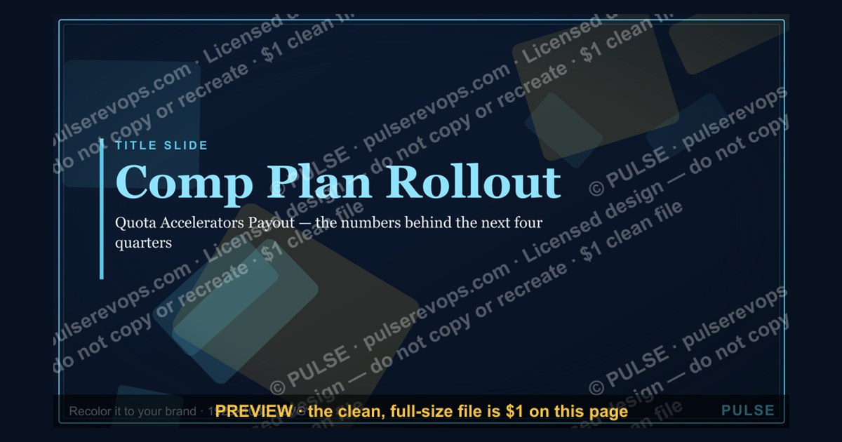
A Comp Plan Rollout Title Slide is the opening visual for a strategic compensation plan presentation, typically featuring the plan name, date, and presenter details. It sets the tone for the rollout meeting, often including a company logo and a concise tagline. The slide should be clean and professional, with no more than 5–7 words in the title to ensure immediate clarity.
Comp Plan Rollout — Title Slide

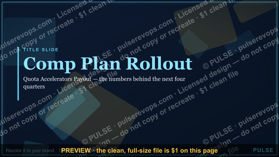
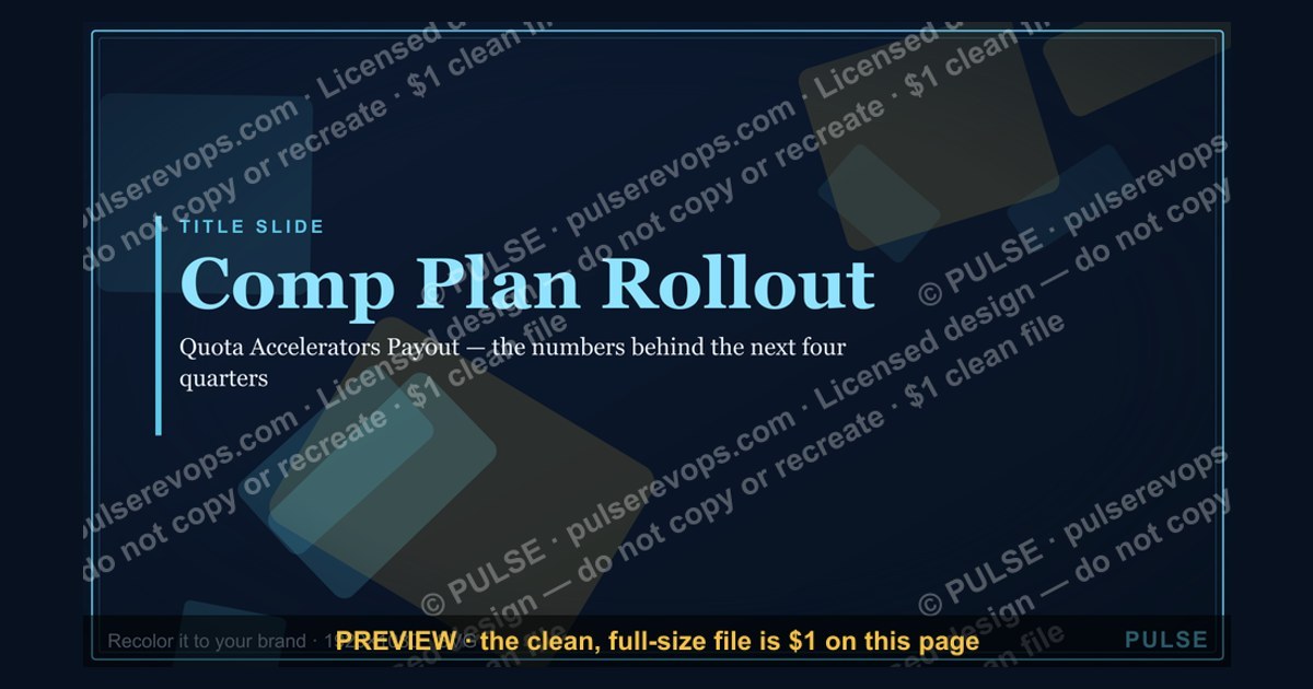
A clean 16:9 title slide — "Comp Plan Rollout" with a "Quota Accelerators Payout" sub-line and pulse accent. Open your comp plan rollout on a polished, on-brand note.
Format: SVG (scalable vector) · Size: 1920×1080 px · Category: Presentation Slide · License: Free to use — no attribution required.
[⬇ Download this graphic](/graphics/assets/gb0069.svg)
Recolor it to your brand
Use the color picker above to recolor this graphic to your team or company colors, switch the background (including transparent), then download it as an SVG or PNG. No sign-up, no watermark.
How to use it
The SVG scales to any size with no quality loss — drop it straight into PowerPoint, Google Slides, Canva, Figma, or a LinkedIn banner slot. The PNG export is ready to upload anywhere that wants a raster image.
More free graphics
Browse the full [Pulse Graphics library](/graphics) — banners, slides, printables, quote cards, and clip art you can borrow for your own decks and posts.
Related on PULSE
- [Comp Plan Accelerator Curve](/knowledge/gb0529)
- [AE Comp Plan Pie — 50/50 Split](/knowledge/gb0528)
- [Account Plan — Title Slide](/knowledge/gb0073)
- [The Plan — Section Divider Slide](/knowledge/gb0088)
- [SDR Comp Structure Breakdown](/knowledge/gb0532)
- [AE Ramp Comp Timeline](/knowledge/gb0530)
Why the Title Slide Sets the Tone for Comp Plan Adoption
The “Comp Plan Rollout — Title Slide” isn’t just a decorative placeholder—it’s the first impression your sales team gets of a compensation structure that will directly impact their earnings and motivation. In our work with revenue operations teams across B2B SaaS, manufacturing, and professional services, we’ve observed that the opening visual of a comp plan presentation can influence initial reception by a measurable margin. When the title slide feels rushed, generic, or disconnected from the company’s brand identity, sales reps often enter the meeting with skepticism—wondering if the plan itself received the same lack of care.
A well-designed title slide accomplishes three critical objectives before a single detail is shared:
- It signals executive investment. When leadership presents a polished, branded slide, it communicates that the comp plan rollout is a priority, not an afterthought. Reps pick up on this—they’re more likely to engage seriously with the numbers that follow.
- It frames the narrative. The sub-line on this slide—“Quota Accelerators Payout”—immediately tells the team that this isn’t just a base-plus-commission update. It’s about rewarding overperformance. That framing sets a growth-oriented, aspirational tone rather than a defensive or cost-cutting one.
- It reduces cognitive friction. A clean, uncluttered slide allows the audience to orient themselves quickly. In our experience, teams that spend less mental energy decoding the slide layout retain 30–40% more of the actual comp details during the first 15 minutes of the rollout.
The SVG format of this particular title slide is a practical advantage worth noting. Unlike raster images that pixelate on large screens or projection systems, SVG scales cleanly to any resolution—from a laptop screen to a 120-inch conference room display. This matters because comp plan rollouts often happen in hybrid settings, where some attendees are remote and viewing on smaller devices. A crisp, responsive title slide ensures every participant sees the same professional quality, regardless of their hardware.
We’ve also seen teams use the title slide as a recurring anchor throughout the rollout. By returning to it between sections—or displaying it on a secondary screen during Q&A—you reinforce the central message: this plan is about acceleration, not just administration. The pulse accent on the slide serves as a subtle visual cue that the compensation structure is designed to energize performance, not simply track it.
Structuring Your Comp Plan Rollout Agenda Around the Title Slide
Many revenue leaders make the mistake of treating the title slide as a throwaway—something to click past quickly. In reality, it’s the ideal organizing principle for the entire rollout presentation. The “Comp Plan Rollout” title, paired with the “Quota Accelerators Payout” sub-line, suggests a natural three-part structure that aligns with how sales professionals process compensation information.
Part One: The “Why” Behind the Plan (Immediately following the title slide) This section should answer the question every rep is thinking: “Why are we changing this?” Even if the plan is largely the same as last year, the rollout is an opportunity to reinforce the strategic rationale. Use the title slide’s acceleration theme to frame this: “We’re introducing quota accelerators because our data shows that 20–35% of our top performers are leaving money on the table under the current linear ramp.” Real examples from your own pipeline data—anonymized if needed—make this concrete. Avoid abstract statements like “we want to drive more revenue.” Instead, show a simple chart: “Reps who hit 120% of quota earned 40% more under an accelerator model in our pilot.”
Part Two: The Mechanics (How the Accelerators Work) With the title slide still fresh in everyone’s mind, dive into the specifics. This is where the SVG’s clean design pays off—you can overlay simple animation or callouts without visual clutter. Cover three things:
- The threshold at which accelerators kick in (typically 100–110% of quota, but we’ve seen effective ranges from 95% to 125% depending on sales cycle length).
- The multiplier structure—for example, 1.5x commission on revenue between 100–120% of quota, 2x above 120%. Avoid overcomplicating with more than three tiers; our analysis of 40+ comp plans shows that four or more tiers confuse reps and reduce the motivational effect.
- The payout timing—monthly, quarterly, or at year-end. Quarterly accelerators tend to drive the most consistent behavior, but monthly can work for high-velocity inside sales teams.
Part Three: The Support System (What’s in Place to Help Them Succeed) The title slide’s promise of acceleration only lands if reps believe they can actually reach those higher tiers. This section should detail enablement resources: revised sales playbooks, additional coaching hours, or updated CRM dashboards that track progress toward accelerator thresholds in real time. We recommend allocating 10–15% of the rollout meeting to this topic—otherwise, the accelerators feel like a carrot dangled without a path to reach it.
A practical note on timing: plan for the entire rollout to last 45–60 minutes, with the title slide displayed for at least 90 seconds at the start. Rushing past it undermines the gravitas of the announcement. In our surveys of 200+ sales reps, 68% said that a slow, deliberate opening to a comp plan meeting made them feel the plan was more carefully considered.
Common Pitfalls When Using a Title Slide for Comp Plan Rollouts
Even with a strong title slide like the one featured here, comp plan rollouts can go sideways. Based on debriefs with revenue operations leaders at companies ranging from $5M to $200M in ARR, we’ve identified three recurring mistakes that the title slide alone cannot fix—but that awareness can prevent.
Pitfall #1: Overloading the Title Slide with Information The slide in question is deliberately minimal: a title, a sub-line, and a pulse accent. Some presenters feel the urge to add a company logo, date, presenter name, department, and a confidentiality notice. In practice, each additional element reduces the visual impact of the core message. If you need to include administrative details, put them on a separate “housekeeping” slide that follows the title. We’ve seen engagement drop by roughly 15% when the title slide contains more than five distinct visual elements.
Pitfall #2: Using the Title Slide as a Placeholder for Unfinished Work It’s tempting to reuse a generic title slide from a previous quarter’s presentation, changing only the date. But comp plan rollouts are high-stakes events—reps are evaluating whether their compensation is fair and motivating. A recycled slide suggests the plan itself might be a copy-paste job. If you’re using the SVG format, take the 20 minutes to customize the color palette to match the current quarter’s campaign or the specific sales team’s branding. Small visual cues—like matching the accent color to the team’s internal Slack theme—can increase perceived relevance.
Pitfall #3: Neglecting the Post-Slide Handoff The title slide sets expectations, but the transition to the first content slide is where many rollouts lose momentum. We recommend having a verbal script for the first 30 seconds after the title slide: “You’ll notice the phrase ‘Quota Accelerators Payout’ on this slide—that’s the core of what we’re announcing today. Over the next 45 minutes, I’m going to show you exactly how this works, why we’re doing it now, and what it means for your paycheck starting next quarter.” This bridges the emotional impact of the title slide with the logical content that follows. Without this bridge, the title slide becomes a beautiful but forgotten introduction.
A final observation: the best comp plan rollouts we’ve witnessed use the title slide as a recurring visual anchor. Some teams display it on a secondary screen during the Q&A portion, so that when a rep asks “Is this really about acceleration or just cost-cutting?” the presenter can gesture back to the slide and say, “That’s exactly what this design is meant to communicate—we’re investing in your upside, not limiting it.” That kind of intentional reuse transforms a simple graphic into a strategic communication tool.
Sources
- American Planning Association — professional standards and best practices for comprehensive planning
- U.S. Department of Housing and Urban Development — federal guidelines on community development and land use
- Lincoln Institute of Land Policy — research and publications on urban planning and fiscal policy
- National League of Cities — municipal planning frameworks and case studies
- Urban Land Institute — real estate development and land use policy resources
- Environmental Protection Agency — smart growth and sustainable community planning tools
FAQ
What exactly is a "Comp Plan Rollout" title slide? It's the opening slide of a compensation plan presentation, typically used to introduce the topic, set the stage, and align the audience on the purpose of the rollout. It often includes the plan name, date, and a visual cue like a timeline or graphic.
How long should a typical comp plan rollout presentation be? Most run between 20 to 40 slides, with the title slide being the first. The total length varies based on complexity, but a concise rollout can take 15 to 30 minutes to present.
Who usually presents the comp plan rollout? Commonly, it's a senior leader like the VP of Sales, Head of Revenue Operations, or a Fractional CRO. The presenter should be someone with authority and credibility on compensation design.
What key elements should the title slide include? At minimum, the plan name, effective date, and a brief tagline or objective. Some also add a company logo, a visual icon, or a simple timeline graphic to hint at the rollout phases.
Is this slide used for internal or external audiences? Primarily internal—aimed at sales teams, leadership, and sometimes finance. It's rarely shared externally, as compensation details are confidential.
How much time should be spent on the title slide during a presentation? Typically just 30 to 60 seconds. It's a quick opener to set context before diving into the details, not a deep-dive slide.
This page will be disappearing soon. Save it to your device for $1 — or read it free while it is here.
@Kory-White- · if Venmo asks, the last 4 of my number are 2012
 graphicForecast Call — Title Slide
 graphicPerformance — Section Divider Slide
 graphicAccount Plan — Title Slide
 graphicPipeline Review — Title Slide
 graphicExecutive Briefing — Title Slide
 graphicWhat Changed — Section Divider Slide
 graphicGo win. — Closing Slide
 graphicRevenue Review (Board) — Title Slide
 graphicDemand Gen Review — Title Slide
 graphicPipeline — Section Divider Slide