
Agenda — Section Divider Slide
 Curated byKory White · Fractional CRO · Maryland
 PULSEKNOWLEDGE LIBRARY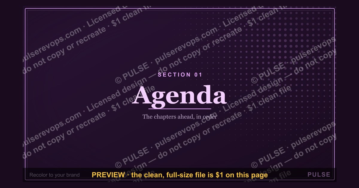
An agenda slide serves as a section divider, typically listing the main topics or phases of a presentation in a clear, sequential format. It is designed to orient the audience by previewing what will be covered, often using bullet points, numbered lists, or a timeline layout. Common design elements include a bold title, concise text, and visual cues like icons or color coding to separate sections.
Agenda — Section Divider Slide

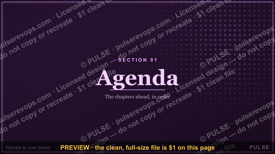
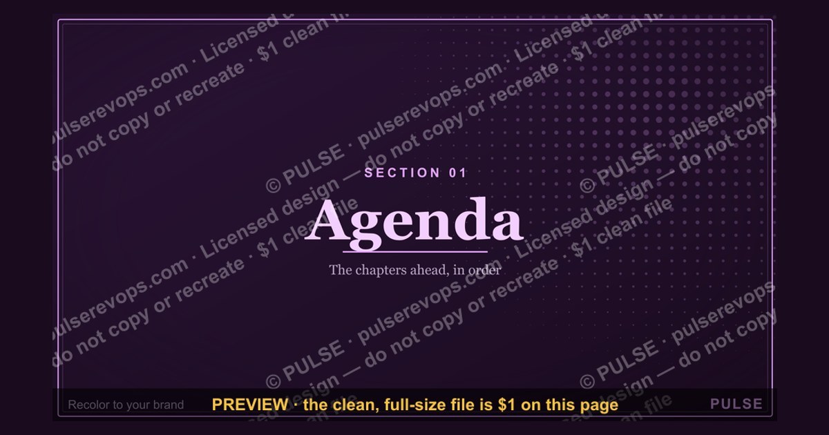
A 16:9 section-divider slide — an oversized "01" beside the "Agenda" header. Use it to move cleanly between the chapters of your deck.
Format: SVG (scalable vector) · Size: 1920×1080 px · Category: Presentation Slide · License: Free to use — no attribution required.
[⬇ Download this graphic](/graphics/assets/gb0081.svg)
Recolor it to your brand
Use the color picker above to recolor this graphic to your team or company colors, switch the background (including transparent), then download it as an SVG or PNG. No sign-up, no watermark.
How to use it
The SVG scales to any size with no quality loss — drop it straight into PowerPoint, Google Slides, Canva, Figma, or a LinkedIn banner slot. The PNG export is ready to upload anywhere that wants a raster image.
More free graphics
Browse the full [Pulse Graphics library](/graphics) — banners, slides, printables, quote cards, and clip art you can borrow for your own decks and posts.
Related on PULSE
- [Pipeline Review — Section Divider Slide](/knowledge/gb0006)
- [Questions — Section Divider Slide](/knowledge/gb0090)
- [The Ask — Section Divider Slide](/knowledge/gb0089)
- [The Plan — Section Divider Slide](/knowledge/gb0088)
- [What Changed — Section Divider Slide](/knowledge/gb0087)
- [Where We Are — Section Divider Slide](/knowledge/gb0086)
Design Principles for an Effective Agenda Divider
The agenda divider slide occupies a unique position in presentation design: it must simultaneously signal a transition, preview what’s coming, and reset the audience’s attention without overwhelming them. Unlike content slides that carry dense information, the divider’s primary job is visual and psychological punctuation. The most effective dividers follow three core principles that separate professional decks from amateur ones.
Visual breathing room is the first principle. A strong divider uses negative space deliberately—typically 40-60% of the slide remains empty or minimally treated. This emptiness isn’t wasted; it gives the audience’s eyes a moment to rest before the next section. In the 16:9 format shown in the example, this translates to generous margins around the numbered agenda items, with the section number (e.g., “03”) rendered large enough to dominate the left third of the slide while the section title sits quietly in the remaining space. The ratio between number and text should feel intentional, not accidental—a common mistake is making the number too small or the text too large, creating visual competition.
Typography hierarchy must be unmistakable. The section number should be 4-6 times larger than the section title, using a weight that commands attention (typically ExtraBold or Black). The section title itself should be 1.5-2 times larger than supporting text like dates or subtitles. Sans-serif fonts work best for dividers because they maintain clarity at extreme sizes—a thin serif font blown up to 120pt can lose legibility, while a clean geometric sans like Montserrat or Inter holds its shape. If your brand uses a serif for body text, consider a sans-serif companion specifically for divider numbers.
Color as wayfinding is the third principle. Each section divider should introduce a color shift that signals a new topic. This doesn’t mean changing the entire slide color—a subtle accent bar, a tinted background block, or a colored number can be enough. The example image uses a dark background with white text, but you can achieve the same effect with a colored left panel (30-40% of slide width) containing the number, while the right panel stays white with the section title in dark text. This color anchor helps audiences mentally file information: “Oh, the blue section is about strategy” becomes an unconscious association after two or three dividers.
A practical test for any agenda divider: cover the section title with your hand—can you still tell this is a section divider and not a title slide? If the number alone doesn’t communicate “this is a transition,” the design needs more contrast. Similarly, if you can read the section title from across a conference room (roughly 20 feet), the text size is adequate. Most designers underestimate how large text needs to be for dividers—aim for 48-72pt for section titles and 120-200pt for numbers in a standard 16:9 slide.
Strategic Placement and Pacing in Your Deck
Where you place agenda dividers matters as much as how they look. The conventional approach—one divider at the start of each major section—works, but experienced presenters use dividers more strategically to control pacing and manage cognitive load. The key insight is that audience attention follows a predictable curve: high at the start, dipping in the middle, rising again near the end. Dividers are tools to reset that curve.
The 3-5 minute rule is a reliable guideline. If a section runs longer than 5 minutes without a visual or verbal transition, audience attention begins to fragment. For a 30-minute presentation with four sections, you might insert an extra “mini-divider” halfway through the longest section—a simplified version with just the section number and a short subheading. This doesn’t need to be a full slide; it can be a brief pause with a single slide that says “Part 2: Implementation” before diving deeper. The mini-divider prevents the middle of your deck from becoming a blur of similar-looking content slides.
Number of dividers should match your message structure, not your outline. A common error is creating a divider for every bullet point in your agenda, resulting in 8-10 dividers for a 20-minute talk. This fragments the narrative and makes the deck feel like a checklist rather than a story. Instead, group your content into 3-5 thematic sections maximum, even if your detailed outline has 7-8 subpoints. Each divider should represent a meaningful shift in topic, tone, or argument—not just a new bullet. For example, if your presentation covers market analysis, product features, pricing, and implementation timeline, that’s four clear sections. But if “pricing” and “packaging” are closely related, combine them under one divider to avoid an unnecessary stop.
The “bookend” technique uses dividers to create a narrative arc. Place a full agenda slide (listing all sections) at the start, then use individual section dividers before each part, and finally return to the full agenda at the end as a summary. This repetition reinforces structure without being repetitive—the audience sees the same information three times, but each viewing serves a different purpose: preview, transition, and recap. In practice, this means your deck has one agenda overview slide (slide 2 or 3), then 4-5 section divider slides, then a final agenda recap slide before the conclusion. The recap slide can be identical to the overview or slightly modified with checkmarks or progress indicators.
Pacing during delivery changes with dividers. When you advance to a section divider, pause for 2-3 seconds before speaking. This silence signals “we’re moving to something new” and gives the audience time to register the visual. Then, state the section number and title aloud, even though it’s on screen: “Section three—our competitive landscape.” This verbal reinforcement doubles the encoding in memory. Avoid reading any additional text on the divider; keep your spoken words to just the section identifier and a one-sentence bridge from the previous topic. For example: “Now that we’ve seen the market size, let’s look at who else is playing in this space. Section three covers our main competitors and how we stack up.”
Common Mistakes and How to Fix Them
Even experienced presenters make predictable errors with agenda dividers. These mistakes undermine the divider’s purpose and can confuse or bore the audience. Recognizing them is the first step to cleaner, more effective transitions.
Mistake 1: Overcrowding the divider. The most frequent error is treating the divider like a content slide—adding bullet points, sub-bullets, icons, logos, dates, or speaker notes. A divider should contain at most three elements: the section number, the section title, and optionally a single line of context (like a date or a one-word theme). Anything beyond that dilutes the visual impact. Fix: ruthlessly strip every element that isn’t essential. If you feel the need to add more information, that’s a sign your section title isn’t descriptive enough. Instead of “Marketing Strategy,” try “Q3 Marketing Strategy: Brand Awareness Push” if you need more specificity, but keep it to one line.
Mistake 2: Inconsistent design across dividers. Some decks have divider #1 with a dark background, divider #2 with a photo background, and divider #3 with a gradient—creating a disjointed experience. Consistency builds trust and reinforces the structure. Fix: create a master divider template with fixed positions for the number, title, and any decorative elements. Then apply it to all dividers, changing only the number and title text. The background should remain consistent (same color, same texture, same treatment) unless you’re using color-coding by section, in which case the change should be systematic—e.g., divider #1 uses blue accent, divider #2 uses green accent, divider #3 uses orange accent—with all other layout elements identical.
Mistake 3: Using dividers as filler slides. When a presenter runs out of content or is unsure about timing, they sometimes add extra dividers to stretch the deck. This backfires—audiences notice when a divider appears without a genuine topic shift. Fix: only insert a divider when you have at least 3-5 minutes of content to follow. If a section is short (2 minutes or less), skip the divider and just use a verbal transition. For example, instead of a slide that says “Section 4: Next Steps,” simply say “Let me wrap up with a few next steps” while advancing to your first next-steps content slide.
Mistake 4: Animating the divider elements. Entrance animations (fly-in, fade, zoom) on divider slides feel gimmicky and slow down the transition. The divider should appear instantly, not build over 2-3 seconds. Fix: set all divider elements to appear “With Previous” or no animation at all. If you must use motion, consider a simple cross-dissolve transition between the previous content slide and the divider (0.5 seconds maximum), but keep the divider itself static. The audience should register the new section in a single glance, not wait for text to animate into place.
Mistake 5: Forgetting the divider’s role in remote presentations. In virtual meetings, dividers serve an additional function: they help late-arriving viewers orient themselves. Someone joining 10 minutes late sees a divider and immediately knows “they’re on section two” without needing to ask. Fix: include the section number prominently in the divider (not just the title) and consider adding a small progress indicator—like “Section 2 of 5”—in a corner. This tiny addition is invaluable for asynchronous viewers who might watch a recording later, as it provides context for where they are in the narrative.
Mistake 6: Matching the divider to the slide master instead of the content. Some presentation templates force a generic divider style that doesn’t match the deck’s visual language. For example, a dark, dramatic divider in an otherwise light, airy deck feels jarring. Fix: the divider should share at least two design elements with your content slides—same font family, same accent color, same margin system, or same background texture. It should feel like a deliberate part of the deck, not a separate template dropped in. If your content slides use a white background with a blue accent bar at the top, your divider could use a blue background with white text and the same accent bar position—creating continuity through inversion.
Sources
- World Health Organization (WHO) — global health data, disease outbreaks, and public health guidelines
- United Nations (UN) — international policy, sustainable development goals, and humanitarian reports
- The World Bank — economic development indicators, poverty statistics, and global financial data
- National Aeronautics and Space Administration (NASA) — space exploration, climate science, and satellite imagery
- The New York Times — major news events, investigative journalism, and cultural analysis
- Harvard Business Review — business strategy, leadership research, and management case studies
FAQ
What is an agenda section divider slide? It’s a slide that visually separates different sections of a presentation, often used in long decks to give the audience a clear roadmap. It typically lists the main topics or sections, like the eight-section layout shown in the example.
How many sections should an agenda divider include? There’s no fixed number, but common ranges are 4 to 8 sections. The example uses eight, which works well for detailed presentations, but fewer sections can be better for simpler agendas.
Can I customize the design of a section divider slide? Yes, you can adjust colors, fonts, and icons to match your brand or theme. The example uses a clean, professional layout, but you can simplify or add visual elements as needed.
Is an agenda divider slide necessary for every presentation? It’s not mandatory, but it helps improve audience engagement and navigation, especially in longer presentations. For short decks with 3–5 slides, it may be overkill.
What’s the best way to order sections on an agenda divider? Typically, you follow the logical flow of your presentation, starting with an introduction or overview and ending with a conclusion or next steps. The example shows a sequential order, but you can rearrange based on priority.
Can I use an agenda divider slide in virtual presentations? Absolutely, it works well in both in-person and virtual settings. It gives remote viewers a clear visual cue of where you are in the presentation, helping them follow along.
This page will be disappearing soon. Save it to your device for $1 — or read it free while it is here.
@Kory-White- · if Venmo asks, the last 4 of my number are 2012
 graphicPerformance — Section Divider Slide
 graphicCustomer QBR — Title Slide
 graphicLet's talk. — Closing Slide
 graphicThe Ask — Section Divider Slide
 graphicPipeline Review — Section Divider Slide
 graphicSales Onboarding — Title Slide
 graphicTerritory & Quota Planning — Title Slide
 graphicSales Training — Title Slide
 graphicWin / Loss Review — Title Slide
 graphicNext steps. — Closing Slide