
Performance — Section Divider Slide
 Curated byKory White · Fractional CRO · Maryland
 PULSEKNOWLEDGE LIBRARY
Quality
Certified
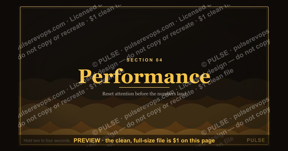

This graphic is a 1920x1080 PNG section divider slide titled "Performance" — a full-bleed title card built to open the performance portion of a deck, all-hands, or QBR. It carries one large word, a thin rule, and a subtitle line, so the audience knows a new chapter has begun before any metric appears on screen.
The scenario this divider solves
Picture the moment a quarterly business review hits its halfway point. The first block covered pipeline coverage, the second covered win rates by segment, and now the presenter needs to pivot into attainment against quota. Without a visual break, slide 14 looks exactly like slide 13 — same white background, same chart frame, same footnote styling. Eyes drift to laptops. Someone in the back asks whether the number on screen is the same one from ten minutes ago.
A Performance Section Divider Slide exists to kill that ambiguity. It is a deliberate interruption: one slide with almost nothing on it, doing one job — announcing that everything after this point is about performance, not pipeline, not coverage, not forecasting hygiene. In decks that run 40 to 80 slides, presenters typically insert three to five dividers, and the performance one is usually the highest-stakes because it precedes the numbers leadership actually came to see.
The failure mode is subtle. Teams that skip dividers assume the agenda slide at the front is enough. It is not, because attention decays. A divider re-anchors the room roughly every 10 to 15 minutes of content, which matches the rough cadence at which passive listening degrades in a meeting setting. The divider is not decoration; it is a pacing instrument.

There is also a practical benefit for asynchronous readers. A deck that gets forwarded without narration — which is most decks — becomes navigable when dividers act as visual bookmarks. A reader scrolling on a phone can jump straight to the performance block instead of hunting through chart titles.
How the mechanism actually works
A section divider works through three stacked effects: visual contrast, cognitive reset, and structural signaling. Each one is doing separate work, and a divider that only achieves one of them underperforms.

Visual contrast is the simplest. If every content slide shares a light background and dense layout, a divider that inverts to a dark or saturated background creates an unmistakable boundary. The eye registers the change before the brain reads the word. This is why most divider templates use a full-bleed color field rather than a colored header bar — the bar reads as a styling variation, the full field reads as a new chapter.
Cognitive reset is the second layer. A divider gives the presenter a natural pause of two to five seconds, which is enough to transition verbally: "That covers coverage. Now let's look at how we actually performed." Without the pause, presenters tend to rush the transition and the audience carries residual context from the previous section into the new one, which produces confused questions later.
Structural signaling is the third layer and the one most often neglected. A divider should tell the reader where they are in the whole. A small progress indicator — "Section 3 of 5" — or a repeated divider design across the deck turns individual slides into a system. When the same divider template appears four times with different titles, the audience learns the pattern after the first one and navigates the rest without effort.

The diagram above shows the sequence. Note the feedback loop at the bottom: consistency across dividers compounds. The first divider costs the audience a few seconds of attention; the third and fourth cost almost nothing because the pattern is already learned. Inconsistent dividers — different fonts, different color fields, different title positions — reset that learning every time and quietly tax the whole deck.
One more mechanical detail: the divider should carry no data. The moment a divider includes a chart, a KPI tile, or a bullet list, it stops being a divider and becomes a content slide with a big title. The whole value is in the emptiness. Resist the urge to fill it.
Real numbers, ranges, and benchmarks
Deck structure varies enormously by company, but a few ranges hold up across most B2B operating reviews and are useful as sanity checks when you are deciding how many dividers to build.

A typical quarterly business review runs 35 to 60 slides. All-hands decks run 25 to 45. Board decks run 20 to 40 and are usually denser per slide. Within those, dividers typically consume 5 to 10 percent of total slide count. That means three to five dividers in a 50-slide QBR, and two to three in a 30-slide all-hands. Going above roughly 12 percent dividers starts to feel padded; going below 4 percent means the deck has no navigable structure.
On timing, presenters move through a divider in 3 to 10 seconds when narrating live. That is the entire budget. If a divider is on screen for 30 seconds, either the presenter is using it as a discussion slide — in which case it should have been a content slide — or they lost their place.

For the graphic itself, 1920x1080 is the standard 16:9 presentation canvas and maps cleanly to PowerPoint's widescreen default and Google Slides' default. Exporting at exactly 1920x1080 keeps text crisp when the deck is projected at 1080p, which is still the most common conference room and webinar resolution. For decks that will be viewed primarily on retina laptops or printed, exporting the same layout at 2x (3840x2160) is worth the extra file size.
File size matters more than people expect. A full-bleed divider with a flat color field and one line of text compresses to well under 200 KB as a PNG. If your divider file is 3 MB, something is wrong — usually a photographic background or a gradient with heavy dithering. Flat fields and solid type keep dividers small, which keeps the whole deck small, which matters when the deck is emailed or attached in a CRM.
On text sizing, the section title on a 1920x1080 divider usually sits between 90 and 160 pixels tall for the cap height. Below roughly 80 pixels the title stops functioning as a visual anchor from the back of a room. Above roughly 200 pixels a single word starts to feel like a poster rather than a slide. The subtitle line, if present, typically runs one-quarter to one-third the size of the main title.

Color contrast is the number that quietly breaks dividers. Body text on a divider should clear a contrast ratio of at least 4.5:1 against its background, and large display type should clear 3:1. White type on a mid-tone blue often fails this; white on a deep navy or near-black almost always passes. If you are unsure, check the pairing with any standard contrast checker before you commit the template.
Trade-offs and alternatives
A full-bleed divider is not the only option, and the right choice depends on how the deck will be consumed.

The main trade-off is visual weight versus information density. A full-bleed divider is heavy — it dominates the screen for a few seconds and creates a hard stop. That is exactly what you want in a live presentation where you are managing attention. It is less useful in a dense read-ahead document where the reader wants to move fast and a full page of near-empty color feels like wasted space. For read-aheads, a lighter alternative — a colored header band on an otherwise normal slide, or a slim horizontal rule with the section name — preserves navigability without spending a full page.
A second trade-off is template consistency versus per-section differentiation. Using one divider design for every section keeps the deck coherent and teaches the pattern quickly. Using a different accent color per section adds wayfinding but risks looking like four different decks stapled together. The common compromise is one layout with a single accent color that shifts subtly per section — same shape, same type, different hue.
A third trade-off is the divider as a standalone graphic versus the divider as part of a template system. If you export this PNG and drop it into a deck, you get a fast, consistent result. If you rebuild it as a master slide layout, you get editability — you can change the title text without opening an image editor — but you also take on the maintenance of keeping that master in sync across teams. Most RevOps teams do both: a PNG for quick use and a matching master layout for the deck template.

The alternatives worth naming explicitly: a table of contents slide that repeats before each section, a thin progress bar pinned to the bottom of every content slide, and a simple numbered section label in the corner of each slide. Each of these is lighter than a full divider and each does less work. The progress bar is excellent for long decks read on screen and nearly invisible in a projected room. The corner label is unobtrusive and cheap but never creates the pause that a divider creates. Pick based on whether you need a stop or a signpost.
Common pitfalls and how to avoid them
The most common mistake is putting content on the divider. A KPI, a quote, a logo lockup with three sub-brands — anything that invites reading turns the divider into a content slide and destroys the pause. Keep it to the section title and, optionally, a one-line subtitle.
The second pitfall is inconsistent dividers. If the performance divider uses a dark navy field and the next section's divider uses a light gray field with different type, the audience has to re-learn the pattern. Build one divider layout, duplicate it, and change only the title text and accent hue.

The third pitfall is a title that does not match the section it precedes. A divider that says "Performance" followed by slides about pipeline generation creates a mismatch that produces confused questions. The divider title should be the literal name of the section, matching whatever the agenda slide called it.
The fourth pitfall is low contrast. Light gray type on a white or pale background looks elegant on a designer's monitor and disappears on a projector in a bright room. Test the divider on an actual projector or at minimum on a dimmed screen before you commit it to a deck that will be presented live.

The fifth pitfall is file bloat. A divider built with a photographic background, a gradient mesh, and drop shadows can run several megabytes, which slows deck loading and bloats email attachments. Flat color fields and solid type keep the file small and the render fast.
The sixth pitfall is treating the divider as a one-time asset. Teams build a divider for one QBR, then rebuild it from scratch the next quarter with slightly different spacing and a different font. Save the source file, name it clearly, and reuse it. The whole point of a divider system is that it is boring and repeatable.
Finally, avoid the temptation to over-animate. A divider that slides in, fades, spins a logo, and types out the title letter by letter spends the audience's attention on the animation instead of on the transition. A simple fade or a hard cut is almost always better.
Related questions
What should the divider slide actually say?
The section name, matching the agenda exactly — here, "Performance." Optionally add a one-line subtitle that frames the section, such as "Attainment against quota, by segment." Nothing else. No metrics, no dates, no logos beyond the deck's standard mark.
How many dividers should a quarterly review have?
Roughly three to five in a 35 to 60 slide QBR, which works out to 5 to 10 percent of total slides. Fewer than that and the deck has no navigable structure; more and the dividers start to feel like padding.
Should the divider be a PNG or a master slide layout?
Both, ideally. The PNG is fast to drop into any deck and guarantees the design renders correctly. A matching master layout gives you editability for teams that maintain a shared template and need to change titles without an image editor.
Does a divider slide need a progress indicator?
Not required, but a small "Section 3 of 5" label or a subtle progress bar helps readers who join mid-deck or scroll asynchronously. It costs almost nothing visually and makes the deck self-locating.
What resolution should the divider be exported at?
1920x1080 for standard 16:9 projection and webinar use. Export at 3840x2160 if the deck will be viewed primarily on retina displays or printed, since the 2x file keeps type crisp at larger sizes.
FAQ
Can I use the same divider for every section and just change the title?
Yes, and that is usually the right call. One layout with a single accent color that shifts subtly per section gives you consistency plus wayfinding. Changing the layout per section makes the deck feel assembled rather than designed.
What if my deck has no clear sections?
Then you probably do not need dividers. Dividers exist to mark boundaries. If the deck is one continuous argument, a table of contents and a progress bar will serve better than four dividers with arbitrary titles.
Is a dark background always better for a divider?
No. Dark backgrounds create strong contrast against light content slides, which is why they are common, but a light divider against dark content slides works equally well. What matters is that the divider is visually distinct from the slides around it, not that it is dark.
How do I keep the divider accessible?
Check contrast ratios — at least 4.5:1 for body text and 3:1 for large display type. Avoid relying on color alone to convey the section; the title text should carry the meaning. If the deck is shared as a PDF, make sure the divider text is real text, not an image of text, so screen readers can access it.
Should the divider include the company logo?
A small, consistent logo mark is fine and often expected in external decks. A large logo lockup with taglines and sub-brands is not — it competes with the section title and turns the divider into a branding slide.
How long should the divider stay on screen?
Three to ten seconds when narrating live. Use the pause to say the transition out loud: "That covers coverage. Now, performance." If it is on screen longer than that, you are either discussing something, in which case it should be a content slide, or you have lost your place.
Sources
- Microsoft: Add, change, or delete the background color in PowerPoint
- Google Workspace: Change the theme, background, or layout in Google Slides
- W3C Web Content Accessibility Guidelines (WCAG) 2.1 — Contrast Minimum
- Nielsen Norman Group: Slide Design and Presentation Research
- Apple: Human Interface Guidelines — Layout
- Canva Design School: Presentation Design Tips
- Adobe: Presentation Design Best Practices
Related on PULSE
- Performance — Attainment Slide
- Performance — Quota vs. Actuals Slide
- Performance — Win Rate by Segment Slide
- Section Divider — Pipeline Review
- Section Divider — Forecast Review
- Deck Structure — Progress Indicators and Navigation
This page will be disappearing soon. Save it to your device for $1 — or read it free while it is here.
@Kory-White- · if Venmo asks, the last 4 of my number are 2012
 graphicWin / Loss Review — Title Slide
 graphicSales Onboarding — Title Slide
 graphicAgenda — Section Divider Slide
 graphicNext steps. — Closing Slide
 graphicSales Training — Title Slide
 graphicThe Ask — Section Divider Slide
 graphicTerritory & Quota Planning — Title Slide
 graphicCustomer QBR — Title Slide
 graphicPipeline Review — Title Slide
 graphicDeal Review — Title Slide