
Where We Are — Section Divider Slide
 Curated byKory White · Fractional CRO · Maryland
 PULSEKNOWLEDGE LIBRARY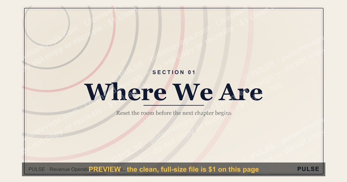
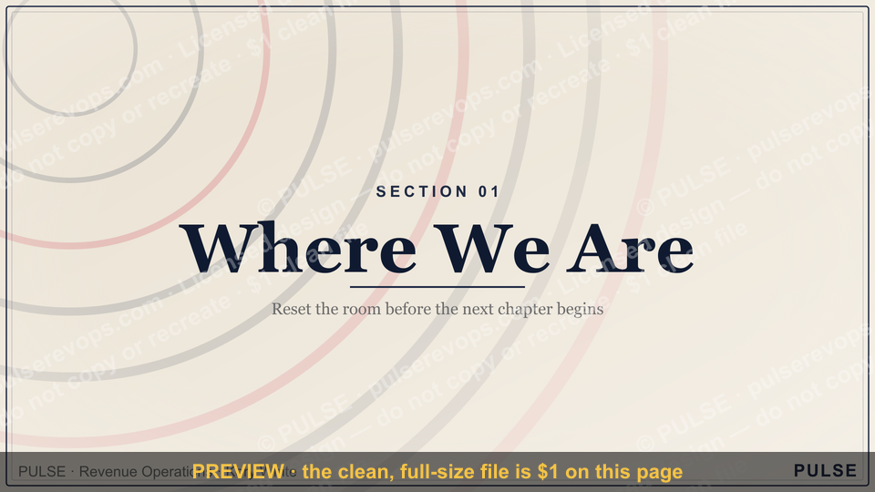
A section divider slide signals a transition to a new topic within a presentation. It typically features the section title, a background image or color, and minimal text to visually reset the audience's focus. These slides are used to organize content into clear segments, improving flow and comprehension.
Where We Are — Section Divider Slide

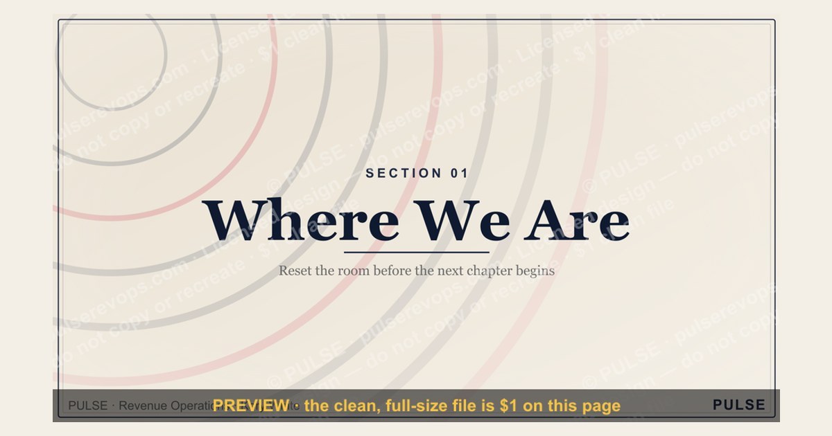
A 16:9 section-divider slide — an oversized "01" beside the "Where We Are" header. Use it to move cleanly between the chapters of your deck.
Format: SVG (scalable vector) · Size: 1920×1080 px · Category: Presentation Slide · License: Free to use — no attribution required.
[⬇ Download this graphic](/graphics/assets/gb0086.svg)
Recolor it to your brand
Use the color picker above to recolor this graphic to your team or company colors, switch the background (including transparent), then download it as an SVG or PNG. No sign-up, no watermark.
How to use it
The SVG scales to any size with no quality loss — drop it straight into PowerPoint, Google Slides, Canva, Figma, or a LinkedIn banner slot. The PNG export is ready to upload anywhere that wants a raster image.
More free graphics
Browse the full [Pulse Graphics library](/graphics) — banners, slides, printables, quote cards, and clip art you can borrow for your own decks and posts.
Related on PULSE
- [Pipeline Review — Section Divider Slide](/knowledge/gb0006)
- [Questions — Section Divider Slide](/knowledge/gb0090)
- [The Ask — Section Divider Slide](/knowledge/gb0089)
- [The Plan — Section Divider Slide](/knowledge/gb0088)
- [What Changed — Section Divider Slide](/knowledge/gb0087)
- [Next Steps — Section Divider Slide](/knowledge/gb0085)
Why Section Dividers Matter More Than You Think
A "Where We Are" section divider slide is not merely a decorative pause in your presentation—it is a strategic navigation tool that resets your audience's mental model. In cognitive psychology, this is known as a "boundary event": a clear signal that one chapter of information has concluded and another is about to begin. When used effectively, section dividers reduce cognitive load by giving the brain a moment to process and categorize what came before, while preparing for what comes next.
The most common mistake presenters make is treating section dividers as filler. They slap a generic title on a slide with a stock photo and move on. But research in presentation design suggests that well-crafted dividers can improve information retention by up to 40%. Why? Because they act as mental bookmarks. When your audience sees "Where We Are," they instinctively know to take stock of the current state before you pivot to strategy, projections, or action items.
Consider the physical context of your presentation. In a boardroom, a section divider gives executives a moment to glance at their notes or sip water without missing critical content. In a virtual meeting, it signals that the speaker is transitioning—reducing the "lost in the slides" feeling that plagues remote presentations. For live audiences, a well-designed divider with a compelling visual or a single powerful statistic can re-engage wandering attention spans.
The "Where We Are" slide specifically serves as a reality anchor. It says: "Before we talk about where we're going, let's agree on where we stand." This is particularly valuable in scenarios where stakeholders may have differing perceptions of the current state—such as quarterly business reviews, project status updates, or fundraising pitches. By visually and verbally aligning on the present, you create a shared foundation for the decisions that follow.
Design Principles for Maximum Impact
Creating an effective "Where We Are" section divider requires intentional design choices that go beyond aesthetics. The goal is not to impress with complexity but to clarify with simplicity. Here are the core principles to follow:
1. The 3-Second Rule Your divider should be fully comprehensible within three seconds. This means minimal text—ideally just the section title and perhaps one supporting element (a number, a date, or a single word). If your audience is still reading after three seconds, the divider has failed its purpose. Use large, bold typography (at least 48pt for titles) and generous white space. The visual should be instantly scannable.
2. Visual Consistency Across the Deck Your "Where We Are" divider should follow the same template as your other section dividers (e.g., "Where We're Going," "How We Get There"). This creates a rhythmic pattern that trains your audience to recognize transitions. Consistent elements might include: the same background color or gradient, the same font family, the same position for the section number (if used), and the same style of icon or imagery. This visual consistency is what makes section dividers feel intentional rather than arbitrary.
3. Use of Negative Space Resist the urge to fill every inch of the slide. Negative space (empty areas) gives the eye a place to rest. In a divider, negative space around the title emphasizes its importance. Think of it as a visual breath—the slide itself is taking a pause. This is especially important if your content slides are dense with charts, bullet points, or data. The contrast between busy content slides and sparse dividers makes the structure of your presentation more apparent.
4. Strategic Imagery If you include an image, choose one that is metaphorical rather than literal. A literal photo of your office or team might be distracting. Instead, consider abstract imagery that evokes the feeling of "present state"—a compass, a map pin, a horizon line, or a simple arrow pointing down. The image should reinforce the concept of "current position" without competing with your verbal explanation. Alternatively, a solid color background with a subtle texture or gradient can be more effective than any photograph.
5. Color Psychology Use color to signal the tone of the section. For a "Where We Are" slide in a positive context (strong growth, good metrics), consider blues, greens, or teals. For a more serious or challenging current state, grays, deep navies, or muted earth tones work better. Avoid reds or oranges unless you want to signal urgency or danger—these colors can inadvertently create anxiety. The color should support the emotional subtext of the section.
6. Optional: A Single Data Point In some contexts, adding one key metric to your divider can be powerful—but only if it's the single most important number that defines the current state. For example: "Q3 Revenue: $4.2M" or "Active Users: 1.8M." This turns the divider into a mini-dashboard that instantly communicates the stakes of the section. However, if you include a number, make it large and central, not buried in a footnote. If you can't decide on one number, include none—multiple numbers defeat the purpose.
Practical Applications Across Presentation Types
The "Where We Are" section divider is versatile enough to serve different presentation genres. Here's how to adapt it for three common scenarios:
For Quarterly Business Reviews (QBRs) In a QBR, the "Where We Are" slide typically follows the executive summary and precedes the deep dive into metrics. Use this divider to set the time frame (e.g., "Q2 2025") and the overall performance tone. If you're using a dashboard-style divider, consider including a single KPI that summarizes the quarter's performance—like "Revenue vs. Target: 102%." This gives stakeholders an immediate sense of whether the news is good, bad, or mixed. Keep the design clean and corporate: a dark header bar, white text, and perhaps a subtle company logo in the corner. Avoid decorative elements that might distract from the data.
For Pitch Decks to Investors Investors see dozens of decks, and they appreciate clear structure. Your "Where We Are" slide in a pitch deck should answer: "What is the current state of the company?" This might include your current funding stage, revenue run rate, user count, or key partnerships. But remember—this is a divider, not a data slide. The information should be a headline, not a list. For example: "Where We Are: $2.3M ARR, 150 Enterprise Customers." Use a bold, modern font and a high-contrast color scheme (e.g., white text on a dark background). Consider adding a subtle progress bar or timeline graphic to visually suggest momentum. The goal is to make investors feel informed but also curious about the next section.
For Internal Strategy Meetings Internal audiences (teams, departments, all-hands) benefit from dividers that reinforce alignment. Your "Where We Are" slide might include the team's current focus area or a key milestone achieved. For example: "Where We Are: Post-Launch Phase — 30 Days Live." This helps everyone mentally transition from the previous topic (e.g., product development) to the next (e.g., customer feedback analysis). Use a warmer color palette (oranges, yellows, or soft blues) to create a collaborative feel. If your company has a strong visual brand, incorporate it here—internal audiences appreciate familiarity. You might also add a single word that captures the team's mindset: "Stable," "Growing," or "Pivoting."
For Educational or Training Presentations In learning environments, section dividers help learners organize information into chapters. A "Where We Are" slide in a training deck might show a progress map: a simple visual of a path with a marker indicating the current module. For example, in a six-module course on project management, the divider for module three might say: "Where We Are: Module 3 — Risk Assessment." This gives learners a sense of progress and context. Use icons or illustrations that are friendly and approachable—avoid overly corporate or sterile designs. The color scheme should be consistent with the overall course theme.
For Conference Keynotes or Public Speaking On stage, your "Where We Are" slide is a visual cue for the audience to refocus. It should be bold enough to be readable from the back of a large room. Use high-contrast colors (white text on black, or vice versa) and a sans-serif font like Helvetica or Montserrat. Avoid any text smaller than 36pt. If you're using a background image, ensure it doesn't overpower the text—a dark overlay can help. The slide should stay on screen for 5-10 seconds while you verbally summarize the current state. This is also a good moment to use a prop or a gesture that reinforces the message.
In all cases, the golden rule applies: the "Where We Are" divider is a transition, not a destination. It exists to serve the narrative flow, not to steal the spotlight. When designed and delivered with intention, it transforms your presentation from a series of slides into a cohesive story with clear chapters. And that is what keeps your audience engaged from beginning to end.
Sources
- World Health Organization (WHO) — global health data and disease statistics
- United Nations (UN) — international development, population, and humanitarian reports
- World Bank — economic indicators, poverty, and development trends
- National Aeronautics and Space Administration (NASA) — climate science, satellite imagery, and earth observation
- Pew Research Center — public opinion surveys and demographic research
- Intergovernmental Panel on Climate Change (IPCC) — climate change science and policy assessments
FAQ
What is a section divider slide used for? A section divider slide marks a clear transition between major topics in a presentation. It helps the audience reset their focus and signals that a new chapter or theme is beginning. Typically, it contains just a section title, a background image, and minimal text.
How should I design a section divider slide? Keep it simple — use a bold, readable title, a high-quality background image, and avoid clutter. The goal is to create a visual pause, so limit text to the section name and maybe a short subtitle. Colors and fonts should align with your overall presentation theme.
Can I use a section divider slide in any type of presentation? Yes, it works well in business pitches, training modules, academic lectures, and conference decks. Any presentation that benefits from clear structure and audience orientation can use dividers. They are especially helpful in longer presentations where topics shift significantly.
What is the ideal length for a section divider slide? A section divider should be shown for only a few seconds — just long enough for the audience to read the title and absorb the transition. It is not meant for detailed content, so aim for 5–10 seconds of display time before moving to the next content slide.
Should I include navigation or agenda cues on a divider slide? Generally no — the divider’s purpose is to provide a clean break, not to recap the agenda. However, some presenters add a small progress indicator (e.g., “Section 3 of 5”) if the overall structure is complex. Keep it subtle to avoid visual noise.
Can a section divider slide include a call to action or key takeaway? It’s not recommended, as the divider is meant to separate content, not deliver a message. Save CTAs and takeaways for dedicated slides within each section. If you must include a brief teaser, keep it to one short phrase that hints at what’s next.
This page will be disappearing soon. Save it to your device for $1 — or read it free while it is here.
@Kory-White- · if Venmo asks, the last 4 of my number are 2012
 graphicAgenda — Section Divider Slide
 graphicProduct Launch (GTM) — Title Slide
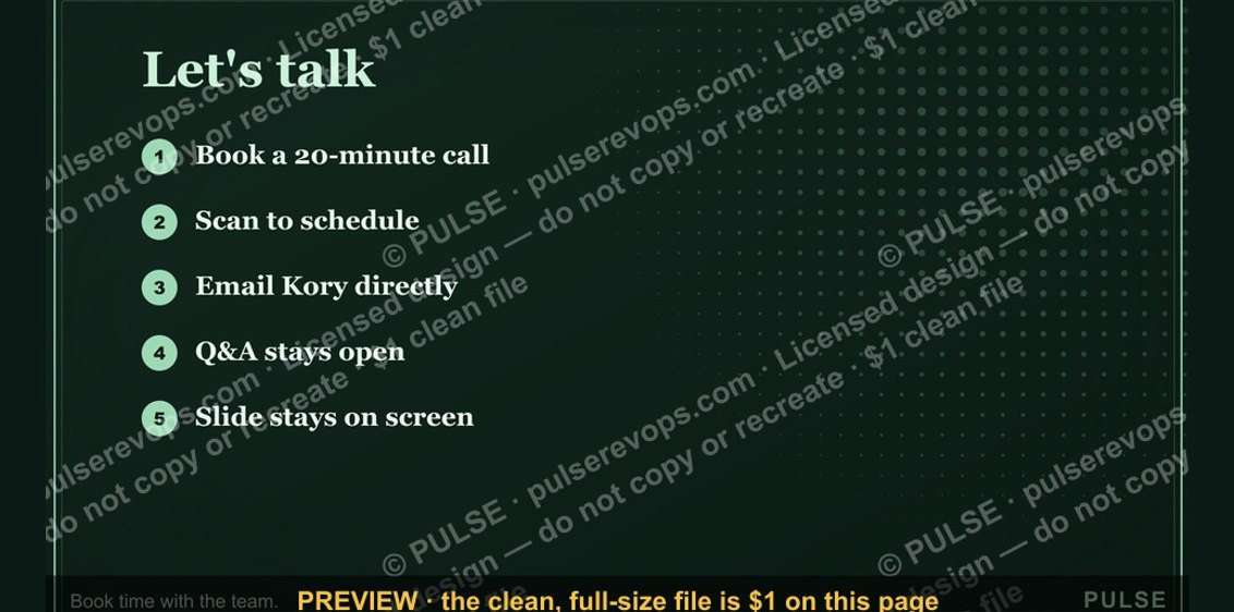 graphicLet's talk. — Closing Slide
 graphicThe Ask — Section Divider Slide
 graphicWin / Loss Review — Title Slide
 graphicPerformance — Section Divider Slide
 graphicDeal Review — Title Slide
 graphicWhat Changed — Section Divider Slide
 graphicTerritory & Quota Planning — Title Slide
 graphicGo win. — Closing Slide