


Questions — Section Divider Slide
Quality
Certified
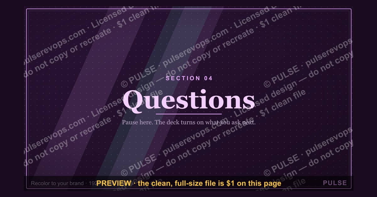
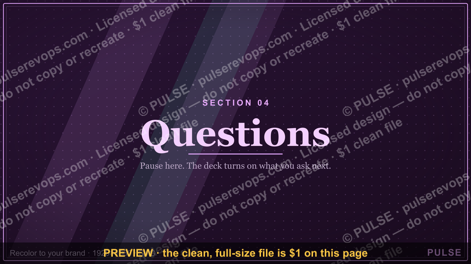
This graphic is a 1920x1080 PNG section divider slide titled "Questions" — a full-bleed title card you drop into a deck, webinar, or video to signal a transition into Q&A. It carries one large word, "Questions," plus a thin divider rule and a small "Section" label, so the audience instantly knows the format is changing.
The two options compared: a plain divider vs. a question-prompt divider
When teams build a Section break for a Q&A block, they almost always land on one of two designs, and the choice matters more than it looks. The first is the plain divider: a single large word — "Questions" — centered on a quiet background, with nothing else competing for attention. The second is the question-prompt divider: the same title, but with two or three sample questions printed beneath it, or a single provocative prompt like "What's the one thing blocking your rollout?" The plain Divider works because it is frictionless. It reads in under a second, it never dates, and it can be reused across every webinar, every all-hands, and every conference Slide deck without editing. Its weakness is that it does no work to prime the audience — a silent room stays silent.
The question-prompt Divider trades that neutrality for momentum. When people see a concrete question already on screen, they stop searching for "a good question" and start reacting to the one in front of them. In practice, a prompt divider tends to produce the first hand-raise faster, because the audience is responding to something rather than generating something. The cost is maintenance: prompts go stale, they can accidentally anchor the whole session to one topic, and a badly chosen prompt ("Why is our tooling so slow?") can read as an internal complaint aired in public.
A third, less common variant sits between them: the Divider with a single line of instruction, such as "Drop your questions in chat — we'll take them in order." That is neither a prompt nor a pure title card; it is a logistics Slide. It is worth naming because it solves a real problem (people don't know the channel) without committing you to specific content. If your Q&A is chat-driven rather than live-mic, this variant usually outperforms both of the others.

The practical comparison comes down to four axes. Reusability: plain wins decisively, prompt loses because content is baked in. First-response speed: prompt wins, because you've removed the blank-page problem. Risk of derailment: plain is near zero, prompt is moderate. Production cost: plain is a one-time asset, prompt is a per-session asset. Most mature teams keep one plain divider as the evergreen default and swap in a prompt version only for sessions where they already know the room is quiet — a Thursday-afternoon internal all-hands, for example, or a webinar with a large anonymous audience.
There is also a sequencing consideration that gets overlooked. A Section divider is not just a title card; it is a pacing device. In a 45-minute session, the Q&A divider typically lands around minute 30, and its job is to change the room's mode from receiving to participating. A plain divider does that with a clean break. A prompt divider does it with a nudge. If your session already has strong interaction — polls, chat prompts, a co-host working the room — the plain version is sufficient and the prompt version is redundant. If your session has been a monologue for 30 minutes, the prompt version is doing real remedial work.
How to decide between them

The decision is not aesthetic. It follows from three inputs you can actually measure before you build anything: audience size, whether the channel is live or written, and whether you already know the questions you want to seed.
The logic behind the tree is simple. Small live rooms do not need priming — the social pressure to ask is already high, and a prompt can actually feel patronizing. Large anonymous rooms need priming because the cost of speaking up is high and the audience assumes someone else will ask. Written channels sit in between: people will type things they would never say aloud, so a prompt helps, but the prompt should be a topic seed rather than a full question, because a full question in chat tends to get answered by twelve people typing variations of the same thing.
There is one more branch worth adding mentally: if your session is recorded and will be watched asynchronously, the divider is doing double duty as a chapter marker. In that case lean plain and lean legible — a prompt divider with three lines of small text becomes unreadable on a phone at 1x speed, and the chapter thumbnail will look cluttered in the video player's scrubber.
Concrete numbers behind each option
Design decisions get easier when you attach numbers to them, and the numbers here are mostly about legibility and timing rather than anything exotic.
Start with the canvas. The graphic is authored at 1920x1080 pixels, which is the standard 16:9 frame. That is the same aspect ratio as a 1080p Slide, a Zoom screen share, a YouTube thumbnail, and a LinkedIn document page. Because it is 16:9, it drops into a deck at full bleed without letterboxing, and it exports cleanly to a video editor's timeline at 1080p. If you need a 4:5 or 1:1 crop for a social post, you will lose the left and right thirds — so keep the word "Questions" inside the central 1080-pixel-wide safe zone if you plan to crop.
Now the type. On a 1080-pixel-tall canvas, a title word set at roughly 180 to 240 pixels tall reads comfortably from the back of a room and remains legible on a phone. Below about 120 pixels, the word starts to disappear in a video player's small thumbnail. The supporting "Section" label should sit around 28 to 40 pixels — visible up close, invisible from a distance, which is exactly what a label should do. The divider rule itself is typically 2 to 4 pixels thick and spans somewhere between 20% and 40% of the frame width; anything longer starts to look like a border rather than a divider.
Contrast is the other number that matters. A light word on a dark field, or dark on light, needs a luminance ratio high enough that it survives a projector with washed-out blacks. In practice, aim for something in the range of 7:1 or better — pure white on a near-black background clears this easily, and mid-grays do not. If your brand palette forces a mid-tone background, add a subtle dark scrim behind the word rather than lowering the type size.
Timing numbers are just as useful. A Section divider should sit on screen for about 2 to 4 seconds in a live session — long enough to register, short enough not to stall. In an edited video, 1.5 to 2.5 seconds is the sweet spot; longer than 3 seconds and viewers start scrubbing. If you are using the divider as a chapter card in a recorded webinar, give it 3 seconds and pair it with an on-screen chapter title in the player.
Finally, count the words. A divider that carries the title plus a label plus a prompt line is carrying three text elements. Add a fourth — a logo, a URL, a date — and the frame starts to feel like a title slide rather than a divider. The discipline is to cap it at three. If you need a fourth element, you probably need a different Slide.
Implementation details and sequencing
Building and deploying this graphic is a short pipeline, but the order matters because a divider that is authored at the wrong size or exported at the wrong compression will look soft on a projector and you will not notice until you are on stage.
Step one is the canvas. Set it to 1920x1080 with a solid background color rather than transparency — a transparent PNG dropped onto a white Slide master will show a white word on white if you have chosen a light type color, and that failure mode is common enough to be worth avoiding by design. Export as a flat PNG.
Step two is the title. Center it optically rather than mathematically: a single word centered by bounding box often looks slightly low, so nudge it up by 2% to 4% of the frame height. If your word has a descender (the "Q" in "Questions" does), the optical center shifts again — check it at thumbnail size, not just full size.
Step three and four are the rule and the label. Place the rule directly beneath the title with a gap roughly equal to the cap height of the title word. Place the "Section" label either directly under the rule or aligned to the left edge of the rule — pick one and use it consistently across every divider in the deck, because inconsistent alignment across a divider series is the single most common polish problem in otherwise clean decks.
Step five is contrast, and it is the step people skip. Check it on the actual output device if you can — a conference projector, a laptop screen, and a phone all render mid-tones differently. If you cannot test on the target device, err toward higher contrast.
Step six is export. PNG, flat, 1920x1080. Do not export as JPEG if the background is a flat color and the type is thin — JPEG ringing around high-contrast edges is visible on a large screen. Do not export at 2x and downscale in the deck tool; let the deck tool handle scaling from a native-resolution file.
Step seven is insertion. In a slide deck, place the divider as its own slide with no other content, and set the slide transition to a simple cut or a short fade — a flashy transition on a divider undercuts the calm the divider is supposed to create. In a video timeline, place it on its own clip and add a short cross-dissolve on both sides.
Step eight is the hold time. Live, 2 to 4 seconds. Edited, 1.5 to 2.5 seconds. If you are running a hybrid session, hold it slightly longer so the remote audience's stream buffer catches up — remote viewers are typically 1 to 3 seconds behind the room, and a divider that flashes past in the room can be missed entirely on the stream.
One sequencing note that saves rework: build the divider series (opening, section breaks, Q&A, closing) as a set in one file with shared guides, then export each as its own PNG. Building them one at a time in separate files is how you end up with four dividers at four different type sizes.
Customizing the wording, colors, and roles for your own team
The graphic ships as a neutral template, and the fastest way to make it yours is to change exactly three things and leave the rest alone: the title word, the accent color, and the label text.
The title word is the highest-leverage edit. "Questions" is the default because it is the most common use, but the same frame works for "Demo," "Roadmap," "Pricing," "Next Steps," or "Appendix." Keep it to one word if you can, two at most. Multi-word titles force the type size down and the divider stops reading at a glance. If you genuinely need three words, drop the label line to keep the total text elements at two.

The accent color is where brand identity enters. Most teams use a single accent — the divider rule and the label in the brand color, the title in white or near-black. Resist the urge to color the title word itself in a bright accent; a colored title on a dark field reads as a lower-contrast element than a white one, and the title is the one thing that must survive a bad projector. If your brand color is light (a pastel, a yellow), use it for the rule only and keep the label neutral.
The label text is the quiet workhorse. "Section" is the default, but "Part 2," "Q&A," "Breakout," or "Chapter 3" all fit the same slot. If your deck has numbered sections, put the number here rather than in the title — "Questions" as the title with "Section 4" as the label reads better than "Section 4: Questions" as a two-line title.
Roles matter if more than one person touches the deck. The common split is: a designer owns the source file and the type/color system, a producer owns the export and insertion into the master deck, and the presenter owns nothing but the hold time. Write the type sizes and hex values into a one-page spec so the next person rebuilding a divider does not guess. If your team uses a shared slide master, bake the divider into the master as a layout rather than pasting a PNG — that way the type stays sharp at any zoom and the color updates propagate.
For teams running recurring sessions — a weekly office hours, a monthly customer webinar — build a small library rather than a single file. One plain divider, one prompt divider with editable prompt text, and one logistics divider covers essentially every case. Store them with a naming convention that includes the canvas size and the date, because a divider built for 4:3 will letterbox on a 16:9 deck and the filename is the only place that information survives.
Related questions

What size should a section divider slide be?
1920x1080 pixels, the standard 16:9 frame. That matches 1080p video, most screen shares, and modern slide decks, so it drops in at full bleed without letterboxing. Keep any text you care about inside the central 1080-pixel-wide zone if you might crop to square or vertical later.
How long should a divider stay on screen?
Live, 2 to 4 seconds. In edited video, 1.5 to 2.5 seconds. Hold slightly longer in hybrid sessions because remote viewers run 1 to 3 seconds behind the room, and a divider that reads fine in person can be missed entirely on the stream.
Should the divider include sample questions?
Only if the room is large and anonymous, or if the session has been a monologue. Small live rooms do not need priming and a prompt can feel patronizing. Written channels benefit from a topic seed rather than a full question, since a full question gets answered twelve times over in chat.
Can I reuse one divider across every deck?

Yes, and most teams should. A plain divider with a single title word is evergreen and reusable indefinitely. Prompt dividers are per-session assets because the content goes stale. Keep one plain version as the default and swap in prompts only when the room needs a nudge.
What contrast ratio should the type hit?
Aim for roughly 7:1 or better between the title word and the background. Pure white on near-black clears this easily; mid-grays do not. If brand colors force a mid-tone field, add a subtle dark scrim behind the word rather than shrinking the type to compensate.
FAQ
What exactly is on this graphic? A 1920x1080 PNG with three elements: a large title word ("Questions"), a thin horizontal divider rule beneath it, and a small label reading "Section." The background is a flat solid color. There is no logo, no date, and no URL — the frame is deliberately capped at three text elements so it reads as a divider rather than a title slide.
Where should I use it? Anywhere a session changes mode from presenting to taking questions: a webinar at the 30-minute mark, an all-hands before open Q&A, a conference talk before the panel, or a recorded video as a chapter card. It also works as a section break between major topics in a long deck, where the label text changes from "Section" to "Part 2" or "Appendix."
When does a divider like this backfire? When it is over-designed. A divider with animation, a busy background, or four competing text elements stops being a divider and becomes a distraction. It also backfires when it is used too often — a 20-slide deck with six dividers feels like it is stalling. One divider per mode change is the discipline.
How do I customize it for my brand? Change three things: the title word, the accent color on the rule and label, and the label text. Keep the title word in white or near-black for contrast, and use the brand color on the rule rather than the title. Write the type sizes and hex values into a one-page spec so the next person rebuilding it does not guess.
What file format should I export? Flat PNG at native 1920x1080. Avoid JPEG if the background is a flat color and the type is thin, because compression ringing around high-contrast edges shows up on large screens. Avoid transparent PNGs too — a light word on a transparent background will vanish against a white slide master.
Can I use it in video, not just slides? Yes. Place it on its own clip in the timeline with a short cross-dissolve on both sides, and hold it 1.5 to 2.5 seconds. It doubles as a chapter marker, which is why legibility at thumbnail size matters more in video than in a live deck — check the word at small size before you commit.
Sources
- W3C Web Content Accessibility Guidelines — Contrast (Minimum)
- Microsoft — PowerPoint slide size and aspect ratio
- Google — Material Design type scale
- Nielsen Norman Group — Legibility, readability, and comprehension
- Adobe — Understanding resolution and pixel dimensions
- Zoom — Screen sharing best practices
- YouTube Help — Video resolutions and aspect ratios
Related on PULSE
- Building a reusable slide master for recurring sessions
- Pacing a 45-minute webinar: where the Q&A break belongs
- Chat-driven vs. live-mic Q&A: choosing the channel
- Designing chapter cards for recorded webinars
- Type sizing and contrast for projector-safe decks
This page will be disappearing soon. Save it to your device for $1 — or read it free while it is here.
@Kory-White- · if Venmo asks, the last 4 of my number are 2012
This page is gone.
This one is off the shelf now. $1 keeps it on your phone for good — the whole page, pictures and diagrams included.
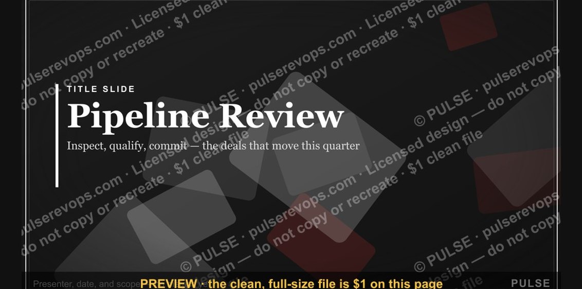 graphicPipeline Review — Title Slide
 graphicExecutive Briefing — Title Slide
 graphicWhere We Are — Section Divider Slide
 graphicThe Ask — Section Divider Slide
 graphicNext steps. — Closing Slide
 graphicRevenue Review (Board) — Title Slide
 graphicAgenda — Section Divider Slide
 graphicProduct Launch (GTM) — Title Slide
 graphicLet's talk. — Closing Slide
 graphicDemand Gen Review — Title Slide