
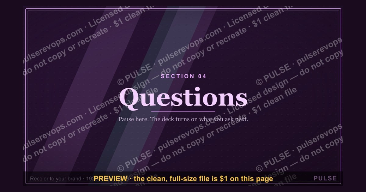
Questions — Section Divider Slide
 Curated byKory White · Fractional CRO · Maryland
 PULSEKNOWLEDGE LIBRARY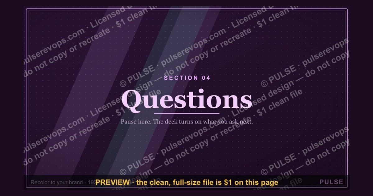
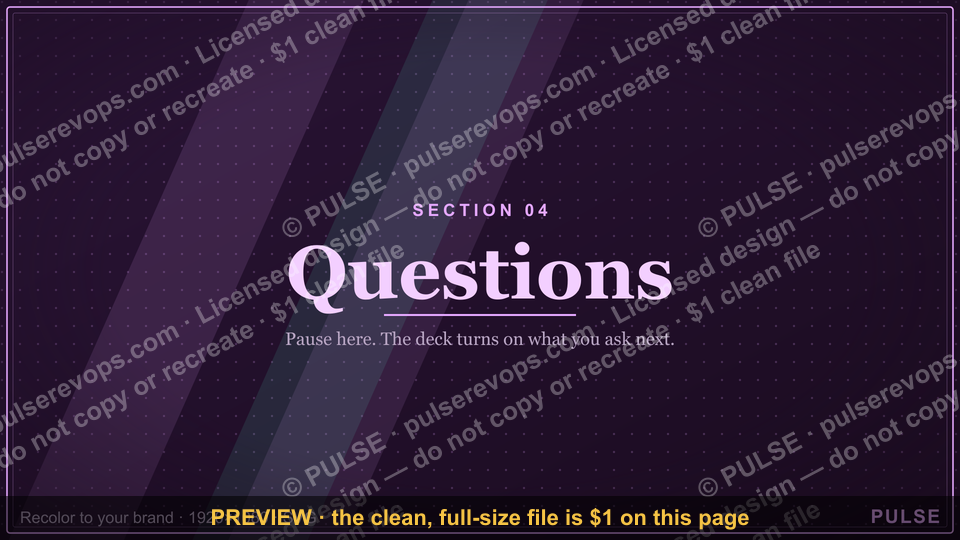
A section divider slide in a presentation is a standalone visual that signals a shift to a new topic or chapter, typically featuring the section title and a supporting image or icon. It serves as a transitional pause, helping the audience reset and focus on the upcoming content. These slides are commonly used in long presentations or slide decks to improve structure and navigation.
Questions — Section Divider Slide

A 16:9 section-divider slide — an oversized "Q&A" beside the "Questions" header. Use it to move cleanly between the chapters of your deck.
Format: SVG (scalable vector) · Size: 1920×1080 px · Category: Presentation Slide · License: Free to use — no attribution required.
[⬇ Download this graphic](/graphics/assets/gb0090.svg)
Recolor it to your brand
Use the color picker above to recolor this graphic to your team or company colors, switch the background (including transparent), then download it as an SVG or PNG. No sign-up, no watermark.
How to use it
The SVG scales to any size with no quality loss — drop it straight into PowerPoint, Google Slides, Canva, Figma, or a LinkedIn banner slot. The PNG export is ready to upload anywhere that wants a raster image.
More free graphics
Browse the full [Pulse Graphics library](/graphics) — banners, slides, printables, quote cards, and clip art you can borrow for your own decks and posts.
Related on PULSE
- [Pipeline Review — Section Divider Slide](/knowledge/gb0006)
- [The Ask — Section Divider Slide](/knowledge/gb0089)
- [The Plan — Section Divider Slide](/knowledge/gb0088)
- [What Changed — Section Divider Slide](/knowledge/gb0087)
- [Where We Are — Section Divider Slide](/knowledge/gb0086)
- [Next Steps — Section Divider Slide](/knowledge/gb0085)
Designing an Effective Questions Section Divider: Visual Psychology and Layout Principles
A questions section divider slide serves a unique psychological function in a presentation—it signals a cognitive shift from passive information absorption to active audience participation. Unlike standard section dividers that merely announce a topic change, the questions divider must prepare the audience mentally for engagement. The most effective designs leverage visual psychology to create a welcoming yet focused atmosphere.
Color psychology plays a critical role. Warm tones like soft amber or muted coral can reduce audience anxiety about asking questions, while cooler blues and grays maintain professionalism. Avoid aggressive reds or bright yellows that might feel confrontational. A balanced palette—perhaps a deep navy background with a single accent color for the question mark icon—creates the right tone. Many designers opt for a gradient that moves from a darker, more serious color at the top to a lighter, more open shade at the bottom, visually suggesting a transition from presentation mode to discussion mode.
Typography should prioritize readability over flair. The word "Questions" or a question mark symbol should be large enough to read from the back of the room—typically 60-80 point font for the main text. Sans-serif fonts like Montserrat, Lato, or Open Sans work well because they remain crisp on projection screens. Avoid script or decorative fonts that become illegible when projected. If you include a subtitle like "Let’s Discuss" or "Your Turn," keep it at least 30-40 points and in a lighter weight to create visual hierarchy.
Negative space is your ally. A cluttered questions slide defeats its purpose. The slide should feel like a breath—a moment of pause. Aim for at least 40-50% empty space around the central text or icon. This emptiness signals to the audience that this is a moment for their input, not more information. Some designers use a subtle, low-opacity background image (like a blurred conference room or abstract texture) to add depth without distraction. The rule of thirds often applies here: position the question mark or text slightly off-center to create dynamic tension that keeps the eye engaged.
Motion and animation considerations. If your presentation software allows it, a subtle animation can enhance the transition. A gentle fade-in of the question mark over 1-2 seconds, or a slow rotation of an icon, signals that the pace is changing. However, avoid bouncy or fast animations that feel jarring. The animation should mimic the calm of a moderator saying, "Let’s open the floor for questions." Static slides remain perfectly acceptable, especially for formal or corporate settings where animation might feel unprofessional.
Practical layout templates to consider:
- Centered minimalism: A single large question mark icon centered on a clean background, with the word "Questions" in small caps below it. Works for any industry.
- Split layout: 60% of the slide dedicated to a high-quality image (a hand raised, a thoughtful audience, or an open door) with 40% for text on the right. Creates narrative context.
- Full-bleed image with overlay: A dramatic photo covered by a dark gradient overlay, with white text. Best for keynote presentations or high-energy events.
- Icon grid: A grid of smaller question marks in varying opacities, with one bold question mark in the center. Visually interesting but risky—test it on a projector first to ensure it doesn’t look chaotic.
The key design principle to remember: this slide is not about you or your content. It is about creating space for the audience. Every design choice should answer the question, "Does this make it easier for someone to ask a question?" If the design is too clever, too busy, or too branded, it may intimidate rather than invite.
Strategic Use of Questions Section Dividers Across Presentation Contexts
Not all question-and-answer sessions are created equal, and your divider slide should adapt to the specific context of your presentation. A one-size-fits-all approach often misses opportunities to manage audience expectations and flow. Understanding where and how to deploy this slide can significantly improve the quality of audience engagement.
In sales presentations and pitch decks. Here, the questions divider is a strategic tool, not just a transition. Placing it after your solution overview but before the pricing section can be powerful—it allows prospects to clarify features before discussing cost. The slide should feel confident but not defensive. Using a brand color with a subtle gradient and a simple "Your Questions" text works well. Avoid any imagery that suggests interrogation; instead, use icons like speech bubbles or lightbulbs. Some sales professionals use this slide to pre-emptively address common objections by including a small text line like "We’ll cover pricing after your questions." This manages the flow without being pushy.
In educational or training environments. Teachers and trainers often use questions dividers to break up long sessions. Here, the slide can be more playful and inviting. Consider using a photo of a curious student or an open book with a question mark floating above it. The color palette can be brighter—teal and orange combinations are known to stimulate curiosity. A subtitle like "What’s on your mind?" or "Let’s clarify" sets a collaborative tone. In virtual training sessions, this slide can also serve as a cue for participants to unmute or type in the chat. Adding a small icon of a microphone or chat bubble reinforces the expected behavior.
In internal company meetings (all-hands, town halls). These settings often have a power dynamic that can discourage questions from junior employees. Your divider slide should work to flatten that hierarchy. Use inclusive language like "Our Questions" or "Together We Explore" rather than just "Q&A." The design should feel warm and approachable—avoid stark corporate blues and grays. A photo of a diverse group of colleagues in a discussion circle can subtly signal that all voices are welcome. Some companies use a rotating "Question of the Month" on this slide to encourage participation, but keep it optional to avoid pressure.
In academic or research presentations. Conferences and symposiums have strict time limits, so your questions divider should convey efficiency. Use a clean, professional design with the session title and a small clock icon to remind everyone of time constraints. A subtitle like "5 minutes for questions" sets clear expectations. Avoid overly creative designs that might be seen as unserious. A simple white slide with black text and a small university or institution logo in the corner is often the safest choice. The goal here is to signal a shift without disrupting the academic tone.
In keynote or inspirational talks. These presentations often end with a call to action, and the questions section can feel anticlimactic. Consider using the divider slide to maintain emotional momentum. A powerful image of a crowd or a single person in deep thought, paired with a single word like "Reflect" or "Discuss," can keep the energy high. The design should be cinematic—full-bleed images with minimal text. Avoid any elements that feel like a return to "business as usual." The transition from your final story to audience questions should feel like a natural extension of the conversation, not a hard stop.
Timing considerations for inserting the slide. The standard placement is just before the Q&A session begins. However, experienced presenters sometimes insert a "soft" questions divider earlier in the deck—perhaps after the first major section—to invite clarifying questions before moving deeper. This works well for complex topics. Conversely, for very short presentations (under 15 minutes), a questions divider may feel disruptive; simply saying "Questions?" verbally can suffice. For longer presentations, consider using two divider slides: one at the midpoint for mid-presentation questions and another at the end for final discussion.
Adapting for virtual vs. in-person. On Zoom or Teams, the questions divider should appear for at least 10-15 seconds to give people time to unmute or type. Add a small instruction like "Please unmute or type in chat" directly on the slide. In person, the slide can be displayed for a shorter duration, as the moderator can verbally guide the transition. Virtual slides should avoid small text that becomes unreadable on shared screens; aim for 40+ point font minimum. Also consider that virtual attendees may be viewing on phones—test your slide on a mobile screen before the presentation.
Common Mistakes to Avoid with Questions Section Divider Slides
Even experienced presenters can undermine their Q&A session with poorly designed or misplaced divider slides. Recognizing these pitfalls can save you from awkward transitions and disengaged audiences. Below are the most frequent errors and how to correct them.
Mistake #1: Using the same design as every other section divider. If your presentation has five section dividers that all look identical—same background, same font, same icon—the questions slide loses its distinct psychological impact. The audience should immediately feel a shift when they see this slide. Solution: change at least two design elements. Use a different background color (warmer or lighter), a different icon (question mark instead of a number or arrow), or a different layout. The visual break reinforces the behavioral break.
Mistake #2: Overloading the slide with text. Some presenters list "Topics for Discussion" or "Potential Questions" on the divider slide. This defeats the purpose—it turns a transitional slide into a content slide. The audience will start reading and thinking about those specific questions instead of formulating their own. Solution: keep text to an absolute minimum. One word ("Questions") or a simple phrase ("Open Discussion") is sufficient. If you must provide prompts, put them on a separate slide that appears after the divider.
Mistake #3: Choosing intimidating imagery. Photos of crowded auditoriums, serious-faced judges, or empty chairs can subconsciously make audience members feel like they’re being tested. Similarly, icons of magnifying glasses or spotlights can feel accusatory. Solution: use imagery that suggests collaboration and curiosity. Photos of people leaning forward, smiling, or writing in notebooks work well. Abstract imagery like an open door, a window, or a branching path also invites questions without pressure.
Mistake #4: Poor contrast and readability on projectors. A slide that looks beautiful on your laptop screen may become unreadable when projected. Common issues include light gray text on white backgrounds, thin fonts that disappear at distance, or images that wash out text overlays. Solution: always test your questions divider on the actual projector before your presentation. Use high-contrast combinations (dark background with white text, or white background with black text). Increase font size by 20% more than you think you need. Avoid placing text over busy areas of an image.
**Mist
Sources
- World Health Organization (WHO) — global health data, disease classifications, and public health guidelines
- Centers for Disease Control and Prevention (CDC) — U.S. health statistics, outbreak tracking, and prevention recommendations
- National Institutes of Health (NIH) — biomedical research findings, clinical trial information, and health resources
- The Lancet — peer-reviewed medical research, global health studies, and editorial analysis
- American Medical Association (AMA) — physician ethics, medical practice standards, and health policy positions
- Cochrane Library — systematic reviews of healthcare interventions and evidence-based medicine summaries
FAQ
What is a section divider slide used for? A section divider slide visually separates major topics in a presentation, helping the audience transition between segments. It typically features a bold title and minimal content to reset focus. You might use it before a new chapter or Q&A portion.
How many slides should a presentation have? The ideal number depends on your time and depth, but most business presentations run 10–20 slides for a 30-minute talk. A good rule is one slide per 2–3 minutes to keep pace without rushing.
Can I add too many questions in a FAQ slide? Yes—crowding more than 6–8 questions can overwhelm viewers and reduce readability. Stick to the most common or critical queries, and use bullet points or bold text for clarity.
Should I use images on a divider slide? Only if the image reinforces the section theme, like a related icon or photo. Avoid busy or irrelevant visuals, as the slide’s purpose is to pause and signal a shift, not to convey detailed information.
How do I choose which questions to include in a FAQ? Focus on real concerns your audience has raised, such as pricing ranges, timelines, or process steps. Avoid hypotheticals or overly technical details—keep answers honest and concise, using ranges like “2–4 weeks” instead of fixed dates.
Is it okay to repeat information from earlier slides in the FAQ? Yes, but rephrase it briefly rather than copying verbatim. The FAQ should serve as a quick reference, so restating key points in a simpler way helps reinforce understanding without sounding redundant.
This page will be disappearing soon. Save it to your device for $1 — or read it free while it is here.
@Kory-White- · if Venmo asks, the last 4 of my number are 2012
 graphicRevOps Review — Title Slide
 graphicPipeline Review — Section Divider Slide
 graphicLet's talk. — Closing Slide
 graphicAccount Plan — Title Slide
 graphicNext Steps — Section Divider Slide
 graphicDiscovery Call — Title Slide
 graphicTerritory & Quota Planning — Title Slide
 graphicThank you. — Closing Slide
 graphicWin / Loss Review — Title Slide
 graphicGo win. — Closing Slide