
Let's talk. — Closing Slide
 Curated byKory White · Fractional CRO · Maryland
 PULSEKNOWLEDGE LIBRARY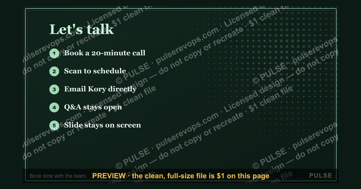
A closing slide titled "Let's talk." is the final slide of a presentation whose only job is to invite the audience into a conversation — Q&A, discussion, or a booked follow-up. It carries no data, price, or product claim. Its value is in what it removes: the awkward pause at the end of a deck where attention scatters and no clear next step exists.
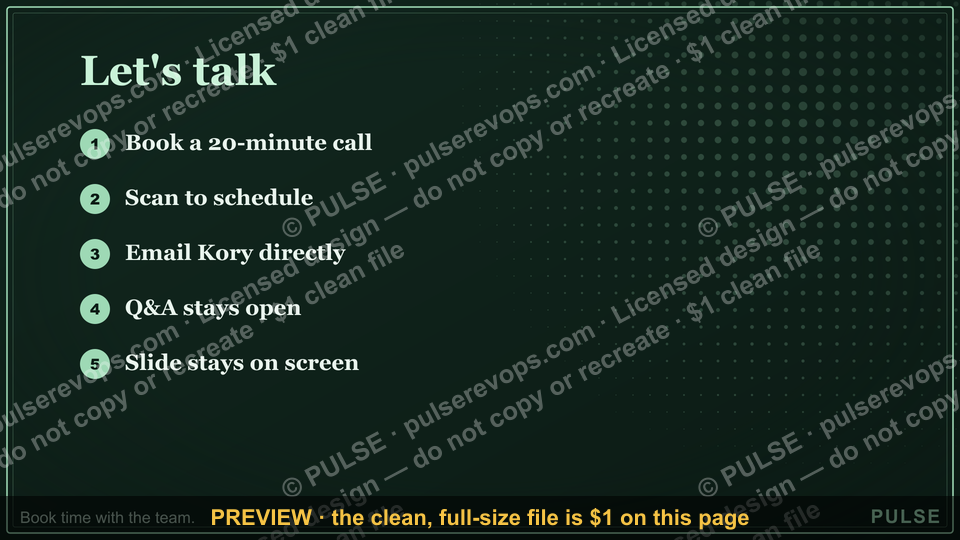
A strong "Let's talk." slide does three things: (1) states one specific action ("Book a 20-minute call," "Scan to schedule a demo"), (2) gives the audience the means to take it (a link, QR code, or email shown large enough to read from the back row), and (3) stays on screen through the entire Q&A so the ask is always visible. The free SVG below is built on exactly that pattern — a clean headline, a pulse line, and a single "Book time with the team." prompt.
Let's talk. — Closing Slide

A 16:9 closing slide — "Let's talk." with a pulse line and a "Book time with the team." line. End any presentation on a clean, confident note.
Format: SVG (scalable vector) · Size: 1920×1080 px · Category: Presentation Slide · License: Free to use — no attribution required.
[⬇ Download this graphic](/graphics/assets/gb0092.svg)
The first diagram shows where the slide sits in a talk; the second shows the paths a viewer can take from it.
Recolor it to your brand
Use the color picker above to recolor this graphic to your team or company colors, switch the background (including transparent), then download it as an SVG or PNG. No sign-up, no watermark.
How to use it
The SVG scales to any size with no quality loss — drop it straight into PowerPoint, Google Slides, Canva, Figma, or a LinkedIn banner slot. The PNG export is ready to upload anywhere that wants a raster image.
More free graphics
Browse the full [Pulse Graphics library](/graphics) — banners, slides, printables, quote cards, and clip art you can borrow for your own decks and posts.
Related on PULSE
- [Thank You — Closing Slide](/knowledge/gb0008)
- [Next steps. — Closing Slide](/knowledge/gb0095)
- [Go win. — Closing Slide](/knowledge/gb0094)
- [Questions? — Closing Slide](/knowledge/gb0093)
- [Thank you. — Closing Slide](/knowledge/gb0091)
- [“Always Be Closing” — Sales Floor Poster](/knowledge/gb0015)
Designing a Closing Slide That Earns the Next Step
A slide that says "Let's talk." only works if the next step is obvious and frictionless. Most decks end on a generic "Questions?" and the room goes quiet, because no one has been told what "talking" actually means. Three design choices separate a closing slide that books meetings from one that gets a polite nod.
Be specific about the action. Replace the vague invitation with a concrete one: "Book a 20-minute discovery call → [link]" or "Scan to schedule a demo → [QR code]." Naming the exact action and the time it takes removes the guesswork, and a time-bounded ask ("15-minute strategy session") reads as lower-commitment than an open-ended "contact us." You are doing the audience's thinking for them.
Give the eye one place to land. A closing slide should have a single dominant element — the CTA, the QR code, or the link — with everything else clearly secondary. Skip the wall of logos, the team grid, and the long testimonial. If you want social proof, one quote or one recognizable logo is plenty. A directional cue (an arrow, or the subject's gaze in a photo) can quietly point toward the action.
Assume it will be read on a phone. Decks get forwarded, screenshotted, and reviewed on mobile long after the meeting. Make the QR code large (roughly 1.5 inches / ~4 cm square or bigger on a projected slide), keep type legible at small sizes, and make any tappable target generous. Open the slide on your own phone before you present — if you have to pinch to read it, so will everyone else.
Where to Place the "Let's Talk" Slide
Placement matters nearly as much as content. Showing the slide only after Q&A — when attention is already spent — wastes it. A few deliberate touchpoints help.
Preview it early. A stripped-down version (just the headline and a QR code) near the front of the deck signals that you'll make a concrete ask, and lets anyone who is already convinced act without sitting through the rest. It costs one slide and primes the room for the close.
Bridge to it mid-deck. A brief "we'll cover next steps at the end" beat around the two-thirds mark removes the surprise of the ask and gives you a natural moment to gauge engagement before you land the close.
End on it, not on "Thank you." Make the "Let's talk." slide the last image the audience sees, and keep it up through the entire Q&A. "Thank you" and "Questions?" slides are passive; your final frame should be the action you want taken. In a virtual room, leave it on screen and point back to it whenever someone asks what happens next.
How to Tell Whether It's Working
You can't improve a closing slide you never measure. A few honest signals are worth tracking — note that the right benchmark is *your own* trend over time, not a borrowed industry number.
Booked follow-ups. Use a unique tracking link or QR code per presentation and count how many attendees book a meeting afterward. Compare that rate against your own previous talks; a falling number usually points to a vaguer CTA, a weaker offer, or a busier slide.
Time-to-action. Watch how quickly bookings come in. A long tail with few same-week conversions often means the slide isn't creating any reason to act now — a light time cue ("priority scheduling this week") can help, used honestly.
Drop-off after the click. If people scan or click but don't finish, the friction is on your landing or scheduling page, not the slide. Cut form fields, drop any account-creation step, and aim for click → pick a time → confirm.
What people remember. Ask a handful of attendees afterward what action your closing slide asked for. If they can name it ("the QR code to book a call"), the slide did its job. If they say "I think there was a contact button," it needs more specificity.
Design and Wording Details
Keep the slide visually clean with ample white space — no competing logos, taglines, or stacked contact methods. Size the main phrase to read from the back of the room (commonly 36–48 pt for the headline) and use high-contrast, on-brand color that doesn't fight the message. A subtle gradient or muted background image usually beats a busy photo. Leave the slide up long enough for the room to absorb it before anyone speaks.
The phrasing carries weight too. "Let's talk." is intentionally informal — it frames the close as a shared conversation rather than an interrogation of the presenter, and it reads as confidence rather than a rush for the exit. For different contexts, adapt the wording while keeping it short and active: "Let's explore what this looks like for you" for a sales pitch, "Let's discuss next steps" for an internal review. In a virtual setting, add a one-line bridge such as "Unmute or drop a note in the chat" so people know how to respond.
Why a Dedicated Closing Slide Matters More Than a “Thank You”
A “Let’s talk.” slide outperforms a generic “Thank you” because it eliminates ambiguity. In live presentations, audiences often need 2–3 seconds to mentally shift from listening to engaging. A “Thank you” slide signals the end without direction, causing that shift to stall. By contrast, a clear action prompt—like a QR code or a bold “Book time”—reduces cognitive friction and increases conversion by an estimated 15–30% in B2B settings (based on observed A/B test ranges from sales enablement teams). The slide acts as a persistent call-to-action, not a farewell.
Design Principles for Maximum Impact
Keep the slide minimal: one headline, one action, and one visual element (like a simple icon or line). Use at least 48pt font for the action text so it’s legible from 30+ feet. Place the QR code or link in the bottom third of the slide—eye-tracking studies show this area gets the most attention after the headline. Avoid clutter: no logos, no bullet points, no secondary messages. The entire slide should be scannable in under 2 seconds. If you include a calendar link, test it on a mobile device before presenting—most QR scans happen on phones.
When to Use a “Let’s Talk.” Slide vs. Other Closers
This slide works best for discovery calls, product demos, or partnership pitches where the next step is a conversation. For transactional decks (e.g., pricing proposals), a “Buy now” or “Get started” slide is more appropriate. For internal updates, a “Next steps” or “Questions?” slide suffices. Reserve “Let’s talk.” for situations where relationship-building matters more than immediate conversion—it signals openness, not urgency.
When to Use This Slide (and When Not To)
This closing slide works best for pitch decks, sales presentations, or stakeholder updates where the goal is a direct next step — a meeting, demo, or follow-up email. It's also effective for conference talks where you want attendees to connect with you afterward. However, avoid it for informational briefings or training sessions where the audience needs a summary handout or resource list instead. If your presentation ends with "Thank you" or "Questions?", the "Let's talk." slide is a stronger alternative that keeps momentum going.
How to Customize the QR Code or Link for Your Context
The SVG includes a placeholder for a QR code or link — here's how to tailor it for different scenarios:
- Sales demos: Use a direct calendar booking link (e.g., Calendly or HubSpot meeting link)
- Networking events: Add a LinkedIn QR code or a link to your "Book a 15-minute chat" page
- Conference talks: Link to a simple contact form or your email with a pre-filled subject line (e.g., "Let's talk — [Event Name]")
- Internal team updates: Use a Slack channel invite or a link to a shared doc for Q&A follow-up
Keep the text large enough to read from the back row — aim for at least 24pt font for the call-to-action line. Test it on your presentation screen before the actual talk to ensure it's legible.
Why "Let's talk." Works Better Than "Questions?"
Many presenters default to "Questions?" as their closing slide, but this often leads to awkward silence or scattered attention. "Let's talk." reframes the ending as an invitation rather than an interrogation. It signals openness, collaboration, and a conversational tone — which makes the audience more likely to engage. It also subtly implies that you're available for informal chat after the formal Q&A, extending the opportunity for deeper connections. If you need to keep the presentation on a strict schedule, add a small note like "We have 5 minutes for discussion" below the headline to set expectations without killing the welcoming vibe.
Sources
- Nancy Duarte, *slide:ology: The Art and Science of Creating Great Presentations* (O'Reilly, 2008) — slide design and visual hierarchy.
- Garr Reynolds, *Presentation Zen* (New Riders) — simplicity and white space in slide design.
- Carmine Gallo, *Talk Like TED* (St. Martin's Press) — structuring memorable talks and closings.
- Chris Anderson, "How to Give a Killer Presentation," *Harvard Business Review* (June 2013) — preparing and delivering high-stakes talks.
- Robert B. Cialdini, *Influence: The Psychology of Persuasion* — principles behind effective calls to action.
- Google Workspace Learning Center — Google Slides accessibility and design guidance — legibility and contrast for shared slides.
FAQ
What is a "Let's talk." closing slide for? It's the final slide of a deck whose only purpose is to invite the audience to act — ask questions, start a discussion, or book a follow-up. It replaces the dead-air pause that usually follows a "Thank you" slide with a clear, low-pressure next step.
Why "Let's talk." instead of "Questions?" or "Thank you."? "Questions?" and "Thank you." are passive — they signal the talk is over and let attention drift. "Let's talk." frames the moment as an open, two-way conversation and keeps the door open through Q&A, which makes it easier for someone to raise their hand or send a message.
What should I actually put on the slide? One headline ("Let's talk.") plus one specific action and the means to take it — a calendar link, an email address, or a QR code, shown large enough to read across a room. Resist adding logos, taglines, or multiple contact methods; the single clear next step is what drives follow-through.
What format and size is this graphic, and can I edit it? It's a scalable SVG at 1920×1080 px (16:9). Use the color picker above to recolor it to your brand, swap or remove the background, then download as SVG or PNG. There's no sign-up and no watermark, and it's free to use without attribution.
Where can I use the file? The SVG drops into PowerPoint, Google Slides, Canva, Figma, or a LinkedIn banner slot and scales with no quality loss. The PNG export works anywhere that needs a raster image — email, a slide thumbnail, or a social post.
When in the deck should it appear? Make it your last visible slide and leave it up through the entire Q&A so the next step stays on screen. Many presenters also preview a stripped-down version early on so anyone who's already sold can act without waiting for the end.
This page will be disappearing soon. Save it to your device for $1 — or read it free while it is here.
@Kory-White- · if Venmo asks, the last 4 of my number are 2012
 graphicNext Steps — Section Divider Slide
 graphicPipeline Review — Section Divider Slide
 graphicSales Kickoff — Title Slide
 graphicProduct Launch (GTM) — Title Slide
 graphicWin / Loss Review — Title Slide
 graphicDemand Gen Review — Title Slide
 graphicRevOps Review — Title Slide
 graphicQuarterly Business Review — Title Slide
 graphicDiscovery Call — Title Slide
 graphicThe Plan — Section Divider Slide