


Comp Plan Rollout — Title Slide
Quality
Certified
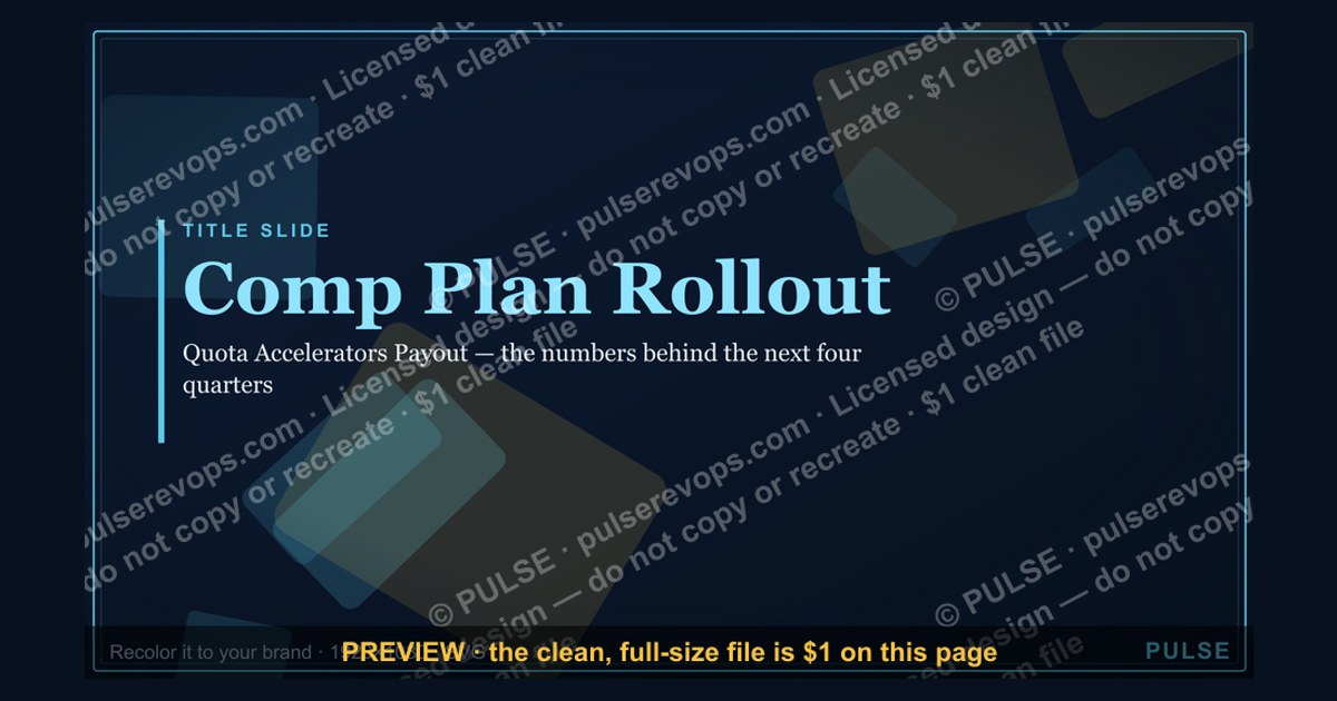
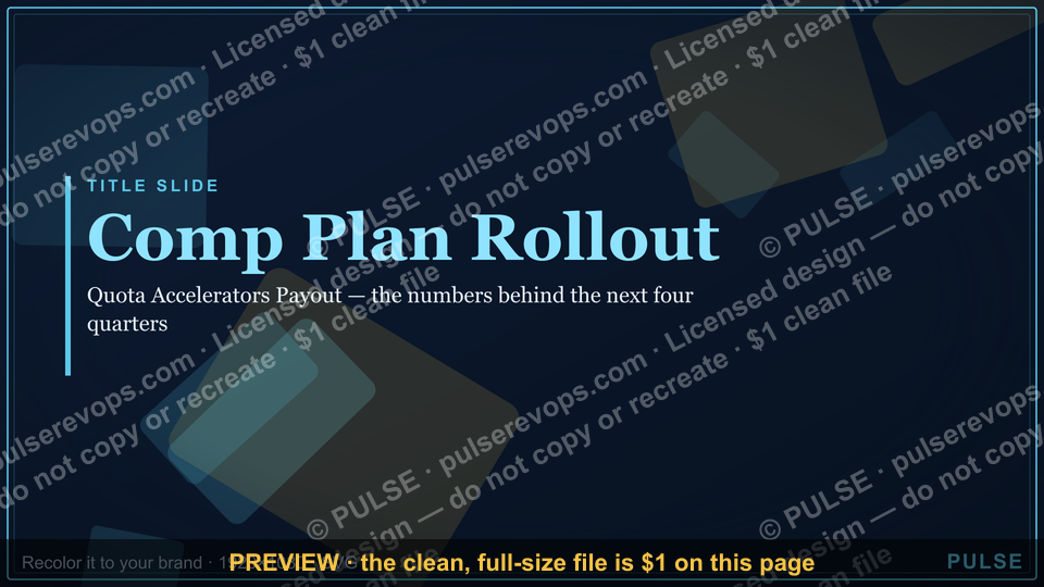
This is a presentation slide at 1920x1080 px titled "Comp Plan Rollout — Title Slide," designed as the opening frame of a comp plan rollout deck. It carries the plan name, the plan year, the audience, and the presenter or owner, so a sales team knows within three seconds what they are about to be walked through and who owns it.
What it is and why it matters
A Comp Plan Rollout Title Slide is the first frame a revenue team sees when the new fiscal-year compensation plan is presented. It is not decoration. It is the frame that sets the emotional and informational register for everything that follows: whether the room leans in or braces for bad news, whether the plan reads as a considered design or a rushed spreadsheet, and whether reps walk out knowing who to ask when the math on their own deals does not match their expectations.
The Slide itself is deliberately sparse. At 1920x1080 px it typically carries five to seven elements and nothing more: the plan name (for example, "FY26 Global Sales Compensation Plan"), the plan year, the audience or business unit, the presenter's name and role, the rollout date or meeting name, and a single company or team mark. Anything beyond that — quota tables, accelerator charts, payout curves — belongs on the slides that follow, not here. The title frame's job is orientation, not explanation.
Why does a title frame matter enough to warrant its own page? Because comp rollouts are one of the few moments in the revenue calendar where the entire field organization is paying attention at the same time, and attention decays fast. A rollout deck that opens with a dense slide of plan mechanics loses the room before the first real point lands. A rollout deck that opens with a clean title frame — plan name, year, audience, owner — buys thirty to sixty seconds of goodwill that the rest of the deck spends.

There is also an accountability dimension. When the title frame names a presenter and an owner, it signals that the plan has a human behind it. Reps who know that the VP of Sales Operations or the CRO owns the plan are more likely to raise questions early rather than quietly disengage. The title frame is the first place that ownership becomes visible.
Practitioners building these slides typically work from a short brief: plan name, plan year, audience segment (enterprise, mid-market, SMB, channel, or all of field), presenter, date, and any legal or confidentiality marking required by the company. That brief is usually five to eight lines of text. The design work is deciding how those lines sit on a 16:9 canvas so the frame reads cleanly from a laptop screen, a conference room projector, and a recorded webinar thumbnail.
A useful sanity check before finalizing: shrink the slide to thumbnail size and look at it from arm's length. If the plan name and year are still legible and the audience is still identifiable, the frame is doing its job. If the only thing readable is the company logo, the type hierarchy is wrong.
The step-by-step process

Building the Title Slide is a short, repeatable process. The steps below assume you already have the plan name and year finalized, which in most organizations means the plan has cleared finance and legal review.
Step one is confirming the plan name and year. This sounds trivial but it is where most rework happens. Plan names change late in the cycle — a "FY26 Sales Compensation Plan" becomes "FY26 Field Compensation Plan" after a reorg, or a regional plan gets folded into a global one. Lock the name before you design anything, because the name is the largest text element on the frame and changing it forces a full re-layout.
Step two is identifying the audience segment and the rollout channel. Audience matters because the same plan often gets presented three or four times — once to enterprise, once to mid-market, once to channel, once to sales leadership. Each version may need a different audience label on the title frame. Channel matters because a slide shown live in a conference room has different legibility requirements than one embedded in a recorded webinar or a PDF that reps will open on a phone.
Step three is collecting the presenter name, role, and date. If the plan is presented by multiple people — common when sales ops, finance, and the CRO all speak — decide whether the title frame names one owner or lists several. Naming one owner is usually cleaner; the others can be introduced on the agenda slide that follows.
Step four is drafting the text elements. Keep the count between five and seven. A typical set: plan name, plan year, audience, presenter name and role, rollout date, and a confidentiality or internal-only marking. If your company requires a legal disclaimer on every external-facing slide, that counts as one of the seven.

Step five is layout. On a 1920x1080 canvas, a common structure is the plan name centered or left-aligned in the upper third, the year directly beneath it in a smaller weight, the audience and presenter in the lower third, and the date in a footer position. Left-aligned layouts tend to read better on widescreen projectors because the eye does not have to hunt for the start of each line.
Step six is applying brand type and color rules. Most revenue organizations have a brand kit with approved fonts and a primary and secondary palette. Use the primary color for the plan name and a neutral for supporting text. Avoid gradients and drop shadows on the title frame; they render poorly on projectors and compress badly in PNG exports.
Step seven is adding any required confidentiality or legal marking. Internal-only, confidential, or "do not distribute" markings usually sit in a corner at small size. If your legal team requires a specific wording, use it verbatim.
Step eight is the thumbnail test. Export a preview at roughly 320 px wide and view it at arm's length. The plan name and year should still be readable. If they are not, increase the type size or reduce the number of elements.
Step nine is the export and placement. Export as PNG at the full 1920x1080 resolution, then place it as the first slide of the rollout deck. If the deck is being distributed as a PDF, confirm the PNG has not been downsampled below 150 DPI in the final file.
Costs, timelines, and typical ranges

The direct cost of producing a title frame is close to zero if you use existing design tools and brand assets. The real cost is time, and the real risk is version sprawl.
Timeline. A single title frame, once the plan name and audience are locked, takes between thirty minutes and two hours to produce in a standard slide or design tool. The variance comes from how much brand compliance review is required. Organizations with a formal brand review gate can add one to three business days of turnaround. Organizations that let the sales ops team self-serve from a template usually turn the frame around same-day.
Version count. Expect three to five versions of the title frame across a full rollout cycle. A global plan presented to four regions typically needs four audience variants, plus one master version for the leadership review. Each variant is a text swap, not a redesign, so the marginal time per variant is ten to fifteen minutes.
File size. A 1920x1080 PNG with flat color and text typically lands between 80 KB and 400 KB. If your export is above 1 MB, you are likely embedding a photographic background or an unflattened vector layer that should be simplified. Large title-frame PNGs slow down deck loading and inflate PDF distributions.
Resolution and aspect ratio. 1920x1080 is the standard 16:9 widescreen ratio and matches the default export of most presentation tools. If your organization still presents on 4:3 projectors — increasingly rare but not extinct in some field offices — you will need a 1440x1080 variant. Do not stretch a 16:9 frame to 4:3; the type will distort.

Storage and reuse. Keep the editable source file, not just the PNG. Next year's title frame is a text edit on this year's source, which cuts production time to fifteen or twenty minutes. Teams that only keep the exported PNG rebuild from scratch every cycle.
Distribution cost. If the rollout deck is hosted on a sales enablement platform, the title frame is part of the deck upload and carries no separate cost. If the frame is also used as a standalone graphic — for example, as the header image on the rollout announcement email — budget an extra ten to fifteen minutes to export a cropped variant at the email platform's recommended width, commonly 600 to 1200 px.
The trade-off to weigh is polish versus speed. A heavily designed title frame with custom illustration can take a day or more and may need brand approval, but it sets a premium tone for a plan that is itself premium — for example, a plan with a new accelerator structure that leadership wants reps to take seriously. A plain, typographic frame takes thirty minutes and works fine for a routine year-over-year update. Match the effort to the stakes.
Where teams get it wrong
The most common failure is overloading the frame. Teams treat the title slide as a summary slide and add quota attainment context, plan change highlights, or a list of what is new. The result is a frame with twelve text elements that reads as noise. The title frame should carry the plan name, year, audience, owner, and date — nothing more. Everything else belongs on slide two.

The second failure is inconsistent naming across the rollout. One region's title frame says "FY26 Sales Comp Plan," another says "FY26 Field Compensation," and a third says "FY26 Incentive Plan." Reps who compare notes across regions — and they do — read the inconsistency as disorganization. Standardize the plan name across every variant and change only the audience label.
The third failure is missing ownership. A title frame with no presenter name signals that no one is accountable for the plan. When reps have questions in week three, they do not know who to ask. Naming the owner on the title frame is a small act that prevents a large amount of drift.
The fourth failure is legibility. Type set at 18 pt on a 1920x1080 canvas is readable on a laptop but disappears on a conference room projector viewed from the back of the room. Plan names should be set large — commonly 54 to 72 pt — and supporting text no smaller than 24 pt. If your audience label is set at 14 pt, it is effectively invisible to half the room.
The fifth failure is a photographic or busy background. A background image with high visual complexity competes with the type and compresses badly in PNG. Flat color or a subtle brand gradient reads better and exports smaller. If your brand requires a photographic background, place a solid or semi-transparent panel behind the text block to preserve contrast.
The sixth failure is forgetting the legal or confidentiality marking. In regulated industries or in organizations with strict internal-information policies, a title frame without the required marking can trigger a compliance flag during review. Confirm the requirement before you design, not after.

The seventh failure is treating the frame as a one-off. Teams that rebuild the title frame from scratch every cycle waste time and introduce inconsistency. Keep the source file, keep a short brief document with the plan name, year, audience list, and owner, and next year's frame becomes a fifteen-minute edit.
The eighth failure is ignoring the mobile viewer. A meaningful share of reps will open the rollout deck on a phone. A title frame with six text elements spread across the full 1920 px width may require pinch-zooming on a phone. Left-aligning the text block and keeping it within the left two-thirds of the canvas improves mobile legibility without changing the desktop experience.
Decision framework: when to choose what
Not every rollout needs the same title frame. The decision turns on audience breadth, whether the plan is a routine refresh or a structural change, and how much brand review the organization requires.
The first branch is routine versus structural. A routine refresh — same plan shape, updated quotas and rates — is well served by a plain typographic frame. A structural change — a new accelerator tier, a shift from quarterly to monthly payouts, a change in how splits are credited — benefits from an enhanced frame that carries a short change headline beneath the plan name, for example "New Accelerator Structure Effective Q1." That headline gives the room a reason to pay attention before the mechanics arrive.
The second branch is audience count. One audience segment means one frame. Two to four segments means a master frame plus variants that change only the audience label. Five or more segments — common in large global organizations with regional and channel splits — means you need a naming convention so variants do not get confused. A simple convention is plan name plus audience plus year, for example "FY26 Field Comp — EMEA — Title."

The third branch is brand review. If your organization requires formal brand review, submit the frame at least three business days before the first rollout session. Review queues back up at the end of the fiscal year, which is exactly when comp rollouts happen. If no formal review is required, self-serve from the template and turn the frame around same-day.
A fourth consideration, not shown in the diagram, is whether the frame will be reused outside the deck. If the same frame will appear as an email header, a sales enablement landing page banner, or a webinar thumbnail, design it with crop-safe margins so the plan name survives a tighter crop. Keeping the plan name within the central 60 percent of the canvas usually makes it crop-safe.
Related questions
What text belongs on a comp plan rollout title slide?
Plan name, plan year, audience segment, presenter name and role, rollout date, and any required confidentiality marking. Five to seven elements total. Quota tables, accelerator charts, and change summaries belong on the slides that follow, not on the title frame.
What size should the title slide be?
1920x1080 px, the standard 16:9 widescreen ratio. Export as PNG. If your organization still uses 4:3 projectors, produce a separate 1440x1080 variant rather than stretching the 16:9 frame, which distorts type.
How long does it take to build one?

Thirty minutes to two hours once the plan name and audience are locked. Brand review gates can add one to three business days. Audience variants are text swaps and take ten to fifteen minutes each.
Should the title slide name a presenter?
Yes. Naming an owner on the title frame signals accountability and gives reps a person to bring questions to. If multiple leaders present, name one owner on the frame and introduce the others on the agenda slide.
Can I reuse last year's title slide?
Yes, and you should. Keep the editable source file, update the plan name, year, audience labels, and presenter, and you have next year's frame in fifteen to twenty minutes. Teams that only keep the exported PNG rebuild from scratch every cycle.
FAQ
Why does a comp plan rollout need a title slide at all?
Because the rollout is one of the few moments the entire field organization is paying attention at once, and attention decays quickly. A clean title frame orients the room — plan name, year, audience, owner — and buys the rest of the deck thirty to sixty seconds of goodwill. Skipping it and opening with dense mechanics loses the room before the first real point lands.
What is the single most common mistake on these slides?
Overloading the frame. Teams add quota context, change highlights, and "what's new" lists until the frame carries twelve text elements and reads as noise. The title frame should carry the plan name, year, audience, owner, and date. Everything else belongs on slide two.

How do I keep the frame legible on a projector?
Set the plan name large — commonly 54 to 72 pt on a 1920x1080 canvas — and keep supporting text at 24 pt or above. Avoid photographic backgrounds; use flat color or a subtle brand gradient. Run a thumbnail test at roughly 320 px wide and confirm the plan name and year are still readable.
Do I need a separate title slide for each region?
If the plan is global but presented regionally, yes. Use a master frame and produce audience variants that change only the audience label. Standardize the plan name across every variant and change nothing else, so reps comparing notes across regions see consistency rather than disorganization.
What file format should I export?
PNG at full 1920x1080 resolution. A flat-color, text-only frame typically lands between 80 KB and 400 KB. If your export exceeds 1 MB, you are likely embedding a photographic background or an unflattened layer that should be simplified. Confirm the PNG has not been downsampled below 150 DPI if the deck is distributed as a PDF.
How do I handle legal or confidentiality markings?
Confirm the requirement with your legal or compliance team before you design, not after. Internal-only, confidential, or "do not distribute" markings usually sit in a corner at small size. If a specific wording is required, use it verbatim. Missing a required marking can trigger a compliance flag during review.
Sources
- Sales Compensation Design — WorldatWork
- Sales Management Association — Sales Compensation Research
- Harvard Business Review — Rethinking Sales Compensation
- Microsoft PowerPoint — Slide Size and Aspect Ratio
- Adobe — PNG File Format Overview
- HubSpot — Sales Compensation Plan Guide
- Gartner — Sales Compensation Best Practices
Related on PULSE
- Comp Plan Rollout — Agenda Slide
- Comp Plan Rollout — Plan Summary Slide
- Comp Plan Rollout — Quota and Territory Slide
- Comp Plan Rollout — Accelerator Mechanics Slide
- Comp Plan Rollout — FAQ and Objection Handling Slide
- Comp Plan Rollout — Presenter Notes and Talking Points
This page will be disappearing soon. Save it to your device for $1 — or read it free while it is here.
@Kory-White- · if Venmo asks, the last 4 of my number are 2012
This page is gone.
This one is off the shelf now. $1 keeps it on your phone for good — the whole page, pictures and diagrams included.
 graphicTerritory & Quota Planning — Title Slide
 graphicDeal Review — Title Slide
 graphicYour Proposal — Title Slide
 graphicThe Plan — Section Divider Slide
 graphicQuarterly Business Review — Title Slide
 graphicAgenda — Section Divider Slide
 graphicSales Training — Title Slide
 gbAnnual Sales Planning — Title Slide
 graphicLet's talk. — Closing Slide
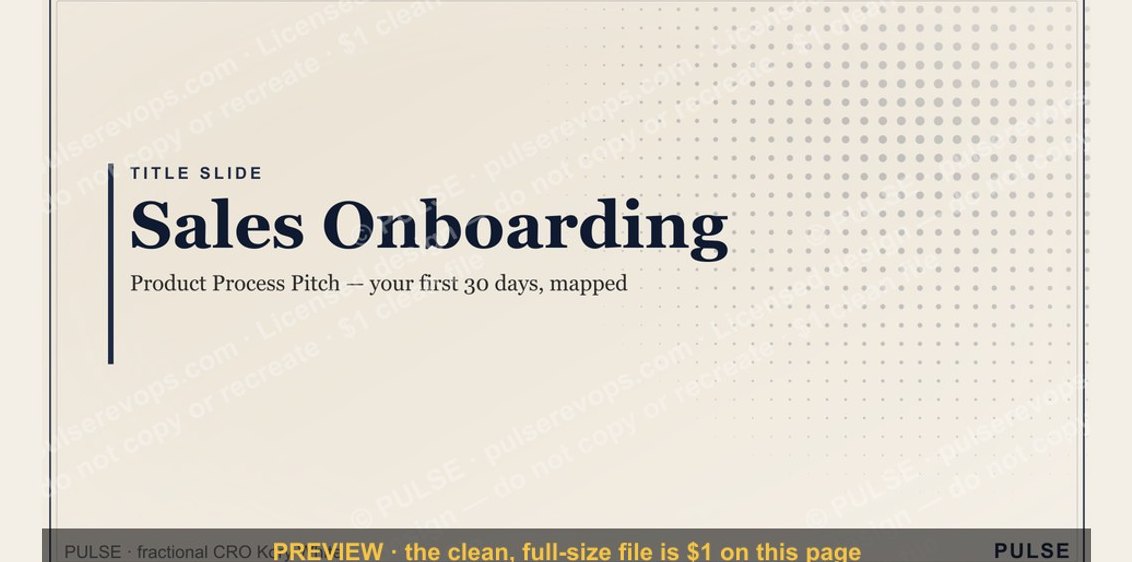 graphicSales Onboarding — Title Slide