
“SHOW UP FOLLOW UP CLOSE” — Sales Floor Print
 Curated byKory White · Fractional CRO · Maryland
 PULSEKNOWLEDGE LIBRARY
Quality
Certified


This is a downloadable sales-floor print/poster, sized 1200x1600 px, titled “SHOW UP FOLLOW UP CLOSE.” It carries three stacked imperatives in bold type, designed to be printed and hung where a Sales team sees it every day. The message is simple: be present, chase every deal, ask for the business. Download the PNG free from this page.
The Wednesday drift on a twelve-person floor
Imagine a twelve-person inside Sales team in an open-plan office. Monday standup lands at 8:30, everyone nodding at the same three priorities. By Wednesday the picture has quietly changed shape. Three reps have logged fewer than twenty dials each across two days. Two reps are carrying deals with no next step recorded in the CRM. One rep has eleven proposals sitting out in the world with zero follow-up calls scheduled. No one quit, no one had a crisis, no system went down. The Floor simply drifted.
That drift is the exact problem this poster exists to interrupt. Drift is not a motivation failure and it is rarely a skill failure. It is an attention failure — the natural decay of disciplined behavior when nothing in the physical environment keeps the standard visible. A rep who skips one call block on Tuesday finds it marginally easier to skip Thursday's. A manager who lets a no-next-step deal slide in a pipeline review signals, without meaning to, that it is acceptable. Within a quarter, the team's baseline has quietly reset two notches lower and nobody can point to the day it happened.
The reason a wall poster can move this at all is that sales floors are physical places with physical rhythms. Reps walk past the same wall forty times a day. They sit in the same bullpen, look at the same whiteboard, hear the same bell. Whatever lives on that wall becomes part of the ambient standard. Most Sales floors already have something up — a leaderboard, a quota thermometer, a compliance notice. This print is designed to be the one artifact that states the minimum daily contract in three words, so that when a rep drifts, the correction is visible without a manager having to say a word.
Consider what happens when the poster is absent. The standard lives only in onboarding decks, in a manager's head, and in the CRM's activity reports — all of which are consulted after the fact. By the time a dashboard shows three reps under twenty dials, the week is half gone. A visible print compresses the feedback loop from "end of week report" to "walking past the wall at 9:15." That compression is the entire value proposition. The poster does not replace coaching, forecasting, or pipeline hygiene. It keeps the floor's minimum standard in everyone's peripheral vision so that coaching conversations start from a shared, visible baseline instead of a debate about whether there was ever a standard at all.
There is also a cultural reason the artifact works. New hires learn norms fastest from what they see around them, not from what they are told. A rep in week two who watches a veteran glance at a wall that says FOLLOW and then pick up the phone learns more in that five-second moment than in an hour of onboarding. The poster is a teaching device disguised as decoration.

How the mechanism actually works
The print works through three reinforcing loops, and it is worth naming them because each one can be broken independently. The first is cueing: a visible phrase triggers the intended behavior at the moment of decision. The second is social proof: on a shared Floor, seeing the standard on the wall tells every rep that it applies to everyone, including the top performer. The third is accountability by visibility: when the standard is public, a rep who is drifting has to actively ignore it, which is psychologically harder than simply forgetting.
The loop above is deliberately circular because the poster is not a one-time campaign. Each of the three verbs maps to a distinct failure mode, and the mapping is the reason the sequence is printed in that order rather than alphabetically or by importance.
SHOW UP covers presence and volume — the rep who is technically employed but has drifted into low-activity mode. This is the most common and least discussed failure on a Sales Floor, because a rep who is quiet and pleasant generates no alarm until the pipeline empties. The poster names it.
FOLLOW covers the middle of the funnel, which is where the largest recoverable revenue usually sits. Deals that have had one good conversation and then gone silent are not lost; they are unattended. A rep who internalizes FOLLOW as a reflex — never end a call without a calendar invite — recovers a meaningful share of these without any additional lead generation.

CLOSE covers the end of the funnel, where the failure is emotional rather than logistical. Reps avoid asking for the business because the ask invites rejection. The poster normalizes the ask by making it one of three equal, expected steps rather than a bold act of courage. When CLOSE is on the wall next to SHOW UP and FOLLOW, it stops being the scary part and becomes the last third of a job description.
The three loops reinforce each other in a specific way. A rep who SHOWS UP more often naturally generates more FOLLOW opportunities. A rep who FOLLOWS consistently produces more CLOSE opportunities, because follow-up is what surfaces buying signals. A rep who CLOSES reliably gets faster feedback on which SHOW UP activity was worth doing, which sharpens their targeting. Break any one loop and the other two degrade within a few weeks.
What is actually on the print, element by element
The graphic is a vertical poster at 1200x1600 pixels, a 3:4 aspect ratio that scales cleanly to common print sizes. The composition is intentionally spare, because anything hung on a busy Sales Floor competes with whiteboards, monitors, and movement, and busy designs lose that competition.
The title sits at the top in large, heavy sans-serif capitals: SHOW UP FOLLOW CLOSE. The three verbs are stacked vertically rather than run as a sentence, so that each one reads as a separate instruction rather than a single slogan. Stacking also means a rep who glances for half a second still registers all three words, whereas a horizontal line would require reading left to right and might only yield the first word.
Beneath the title, a single supporting line in smaller type states the daily contract in plain language — something to the effect of "Be here. Chase every deal. Ask for the business." This line is deliberately lowercase and smaller, so it reads as a gloss on the headline rather than a competing statement. It exists for the new hire in week one who needs the verbs translated once; after that, the headline carries the meaning alone.

The lower third of the poster is left mostly open, with a subtle rule or divider separating the headline block from the bottom margin. That open space is functional, not decorative. It gives the eye somewhere to rest, and it makes the poster look like a statement rather than a flyer. On a wall crowded with dense documents, the empty space is what makes the print legible from fifteen feet away.
There is no logo, no vendor name, no QR code, and no contact information on the default version. This is a deliberate choice. The moment a poster carries a vendor mark, it reads as advertising and the team stops seeing it as their own standard. The default print is meant to be owned by the team that hangs it, and the customization guidance later in this page explains how to add a team name or a floor-specific line if you want one.
Color is used sparingly. The headline is set in a single high-contrast color against a neutral background, which keeps it readable under the mixed lighting typical of an office — fluorescent overhead, monitor glow, and window light all at once. High contrast matters more than any specific hue, because a poster that looks sharp on a designer's calibrated monitor can wash out completely on a printed sheet under office lighting.
Where and how to use it on the floor
Placement determines whether the print does anything at all. The single best location is directly in the line of sight of a rep who is sitting at their desk and has just finished a call — the moment when the decision to dial again or drift into email actually happens. A poster behind the rep's chair does nothing. A poster on the wall they face while thinking does a great deal.

The second-best location is the path to and from the floor's entrance or the coffee station, because that is where reps pass repeatedly without intending to look at anything. Repeated incidental exposure is the mechanism; a poster that is only seen during a scheduled meeting is a poster that will be forgotten by Thursday.
Print size should match viewing distance. For a wall-mounted poster viewed from six to fifteen feet, a common and inexpensive choice is 18x24 inches, which preserves the 3:4 ratio and keeps the headline readable across an open-plan room. For a smaller team room or a huddle space where reps sit within four feet, 12x16 inches is sufficient and cheaper to produce. For a large Floor where the poster will be seen from twenty feet or more, step up to 24x32 inches; below that size the headline stops resolving at distance and the poster becomes visual noise.
Paper choice matters more than most people expect. Standard 20 lb office paper curls at the edges within a week in a room with air movement and looks improvised. A heavier matte stock in the 80 to 100 lb text range holds flat, resists glare far better than gloss, and costs only marginally more. Matte is the right call for any wall that receives direct overhead light, because gloss produces a hot spot that destroys legibility from exactly the angles where people stand.
Mounting options in rough order of practicality: a simple black frame with a mat looks permanent and signals that the standard is institutional rather than a temporary campaign; foam board with adhesive strips is the cheapest option that still looks intentional; direct wall vinyl is best for a large Floor where you want the message at architectural scale but is harder to reposition. Avoid taping a plain sheet to the wall — it reads as a memo and gets tuned out within days.
One practical detail: hang the poster at eye level for a standing adult, roughly 60 to 66 inches to center. Posters hung too high are the most common mistake on Sales floors and are effectively invisible to seated reps.

Real numbers, ranges, and benchmarks
The poster itself carries no statistics, and it should not — a wall print with numbers on it invites debate about the numbers. But the operational benchmarks behind the three verbs are worth knowing, because they tell you whether the poster is working.
For SHOW UP, a common planning range for an inside Sales rep is 40 to 80 dials per day, though the right number depends heavily on deal size and whether the rep is doing prospecting, account management, or a blend. A useful sanity check is not the raw dial count but the ratio of dials to conversations: if a rep is making 60 dials and reaching three people, the problem is list quality, not effort, and the poster will not fix it. Connect rates in outbound cold calling commonly land in the single digits to low teens as a percentage of dials, and any rep materially below the team's own baseline deserves a coaching conversation rather than a poster.
For FOLLOW, the most actionable metric is the percentage of qualified deals with a scheduled next step. Mature teams hold this above 90 percent; teams that drift commonly sit between 60 and 75 percent, which means a quarter to a third of the pipeline is unattended at any given time. The second metric is follow-up latency — the elapsed time between a conversation and the next touch. Same-day or next-day follow-up converts materially better than a week later, and the gap widens the longer the delay runs. A practical floor standard is that no qualified deal goes more than two business days without a logged touch or a booked meeting.
For CLOSE, the benchmark that matters is proposal-to-close rate, and it varies so widely by deal size and market that no universal number is honest. What is universal is the diagnostic pattern: if a rep's proposal-to-close rate is far below the team's, the cause is usually that CLOSE was never explicitly asked for. Reviewing recorded calls for the actual closing question is one of the highest-yield coaching activities available, and it costs nothing.

At the team level, the composite indicator is pipeline coverage — the ratio of open pipeline to quota. A common planning target is three to four times coverage. When coverage drops below roughly 2.5x, the cause is almost always upstream: insufficient SHOW UP activity three to six weeks earlier, which is precisely the lag the poster is designed to prevent.
One caveat on all of these ranges: they are planning heuristics, not laws. A team selling a $200 product with a one-call close will look nothing like a team selling a six-figure enterprise contract with a nine-month cycle. Use the team's own trailing baseline as the comparison, not an industry figure pulled from a blog.
Trade-offs, alternatives, and when the poster backfires
The most important trade-off is the one in the diagram: a poster is an attention tool, not a capability tool. If a rep cannot close because they have never been taught to handle a pricing objection, hanging CLOSE on the wall every day does not teach them — it just reminds them daily that they are failing at something they do not know how to do. That is how a motivational artifact turns into a source of quiet resentment. Diagnose the problem before you hang the solution.
The second trade-off is novelty decay. Any wall artifact loses roughly half its attention value within two to three weeks. The poster is not exempt. The countermeasures are rotation and pairing: move it to a different wall every month or two so it re-enters peripheral vision as something new, and pair it with a live ritual — a thirty-second standup reference, a weekly call-out of a rep who did all three verbs well — so the wall is continuously reconnected to behavior. A poster with no ritual behind it becomes wallpaper.
The third trade-off is tone. The same three words read as a rallying cry on one Floor and as a scolding on another. On a team that is hitting plan and has healthy morale, the poster reads as shared identity. On a team that is missing plan badly and has just been through a reorg, the same poster can read as management implying the reps are lazy. If your Floor is in the second state, fix the underlying conversation first. The poster amplifies whatever the team already believes about itself.

Alternatives worth considering, and when they beat the poster: a digital dashboard on a wall-mounted screen beats print if your team is fully remote or hybrid and rarely on the Floor. A one-page printed scorecard beats the poster if the actual problem is that reps do not know their own numbers. A structured call-coaching program beats the poster if the problem is skill. The poster is the cheapest, fastest, lowest-risk intervention of the group, which is exactly why it is worth trying first — but it is not a substitute for the others when they are what is needed.
One more trade-off: the poster is public, and public standards can create anxiety in reps who are already struggling. If you have a rep on a performance plan, a wall that shouts CLOSE every day is not helpful to them and may accelerate their exit. Consider whether the poster belongs on the main Floor or in a huddle room during a performance-management period.
Common pitfalls and how to avoid them
The first pitfall is hanging the poster and changing nothing else. The print is a cue, and a cue without a habit attached decays. Pair it with one concrete ritual on day one: a standup where the manager asks three questions matching the three verbs — who did you show up for, what did you follow up on, what did you close or attempt to close. That single change converts the poster from decoration into a daily agenda.
The second pitfall is hanging it where no one looks. Test placement empirically: stand at three desks and note which walls fall in the natural sightline. If the answer is "none," the poster is in the wrong room. The most common version of this mistake is hanging it in a hallway that reps only walk when leaving for the day.

The third pitfall is treating the three verbs as equal for every role. A pure account manager with no prospecting responsibility does not need SHOW UP in the dialing sense; they need it in the responsiveness sense. A rep in a long enterprise cycle may close twice a quarter, so a daily CLOSE reminder is not calibrated to their work. Customize the supporting line for the role, or accept that the poster speaks most directly to the prospecting-heavy seats on the Floor.
The fourth pitfall is over-printing. Teams that hang six copies of the same poster in one room destroy its impact through repetition. One or two well-placed copies beat six scattered ones. The artifact works because it is distinctive; making it ubiquitous makes it invisible.
The fifth pitfall is measuring the poster instead of the behavior. Do not try to attribute a pipeline change to the poster. Track the three underlying metrics — activity, next-step coverage, and proposal-to-close rate — and let the poster be one input among several. If the metrics move, keep it. If they do not move after a full quarter and the rituals are in place, the problem is elsewhere and no amount of wall space will solve it.
The sixth pitfall is the poster that contradicts reality. If the Floor's actual culture rewards long internal meetings over dialing, a poster that says SHOW UP will be read as irony and will actively damage credibility. Align the visible standard with the rewarded behavior before you print anything. This is the single most common reason wall artifacts fail, and it has nothing to do with the design.
Customizing the print for your team
The default PNG is a finished artifact, but it is designed to be adapted, and there are four variables worth adjusting for your own Floor.

Wording: the three verbs are the core and should not be replaced, but the supporting line beneath them can be rewritten to match your team's language. A team that calls its prospects "members" should say members. A team with a named sales methodology should reference it. Keep the supporting line under about ten words so it stays a gloss rather than a paragraph.
Roles: if your Floor has distinct seats — SDRs, account executives, customer success — consider printing a variant for each. An SDR version might emphasize SHOW UP and FOLLOW, since their job ends before CLOSE. An AE version might give CLOSE more visual weight. A customer success version might reframe the middle verb around retention follow-up. Three role-specific prints hung in three zones beat one generic print hung everywhere.
Color: match the headline color to your existing floor signage so the poster looks native to the room rather than imported. High contrast against the background matters more than the specific hue. If your office has a dark wall, use a light background version; if it has a light wall, the default works as-is. Test the printed proof under the actual office lighting before you commit to a full print run.
Team name or floor identifier: optional, and best kept small — a line at the bottom in modest type. If you add one, keep it subordinate to the three verbs. The moment the team name is the largest element on the poster, it becomes a banner about the team rather than a standard for the work.

For all variants, keep the 1200x1600 canvas and the 3:4 ratio so that any version can be reprinted at any of the standard sizes without re-laying out the design. Export at the full 1200x1600 resolution so the print stays sharp at 24x32 inches; scaling a smaller file up produces soft edges on the headline, which is the one element that must stay crisp.
Specs and download
The file is a PNG at 1200x1600 pixels, which is a 3:4 ratio and prints cleanly at 12x16, 18x24, and 24x32 inches without cropping or distortion. Download it free from this page using the download control shown with the graphic at the top. No account, no email, no attribution required.
To swap in a customized version, replace the PNG with your edited file at the same 1200x1600 dimensions and re-upload or reprint. If you are editing in a design tool, keep the headline as live text until the final export so that spelling and spacing stay exact, then flatten to PNG at the full resolution. Avoid exporting as JPEG for print — the compression artifacts are visible on large type and on any flat color field.
For a print vendor, the safest instruction is simply "print this PNG at 18x24 inches on matte text stock, no scaling, no border." Most consumer print services handle that without further questions. If you are printing in-house, set the printer to actual size rather than "fit to page," which is the single most common cause of a poster that comes out with an unintended white margin and a smaller headline than intended.
If you want to run the poster as a digital asset instead — on a wall-mounted screen in a hybrid office — the same 1200x1600 PNG works as a full-screen image on any 3:4 or portrait-oriented display. For a 16:9 screen, the image will letterbox on the sides, which is acceptable and keeps the composition intact.
Related questions
What does "SHOW UP FOLLOW CLOSE" actually mean for a rep?
It is a three-part daily contract. SHOW UP means be present and active — log in, dial, engage. FOLLOW means never let a qualified deal sit without a scheduled next step. CLOSE means explicitly ask for the business rather than waiting for the prospect to volunteer a decision.
Is this poster a substitute for sales training?
No. It is an attention and culture artifact. It keeps a standard visible on the floor. It does not teach objection handling, discovery, or negotiation. If the underlying problem is skill, invest in coaching and training first, then hang the poster to reinforce the standard.
What size should I print the sales-floor poster?
For a wall viewed from six to fifteen feet, 18x24 inches is the practical default and preserves the 3:4 ratio. Use 12x16 for small rooms and 24x32 for large floors viewed from twenty feet or more. Matte heavy stock resists glare far better than gloss.
Can I change the wording or colors?
Yes. The three verbs are the core and should stay, but the supporting line, headline color, and an optional small team name are all fair game. Keep the 1200x1600 canvas and 3:4 ratio so any variant reprints at standard sizes without re-layout.
How long before the poster stops working?
Expect attention value to halve within two to three weeks if nothing else changes. Rotate its position every month or two and pair it with a live ritual, such as a standup that references the three verbs, to keep it connected to behavior rather than becoming wallpaper.
FAQ
Where should I hang this on the sales floor? Directly in the sightline of a rep who has just finished a call and is deciding what to do next. Second-best is a path reps walk repeatedly, such as the route to the coffee station or the floor entrance. Avoid hallways used only on the way out.
Does the poster work for remote or hybrid teams? Less well, because the mechanism depends on physical repetition. For hybrid teams, use the same PNG as a full-screen image on a wall-mounted display in the office, and consider a digital version pinned in the team's chat channel for remote days.
What if my team already has a leaderboard on the wall? Keep both, but place them apart. A leaderboard is about relative performance; this print is about the minimum standard everyone shares. Adjacent placement makes the poster read as a ranking artifact, which is not what it is.
Should I put my company logo on it? The default has none, deliberately, so the team owns the standard rather than a vendor. A small logo is fine if your internal brand guidelines require it, but keep it subordinate to the three verbs. A large logo turns the poster into advertising.
How do I know if the poster is actually working? Track three things: daily activity volume, the percentage of qualified deals with a scheduled next step, and proposal-to-close rate. If those move after a quarter with rituals in place, keep it. If they do not, the constraint is elsewhere.
Can I print this in black and white? Yes, and it holds up well because the design relies on contrast and type weight rather than color. Print a proof first, since some office printers render large solid type with banding that is not visible on screen.
Sources
- Salesforce: What Is a Sales Pipeline?
- HubSpot: Sales Follow-Up Best Practices
- Harvard Business Review: The New Sales Imperative
- Gartner: Sales Research and Insights
- McKinsey: The B2B Digital Selling Playbook
- Salesforce: Sales Activity Metrics
- HubSpot: Sales Statistics and Benchmarks
Related on PULSE
- Sales floor cadence: building a daily rhythm reps actually keep
- Pipeline hygiene: the no-next-step deal audit
- Follow-up latency and why the first 48 hours decide the deal
- Asking for the business: scripts for the closing question
- Activity metrics that predict quota attainment
- Designing sales-floor signage and visual standards
This page will be disappearing soon. Save it to your device for $1 — or read it free while it is here.
@Kory-White- · if Venmo asks, the last 4 of my number are 2012
This page is gone.
This one is off the shelf now. $1 keeps it on your phone for good — the whole page, pictures and diagrams included.
 graphic“SELL THE VALUE” — Sales Floor Print
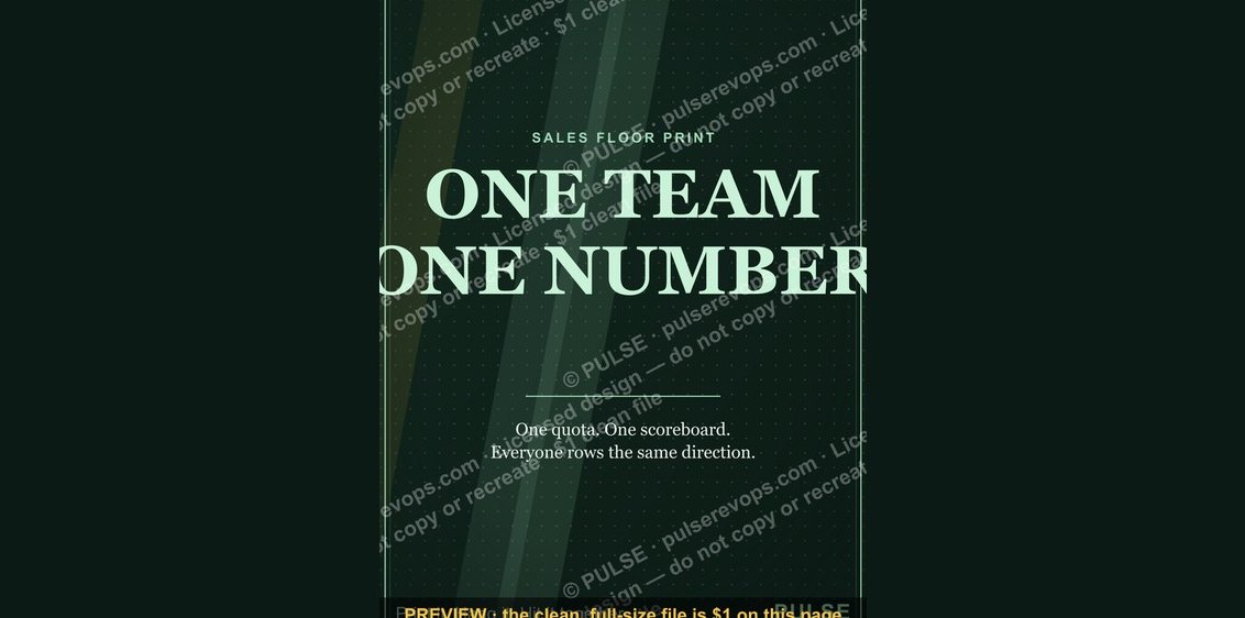 graphic“ONE TEAM ONE NUMBER” — Sales Floor Print
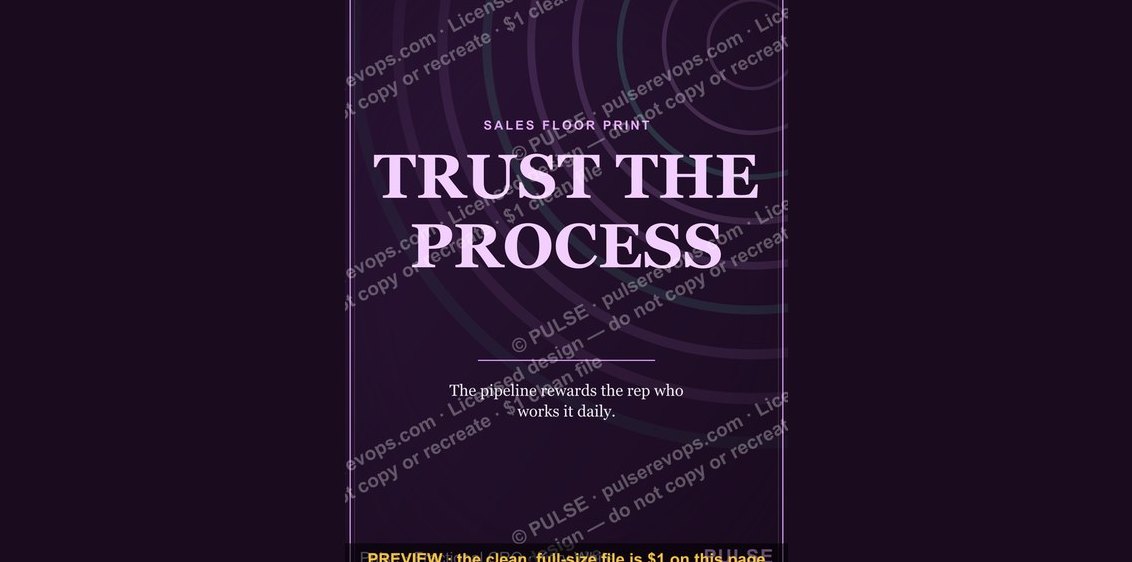 graphic“TRUST THE PROCESS” — Sales Floor Print
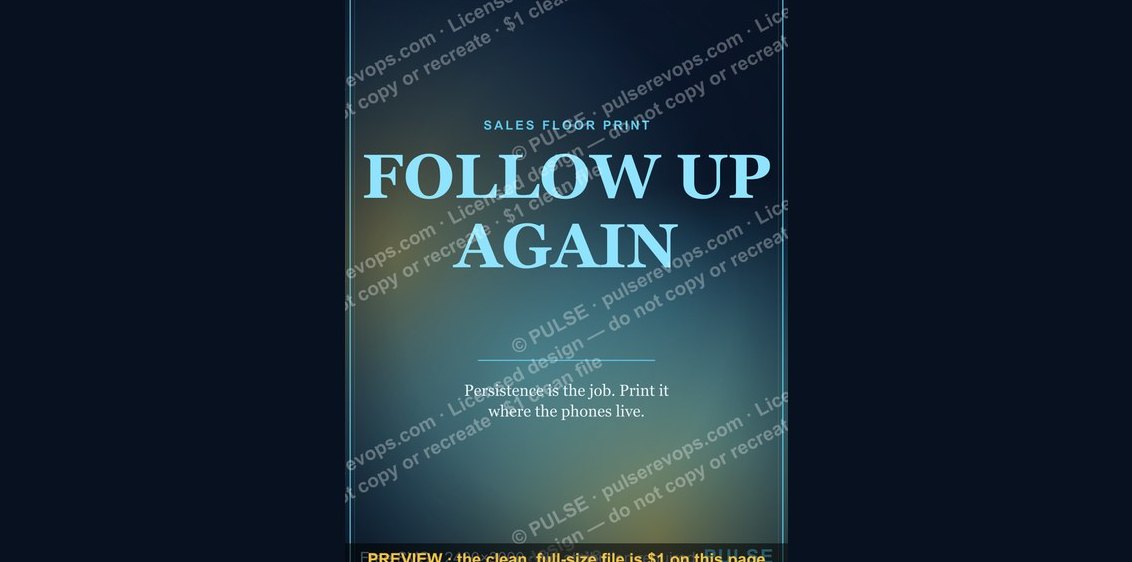 graphic“FOLLOW UP AGAIN” — Sales Floor Print
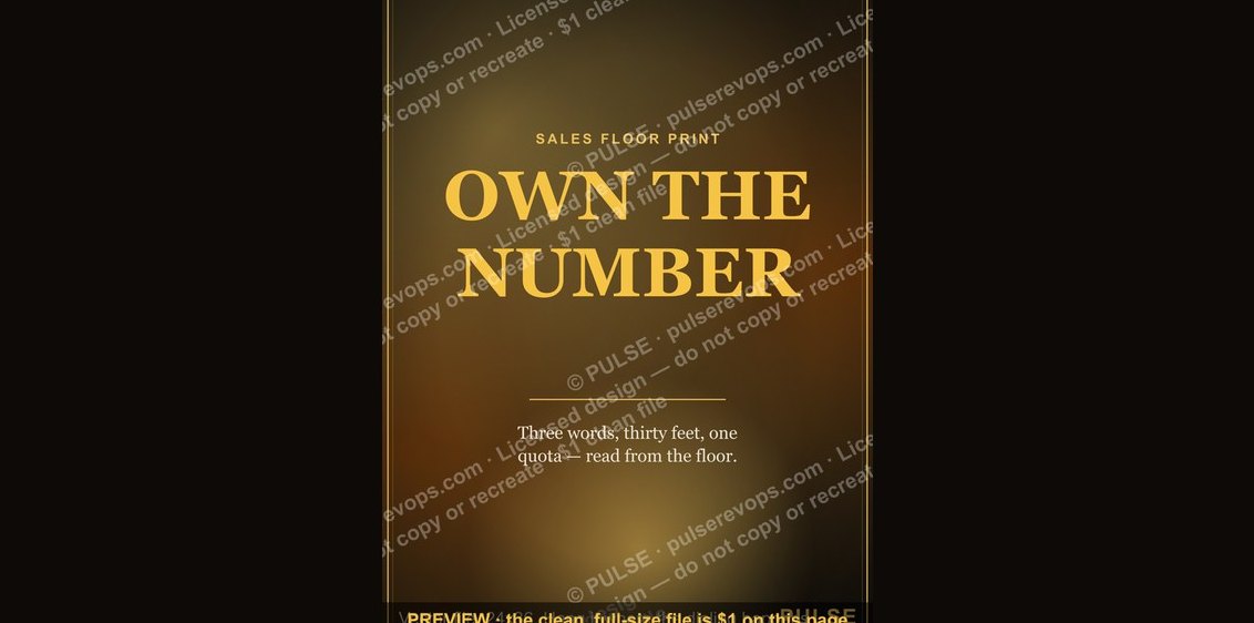 graphic“OWN THE NUMBER” — Sales Floor Print
 graphic“CHASE THE NO” — Sales Floor Print
 graphic“Always Be Closing” — Sales Floor Poster
 graphic“ASK BETTER QUESTIONS” — Sales Floor Print
 graphic“NEXT CALL WINS” — Sales Floor Print
 graphic“QUOTA IS A FLOOR” — Sales Floor Print