
Business Development — LinkedIn Banner
 Curated byKory White · Fractional CRO · Maryland
 PULSEKNOWLEDGE LIBRARY
A business development LinkedIn banner should do one job well: tell a profile visitor, in under three seconds, who you help and what outcome you create. Build it around a single headline value proposition (for example, "I open enterprise pipeline for B2B SaaS"), keep it to roughly 8–15 words, and pair it with a soft call-to-action such as "Open to partnerships" or "Let's connect." Use the correct canvas (1584×396 px for a personal profile), keep critical text out of the lower-left where LinkedIn overlays your photo and name, and limit yourself to two fonts and one accent color. Clean, specific, and brand-consistent beats busy and clever — one clear message aimed at the decision-makers you want to reach.
Business Development — LinkedIn Banner

A dark, on-brand LinkedIn banner — "I create new revenue." over a "Source · Qualify · Pass" line with a pulse motif. Put it on your profile to signal exactly what you do.
Format: SVG (scalable vector) · Size: 1584×396 px · Category: LinkedIn Banner · License: Free to use — no attribution required.
[⬇ Download this graphic](/graphics/assets/gb0231.svg)
The two diagrams below show how the pieces fit together: the first maps the path from a profile visit to a business outcome, and the second is the decision flow for what your banner should actually say.
Recolor it to your brand
Use the color picker above to recolor this banner to your team or company colors, switch the background (including transparent), then download it as an SVG or PNG. No sign-up, no watermark.
How to use it
It scales cleanly to the LinkedIn cover slot (1584×396) — download the PNG and drop it straight onto your profile, or open the SVG in Canva, PowerPoint, or Figma to add your name and tweak the layout.
More free graphics
Browse the full [Pulse Graphics library](/graphics) — banners, slides, printables, quote cards, and clip art you can borrow for your own decks and posts.
Design Choices That Make a Banner Read as Credible
A business development banner is a visual handshake. In the few seconds before someone reads your headline, the color, type, and layout have already told them whether you look established or improvised. The goal isn't decoration — it's making one message land fast and feel trustworthy.
For B2B contexts, a restrained palette tends to read as the most professional. Navy blue and charcoal gray signal stability and expertise, and pairing them with a single complementary accent — a muted teal, burnt orange, or soft gold — adds warmth without tipping into "salesy." A useful starting framework is a 70-20-10 split: about 70% neutral base, 20% secondary neutral, and 10% accent reserved for the words or CTA you most want noticed. Pure black backgrounds can read as harsh rather than premium, and heavily saturated neon tones tend to look amateur, so most BD professionals are safer in the muted-professional range.
Typography carries as much weight as color. Clean sans-serif faces such as Inter, Montserrat, or Lato render crisply across devices and feel modern. A practical hierarchy: a bold headline (weight 600–800) around 36–48 pt, with supporting text at 18–24 pt in a regular or medium weight. Keep to two font families at most — one for the headline, one for body — and skip script or decorative faces, which lose legibility at banner scale.
Visual hierarchy decides what a viewer sees first, second, and third. Eyes tend to follow a Z-pattern across digital content, so put your most important element — usually your name or core value proposition — in the upper-left or center-left, with a secondary line below or to the right. Use size, contrast, and whitespace to lead the eye; a banner where every element competes for attention ends up communicating nothing. The widely cited example of a navy background, white text, and a single gold accent line works precisely because it is disciplined: one focal message, one accent, plenty of breathing room. Restraint, not novelty for its own sake, is what makes a BD banner convert a glance into a click.
Dimensions, File Formats, and Technical Best Practices
Using the wrong dimensions is the fastest way to undermine an otherwise strong banner, because LinkedIn will crop, stretch, or pixelate anything that doesn't match its slot. For personal profiles, design at 1584×396 px; LinkedIn caps banner uploads at 8 MB. Company pages use a different cover ratio, so check the current spec in LinkedIn's own help center before exporting for a page rather than a profile. If you're working in Canva, Figma, or Photoshop, design at 2× (3168×792 for a personal profile) so the banner stays crisp on high-DPI and Retina displays.
The safe zone is narrower than the full canvas. LinkedIn overlays your circular profile photo on the lower-left of the banner, and your name, headline, and location sit in the lower-left quadrant. Anything important placed in that bottom-left region will be partially or fully covered. Keep your essential text and logo inside a central rectangle — roughly 1400×300 px with a 50–60 px margin on all sides — so nothing critical gets clipped, including on the tighter mobile crop.
Format affects both clarity and load time. PNG is the safest choice for banners with text, logos, or sharp edges because it keeps lines crisp and supports transparency. JPEG is acceptable for purely photographic backgrounds but can introduce compression artifacts around text. Avoid animated GIFs — LinkedIn doesn't animate profile banners, and a static design is the professional norm. Export at 72 DPI in the sRGB color profile so colors stay consistent across monitors and phones.
A few habits prevent the most common mistakes. Preview on both desktop and mobile before publishing, since mobile crops more tightly from the sides. Bump text size up slightly if it feels small in the mobile preview. Compress the final PNG (TinyPNG or Squoosh do this without visible quality loss) to keep load snappy, and give the file a descriptive name like "business-development-banner-yourname.png" so it's easy to manage later.
Messaging That Turns a Profile View into a Conversation
Your banner is prime real estate for the one message you want every visitor to remember. Unlike the character-limited headline, the banner gives you room to say what you do, who you serve, and the result you deliver — but more room is not a license for more words. The strongest banners run about 8–15 words total, split between a headline and a single subheadline.
Lead with a power statement that answers the silent question, "Why should I care?" For a BD professional that might be "I connect B2B SaaS companies with their next 50 enterprise clients" or "Strategic partnerships that drive new recurring revenue." Avoid generic labels like "Business Development Specialist" or "Driving Growth" — they blend into thousands of identical profiles. Specificity wins: name the industry, the outcome, or the methodology. If you own a niche, such as fintech partnerships in Latin America, say so plainly.
The subheadline adds one layer of credibility or context — a notable role, a client result, or social proof — kept to a single line. Match tone to your field: direct and benefit-led for finance or manufacturing, slightly more conversational for tech or creative work. Steer clear of hype words like "revolutionary" or "game-changing," which trigger skepticism in experienced buyers; concrete outcomes and timeframes read as more credible.
Finally, give visitors a low-commitment next step. A soft CTA such as "Book a 15-minute intro call" or "Open to partnerships," placed bottom-right where the eye finishes its scan, gives interested viewers a reason to act instead of drifting away. Treat the banner as a living asset: swap the value proposition every 90 days, test a different angle, and watch which version earns more profile views, connection accepts, and inbound messages.
Sources
- LinkedIn Help — Add or edit your profile background photo — official guidance on banner image specs and placement.
- Canva Design School — tutorials on banner dimensions, layout, and visual branding.
- Harvard Business Review — career and personal-branding coverage — research-based articles on professional presence and networking.
- Adobe — image file formats and export guidance — reference on PNG vs. JPEG and resolution for digital assets.
- TinyPNG — PNG/JPEG compression tool for keeping banner files small without visible quality loss.
- Squoosh — open-source image compression and format conversion for web-ready exports.
Related on PULSE
- [Sales Development Rep — LinkedIn Banner](/knowledge/gb0229)
- [Quarterly Business Review — Title Slide](/knowledge/gb0005)
- [Monthly Business Review — Title Slide](/knowledge/gb0061)
- [“Run your patch like a business.” — LinkedIn Banner](/knowledge/gb0323)
FAQ
What does a Business Development LinkedIn banner typically include? A strong banner features a single value proposition as the headline, an optional one-line credibility statement, and a soft call-to-action — all arranged with clean visual hierarchy inside the standard 1584×396 px canvas. Many also include a logo or accent element, but the focus should stay on one clear message rather than a crowded collage.
How often should I update my Business Development banner? Refresh it whenever your role, company, or core message changes, and otherwise treat 6–12 months as a natural review cadence. If you're actively testing messaging, swapping the value proposition every 90 days and watching profile views and inbound messages tells you which angle resonates.
Can I use a free template for my Business Development banner? Yes. Free and premium templates are available on Canva, Freepik, and Adobe Express, and the graphic on this page is free to use with no attribution required. Whatever you start from, customize the colors and copy so it reflects your brand rather than looking like an untouched stock template.
Should my banner include a call-to-action? A soft CTA — "Let's connect," "Open to partnerships," or a link to your calendar — works well on LinkedIn. Keep it low-friction; aggressive, hype-heavy CTAs read as salesy. Place it bottom-right, where the eye naturally finishes scanning the banner.
What colors work best for a Business Development banner? Use your company's brand colors, or a professional base of navy, charcoal, and white with one accent. A 70-20-10 split — neutral base, secondary neutral, and a single accent for key words — keeps it disciplined. Avoid harsh pure-black backgrounds and saturated neon tones, which tend to read as either austere or amateur.
How do I make sure my banner looks good on mobile? Keep all essential text and imagery inside a central rectangle (about 1400×300 px) with a 50–60 px margin, since mobile crops more tightly from the sides and LinkedIn overlays your photo and name in the lower-left. Preview on an actual phone before publishing, and nudge font sizes up if anything feels small.
Read it free — or make it yours for $1.
@Kory-White- · if Venmo asks, the last 4 of my number are 2012
 graphic“Start your sales career here.” — LinkedIn Banner
 graphicSemiconductor Foundry CRO — LinkedIn Banner
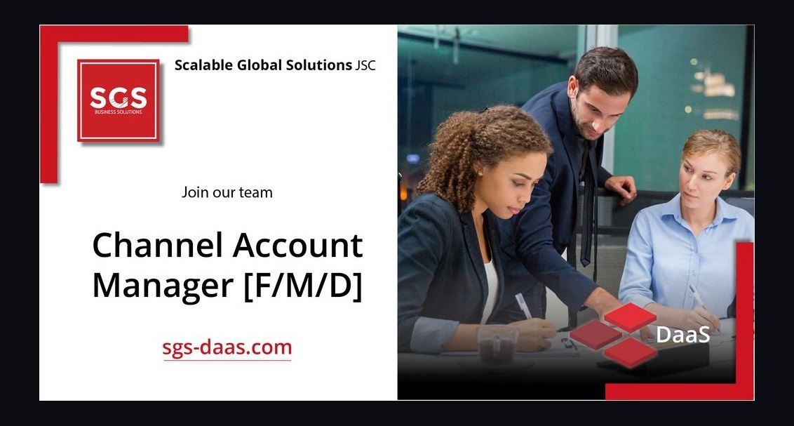 graphicChannel Account Manager — LinkedIn Banner
 graphicAI Translation Engineer — LinkedIn Banner
 graphicHow to identify the champion in a sales meeting in 2027?
 graphicSales Enablement Lead — LinkedIn Banner
 graphicYour pipeline is your paycheck. — LinkedIn Wallpaper
 graphicStay in the deal. — LinkedIn Wallpaper
 graphicProduct Marketing Lead — LinkedIn Banner
 graphic“A forecast you can trust.” — LinkedIn Banner