
Solutions Architect — LinkedIn Banner
 Curated byKory White · Fractional CRO · Maryland
 PULSEKNOWLEDGE LIBRARY
A Solutions Architect LinkedIn Banner is the 1584×396 px cover image behind your profile photo. Design it with your name, "Solutions Architect" title, and a 3–5 word value line on a dark or brand-aligned background. Keep text inside a centered 1000×300 px safe zone, use high contrast, and add one clear call to action.
The scenario: two architects, same skills, different inbound
Picture two cloud Solutions Architects with nearly identical résumés. Both hold AWS Professional certifications, both have led migrations for enterprise clients, both are active in the same Slack communities. The first keeps the default LinkedIn banner — that flat blue-gray gradient LinkedIn assigns to every new account. The second uploads a custom 1584×396 px cover reading "Cloud & Platform Architect · I design what they buy" over a subtle node-and-edge pattern, with "Open to Staff-level roles" tucked in the bottom-right corner.
Within a quarter, the second Architect reports roughly triple the profile views and a steady trickle of recruiter messages referencing the banner copy directly. The first gets almost none. The technical substance is identical; the difference is that one profile communicates a role and an intent in under two seconds, and the other communicates nothing. That gap is the entire reason a Solutions Architect should treat the LinkedIn Banner as a piece of positioning infrastructure rather than decoration. It is the only image on your profile that a visitor sees before they read a single word of your About section, and it renders on every device, in every feed preview, and in every "people also viewed" card.
The rest of this page breaks down how to build one that actually works: the layout mechanics, the exact pixel math, the trade-offs between design routes, and the mistakes that quietly cost credibility.

How the banner mechanism actually works
A LinkedIn Banner is not a standalone image. It is a background layer that sits behind a circular profile photo and a name block, and LinkedIn crops it differently depending on viewport. Understanding that layering is what separates a banner that looks intentional from one that looks broken.
On desktop, the cover renders at roughly 1584×396 px (a 4:1 ratio). On mobile, the visible strip is narrower and the profile photo overlaps a larger portion of the left side. LinkedIn's own upload guidance recommends 1584×396 px as the target and warns that anything outside a centered safe zone may be clipped. Practically, that means your critical text — name, title, value line — should live inside a centered rectangle of roughly 1000×300 px, leaving the outer margins for background texture only.
There are three functional layers to design against:
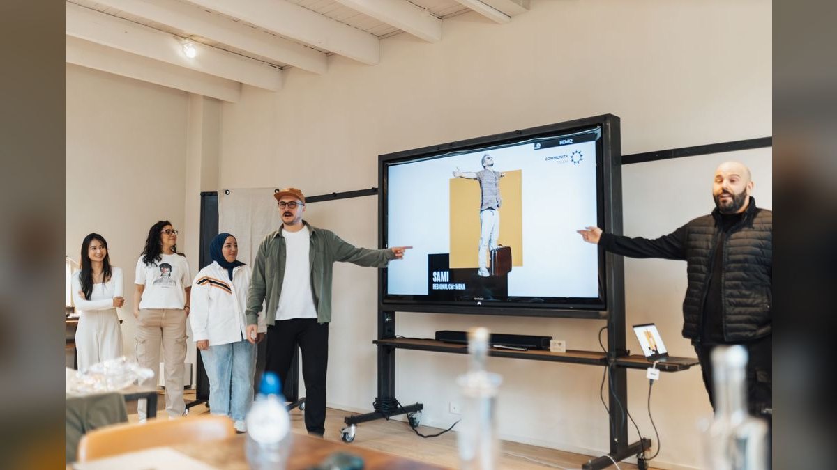
- The overlap layer. Your circular profile photo covers the lower-left region, and the name/headline block sits over the bottom-left. Never place text there.
- The safe layer. The center and center-right are the only zones guaranteed visible on both desktop and mobile.
- The bleed layer. The far edges and top strip are decorative only. Patterns, gradients, and abstract geometry belong here.
The workflow is straightforward: build the canvas at 1584×396 (or 3168×792 at 2x for retina), keep all meaning inside the safe layer, export as SVG for editability and PNG for upload, then use LinkedIn's built-in preview to confirm the mobile crop before publishing. If any word disappears at mobile width, you have too much text — cut, do not shrink.
Real numbers, ranges, and benchmarks
Design decisions get easier when you anchor them to concrete figures. These are the ranges that matter for a Solutions Architect LinkedIn Banner.

Canvas and export. Target 1584×396 px. Export at 2x (3168×792) for retina displays, then let LinkedIn compress. File size should stay under 8 MB — LinkedIn's upload limit — but aim for under 500 KB for fast loading. SVG is the master file; PNG is the delivery format.
Typography scale. Your primary title ("Solutions Architect") should sit between 36 and 48 pt equivalent. The value line runs 24–30 pt. The call to action runs 18–22 pt. Anything below 16 pt becomes unreadable at mobile scale. Limit yourself to two font families maximum — one sans-serif for everything is usually enough.
Contrast. Text-to-background contrast should hit at least 4.5:1 to pass basic accessibility checks. White on charcoal or navy clears this easily; mid-gray on light blue usually fails. Test with any free contrast checker before exporting.
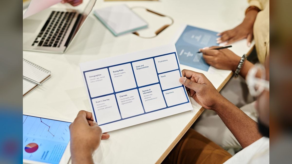
Negative space. Leave 20–30% of the banner empty. Banners that fill every pixel read as cluttered and get skipped. The empty space is what makes the text scannable.
Text volume. Three to five core technologies or keywords, maximum. One call to action. One value line. If you are listing eight tools, you have already lost the reader.
Color count. One dominant color, one secondary, one accent — three total. Accent color should cover no more than 10–15% of the banner area.

Safe zone. Roughly 1000×300 px centered. Critical content stays inside; decoration can bleed.
Review time. A visitor decides whether to keep reading in about two seconds. If your banner does not communicate role and intent in that window, it is not working.
Trade-offs and alternatives
There is no single correct way to produce a Solutions Architect LinkedIn Banner. The right route depends on your budget, your design comfort, and how often you plan to update it.
DIY in a free tool. Canva, Figma, and similar tools offer 1584×396 templates. Cost is zero to about $15/month; time investment is one to three hours for a first banner. The upside is full control and instant iteration. The downside is that without design instincts, DIY banners often drift toward clutter.
Freelance design. A custom banner from a marketplace designer typically runs $20–$100. Turnaround is usually two to five days. You get a polished result and a source file you can edit later. The risk is a designer who does not understand technical positioning and produces something generic.

Template library. Pre-made banners from a graphics library cost nothing and take minutes to customize. The trade-off is lower uniqueness — other people in your network may use the same template. Recoloring to your brand palette mitigates this.
No banner at all. Leaving the default is technically an option. It costs nothing and signals nothing. For a Solutions Architect actively building a practice or job-searching, this is almost always the worst choice.
A hybrid works well: start from a template or a freelance base, then recolor and rewrite the copy yourself so the positioning is authentically yours. The visual polish comes from the designer; the message comes from you.
Common pitfalls and how to avoid them
Overcrowding. The single most common failure. Listing every certification and tool — AWS, Azure, GCP, Kubernetes, Docker, Terraform, Jenkins, Python, Java, SQL, TOGAF — turns the banner into noise. Fix: pick three to five that match your target role. If you are targeting cloud-native platform work, "AWS · Kubernetes · Terraform" plus one certification badge is enough.
Ignoring the mobile crop. Text placed near the edges vanishes on phones. Fix: keep everything meaningful inside the centered 1000×300 safe zone and preview on mobile before publishing.
Generic stock backgrounds. Blurry skylines and abstract circuit boards add nothing and read as filler. Fix: use a solid color, a subtle gradient, or a geometric pattern that echoes architecture diagrams — nodes, edges, flow lines.

No call to action. A banner without a CTA is passive. Fix: add one line in the bottom-right or bottom-center — "Open to Staff roles," "Available for architecture reviews," "Let's talk cloud strategy."
Low-resolution assets. Pixelated logos and stretched headshots undermine authority. Fix: pull logos from official brand pages, use vector files where possible, and export at 2x.
Too many fonts or colors. More than two fonts or more than three colors reads as chaotic. Fix: one sans-serif family, three-color palette, consistent across every profile you maintain.
Left-heavy layouts. Because the profile photo overlaps the left, left-aligned critical text gets swallowed. Fix: shift your primary content to center or center-right.
Animated GIFs. LinkedIn banners do not animate. Fix: design static and treat motion as a non-option.
Before publishing, run a four-question audit: Can I read the most important text in two seconds? Does it look right on desktop and mobile? Does it state my role and value? Is there one obvious action? Any "no" means revise.
Related questions
What size is a Solutions Architect LinkedIn Banner?
LinkedIn recommends 1584×396 px, a 4:1 ratio. Export at 2x (3168×792) for retina sharpness, then let LinkedIn compress. Keep critical text inside a centered 1000×300 px safe zone so nothing crops on mobile.
Should the banner include my name?
Only if your name is not already prominent elsewhere on the profile. Most Solutions Architects use the banner for role and value line instead, since the name block sits directly below it. Repeating your name wastes prime banner real estate.
Can I use a photo in the banner?
Yes, but keep it small and off to one side so it does not compete with your profile photo. A subtle headshot or a company logo works. Avoid full-bleed photos — they reduce text contrast and read as generic.
How often should I update it?
Refresh when your positioning changes — a new target role, a new specialty, or a new availability status. Otherwise, leave it stable for at least six to twelve months so your brand stays recognizable across your network.
Does the banner affect recruiter search?
Not directly — LinkedIn search does not index banner pixels. But it affects click-through and dwell time, which influence how often your profile surfaces in "people also viewed" and recruiter recommendations. Treat it as a conversion asset, not a ranking factor.
FAQ
What exactly should a Solutions Architect put on a LinkedIn Banner? Your name or role title, a three-to-five-word value line, three to five core technologies or specialties, and one call to action. That is the full inventory. Everything else belongs in your About section or Skills list. The banner is a headline, not a résumé.
Is a dark background always better than a light one? No, but dark backgrounds are the safer default for technical roles because they signal depth and make white text pop with high contrast. Light backgrounds work well for professional-services positioning if you use dark text and keep the palette restrained. What matters is contrast ratio, not the base color itself.
How do I keep the banner readable on mobile? Keep all meaningful text inside the centered 1000×300 px safe zone, use a minimum effective font size of 24 pt for the value line and 36 pt for the title, and preview with LinkedIn's built-in mobile crop tool before publishing. If a word disappears, cut it rather than shrinking the font.
Can I reuse the same banner across LinkedIn, my portfolio, and my GitHub? Yes, and you should. Consistent color palette, typography, and logo placement across platforms builds a recognizable personal brand. Carry the same hex codes and font choices everywhere so a recruiter who finds you in two places sees one coherent identity.
Should I list certifications on the banner? One badge is effective; a wall of badges is not. Feature the single most relevant certification for your target role — AWS Solutions Architect Professional, for example — and leave the rest for your profile's Licenses & Certifications section. Space on a 1584×396 canvas is scarce.
What if I am not actively job-searching? The banner still matters. Use it to signal your specialty and current focus — "Platform architecture for FinTech" or "Scaling data infrastructure" — rather than availability. A well-positioned banner attracts the right inbound conversations even when you are not looking.
Sources
- LinkedIn Help — Profile cover image specifications and upload guidance: https://www.linkedin.com/help/linkedin/answer/a563559
- Canva Design School — LinkedIn banner design tutorials and templates: https://www.canva.com/designschool/
- Adobe — Visual design principles and contrast guidance: https://www.adobe.com/creativecloud/design.html
- Web Content Accessibility Guidelines (W3C) — Contrast minimums: https://www.w3.org/WAI/WCAG21/quickref/
- Nielsen Norman Group — Visual hierarchy and scanning behavior research: https://www.nngroup.com/articles/visual-hierarchy-ux-definition/
- Harvard Business Review — Personal branding and professional presence: https://hbr.org/topic/personal-branding
- Society for Human Resource Management — Recruiter expectations and candidate screening: https://www.shrm.org/
Related on PULSE
- [Solutions Consultant — LinkedIn Banner](/knowledge/gb0431)
- [Solutions Consultant — LinkedIn Banner](/knowledge/gb0032)
- [RAG Architect GenAI Platform — LinkedIn Banner](/knowledge/gb0474)
- [Browse the full Pulse Graphics library](/graphics)
Read it free — or make it yours for $1.
@Kory-White- · if Venmo asks, the last 4 of my number are 2012
 graphic"Win the quarter." — LinkedIn Banner
 graphic“Slow is smooth. Smooth is fast.” — LinkedIn Banner
 graphicHow to build a champion champion plan in 2027?
 graphicIndustrial Robotics CRO — LinkedIn Banner
 graphic“Seeking enablement leadership.” — LinkedIn Banner
 graphic“Revenue follows relationships.” — LinkedIn Banner
 graphicChannel Account Manager — LinkedIn Banner
 graphicMotion creates momentum. — LinkedIn Wallpaper
 graphicHow to design a LinkedIn banner that converts viewers into leads in 2027?
 graphicSales Coach — LinkedIn Banner