
Cybersecurity Sales Director — LinkedIn Banner
 Curated byKory White · Fractional CRO · Maryland
 PULSEKNOWLEDGE LIBRARY
Quality
Certified
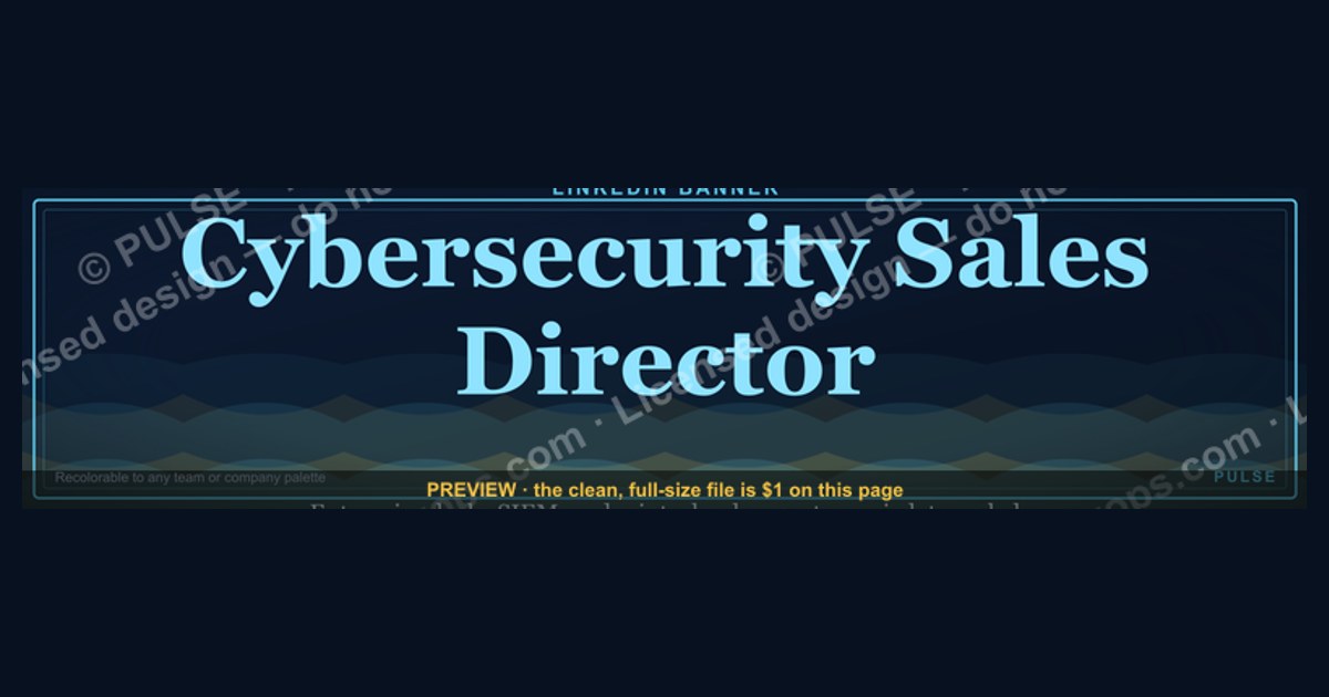
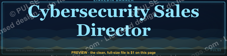
This is a free downloadable LinkedIn profile banner graphic, sized 1584x396 px, titled "Cybersecurity Sales Director — LinkedIn Banner." It states the role plainly in bold type over a dark, security-themed background so that recruiters, peers, and prospects instantly recognize the holder as a senior seller of security solutions. Download the PNG and upload it as your profile cover image.
The outcome you should expect
A LinkedIn profile banner is not a campaign. It is a piece of static real estate that sits behind your headshot and follows you into every search result, connection request, comment thread, and InMail preview. For a Cybersecurity Sales Director, the realistic outcome of installing a clean, role-specific Banner is narrow but compounding: a modest lift in profile-to-message conversion, a faster read of your seniority by people who have never met you, and a small but real reduction in the "what does this person actually do?" friction that kills cold outreach before it starts.
Be honest about the ceiling. Your Banner will not generate inbound leads on its own, will not fix a weak headline, and will not compensate for a profile that lists no quota history. What it does is remove ambiguity. When someone lands on your profile from a search for "cybersecurity sales leader," the Banner confirms in a glance what the headline says in words. That redundancy is the point — repetition across headline, banner, and About section is what makes positioning stick.
The measurable expectations are modest. Practitioners who test profile changes generally report small effects on connection acceptance and message reply rates, not step changes. Treat the Banner as a hygiene item, like a professional headshot, rather than a growth lever. The return shows up over months of consistent presence, not in a dashboard the week you upload it.

There is also a second-order outcome worth naming. A banner that names your function makes you findable and legible to internal audiences too — recruiters at your own company, partner alliances, and channel managers who need to route a deal to the right region. In large security vendors, where a single account can touch sales engineering, channel, and customer success, being visibly identifiable as a Director-level seller shortens internal routing. That is unglamorous but genuinely useful.
Finally, expect the Banner to age. Job titles change, companies get acquired, product lines get rebranded. A banner that says "Cybersecurity Sales Director" is accurate for a season, not a career. Plan to revisit it whenever your scope shifts — a move from regional to global responsibility, or from direct sales to channel leadership, changes what the banner should communicate even if the title stays the same on paper.
What drives that outcome
The outcome is driven by three forces working together: visual contrast, semantic clarity, and placement consistency.

Visual contrast is the mechanical part. LinkedIn renders the cover image as a wide, short strip, and it is partially obscured by your circular profile photo on the left side and your name block on the lower left. Anything you place in the bottom-left quadrant will be hidden on desktop and mobile. A banner that works puts its message in the upper-center and right-hand regions, where nothing covers it. Dark backgrounds with light type tend to hold up better than busy photography because the text stays legible when LinkedIn compresses and re-crops the image at different viewport widths.
Semantic clarity is the language part. "Cybersecurity Sales Director" is a compound signal: it names the industry (security), the function (sales), and the level (director). Each word does work. Drop "Cybersecurity" and you become a generic sales leader competing with every SaaS seller on the platform. Drop "Director" and you read as an individual contributor, which changes how prospects and recruiters calibrate their first message. The Banner's job is to keep all three tokens visible at once.

Placement consistency is the behavioral part. A Banner only helps if it agrees with everything around it. If your headline says "Helping CISOs sleep better" but your Banner says "Cybersecurity Sales Director," you have created a small dissonance that readers resolve by trusting neither. The banner should echo the headline, not compete with it. The cleanest pattern is: headline carries the value proposition, banner carries the role and domain, About section carries the proof.
There is a fourth, quieter driver: repetition across your network. When you comment on a prospect's post, your miniature profile card appears with a sliver of your banner. When you appear in "people also viewed," the banner shows. Over dozens of impressions, a consistent visual identity builds recognition that a text-only profile cannot. This is the same logic behind consistent trade-show booth design — you are buying recall, not clicks.
Benchmarks and realistic ranges
Because LinkedIn does not publish per-element performance data, the honest way to benchmark a Banner is against the constraints the platform imposes and the conventions that experienced sellers follow.

Start with dimensions. LinkedIn's recommended cover image is 1584 x 396 pixels, a 4:1 aspect ratio. Uploads outside that ratio get cropped, usually from the edges, which is why critical text should sit within roughly the central 80 percent of the canvas. The file should be a PNG or JPG under LinkedIn's upload size limit; PNG is preferred for graphics with flat color and text because it avoids the compression artifacts that smear letter edges in JPGs. Keep the file well under 8 MB.
For text size, the practical floor is around 40-48 px for the primary line at full 1584-px width. Anything smaller turns to mush on the mobile feed, where the banner is displayed at a fraction of its native size. A two-line layout — role on top, domain or specialty beneath — reads more reliably than a single long line, because line breaks give the eye a resting point.
Color contrast is the other benchmark. Aim for a contrast ratio that keeps light text readable on a dark field; dark navy, charcoal, or near-black backgrounds with white or light-gold type are the common security-industry palette because they signal "enterprise" and "serious" without shouting. Avoid gradients that fade to light in the region where your type sits, and avoid placing text directly over photographic detail.

On the softer side, benchmark against your own baseline. Before uploading, note your profile view count for a month and your connection-request acceptance rate. After uploading, watch the same numbers for a comparable period. Expect noise; a single month is not a trend. What you are looking for is whether the profile views trend up and whether the people viewing look more like your target buyer. If your views rise but the audience is wrong — recruiters for unrelated roles, for instance — the banner may be signaling too broadly.
For team deployments, the useful benchmark is consistency. A sales organization of twenty directors with twenty wildly different banners looks improvised. A shared template with per-person name and territory swapped in looks like a company that has its act together. The template approach also cuts the design cost per person to near zero once the master file exists.
Ranges to keep in mind: two to four words for the primary line, one accent color plus neutrals, no more than three type sizes, and a single focal point. Every additional element you add reduces the legibility of the one that matters.
Risks, edge cases, and failure modes
The most common failure is text collision with the profile photo. Designers who build the banner in isolation, without overlaying a mock profile picture, discover after upload that their company name or tagline sits exactly where the circular avatar lands. The fix is to preview the banner with a photo placeholder before finalizing, and to keep the left third of the canvas free of essential content.
The second failure is over-specification. A banner that reads "Cybersecurity Sales Director | Enterprise Accounts | West Region | Zero Trust | SASE | Cloud Security" is a keyword dump, not a message. At banner scale, nobody reads six pipe-separated phrases. Pick the two or three tokens that matter most for your target audience and let the headline and About section carry the rest.
A third risk is tone mismatch. Security buyers are a skeptical audience. A banner that leans on aggressive sales language — "crushing quota," "hunting," "closing" — can read as a warning sign to a CISO who is trying to decide whether you understand risk. The safer register for a Director-level banner is credential and domain: what you sell, who you sell it to, and at what level. Confidence reads better than bravado here.

There are edge cases where a role banner actively backfires. If you are transitioning out of sales into advisory, board work, or consulting, a banner that announces you as a sales Director can undercut the new positioning. If you are job-searching confidentially, a banner that names your current employer is a liability. If you work for a company with strict brand guidelines, an unofficial banner using the corporate logo without approval can create a compliance problem — check the policy before you upload.
Another edge case is the multi-hyphenate. Many senior sellers in security also write, speak, or advise. A banner that tries to cover all of those roles at once ends up communicating none of them clearly. If you must span two identities, put the primary role in the banner and the secondary one in the headline, so the hierarchy is unambiguous.
Finally, watch for the stale-banner problem. A banner mentioning a product that has since been renamed, or a company that has been acquired, signals that you are not paying attention. Set a calendar reminder to review your banner whenever your role, employer, or flagship product changes.

A practical rollout plan
Rolling out a banner — whether for yourself or for a team — is a short project with a clear sequence. The steps below assume you have the graphic file in hand and want to get it live without breaking anything.
First, audit what you have. Screenshot your current profile on both desktop and mobile so you have a before state. Note your headline, your About opening line, and your current banner. The new banner has to agree with the other two.

Second, prepare the file. Confirm it is 1584 x 396 px, exported as PNG, and that all essential text sits within the safe central zone. Check the contrast by viewing it at thumbnail size — if you cannot read the main line at 10 percent zoom, it is too small or too low-contrast.
Third, mock the overlay. Drop your profile photo onto the left side of the banner in an image editor to confirm nothing important is hidden. Do the same for the name block that sits along the bottom left.
Fourth, upload and preview. LinkedIn lets you reposition the image after upload; use that to nudge the framing. Check the result on mobile, where the crop is tighter.

Fifth, align the surrounding copy. Update your headline so it complements rather than duplicates the banner. If the banner says "Cybersecurity Sales Director," the headline can carry the value proposition — the outcome you deliver — without repeating the title.
Sixth, measure lightly. Record profile views and connection acceptance for the following month. Do not over-interpret small movements.
Seventh, templatize if you are deploying to a team. Build one master file with clearly marked layers for name, territory, and role, then produce individual exports. Distribute with a one-page spec sheet covering dimensions, fonts, and colors so nobody improvises.
Related questions
What size should a LinkedIn banner be?
LinkedIn recommends 1584 x 396 pixels, a 4:1 ratio. Upload a PNG for crisp text. Keep essential content inside the central area, since the profile photo and name block cover the left side on both desktop and mobile views.
Does a banner actually help sales?
Modestly. It will not generate leads by itself, but it removes ambiguity about your role and domain, which can improve connection acceptance and message reply rates over time. Treat it as hygiene, not a growth channel.
Can I use my company logo on it?
Only if your employer's brand guidelines permit it. Many security vendors restrict unapproved use of logos in personal materials. Check the policy first, and when in doubt, use your role and domain in type instead of the mark.
What should the headline say if the banner already states my title?
Use the headline for the outcome you deliver rather than the title itself. If the banner reads "Cybersecurity Sales Director," the headline can say what you help buyers achieve, so the two elements complement each other instead of repeating.
Is a dark background better than a light one?
Not universally, but dark backgrounds with light type are common in security because they read as enterprise and hold up well under LinkedIn's compression. The real test is contrast at thumbnail size, not the color itself.
FAQ
Can I download this banner and use it as-is? Yes. The graphic on this page is offered as a free PNG download at 1584 x 396 px. Upload it directly as your LinkedIn cover image through your profile's edit menu. If you want to change the wording, colors, or role, use it as a starting template rather than a fixed asset.
Will LinkedIn crop or distort my banner after upload? LinkedIn may crop the image if it does not match the recommended 4:1 ratio, and it lets you reposition the framing after upload. Keep essential text within the central portion of the canvas so that edge cropping never removes your main line. Always preview on mobile after uploading.
What file format and size should I export? PNG is the best choice for graphics with flat color and text because it avoids the smearing that JPG compression introduces around letter edges. Keep the file comfortably under LinkedIn's upload limit and at the full 1584 x 396 px so it stays sharp on high-density displays.
Does the banner need to match my company's brand colors? It should not clash with them. If your employer has a defined palette, pulling one accent color from it keeps your profile visually consistent with the rest of your team's materials. If there is no guidance, a neutral dark field with a single accent reads as professional in almost any context.
How often should I update it? Review it whenever your role, employer, territory, or flagship product changes. A banner that names a product line that no longer exists, or a company that has been acquired, signals inattention. A yearly review is a reasonable default even when nothing obvious has changed.
Is it worth building a team version? If you manage multiple sellers, yes. A shared master template with swappable name, role, and territory layers produces a consistent visual identity across the team at almost no marginal cost, and it prevents the improvised look that comes from everyone designing their own.
Sources
- LinkedIn Help — Cover image specifications: https://www.linkedin.com/help/linkedin/answer/a563549
- LinkedIn Help — Edit your profile: https://www.linkedin.com/help/linkedin/answer/a546766
- LinkedIn Marketing Solutions Blog: https://business.linkedin.com/marketing-solutions/blog
- Nielsen Norman Group — Visual hierarchy: https://www.nngroup.com/articles/visual-hierarchy-ux-definition/
- Nielsen Norman Group — F-shaped reading pattern: https://www.nngroup.com/articles/f-shaped-pattern-reading-web-content/
- W3C Web Content Accessibility Guidelines — Contrast: https://www.w3.org/WAI/WCAG21/Understanding/contrast-minimum.html
- HubSpot Blog — LinkedIn profile tips: https://blog.hubspot.com/sales/linkedin-profile-tips
- Harvard Business Review — Personal branding: https://hbr.org/topic/subject/personal-branding
Related on PULSE
- Cybersecurity Sales Director — LinkedIn Headline
- Cybersecurity Sales Director — LinkedIn About Section
- Cybersecurity Sales Director — Cold Outreach Sequences
- Cybersecurity Sales Director — Quota Attainment Benchmarks
- Cybersecurity Sales Director — Channel and Alliance Motion
- Cybersecurity Sales Director — Interview and Promotion Path
This page will be disappearing soon. Save it to your device for $1 — or read it free while it is here.
@Kory-White- · if Venmo asks, the last 4 of my number are 2012
This page is gone.
This one is off the shelf now. $1 keeps it on your phone for good — the whole page, pictures and diagrams included.
 graphicLogistics CRO — LinkedIn Banner
 graphicHealthcare RevOps Leader — LinkedIn Banner
 graphicFinTech CRO — LinkedIn Banner
 graphicB2B SaaS VP of Sales — LinkedIn Banner
 graphicVP of Sales — LinkedIn Banner
 graphicRamp Curve — Months 1-12
 graphicOffensive Security Pentest CRO — LinkedIn Banner
 graphicSales Funnel — Icon / Clip Art
 graphicPipeline cures all. — LinkedIn Wallpaper
 graphicRevenue by Channel Pie