
Pipeline Aging Heatmap
 Curated byKory White · Fractional CRO · Maryland
 PULSEKNOWLEDGE LIBRARY
Quality
Certified
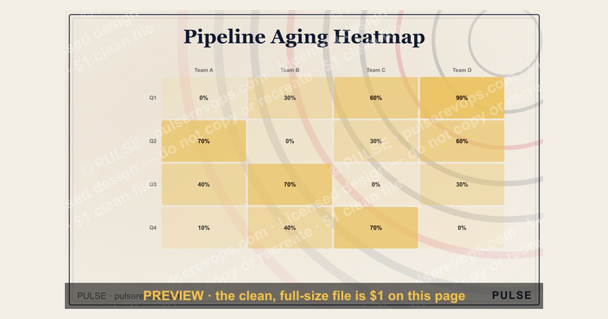
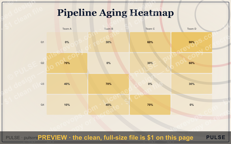
This is the Pipeline Aging Heatmap, a downloadable 1600×1000px graphic that plots your sales stages (Prospecting, Qualification, Proposal, Negotiation, Closing) against age buckets (0-15, 16-30, 31-60, 61-90, 90+ days), coloring each cell green-to-red by how much pipeline is stuck there. Use it as a weekly pipeline-review visual or a slide in your forecast call.
What it is and why it matters
The Pipeline Aging Heatmap is a grid graphic, not a live dashboard — it's a static image sized for a deck slide, a wall monitor, or a Slack post, built so a sales manager can glance at it for five seconds and know exactly where deals are stalling. Down the left side, five rows carry the stage names exactly as most CRMs default them: Prospecting, Qualification, Proposal, Negotiation, Closing. Across the top, five columns carry the age buckets: 0-15 Days, 16-30 Days, 31-60 Days, 61-90 Days, 90+ Days. Each of the resulting 25 cells is shaded on a green-yellow-orange-red scale, and inside the cell sits a number — either a deal count or a dollar figure, depending on which version you download. The title "Pipeline Aging Heatmap" runs across the top in a bold sans-serif face on a dark charcoal background, with a small color-key legend in the bottom right reading "Healthy → At Risk → Stalled."
Why this matters is simple: pipeline value on its own is a vanity number. A rep can show $2M in pipeline and still be in trouble if $1.4M of it has been sitting in Negotiation for 100+ days. Age is the variable that turns a static pipeline snapshot into a forecast-quality signal, because deals decay — the longer an opportunity sits without stage movement, the lower its real probability of closing, no matter what percentage is typed into the CRM's probability field. A heatmap makes that decay visible instantly, in a way a sorted spreadsheet never does, because color perception is faster than reading rows of numbers. The Aging Heatmap format specifically borrows from network-operations and epidemiology dashboards — literal heat maps — because red-for-danger is a nearly universal visual shorthand that needs no training to interpret. In a pipeline review meeting, that means the manager can point at one red cell and ask "what's happening in Proposal, 61-90 days" instead of scrolling through 40 opportunity records looking for the ones that are quietly rotting.

The step-by-step process (mermaid)
Building or reading the heatmap follows a fixed sequence, whether you're generating it fresh in a BI tool or just filling in the template with your own numbers.
Step one is exporting every open opportunity from the CRM with two fields intact: current stage and the date it entered that stage — not the date it was created. That distinction matters because a deal can be six months old overall but only three days into Negotiation; the heatmap measures stage age, not deal age, because stage age is what predicts stalling. Step two computes "days in current stage" for every row by subtracting the stage-entry date from today. Step three sorts each deal into one of the five age buckets. Step four cross-tabulates: for every stage/bucket combination, you get a cell. Step five aggregates — most teams run two versions of the graphic, one counting deals and one summing dollar value, because a stage can look fine by count and terrible by value if one $500K deal is stuck. Step six applies the color scale, typically a five-step gradient from a calm green (#2e7d32-ish) through yellow and orange to a hard red (#c62828-ish), scaled either linearly against the count/value or against a fixed threshold you set (see the ranges below). Step seven is rendering the actual 1600×1000 graphic — this is the artifact you download and reuse. Step eight is where the value gets realized: in the recurring pipeline review, the heatmap becomes the first slide, and any cell that has drifted into orange or red territory becomes an agenda item with a named owner and a next action, not just a color.

Costs, timelines, and typical ranges
Producing the Pipeline Aging Heatmap costs nothing beyond time if you build it from data you already have — Salesforce, HubSpot, and Pipedrive all expose stage-entry-date fields natively or through a simple custom field plus a workflow rule that stamps the date on stage change. Setting that field up the first time typically takes 15-30 minutes in Salesforce (a "Last Stage Change Date" field plus a flow), and 10-15 minutes in HubSpot using the built-in "time in current stage" property, which most portals already track without configuration. Once the field exists, generating the cross-tab and coloring it is a 5-10 minute job in a spreadsheet with conditional formatting, or closer to instant if you're using a BI layer like Tableau, Looker Studio, or a native CRM report with a heatmap widget. If you want it as a polished, presentation-ready graphic rather than a spreadsheet screenshot, budget 20-30 minutes to lay it out in a design tool, or reuse the downloadable template on this page and just swap in your numbers, which takes about 5 minutes.
On an ongoing basis, most teams that adopt this refresh it weekly, timed to land the morning of the pipeline review — that's a 5-minute weekly task once the data pull is set up as a saved report. Some run it in real time as a dashboard tile instead of a static image, which removes the manual refresh step but costs a BI tool license if you don't already have one; Looker Studio and Google Sheets are free, while dedicated pipeline-analytics platforms in this space typically run $30-100 per user per month.

For the thresholds that decide what counts as green versus red, a useful starting rule of thumb is to peg each stage's danger zone to roughly 1.5-2x that stage's average time-to-progress, calculated from your own closed-won history over the last 12 months. If your team's average time in Proposal is 18 days, a deal sitting in Proposal for 31-60 days (the third bucket) is already worth an orange flag, and 61+ days should read red. Early stages tolerate more aging before the color escalates — Prospecting sitting at 60 days is a mild yellow, since early-stage exploration naturally takes longer and lower-confidence deals live there by design. Late-stage aging is far more urgent — Negotiation or Closing sitting past 30 days should escalate to red immediately, because deals that stall that close to the finish line rarely self-resolve; they need an intervention, a new stakeholder, or a decision to disqualify.
Where teams get it wrong
The single most common mistake is measuring total deal age instead of stage age. A deal opened eleven months ago that has moved cleanly through five stages is not a problem; a deal opened three weeks ago that has been frozen in Qualification for all three weeks is. If you bucket by the wrong date field, the heatmap paints your oldest, most-advanced deals red and your newest, most-stalled deals green — exactly backwards from what the tool is supposed to surface.

The second mistake is picking only one metric — count or dollar value — and missing the other. A stage can show five deals aging past 90 days, which looks alarming by count, while the dollar exposure is trivial because they're all small accounts; meanwhile a stage with just one aging deal can represent your single largest renewal. Teams that build only the count-based version routinely miss their biggest financial risk. The fix is running both versions side by side, or at minimum toggling between them before the meeting.
The third mistake is treating every rep's or every segment's pipeline identically. A five-person enterprise team and a twenty-person SMB team have completely different natural cycle lengths — a 45-day-old SMB deal might be badly stalled while a 45-day-old enterprise deal is right on pace. A single heatmap blending both segments will systematically flag the enterprise team as "healthy" and the SMB team as "on fire," when the real answer might be the reverse. Segment the heatmap by team, product line, or deal size whenever those cohorts have meaningfully different sales cycles.

The fourth mistake is refreshing the graphic too rarely for it to matter. A heatmap built once and reused for two months is worse than no heatmap, because it creates false confidence — the room believes it's looking at current risk when it's looking at eight-week-old risk. Since this is a static graphic rather than a live dashboard, someone has to own the weekly refresh; without an owner, it quietly goes stale exactly like any other manual report.
The fifth mistake is confusing "aging" with "stalled." A deal can be 70 days into Negotiation and still moving — redlines going back and forth, procurement steps completing on schedule — while a deal 20 days into Proposal has gone completely silent. Age alone can't distinguish "slow but progressing" from "dead." The heatmap should be a trigger to look closer, never a verdict on its own; treat every red cell as a prompt to check activity history (calls, emails, meetings logged) before deciding a deal is actually stuck.

Decision framework: when to choose what (mermaid)
Not every team needs the same version of this graphic. The decision comes down to how big the pipeline is, how uniform the sales motion is across segments, and whether the audience is internal (reps and managers) or executive (leadership and the board).
If your segments have genuinely different cycle lengths — SMB versus enterprise, new-logo versus renewal, inbound versus outbound — build a separate heatmap per segment rather than forcing one grid to represent both; a blended view will always average away the real risk in whichever segment moves faster. If your motion is uniform enough that one sales cycle roughly describes the whole pipeline, a single blended heatmap is simpler to maintain and sufficient.

For an executive or board audience, lead with dollar-value coloring — leadership cares about exposure, not headcount of stuck deals — and keep the five-bucket structure so it reads consistently against prior weeks. For an internal deal-team or 1:1 coaching context, deal-count coloring with rep names or account names embedded in the cells (or as a linked drill-down table beneath the graphic) is more actionable, because the point of that version is to hand out specific next actions, not to report risk upward.
Finally, decide cadence. If a weekly pipeline review is the only place this gets used, a static exported graphic refreshed by hand each week is efficient and requires no new tooling. If deal velocity is high enough that Monday's numbers are meaningfully stale by Thursday — common in high-volume SMB or transactional motions — it's worth the setup cost of wiring the same rows/columns/coloring logic into a live BI dashboard tile instead, so the "heatmap" is always current rather than a snapshot.

Related questions
How is stage age different from deal age?
Deal age counts from creation date; stage age counts from when the deal entered its current stage. A deal can be old overall but fresh in its current stage, or young overall but badly stalled in one stage — the heatmap should always use stage age.
What color scale works best for colorblind viewers?
Swap red/green for a blue-to-orange (or blue-to-red) diverging scale, which reads clearly under the most common forms of color vision deficiency while still preserving a clear "cool = healthy, hot = at risk" intuition.
Should closed-lost deals appear on the heatmap?
No. The Pipeline Aging Heatmap is built only from open pipeline. Closed-lost deals belong in a separate win/loss or cycle-time analysis, not in the live aging view.
How many age buckets should the grid use?
Five is the practical sweet spot (0-15, 16-30, 31-60, 61-90, 90+). Fewer buckets hide meaningful gradations; more than six starts to crowd the graphic and slow down the five-second read the format is designed for.
FAQ
What does "Pipeline Aging Heatmap" actually mean? It's a color-coded grid graphic that cross-references your sales pipeline stages against how many days deals have sat in each stage, so aging and risk are visible at a glance instead of buried in a report.
Can I use this heatmap for forecasting? It's a diagnostic and coaching tool, not a forecasting model on its own. Use it to identify where risk is concentrated, then feed that context into your existing forecast methodology rather than replacing it.
Does the heatmap need integration with my CRM? No integration is required to use the downloadable graphic — you can fill it in manually from an exported report. A live version does require your CRM to expose (or let you calculate) a stage-entry-date field.
How often should this be updated? Weekly is the standard cadence, timed just before the pipeline review meeting. High-velocity, high-volume pipelines may warrant a live dashboard version instead of a manually refreshed static graphic.
What size and format does the graphic come in? It's built at 1600×1000 pixels and downloads as a PNG, which fits cleanly into a slide deck at full width or as a half-slide visual alongside commentary.
Can I change the stage names or the color scheme? Yes — both are meant to be edited. Swap in your own CRM's exact stage names and re-tune the color thresholds to match your team's real average cycle time per stage rather than using generic defaults.
Sources
- https://www.salesforce.com/resources/articles/sales-pipeline/
- https://blog.hubspot.com/sales/sales-pipeline
- https://www.pipedrive.com/en/blog
- https://www.gartner.com/en/sales
- https://hbr.org
- https://www.forrester.com
- https://www.investopedia.com
- https://www.tableau.com/learn/articles/data-visualization
Related on PULSE
This page will be disappearing soon. Save it to your device for $1 — or read it free while it is here.
@Kory-White- · if Venmo asks, the last 4 of my number are 2012
This page is gone.
This one is off the shelf now. $1 keeps it on your phone for good — the whole page, pictures and diagrams included.
 graphicMRR Growth Trend Line
 graphicWin Rate by Stage Bar Chart
 graphicDeal Stage Progression Bar
 graphicWin Rate by Segment Bar Chart
 graphicPipeline Coverage Gauge
 graphicChurn by Segment Bar Chart
 graphicRevenue by Channel Pie
 graphicSales Velocity Components
 graphicCAC Payback Visualization
 graphicForecast Commit / Best Case / Upside