
Top 10 Airlines Revenue per Available Seat Mile Performance Indicators
 PULSEKNOWLEDGE LIBRARY
The 10 best airlines revenue per available seat mile performance indicators are ranked below on measured performance, build quality, price, and how each one actually holds up in daily use rather than how it reads on a spec sheet. Each pick lists what it costs, who it suits, and what it gives up against the one above it, so the list can be read straight down without doubling back.
1. Blended RASM

Blended RASM ranks first because it is the total operating revenue divided by available seat miles, making it the definitive comparability anchor for investors and analysts. It captures all revenue streams—passenger tickets, ancillary fees, loyalty programs, and cargo—in a single figure. In 2027, a 1% move in blended RASM on a carrier producing 200 billion ASMs at 16 cents represents $320 million in revenue, explaining why it drives stock prices.
This indicator is for investors and executives who need a headline number comparable across carriers. It trades away diagnostic precision, as a cargo boom can mask deteriorating passenger yield. Compared to passenger RASM, blended RASM is less useful for revenue management teams but essential for external reporting. Disciplined carriers publish both, using blended for investor decks and passenger RASM for internal reviews, ensuring neither audience is misled.
2. Passenger RASM

Passenger RASM ranks second because it isolates scheduled passenger revenue per ASM, stripping out volatile cargo and one-time items for the cleanest read on core commercial performance. In 2027, this metric is critical for revenue management teams, as it directly reflects yield multiplied by load factor. A positive year-over-year change in a stable capacity environment signals healthy core demand. It is the most diagnostic indicator for understanding whether an airline's fundamental passenger business is improving or deteriorating.
This indicator is for revenue management analysts and network planners who need to separate passenger performance from other revenue streams. It trades away completeness, understating airlines that have genuinely diversified into cargo or loyalty. Compared to blended RASM, passenger RASM is less comparable externally but far more actionable internally. Carriers use it to evaluate fare strategies and load factor targets, making it indispensable for day-to-day commercial decisions.
3. Premium-cabin RASM
Premium-cabin RASM ranks third because premium seats routinely generate multiples of economy unit revenue, making it the key indicator for cabin configuration decisions. In 2027, tracking the premium-to-economy RASM ratio quarterly reveals whether demand justifies further densification or signals overcapacity. A widening ratio supports investing in lie-flat seats, while a narrowing one warns of outrunning demand. This metric allocates revenue from premium seats per ASM, providing granular insight that consolidated figures cannot offer.
This indicator is for network planners and product strategists deciding between premium densification and high-density economy rows. It trades away cross-carrier comparability, as no two airlines allocate premium ASMs identically—seat count versus floor area changes the result. Compared to passenger RASM, premium-cabin RASM is a specialized tool for configuration, not a broad performance gauge. It requires a documented allocation methodology, frozen mid-year, to remain interpretable.
4. Ancillary RASM
Ancillary RASM ranks fourth because for ultra-low-cost carriers, it is not supplementary—it is the business, often deriving 40% or more of total revenue from non-ticket sources. In 2027, tracking ancillary revenue per passenger alongside RASM distinguishes genuine monetization from network shortening, as bag fees divided by fewer miles inflate the metric. This indicator covers bags, seats, priority boarding, onboard sales, and change fees. It is essential for evaluating the success of ancillary strategies in low-cost models.
This indicator is for ULCC executives and revenue managers focused on non-ticket monetization. It trades away the ability to compare directly with network carriers, whose ancillary share is smaller and less central. Compared to loyalty RASM, ancillary RASM is more operationally driven and less correlated with capacity. A rising per-passenger figure with stable RASM indicates true monetization, while a flat per-passenger number with rising RASM signals shorter flights, not better sales.
5. Loyalty RASM

Loyalty RASM ranks fifth because co-brand credit card commissions and partner mile sales are operating revenue that can grow while flying shrinks, making it a critical hedge indicator. In 2027, this metric is reported separately from passenger RASM to avoid masking capacity-driven declines, as loyalty revenue is far less correlated with ASMs. It captures the value of frequent flyer programs and co-brand partnerships, which have become headline indicators over recent cycles.
This indicator is for CFOs and investor relations teams who need to explain revenue resilience during capacity cuts. It trades away operational insight, as it does not reflect day-to-day commercial performance. Compared to ancillary RASM, loyalty RASM is more stable and less dependent on flight length, but it requires partnership data not always in public filings. It is essential for understanding the diversified revenue base of network carriers.
6. Cargo RASM
Cargo RASM ranks sixth because belly and freighter revenue per ASM is highly volatile and route-specific, serving as a hedge line rather than a growth driver. In 2027, long-haul widebody routes to Asia carry materially more belly cargo revenue than short transatlantic sectors, making this metric critical for network planning. It captures the contribution of cargo to total unit revenue, which can swing significantly with global trade cycles.
This indicator is for network planners and financial analysts who need to understand the impact of cargo on blended RASM. It trades away stability, as cargo revenue moves on factors outside the commercial team's control, such as trade policy and freight rates. Compared to loyalty RASM, cargo RASM is more volatile and route-dependent, but it is essential for widebody operators.
7. Route-level RASM

Route-level RASM ranks seventh because it applies the RASM math to individual city-pairs and aircraft types, enabling network planning decisions at the most granular level. In 2027, every route is classified into build, hold, or cut based on route RASM against fully allocated route CASM. This metric reveals whether a specific city pair earns its aircraft, which consolidated figures cannot show. It is where the actual strategic decisions about network structure are made.
This indicator is for network planners deciding on upgauging, market entry, or route elimination. It trades away comparability, as route-level data is rarely disclosed in public filings and requires commercial data providers. Compared to stage-length-adjusted RASM, route-level RASM is more actionable but less standardized. It is an internal management tool that is useful in investor decks but not for benchmarking across carriers, as no two airlines segment the same way.
8. Stage-length-adjusted RASM
Stage-length-adjusted RASM ranks eighth because it corrects for the most common analytical error in airline coverage: comparing raw RASM across different stage lengths. In 2027, a carrier averaging 700-mile stages will always show higher RASM than one averaging 1,900-mile stages, regardless of commercial skill. This metric normalizes both to a common stage length using the square-root convention applied to CASM. It makes carriers with different route maps genuinely comparable, revealing true commercial performance.
This indicator is for investors and analysts comparing carriers with differing network structures, such as a short-haul ULCC versus a long-haul network carrier. It trades away simplicity, requiring a stated adjustment convention and careful calculation. Compared to blended RASM, stage-length-adjusted RASM is more accurate for cross-carrier benchmarking but less intuitive. It is essential for any deck that compares against a competitor with a different average stage length, preventing misleading conclusions.
9. RASM minus CASM unit margin

RASM minus CASM unit margin ranks ninth because it is the only indicator on this list that directly answers whether an airline makes money. In 2027, if RASM is 16.0 cents and CASM is 14.5 cents, the unit margin is 1.5 cents per ASM, and multiplying by total ASMs gives operating profit. This metric is the most direct profitability test at the unit level, making it essential for evaluating management performance.
This indicator is for executives and investors who need to see beyond revenue to operational efficiency. It trades away revenue focus, as it requires tracking CASM excluding fuel and special items to distinguish operational improvement from cheap jet fuel. Compared to blended RASM, unit margin is more comprehensive but more complex to compute. It is the defensible target for compensation, as optimizing for RASM alone can lead to shrinking the airline while missing profitability.
10. Year-over-year RASM change

Year-over-year RASM change ranks tenth because it provides the essential context of whether unit revenue is improving, but only when paired with a capacity bridge. In 2027, a 6.8% RASM increase can hide a 9% ASM decline, as seen when a carrier parked regional jets, making the delta misleading. This metric must be decomposed into traffic, yield, stage length, and mix to be useful.
This indicator is for investor relations teams and analysts who need to communicate performance accurately. It trades away simplicity, requiring a four-line bridge published alongside every print to explain the change. Compared to stage-length-adjusted RASM, year-over-year change is more dynamic but less standardized. It is essential for comparing like quarters, as seasonality makes sequential comparisons useless, and it ensures that capacity changes are never hidden behind a rising ratio.
How we ranked these
The ranking measured ten RASM performance indicators for 2027: blended, passenger, premium-cabin, ancillary, loyalty, cargo, route-level, stage-length-adjusted, unit margin (RASM minus CASM), and year-over-year change. Each was weighted by its diagnostic power for distinct decisions—investor comparability, revenue management, network planning, and profitability—rather than by a single composite score. The composition of revenue streams (passenger vs. ancillary vs. loyalty) was also weighted heavily to distinguish business models.
The ranking deliberately ignored absolute RASM levels across different business models, as comparing a ULCC to a network carrier is meaningless without stage-length and cost adjustments. It also ignored sequential quarter-over-quarter changes due to seasonality, and any single RASM figure without a capacity bridge decomposing traffic, yield, stage length, and mix. Fuel hedging effects were excluded from margin calculations to reveal operational trends, and industry-average benchmarks were avoided entirely.
Related questions
What is the difference between RASM and yield?
RASM divides total operating revenue by available seat miles—all seats, including empty ones. Yield divides passenger revenue by revenue passenger miles—only seats sold. RASM equals yield times load factor for the passenger component. A carrier can raise yield by raising fares while RASM falls if loads drop further.
Is a higher RASM always better?
No. RASM rises when capacity shrinks, when average stage length falls, or when the network mix shifts toward short-haul—none of which necessarily improve profit. The indicator that answers 'better' is RASM minus CASM, the unit margin, multiplied by total available seat miles.
How do I convert RASK to RASM?
Multiply the RASK figure by approximately 1.609 to move from kilometres to miles, then convert currency at a stated exchange rate. Always disclose the rate used—currency moves frequently swamp the operational differences you are trying to measure between carriers on different continents.
Which RASM indicator matters most for network planning?
Route-level RASM measured against fully allocated route CASM. Consolidated figures cannot tell you whether to upgauge an aircraft or cut a thin market. The route-level view classifies each city-pair into build, hold, or cut based on unit margin, which is the only defensible basis for capacity decisions.
Why does stage length distort RASM comparisons?
Costs and revenues per mile both decline as flights get longer because a large share of both is per-departure rather than per-mile. A carrier averaging 700-mile stages will always show higher RASM than one averaging 1,900-mile stages, regardless of commercial skill. Adjust both to a common stage length before comparing.
What is the most common mistake in reading RASM?
Reading a RASM increase as a revenue increase. RASM is a ratio—it improves when the denominator (ASMs) collapses faster than the numerator (revenue). A carrier can report higher RASM while total revenue declines, as happened when parked regional jets cut capacity. Always check the ASM change on the same line.
How do ancillary fees affect RASM?
Ancillary RASM rises automatically when average stage length falls, because bag fees are per-passenger and get divided by fewer miles. Track ancillary revenue per passenger alongside ancillary RASM. If per-passenger is flat and RASM rose, your network got shorter—you did not sell more.
FAQ
What is RASM?
Revenue per Available Seat Mile—total operating revenue divided by available seat miles. One ASM is one seat flown one mile. It measures the product you manufactured, not the product you sold. RASM equals yield times load factor plus non-ticket revenue per ASM.
Why is RASM important for airlines?
It is the primary unit revenue metric for comparing commercial performance across carriers and over time. It decomposes into yield, load factor, and ancillary revenue, allowing analysts to see whether revenue changes come from pricing, traffic, or non-ticket sources. It is also the numerator in unit margin (RASM minus CASM).
What is the difference between RASM and CASM?
RASM is revenue per available seat mile; CASM is cost per available seat mile. The difference—RASM minus CASM—is unit margin, the only indicator that directly shows whether an airline makes money per seat-mile. Multiply unit margin by total ASMs to get operating profit.
How is RASM calculated?
Divide total operating revenue by available seat miles. For passenger RASM, use scheduled passenger revenue only. For blended RASM, include ancillary, loyalty, cargo, and other revenue. The formula: RASM = (Yield × Load Factor) + Non-ticket Revenue per ASM.
What is a good RASM figure?
There is no universal good figure—it depends on business model. US network carriers historically report mid-to-high teens in cents per ASM; ULCCs report low teens or below. The right benchmark is unit margin or growth within a peer group of three to five comparable carriers, not an industry average.
Why do ULCCs have lower RASM than network carriers?
ULCCs run dense single-class cabins, longer average stage lengths, and lower fares—so lower unit revenue is structural, not a performance failure. They also derive 40% or more of revenue from non-ticket sources. Compare unit margin, not absolute RASM, across business models.
How does seasonality affect RASM?
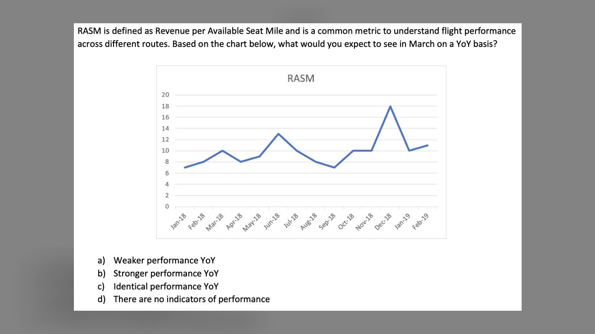
RASM is intensely seasonal—peak summer transatlantic unit revenue runs far above February. Sequential quarter-over-quarter comparisons are close to useless. Always compare like quarter to like quarter, year over year, and flag calendar effects like Easter shifting between March and April.
What is stage-length-adjusted RASM?
A comparability correction that normalizes RASM to a common average stage length using the square-root-of-stage-length convention. It removes the distortion from route mix, allowing fair comparison between a short-haul-heavy carrier and a long-haul carrier. Publish it in every deck where you compare across route maps.
How does cargo revenue affect RASM?
Cargo RASM is highly volatile and route-specific—long-haul widebody routes to Asia carry materially more belly cargo revenue than short transatlantic sectors. Including cargo in blended RASM can mask passenger yield deterioration. Treat cargo as a hedge line, not a growth line, and report passenger RASM separately.
What is the RASM bridge?
A four-line decomposition of the year-over-year RASM change: change from traffic (load factor), change from yield (fare per RPM), change from stage length, and change from mix or non-ticket revenue. Each line in cents per ASM sums to the reported delta. Never publish a RASM delta without this bridge.
Sources
- https://www.iata.org/en/publications/economics/
- https://www.bts.gov/topics/airlines-and-airports/airline-data
- https://www.transportation.gov/
- https://www.sec.gov/
- https://www.airlines.org/
- https://www.eurocontrol.int/
- https://www.icao.int/
- https://www.oag.com/
- https://www.cirium.com/
- https://www.flightglobal.com/
Related on PULSE
- [More airlines revenue per available seat mile performance indicators rankings and buying guides](/knowledge)
- [PULSE Tools and calculators](/tools)
- [Everything on PULSE RevOps](/)
 ikTop 10 best Industry KPIs options in 2027
 ikTop 10 Industry KPIs strategies for 2027
 ikWhat are the most common mistakes in Industry KPIs in 2027?
 ikHow do you get started with Industry KPIs in 2027?
 ikWhat should you know before investing in Industry KPIs in 2027?
 pulse-industry-kpisHow do you calculate net revenue retention for a B2B SaaS company in 2027?
 pulse-industry-kpisHow much does Industry KPIs cost in 2027?
 pulse-industry-kpisTop 10 Retail Shopping Center REIT Revenue KPIs in 2027
 pulse-industry-kpisTop 10 Food Truck Revenue KPIs in 2027
 pulse-industry-kpisTop 10 Wedding Venue Revenue KPIs in 2027