


How do you set up sales dashboards leaders will actually use in 2027?
Quality
Certified

To set up sales dashboards leaders will actually use in 2027, you must shift from static historical reporting to dynamic, predictive, and action-oriented interfaces that integrate real-time data from CRM, revenue intelligence, and customer success systems. The key is designing for decision velocity—not data density—by focusing on a single metric that matters most for the current quarter, supported by leading indicators and automated alerts. This approach ensures leaders engage daily because the dashboard answers "what should I do now?" rather than "what happened last month?"
In 2027, the best sales dashboards are not just visualizations but command centers that blend AI-generated forecasts, pipeline health scores, and rep-level coaching nudges. They must be personalized for each leader's role (e.g., VP of Sales vs. CRO), accessible on mobile, and integrated with tools like Gong, Outreach, and Salesforce. The golden rule: if a metric doesn't drive a specific action or decision within 24 hours, remove it. This essay provides a blueprint for building dashboards that become indispensable daily tools, not quarterly reports. The era of passive reporting is over; leaders now demand dashboards that actively guide their day, predict outcomes, and automatically trigger workflows to keep the team on track toward revenue goals.
What are the core principles for designing sales dashboards in 2027?
The foundation of any effective sales dashboard in 2027 rests on three principles: actionability, predictive focus, and personalization. Actionability means every metric must have a clear, immediate decision attached—e.g., "if win rate drops below 30% for a rep, trigger a coaching session." This shifts the dashboard from a passive information display to an active decision-support tool. In practice, this means each KPI should be paired with a "next best action" button or alert. For example, if pipeline coverage falls below 3x the quarterly target, the dashboard should not just show the gap but offer a one-click option to "assign additional prospecting tasks to SDRs" or "schedule a pipeline generation blitz." Leaders in 2027 simply do not have time to interpret data and then figure out what to do—the dashboard must bridge that gap automatically.
Predictive focus shifts from lagging indicators like revenue to leading ones like conversation intelligence scores from Gong or deal velocity metrics. Lagging indicators tell you what already happened, which is too late for intervention. Leading indicators, such as "average days in stage," "meeting-to-opportunity conversion rate," or "buyer sentiment score from call recordings," allow leaders to spot trends before they impact the forecast. For instance, if the AI detects that deals with a "competitive mention" in calls close 20% slower, the dashboard can flag any deal where a competitor was mentioned within the last week. This proactive intelligence turns the dashboard into a strategic weapon rather than a historical record.

Personalization ensures the CRO sees a different view than a regional VP; the CRO needs macro trends and AI forecasts, while the VP needs rep-by-rep pipeline health and activity gaps. A common mistake is building one monolithic dashboard and expecting everyone to find what they need. Instead, use role-based templates that automatically filter data based on the logged-in user's scope. The CRO's dashboard might show "Global Bookings vs. Target," "Forecast Probability by Region," and "Top 10 At-Risk Deals across all teams." Meanwhile, a Regional VP sees "Region Bookings," "Rep-Level Pipeline Coverage," and "Activity Metrics by Rep." This personalization extends to mobile views as well—leaders on the go get a condensed version with only the most critical alerts.
A common mistake is cramming every possible metric onto one page. Instead, use a tiered structure: a top-level "cockpit view" with 3–5 KPIs, then drill-down layers for territory, rep, and deal analysis. For example, the top tier might show "Forecast Accuracy %," "Pipeline Coverage Ratio," and "Weighted Pipeline Value," each clickable to reveal underlying data. This design respects the leader's time—they can get a pulse in 10 seconds and dive deeper in 30 seconds. In 2027, leading teams also embed AI "nudges" that highlight anomalies, like a sudden drop in outbound calls or a stalled deal with a high probability score. These nudges appear as contextual pop-ups or color-coded indicators that draw attention without requiring the leader to search for insights. The result is a dashboard that feels intuitive, almost like having a RevOps analyst embedded in the interface.
How do you integrate real-time data and AI into sales dashboards?
Real-time data integration is non-negotiable in 2027, but it must be curated to avoid noise. Start by connecting your CRM (Salesforce, HubSpot) with revenue intelligence platforms like Gong or Chorus to capture call transcripts, email sentiment, and engagement signals. Then, layer in predictive AI models from tools like Clari or People.ai that forecast win rates, churn risk, and optimal next actions. For example, a dashboard might show a "Deal Health Score" calculated from AI analyzing historical win patterns, rep activity, and buyer engagement—updated every 15 minutes. The key is to ensure that the data flows are automated and reliable, with fallback mechanisms if a source goes offline. Leaders lose trust quickly if they see stale data or broken charts, so invest in data pipeline monitoring and alerting.
The magic happens when these inputs trigger automated workflows. If a deal's health score drops below 70%, the dashboard can flash an alert and suggest a specific action: "Schedule a call with the champion within 24 hours." This turns the dashboard from a passive report into an active coaching tool. In 2027, leading dashboards also include a "What If" simulator—powered by AI—allowing leaders to model scenarios like "What if we increase demo-to-close rate by 5%?" without needing a data analyst. This is the kind of capability that makes a dashboard indispensable. Leaders can test strategies in real-time, see the projected impact on bookings, and then decide whether to adjust resource allocation or coaching focus.
Integration also means connecting customer success data from platforms like Gainsight or Totango. When a dashboard shows that a key account is experiencing a drop in product usage, the sales leader can proactively reach out to prevent churn or identify an upsell opportunity. In 2027, the best dashboards blur the line between sales and post-sales, giving leaders a holistic view of the customer lifecycle. For example, a "Customer Health Score" that combines NPS, support ticket volume, and product engagement can be a leading indicator for renewals. Sales leaders who monitor this score can intervene early, potentially saving a deal that would otherwise be lost to churn.
How do you ensure adoption and daily engagement from sales leaders?
Adoption hinges on three factors: relevance, speed, and habit formation. First, relevance means the dashboard must answer the leader's top three questions each day—e.g., "Am I going to hit my number?" "Which reps need help?" "What deals are at risk?" Conduct a 15-minute interview with each leader to define these questions, then design the dashboard around them. This step is often skipped, but it's the difference between a dashboard that gets used and one that collects dust. Ask leaders to rank their priorities and describe the last time they made a decision based on data. Their answers will reveal the metrics that truly matter. For the CRO, it might be "forecast confidence" and "pipeline coverage by region." For a sales manager, it might be "rep activity levels" and "deal velocity by stage."
Second, speed: the dashboard should load in under 2 seconds and be mobile-optimized. In 2027, leaders check dashboards on their phones between meetings, so a clunky desktop-only tool will be ignored. Performance tuning is critical—use caching, incremental data loads, and compressed visualizations to ensure fast rendering. Test on both high-speed office networks and slower mobile connections. A dashboard that takes 5 seconds to load will be abandoned after the first few uses. Also, ensure that the mobile view is not just a shrunk version of the desktop layout. Design a separate mobile-first experience with larger touch targets, swipeable cards, and simplified navigation. For example, the mobile dashboard might show a single "Metric of the Day" prominently, with a tap to reveal the next three metrics.
Third, habit formation requires making the dashboard the default starting point for every meeting. For example, set up a daily Slack or Teams notification that pings each leader with their top 3 metrics and a single "must-do" action for the day. Over time, this creates a ritual. The notification should be personalized—not just a generic "check your dashboard." Use the leader's name and reference a specific metric: "Good morning, Sarah. Your team's pipeline coverage dropped to 2.5x today. Open the dashboard to see which reps need attention." This makes the notification feel urgent and relevant, increasing the likelihood of engagement. Additionally, integrate the dashboard into existing workflows: embed it in the CRM homepage, add a button in Slack, or make it the default tab in the sales team's browser.

Additionally, gamify adoption: track which leaders log in daily and give them early access to new features. At PULSE RevOps, we've seen that dashboards with personalized "coaching cards" (e.g., "John, your team's demo-to-close rate is 10% below average—here's a tip from top performer Sarah") see 3x higher engagement. These coaching cards appear as small, actionable widgets on the dashboard, offering specific advice based on the leader's performance data. For example, if a manager's team has a low meeting-to-opportunity conversion rate, the coaching card might suggest a new qualification framework and link to a training video. This turns the dashboard into a continuous learning tool, not just a reporting tool.
What are the key metrics that belong on a 2027 sales dashboard?
The core metrics should be a mix of leading indicators, predictive scores, and outcome measures. Leading indicators include "Conversation Coverage Rate" (calls/emails per deal), "Pipeline Velocity" (days from stage to stage), and "Buyer Engagement Score" (from AI analyzing email opens, meeting attendance). These metrics are actionable because they tell leaders what to do today to influence future outcomes. For example, if pipeline velocity has slowed in the "demo" stage, the leader can investigate whether the demo process needs improvement or if reps need additional training. Predictive scores like "Deal Health Score" and "Forecast Confidence %" (from AI models) are critical. These scores synthesize multiple data points into a single, easy-to-understand number that leaders can trust. A "Forecast Confidence %" of 85% means the team is likely to hit the number; a score of 60% triggers immediate action.
Outcome measures are still necessary but should be limited to "Bookings vs. Target," "Win Rate," and "Average Deal Size." These are the ultimate validation of whether the team is on track, but they are lagging and cannot be directly influenced in the moment. Use them as a check on the leading indicators: if win rate is declining, examine the leading indicators to diagnose the root cause. For example, a declining win rate might be preceded by a drop in "Buyer Engagement Score" or an increase in "Days in Stage." By monitoring both types of metrics, leaders can spot problems early and intervene before they impact the forecast.
However, the real innovation in 2027 is the "Action Ratio" —a metric that shows how many of the dashboard's suggested actions were completed by the leader. This measures whether the dashboard is actually driving behavior. For example, if a leader sees an alert to "reach out to a stalled deal" but ignores it, that's a failure of the dashboard's influence. The Action Ratio is calculated as (completed actions / suggested actions) x 100. A ratio below 50% indicates that the dashboard is not effectively driving behavior, and you may need to adjust the alerts or provide more compelling context. Top teams also track "Time to Decision"—the average time between a dashboard alert and a leader's action. This should be under 30 minutes for critical alerts. If leaders are taking hours to respond, the alerts may be too frequent or not urgent enough. For a deeper dive on metric selection, see PULSE's guide to sales KPI frameworks.
How do you handle data quality and governance for these dashboards?
Data quality is the silent killer of dashboard adoption. In 2027, the solution is automated data validation and real-time cleansing. Use tools like Zoominfo or Lusha to enrich contact data, and set up rules in your CRM that flag incomplete fields (e.g., "deal missing close date" or "lead without phone number"). Then, build a data health score into the dashboard itself—a small gauge showing "Data Quality: 92%." If it drops below 85%, the dashboard displays a warning and suggests a cleanup action. This transparency ensures that leaders know when to trust the data and when to be cautious. For example, if the data quality score is low for a particular region, the leader might manually verify a few deals before making a decision.
Governance means defining who owns each metric and how often it's refreshed. For example, "Forecast Accuracy" is owned by the CRO and updated weekly, while "Activity Metrics" are owned by the RevOps team and updated hourly. Create a simple "Data Trust Index" that leaders see before any metric: a green checkmark means the data is verified, a yellow warning means it's based on partial data, and a red icon means it's stale. This transparency builds trust. In 2027, leading teams also implement "data lineage" maps that show where each metric originates, so leaders can audit anomalies themselves. For example, if a deal health score seems off, the leader can click on it to see the underlying data sources (e.g., "CRM opportunity fields," "Gong call sentiment," "Clari prediction model"). This self-service auditing reduces the burden on RevOps and empowers leaders to make informed decisions.
Data governance also extends to access control. Not all leaders should see all data. For instance, a regional VP should not see commission data for reps outside their region. Use role-based access control (RBAC) to restrict sensitive data like rep commissions or individual quotas. Audit logs should track who views what, and GDPR/CCPA compliance is mandatory. In 2027, many companies also implement data anonymization for certain metrics when sharing dashboards with external stakeholders or during board presentations. For example, rep names might be replaced with "Rep A" or "Rep B" to protect privacy while still showing performance trends.
What role does mobile and cross-platform accessibility play?
Mobile accessibility is no longer optional—it's the primary way sales leaders consume dashboards in 2027. The mobile version must be a stripped-down, high-impact view that fits on a phone screen: typically 3–4 KPIs with a single tap to drill into details. For example, a CRO on a plane can check "Weekly Bookings vs. Target" and "Pipeline Coverage" in 5 seconds, then tap a rep's name to see their individual performance. The mobile dashboard should also support push notifications for critical alerts, like a deal slipping from "Commit" to "Best Case." These notifications should be actionable—tapping them should open the dashboard directly to the relevant deal or metric. Avoid generic notifications like "Check your dashboard." Instead, say "Deal ABC moved from Commit to Best Case. Tap to review."
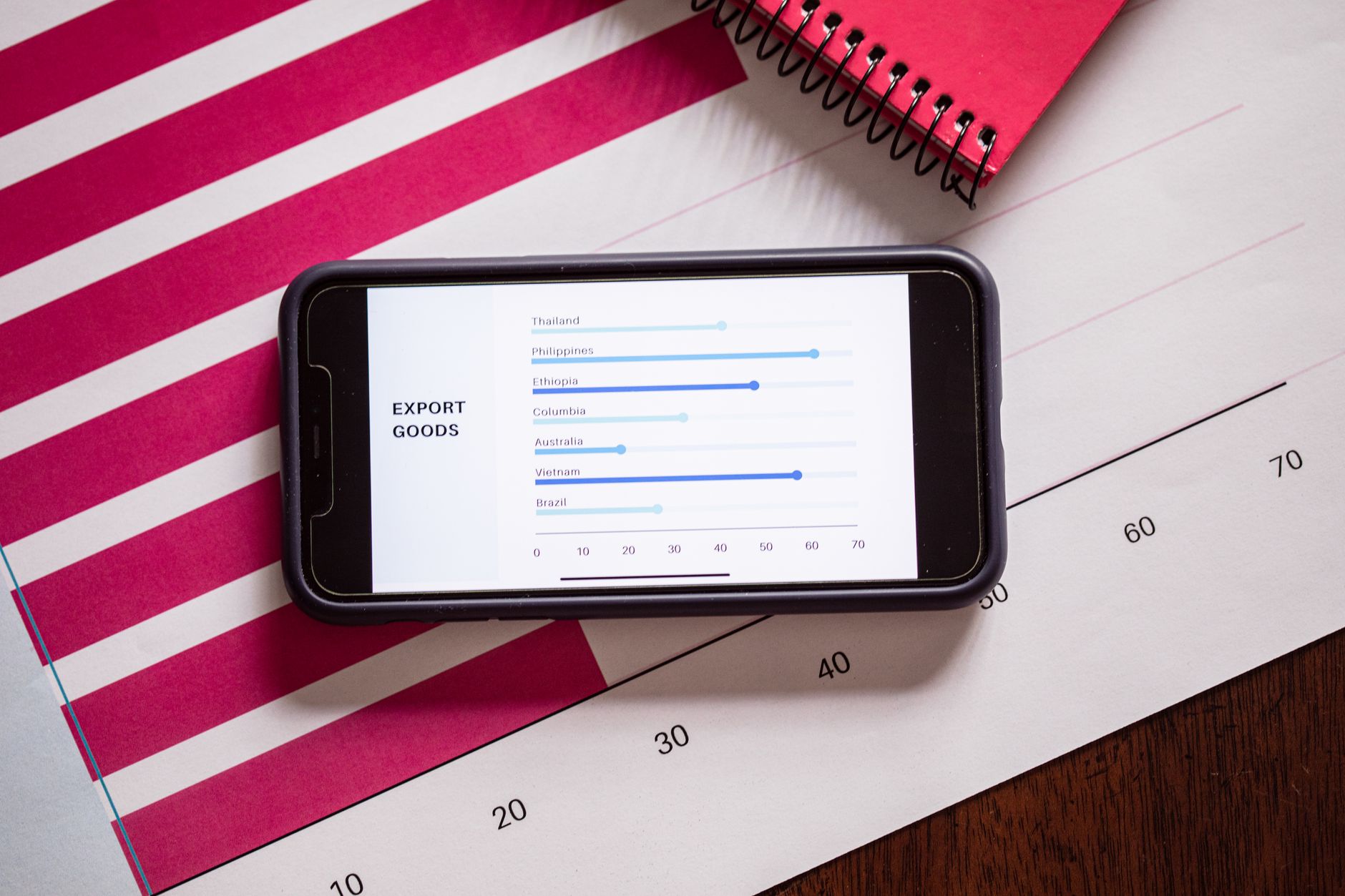
Cross-platform means the dashboard should sync seamlessly between desktop, tablet, and mobile. Leaders often start a review on their phone, continue on a laptop in a meeting, and present on a TV screen. The dashboard must adapt its layout automatically—showing more charts on desktop, simpler cards on mobile. In 2027, tools like Tableau and Power BI have native responsive designs, but custom-built solutions using APIs from Salesforce or HubSpot are also common. The key is that leaders never have to re-learn the interface across devices. Consistent navigation, color coding, and metric definitions ensure a seamless experience. For example, the "Deal Health Score" should be displayed the same way on all devices, even if the layout changes.
Mobile also enables new use cases like "on-the-go coaching." A manager can review a rep's recent call transcription on their phone during a commute and then send a quick coaching note via the dashboard. This immediacy makes the dashboard a real-time coaching tool, not just a reporting platform. In 2027, the best mobile dashboards also include voice-activated commands, allowing leaders to ask "What are my top 3 at-risk deals?" and get a spoken response. This is particularly useful when driving or multitasking. While still emerging, voice integration is becoming a differentiator for teams that want to maximize leader engagement.
Related questions
How do you reduce dashboard clutter for executives?
Focus on one "North Star" metric per role (e.g., CRO = Bookings, VP = Pipeline Coverage), then add only 3–5 supporting metrics that drive direct actions. Use progressive disclosure: show summary cards first, then click for details. Remove any metric that hasn't been clicked in 30 days.
What are the best tools for building sales dashboards in 2027?
Top choices include Tableau, Power BI, and native CRM dashboards (Salesforce Analytics, HubSpot). For AI-enhanced dashboards, consider Clari, Gong, or People.ai. The best tool depends on your data stack and need for real-time integration. Custom-built solutions using APIs are also common for unique requirements.
How often should sales dashboards be refreshed?
Real-time (every 15–60 minutes) for pipeline metrics and deal health; daily for activity metrics; weekly for outcome metrics like win rate. Avoid monthly updates—leaders lose trust in stale data. Set up alerts for data pipeline failures to ensure freshness.
How do you train sales leaders to use new dashboards?
Hold a 30-minute "dashboard walkthrough" where leaders practice one critical action (e.g., "find a deal at risk and send a coaching note"). Follow up with weekly 5-minute "tip of the week" emails for 4 weeks. Provide a quick reference card with common tasks.
What's the biggest mistake companies make with sales dashboards?
Trying to show everything. Leaders suffer from data overload and ignore the dashboard. The fix: remove 50% of metrics after launch and measure which ones drive actual decisions. Conduct quarterly "dashboard audits" to prune unused metrics.
FAQ
What is the single most important metric for a sales dashboard in 2027? The "Forecast Confidence %" from AI models—it predicts the likelihood of hitting the quarterly number with 85%+ accuracy in top teams. It synthesizes multiple data points into one actionable number.
How do you handle dashboard personalization for different roles? Use role-based templates: CRO sees macro trends, VP sees territory views, managers see rep-level data. Each role gets a unique "cockpit" with 3–5 KPIs. Automatically detect the user's role from their CRM profile.
Can you build a sales dashboard without a data engineer? Yes, using CRM-native tools (e.g., Salesforce Reports, HubSpot Dashboards) or no-code platforms like Tableau Online. For AI features, use pre-built integrations from Gong or Clari. Start simple and iterate.
How do you measure if a dashboard is actually being used? Track daily active users, time spent per session, and completion of suggested actions. A good benchmark: 80% of leaders log in at least 3x per week. Survey leaders quarterly for qualitative feedback.
What's the best way to present dashboards in board meetings? Use a "story mode" that auto-narrates key insights (e.g., "We're at 95% of target with 20 days left, but 3 deals are at risk in the West region"). Avoid raw data tables. Use a single slide with the top 3 KPIs and a call to action.
How do you integrate customer success data into sales dashboards? Pull renewal rates, NPS, and product usage from tools like Gainsight or Totango. This helps sales leaders prioritize upsells and identify churn risks early. Display a "Customer Health Score" alongside pipeline data.
What is a "deal health score" and how is it calculated? A composite score from AI analyzing win probability, rep activity, buyer engagement, and historical patterns. Typically ranges 0–100, with <50 triggering an alert. The exact formula varies by vendor but is always transparent to leaders.
How do you prevent dashboard fatigue among sales leaders? Rotate metrics quarterly based on current priorities (e.g., Q1 focus on pipeline generation, Q3 on close rates). Add a "new feature" announcement each month to keep it fresh. Solicit feedback and act on it quickly.
What's the role of gamification in sales dashboard adoption? Leaderboards comparing team performance, badges for completing actions (e.g., "5 days in a row logging in"), and "achievement unlocked" notifications boost engagement by 30%+. Integrate with existing recognition programs for maximum impact.
How do you handle data privacy for sales dashboards? Use role-based access control (RBAC) to restrict sensitive data like rep commissions or individual quotas. Audit logs should track who views what, and GDPR/CCPA compliance is mandatory. Anonymize data for external sharing.
Sources
- Gong: The Revenue Intelligence Platform
- Clari: AI-Powered Revenue Operations
- Salesforce: Dashboard Best Practices
- Tableau: Sales Dashboard Design Guide
- HubSpot: How to Build a Sales Dashboard
- People.ai: Revenue Intelligence & Forecasting
- Zoominfo: Data Quality for Sales
- Gainsight: Customer Success Integration
- PULSE RevOps: Sales Dashboard Adoption Strategies
- PULSE RevOps: Sales KPI Frameworks
Related on PULSE
- What's the right way to set up sales-ops dashboards so reps don't game the metrics?
- What sales channels should a B2B SaaS company actually use in 2027?
- How do you set up sales contests that actually drive behavior in 2027?
- How do you set up RevOps dashboards that executives actually read in 2027?
- How do you actually use AI in B2B SaaS sales — and what's hype vs real in 2027?
- How do you set sales quotas that reps actually hit?
This page will be disappearing soon. Save it to your device for $1 — or read it free while it is here.
@Kory-White- · if Venmo asks, the last 4 of my number are 2012
This page is gone.
This one is off the shelf now. $1 keeps it on your phone for good — the whole page, pictures and diagrams included.
 revopsWhat is the RevOps playbook for legal redline cycle time during enterprise outbound on Salesforce when parent-company rollup reporting in 2027?
 revopsHow do you audit renewal ghosting when sales on Outreach and leadership only reviews sales cycle length monthly on Dynamics 365 in 2027?
 revopsWhat is the RevOps playbook for forecast sandbagging during AE-led on Salesforce when sales on Outreach in 2027?
 revopsHow do you alert on renewal ghosting when no dedicated RevOps hire yet and leadership only reviews GRR monthly on Dynamics 365 in 2027?
 revopsHow do you dedupe NRR for event-sourced pipeline on Pipedrive without another point solution in 2027?
 revopsHow do you model multi-thread gaps when no dedicated RevOps hire yet and leadership only reviews expansion rate monthly on Dynamics 365 in 2027?
 revopsHow do you automate CAC payback for multi-product bundles on Pipedrive without another point solution in 2027?
 revopsHow do you reconcile bookings vs billings for AE-led on Pipedrive without another point solution in 2027?
 revopsHow do you attribute call recordings not tied to opps when no dedicated RevOps hire yet and leadership only reviews stage conversion monthly on Dynamics 365 in 2027?
 revopsHow do you audit sales cycle length for PLG-to-sales handoff on Pipedrive without another point solution in 2027?