


How to Wear Slate Blue vs. Charcoal Gray in 2027
Quality
Certified
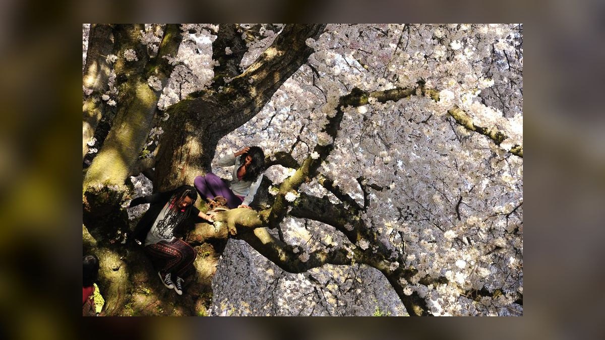
Wear slate blue when you want approachable authority — it reads warmer on camera and pairs with brown leather. Wear charcoal gray when the room demands neutrality, formality, or you need one suit to cover funerals, board meetings, and evening events. Slate blue is the daily driver; charcoal is the closer.
The Tuesday morning that forces the decision
Picture the closet at 6:40 a.m. Two suits hang there. One is slate blue — a mid-tone, slightly muted blue with gray sitting underneath it, the color of wet stone under an overcast sky. The other is charcoal gray, dark enough that in low light it can pass for black but reveals itself as gray the moment sun hits it. The day ahead has three parts: a client kickoff at 9, a photographed panel at 1, and a dinner at 7 where the guest list includes someone's father-in-law who still thinks jeans are radical.
Most people flip a mental coin. That's the mistake. These two colors are not interchangeable neutrals — they occupy different social registers and behave differently under different light sources, and once you understand why, the choice stops being a coin flip and starts being a read of the room.
Slate blue is a *warm-adjacent* neutral. It contains enough chroma to register as a color rather than an absence of one. People read it as chosen. That's the whole advantage: a slate blue suit signals that you thought about what you put on, without shouting. It also flatters more skin tones than gray does, because the blue undertone pushes against sallowness rather than amplifying it. On camera — and by 2027, assume you're on camera constantly, in hybrid meeting rooms with ceiling-mounted wide-angle lenses and in every conference photo — slate blue holds its shape. It doesn't collapse into a silhouette.
Charcoal gray is the opposite proposition. It is deliberately quiet. Charcoal doesn't want to be noticed; it wants to make everything near your face — your shirt, your tie, your expression — the thing that gets noticed. That's its power and its limitation. In a funeral, a deposition, a board vote, a first meeting with someone senior who hasn't decided about you yet, charcoal is correct precisely because it makes no argument. It also handles the widest range of occasions of any single suit color, which is why "buy charcoal first" is the oldest advice in menswear and still, mostly, right.

The practical resolution for that Tuesday: slate blue for the kickoff and the panel, because both reward warmth and photograph well. Charcoal if the dinner were a formal one — but for a dinner that's merely stiff, slate blue with a white shirt and a darker tie carries it fine. One suit, three settings. That's the case for slate blue as the daily driver.
Now broaden it slightly, because the same logic runs past suits. The choice between a warm-neutral and a cool-neutral shows up in a knit polo under a jacket, in a wool overcoat, in a laptop bag, in the frame of your glasses. Any time you're picking between "a color that reads as a decision" and "a color that reads as a default," you're running this same calculation. Slate blue is the decision. Charcoal is the default. Most wardrobes need both, and most people over-index on one.
How the two colors actually behave under light and against skin
Color in clothing is not a fixed property. It is a negotiation between the dye, the fiber, the weave, and whatever photons are hitting it. Understanding that negotiation is what separates people who own good clothes from people who look good in them.

Start with the fiber. Wool takes dye deeply and scatters light from a slightly irregular surface, so a slate blue worsted looks softer and more dimensional than the same color in a flat synthetic. A high-twist wool in slate blue will appear a shade lighter and drier; a flannel in the same dye lot will look darker, warmer, and more saturated because the brushed nap traps light. This is why the "same" slate blue can look like two different colors across two garments — and why buying a jacket and trousers separately in the same nominal shade almost always produces a mismatch you'll see in daylight even though the store's lighting hid it.
Charcoal has a related but distinct behavior. Gray is, technically, a desaturated neutral, which means it has almost nothing to hold onto under colored light. Under warm incandescent or the amber LED lighting most restaurants use, charcoal drifts brown. Under the cool white of an office ceiling, it drifts blue. Under the mixed lighting of a hotel ballroom — some warm sconces, some cool downlights — it can look mottled and slightly dead. Slate blue, having actual chroma, resists this drift. It shifts, but it stays recognizably itself.
Against skin, the pattern is fairly consistent. Slate blue tends to work across a very wide range of complexions because blue is the near-universal flattering hue in menswear and womenswear alike — it creates contrast against warm skin and harmony against cool skin without ever competing. Charcoal is more conditional. On very pale, cool-toned skin, deep charcoal can look severe, draining color from the face; the fix is a warmer shirt (ecru, light blue, soft pink) rather than stark white. On deeper skin tones, charcoal often looks superb — the tonal closeness reads as intentional and sophisticated rather than washing anything out.
Hair color plays in too, and people forget it. Silver or white hair against charcoal creates a very high-contrast, formal, slightly severe effect that some people love and others find aging. The same hair against slate blue is softened considerably. If you've gone gray and noticed your dark suits suddenly feel heavier than they used to, that's what you're seeing — and slate blue is the standard fix.

There's one more variable worth naming: the camera itself. Phone cameras and video-call software both apply aggressive automatic white balance and contrast curves. Charcoal frequently clips to near-black in these pipelines, which flattens you into a dark rectangle with a head on top. Slate blue survives the processing because the algorithm has chroma information to preserve. If a meaningful share of your professional presence happens through a lens — and in 2027 it does — that is not a small consideration.
What to wear with each: shirts, ties, shoes, and the numbers that matter
Let's get concrete, because "wear it with a nice shirt" helps nobody.
Slate blue pairings. The single best shirt is white — always available, always correct, maximum contrast. After that, pale blue works but risks a monochrome-blue effect if the shades are close; keep at least three or four steps of value separation between suit and shirt so they don't blur together. Ecru and light cream are underused and excellent: the warmth plays against the blue's coolness and reads as considered rather than corporate. Soft pink works on slate blue better than it does on charcoal, because the blue gives it something to contrast with.
For ties: burgundy is the workhorse. Forest and olive green are strong and underused. Brown — genuine chocolate or tobacco brown — is the move if you want to look like you know what you're doing; brown and blue is one of the most reliable combinations in menswear and almost nobody uses it. Avoid a tie that is the same blue family as the suit unless you're deliberately going tonal, and if you are, push the tie considerably darker (navy) so there's clear separation.

Shoes with slate blue: brown, in almost every case. Mid-brown, dark brown, oxblood, tan in summer. Black shoes with slate blue is not wrong but it's a harder, more formal look that costs you the color's main advantage. Belt matches shoes. Watch strap ideally matches too, or goes to steel bracelet.
Charcoal pairings. White shirt, always the default and hard to beat. Pale blue is the second. Charcoal is less forgiving of colored shirts than blue is — pink can look washed and thin against it, and any shirt with a strong pattern will fight the suit's neutrality without gaining anything. Where charcoal shines is in the tie: because the suit is a blank canvas, a tie in a strong color reads as much bolder than it would on blue. Deep red, emerald, gold, a real pattern — charcoal supports all of it.
Shoes with charcoal: black, primarily. Dark brown works and looks deliberately relaxed, but if the occasion is formal enough to have called for charcoal in the first place, black is the safer read. Oxblood is a good middle path.
Numbers worth internalizing. Suit weight is measured in grams per square meter or ounces per yard, and it drives whether a color works seasonally. A 250–280 gsm (roughly 8–9 oz) wool is a genuine warm-weather cloth; 280–340 gsm (9–11 oz) is the true year-round range and where most good suits live; 340–400+ gsm (11–13+ oz) is winter weight with real drape. Slate blue in a light, high-twist summer cloth looks bright and airy; the same color in heavy flannel looks like a completely different, moodier garment. Charcoal in tropical wool is a strong summer formal option specifically because the open weave keeps the dark color from becoming an oven.
Super numbers — Super 100s, 120s, 150s — measure fiber fineness, not quality. Higher is finer and softer but also more fragile and more prone to shine at the elbows and seat. For a suit you'll actually wear weekly, Super 100s to 120s is the sweet spot. Super 150s and above is for occasional wear. This matters more for charcoal than slate blue, because shine shows dramatically on dark gray and is much less visible on a mid-tone blue. If you wear one suit hard, that's an argument for slate blue.

Cost-per-wear is the honest metric. A suit worn once a week for three years gets roughly 150 wears; divide the purchase price plus dry cleaning by that. If you're buying one suit, charcoal spreads across more occasions and wins on pure versatility. If you're buying a second, slate blue is the correct second, and it will likely out-wear the first because you'll reach for it more.
Care intervals. Dry clean a suit far less than instinct suggests — every 15 to 20 wears, or when it's genuinely soiled or smells. Between cleanings, brush it with a clothes brush after each wear and hang it on a wide wooden hanger for 24 hours to let the wool recover. Steam removes most wrinkles. Over-cleaning is the fastest way to kill a suit, and it hits dark charcoal hardest because the solvents accelerate the shine problem.
Trade-offs, alternatives, and the colors sitting on either side
Neither color is a complete answer, and the honest framing is a trade-off table rather than a winner.
Charcoal's cost is monotony. If charcoal is your only suit and you wear it three times a week, everyone knows it, and the effect is less "consistent" than "he has one suit." It also carries funeral associations strongly enough that in some contexts a charcoal suit with a dark tie will read as mourning regardless of your intent. And in creative or casual-forward industries, charcoal can read as overdressed or slightly out of step — a costume of seriousness in a room that isn't asking for it.
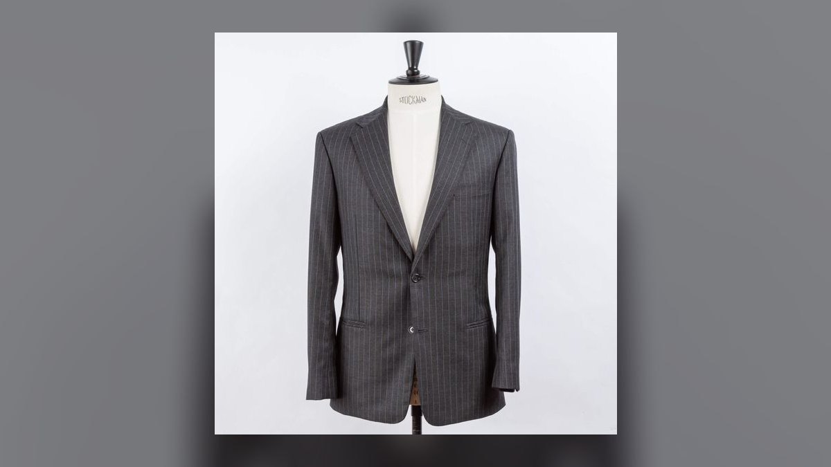
Slate blue's cost is specificity. It is a *chosen* color, which means it can be wrong. In genuinely formal or somber settings it's underdressed. Its dye is also harder to match across garments and harder to replace — if you tear a slate blue trouser, finding a matching pair is a real problem in a way that charcoal isn't. And a badly-chosen slate blue, one that leans too bright or too purple, ages poorly and looks cheap fast.
The alternatives on either side are worth knowing, because they solve specific gaps:
Navy sits adjacent to slate blue but darker and more formal. If you want blue's flattering effect with more of charcoal's authority, navy is the answer, and it is probably the single most useful suit color in existence. Slate blue is what you buy *after* navy, not instead of it.
Mid-gray (sometimes called silver gray or business gray) is charcoal's lighter cousin. It's noticeably less formal, more spring-and-summer, and it photographs better than charcoal because it doesn't clip to black. If your objection to charcoal is that it's heavy, mid-gray solves that while keeping gray's neutrality.
Brown — genuine tobacco or chocolate brown — has quietly returned as a serious option and reads as confident and slightly unconventional. It occupies roughly the same social register as slate blue: chosen, warm, not formal.
Greenish-gray and olive are further out but real. They sit near slate blue in the "warm neutral with chroma" category.
There's a sequencing argument buried in this. If you're building from zero, the order that maximizes coverage per dollar is: navy first, charcoal second, slate blue third, then mid-gray or brown fourth. That order front-loads formality and versatility, then adds warmth and variety. Reversing it — buying the interesting color first — leaves you with a wardrobe full of options and nothing to wear to a funeral.
The same trade-off runs through separates. A slate blue sport coat is one of the most useful odd jackets you can own because it pairs with gray trousers, cream trousers, and dark denim. A charcoal sport coat is much harder to place — gray jackets want gray-adjacent trousers, and the combinations get muddy fast. If you're buying a jacket rather than a suit, the calculus flips hard toward slate blue.
Where people get this wrong
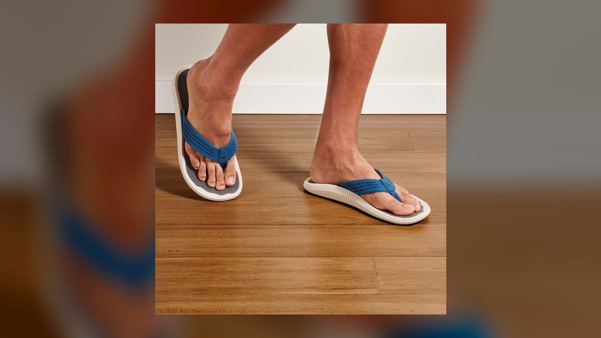
Matching instead of coordinating. The most common failure is treating charcoal as a color to match rather than a background to build on. Charcoal suit, charcoal tie, charcoal socks — it reads as a uniform and drains the outfit of any life. Charcoal's job is to sit back; give it something to sit behind.
Mismatched blues. Wearing slate blue with a navy shirt or a slate-adjacent tie produces a blur where the eye can't find an edge. Blue-on-blue works only with strong value separation — pale shirt against mid suit, or mid shirt against dark tie. Two mid-tones next to each other is the failure mode.
Buying jacket and trousers on different days. Dye lots drift. A slate blue jacket from one production run and trousers from another will not match under daylight even if they matched under store lighting. If it's a suit, buy it as a suit. If you need an extra pair of trousers, buy them at the same time.
Ignoring the shoe constraint. People buy slate blue and then discover their only good shoes are black. The suit then never gets worn, or gets worn in a compromised combination. Check your shoes before you buy the suit — a slate blue suit implicitly requires brown shoes to reach its best form.
Over-dry-cleaning charcoal. Dark gray shows shine, and shine is mostly caused by fiber flattening from heat, pressing, and solvent exposure. Brush and steam; clean rarely. A charcoal suit cleaned every three wears will look tired within a year.

Choosing for the room you're in, not the room you're going to. The 9 a.m. meeting is not the whole day. If your evening has a dress code, that constrains the morning. Charcoal is the answer when the day has a wide range; slate blue is the answer when the day is coherent.
Treating "slate blue" as one color. It isn't. It spans from a genuinely gray-heavy blue that's nearly a blue-gray, to a brighter, more saturated version that edges toward periwinkle. The gray-heavy end is far more versatile and far more professional; the saturated end is a fashion color with a short shelf life. When shopping, take it to a window. Store lighting flatters saturation, and daylight tells the truth.
Assuming the rules are fixed. Dress codes have been loosening for a decade and the trajectory continues. In 2027, the number of rooms that genuinely require a charcoal suit is smaller than it was, and the number of rooms where a slate blue suit with no tie is exactly right is larger. Read the actual room rather than the room you were trained on — but keep one charcoal suit, because the rooms that require it still exist and they're always the important ones.
Related questions
Can I wear brown shoes with a charcoal gray suit?
Yes, and dark brown or oxblood looks deliberately relaxed. But charcoal is usually chosen for formality, and black shoes match that intent. Use brown when you're dressing charcoal down; use black when the occasion is the reason you picked charcoal.
Is slate blue the same as navy?
No. Navy is much darker and more formal — it's a near-black blue. Slate blue is a mid-tone with visible gray underneath. Navy substitutes for charcoal in formality; slate blue does not. Own navy first if you can only own one blue.
Which color photographs better?

Slate blue, clearly. Cameras and video software apply automatic contrast that clips charcoal toward flat black, erasing detail. Slate blue's chroma survives that processing, so it holds shape and dimension on screen and in conference photos.
Can slate blue work as separates?
Extremely well. A slate blue sport coat pairs with gray flannel trousers, cream chinos, and dark denim. It's one of the most useful odd jackets you can own — significantly more versatile as a separate than a charcoal jacket, which is hard to pair.
What if I can only buy one suit?
Charcoal gray, or navy. Both cover funerals, weddings, interviews, and daily work. Slate blue is the correct *second* suit — it's the one you'll reach for most once the formal base is covered.
FAQ
How do I tell slate blue from blue-gray or steel blue when shopping?
Take the garment to natural light — a window or the doorway. Store lighting is tuned to make color pop and will exaggerate saturation. In daylight, slate blue reads as blue with gray visibly underneath it: muted, slightly dusty, never bright. If it looks vivid or leans purple in daylight, it's a fashion blue, not slate, and it will date faster.
Does charcoal really look black in low light?

Often, yes. Deep charcoal in dim restaurant or evening lighting can pass for black at a glance, which is part of why it's so versatile. The tell is a hard light source — sunlight, a camera flash, a spotlight — which reveals the gray immediately. This is also why charcoal is not a substitute for black tie: the moment there's real light, the difference is obvious against actual black.
What shirt color is most flattering with charcoal for pale skin?
Move away from stark white toward warmth. Ecru, light cream, pale blue, and soft pink all put a warmer tone next to the face and counteract charcoal's draining effect. Stark white against charcoal against pale skin creates a very high-contrast, slightly severe look. If you want white, choose a softer off-white rather than optic white.
Can I wear slate blue to a funeral?
Generally no. Funerals call for charcoal, navy, or black. Slate blue reads as a chosen, warm color, which is the opposite of what the setting asks for. If slate blue is genuinely all you have, pair it with a white shirt, a black or very dark tie, and black shoes to push it as somber as it will go — but charcoal is the right tool.
How often should I dry clean either suit?
Every 15 to 20 wears, or when actually soiled. Between cleanings, brush the wool with a clothes brush and hang the suit on a wide wooden hanger for at least 24 hours so the fibers recover. Steam out wrinkles rather than pressing them. Over-cleaning flattens the wool and creates shine, and that damage shows far more dramatically on charcoal than on slate blue.
Is slate blue a passing trend?
The gray-heavy version is not — it sits in the same durable family as navy and mid-gray and has been in rotation for decades under various names. The brighter, more saturated end of the range is more trend-exposed and will look dated sooner. Buy the muted version and it stays wearable indefinitely.
Sources
- https://www.permanentstyle.com/ — long-running menswear resource covering cloth weight, color, and tailoring construction
- https://www.gentlemansgazette.com/ — detailed guides on suit colors, shirt-and-tie pairing, and formality levels
- https://www.esquire.com/style/ — mainstream coverage of suiting, color trends, and dress codes
- https://www.gq.com/style — style guidance on suits, separates, and shoe pairing
- https://www.woolmark.com/ — Woolmark Company technical resources on wool fiber, micron counts, and fabric weight
- https://www.artofmanliness.com/style/ — practical primers on suit color selection and garment care
- https://www.britannica.com/topic/dress-clothing — background on dress codes and the history of formal clothing
- https://www.si.edu/ — Smithsonian collections and articles on textile and dress history
Related on PULSE
- How to Build a Five-Suit Rotation That Covers Every Occasion
- Navy vs. Black: Which Suit Actually Belongs in Your Closet First
- Fabric Weight Explained — GSM, Ounces, and Year-Round Wool
- Brown Shoes, Black Shoes: The Pairing Rules That Still Hold
- How to Care for a Wool Suit Without Destroying It
- Sport Coat vs. Suit Jacket: Why One Works as a Separate and One Doesn't
This page will be disappearing soon. Save it to your device for $1 — or read it free while it is here.
@Kory-White- · if Venmo asks, the last 4 of my number are 2012
This page is gone.
This one is off the shelf now. $1 keeps it on your phone for good — the whole page, pictures and diagrams included.
 pulse-styleHow to Style a Turtleneck for a Theater Show in 2027
 pulse-styleTop 10 Outfits for a Trip to Iceland in 2027
 pulse-styleWhat to Wear as a Maid of Honor to a Courthouse Wedding in 2027
 pulse-styleTop 10 Cobalt Blue Outfits for Winter in 2027
 pulse-styleWhat to Wear to a Mountain Getaway in 2027
 pulse-styleTop 10 Outfits for a Hiking Trip in 2027
 pulse-styleWhat to Wear on a Foggy Morning in 2027
 pulse-styleTop 10 Camel Outfits for Fall in 2027
 pulse-styleHow to Wear Terracotta with Wide-Leg Pants in 2027
 pulse-styleTop 10 Outfits for Work in the Summer in 2027