
Cream or Ivory: Which Is Safer to Wear as a Wedding Guest in 2027
 Curated byKory White · Fractional CRO · Maryland
 PULSEKNOWLEDGE LIBRARY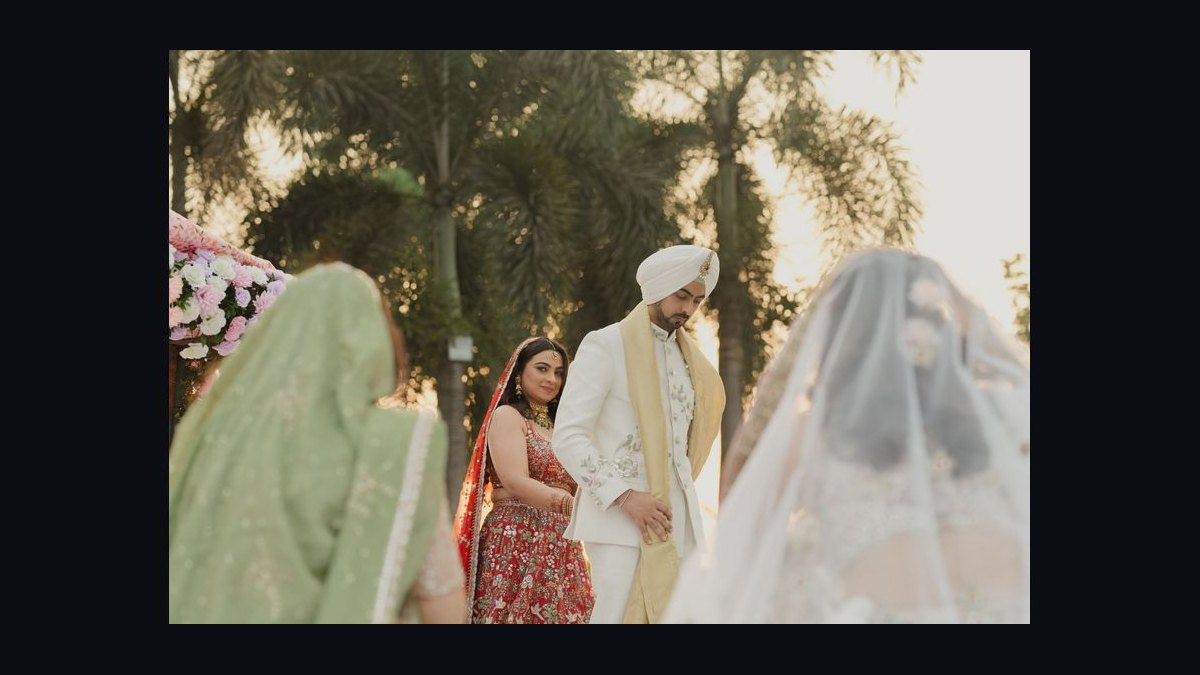
Ivory is the safer choice for a wedding guest in 2027. Cream sits close enough to white that, under bright or backlit conditions, it can read as bridal in photos and in person. Ivory carries a warmer, more clearly non-white cast, so it reads as a guest colour. Check the dress code first.
The barn, the backlight, and the guest in cream
Imagine a late-September 2027 wedding in a converted barn. The walls are whitewashed, and the entire west wall is glass. The ceremony is scheduled for 4:30 p.m., which means the final stretch of golden-hour light comes straight through those windows and lands on the guest seating.
A guest arrives in a cream silk-blend midi dress. She checked the invitation, which said "cocktail attire," and she reasoned that cream is not white. In the parking lot, in flat shade, the dress looks like a warm beige. It reads as a neutral. She feels fine about it.
Then she walks inside and sits down in the third row, directly in the path of that window light. The fabric is silk-blend, which means it has a slight sheen. Backlit, the sheen turns the cream into something much closer to white than it looked outside. In the photographer's frame, positioned at the front of the aisle shooting back toward the guests, her dress is the brightest object in the row. It is not that she looks like the bride. It is that she looks like she is trying to.
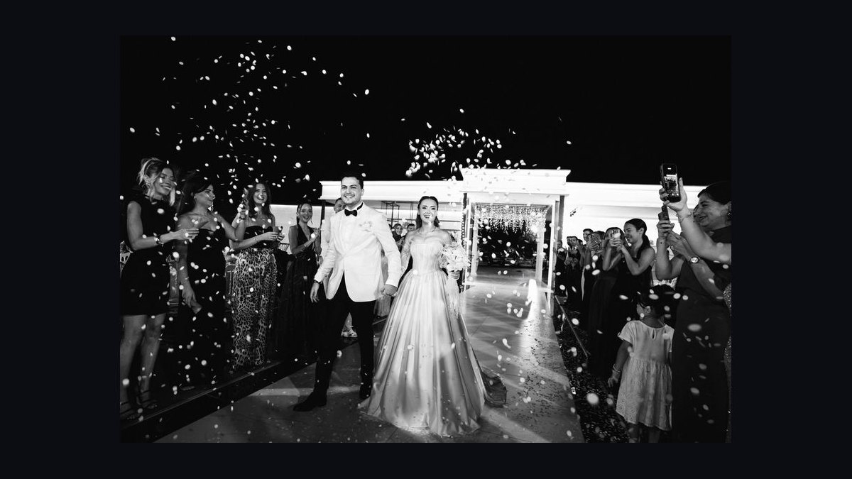
Nobody says a word. That is the whole problem with this category of mistake. Wedding guest dress codes are mostly enforced by ambient social pressure rather than explicit correction, and ambient pressure does not activate for a colour that is merely ambiguous. The guest never learns. The photos are permanent anyway.
This scenario is not exotic. It is the single most common version of the cream-versus-ivory problem, and it is a lighting problem as much as a colour problem. The same dress in a dim hotel ballroom with warm tungsten light would have read as beige all night. The same dress at a noon ceremony outdoors would have read as near-white from twenty feet. The variable that decides whether a guest is "safe" is not the name on the fabric swatch. It is the interaction between the fabric's base tone, its finish, and the light it will actually sit in.
Which is why the useful answer to "cream or ivory" is not a single word. It is a decision procedure, and it starts with the dress code and the venue rather than with the colour name.

How colour actually reads in a wedding photograph
The mechanism that makes cream risky and ivory comparatively safe is worth understanding, because it explains why the two colours behave so differently despite sitting next to each other on a paint chip.
Start with base tone. White is the reference point. Cream is typically a yellow-white: it has a small amount of yellow and often a touch of orange in its base, which pulls it toward butter or vanilla. Ivory is also a yellow-white, but it usually carries more warmth and a slight brown or grey undertone, which pulls it toward parchment or old paper. On a swatch, the difference can be almost invisible. In context, the difference is everything, because the eye judges colour relative to its surroundings rather than in absolute terms.
That is the second mechanism: simultaneous contrast. The human visual system constantly recalibrates. A cream dress seen against a dark navy suit reads as light beige. The same cream dress seen against a white tablecloth, white napkins, white floral arrangements, and a white aisle runner reads as white. The dress has not changed. The reference frame has. This is why guests who "tested" their dress at home in a bedroom mirror get surprised at the venue: bedrooms are full of warm wood and beige walls, which flatter cream, while reception halls are full of white linen, which does not.
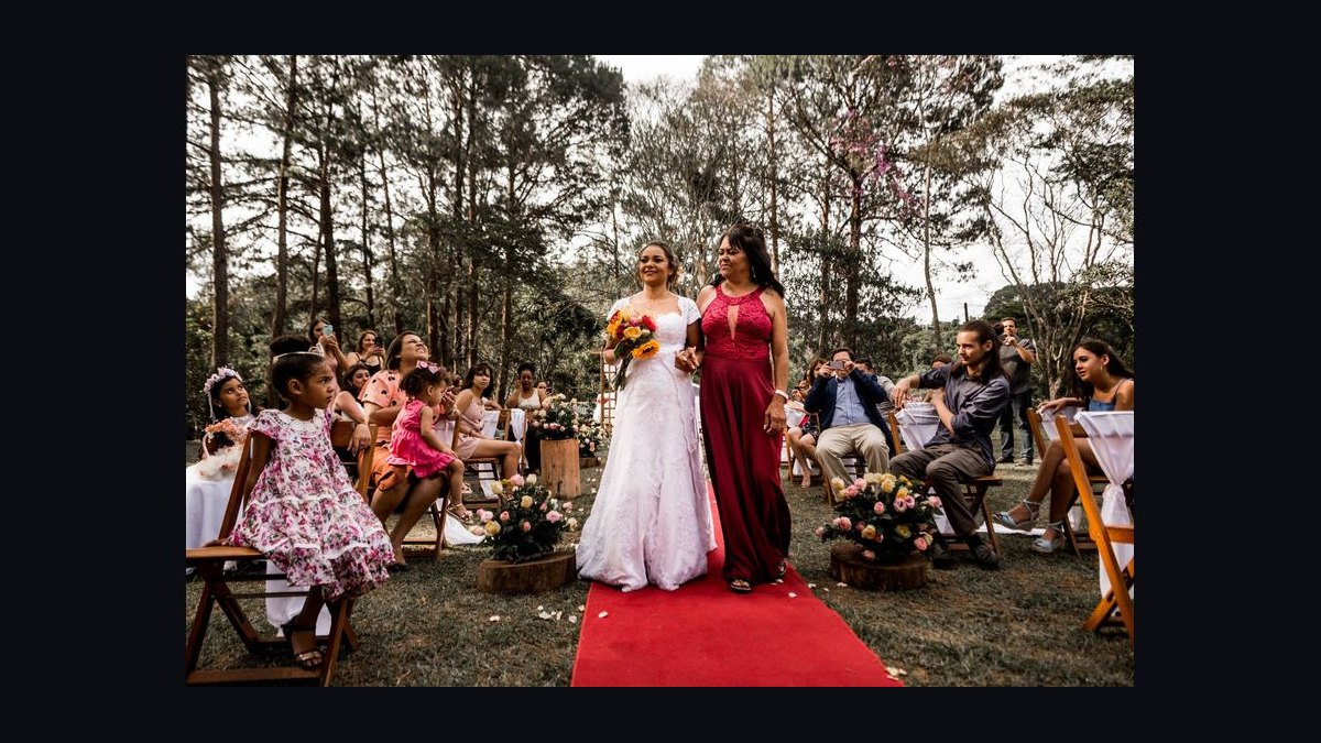
Third mechanism: fabric finish and specular highlight. Matte fabrics — crepe, matte jersey, heavy cotton, wool suiting — scatter light diffusely. Their apparent colour stays close to their base tone. Fabrics with sheen — silk, satin, charmeuse, many silk blends, anything with a satin weave — produce specular highlights, meaning bright spots where light reflects directly off the fibre. Those highlights are essentially white regardless of the base colour, because you are seeing the light source, not the pigment. A cream satin dress in direct light therefore contains literal patches of white. A cream matte crepe dress in the same light contains none.
Fourth mechanism: exposure behaviour in photography. Camera sensors and film both respond to luminance, and the wedding photographer is metering for the bride, who is almost certainly wearing the brightest thing in the room. The exposure is set so that the bridal gown retains detail rather than blowing out. Anything else in the frame that is nearly as bright will also sit high on the curve. A cream dress that is 88% as bright as the bridal white will, after metering and processing, look very close to it. An ivory dress that is 78% as bright will not.
Put those four together and the practical rule falls out. The riskiness of a light neutral dress is a function of (base tone closeness to white) × (sheen) × (brightness of surroundings) × (light intensity and direction). Cream scores high on the first and often high on the second. Ivory scores lower on the first and, if chosen matte, low on the second. That is the entire reason ivory is the safer pick.
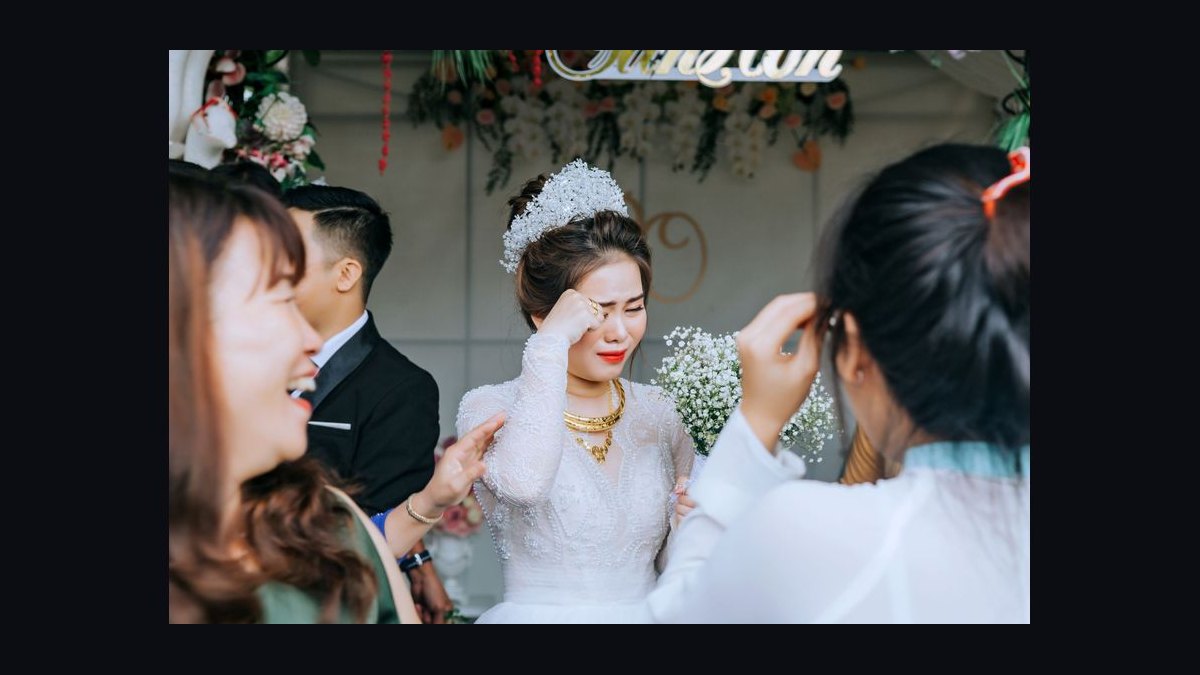
The flowchart is deliberately conservative at the top. Dress code overrides colour analysis every time. If an invitation says white or ivory is reserved for the bride, or if it specifies an all-white or black-and-white palette, the question of cream versus ivory becomes moot — you wear neither, and you pick from the palette the couple actually asked for.
What the numbers look like in practice
Colour specification is where this conversation usually goes vague, so it helps to have real reference points. In standard sRGB terms, pure white sits at roughly 255, 255, 255. Common off-white values used in design work sit in the 245–250 range on each channel. Ivory is frequently specified around 255, 255, 240 — a very light yellow with a hint of warmth. Cream is commonly specified around 255, 253, 208, and in many commercial palettes it lands closer to 245, 240, 200.
Read those numbers side by side and the pattern is clear. Ivory and white differ by roughly 15 points on the blue channel and almost nothing on red and green. Cream and white differ by 40 to 55 points on blue and often 10 to 15 on green. In other words, ivory is a whisper away from white in hue but stays warm; cream is a more saturated yellow that, under bright light, still photographs lighter than it looks.
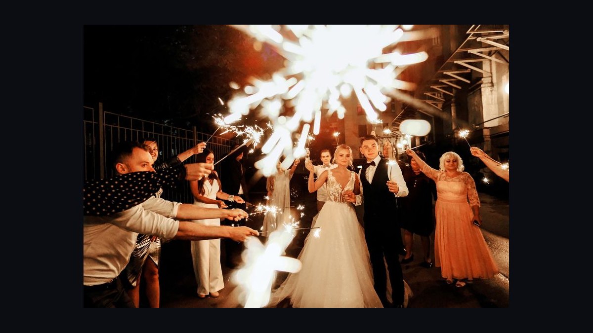
That gap matters less than the lighting does, though. Practical brightness ranges explain why. In a dimly lit evening ballroom, ambient light might sit in the 50–150 lux range, and a cream dress under that light will appear several stops darker than a white gown, reading clearly as beige or champagne. Outdoors at midday, direct sun can exceed 100,000 lux, and in that light the same cream fabric reflects so much light that it clips toward white in the highlights. A west-facing window at 4:30 p.m. in late September sits somewhere in between but is highly directional, which is why backlit sheen is such a specific hazard.
Then there is the metering gap. Wedding photographers typically expose so that a white gown with detail sits around 85–95% luminance rather than clipping at 100%. A cream dress that measures 90% of the bridal gown's luminance will, after that exposure decision, land within a few percent of the gown on screen. An ivory dress at 78–82% will not. This is not a matter of opinion; it is arithmetic on the exposure curve.
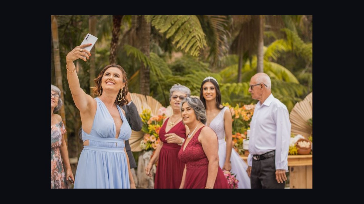
Distance and field of view also matter more than people expect. A guest standing twenty feet from the camera occupies a small fraction of the frame, and small bright areas are read by the eye as "white" more readily than large ones are. This cuts both ways: a cream dress far from the camera in a wide aisle shot is more likely to be misread as white than the same dress in a close portrait. It also means that in the one photograph where the guest is prominent — a group shot, a candid with the couple — the risk is highest.
Finally, consider the guest list itself. At a wedding of 120 people, somewhere between 8 and 20 guests will be wearing some form of light neutral: blush, champagne, sand, oyster, greige, taupe, stone. Cream and ivory are simply two points on that spectrum. The reason they attract attention is not that they are the only light colours present. It is that they are the two that sit closest to the one colour the couple asked everyone to leave alone.
Where ivory stops being safe, and what else to wear instead
Ivory is the safer of the two, but "safer" is not "always fine." There are three situations where ivory becomes a problem, and each has a workaround.
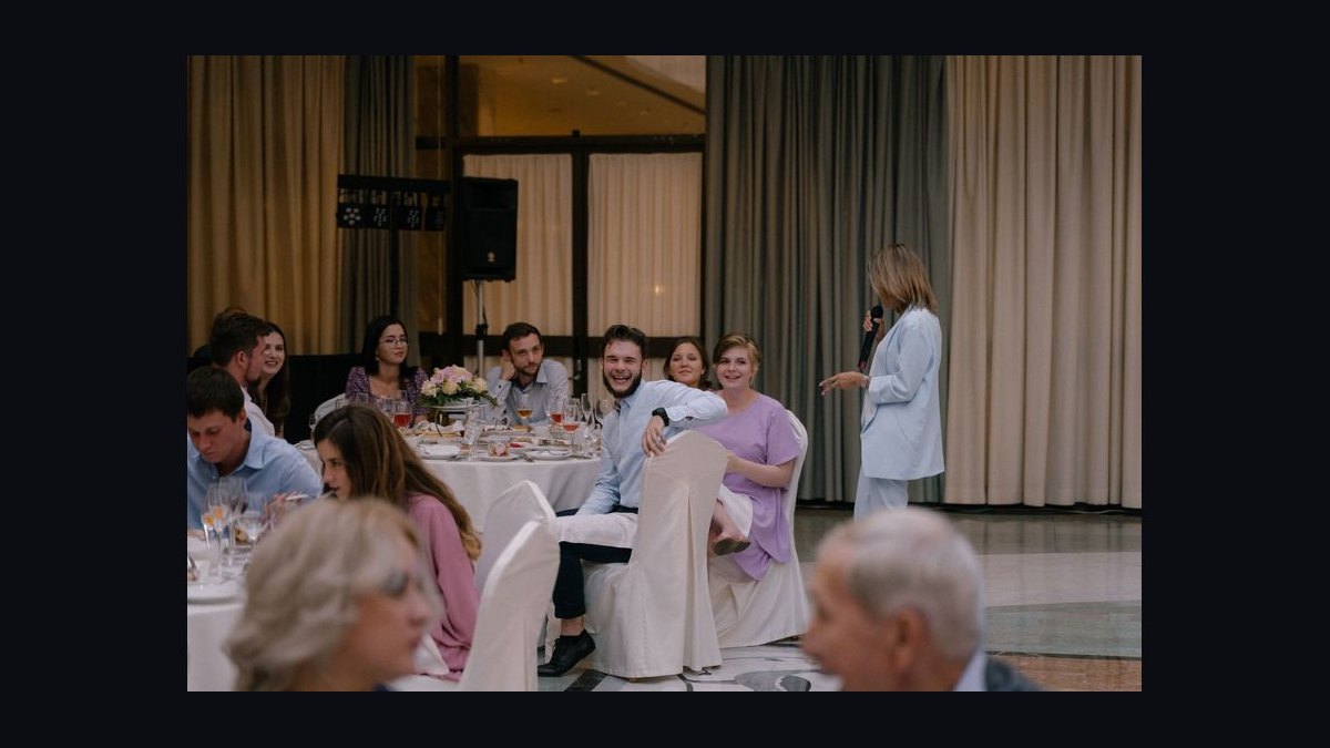
The first is a dress code that explicitly reserves ivory. Some couples, particularly those doing a specific palette, will name it: "Please avoid white, ivory, and cream." When that line appears, ivory is off the table regardless of how warm it is. The same applies to an all-white or black-and-white guest dress code, where ivory is either the point or forbidden depending on the couple's phrasing, and the only safe move is to ask.
The second is an ivory dress with a satin or charmeuse finish in a bright, backlit venue. Sheen reintroduces the white-highlight problem. A matte ivory crepe or an ivory linen-blend is a different proposition entirely from an ivory duchesse satin, and the matte version is the one to choose if you are set on ivory.
The third is a bridal party in ivory. If the couple has put their bridesmaids in ivory, or if the bride herself is wearing an ivory gown rather than white, then ivory is no longer a neutral — it is the bridal colour. This is more common than it used to be, since many brides choose ivory or champagne gowns deliberately. Read the invitation and, if the couple has a wedding website, check the wedding party page.
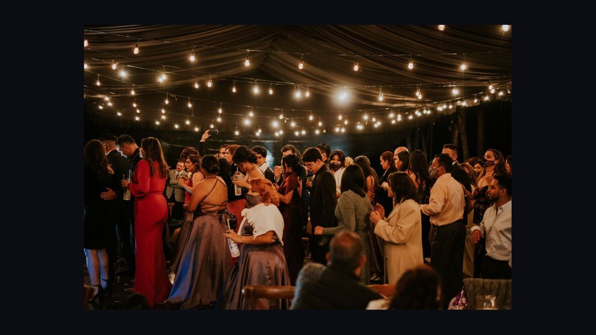
If any of those three apply, the alternative is not to reach for cream. It is to step one full shade away from the bridal spectrum. Champagne, sand, oyster, greige, soft taupe, dusty sage, muted terracotta, slate blue, and deep jewel tones all sit comfortably outside the white-ivory-cream zone while still reading as formal and photographed well. A dusty sage or slate blue dress is unambiguously a guest dress in every lighting condition, which is precisely the property you want.
The other alternative worth naming is simply asking. A short message to the couple or to a member of the wedding party — "I found a dress in ivory, is that okay with your palette?" — resolves the question in thirty seconds and costs nothing socially. It is far better than guessing and spending the reception wondering. Couples generally appreciate being asked; what they do not appreciate is being surprised in the gallery three weeks later.
Pitfalls that catch guests, and how to sidestep them
The most common pitfall is judging the dress in the wrong light. A dress viewed in a warm bedroom with wood floors and incandescent bulbs will look considerably more beige than it does in a white-walled venue with daylight. The fix is to take the dress to a bright window at midday, stand with your back to the glass, and look at it in a mirror. If the fabric turns bright and loses its beige character, it is a cream that will read near-white at the venue. If it stays warm and slightly dull, it is behaving like ivory.
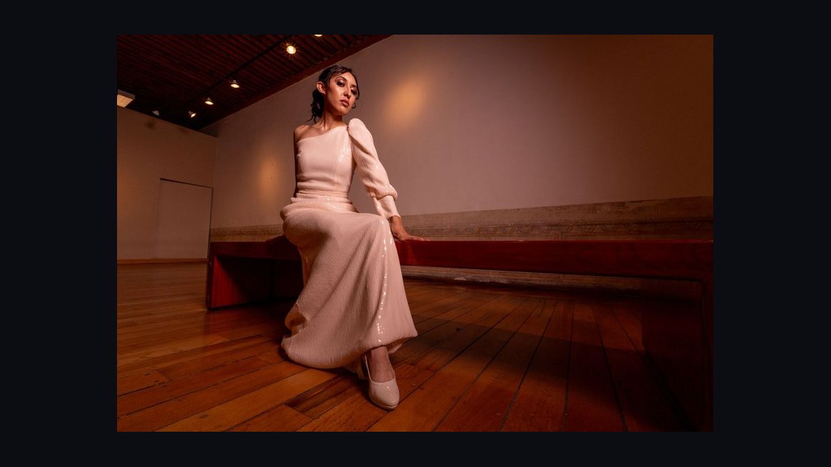
The second pitfall is trusting the product name. Retailers use "cream," "ivory," "ecru," "oat," "bone," "vanilla," and "pearl" more or less interchangeably, and the same word can describe wildly different base tones across brands. A dress labelled ivory by one label can be warmer than a dress labelled cream by another. Ignore the name and judge the actual colour, ideally against a sheet of white printer paper held beside the fabric. If the paper and the dress look like the same colour at a glance, it is too close.
The third pitfall is the sheen trap. Shoppers buy silk-blend and satin dresses because they photograph beautifully, which they do — but the same property that makes them photograph well is the property that creates white specular highlights. If you want a light neutral, choose a matte weave. Crepe, matte jersey, heavy cotton poplin, linen blends, and wool suiting all hold their base tone far more faithfully.
The fourth pitfall is relying on accessories to fix the colour. A cream dress with a bold belt, a coloured shoe, or a statement bag does not stop reading as cream from across the room. Colour perception is dominated by the largest area in the visual field, which is the dress itself. Accessories change the outfit; they do not change the silhouette's colour.
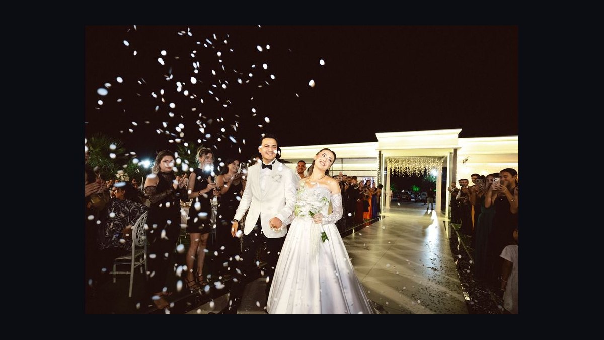
The fifth pitfall is the group photo. Guests often think about how the dress looks in isolation and not about how it looks standing next to the bride. In the formal group photograph, the bride is centre frame in white or ivory, and any guest in a similar tone will be visually adjacent to her. This is the single most consequential photograph for this decision, and it is worth asking, before the wedding, whether you would be comfortable standing in it.
The sixth pitfall is the after-party and the next-day brunch. Many 2027 weddings run across multiple events, and a dress code that was fine for the ceremony may not carry to a welcome party or a morning-after brunch. If the couple has planned a white party, a pool party, or a themed event, check each event separately. A cream dress that was acceptable at the reception may be exactly wrong at a white-themed after-party.
The seventh pitfall, and the one that causes the most regret, is not asking. The cost of a quick text is near zero. The cost of being the guest in the near-white dress in the gallery is a small, permanent social tax. Between the two, the text wins every time.
Related questions
Does the "no white" rule apply to cream and ivory?
Yes, in practice. The rule exists to keep the bride visually distinct, and cream and ivory both sit close enough to white to blur that distinction under bright light. Ivory is the safer of the two, but neither is a free pass, and a dress code that names them removes the question entirely.
Is ivory or cream better for a black-tie wedding?
Ivory, and ideally in a matte finish. Black-tie venues tend to be bright and heavily photographed, which is exactly the condition that pushes cream toward white. An ivory crepe or matte ivory gown reads as a deliberate, formal neutral without competing with the bridal white.
What if the bride is wearing ivory instead of white?
Then ivory is effectively the bridal colour and you should avoid it, along with cream. Step one full shade away: champagne, sand, oyster, greige, or a colour from the couple's stated palette. This is increasingly common, so check the couple's website or ask.
Can I wear cream to a daytime garden wedding?
Only with caution. Garden weddings are outdoor and often sunny, which is the worst lighting for cream because direct sun pushes it toward white. If you love the dress, choose a matte cream rather than a sheen fabric, and check it in direct daylight before committing.
Does fabric matter more than the colour name?
Yes. Sheen matters enormously. A matte cream and a satin ivory can behave almost identically in photographs, because the satin's specular highlights add white while the matte cream's lack of sheen keeps it looking beige. Judge finish first, then colour.
FAQ
Is cream or ivory safer for a wedding guest in 2027?
Ivory is safer. It carries more warmth and a slight brown or grey undertone, so it reads as a non-white neutral in most lighting. Cream sits closer to white, especially in bright, backlit, or white-walled venues, and can photograph as bridal. If you must choose one, choose ivory in a matte fabric.
Why does cream look white in wedding photos?
Three things combine: cream's base tone is only a short step from white, bright venues and backlit windows push light neutrals lighter, and cameras meter for the bride's gown so nearby bright fabrics sit high on the exposure curve. Sheen fabrics add literal white highlights on top of that.
Can I wear ivory if the invitation says no white?
Read the exact wording. If it says "no white," ivory is usually acceptable, though it is worth a quick check. If it says "no white, ivory, or cream," then ivory is out. If the palette is all-white or black-and-white, follow the palette the couple specified.
What colours are safest for a wedding guest instead?
Champagne, sand, oyster, greige, soft taupe, dusty sage, muted terracotta, slate blue, and most jewel tones. These sit clearly outside the white-ivory-cream band and read unambiguously as guest colours in every lighting condition, including bright outdoor ceremonies and heavily photographed ballrooms.
Does the fabric finish really change how the colour reads?
Yes, and often more than the colour name does. Satin, charmeuse, and silk blends produce specular highlights that are effectively white. Matte fabrics — crepe, matte jersey, cotton poplin, linen blends, wool suiting — hold their base tone. A matte cream is frequently safer than a satin ivory.
How do I check a dress before the wedding?
Take it to a bright window at midday, hold a sheet of white printer paper beside the fabric, and look at both in a mirror with your back to the glass. If the paper and the dress look like the same colour, it is too close. If the dress stays visibly warmer and duller than the paper, it is behaving like ivory.
Sources
- Pantone Color of the Year and colour standards
- Bridebook — wedding guest dress code guide
- The Knot — what not to wear to a wedding
- Martha Stewart Weddings — wedding guest attire advice
- Wikipedia — Ivory (colour))
- Wikipedia — Cream (colour))
- Wikipedia — Simultaneous contrast and colour constancy
- Wikipedia — Specular reflection
- Wikipedia — Exposure (photography))
Related on PULSE
- Wedding guest dress codes explained: black tie, cocktail, and semi-formal
- How to read a wedding invitation's attire line without guessing
- Colour palettes that photograph well at outdoor ceremonies
- What to wear to a multi-event wedding weekend
- Photographing light neutrals: why white balance matters at receptions
- Building a wedding guest wardrobe you can rewear
This page will be disappearing soon. Save it to your device for $1 — or read it free while it is here.
@Kory-White- · if Venmo asks, the last 4 of my number are 2012
 pulse-styleWhat to Wear to a Wine Country Trip in 2027
 pulse-styleWhat to Wear to a Trip to Chicago in 2027
 pulse-styleWhat to Wear as a Father of the Groom to a Destination Wedding in 2027
 pulse-styleTop 10 Spring Coats for Women in 2027
 pulse-styleWhat to Wear for Unpredictable Weather in 2027
 pulse-styleHow to Style Platform Heels in Spring in 2027
 pulse-styleTop 10 Belts for Business Attire in 2027
 pulse-styleHow to Style a Denim Jacket in Fall in 2027
 pulse-styleTop 10 Cream Outfits for the Office in 2027
 pulse-styleTop 10 Wrinkle-Free Dress Shirts in 2027