


Activity to Revenue — Motivational Print
Quality
Certified

An Activity to Revenue motivational print is a wall or digital poster that maps the causal chain — activity creates pipeline, pipeline creates revenue — so a team sees the connection daily. Its value is behavioral, not decorative: it reframes "was I busy?" into "did this move a deal?" Pair it with a scoreboard or it becomes wallpaper.
The Monday morning that made the print necessary
Picture a twelve-person revenue team on the first Monday of a quarter. The dashboard on the big screen shows last quarter's activity totals: 4,100 dials, 9,800 emails, 340 sequences launched. Everybody clapped. Then the CRO pulls the second slide — closed-won revenue was 71% of target, and the number of net-new opportunities created was down slightly from the prior quarter. The room goes quiet, because both slides are true at the same time. The team worked harder and produced less.
This is the exact scenario the print is built for. It exists because activity metrics are easy to generate and easy to feel good about, while revenue metrics are lagging, lumpy, and arrive weeks after the behavior that caused them. A rep who dials 80 numbers on Tuesday gets an immediate hit of visible output. The revenue consequence of those dials — if there is one — lands in six or eleven weeks, by which point nobody can trace it back to Tuesday. The feedback loop is broken, so behavior drifts toward whatever produces the fastest signal. That is almost never the highest-value work.
Consider how the drift actually happens in practice. A rep has a list of 200 accounts. Forty of them look like genuinely strong fits — right size, right stack, a trigger event in the last ninety days. The remaining 160 are filler that a data provider appended to hit a list-size target. Working the forty properly means research, a custom angle, a multi-threaded approach into three personas, and maybe two hours per account before the first touch. Working the 160 means loading them into a sequence and hitting send. Both actions produce an activity count. Only one of them produces revenue at any meaningful rate. And when the weekly review measures touches rather than qualified conversations, the sequence wins every single time — not because the rep is lazy, but because the rep is rationally optimizing for the thing being measured.

A motivational print does not fix a broken comp plan and it does not fix a bad list. What it does is put a permanent, non-negotiable statement of the causal chain in the room where the tradeoff is being made. When a rep is deciding between two hours of research and two minutes of send-all, a poster that reads ACTIVITY → PIPELINE → REVENUE is a cheap, always-on prompt to ask which link in the chain the next hour actually touches. That is a small intervention. Small interventions that fire two hundred times a quarter are not small in aggregate.
The adjacent version of this problem shows up well outside sales. A support team measured on tickets closed will close easy tickets and let the hard ones age. A marketing team measured on MQLs will tune the form until anything with an email address qualifies. A recruiting team measured on candidates screened will screen candidates it already knows won't pass the hiring manager. Same structure every time: a proxy metric that is fast and countable displaces the slow outcome metric it was supposed to predict. The print is a sales-floor-shaped answer to a general management problem, which is part of why the artwork travels so well into ops, CS, and agency environments.
How the mechanism actually works
The print does three specific cognitive jobs, and it is worth separating them because most teams only get value from the first one and then conclude posters don't work.

Job one: it makes the chain explicit. Most reps could recite "activity leads to revenue" if asked, but they do not hold it in working memory during the moment of choice. Displaying the chain converts a piece of knowledge into an environmental cue. This is the same mechanism behind a checklist on an operating room wall — the surgeon already knows to count the instruments; the sign makes the knowledge fire at the right instant.
Job two: it establishes a shared vocabulary for critique. Once "activity to revenue" is on the wall, a manager can point at it during a pipeline review instead of delivering an implied criticism of the rep personally. "Which part of the chain does this touch?" is a question about the work. "Why are you wasting time on this account?" is a question about the person. The first one gets an honest answer. The second one gets a defensive one. Physical or digital artwork that names the principle gives the team a neutral third party to argue with.
Job three: it sets a norm for new hires. A rep in week two is reading the room constantly, trying to infer what this company actually rewards versus what the onboarding deck claimed. Persistent visual signals are strong evidence. If the only thing on the wall is a leaderboard of dials, the new rep learns the company rewards dials no matter what the manager says in the 1:1.
Here is the loop the print is trying to close:
Notice where the diagram loops fastest. The motion-without-progress path returns to the decision point almost immediately with a positive feeling attached. The revenue path takes weeks and arrives with the causality already smeared. Any intervention that closes this gap works by pulling the slow signal forward in time — a print does it with a persistent reminder, a scoreboard does it with a weekly proxy, a comp plan does it with money. They are the same class of fix at different price points.

The failure mode of the print alone is habituation. Anything hung on a wall becomes invisible in roughly two to four weeks; the brain stops allocating attention to a stimulus that never changes and never has consequences attached. This is not a knock on the artwork — it's a known property of static environmental cues. The fix is to attach a recurring ritual to it so the print gets reactivated on a schedule. Point at it in the Monday standup. Use it as the header image on the weekly pipeline email. Make it the Slack channel banner for the quarter and change it next quarter. A print that participates in a ritual stays live; a print that just hangs there dies quietly in month two.
Real numbers, ranges, and benchmarks
There are two entirely separate number sets people want when they search this topic, and conflating them is why the underlying draft on this page was confusing. Set one: what the print costs and what it's worth as an object. Set two: the actual revenue math the print is pointing at. Both matter.
Production and cost side. A scalable SVG file costs nothing to distribute and nothing to resize — you can drop the same file into a LinkedIn banner slot, a Google Slides title card, and a 24×36 wall print without any quality loss, which is the practical argument for vector over a raster JPEG. Physical printing is where cost enters, and it's modest: local and online print shops handle poster-size runs, and the price scales mostly with substrate and size rather than with design complexity. A paper poster is the cheap end; a stretched canvas or a framed print costs multiples of that. For a team of twelve, printing one large floor print plus a digital version for remote staff is a rounding error against a single rep's monthly comp. Do not overthink the budget — the expensive part of this intervention is the meeting time you attach to it, not the paper.

If you are on the other side of this transaction — selling motivational prints rather than hanging them — the economics look like a normal print-on-demand business. Digital downloads carry near-zero marginal cost and near-total margin, but require volume and discovery. Physical prints through a fulfillment partner carry the base print cost plus shipping, so margin depends heavily on your price point and whether you're selling one-offs or bulk orders to companies outfitting an office. Custom and branded work — recoloring a design to a company's palette, adding a logo — commands materially more than a stock listing because it's a service, not a file. The general shape: digital is high-margin and low-ticket, custom bulk is lower-margin per unit and much higher ticket. Neither is the "right" answer; they're different businesses that happen to share an art file.
Revenue math side. This is the more useful set for a sales leader. The chain the print names decomposes cleanly:
Revenue ≈ Opportunities Created × Average Deal Size × Win Rate, run against Sales Cycle Length to get a rate rather than a total. Four levers. Every activity a rep performs either moves one of those four or it does not. That's the whole framework, and it fits on a poster because it is genuinely that compact.
Run it on a concrete example. Say a rep carries a $600k annual number with a $40k average deal size and a 25% win rate. That's fifteen closed deals a year, which means sixty opportunities created a year, or five per month. If the cycle runs ninety days, the rep needs roughly fifteen live opportunities in the pipe at any moment just to stay on pace. Now the useful question: which activity produces an opportunity? If the rep's historical conversion from qualified conversation to opportunity is one in three, they need fifteen qualified conversations a month. If conversations come from about one in twenty well-targeted outreach efforts, that's three hundred targeted touches a month — call it fifteen a working day. Fifteen genuinely researched touches a day is hard but achievable. Four hundred spray touches a day is easy and produces a different, much worse conversion rate that breaks the whole chain.
That is the argument the print compresses into three words. Not "do more activity." Do the activity whose conversion rate actually holds up when you multiply it out.

A caution on benchmarks. Be extremely skeptical of any specific percentage lift attributed to hanging a poster. There is no credible controlled study isolating motivational wall art as a variable, and any number you see claiming one should be treated as marketing. What is well-established in the research literature is narrower and more useful: specific, challenging, outcome-linked goals outperform vague ones or "do your best" instructions — this is the core finding of goal-setting theory, developed over decades by Locke and Latham. The print is a delivery mechanism for that finding, not evidence of its own effect size. Sell it internally on that honest basis and it survives contact with a skeptical CFO. Sell it on a made-up 22% lift and it doesn't.
Trade-offs, alternatives, and what to run instead
A print is the cheapest item on a ladder of interventions that all target the same behavior. Knowing where it sits on that ladder keeps expectations calibrated.
Cheapest and weakest: the print alone. Near-zero cost, near-zero friction, no political capital required, and a real but modest effect that decays without reinforcement. Worth doing. Never sufficient alone.
Next rung: redefining the tracked metric. Instead of counting calls, count high-intent conversations — a call that ends with a scheduled next step or a disqualification with a stated reason. Instead of counting emails sent, count personalized sequences completed against target accounts. This costs a CRM field change and a week of arguing about definitions, and it is dramatically more powerful than the print because it changes what shows up on the scoreboard people are actually judged by. The risk is that quality metrics are gameable in a different direction — a rep can log "high-intent conversation" liberally — so you need spot audits or the definition rots within a quarter.

Next rung: the weekly activity audit. Each person lists what they did last week and scores each item on revenue impact, then targets a reduction in low-impact hours next week. This is genuinely useful the first three times and then becomes a compliance exercise unless a manager acts on the output. If nobody ever cancels a recurring meeting or kills a low-yield channel as a result of the audit, stop running it — you've added an activity that doesn't touch revenue, which is a fairly on-the-nose way to fail.
Most expensive and strongest: comp and quota design. Pay on the outcome you want and behavior follows within one pay period. This is also the intervention that will get you the most resistance, requires finance sign-off, and does real damage if you get the design wrong — a plan that overweights new logos will strangle expansion revenue, and a plan that overweights closed-won will produce sandbagging near quarter end. Change comp rarely and deliberately.
The stacking point in that diagram is the real recommendation. A print with no metric change behind it is decoration. A metric change with no visible reinforcement gets quietly ignored by half the team. Run them together and the poster becomes shorthand for a policy that actually exists, which is the only condition under which wall art does anything at all.
There's also a straightforward alternative worth naming: don't use a motivational print at all, and instead put the live pipeline dashboard on the wall screen. For some teams this is strictly better — it's dynamic, it can't habituate the same way, and it carries real information rather than a principle. The counterargument is that a dashboard shows the score without showing the causal theory, and reps who are behind on a dashboard often respond by increasing volume of whatever is easiest to increase. The print supplies the theory the dashboard assumes. Running both is not redundant.
Pitfalls, and how to avoid each one

Pitfall: the print becomes an implied criticism. If leadership hangs "Activity to Revenue" the same week it announces that activity minimums are going up, the team reads the poster as management complaining that people aren't working hard enough. That is the opposite of the intended message — the print's actual argument is that raw volume is the wrong target. Introduce it with an explicit framing: this is here to protect you from busywork, not to demand more of it. Then prove it by killing something. Cancel a low-yield recurring meeting in the same week you hang it. Nothing establishes the meaning of a symbol faster than one visible sacrifice that matches it.
Pitfall: habituation. Covered above, but it's the number-one killer. Attach the print to a recurring ritual — a five-minute morning huddle where each person names one revenue-linked action for the day, or a quarterly retrospective that uses the print as the agenda's organizing question. Rotate the artwork annually. Change the Slack banner when the quarter changes. Motion in the environment keeps the cue alive.
Pitfall: treating "activity" as the enemy. Some teams overcorrect and start disparaging volume entirely, which is a mistake. Early-stage teams with no brand, no referrals, and no inbound genuinely do need volume — you cannot research your way to pipeline when your total addressable list of perfect-fit accounts is thirty companies. The print's message is about the chain, not about volume being bad. Volume that converts is exactly what you want. Volume that doesn't convert is what you're eliminating. Reps who hear "stop doing activity" will slow down and produce nothing, and then you have a worse problem than busywork.
Pitfall: no definition of the middle link. ACTIVITY → PIPELINE → REVENUE only works if "pipeline" means something specific and enforced. If any rep can create an opportunity by typing a company name into a stage-one field, the middle link is noise and the chain teaches nothing. Define entry criteria for stage one — a confirmed pain, a named economic buyer, an agreed next step, whatever fits your motion — and audit against it monthly. A poster pointing at a fake number is worse than no poster, because it lends the fake number legitimacy.

Pitfall: buying it for a remote team and never distributing it. If half the team is distributed, a physical print on an office wall reaches the people who need it least. Ship the digital version deliberately: a virtual-background variant, a Slack channel banner, a slide-deck title card, a laptop sticker if you want to get literal about it. The whole reason vector formats matter here is that the same file serves all of those without a redesign.
Pitfall: recoloring badly. If you're rebranding a design to your palette, watch contrast. Motivational typography that looks sharp in high-contrast black-on-white frequently becomes unreadable when someone drops it to a pale corporate teal on a light gray background — and it becomes unreadable exactly at the viewing distance a wall print is meant for. Test the recolored version from across the room before you commit to a large physical print, and check the same file at Slack-banner scale, where the constraint is different and the aspect ratio will crop your composition.
Pitfall: expecting the artifact to substitute for management. This is the summary pitfall and the honest one. A print cannot fix a bad territory split, an untrained rep, a product that doesn't fit the market you're selling into, or a pipeline that's short because marketing's budget got cut. Every one of those will produce exactly the same symptom — high activity, low revenue — and none of them respond to a poster. Diagnose which of those you actually have before you decide the fix is on the wall. If the answer is "our targeting is fine and our reps are capable but attention drifts to easy work," the print is a genuinely good, cheap tool. If the answer is anything else, fix the anything else first.
Related questions
Does a motivational print actually change behavior?
Modestly, and only when reinforced. Environmental cues improve recall at the moment of decision, but static cues habituate within weeks. Attach it to a ritual — a standup question, a weekly review agenda item — and the effect persists. Alone, on a wall, it fades.
What should replace call and email counts on a sales scoreboard?

Track qualified conversations, opportunities created, pipeline dollars added, and stage-conversion rates. Keep raw activity visible as a diagnostic for a struggling rep, but never as the headline metric. The headline should be the thing you'd actually pay for.
Is this concept only useful for B2B sales teams?
No. Any function with a fast proxy metric and a slow outcome metric has the same drift problem — support closing easy tickets, marketing loosening MQL criteria, recruiting screening unqualified candidates. The framing transfers directly; only the vocabulary changes.
Should I print it physically or keep it digital?
Both, if the team is hybrid. Vector formats scale to a wall poster and a Slack banner from one file. A physical print serves the office; the digital variant reaches remote staff, who otherwise get none of the benefit.
How often should the artwork be refreshed?
Quarterly for digital surfaces, annually for physical. The refresh isn't about the design going stale — it's about resetting the attention the cue receives. A new image gets looked at; the one that's hung untouched for eighteen months does not.
FAQ
What does "Activity to Revenue" actually mean?
It names the causal chain in a selling motion: activity produces pipeline, pipeline produces revenue. The point of stating it is that only some activity enters that chain. A dial to a wrong-fit account is activity and produces nothing. The phrase is a filter for distinguishing the two, not an instruction to do more of everything.
Is a print like this suitable for a B2C or non-sales team?

Yes. The underlying dynamic — a countable proxy metric crowding out a slower outcome metric — appears in support, marketing, recruiting, agency delivery, and owner-operated small businesses. Nothing about the chain is B2B-specific. Teams outside sales sometimes prefer wording that says "effort → output → result," but the mechanism is identical.
Does the print include specific KPIs or numbers?
Typically not, and that's deliberate. A poster with hard-coded targets goes stale the moment the plan changes, and it doesn't travel between teams. Keep the artwork principled and put the numbers on an adjacent scoreboard that updates. The pairing — permanent principle, changing numbers — is what makes the wall useful.
How do I recolor one to my company's brand?
Work from a vector file rather than a raster one. Vector artwork lets you swap fill colors, change or remove the background, and export cleanly at any size without artifacts. After recoloring, check contrast at real viewing distance for the physical version and at small scale for banner use — pale brand palettes frequently fail the first test.
Won't my team just ignore it after a month?
Probably, if nothing reinforces it. Habituation to unchanging environmental stimuli is expected, not a design flaw. Counter it by attaching the print to a repeating ritual and by rotating the artwork on a schedule. Teams that treat it as decoration get decoration; teams that treat it as the header for a recurring conversation get a durable cue.
Is the concept tied to a specific sales methodology?
No. It's compatible with essentially any framework — MEDDIC, Challenger, SPIN, or a homegrown process — because it operates one level above methodology. Every method eventually distinguishes work that advances a deal from work that doesn't. This is just that distinction, stated plainly enough to fit on a wall.
Sources
- https://hbr.org/2011/04/the-power-of-small-wins
- https://www.gallup.com/workplace/236927/employee-engagement-drives-growth.aspx
- https://www.shrm.org/topics-tools/topics/compensation-benefits
- https://www.bls.gov/productivity/
- https://www.ama.org/marketing-news/
- https://hbr.org/2010/09/column-the-goal-setting-fallacy
- https://www.apa.org/monitor/2018/07/cover-motivation
Related on PULSE
This page will be disappearing soon. Save it to your device for $1 — or read it free while it is here.
@Kory-White- · if Venmo asks, the last 4 of my number are 2012
This page is gone.
This one is off the shelf now. $1 keeps it on your phone for good — the whole page, pictures and diagrams included.
 graphic“BRING THE ENERGY” — Sales Floor Print
 graphic“HELP FIRST” — Sales Floor Print
 graphic“MAKE THE CALLS” — Sales Floor Print
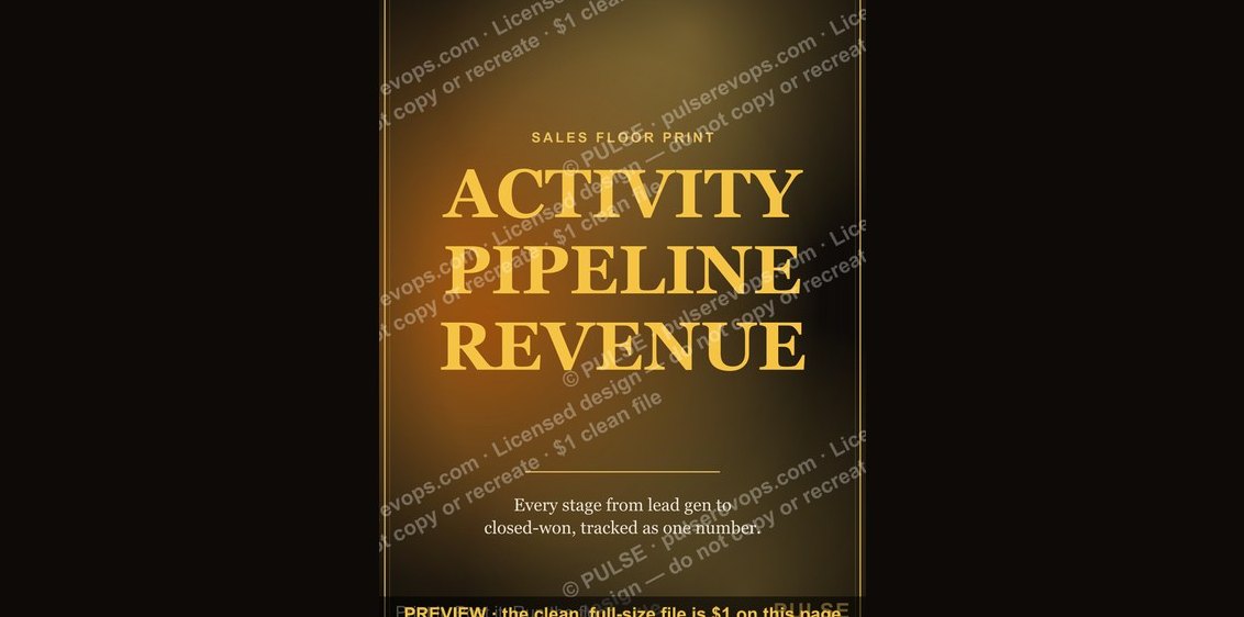 graphic“ACTIVITY PIPELINE REVENUE” — Sales Floor Print
 graphic“SELL THE VALUE” — Sales Floor Print
 graphic“QUOTA IS A FLOOR” — Sales Floor Print
 graphic“FILL THE FUNNEL” — Sales Floor Print
 graphic“CHASE THE NO” — Sales Floor Print
 graphic“EARN EVERY YES” — Sales Floor Print
 graphic“FOLLOW UP AGAIN” — Sales Floor Print