


“Activity creates luck.” — Quote Card
Quality
Certified
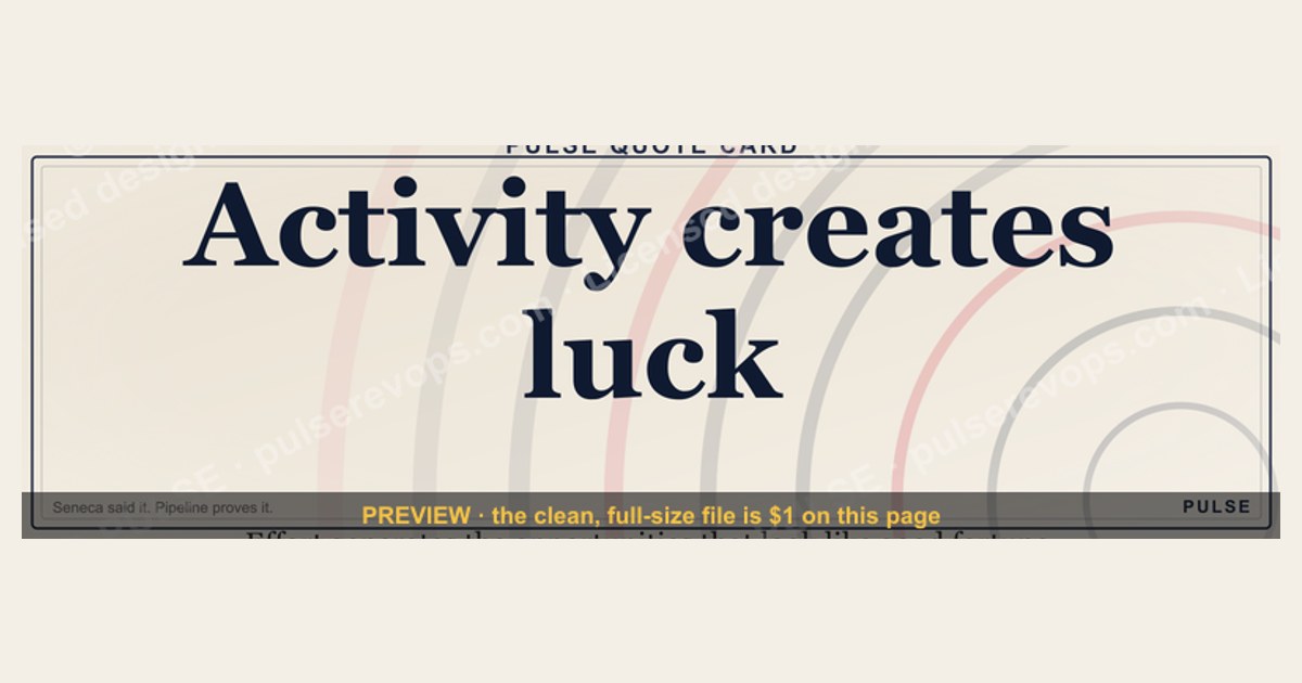
This banner is a 1600×500 px graphic that displays the line "Activity creates luck." in bold typography on a dark backdrop, sized to drop straight into a LinkedIn cover slot, a Slack or Teams header, or a printed office poster. It exists to turn a short, repeatable idea — that consistent activity creates the conditions luck needs to show up — into something a team sees daily. Download the PNG free from this page and swap it in anywhere a visual reminder helps.
The two ways to deploy this banner
There are really only two contexts where a graphic like this earns its keep, and they pull the design in different directions, so it helps to think of this as two distinct use cases sharing one file.
The first is the public-facing placement: a LinkedIn profile banner, a Twitter/X header, or a footer image on an email signature. Here the banner is doing brand work as much as motivational work — it sits behind your name and headline, so it has to read clearly at small sizes (LinkedIn crops and compresses aggressively on mobile), it has to survive being partially covered by a profile photo circle in the lower-left, and it has to look intentional next to a corporate logo if one is present. The quote text sits in the right two-thirds of the frame specifically so it clears the avatar overlap zone. Typography on this version favors a heavier weight — a bold sans-serif or a slab serif — because thin strokes disappear once LinkedIn's compression pass runs on the image.

The second use case is internal: a Slack workspace header, a Teams background, a shared-drive cover image, or a printed poster taped to a wall near a sales floor or call-center bay. This version can afford more restraint. Nobody's profile photo is cutting into it, nobody is judging your personal brand from it, and it's usually seen at a larger physical or pixel size (a monitor background, a printed 24×36 poster scaled proportionally from the same 16:5 ratio). Internal placements tend to keep the quote centered rather than offset, and some teams add a small attribution line — "— Quote Card" or a team name — beneath the main text, since the internal audience already knows the context and doesn't need brand signaling.
Both versions share the same core elements: the quote text itself, set in a single weight and color for maximum legibility; a dark matte background (near-black, not pure black, so it doesn't crush on cheaper monitors); and a thin accent rule or single accent color used sparingly — on a comma, a period, or a short underline beneath the word "luck" — to give the eye one place to land after reading the sentence. Neither version uses a photograph or texture behind the text; competing visual noise is the single most common reason quote graphics fail to read at a glance, so the background stays flat and dark on purpose.
How to decide between them
Picking the right variant comes down to answering three questions in sequence: who sees it, where does it live, and how long does it stay visible. A banner meant to be glanced at for two seconds while scrolling a feed needs different weighting than one that sits on a wall for months.
Once you know which branch you're on, the export settings mostly take care of themselves. Public, mobile-heavy placements should lean toward the heaviest legible weight and the highest contrast ratio the palette allows, because compression and small display size are working against you simultaneously. Internal static placements — a poster that hangs for a quarter, a monitor background that sits unattended for hours — can use a slightly lighter touch since the viewer has time to read it properly rather than catching it mid-scroll.
The one case that doesn't fit neatly on the flowchart is a printed poster scaled well beyond the source resolution. If you're printing larger than roughly 16×5 inches at 100 DPI, source a vector or higher-resolution export rather than stretching the 1600×500 PNG — raster text starts showing visible pixelation past that scale, and a blurry version of a quote about consistent effort undercuts the message before anyone reads it.
Concrete numbers behind the banner
The specs below are what make the file interchangeable across platforms without a redesign each time.
- Canvas size: 1600 × 500 px, a 3.2:1 aspect ratio. That ratio is close enough to LinkedIn's recommended cover-image ratio (roughly 4:1 cropped down in the visible window) and Slack's header proportions that a single export works in both without visible letterboxing.
- File format: PNG-24, not JPEG. Flat dark backgrounds with sharp text edges compress far more efficiently as PNG, and PNG avoids the blocky compression artifacts JPEG introduces around high-contrast letterforms. Expect a file size in the 150–400 KB range at this resolution — small enough to upload instantly to any of the platforms above.
- Safe margin: keep all text at least 60 px (about 4% of the canvas width) from every edge. LinkedIn in particular crops banner edges differently across desktop and mobile, so text that hugs the border risks getting clipped on one device even though it looks fine on another.
- Type scale: the main quote line typically runs 64–96 px depending on character count — shorter lines like this one can run larger, closer to 90–96 px, since there's less horizontal space pressure. An attribution line, when used, runs much smaller, around 24–28 px, so it reads as a caption rather than competing with the headline.
- Color contrast: the text-to-background contrast ratio should clear at least 7:1 for a graphic meant to be read at a glance — well above the minimum accessibility threshold for large text, which matters here because the whole point is instant legibility, not just compliance.
- Avatar clearance (LinkedIn variant only): the profile photo circle covers roughly the bottom-left 200×200 px region of a standard banner crop. Anything you don't want obscured belongs to the right of that zone.
None of these numbers are arbitrary — they're the practical constraints of the platforms this graphic is built to live on, worked backward into a single export that doesn't need per-platform variants.
Implementation and sequencing
Getting the banner from "downloaded file" to "live on your profile or in your workspace" is a short, linear sequence, but the order matters more than it looks — skipping the preview step is the single most common reason people re-upload a graphic three times before it looks right.
Start by opening the downloaded file locally rather than uploading it blind. This catches two problems early: color shift (some monitors render the near-black background as noticeably blue or green) and unexpected cropping from whatever tool generated your copy. Five minutes here saves a re-upload later.
For LinkedIn, the upload path is Edit Profile → the cover image icon → upload, and LinkedIn will offer its own crop tool on top of your file — this is exactly why the safe-margin rule above matters, since LinkedIn's crop tool can shift the visible window slightly depending on your existing profile photo size. Always check the mobile preview LinkedIn shows during upload; the desktop preview alone has led plenty of people to publish a banner with the quote's last word clipped on phones.
For Slack, workspace admins go through Settings & Administration → Customize Workspace, where a header/banner image option accepts the same PNG. Because Slack renders this smaller and often in a sidebar or tab context rather than full-width, the centered layout variant described earlier tends to hold up better here than the offset-right one built for LinkedIn.
For a printed version, don't send the 1600×500 file straight to a large-format printer without checking with them first — ask what native resolution they need at your target size, and if it's larger than what the PNG supports cleanly, request a vector re-export rather than accepting an upscaled, softened print. Most print shops will pull a proof for approval before the full run; always look at that proof under the lighting where the poster will actually hang, since dark backgrounds can print noticeably darker or muddier under fluorescent office lighting than they appear on a calibrated screen.
Customizing the wording or palette for your own team follows the same sequence in reverse: swap the quote text, keep the same dark-background-plus-single-accent-color formula, re-check contrast, and re-export at the same 1600×500 canvas so it drops into the identical upload flows without any platform-specific rework.
Related questions
Why does this quote work as a banner instead of a full poster with more text?
Short, single-sentence quotes hold up under compression and small display sizes; a paragraph-length quote becomes unreadable once LinkedIn or Slack shrinks the image, so the format itself enforces brevity.
Can I put a company logo on the same banner?
Yes, but keep it small and in a corner outside the avatar-clearance zone — a logo competing with the quote for attention usually makes both harder to read at a glance.
Does the banner need to match my other social media graphics?
Not strictly, but reusing the same dark-background-plus-accent-color formula across your banner, email signature, and any other quote graphics creates a recognizable visual pattern people associate with your team over time.
What's the difference between this and a generic "motivational poster"?
This graphic is built to the exact pixel and format constraints of specific platforms (LinkedIn, Slack, print at a known ratio), where a generic motivational poster image usually isn't sized or tested against any of them.
Will the PNG look blurry if I resize it smaller?
No — shrinking a PNG loses no quality. Blur only becomes a risk when you scale it up beyond its native 1600×500 resolution, particularly for large-format printing.
FAQ
What does "Activity creates luck" actually mean in a sales or work context? It's shorthand for the idea that opportunities most people credit to chance are disproportionately found by people who are doing more of the underlying work — more calls, more pitches, more attempts — so that when a favorable break does appear, someone is positioned to catch it. The banner exists to keep that reminder visible rather than to make a literal claim about probability.
Is this graphic editable, or only the final PNG? The download on this page is the finished PNG, ready to use as-is. If you want to change the wording or colors, use any basic image or design tool to rebuild the same layout — flat dark background, single bold quote line, optional small attribution — at the same 1600×500 canvas so it still fits the platforms it's designed for.
Why is the background dark instead of white or brand-colored? A dark, near-black background gives the highest reliable contrast against light text across every platform this banner targets, and it compresses cleanly as a PNG. A busier or brand-colored background can work, but it raises the risk of the text losing contrast once a platform re-compresses the upload.
Can I use this banner on Instagram or Facebook instead of LinkedIn? The 3.2:1 ratio isn't a native fit for Instagram (which favors square or 4:5 crops) or a Facebook cover photo (a different aspect ratio again), so it will get cropped unpredictably on those platforms. It's built specifically for LinkedIn-style wide banners, Slack/Teams headers, and print at the same proportions.
Does using a quote banner like this actually change behavior, or is it just decoration? On its own, no single graphic changes outcomes — it functions as a passive, repeated reminder, the same way any piece of workplace signage does. Its value is in the frequency of exposure, not in the image itself, so it works best paired with whatever activity-tracking or coaching process the quote is meant to reinforce.
How often should a team refresh the quote or banner to keep it from becoming background noise? There's no fixed rule, but any static visual loses its attention-grabbing effect once people stop consciously seeing it — commonly after a few weeks in a high-traffic spot like a shared Slack header. Rotating between a small set of banners, rather than leaving one up indefinitely, keeps the message from fading into wallpaper.
Sources
- https://www.linkedin.com/help/linkedin/answer/a542334
- https://slack.com/help/articles/205240127-Guide-to-customizing-your-workspace
- https://www.adobe.com/creativecloud/file-types/image/raster/png-file.html
- https://www.canva.com/learn/image-file-types/
- https://www.w3.org/WAI/WCAG21/Understanding/contrast-minimum.html
- https://blog.hubspot.com/sales
- https://www.merriam-webster.com/dictionary/luck
Related on PULSE
- Why sales activity metrics predict pipeline better than intuition
- How to build a call-volume tracking cadence for a small sales team
- LinkedIn profile optimization checklist for sales reps
- Designing internal culture graphics that don't feel like corporate posters
- The difference between leading and lagging indicators in sales coaching
This page will be disappearing soon. Save it to your device for $1 — or read it free while it is here.
@Kory-White- · if Venmo asks, the last 4 of my number are 2012
This page is gone.
This one is off the shelf now. $1 keeps it on your phone for good — the whole page, pictures and diagrams included.
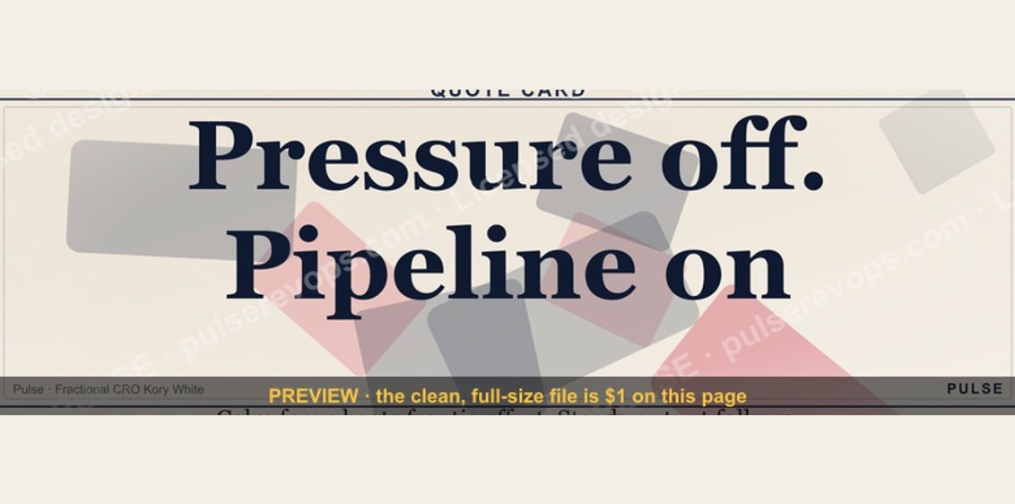 graphic“Pressure off. Pipeline on.” — Quote Card
 graphic“Listen more. Pitch less.” — Quote Card
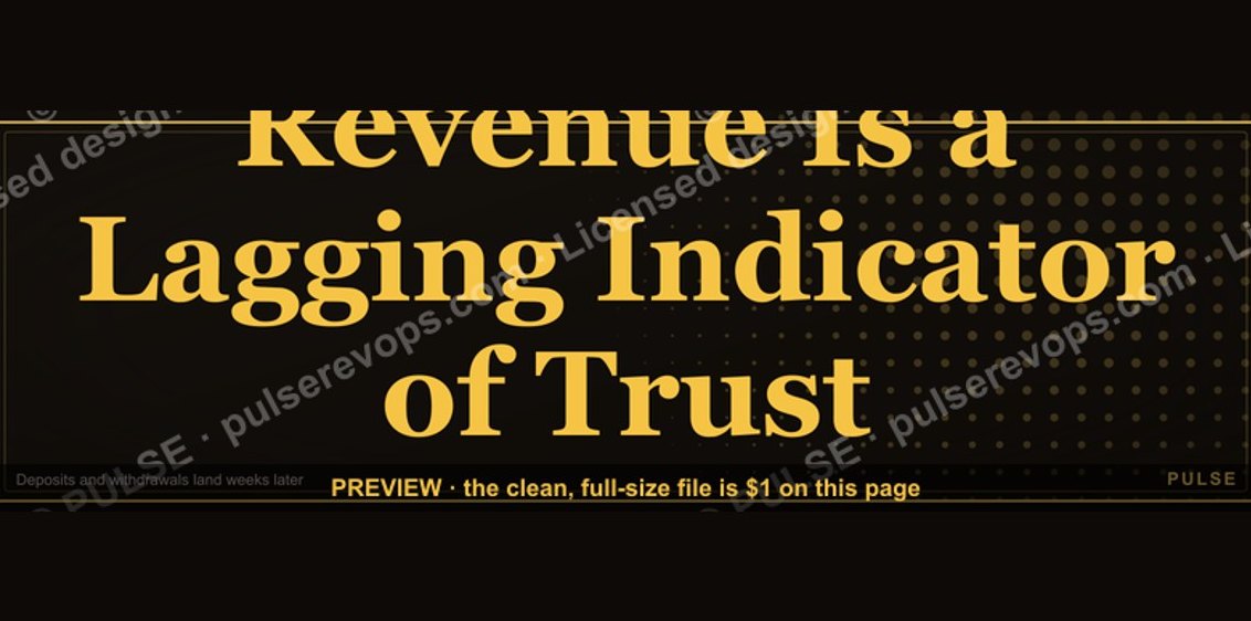 graphic“Revenue Is a Lagging Indicator of Trust” — Quote Card
 graphic“The best discovery feels like free therapy.” — Quote Card
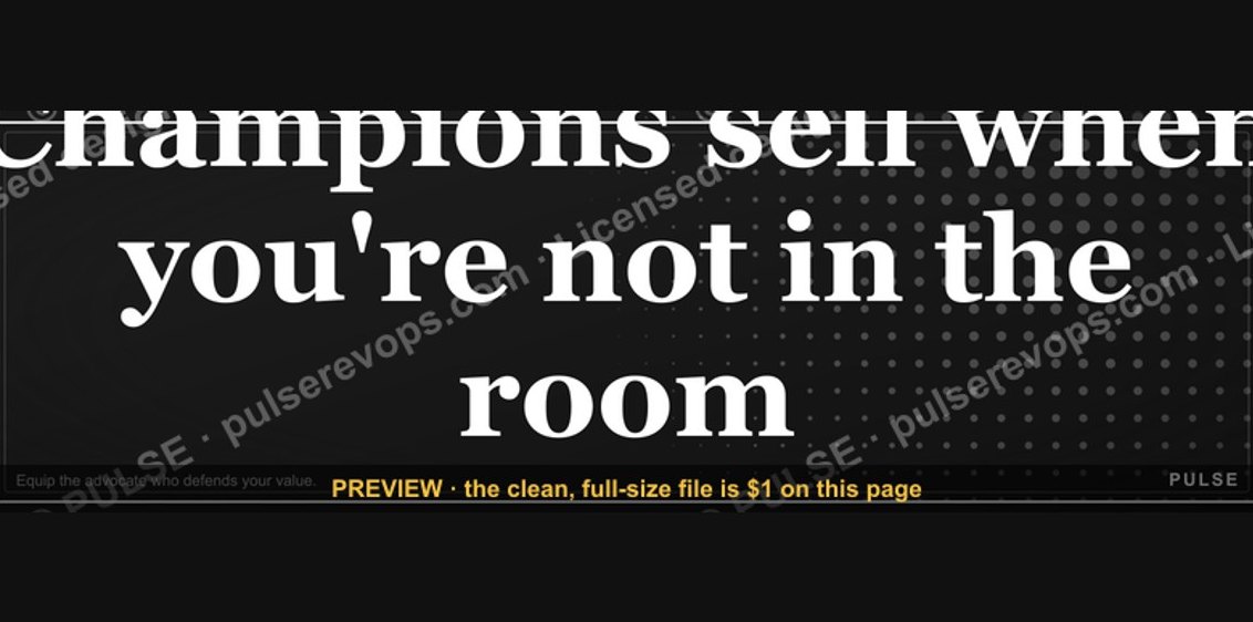 graphic“Champions sell when you're not in the room.” — Quote Card
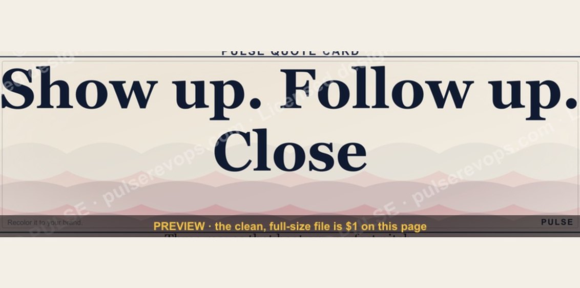 graphic“Show up. Follow up. Close.” — Quote Card
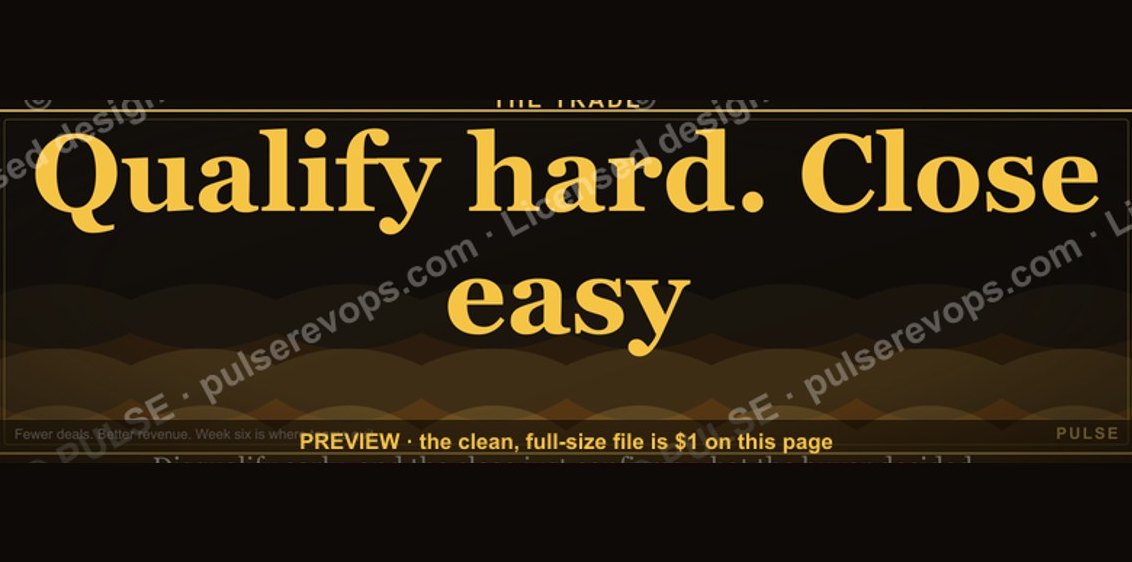 graphic“Qualify hard. Close easy.” — Quote Card
 graphic“Revenue follows relationships.” — Quote Card
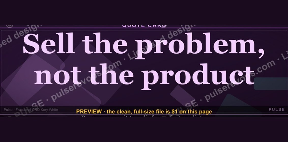 graphic“Sell the problem, not the product.” — Quote Card
 graphic“The fortune is in the follow-up.” — Quote Card