


Sales Enablement — LinkedIn Banner
Quality
Certified
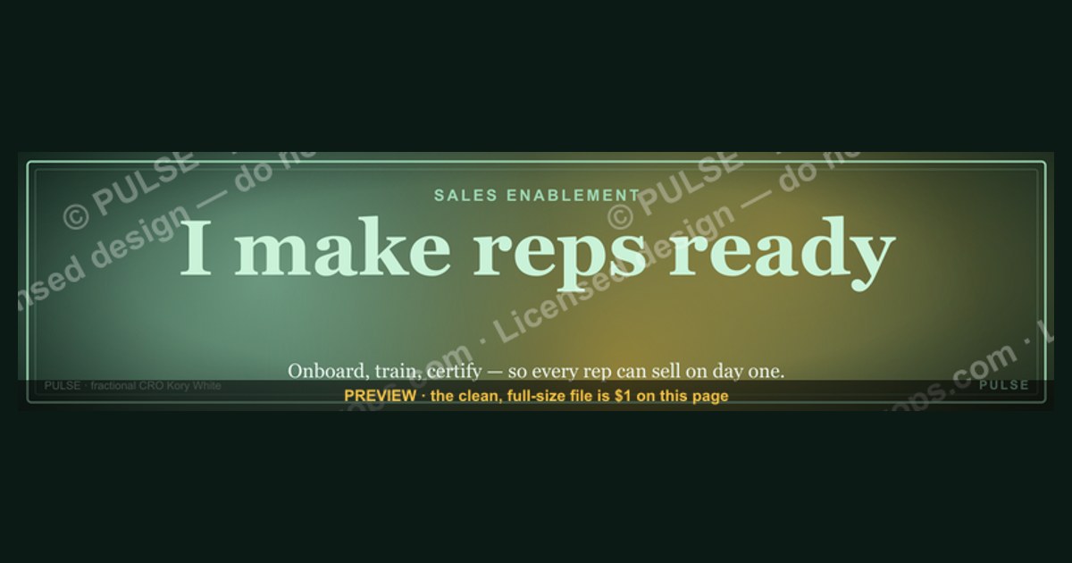
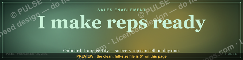
This is a downloadable LinkedIn profile banner sized 1584x396 px, reading "Sales Enablement" as a bold primary wordmark with a smaller supporting sub-line, set in clean sans-serif type on a dark navy-to-charcoal gradient. It's a role-signal banner meant to sit under a LinkedIn profile photo, telling recruiters and peers at a glance that the profile owner works in or leads sales enablement.
The two (or more) options compared
There are really two directions a rep or enablement leader takes with a LinkedIn banner, and this graphic sits squarely in one of them. The first is a role-signal banner — exactly what this design is — which states a function or team ("Sales Enablement") in bold type, using the banner as a label rather than a message. The second is a personal-brand banner, which leans on a tagline, a quote, or a value proposition instead of a job function, something like "Helping revenue teams close faster" or "Turning reps into top performers." A role-signal banner works best for people whose title alone does the selling — enablement managers, RevOps leads, sales engineers, onboarding specialists — because a visitor scanning a search results page, a shared LinkedIn post, or a mutual connection's comment thread gets instant context before they ever open the About section. A personal-brand banner tends to work better for individual contributors trying to differentiate inside a crowded, already-obvious title, like "Account Executive" or "SDR," where the function is clear from the headline and the banner has room to do something else — signal personality, humor, a specialty, or a results claim.
The trade-off between the two is specificity versus longevity. A role-signal banner like this one ages well: it rarely needs to change unless the person changes departments or gets promoted into a different function entirely, so it behaves like a piece of durable personal infrastructure rather than a campaign asset. The cost is that it says less about the individual — two enablement managers at different companies could run the identical banner and nothing about it would distinguish them. A personal-brand banner is more memorable in a single glance and can carry a genuine point of view, but it requires far more thought to execute well, and a cheesy or over-clever tagline ages badly, especially once the joke or the moment it referenced has passed. Most enablement professionals who think about this land on a hybrid approach: a banner that states the function cleanly, the way this one does, and lets the headline text field directly underneath the banner carry the personal differentiation — something like "Sales Enablement | Onboarding & Certification | Ex-SDR" or "Revenue Enablement Lead | Built the ramp program that cut time-to-first-deal by half." That split — banner for category, headline for specificity — is the exact pattern this graphic is built to support, and it's worth treating as a deliberate two-part system rather than picking one asset and hoping it does both jobs.

A third, less common option worth naming is a team or campaign banner, used by enablement leaders who want to promote a broader initiative — a certification program, a conference talk, a resource hub, an open role on the team — rather than their own individual role. That's a meaningfully different asset: it usually includes a call to action, a URL, or an event date, and it's typically swapped out on a short cycle tied to the campaign rather than left in place for a year or more. This graphic isn't built for that use case. It's designed for an individual's profile as a standing identity marker, not a rotating promotional slot, so if the goal is to drive traffic to a webinar or a job posting, a purpose-built campaign banner — and probably a company page post alongside it — is the better tool.
It's also worth noting how this compares to banners used on adjacent platforms, since many enablement professionals maintain a consistent visual identity across LinkedIn, a personal website, and sometimes X or GitHub. A LinkedIn banner's 4:1 ratio is wider and shorter than a typical X/Twitter header (which uses a similar but not identical ratio) or a YouTube channel banner (which uses a much taller safe zone because of app/desktop/TV cropping differences). Because of that, a banner designed specifically for LinkedIn's 1584x396 canvas, like this one, usually can't be dropped unmodified onto another platform without re-checking the safe zone — the text placement that reads perfectly centered on LinkedIn can end up off-center or clipped elsewhere.
How to decide between them (mermaid)

The decision mostly comes down to two questions: how established the person's title already is on their profile, and how much they want the banner to function as an evergreen asset versus something tied to a specific initiative or moment.
If someone is new to enablement, transitioning out of a quota-carrying role, or simply has a vague or flat title on their profile — some companies still label enablement staff with generic titles like "Sales Specialist" or "Program Manager" — the role-signal banner does real, measurable work: it removes ambiguity before a recruiter, hiring manager, or peer has to ask what the person actually does. That ambiguity-removal function matters more than it sounds, because LinkedIn profile views are often skimmed in seconds, not read closely; a banner that states the function clearly can be the difference between someone continuing to scroll the profile and someone bouncing to the next search result. If the title is already unambiguous — say, "VP of Sales Enablement" is already sitting in the headline — the banner has more freedom to do something else. But plenty of established enablement leaders keep a role-signal banner anyway, simply because it's clean, on-brand, low-maintenance, and doesn't require a redesign every time they change jobs internally.
There's also a timing consideration that the decision tree above doesn't fully capture: people going through an active job search or an internal transfer often deliberately choose a role-signal banner specifically because it front-loads the keyword a recruiter's search or an ATS-adjacent LinkedIn Recruiter query is likely to match on. "Sales Enablement" appearing prominently and visually — not just buried in the About section — reinforces the same signal that the headline and skills section are already trying to send, adding a visual layer to what is otherwise a text-search problem.
Concrete numbers behind each option

LinkedIn's banner (cover photo) dimensions are fixed at 1584x396 pixels, an aspect ratio of exactly 4:1. That's the canvas this graphic was built to fill edge-to-edge with no cropping surprises on desktop. On mobile, LinkedIn crops the banner more aggressively — the visible region on a phone is narrower than the full desktop canvas — so the safe practice enablement teams use is keeping all critical text (the "Sales Enablement" wordmark here) within the center 60-70% of the horizontal canvas and vertically centered, since the left edge is also partially obscured by the profile photo circle on both desktop and mobile layouts. That circle overlap is easy to forget when designing a banner from scratch, and it's the single most common reason a homemade banner looks broken in production even though it looked fine in the export preview.
File size matters too: LinkedIn recommends keeping the banner under 8MB, and in practice a well-compressed PNG or JPG of a design like this one lands well under 1MB, which loads faster on mobile connections and avoids LinkedIn's own re-compression artifacts kicking in harder on large files. For text legibility at the small render sizes LinkedIn actually displays — banners often render at 30-40% of native resolution on a laptop screen, and even smaller inside the mobile app's profile header — a wordmark like "Sales Enablement" needs a minimum effective font size. On a 1584px-wide canvas, that typically means primary text no smaller than roughly 60-80px, which is in the range this design uses for its main line, with the supporting sub-line noticeably smaller, around 24-32px, to keep a clear visual hierarchy between the two.

Color contrast is a related, often-skipped number: a dark navy-to-charcoal gradient background (roughly in the range of very low luminance, dark blue-gray tones) needs light text — white or a light gold/cream — at a contrast ratio well above the minimum readability threshold used for on-screen text, since a banner viewed on a phone in bright daylight loses contrast faster than the same file viewed on a calibrated monitor. Designers who skip a contrast check on a gradient background often end up with text that's legible in the middle of the banner but washes out near the gradient's lighter end.
On the usage-cycle side, enablement banners like this one tend to get swapped in cycles tied to org changes rather than a fixed cadence. Most people update a role-signal banner once every 6-18 months, generally triggered by a title change, an internal rebrand of the enablement function (some companies rename it "Revenue Enablement" or "GTM Enablement" as the function's scope grows to include customer success or partner teams), or a company-wide visual refresh that trickles down into how employees present themselves externally. That 6-18 month window is longer than the typical campaign-banner cycle (weeks) and shorter than a "set it and forget it" asset like a profile photo, which many people keep unchanged for years — it sits in its own maintenance category.
Implementation details and sequencing (mermaid)
Swapping this banner onto a live LinkedIn profile is a short, largely linear process, but the sequencing matters because LinkedIn's built-in crop tool behaves differently depending on the exact dimensions of the file uploaded.

The most common failure mode is uploading an image that isn't exactly 4:1, which forces LinkedIn's built-in cropper to letterbox or crop content the uploader didn't intend — usually clipping the top or bottom of the wordmark text. Exporting at the exact 1584x396 pixel dimensions sidesteps that entirely, and it's worth double-checking the export dimensions in an image editor before uploading rather than trusting a tool's default canvas size, since some design tools default to a slightly different LinkedIn banner template that was accurate in past years but has since drifted from the current spec. After uploading, it's worth checking the banner specifically on the LinkedIn mobile app rather than assuming the desktop preview is representative, since desktop and mobile rendering crop differently around the profile photo circle, and text that looks centered on desktop can sit slightly off-center on a phone screen.
Once the banner is live, the highest-leverage next step is aligning the headline text field directly below it. Since the banner already states the category — "Sales Enablement" — the headline should carry the specific differentiator (a specialty, a certification, a notable outcome, a prior role) rather than repeating the same words the banner already shows on the page. Restating "Sales Enablement" verbatim in both the banner and the headline wastes the headline's limited character budget on redundant information a visitor has already absorbed visually. Teams rolling this out across an entire enablement function sometimes standardize the banner across every team member's profile while leaving the headline and About section fully individual, which keeps a consistent visual identity across the team's public-facing profiles without flattening everyone's personal brand into one templated block of text — a pattern borrowed from how sales teams sometimes standardize LinkedIn profile photos with a consistent background or filter for the same reason.

To customize the wording for a different team or role, the same layout pattern extends cleanly. Swap "Sales Enablement" for "Revenue Enablement," "Partner Enablement," "Customer Success Enablement," or a specific initiative name, and swap the sub-line to match; the gradient background, typography weight, and centered layout hold up across all of those variants without needing a full redesign. That's part of why a template like this is useful to more than just the exact title printed on it — an enablement leader whose function later absorbs customer success onboarding, for instance, can update the wordmark rather than starting over. For anyone editing the file directly rather than swapping in an equivalent pre-made variant, a basic image editor is enough — the design doesn't rely on complex layering, just a gradient background, one or two text layers, and consistent margins from the edges to preserve the safe zone discussed above.
Related questions
What size should a LinkedIn banner be?
1584x396 pixels, a 4:1 aspect ratio. Exporting at that exact size avoids LinkedIn's automatic crop tool clipping text or logos near the edges on desktop and mobile.
Should my LinkedIn banner match my company's branding?
It can, but it doesn't have to — personal profile banners are typically owned by the individual, not brand guidelines. Matching team colors helps if enablement is standardizing visual identity across profiles.
How often should I update my LinkedIn banner?
Most people update a role-signal banner every 6-18 months, usually triggered by a title change, promotion, or a department rebrand rather than a fixed schedule.
Does a LinkedIn banner affect profile views?
It can indirectly — a clear, professional banner increases the odds a visitor reads further into the profile, though LinkedIn doesn't publicly confirm it factors into internal search ranking.
Can I use the same banner design on other platforms?
Not directly — LinkedIn's 4:1 ratio differs from X's header ratio and YouTube's banner safe zone, so a design built for 1584x396 usually needs its text repositioned before reuse elsewhere.
FAQ
Can I use this banner if my title isn't exactly "Sales Enablement"? Yes. The wording is meant to be edited — swap in "Revenue Enablement," "Sales Ops," or whatever function actually applies, keeping the same layout and hierarchy.
Will this banner look right on mobile? It's designed with key text centered within the safe zone that survives both desktop and mobile cropping, but it's always worth checking the live render on the LinkedIn app after uploading.
What file format should I download it as? PNG, which preserves sharp text edges and gradient backgrounds better than JPG at the file sizes LinkedIn accepts.
Can I add my name or a logo to this banner? The base design is a wordmark banner; adding a name or logo means editing the file directly in an image editor before uploading, since this page provides the base graphic, not a live editor.
Does the banner need to match my profile photo style? Not strictly, but a dark, clean banner like this one pairs well with most professional headshot styles since it doesn't compete visually with the photo circle overlapping its left edge.
Is a role-signal banner outdated compared to personal-brand banners? No — it's simply a different tool. Role-signal banners remain common precisely because they're low-maintenance and instantly legible, which matters more than novelty for most professional profiles.
Sources
- https://www.linkedin.com/help/linkedin/answer/a541952
- https://business.linkedin.com/marketing-solutions/success/best-practices/linkedin-profile-best-practices
- https://www.canva.com/create/linkedin-banners/
- https://blog.hubspot.com/marketing/linkedin-banner-size
- https://sproutsocial.com/insights/linkedin-cover-photo-size/
- https://www.hootsuite.com/social-media-image-sizes-guide
- https://www.forbes.com/sites/forbescoachescouncil/personal-branding-linkedin-profile/
Related on PULSE
- What size should a LinkedIn banner be for a sales team profile?
- How do I write a LinkedIn headline that complements my banner?
- What's the difference between sales enablement and sales operations?
- How often should sales reps update their LinkedIn profile visuals?
- What makes a personal brand banner effective on LinkedIn?
This page will be disappearing soon. Save it to your device for $1 — or read it free while it is here.
@Kory-White- · if Venmo asks, the last 4 of my number are 2012
This page is gone.
This one is off the shelf now. $1 keeps it on your phone for good — the whole page, pictures and diagrams included.
 graphicVector Database CTO — LinkedIn Banner
 graphicHow to build a champion seller playbook in 2027
 graphicField Sales Rep — LinkedIn Banner
 graphicCalm closers win. — LinkedIn Wallpaper
 graphicWhat do top-performing graphic designers do differently in 2027?
 graphic“Stay in the deal.” — LinkedIn Banner
 graphicCommercial Director — LinkedIn Banner
 graphicSpeed to lead wins. — LinkedIn Wallpaper
 graphicTrust compounds. — LinkedIn Wallpaper
 graphicLLM Builder AI Engineer — LinkedIn Banner