


“Stay in the deal.” — LinkedIn Banner
Quality
Certified
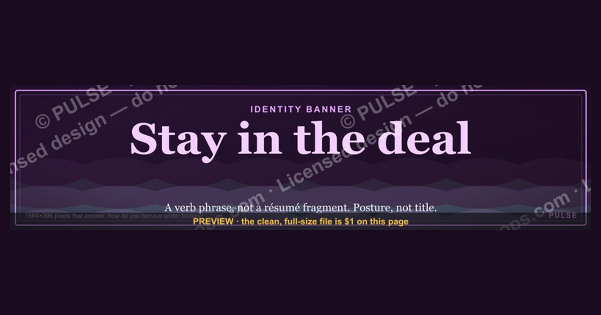
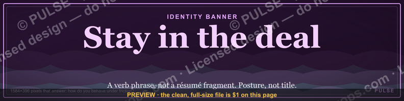
This is a LinkedIn profile banner sized 1584×396 px that reads "Stay in the deal." in gold serif type, centered on a matte black field. It's a personal reminder graphic for salespeople and closers — a headline-level cue, visible every time someone visits your LinkedIn profile, that reinforces the discipline of staying engaged with a deal through every stall, objection, and silence instead of walking away early.
The two ways to run this banner
There are really two distinct uses for this LinkedIn banner, and they call for slightly different wording and design choices even though the base file is the same 1584×396 PNG.
The first is the personal rep banner. An individual account executive, SDR, or closer installs "Stay in the deal." as their own cover image, sitting behind their profile photo at the top of their LinkedIn page. In this mode the banner functions as a private mantra made public — a line the rep wrote to themselves that happens to be visible to prospects, hiring managers, and peers. The gold-on-black treatment reads as understated and confident rather than promotional, which matters here: a banner that looks like an ad undercuts the message. Reps who use this version tend to pair it with a headline underneath the photo that names their role and quota-carrying function (e.g., "Enterprise AE — helping teams close what almost got away"), so the banner and headline read as one thought rather than two unrelated pieces of profile real estate.

The second is the team or leader banner. A VP of Sales, RevOps lead, or sales enablement manager sometimes standardizes this same banner — or a close variant with the team name added — across every rep's profile as part of a culture push. This version usually needs a small modification: adding a team name, a quarter label ("Q4 — Stay in the deal"), or a subtle wordmark in one corner so the banner reads as an intentional campaign rather than a coincidence when five reps on the same LinkedIn "People also viewed" carousel all show the identical graphic. Leaders running this version should decide upfront whether they want strict uniformity (every rep runs the exact same file, unmodified) or a shared template (same typography and color system, but each rep can swap in their own short phrase). Strict uniformity is easier to enforce and looks more polished in aggregate; the shared-template approach gets more buy-in because reps feel ownership over their own banner instead of being handed a corporate asset.
Both versions share the same design logic worth spelling out: a short, declarative sentence, set in a serif face for gravity rather than a sans-serif for speed, in gold against black for contrast that survives LinkedIn's automatic compression. The phrase "Stay in the deal." works because it's an instruction, not a slogan — it tells the viewer (and the profile owner, every time they check their own page) what the standard is. That's a different job than a banner that says something like "Closing since 2019," which is a credential rather than a discipline. Choose the personal version if the goal is individual accountability; choose the team version if the goal is establishing a shared vocabulary across a sales floor.
How to decide which version fits your profile

The decision tree above collapses to one real question: is this banner representing a person or a program? If a single rep is installing it on their own initiative, the personal path is almost always right — it's low-friction, requires no approval chain, and can be swapped out in thirty seconds if it stops feeling right. If a sales leader is rolling it out across a team, the decision shifts to a governance question: does uniformity matter more than individual expression? Teams early in a culture initiative (the first quarter after introducing a phrase like "stay in the deal" as a value) usually benefit from strict uniformity, because the repetition itself is the point — prospects and recruiters scrolling through a company's sales team on LinkedIn should see the same phrase enough times that it registers as a real standard, not a one-off. Teams further along, where the phrase has already taken hold internally, can loosen into the shared-template approach without losing the effect, because the discipline is now cultural rather than cosmetic.
One more branch worth naming explicitly: if the banner is being used to reinforce something a manager already coaches on in one-on-ones — "don't disengage from an account just because the prospect went quiet for two weeks" — the personal version paired with a headline works better than the team version, because it puts the accountability back on the individual rep's own page rather than diffusing it into a group identity. If instead the goal is recruiting-facing (showing candidates what the sales floor values before they ever get on a call), the team version does more work, since consistency across multiple profiles is what a candidate actually notices when they check out five people from the same company back-to-back.
The numbers behind the layout
The banner ships at 1584×396 px, which is LinkedIn's specified cover-image dimension for personal profiles as of this writing — that 4:1 aspect ratio is fixed by LinkedIn's layout, not a stylistic choice, and uploading anything off that ratio forces LinkedIn's own auto-crop to make the decision for you, which is exactly what this file is built to avoid.
A few layout numbers matter more than they look like they should:
- Safe zone: LinkedIn overlays the circular profile photo on the left third of the banner on desktop, and shifts differently on mobile. Keep primary text — in this case "Stay in the deal." — centered in the right two-thirds to center-right of the frame, roughly starting past the 480px mark from the left edge, so it never sits behind or crowds the profile photo circle on either desktop or mobile rendering.
- Type scale: at 1584px wide, a headline phrase this short reads best set large — roughly 90-130pt equivalent in the source file — so it remains legible when LinkedIn compresses the banner for mobile thumbnails, where the effective display width shrinks to a few hundred pixels.
- Contrast: gold text (a warm, desaturated gold rather than a bright yellow) against true or near-black background gives a contrast ratio well above the 4.5:1 minimum usually cited for accessible text-on-background pairs, which matters because LinkedIn's own JPEG/PNG compression on upload will slightly soften edges — starting from high contrast gives the phrase margin to survive that compression without looking washed out.
- File weight: keep the exported PNG under roughly 8MB (LinkedIn's practical upload ceiling for cover images tends to bottleneck well before that on file size, though the platform's stated limits vary by client), and prefer PNG over JPEG for this kind of flat-color, high-contrast graphic — JPEG compression artifacts show up worst exactly on hard edges like serif letterforms against a solid black field, while PNG preserves the crispness.
- Team-rollout scale: if this is a team version, the practical constraint isn't design, it's coordination. A ten-person team rolling out a uniform banner takes maybe fifteen minutes of leader time to distribute the file and confirm everyone updated within the same week — do it in a single push rather than trickling it out, since the visual effect of "the whole team just did this together" is stronger than reps updating independently over a month.
None of these numbers are LinkedIn-published guarantees — LinkedIn changes cropping and compression behavior periodically — so treat them as working defaults, not fixed law, and always preview the banner on both desktop and a phone before calling it done.
Installing and customizing the banner
The mechanics of installing this banner are simple, but the sequencing matters more than people expect, because skipping steps is exactly how mismatched banners end up live. Start by downloading the PNG at its native 1584×396 resolution directly rather than screenshotting it off the page — a screenshot recompresses the image and will visibly soften the serif type. If no customization is needed, go straight to LinkedIn: open your profile, click the small camera or pencil icon on the existing cover photo, and upload the file. LinkedIn will show a crop preview — because the platform sometimes nudges the visible frame depending on your profile photo position, always check this preview rather than assuming the upload will render exactly as designed.
If customization is needed — a team name, a different phrase length, a recolor to match brand palette instead of gold-on-black — open the file in any editor that can handle layered PNGs (most vector or raster design tools work; the specific one matters less than preserving the exact 1584×396 canvas size on export). Keep the same safe-zone discipline described above: don't let new text creep into the left-third profile-photo zone, and don't shrink the type so much that it disappears on a mobile-sized rendering. Export at the same dimensions and re-upload following the same steps.
The step people skip is the last one: updating the headline text underneath the profile photo to actually match the banner. A banner that says "Stay in the deal." sitting above a generic headline like "Sales Professional at [Company]" reads as decoration. A banner paired with a headline that names the actual discipline — how the rep works accounts, what they're known for holding onto — turns the banner from wallpaper into a stated value. This is the single highest-leverage five minutes in the whole process, and it's the one step that has nothing to do with image files at all.
For a team rollout specifically, sequence the distribution as one coordinated push rather than a slow trickle: send the file (and any team-name variant) to every rep in the same message, give a same-week deadline, and have the leader install theirs first so reps see it live before being asked to do the same. Staggered rollouts dilute the "the whole floor just committed to this" effect that makes a team banner worth doing at all.
Related questions
Does changing my LinkedIn banner affect my profile's visibility or reach?
No — a cover photo update is a normal profile edit and doesn't change how LinkedIn's algorithm surfaces your profile in search or recommendations. It may generate a "profile updated" notification to close connections depending on their settings, which is a minor visibility bump, not a ranking change.
What size should I resize a banner to if I want to reuse it as a LinkedIn post image instead?
LinkedIn feed posts use a different aspect ratio than profile banners — square (1200×1200) or landscape (1200×627) tends to render best in-feed, so a 1584×396 banner will need cropping or a redesign, not a simple resize, to avoid awkward stretching.
Can I use the same banner phrase across LinkedIn, a Slack status, and email signature for consistency?
Yes, and it's an effective way to reinforce a short phrase like "Stay in the deal." across touchpoints — just keep the wording identical everywhere rather than paraphrasing it, since the repetition of the exact phrase is what makes it stick as a shared standard.
How often should a sales team refresh or rotate a shared banner phrase?
There's no fixed rule, but rotating too often (monthly) dilutes the phrase before it becomes a real shorthand; most teams get more value holding one phrase for a full quarter or longer before introducing a new one.
FAQ
What does "Stay in the deal." mean as a sales principle? It's a reminder not to disengage from an opportunity prematurely — to keep following up, keep the account plan alive, and keep showing up through silence, stalls, and slow procurement cycles instead of writing the deal off the moment it gets quiet.
Is this banner meant for individual reps or entire sales teams? Either — the file works as a personal profile banner for one rep's own accountability, or as a coordinated team rollout when a sales leader wants the phrase to become a shared floor-wide standard. See the comparison above for how to pick.
Will this banner look right on both desktop and mobile LinkedIn? Yes, if the safe-zone spacing is respected — keep the phrase clear of the left-third profile-photo overlap and don't shrink the type past legibility at small sizes, and always check LinkedIn's crop preview before publishing.
Can I change the color scheme from gold-on-black to match my own brand colors? Yes — export at the same 1584×396 canvas and keep contrast high (dark background, light contrasting text, or the reverse) so the phrase stays legible after LinkedIn's compression on upload.
Does a banner like this actually change buyer behavior, or is it just internal signaling? It's primarily internal — a reminder to the rep and a signal to teammates and recruiters about what the team values. It has no direct mechanism to influence a prospect's behavior; its value is in the discipline it reinforces on the seller's side of the table.
When does a banner like this backfire? When the phrase isn't backed by real behavior — a banner preaching persistence while a team's actual pipeline hygiene shows deals going stale and unworked reads as hollow, and reps or prospects who notice the gap will discount the message rather than absorb it.
Sources
- https://www.linkedin.com/help/linkedin/answer/a566331 — LinkedIn's official cover photo size and upload guidance
- https://www.linkedin.com/business/marketing — LinkedIn's business marketing resource hub covering profile and page image specifications
- https://www.hubspot.com/sales — HubSpot Sales resources on pipeline follow-through and deal engagement practices
- https://www.salesforce.com/resources/ — Salesforce sales best-practice resource library
- https://www.gong.io/resources/ — Gong's sales research and content on deal engagement and buyer behavior
- https://www.w3.org/WAI/WCAG21/quickref/ — WCAG 2.1 quick reference for text contrast ratio standards
- https://www.canva.com/create/linkedin-banners/ — Canva's LinkedIn banner design and sizing guide
Related on PULSE
- How long should a rep keep following up on a stalled deal before disengaging?
- What's the ideal LinkedIn headline format for a quota-carrying sales rep?
- How do sales leaders build team culture through shared language and rituals?
- What separates deals that go dark and recover from deals that go dark and die?
- How should sales managers coach reps on account persistence without encouraging pestering?
This page will be disappearing soon. Save it to your device for $1 — or read it free while it is here.
@Kory-White- · if Venmo asks, the last 4 of my number are 2012
This page is gone.
This one is off the shelf now. $1 keeps it on your phone for good — the whole page, pictures and diagrams included.
 graphicHow do you build a Champions sell motion from scratch in 2027?
 graphic“Ready to lead a sales team.” — LinkedIn Banner
 graphicIndustrial Robotics CRO — LinkedIn Banner
 graphic“Speed to lead wins.” — LinkedIn Banner
 graphic“The next call is the most important one.” — LinkedIn Banner
 graphic“Sell the problem, not the product.” — LinkedIn Banner
 graphicPipeline cures all. — LinkedIn Wallpaper
 graphicTrust compounds. — LinkedIn Wallpaper
 graphicRevOps Manager — LinkedIn Banner
 graphicRenewals Manager — LinkedIn Banner